Archive

Archive for the ‘’ Category

AI-Driven Analytics for User Experience Design

June 11th, 2024 No comments

The modern digital landscape continues to reshape due to new artificial intelligence technologies. Its usage is already quite common in the user experience: customers interact with chatbots and virtual assistants, receive personalized recommendations, etc. That is possible due to the effective UX design resulting from AI-driven analytics. 

Artificial intelligence assists experts during different stages of design thinking. However, 97% of professionals used AI mainly to process information gathered from users.  

  • How do AI-driven analytics process and enhance UX design?
  • What solutions does artificial intelligence offer to improve the user experience?
  • What challenges does AI face in terms of user experience design?

You’ll find answers to the above-mentioned questions here. Thus, let’s get started!

Stages of AI-Driven Analytics

Users of the digital world utilize various apps, software, and services on a regular basis. Customer satisfaction directly influences the company’s metrics, such as ROI, customer, retention, etc. AI-driven analytics can be very helpful in providing evidence-based solutions. However, that requires artificial intelligence to undergo several data-processing stages.  

Data Collection

Analytics requires data for processing. Thus, initially collect useful information on users, which falls into different categories:

  • User interactions that include clicks, swipes, taps, scrolls, and others;
  • Audience behavior that manifests in purchases, submissions, and spent browsing time; 
  • Preferences of platform visitors about what they like to check, buy, customize, and features to use; 
  • Demographics include age, gender, location, language, device type, and other related information; 
  • Feedback is about surveys, reviews, ratings, comments, and tickets on problems;
  • Contextual data considers the time of day, referral sources, device type, and other features that can describe the audience;
  • Performance data collects all error reports, latency, crashes, and performance-related issues.

Such volumes of data a company accumulates from different sources are not just mobile apps and websites. The Internet of Things devices provide relevant information too. 

Data Processing & Analysis

With enough data on users, artificial intelligence processes it. The goal is to define any patterns, trends, correlations, and anomalies. Such activity can show specific behavioral tendencies that are common within the audience. 

These are the insights that UX designers can use. They show what actions users perform the most and in what way. Meanwhile, experts can improve the existing user interface to deliver a better experience.

To enhance this process, UX designers often collaborate with experts in LLM data analytics to interpret complex user behaviors and interactions. Incorporating data analytics allows for a more sophisticated analysis of large datasets, leading to more effective and user-centric design improvements.

User Segmentation

The audience consists of unique individuals who share some similar features. Their differentiation into separate categories makes it easier to match their needs. Such a task requires lots of processing hours for humans, but not for AI.

As a result, designers can bring new features and interface solutions for smartphone users. Meanwhile, computer owners’ with their issues won’t be missed, and experts can approach and solve them in a tailored manner. 

Predictive Analysis

Predicting a user’s behavior requires taking into account multiple parameters. That is what artificial intelligence can successfully deal with. Through data analysis, it develops predictive models that may forecast the way users will interact. Such insights are useful to designers as they can:

  • Develop corresponding UX solutions;
  • Optimize workflow;
  • Ensure greater satisfaction;
  • Enhance user engagement.

A/B Testing & Optimization

A/B testing is a common practice that allows comparing one UX design with another. Quite often, this is a long-term process that helps to understand user behavior better. AI optimization of testing saves company resources, allowing designers to focus on improving the user experience itself. 

Real-Time insights

As artificial intelligence never sleeps, it can evaluate incoming data in real-time. That greatly benefits designers of UX in multiple ways:

  • A company receives timely insights on user interactions and feedback;
  • Possibility to address any issues that occur without delay; 
  • It allows designers to optimize UX in time to match expectations and behavior changes.

Natural Language Processing (NLP)

Artificial intelligence greatly boosts the interaction between humans and computers. Natural language processing involves comprehension of written, spoken, and even sign languages. AI understands not just the meaning of words, but also their style, context, and emotions. Such data allows designers to reproduce human-like communication via virtual assistants and chatbots. As a result, users obtain an elevated experience with a personalized approach. 

AI Solutions for UX Design

Experts come up with UX designs that are effective and convenient to use. Meanwhile, AI is capable of interpreting complex data and delivering new solutions that:

  • Optimize interactions;
  • Anticipate needs;
  • Enhances accessibility.

Artificial intelligence tackles aspects of user experience that have been less studied before. That results in new approaches to creating top-notch UX design.

Automated Design Assistance

AI-powered tools already exist and help with design tasks. They automated various minor processes and steps that made the entire process easier. With some time they will become even better at understanding goals and will provide more precise solutions.

Figma, Adobe Firefly and Illustrator, Sketch, Axure RP, and other software offer automated design assistance as built-in features or plugins. Thus, designers can deliver high-quality UX with less effort. 

Personalization

Modern user experience design focuses on the elevation of personalization. An AI-driven approach greatly enhances this process, and it is capable of understanding and covering most audience preferences. That is the result of data processing on user purchasing behavior, browsing history, demographic details, etc.

Besides a satisfactory experience, the personalized design enhances conversion rates, positive reviews, and brand recognition. 

Accessibility

Digital products and services always face challenges in remaining accessible to every user. Common interfaces are easy to navigate, but not for individuals with disabilities. Their experience is completely different. Therefore, modern AI-driven UX design has become more inclusive. 

Artificial intelligence tools recognize visual and audio content and then interpret it for a user. That leads to the creation of inclusive UX designs that are easy to navigate. They also assist users with visual, auditory, cognitive, or motor impairments to interact with interfaces in the most effective ways: 

  • Provide alternative text for images;
  • Supporting screen readers;
  • Implementing voice command navigation.

Voice User Interface (VUI) Design

Most websites, applications, and services utilize a common graphical interface design. However, AI made it possible to successfully implement voice commands in navigation. It requires processing spoken language, to comprehend the meaning correctly, regardless of poor pronunciation, dialects, grammar mistakes, etc.

Machine learning algorithms facilitate the improvement of language recognition accuracy. You can already encounter VUI in smart speakers, IoT devices, automotive systems, and virtual assistants.

To ensure that VUIs are as intuitive and user-friendly as their graphical counterparts, businesses increasingly turn to specialized ui ux design services. These ui ux design services focus on creating seamless, engaging voice interactions that cater to diverse user needs and preferences.

Challenges of AI-Driven UX Design

Artificial intelligence successfully offers and implements its solutions to enhance the user experience via innovative designs. Nevertheless, it is still far from being perfect. The use of AI has various concerns and issues that require human intervention.  

Lack of AI Expertise

Teaching AI is a huge challenge that requires significant resources. First, you need enough professionals to provide valuable content for learning. Next, these designers must have some skills and understanding of machine learning. Then, with AI analytics, it is possible to obtain some results. 

As for the quality of the final product, it may vary depending on algorithms, learning data, and implementation.

Resistance to Change Among Professionals

Artificial intelligence is still a new technology for many experts. Making a shift to unknown or poorly understood tools doesn’t provide confidence. It requires time to foster the mindset of collaboration between user experience designers and AI-driven solutions. 

Another reason to resist changes is the fear of job displacement. That reduces the willingness among experts to cooperate and teach artificial intelligence how to solve different UX tasks. 

Ethical Concerns

Machine learning requires data to learn, which is collected from users. Therefore, companies that develop artificial intelligence solutions store large volumes of information, which requires strong protection. That leads to the lack of trust in privacy and security measures that AI-driven design tools utilize. 

Integration Issues

AI-driven UX design requires developing a completely different workflow. It requires time for experts to learn how to utilize the tool effectively. Moreover, it may lack compatibility with existing software. As the implementation of AI leads to reduced work efficiency for a while, companies are less interested in such technologies.

AI Creativity in Problem Solving

Creativity is a strength of the human mind. AI-driven analytics still struggle to produce creative outcomes of enough quality. That is due to the limits of machine learning algorithms. They can absorb professional techniques and methods of UX design, but they cannot come up with original ideas. Therefore, AI requires collaboration with humans to provide decent results.

Bias & Fairness in Using AI Tools

The training process for AI is very complicated. It requires filtering the incoming information to avoid mimicking of inappropriate human experience. Thus, bias and discriminatory outcomes may occur as a result of artificial intelligence processing. To avoid that, designers need additional effort to teach AI about equity, fairness, diversity, etiquette, etc. 

To Sum Up

Artificial intelligence continues to evolve and become better. With its bulk analytics, it can highlight patterns in user behavior and address issues appropriately. That is what we humans may not notice. AI-driven user experience design allows experts to meet the needs of the audience, even though there are some challenges. As artificial intelligence will improve significantly in the future, let’s be prepared to use it in our favor. 

Featured Image by Pavel Danilyuk on Pexels

The post AI-Driven Analytics for User Experience Design appeared first on noupe.

Categories: Others Tags:

CSS Container Queries

June 10th, 2024 No comments

Container queries are often considered a modern approach to responsive web design where traditional media queries have long been the gold standard — the reason being that we can create layouts made with elements that respond to, say, the width of their containers rather than the width of the viewport.

.parent {
  container-name: hero-banner;
  container-type: inline-size;

  /* or container: hero-banner / inline-size; */
}

}

.child {
  display: flex;
  flex-direction: column;
}

/* When the container is greater than 60 characters... */
@container hero-banner (width > 60ch) {
  /* Change the flex direction of the .child element. */
  .child { 
    flex-direction: row;
  }
}

Why care about CSS Container Queries?

  1. When using a container query, we give elements the ability to change based on their container’s size, not the viewport.
  1. They allow us to define all of the styles for a particular element in a more predictable way.
  1. They are more reusable than media queries in that they behave the same no matter where they are used. So, if you were to create a component that includes a container query, you could easily drop it into another project and it will still behave in the same predictable fashion.
  1. They introduce new types of CSS length units that can be used to size elements by their container’s size.

Registering Elements as Containers

.cards {
  container-name: card-grid;
  container-type: inline-size;

  /* Shorthand */
  container: card-grid / inline-size;
}

This example registers a new container named card-grid that can be queried by its inline-size, which is a fancy way of saying its “width” when we’re working in a horizontal writing mode. It’s a logical property. Otherwise, “inline” would refer to the container’s “height” in a vertical writing mode.

  • The container-name property is used to register an element as a container that applies styles to other elements based on the container’s size and styles.
  • The container-type property is used to register an element as a container that can apply styles to other elements when it meets certain conditions.
  • The container property is a shorthand that combines the container-name and container-type properties into a single declaration.

Some Possible Gotchas

Querying a Container

@container my-container (width > 60ch) {
  article {
    flex-direction: row;
  }
}
  • The @container at-rule property informs the browser that we are working with a container query rather than, say, a media query (i.e., @media).
  • The my-container part in there refers to the container’s name, as declared in the container’s container-name property.
  • The article element represents an item in the container, whether it’s a direct child of the container or a further ancestor. Either way, the element must be in the container and it will get styles applied to it when the queried condition is matched.

Some Possible Gotchas

Container Queries Properties & Values

Container Queries Properties & Values

container-name

container-name: none | <custom-ident>+;
Value Descriptions
  • none: The element does not have a container name. This is true by default, so you will likely never use this value, as its purpose is purely to set the property’s default behavior.
  • : This is the name of the container, which can be anything, except for words that are reserved for other functions, including defaultnoneatno, and or. Note that the names are not wrapped in quotes.
  • Initial value: none
  • Applies to: All elements
  • Inherited: No
  • Percentages: N/A
  • Computed value: none or an ordered list of identifiers
  • Canonical order: Per grammar
  • Animation: Not animatable

container-type

container-type: normal | size | inline-size;
Value Descriptions
  • normal: This indicates that the element is a container that can be queried by its styles rather than size. All elements are technically containers by default, so we don’t even need to explicitly assign a container-type to define a style container.
  • size: This is if we want to query a container by its size, whether we’re talking about the inline or block direction.
  • inline-size: This allows us to query a container by its inline size, which is equivalent to width in a standard horizontal writing mode. This is perhaps the most commonly used value, as we can establish responsive designs based on element size rather than the size of the viewport as we would normally do with media queries.
  • Initial value: normal
  • Applies to: All elements
  • Inherited: No
  • Percentages: N/A
  • Computed value: As specified by keyword
  • Canonical order: Per grammar
  • Animation: Not animatable

container

container: <'container-name'> [ / <'container-type'> ]?
Value Definitons

If  is omitted, it is reset to its initial value of normalwhich defines a style container instead of a size container. In other words, all elements are style containers by default, unless we explicitly set the container-type property value to either size or inline-size which allows us to query a container’s size dimensions.

  • Initial value: none / normal
  • Applies to: All elements
  • Inherited: No
  • Percentages: N/A
  • Computed value: As specified
  • Canonical order: Per grammar
  • Animation: Not animatable

Container Length Units

Container Width & Height Units

Unit Name Equivalent to…
cqw Container query width 1% of the queried container’s width
cqh Container query height 1% of the queried container’s height

Container Logical Directions

Unit Name Equivalent to…
cqi Container query inline size 1% of the queried container’s inline size, which is its width in a horizontal writing mode.
cqb Container query block size 1% of the queried container’s inline size, which is its height in a horizontal writing mode.

Container Minimum & Maximum Lengths

Unit Name Equivalent to…
cqmin Container query minimum size The value of cqi or cqb, whichever is smaller.
cqmax Container query maximum size The value of cqi or cqb, whichever is larger.

Container Style Queries

Container Style Queries is another piece of the CSS Container Queries puzzle. Instead of querying a container by its size or inline-size, we can query a container’s CSS styles. And when the container’s styles meet the queried condition, we can apply styles to other elements. This is the sort of “conditional” styling we’ve wanted on the web for a long time: If these styles match over here, then apply these other styles over there.

CSS Container Style Queries are only available as an experimental feature in modern web browsers at the time of this writing, and even then, style queries are only capable of evaluating CSS custom properties (i.e., variables).

Browser Support

The feature is still considered experimental at the time of this writing and is not supported by any browser, unless enabled through feature flags.

This browser support data is from Caniuse, which has more detail. A number indicates that browser supports the feature at that version and up.

Desktop

Chrome Firefox IE Edge Safari
128 No No 125 TP

Mobile / Tablet

Android Chrome Android Firefox Android iOS Safari
125 No 125 No

Registering a Style Container

article {
  container-name: card;
}

That’s really it! Actually, we don’t even need the container-name property unless we need to target it specifically. Otherwise, we can skip registering a container altogether.

And if you’re wondering why there’s no container-type declaration, that’s because all elements are already considered containers. It’s a lot like how all elements are position: relative by default; there’s no need to declare it. The only reason we would declare a container-type is if we want a CSS Container Size Query instead of a CSS Container Style Query.

So, really, there is no need to register a container style query because all elements are already style containers right out of the box! The only reason we’d declare container-name, then, is simply to help select a specific container by name when writing a style query.

Using a Style Container Query

@container style(--bg-color: #000) {
  p { color: #fff; }
}

In this example, we’re querying any matching container (because all elements are style containers by default).

Notice how the syntax it’s a lot like a traditional media query? The biggest difference is that we are writing @container instead of @media. The other difference is that we’re calling a style() function that holds the matching style condition. This way, a style query is differentiated from a size query, although there is no corresponding size() function.

In this instance, we’re checking if a certain custom property named --bg-color is set to black (#000). If the variable’s value matches that condition, then we’re setting paragraph (p) text color to white (#fff).

Custom Properties & Variables

.card-wrapper {
  --bg-color: #000;
}
.card {
  @container style(--bg-color: #000) {
    /* Custom CSS */
  }
}

Nesting Style Queries

@container style(--featured: true) {
  article {
    grid-column: 1 / -1;
  }
  @container style(--theme: dark) {
    article {
      --bg-color: #000;
      --text: #fff;
    }
  }
}

Specification

CSS Container Queries are defined in the CSS Containment Module Level 3 specification, which is currently in Editor’s Draft status at the time of this writing.

Browser Support

Browser support for CSS Container Size Queries is great. It’s just style queries that are lacking support at the time of this writing.

  • Chrome 105 shipped on August 30, 2022, with support.
  • Safari 16 shipped on September 12, 2022, with support.
  • Firefox 110 shipped on February 14, 2023, with support.

This browser support data is from Caniuse, which has more detail. A number indicates that browser supports the feature at that version and up.

Desktop

Chrome Firefox IE Edge Safari
106 110 No 106 16.0

Mobile / Tablet

Android Chrome Android Firefox Android iOS Safari
125 126 125 16.0

Demos!

Card Component

In this example, a “card” component changes its layout based on the amount of available space in its container.

CodePen Embed Fallback
Call to Action Panel

This example is a lot like those little panels for signing up for an email newsletter. Notice how the layout changes three times according to how much available space is in the container. This is what makes CSS Container Queries so powerful: you can quite literally drop this panel into any project and the layout will respond as it should, as it’s based on the space it is in rather than the size of the browser’s viewport.

CodePen Embed Fallback
Stepper Component

This component displays a series of “steps” much like a timeline. In wider containers, the stepper displays steps horizontally. But if the container becomes small enough, the stepper shifts things around so that the steps are vertically stacked.

CodePen Embed Fallback
Icon Button

Sometimes we like to decorate buttons with an icon to accentuate the button’s label with a little more meaning and context. And sometimes we don’t know just how wide that button will be in any given context, which makes it tough to know when exactly to hide the icon or re-arrange the button’s styles when space becomes limited. In this example, an icon is displayed to the right edge of the button as long as there’s room to fit it beside the button label. If room runs out, the button becomes a square tile that stacks the icons above the label. Notice how the border-radius is set in container query units, 4cqi, which is equal to 4% of the container’s inline-size (i.e. width) and results in rounder edges as the button grows in size.

CodePen Embed Fallback
Pagination

Pagination is a great example of a component that benefits from CSS Container Queries because, depending on the amount of space we have, we can choose to display links to individual pages, or hide them in favor of only two buttons, one to paginate to older content and one to paginate to newer content.

CodePen Embed Fallback

Articles & Tutorials

General Information
Container Size Query Tutorials
Container Style Queries

CSS Container Queries originally published on CSS-Tricks, which is part of the DigitalOcean family. You should get the newsletter.

Categories: Designing, Others Tags:

20 Best New Websites, June 2024

June 10th, 2024 No comments

Arranging content in an easily accessible way is the backbone of any user-friendly website. A good website will present that information well while conveying a coherent brand identity. A great site will go one step further to create an emotional response in the user.

Categories: Designing, Others Tags:

Presenting UX Research And Design To Stakeholders: The Power Of Persuasion

June 5th, 2024 No comments

For UX researchers and designers, our journey doesn’t end with meticulously gathered data or well-crafted design concepts saved on our laptops or in the cloud. Our true impact lies in effectively communicating research findings and design concepts to key stakeholders and securing their buy-in for implementing our user-centered solutions. This is where persuasion and communication theory become powerful tools, empowering UX practitioners to bridge the gap between research and action.

I shared a framework for conducting UX research in my previous article on infusing communication theory and UX. In this article, I’ll focus on communication and persuasion considerations for presenting our research and design concepts to key stakeholder groups.

A Word On Persuasion: Guiding Understanding, Not Manipulation

UX professionals can strategically use persuasion techniques to turn complex research results into clear, practical recommendations that stakeholders can understand and act on. It’s crucial to remember that persuasion is about helping people understand what to do, not tricking them. When stakeholders see the value of designing with the user in mind, they become strong partners in creating products and services that truly meet user needs. We’re not trying to manipulate anyone; we’re trying to make sure our ideas get the attention they deserve in a busy world.

The Hovland-Yale Model Of Persuasion

The Hovland-Yale model, a framework for understanding how persuasion works, was developed by Carl Hovland and his team at Yale University in the 1950s. Their research was inspired by World War II propaganda, as they wanted to figure out what made some messages more convincing than others.

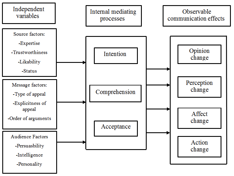
In the Hovland-Yale model, persuasion is understood as a process involving the Independent variables of Source, Message, and Audience. The elements of each factor then lead to the Audience having internal mediating processes around the topic, which, if independent variables are strong enough, can strengthen or change attitudes or behaviors. The interplay of the internal mediating processes leads to persuasion or not, which then leads to the observable effect of the communication (or not, if the message is ineffective). The model proposes that if these elements are carefully crafted and applied, the intended change in attitude or behavior (Effect) is more likely to be successful.

The diagram below helps identify the parts of persuasive communication. It shows what you can control as a presenter, how people think about the message and the impact it has. If done well, it can lead to change. I’ll focus exclusively on the independent variables in the far left side of the diagram in this article because, theoretically, this is what you, as the outside source creating a persuasive message, are in control of and, if done well, would lead to the appropriate mediating processes and desired observable effects.

Effective communication can reinforce currently held positions. You don’t always need to change minds when presenting research; much of what we find and present might align with currently held beliefs and support actions our stakeholders are already considering.

Over the years, researchers have explored the usefulness and limitations of this model in various contexts. I’ve provided a list of citations at the end of this article if you are interested in exploring academic literature on the Hovland-Yale model. Reflecting on some of the research findings can help shape how we create and deliver our persuasive communication. Some consistent from academia highlight that:

  • Source credibility significantly influences the acceptance of a persuasive message. A high-credibility source is more persuasive than a low-credibility one.
  • Messages that are logically structured, clear, and relatively concise are more likely to be persuasive.
  • An audience’s attitude change is also dependent on the channel of communication. Mass media is found to be less effective in changing attitudes than face-to-face communication.
  • The audience’s initial attitude, intelligence, and self-esteem have a significant role in the persuasion process. Research suggests that individuals with high intelligence are typically more resistant to persuasion efforts, and those with moderate self-esteem are easier to persuade than those with low or high self-esteem.
  • The effect of persuasive messages tends to fade over time, especially if delivered by a non-credible source. This suggests a need to reinforce even effective messages on a regular basis to maintain an effect.

I’ll cover the impact of each of these bullets on UX research and design presentations in the relevant sections below.

It’s important to note that while the Hovland-Yale model provides valuable insight into persuasive communication, it remains a simplification of a complex process. Actual attitude change and decision-making can be influenced by a multitude of other factors not covered in this model, like emotional states, group dynamics, and more, necessitating a multi-faceted approach to persuasion. However, the model provides a manageable framework to strengthen the communication of UX research findings, with a focus on elements that are within the control of the researcher and product team. I’ll break down the process of presenting findings to various audiences in the following section.

Let’s move into applying the models to our work as UX practitioners with a focus on how the model applies to how we prepare and present our findings to various stakeholders. You can reference the diagram above as needed as we move through the Independent variables.

Applying The Hovland-Yale Model To Presenting Your UX Research Findings

Let’s break down the key parts of the Hovland-Yale model and see how we can use them when presenting our UX research and design ideas.

Source

Revised: The Hovland-Yale model stresses that where a message comes from greatly affects how believable and effective it is. Research shows that a convincing source needs to be seen as dependable, informed, and trustworthy. In UX research, this source is usually the researcher(s) and other UX team members who present findings, suggest actions, lead workshops, and share design ideas. It’s crucial for the UX team to build trust with their audience, which often includes users, stakeholders, and designers.

You can demonstrate and strengthen your credibility throughout the research process and once again when presenting your findings.

How Can You Make Yourself More Credible?

You should start building your expertise and credibility before you even finish your research. Often, stakeholders will have already formed an opinion about your work before you even walk into the room. Here are a couple of ways to boost your reputation before or at the beginning of a project:

Case Studies

A well-written case study about your past work can be a great way to show stakeholders the benefits of user-centered design. Make sure your case studies match what your stakeholders care about. Don’t just tell an interesting story; tell a story that matters to them. Understand their priorities and tailor your case study to show how your UX work has helped achieve goals like higher ROI, happier customers, or lower turnover. Share these case studies as a document before the project starts so stakeholders can review them and get a positive impression of your work.

Thought Leadership

Sharing insights and expertise that your UX team has developed is another way to build credibility. This kind of “thought leadership” can establish your team as the experts in your field. It can take many forms, like blog posts, articles in industry publications, white papers, presentations, podcasts, or videos. You can share this content on your website, social media, or directly with stakeholders.

For example, if you’re about to start a project on gathering customer feedback, share any relevant articles or guides your team has created with your stakeholders before the project kickoff. If you are about to start developing a voice of the customer program and you happen to have Victor or Dana on your team, share their article on creating a VoC to your group of stakeholders prior to the kickoff meeting. [Shameless self-promotion and a big smile emoji].

You can also build credibility and trust while discussing your research and design, both during the project and when you present your final results.

Business Goals Alignment

To really connect with stakeholders, make sure your UX goals and the company’s business goals work together. Always tie your research findings and design ideas back to the bigger picture. This means showing how your work can affect things like customer happiness, more sales, lower costs, or other important business measures. You can even work with stakeholders to figure out which measures matter most to them. When you present your designs, point out how they’ll help the company reach its goals through good UX.

Industry Benchmarks

These days, it’s easier to find data on how other companies in your industry are doing. Use this to your advantage! Compare your findings to these benchmarks or even to your competitors. This can help stakeholders feel more confident in your work. Show them how your research fits in with industry trends or how it uncovers new ways to stand out. When you talk about your designs, highlight how you’ve used industry best practices or made changes based on what you’ve learned from users.

Methodological Transparency

Be open and honest about how you did your research. This shows you know what you’re doing and that you can be trusted. For example, if you were looking into why fewer people are renewing their subscriptions to a fitness app, explain how you planned your research, who you talked to, how you analyzed the data, and any challenges you faced. This transparency helps people accept your research results and builds trust.

Increasing Credibility Through Design Concepts

Here are some specific ways to make your design concepts more believable and trustworthy to stakeholders:

Ground Yourself in Research. You’ve done the research, so use it! Make sure your design decisions are based on your findings and user data. When you present, highlight the data that supports your choices.

Go Beyond Mockups. It’s helpful for stakeholders to see your designs in action. Static mockups are a good start, but try creating interactive prototypes that show how users will move through and use your design. This is especially important if you’re creating something new that stakeholders might have trouble visualizing.

User Quotes and Testimonials. Include quotes or stories from users in your presentation. This makes the process more personal and shows that you’re focused on user needs. You can use these quotes to explain specific design choices.

Before & After Impact. Use visuals or user journey maps to show how your design solution improves the user experience. If you’ve mapped out the current user journey or documented existing problems, show how your new design fixes those problems. Don’t leave stakeholders guessing about your design choices. Briefly explain why you made key decisions and how they help users or achieve business goals. You should have research and stakeholder input to back up your decisions.

Show Your Process. When presenting a more developed concept, show the work that led up to it. Don’t just share the final product. Include early sketches, wireframes, or simple prototypes to show how the design evolved and the reasoning behind your choices. This is especially helpful for executives or stakeholders who haven’t been involved in the whole process.

Be Open to Feedback and Iteration. Work together with stakeholders. Show that you’re open to their feedback and explain how their input can help you improve your designs.

Much of what I’ve covered above are also general best practices for presenting. Remember, these are just suggestions. You don’t have to use every single one to make your presentations more persuasive. Try different things, see what works best for you and your stakeholders, and have fun with it! The goal is to build trust and credibility with your UX team.

Message

The Hovland-Yale model, along with most other communication models, suggests that what you communicate is just as important as how you communicate it. In UX research, your message is usually your insights, data analysis, findings, and recommendations.

I’ve touched on this in the previous section because it’s hard to separate the source (who’s talking) from the message (what they’re saying). For example, building trust involves being transparent about your research methods, which is part of your message. So, some of what I’m about to say might sound familiar.

For this article, let’s define the message as your research findings and everything that goes with them (e.g., what you say in your presentation, the slides you use, other media), as well as your design concepts (how you show your design solutions, including drawings, wireframes, prototypes, and so on).

The Hovland-Yale model says it’s important to make your message easy to understand, relevant, and impactful. For example, instead of just saying,

“30% of users found the signup process difficult.”

you could say,

“30% of users struggled to sign up because the process was too complicated. This could lead to fewer renewals. Making the signup process easier could increase renewals and improve the overall experience.”

Storytelling is also a powerful way to get your message across. Weaving your findings into a narrative helps people connect with your data on a human level and remember your key points. Using real quotes or stories from users makes your presentation even more compelling.

Here are some other tips for delivering a persuasive message:

  • Practice Makes Perfect
    Rehearse your presentation. This will help you smooth out any rough spots, anticipate questions, and feel more confident.
  • Anticipate Concerns
    Think about any objections stakeholders might have and be ready to address them with data.
  • Welcome Feedback
    Encourage open discussion during your presentation. Listen to what stakeholders have to say and show that you’re willing to adapt your recommendations based on their concerns. This builds trust and makes everyone feel like they’re part of the process.
  • Follow Through is Key
    After your presentation, send a clear summary of the main points and action items. This shows you’re professional and makes it easy for stakeholders to refer back to your findings.

When presenting design concepts, it’s important to tell, not just show, what you’re proposing. Stakeholders might not have a deep understanding of UX, so just showing them screenshots might not be enough. Use user stories to walk them through the redesigned experience. This helps them understand how users will interact with your design and what benefits it will bring. Static screens show the “what,” but user stories reveal the “why” and “how.” By focusing on the user journey, you can demonstrate how your design solves problems and improves the overall experience.

For example, if you’re suggesting changes to the search bar and adding tooltips, you could say:

“Imagine a user lands on the homepage and sees the new, larger search bar. They enter their search term and get results. If they see an unfamiliar tool or a new action, they can hover over it to see a brief description.”

Here are some other ways to make your design concepts clearer and more persuasive:

  • Clear Design Language
    Use a consistent and visually appealing design language in your mockups and prototypes. This shows professionalism and attention to detail.
  • Accessibility Best Practices
    Make sure your design is accessible to everyone. This shows that you care about inclusivity and user-centered design.

One final note on the message is that research has found the likelihood of an audience’s attitude change is also dependent on the channel of communication. Mass media is found to be less effective in changing attitudes than face-to-face communication. Distributed teams and remote employees can employ several strategies to compensate for any potential impact reduction of asynchronous communication:

  • Interactive Elements
    Incorporate interactive elements into presentations, such as polls, quizzes, or clickable prototypes. This can increase engagement and make the experience more dynamic for remote viewers.
  • Video Summaries
    Create short video summaries of key findings and recommendations. This adds a personal touch and can help convey nuances that might be lost in text or static slides.
  • Virtual Q&A Sessions
    Schedule dedicated virtual Q&A sessions where stakeholders can ask questions and engage in discussions. This allows for real-time interaction and clarification, mimicking the benefits of face-to-face communication.
  • Follow-up Communication
    Actively follow up with stakeholders after they’ve reviewed the materials. Offer to discuss the content, answer questions, and gather feedback. This demonstrates a commitment to communication and can help solidify key takeaways.

Framing Your Message for Maximum Impact

The way you frame an issue can greatly influence how stakeholders see it. Framing is a persuasion technique that can help your message resonate more deeply with specific stakeholders. Essentially, you want to frame your message in a way that aligns with your stakeholders’ attitudes and values and presents your solution as the next logical step. There are many resources on how to frame messages, as this technique has been used often in public safety and public health research to encourage behavior change. This article discusses applying framing techniques for digital design.

You can also frame issues in a way that motivates your stakeholders. For example, instead of calling usability issues “problems,” I like to call them “opportunities.” This emphasizes the potential for improvement. Let’s say your research on a hospital website finds that the appointment booking process is confusing. You could frame this as an opportunity to improve patient satisfaction and maybe even reduce call center volume by creating a simpler online booking system. This way, your solution is a win-win for both patients and the hospital. Highlighting the positive outcomes of your proposed changes and using language that focuses on business benefits and user satisfaction can make a big difference.

Audience

Understanding your audience’s goals is essential before embarking on any research or design project. It serves as the foundation for tailoring content, supporting decision-making processes, ensuring clarity and focus, enhancing communication effectiveness, and establishing metrics for evaluation.

One specific aspect to consider is securing buy-in from the product and delivery teams prior to beginning any research or design. Without their investment in the outcomes and input on the process, it can be challenging to find stakeholders who see value in a project you created in a vacuum. Engaging with these teams early on helps align expectations, foster collaboration, and ensure that the research and design efforts are informed by the organization’s objectives.

Once you’ve identified your key stakeholders and secured buy-in, you should then Map the Decision-Making Process or understand the decision-making process your audience goes through, including the pain points, considerations, and influencing factors.

  • How are decisions made, and who makes them?
  • Is it group consensus?
  • Are there key voices that overrule all others?
  • Is there even a decision to be made in regard to the work you will do?

Understanding the decision-making process will enable you to provide the necessary information and support at each stage.

Finally, prior to engaging in any work, set clear objectives with your key stakeholders. Your UX team needs to collaborate with the product and delivery teams to establish clear objectives for the research or design project. These objectives should align with the organization’s goals and the audience’s needs.

By understanding your audience’s goals and involving the product and delivery teams from the outset, you can create research and design outcomes that are relevant, impactful, and aligned with the organization’s objectives.

As the source of your message, it’s your job to understand who you’re talking to and how they see the issue. Different stakeholders have different interests, goals, and levels of knowledge. It’s important to tailor your communication to each of these perspectives. Adjust your language, what you emphasize, and the complexity of your message to suit your audience. Technical jargon might be fine for technical stakeholders, but it could alienate those without a technical background.

Audience Characteristics: Know Your Stakeholders

Remember, your audience’s existing opinions, intelligence, and self-esteem play a big role in how persuasive you can be. Research suggests that people with higher intelligence tend to be more resistant to persuasion, while those with moderate self-esteem are easier to persuade than those with very low or very high self-esteem. Understanding your audience is key to giving a persuasive presentation of your UX research and design concepts. Tailoring your communication to address the specific concerns and interests of your stakeholders can significantly increase the impact of your findings.

To truly know your audience, you need information about who you’ll be presenting to, and the more you know, the better. At the very least, you should identify the different groups of stakeholders in your audience. This could include designers, developers, product managers, and executives. If possible, try to learn more about your key stakeholders. You could interview them at the beginning of your process, or you could give them a short survey to gauge their attitudes and behaviors toward the area your UX team is exploring.

Then, your UX team needs to decide the following:

  • How can you best keep all stakeholders engaged and informed as the project unfolds?
  • How will your presentation or concepts appeal to different interests and roles?
  • How can you best encourage discussion and decision-making with the different stakeholders present?
  • Should you hold separate presentations because of the wide range of stakeholders you need to share your findings with?
  • How will you prioritize information?

Your answers to the previous questions will help you focus on what matters most to each stakeholder group. For example, designers might be more interested in usability issues, while executives might care more about the business impact. If you’re presenting to a mixed audience, include a mix of information and be ready to highlight what’s relevant to each group in a way that grabs their attention. Adapt your communication style to match each group’s preferences. Provide technical details for developers and emphasize user experience benefits for executives.

Example

Let’s say you did UX research for a mobile banking app, and your audience includes designers, developers, and product managers.

Designers:

  • Focus on: Design-related findings like what users prefer in the interface, navigation problems, and suggestions for the visual design.
  • How to communicate: Use visuals like heatmaps and user journey maps to show design challenges. Talk about how fixing these issues can make the overall user experience better.

Developers:

  • Focus on: Technical stuff, like performance problems, bugs, or challenges with building the app.
  • How to communicate: Share code snippets or technical details about the problems you found. Discuss possible solutions that the developers can actually build. Be realistic about how much work it will take and be ready to talk about a “minimum viable product” (MVP).

Product Managers:

  • Focus on: Findings that affect how users engage with the app, how long they keep using it, and the overall business goals.
  • How to communicate: Use numbers and data to show how UX improvements can help the business. Explain how the research and your ideas fit into the product roadmap and long-term strategy.

By tailoring your presentation to each group, you make sure your message really hits home. This makes it more likely that they’ll support your UX research findings and work together to make decisions.

The Effect (Impact)

The end goal of presenting your findings and design concepts is to get key stakeholders to take action based on what you learned from users. Make sure the impact of your research is crystal clear. Talk about how your findings relate to business goals, customer happiness, and market success (if those are relevant to your product). Suggest clear, actionable next steps in the form of design concepts and encourage feedback and collaboration from stakeholders. This builds excitement and gets people invested. Make sure to answer any questions and ask for more feedback to show that you value their input. Remember, stakeholders play a big role in the product’s future, so getting them involved increases the value of your research.

The Call to Action (CTA)

Your audience needs to know what you want them to do. End your presentation with a strong call to action (CTA). But to do this well, you need to be clear on what you want them to do and understand any limitations they might have.

For example, if you’re presenting to the CEO, tailor your CTA to their priorities. Focus on the return on investment (ROI) of user-centered design. Show how your recommendations can increase sales, improve customer satisfaction, or give the company a competitive edge. Use clear visuals and explain how user needs translate into business benefits. End with a strong, action-oriented statement, like

“Let’s set up a meeting to discuss how we can implement these user-centered design recommendations to reach your strategic goals.”

If you’re presenting to product managers and business unit leaders, focus on the business goals they care about, like increasing revenue or reducing customer churn. Explain your research findings in terms of ROI. For example, a strong CTA could be:

“Let’s try out the redesigned checkout process and aim for a 10% increase in conversion rates next quarter.”

Remember, the effects of persuasive messages can fade over time, especially if the source isn’t seen as credible. This means you need to keep reinforcing your message to maintain its impact.

Understanding Limitations and Addressing Concerns

Persuasion is about guiding understanding, not tricking people. Be upfront about any limitations your audience might have, like budget constraints or limited development resources. Anticipate their concerns and address them in your CTA. For example, you could say,

“I know implementing the entire redesign might need more resources, so let’s prioritize the high-impact changes we found in our research to improve the checkout process within our current budget.”

By considering both your desired outcome and your audience’s perspective, you can create a clear, compelling, and actionable CTA that resonates with stakeholders and drives user-centered design decisions.

Finally, remember that presenting your research findings and design concepts isn’t the end of the road. The effects of persuasive messages can fade over time. Your team should keep looking for ways to reinforce key messages and decisions as you move forward with implementing solutions. Keep your presentations and concepts in a shared folder, remind people of the reasoning behind decisions, and be flexible if there are multiple ways to achieve the desired outcome. Showing how you’ve addressed stakeholder goals and concerns in your solution will go a long way in maintaining credibility and trust for future projects.

A Tool to Track Your Alignment to the Hovland-Yale Model

You and your UX team are likely already incorporating elements of persuasion into your work. It might be helpful to track how you are doing this to reflect on what works, what doesn’t, and where there are gaps. I’ve provided a spreadsheet in Figure 3 below for you to modify and use as you might see fit. I’ve included sample data to provide an example of what type of information you might want to record. You can set up the structure of a spreadsheet like this as you think about kicking off your next project, or you can fill it in with information from a recently completed project and reflect on what you can incorporate more in the future.

Please use the spreadsheet below as a suggestion and make additions, deletions, or changes as best suited to meet your needs. You don’t need to be dogmatic in adhering to what I’ve covered here. Experiment, find what works best for you, and have fun.

Project Phase Persuasion Element Topic Description Example Notes/
Reflection
Pre-Presentation Audience Stakeholder Group Identify the specific audience segment (e.g., executives, product managers, marketing team) Executives
Message Message Objectives What specific goals do you aim to achieve with each group? (e.g., garner funding, secure buy-in for specific features) Secure funding for continued app redesign
Source Source Credibility How will you establish your expertise and trustworthiness to each group? (e.g., past projects, relevant data) Highlighted successful previous UX research projects & strong user data analysis skills
Message Message Clarity & Relevance Tailor your presentation language and content to resonate with each audience’s interests and knowledge level Presented a concise summary of key findings with a focus on potential ROI and revenue growth for executives
Presentation & Feedback Source Attention Techniques How did you grab each group’s interest? (e.g., visuals, personal anecdotes, surprising data) Opened presentation with a dramatic statistic about mobile banking app usage
Message Comprehension Strategies Did you ensure understanding of key information? (e.g., analogies, visuals, Q&A) Used relatable real-world examples and interactive charts to explain user research findings
Message Emotional Appeals Did you evoke relevant emotions to motivate action? (e.g., fear of missing out, excitement for potential) Highlighted potential revenue growth and improved customer satisfaction with app redesign
Message Retention & Application What steps did you take to solidify key takeaways and encourage action? (e.g., clear call to action, follow-up materials) Ended with a concise call to action for funding approval and provided detailed research reports for further reference
Audience Stakeholder Feedback Record their reactions, questions, and feedback during and after the presentation Executives impressed with user insights, product managers requested specific data breakdowns
Analysis & Reflection Effect Effective Strategies & Outcomes Identify techniques that worked well and their impact on each group Executives responded well to the emphasis on business impact, leading to conditional funding approval
Feedback Improvements for Future Presentations Note areas for improvement in tailoring messages and engaging each stakeholder group Consider incorporating more interactive elements for product managers and diversifying data visualizations for wider appeal
Analysis Quantitative Metrics Track changes in stakeholder attitudes Conducted a follow-up survey to measure stakeholder agreement with design recommendations before and after the presentation Assess effectiveness of the presentation

Figure 3: Example of spreadsheet categories to track the application of the Hovland-Yale model to your presentation of UX Research findings.

References

Foundational Works

  • Hovland, C. I., Janis, I. L., & Kelley, H. H. (1953). Communication and persuasion. New Haven, CT: Yale University Press. (The cornerstone text on the Hovland-Yale model).
  • Weiner, B. J., & Hovland, C. I. (1956). Participating vs. nonparticipating persuasive presentations: A further study of the effects of audience participation. Journal of Abnormal and Social Psychology, 52(2), 105-110. (Examines the impact of audience participation in persuasive communication).
  • Kelley, H. H., & Hovland, C. I. (1958). The communication of persuasive content. Psychological Review, 65(4), 314-320. (Delves into the communication of persuasive messages and their effects).

Contemporary Applications

  • Pfau, M., & Dalton, M. J. (2008). The persuasive effects of fear appeals and positive emotion appeals on risky sexual behavior intentions. Journal of Communication, 58(2), 244-265. (Applies the Hovland-Yale model to study the effectiveness of fear appeals).
  • Chen, G., & Sun, J. (2010). The effects of source credibility and message framing on consumer online health information seeking. Journal of Interactive Advertising, 10(2), 75-88. (Analyzes the impact of source credibility and message framing, concepts within the model, on health information seeking).
  • Hornik, R., & McHale, J. L. (2009). The persuasive effects of emotional appeals: A meta-analysis of research on advertising emotions and consumer behavior. Journal of Consumer Psychology, 19(3), 394-403. (Analyzes the role of emotions in persuasion, a key aspect of the model, in advertising).
Categories: Others Tags:

Client Management Tools Unleashed: 9 Best Picks for 2024

June 4th, 2024 No comments

As companies scale and their customer base expands, the demand for managing clients and meeting growth targets intensifies exponentially.

Enter client management tools that simplify task and activity workflows. This software empowers teams to channel their energies where it truly counts: delivering unparalleled customer service. 

With client management software, businesses can confidently navigate the complexities of scaling, ensuring that each interaction with their valued clientele remains exceptional.

With so many market options, it can be difficult to make the right choice. But don’t fret—we’ve done the leg work for you and created a list of the 8 best client management tools for 2024. Let’s get started!

Overview of Client Management Tools

Client management tools are designed to streamline and enhance managing customer relationships. These tools typically offer features like contact management, communication tracking, task automation, and analytics features. 

These tools enable businesses to provide exceptional customer service, optimize workflows, and drive growth and profitability by centralizing client data and facilitating efficient communication and task management.

Selection Criteria for the Best Client Management Tools

We followed a four-step selection criteria—

  1. Has the product been a good partner in helping the client’s business?
  2. Contact and account management
  3. Pros and Cons
  4. We also follow G2 reviews from real customers to determine this list. Let’s get right into it.

Top 9 Client Management Tools for 2024

  1. Jotform
  2. Salesforce
  3. Hubspot
  4. Nifty
  5. Bitrix 24
  6. Zoho CRM
  7. ClickUp
  8. Freshworks CRM
  9. Monday.com

In-Depth Review of Selected Tools

1. Jotform

Jotform sets itself apart from other client management tools by offering users a unique workflow automation capability with its form builder, tables, approvals, and teams products. 

Jotform’s lead generation templates are customizable based on your business type, nature, and purpose, allowing you to enlarge your database in an automated way. You can confidently strengthen your team’s communication with clients with the forms you create. You can also use your data offline, download it, or utilize Jotform’s no-code app builder to develop a mobile application.

Jotform is available on the free plan with a limit of 100 monthly submissions and 5 forms. Additionally, Jotform offers discounts to non-profit organizations and educational institutions.

Pros

  • Fully customizable
  • Ready to use templates
  • Integrations
  • Intuitive Interface

Cons

  • Learning curve
  • Comparatively expensive

2. Salesforce

TechRadar ranked Salesforce the #1 client management tool in 2024. Salesforce Customer 360 is an intelligent, proactive, and AI-powered platform that helps customers make the best business decisions. 

It’s an all-around sales pipeline management tool that integrates with software like Slack, Mulesoft, Tableau, etc.

When it comes to contact management, Salesforce gives you a clear picture of your clients, their activity history, key contacts, customer communication, and internal account discussions.

Let’s take a look at the pros and cons of this platform—

Pros

  • Ease of Use
  • Easy Customization
  • Lead Management
  • Integration

Cons

  • Learning Curve
  • Expensive
  • Limited Customization

Most customers state that Salesforce’s expensive prices are one of the biggest reasons they don’t choose it. However, if the price point is not an issue for your organization, go for it!

3. Hubspot

Hubspot’s CRM is a well-known client management tool for SMBs and enterprises. Its flexible, easy-to-use interface makes it easy to track emails, track sales lead, schedule meetings, and live chat to stay connected with your clients on the go.

It can help you centralize your sales activities, making it easy to track leads, manage contacts, and stay organized. You can identify the most promising leads based on their engagement level and behavior, enabling you to focus your efforts on customers with the highest likelihood of conversion.

Its integration with Pipedrive, Salesforce, Microsoft Dynamics 365, Clearbit, etc, makes it easy for customers to maintain and navigate through data on a single platform.

Pros

  • Integration
  • Task management
  • Intuitive interface

Cons

  • Learning curve
  • Expensive premium plans
  • Contact management

Hubspot offers the perfect alternative to Salesforce’s higher price point. The free plan provides good features like shared inbox space and live chat. However, a word of caution would be that it is very expensive, especially if you’re looking for small businesses or startups tools. The monthly sales seat costs start from $100 and require a mandatory onboarding service.

4. Nifty 

Nifty isn’t just for project management—it’s your all-in-one client management software. Designed to streamline client interactions, boost team productivity, and ensure deadlines are met, Nifty is a game-changer for client-centric businesses.

Key Features:

Client Communication: Seamless client communication with real-time chat, file sharing, and discussion threads.

Task Management: Intuitive task management system with due dates, priorities, and dependencies for efficient project execution.

Project Tracking: Milestones, deadlines, and task progress tracking for a clear overview of project status.

Time Tracking: Log billable hours and track team productivity for accurate client billing.

Integrations: Connect with Google Drive, Slack, Zoom, and more to enhance collaboration.

Pros:

  • User-friendly interface for quick adoption.
  • Tailor Nifty to fit your client management needs.
  • Robust features suitable for teams of all sizes.
  • Seamlessly integrate with third-party tools for enhanced functionality.

Cons:

  • Learning Curve
  • Limited Customization 

5. Bitrix 24

Bitrix is much more than a CRM. It’s a useful tool for customer support, and it comes with its own Customer Contact Center so you can solve customer queries in real-time.

It also helps businesses set up automated support, create websites, or set up a chat network for their websites. They come with task and project management tools, CRM, chats, video calls, a website builder, telephony, CRM marketing and analytics, and more.

Bitrix24’s cloud-based nature empowers a modern, distributed workforce. Team members can collaborate and access the platform from anywhere there’s an internet connection.

Bitrix24 offers a free plan with a surprising amount of functionality which is a huge plus. It lets smaller businesses and teams experiment extensively before committing to a paid plan.

Pros

  • Ease of Use
  • Task Management
  • Team Collaboration
  • Project Management

Cons

  • User Interface
  • Missing Features
  • Training Required

6. Zoho CRM

Zoho CRM acts as an all-in-one platform. It allows you to monitor leads behavior and customer buyer preferences and view price lists of documents without changing applications.

One of the biggest differentiators between Zoho CRM and others on the list is its omnichannel approach. This allows businesses to engage with clients via whichever medium they prefer, whether email or telephone, etc.

It also offers its own AI assistance. Zia Voice can help retrieve information, update accounts, and generate reports. It is the perfect combination of usability, customization, functionality, and extensibility to help different-sized industries manage client relationships. 

Pros

  • Lead Management
  • Easy Customization
  • Integration

Cons

  • Learning Curve
  • Integration Issues

7. ClickUp

ClickUp is a hub where teams come together to make client management easy and collaborative. The well-organized layout allows users to find what they need quickly without any confusion.

It provides robust task management capabilities, allowing users to organize, prioritize, and track tasks effortlessly. 

One of ClickUp’s standout features is its automation functionality. 

You can automate repetitive tasks, notifications, and workflows, saving time and reducing manual effort. The automation options are highly customizable, allowing users to tailor them to their specific workflow requirements.

Pros

  • Visually appealing (yes, it matters!)
  • Task Management
  • Easy Customization
  • Project Management

Cons

  • Slow loading
  • Learning curve

8. Freshworks CRM

Using Freshsales Suite, your marketing virtual assistants teams can organize customer information, personalize and automate emails, and find the right sales opportunities.

With Freshworks’ CRM, Freshsales, sales managers can guide leads through the sales process from first contact to closing. 

The built-in email, phone, chat, and telephone give sales teams more time to sell and increase efficiency and productivity in their daily tasks. With Freddy AI, salespeople can get insights into the best deals to go after and what actions to take, as well as predict revenue with sales forecasting.

Pros

  • Customer support
  • Intuitive
  • Easy integration

Cons

  • Limited features
  • Bugs
  • Expensive

9. Monday.com

Monday.com is best suited for small—to medium-sized organizations, helping them manage the entire sales cycle, from pre- to post-sales.

It supports contact management, and its templates allow you to create personalized emails that are automatically complete with contact information, sync emails sent and received, record meeting notes, and view all communication in a single timeline. 

You can automate workflows to reduce administrative and repetitive tasks and streamline communication. However, remember that the number of actions is limited to 250 per seat per month unless you upgrade to a higher plan.

Pros

  • Automation features
  • Simplicity
  • Intuitive

Cons

  • Expensive
  • CRM Issues
  • Integration Issues

Conclusion

Note that this list is not exhaustive and that more tools are available. 

Moving on—

If there’s one thing we’ve noticed about these tools, they are quite expensive and require a learning curve. However, many resources on the tool’s website can educate you on the inside out. 
Client management tools are essential to your workflow if you want to build a steady and positive relationship with your clients. Remember to choose the one tool that matches your business objectives and goals.

Featured Image by Brooke Cagle on Unsplash

The post Client Management Tools Unleashed: 9 Best Picks for 2024 appeared first on noupe.

Categories: Others Tags:

FERPA Compliance in the Digital Age: A Guide for Educational Institutions

June 3rd, 2024 No comments

With a staggering 954 data breaches reported in the U.S. schooling system, 2023 smashed all the records—nearly seven times the previous year’s figures. 

This trend uncovers a harsh reality: educational institutions’ data is in danger. According to the Comparitech Report, since 2005, a total of 2,691 data breaches have rocked the U.S. education sector, putting millions of student records at risk. 

From the massive Illuminate Education breach in 2021, which affected over 605 institutions, to misconfigured cloud storage leaks at McGraw Hill, which affected over 100,000 students, the vulnerabilities are real, and the consequences are severe. 

FERPA compliance has never been more critical. But what exactly does it mean for your school or college? 

This guide will help you understand your obligations under the FERPA – Family Educational Rights and Privacy Act, identify potential pitfalls and implement practical strategies to protect your students, your institution, and the trust of your community.

Understanding FERPA Rights and Requirements

FERPA is a cornerstone of US education privacy law. It grants important rights to parents and eligible students.

 It also sets the standards that educational institutions must follow. Here’s a breakdown of the key aspects:

  • Access and Amendment Rights. Parents and students have the right to review their educational records and request corrections if they find inaccuracies. If there is a disagreement, a formal hearing process is available.
  • Consent for Disclosure. Schools generally need written consent before they release student records. Still, there are some exceptions in specific situations.
  • Directory Information. While schools can share basic information like names and photos without consent, parents can opt out of this disclosure.
  • Education Records Defined. FERPA covers a wide range of records, including physical and digital formats, as long as they are directly related to a student and maintained by the school.

What Schools Must Do: FERPA and Data Security

But FERPA doesn’t only grant rights. The Act also orders robust data security practices for schools that receive federal funds. 

This protection extends to FERPA-specific data and all sensitive student information.

Here’s what schools must do to protect data:

  • Cybersecurity Frameworks. Adopt established frameworks like NIST CSF or ISO 27001 to provide a structured approach to comprehensive security measures.
  • Technical Safeguards. Use firewalls, antivirus software, and encryption. These digital shields protect your data from unauthorized access and breaches. Archiving software can help you ensure education compliance
  • Risk Assessments. Regular risk assessments can help you identify vulnerabilities and proactively mitigate them.
  • Access Controls and Monitoring. Limit access to sensitive information based on job roles. Monitor who’s accessing data to ensure accountability—annual FERPA Updates. Provide yearly reminders to parents and students about their rights, including their right to opt out of directory information sharing.

Common FERPA Mistakes and How to Avoid Them

When it comes to FERPA, even seemingly minor mistakes can have major consequences. Here are some common pitfalls and how to steer clear of them:

Neglecting Security Basics

Unfortunately, lost laptops, weak passwords, and phishing scams are common ways student data is compromised. 

Don’t underestimate the importance of basic security practices.

Mishandling Record Requests

Establish a transparent, well-documented process for handling requests from parents and students to view or modify their records.

Ambiguity Around Directory Information

Clearly define what constitutes directory information and make the opt-out process easy and transparent for parents.

The Consequences of Non-Compliance: Beyond Inconvenience

FERPA violations carry significant consequences for educational institutions. Failing to follow these regulations can result in various penalties, impacting the institution and its personnel.

These consequences include:

  • Financial Penalties. Institutions may incur notable fines for violating FERPA regulations. This can strain resources and harm the institution’s ability to fulfill its educational mission.
  • Employee Discipline. Employees responsible for data breaches or non-compliance may face disciplinary action, including suspension or termination. Upholding FERPA is a shared responsibility that requires accountability at all levels.
  • Loss of Federal Funding. The most severe penalty is the potential loss of crucial federal funding administered by the U.S. Department of Education. This loss can significantly disrupt the institution’s operations and limit its capacity to provide essential services.
  • Disciplinary Action by the FPCO. The Family Policy Compliance Office (FPCO) within the Department of Education can take disciplinary action against institutions that fail to meet FERPA standards. This could involve investigations, formal warnings, or other measures negatively impacting the institution’s standing.

FERPA compliance is a fundamental responsibility of educational institutions to their students and the broader community. By prioritizing data protection and privacy, institutions safeguard student information and uphold the trust essential for a thriving learning environment.

Key Challenges for FERPA Compliance

The digital age presents unique hurdles for FERPA compliance:

  • Data Breaches and Cybersecurity. The threat of cyberattacks is considerable nowadays. Ensuring strong security protocols and incident response plans is a FERPA mandate.
  • Third-Party Vendors. Schools must meticulously vet any third-party vendors having access to student data. FERPA requires strict contracts with precise data use limitations and security guarantees.
  • “School Official” and “Legitimate Educational Interest.” These FERPA terms have become even more complex in the digital age. Schools must define who has authorized access to student records and under what circumstances.
  • Parental Rights. FERPA grants parents significant rights regarding their child’s educational records. Schools need streamlined processes for consent forms, viewing rights, and handling record amendment requests.
  • Student Directory Information. FERPA regulates seemingly simple information like student names and photos. Schools must have transparent policies on what constitutes directory information and how parents can opt-out.

6 Practical Strategies for FERPA Success in the Digital Age

Don’t let these challenges overwhelm you. Here’s your roadmap to proactive FERPA compliance:

  1. Robust Policy Framework. Develop and regularly update a comprehensive FERPA policy. Ensure it includes the specific risks and technologies of the digital age and is easily accessible to staff, students, and parents.
  2. Data Mapping and Inventory. Know exactly what student data you have, where it’s stored, and who has access. This is crucial for security and swift incident response.
  3. Multi-Layered Security. Employ a combination of technical safeguards, including firewalls, encryption, access controls, and intrusion detection systems. Regularly update and patch software to stay ahead of threats.
  4. Comprehensive Training. Educate all staff members about FERPA, security best practices, and the potential consequences of non-compliance. Foster a culture of vigilance and reporting.
  5. Thorough Vendor Vetting. Before partnering with any third-party vendor, review their security practices and contractual agreements to ensure they align with FERPA requirements.
  6. Transparent Communication. Be open and proactive with parents and students about your data collection and protection practices. Provide clear information about their rights and how they can exercise them.

The Path Forward: A Culture of Data Responsibility

FERPA compliance is an ongoing commitment to safeguarding student privacy and building trust within your educational community. 

By embracing a proactive, holistic approach, you can achieve compliance and create a safe and secure learning environment for your students.

Featured image by Elisa Calvet B. on Unsplash

The post FERPA Compliance in the Digital Age: A Guide for Educational Institutions appeared first on noupe.

Categories: Others Tags:

Exciting New Tools for Designers, June 2024

June 3rd, 2024 No comments

In this month’s roundup of the best tools for web designers and developers, we’ll explore a range of new and noteworthy tools designed to enhance various aspects of your daily tasks. Whether you’re looking to balance your work and life more effectively, find inspiration for web interactions, or streamline your development process, there’s something here for everyone. Enjoy!

Categories: Designing, Others Tags:

Ice Cream Ahead (June 2024 Wallpapers Edition)

May 31st, 2024 No comments

There’s an artist in everyone. Some bring their ideas to life with digital tools, others capture the perfect moment with a camera or love to grab pen and paper to create little doodles or pieces of lettering. And even if you think you’re far from being an artist, well, it might just be hidden deep inside of you. So why not explore it?

For more than 13 years already, our monthly wallpapers series has been the perfect opportunity to do just that: to break out of your daily routine and get fully immersed in a creative little project. This month was no exception, of course.

In this post, you’ll find beautiful, unique, and inspiring wallpapers designed by creative folks who took on the challenge. All of them are available in versions with and without a calendar for June 2024 and can be downloaded for free. As a little bonus goodie, we also added a selection of June favorites from our archives that are just too good to be forgotten. Thank you to everyone who shared their designs with us this month! Happy June!

  • You can click on every image to see a larger preview,
  • We respect and carefully consider the ideas and motivation behind each and every artist’s work. This is why we give all artists the full freedom to explore their creativity and express emotions and experience through their works. This is also why the themes of the wallpapers weren’t anyhow influenced by us but rather designed from scratch by the artists themselves.
  • Submit a wallpaper!
    Did you know that you could get featured in our next wallpapers post, too? We are always looking for creative talent.

Kitten

Designed by Design Studio from India.

Celebrate National Tropic Day

“Today, let’s dive into the lush wonders of the tropics! From breathtaking landscapes to tantalizing flavors, National Tropic Day is a celebration of all things tropical. Join us in honoring the vibrant cultures and biodiversity that make these regions so unique. Get ready to embark on a tropical adventure!” — Designed by PopArt Studio from Serbia.

All-Seeing Eye

Designed by Ricardo Gimenes from Sweden.

Grand Canyon In June

“June arrives, and with it, summer. The endless afternoons, the heat… and all those moments to enjoy and rest, because, even if we are working, in summer everything is seen with different eyes. This year, we are going to the Grand Canyon of Colorado to admire the beauty of its landscapes and enjoy its sunsets.” — Designed by Veronica Valenzuela Jimenez from Spain.

Splash

Designed by Ricardo Gimenes from Sweden.

What Is Green

“When June arrives, it’s the best moment of the year for the photosynthesis (in the north). Most of the plants are in green colors. I like to play with colors and computers. This picture comes out of my imagination. It’s like looking with an electronic microscope at a strange green structure.” — Designed by Philippe Brouard from France.

Back In My Days

Designed by Ricardo Gimenes from Sweden.

Create Your Own Path

“Nice weather has arrived! Clean the dust off your bike and explore your hometown from a different angle! Invite a friend or loved one and share the joy of cycling. Whether you decide to go for a city ride or a ride in nature, the time spent on a bicycle will make you feel free and happy. So don’t wait, take your bike and call your loved one because happiness is greater only when it is shared. Happy World Bike Day!” — Designed by PopArt Studio from Serbia.

Summer Coziness

“I’ve waited for this summer more than I waited for any other summer since I was a kid. I dream of watermelon, strawberries, and lots of colors.” — Designed by Kate Jameson from the United States.

Summer Surf

“Summer vibes…” — Designed by Antun Hirsman from Croatia.

Strawberry Fields

Designed by Nathalie Ouederni from France.

Deep Dive

“Summer rains, sunny days, and a whole month to enjoy. Dive deep inside your passions and let them guide you.” — Designed by Ana Masnikosa from Belgrade, Serbia.

Join The Wave

“The month of warmth and nice weather is finally here. We found inspiration in the World Oceans Day which occurs on June 8th and celebrates the wave of change worldwide. Join the wave and dive in!” — Designed by PopArt Studio from Serbia.

Summer Party

Designed by Ricardo Gimenes from Sweden.

Oh, The Places You Will Go!

“In celebration of high school and college graduates ready to make their way in the world!” — Designed by Bri Loesch from the United States.

Ice Creams Away!

“Summer is taking off with some magical ice cream hot air balloons.” — Designed by Sasha Endoh from Canada.

Merry-Go-Round

Designed by Xenia Latii from Germany.

Nine Lives

“I grew up with cats around (and drawing them all the time). They are so funny… one moment they are being funny, the next they are reserved. If you have place in your life for a pet, adopt one today!” — Designed by Karen Frolo from the United States.

Solstice Sunset

“June 21 marks the longest day of the year for the Northern Hemisphere — and sunsets like these will be getting earlier and earlier after that!” — Designed by James Mitchell from the United Kingdom.

Travel Time

“June is our favorite time of the year because the keenly anticipated sunny weather inspires us to travel. Stuck at the airport, waiting for our flight but still excited about wayfaring, we often start dreaming about the new places we are going to visit. Where will you travel to this summer? Wherever you go, we wish you a pleasant journey!” — Designed by PopArt Studio from Serbia.

Bauhaus

“I created a screenprint of one of the most famous buildings from the Bauhaus architect Mies van der Rohe for you. So, enjoy the Barcelona Pavillon for your June wallpaper.” — Designed by Anne Korfmacher from Germany.

Pineapple Summer Pop

“I love creating fun and feminine illustrations and designs. I was inspired by juicy tropical pineapples to celebrate the start of summer.” — Designed by Brooke Glaser from Honolulu, Hawaii.

Melting Away

Designed by Ricardo Gimenes from Sweden.

The Kids Looking Outside

“These are my cats looking out of the window. Because it is Children’s Day in June in a lot of countries, I chose to make a wallpaper with this photo of my cats. The cats are like kids, they always want to play and love to be outside! Also, most kids love cats!” — Designed by Kevin van Geloven from the Netherlands.

Expand Your Horizons

“It’s summer! Go out, explore, expand your horizons!” — Designed by Dorvan Davoudi from Canada.

Ice Cream June

“For me, June always marks the beginning of summer! The best way to celebrate summer is of course ice cream, what else?” — Designed by Tatiana Anagnostaki from Greece.

Sunset In Jamaica

“Photo from a recent trip to Jamaica edited to give a retro look and feel.” — Designed by Tommy Digiovanni from the United States.

Flamingood Vibes Only

“I love flamingos! They give me a happy feeling that I want to share with the world.” — Designed by Melissa Bogemans from Belgium.

Knitting For Summer

“I made multiple circles overlapping with close distances. The overall drawing looks like a clothing texture, for something you could wear in coming summer. Let’s have a nice summer.” — Designed by Philippe Brouard from France.

Categories: Others Tags:

Top Vue Admin Dashboard & Templates

May 31st, 2024 No comments

Vue.js is one of the most liked JavaScript frameworks for creating interactive and dynamic user interfaces in today’s busy web development space. Vue.js’ reactivity of components as well as its smooth data binding put it on a pedestal when it comes to admin dashboard designing.

This article discusses some of the leading Vue administrator dashboards that can save you time and effort in making your web apps.

1. Berry

C:Users1Downloadsscreen shotBerry.png

Download | Preview

Berry by CodedThemes, it is an attractive and considerably flexible Vue Template that stresses ease of use and attractiveness. It is developed with the latest Vue.js and comes with a variety of well-designed components and layouts. The design language in Berry prioritizes simplicity and ease of use, which makes it perfect for dashboards that have to efficiently communicate information.

Various style options are included in the template so you can easily tailor it to your specific needs.

2. Mantis

C:Users1Downloadsscreen shot3d0106d3-8808-4012-9f10-818076b246f0 3.png

Download | Preview

Mantis is a multi-purpose Vue administration template that comes with modern aesthetics and vast functionalities. It has various customizable parts, additives and modules making it good for constructing intricate administrative interfaces.

This template is focused on simplicity in design and ease of navigation, which promotes efficiency for users. Mantis is also compatible with dark mode, thus enhancing its appeal and usage under different lighting conditions.

3. Able Pro

C:Users1Downloadsscreen shotAble Pro.png

Download | Preview

Able Pro is an advanced Vue admin template known for its vast collection of features and flexibility. It comes with various UI components, charts, forms, and tables that are specifically designed to aid in the development of admin panels.

Modular architecture enables easy adaptation and extension while responsive design ensures compatibility on multiple devices. Moreover, it can be seamlessly integrated with third-party plugins.

4. Vue Material Dashboard PRO

C:Users1Downloadsscreen shotVue Material Dashboard PRO.png

Download | Preview

Vue Material Dashboard PRO is a paid-for Vue administrator model that combines Google’s material design guidelines with the efficiency of Vue.js. It has a range of components such as graphs, tables, or forms which have been styled to look similar.

The template has a neat and futuristic interface, making it best suited for web applications at a professional level. Developers have an all-inclusive customization option hence they can adapt it to different project needs.

5. Vue Paper Dashboard Pro

C:Users1Downloadsscreen shotVue Paper Dashboard PRO.png

Download | Preview

Vue Paper Dashboard PRO is another stunning product by Creative Tim that features paper-related looks. This premium Vue template contains a variety of pre-built elements and widgets following one visual paradigm.

It’s suitable for applications that require a visually appealing yet practical admin interface. The template’s emphasis on simplicity and elegance keeps user interactions intuitive and efficient.

6. Diamond

C:Users1Downloadsscreen shotDiamond.png

Download | Preview

Based on its neatness, Diamond is a full-fledged Vue admin template by PrimeVue which also maintains tidiness. It has multiple UI components and pre-built pages to cater for various administrative panel needs.

Performance is given priority in the template to facilitate ease of use thereby making it a nice option for programmers who need a speedy set up of complex dashboards. The modern design and user-friendly interface of Diamond thus make better user experience resulting in greater effectiveness.

7. Ultima

C:Users1Downloadsscreen shotUltima.png

Download | Preview

Ultima is noted for its contemporary look and vast library of components as one of the most potent Vue admin templates. It has numerous ready-to-use layouts and themes that provide more flexibility when it comes to different project settings.

Ultima is built for speed, with fast load times and seamless interactions being the result. This makes it a viable option for beginners as well as seasoned developers because it has extensive documentation and an active community support system.


8. Vristo

C:Users1Downloadsscreen shotVristo.png

Download | Preview

Vristo, Vue admin template for complex needs uses Tailwind CSS and Nuxt.js frameworks to streamline development. There are many components, ready-made pages, and advanced extensions that simplify the creation of administrative interfaces. 

Developers will find it easy to create unique and handy dashboards using the modular design of Vristo along with its rich customization features. It is coded simply and has a responsive design that makes it suitable for various devices.

9. MaterialPro Vue JS Template

C:Users1Downloadsscreen shotMaterialPro VueJs Admin Template.png

Download | Preview

MaterialPro Vue Js Template is an ALL-IN-ONE tool designed to build easily adjustable premium quality administration dashboards. The concept of material design was used during the development process so as to ensure an appealing interface that can be quickly understood by anyone who enters it visually. Variety of elements, widgets and graphs provided in the template may be tailored according to a current project’s specs.

Meticulous attention was paid by MaterialPro towards it detail and thorough documentation making it indispensable for developers’ quality administrator panels creating purposes.

10. Sing App Vue

C:Users1Downloadsscreen shotSing App Vue.png

Download | Preview

Sing App Vue is a modern Vue admin template that is responsive too; its focus is on simplicity and intuitiveness in usage. Many pre-made pages as well as components help you easily make your own admin dashboard here.

Sing App Vue focuses on offering a clean and easy user experience, ensuring that data is presented clearly and readily. Its adaptability and scalability make it suited for a wide range of applications, including small initiatives and large-scale business solutions.


11. Light blue view

C:Users1Downloadsscreen shotLight Blue Vue.png

Download | Preview

Light Blue Vue is a visually stunning yet highly effective Vue template. It has a modern design with a light color palette for a new appearance and feel. The template includes a range of components, widgets, and pre-built pages, all of which are intended to aid rapid development. 

Light Blue Vue’s responsive design provides compatibility with a variety of devices, while its modular architecture allows for simple customization and extension.


12. Spruha – Vue Administrative Template

C:Users1Downloadsscreen shotSpruha – Vue Admin Template.png

Download | Preview

Spruha is a versatile Vue template that includes a variety of components and pre-designed layouts to make it easier to create admin panels. It stresses clean and modern design, ensuring that interfaces are both user-friendly and visually appealing. 

Spruha’s extensive documentation and active support community make it an ideal alternative for developers looking for a dependable and efficient template for their projects.

Wrapping It Up

These Vue admin templates provide a wide range of features and design styles to suit a variety of project needs. Whether you require a simple, attractive interface or a complete solution with vast capabilities, there is a template to meet your requirements. Using these templates, developers can dramatically save development time and effort while focusing on producing high-quality applications.

The post Top Vue Admin Dashboard & Templates appeared first on noupe.

Categories: Others Tags:

Data Orchestration 101: Process, Benefits, Challenges, and Tools 

May 31st, 2024 No comments

Today, data drives the world. Managing and using data efficiently is crucial for organizations to gain insights, make informed decisions, and guide business growth. Data orchestration plays a pivotal role in this process by automating and coordinating data workflows across diverse systems and platforms. 

Data orchestration is not just about moving data from one place to another; it is about ensuring that data flows smoothly, undergoes necessary transformations, and reaches its intended destination promptly and accurately. 

In this piece, we discuss the fundamentals of data orchestration, including its processes, benefits, challenges, and the tools available to streamline data management. 

By understanding data orchestration, organizations can optimize their data pipelines, enhance operational efficiency, and fully utilize their data assets. 

Let’s start by understanding what data orchestration is.

What is Data Orchestration?

Data orchestration is a fundamental process in modern data management and strategies that involves automating and coordinating data workflows across different systems, applications, and environments. 

In simpler terms, data orchestration ensures that data is efficiently collected, transformed, and moved to where it is needed for various business purposes, such as analytics, reporting, or application integration. 

The key steps in data orchestration include:

  • Data Ingestion: Gathering data from multiple sources, including databases, APIs, files, and streams.
  • Data Transformation: Converting and cleansing data to ensure consistency and quality.
  • Data Routing and Distribution: Directing data to the appropriate destinations based on predefined rules or conditions.
  • Data Storage and Archival: Storing data in suitable repositories.

Data orchestration streamlines these processes, enabling organizations to leverage their data effectively, make informed decisions faster, and optimize business operations. 

Let’s understand the above steps in detail.

Process of Data Orchestration

Data orchestration involves a series of coordinated steps to manage and automate data workflows effectively. Here is a simplified breakdown of the data orchestration process: 

Data Ingestion: Gather data from sources, such as databases, applications, IoT devices, or external APIs, and ensure data is collected in a consistent format and at regular intervals. 

Data Transformation: Cleanse and preprocess raw data to ensure quality and consistency. Apply transformations to standardize data formats, handle missing values, and enrich data with additional context or metadata. 

Data Routing and Distribution: Direct data to appropriate destinations based on predefined rules or business logic. Route data to specific storage systems, analytics platforms, or downstream applications. 

Data Storage and Archival: Store processed data in suitable repositories, such as databases, data lakes, or cloud storage. Implement data retention policies to archive or delete data based on regulatory requirements or business needs. 

Data Monitoring and Management: Monitor data pipelines for performance, errors, or anomalies. Implement data governance practices to establish data security, privacy, and compliance with regulatory standards. 

Automated Workflows and Orchestration: Use orchestration tools or platforms to automate data workflows and schedule data processing tasks. Coordinate dependencies between different stages of the data pipeline to optimize efficiency and resource utilization. 

By following these structured steps, organizations can streamline data management processes, improve the quality of data, and facilitate seamless data integration across diverse systems. 

Benefits of Data Orchestration

Data orchestration offers several key benefits that enhance data management and facilitate efficient workflows within organizations: 

Improved Data Quality: Data orchestration automates data cleansing and transformation processes, ensuring consistency, accuracy, and reliability of data across systems. 

Enhanced Operational Efficiency: By automating data workflows, orchestration reduces manual intervention, minimizes errors, and accelerates data processing tasks, leading to improved productivity and resource utilization. 

Streamlined Data Integration: Data orchestration enables seamless integration of data from multiple sources and formats, making it easier to combine and analyze diverse datasets for meaningful insights. 

Faster Time to Insights: Automated data pipelines and workflows enable faster data delivery and analytics, empowering organizations to make prompt decisions and respond to market changes. 

Scalability and Flexibility: Orchestration platforms support scalability by handling large data volumes and adapting to evolving business needs without compromising performance. 

Real-time Data Processing: With data orchestration, organizations can process and analyze real-time data, enabling immediate responses to events and opportunities. 

Cost Savings: By optimizing data workflows and resource utilization, data orchestration reduces operational costs associated with manual data management and maintenance. 

Data Governance and Compliance: Orchestration tools enforce data governance policies, ensuring data security, privacy, and compliance with regulatory requirements. 

With data orchestration, businesses can unlock new opportunities for growth and digital transformation while maintaining data integrity and operational excellence.

Challenges in Data Orchestration

While data orchestration offers significant benefits, it also poses certain challenges that organizations must address for successful implementation and operation: 

Complexity of Data Sources: Managing data from diverse sources, including databases, cloud platforms, IoT devices, and third-party APIs, requires handling different data formats, protocols, and connectivity issues. 

Data Quality and Consistency: Ensuring data quality and consistency across different sources can be challenging, leading to issues such as duplicates, missing values, and conflicting data. 

Scalability and Performance: Scaling data orchestration processes to handle large data volumes and increasing workloads while maintaining performance and efficiency requires robust infrastructure and optimization. 

Data Security and Compliance: Significant challenges exist in safeguarding sensitive data and ascertaining compliance with privacy regulations (e.g., GDPR, HIPAA) throughout the data orchestration lifecycle. 

Integration and Interoperability: Integrating data orchestration tools and platforms with existing systems and applications, especially legacy systems, requires addressing compatibility and interoperability issues. 

Monitoring and Maintenance: Monitoring data orchestration workflows for errors, bottlenecks, and performance issues, as well as maintaining and troubleshooting complex data pipelines, can be resource-intensive. 

Organizational Alignment: Ensuring alignment between business goals, data strategy, and IT capabilities is crucial for successful data orchestration implementation and adoption across the organization. 

Skill Gaps and Training: Addressing skill gaps and providing adequate training for data engineers, analysts, and IT teams to design, implement, and manage data orchestration processes effectively. 

Addressing these challenges requires careful planning, robust infrastructure, and continuous improvement of data management practices. By overcoming these obstacles, organizations can use data orchestration to drive innovation, enhance operational efficiency, and unlock the full potential of their data assets.

Data Orchestration Tools and Platforms

Data orchestration is facilitated by a range of specialized tools and platforms designed to streamline data workflows and automate processes. 

Here are some popular data orchestration tools and platforms used by organizations: 

  • Apache Airflow: This is an open-source platform for orchestrating complex data workflows, scheduling tasks, and monitoring data pipelines using Python-based workflows. 
  • Informatica: A comprehensive data integration platform that supports data orchestration, transformation, and management across on-premises and cloud environments. 
  • Talend Data Fabric: An integration platform that provides data orchestration capabilities for data integration, quality, governance, and analytics tasks. 
  • Microsoft Azure Data Factory: A cloud-based data integration service that lets its users create, schedule, and orchestrate data pipelines for data movement and transformation. 
  • AWS Glue: A fully managed ETL (Extract, Transform, Load) service by Amazon Web Services (AWS) for orchestrating data transformation and preparation tasks. 
  • Google Cloud Dataflow: A managed service for stream and batch processing that supports data orchestration through Apache Beam, enabling scalable data processing workflows. 
  • StreamSets: An open-source data orchestration platform that enables data ingestion, processing, and delivery with a visual interface for designing data pipelines. 

These tools offer features such as workflow scheduling, monitoring, error handling, and integration with various data sources and destinations. You can choose the right data orchestration tool based on your specific requirements, data ecosystem, and scalability needs. 

In the End

In conclusion, data orchestration plays a crucial role in empowering organizations to manage and utilize their data effectively. It enhances operational efficiency and accelerates time-to-insights by automating data workflows, ensuring data quality, and facilitating seamless integration across various systems. 

Despite challenges such as data complexity and scalability issues, organizations can benefit from data orchestration using specialized tools and platforms tailored to their needs.

Featured image by Drew Beamer on Unsplash

The post Data Orchestration 101: Process, Benefits, Challenges, and Tools  appeared first on noupe.

Categories: Others Tags: