Best No Code App Builders of 2024
Did you know that a software framework or application can be implemented without requiring any coding knowledge? In 2024, it’s possible to create a digital workplace, applications for internal management within an organization, or simply develop applications for fun, all without any coding knowledge.
Thanks to technology, these no-code app builders allow users to easily and quickly create applications. We’ve compiled the 7 best no-code app builders of 2024 for you, where you can build your applications or even set up a digital shop. Here they are:
1. Jotform Apps
Jotform’s app builder, one of its significant products alongside its form builder, tables, report builder, and PDF editor, enables users to create applications effortlessly without requiring coding knowledge. With its diverse integrations and a wide array of ready-made templates, this app builder offers convenience for various purposes within the Jotform ecosystem.
Users can easily create a company portal or store internal documents for easy access using Jotform’s user-friendly drag-and-drop design interface, and effectively monitor data using its complementary tools like spreadsheets and streamlined collaboration through approval workflows. Additionally, users can download their apps on any smartphone, computer, or tablet and quickly share them via links, emails, or QR codes.
Moreover, through the app builder, users can create digital store apps with various payment integrations, enabling them to transition their businesses into the digital business environment.
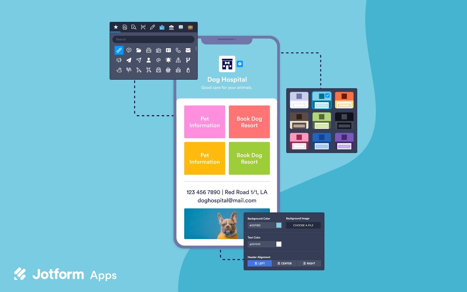
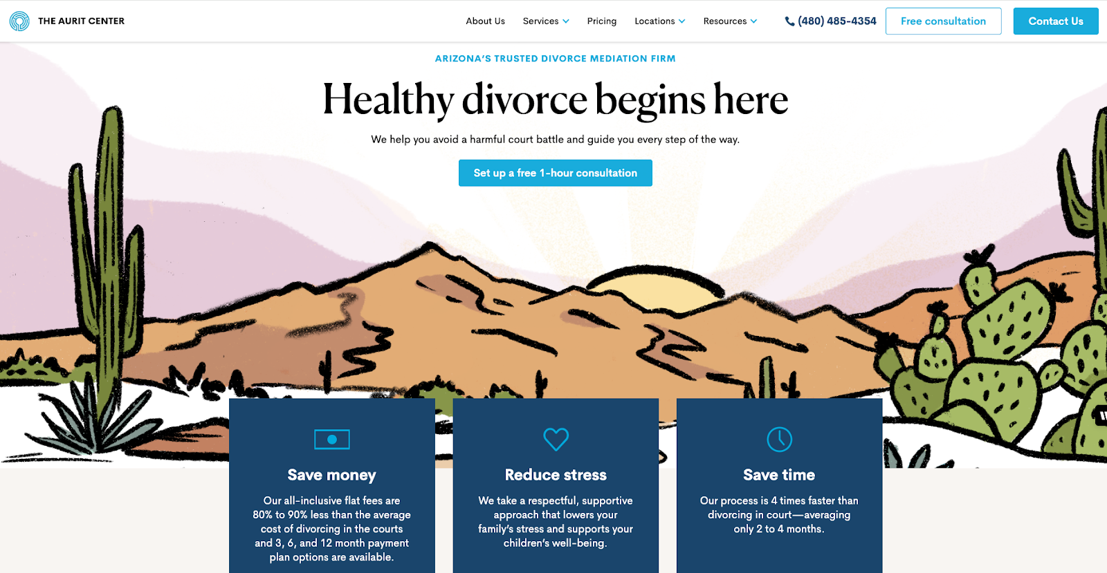
Image source: www.jotform.com
Features
- Customize your app with drag-and-drop forms and elements.
- Choose from over 600 app templates to kickstart your app creation process.
- Access various payment processing options across devices.
- Easily share your app by generating a QR code.
- Access your app from any device.
- Customize CSS to tailor the appearance of your forms.
- Integrate with CRM systems for streamlined data management.
- Efficiently manage form submissions.
Pricing
Jotform’s pricing depends on the expected usage of your forms. All plans provide access to every feature except HIPAA friendly features. With yearly subscriptions, users receive a 20% discount. These subscriptions comprise of four distinct plans:
Starter Plan: Free, with a monthly limit of 100 submissions.
Bronze Plan: $34 monthly, allowing up to 1,000 submissions per month.
Silver Plan: $39 monthly, providing a monthly submission limit of 2,500.
Gold Plan: $99 monthly, offering a generous monthly submission cap of 10,000.
Moreover, there’s an Enterprise Plan with exclusive features and terms. It’s important to note that Jotform extends a 50% discount to educational institutions and non-profit organizations.
2. Softr
Softr is differentiated from other builders by its functionality on client portals and internal tools. This platform connects complex data management systems like Airtable or Google Sheets with user-friendly, customizable applications, allowing users to create fully functional apps without any coding skills. Softr also comes with various integrations, like Stripe for payments and Mailchimp for email marketing.
Although Softr originally focused on assisting entrepreneurs in launching new apps and SaaS businesses—a capability it still excels at—the company has recently shifted its attention to aiding medium to large corporations in constructing internal tools for their operations. It’s worth noting that Softr is not classified as a full-fledged no-code web app builder due to its lack of a built-in database. In addition to accommodating this usage scenario, Softr offers robust SEO support, enhancing the discoverability of Softr-built applications.
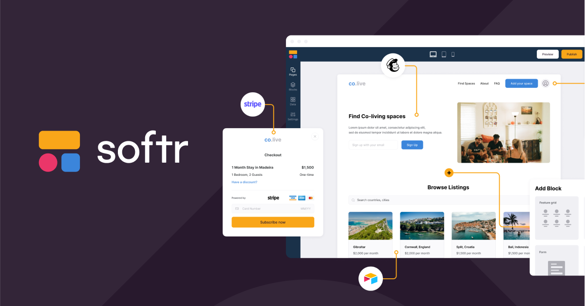
Image source: www.softr.io
Features
- Efficiently manage memberships.
- Handle payments smoothly.
- SEO for visibility.
- Customize interfaces effortlessly.
- Access various data sources.
- Automate workflows seamlessly.
- Manage users and permissions.
Pricing
Softr has five different plans for different purposes. These are annually billed prices:
Free Plan: Free for individuals building passion projects and 100 external app users limit.
Basic Plan: $49 monthly, allowing up to 1000 external app users.
Professional Plan: $139 monthly, allowing up to 5000 external app users.
Business Plan: $269 monthly, allowing up to 10000 external app users.
Enterprise Plan: Custom pricing for larger companies that want extra volume, security, and support.
Softr has 2 month-free campaign for annual plans and special plans for non-profits and educational organizations.
3. Thunkable
Whether you’re an entrepreneur with an innovative app idea or an educator seeking to engage students with interactive projects, Thunkable has you covered. Its user-friendly interface simplifies app development through drag-and-drop components, offering a diverse range from buttons to maps. Thunkable stands out for its ability to generate apps for both iOS and Android simultaneously, reaching a broader audience with a single design. With an extensive library of pre-built templates and components, you have plenty of options for customization, allowing you to bring your unique app ideas to life.
Thunkable seamlessly integrates with various APIs and services, enabling the addition of advanced features like real-time data storage with Firebase or machine learning capabilities. Thunkable, designed specifically for native mobile app creation, offers in-depth logic capabilities for building complex and feature-rich apps. While these components may require additional setup, they significantly enhance app functionality.
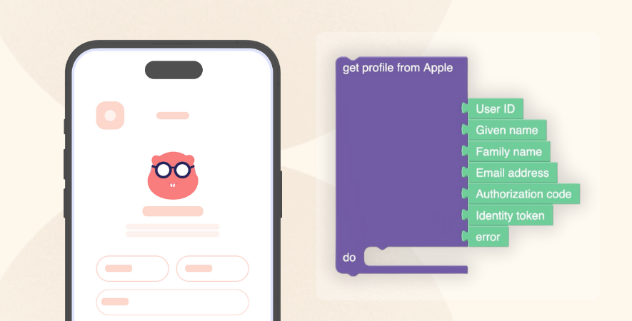
Image source: www.thunkable.com
Features
- Utilize drag-and-drop elements for easy app creation.
- Develop apps for device-native experiences.
- Publish directly without intermediaries.
- Employ advanced logic blocks for intricate functionalities.
- Integrate with various services and APIs for expanded capabilities.
Pricing
Thunkable’s pricing policy is simpler compared to other app builders. With three main tiers, Thunkable offers users a yearly subscription option with two months of free usage.
Free Plan: No subscription fee, and ideal for beginners just getting started.
Starter Plan: $13 monthly billed annually, and ideal for growing your initial idea.
Pro Plan: $38 monthly billed annually, and perfect for building and launching your app.
4. Bubble
Bubble is a comprehensive no-code web app builder renowned for its extensive functionality and adaptability, complemented by a vast ecosystem of third-party plugins, tutorials, and expert guidance. It specializes in developing web applications and, with the assistance of third-party plugins, can also create PWAs.
Bubble stands out for its ability to construct virtually any type of application without the need for coding. However, it’s important to note that the learning curve is steeper compared to platforms like Softr, and Bubble apps may not offer the highest level of performance. Bubble is best suited for individuals willing to invest time in mastering its learning curve and aspire to create apps or SaaS products with complex functionality.
The plugin marketplace within Bubble is an invaluable resource, offering pre-built features for a wide range of use cases. While gaining proficiency in app development principles is advisable, leveraging plugins allows users to assemble approximately 80% of their app through drag-and-drop functionality.
For those concerned about the longevity of no-code tools, it’s worth mentioning that Bubble has been in the sector for nearly 12 years and has continued to provide app development for over a decade.
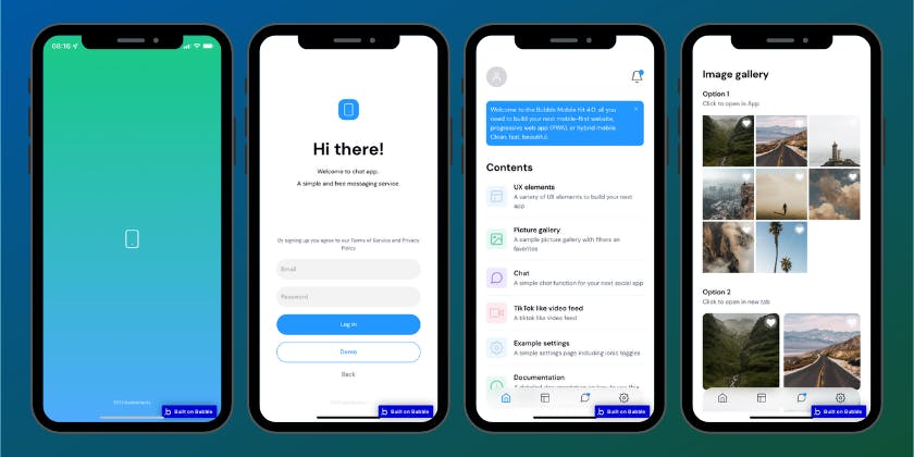
Image source: www.bubble.io
Features
- Responsive design for mobile devices and dynamic content.
- Unlimited scalability for users, traffic, and data storage.
- Password protection or OAuth 2.0 authentication.
- Integration with email, SEO, analytics, and other services.
- Enhanced user interaction with dynamic and static content elements.
Pricing
Bubble has different plans that are billed at annual prices.
Free Plan: Free, with a limit of 50k workload units/mo, and best for learning how to use Bubble.
Starter Plan: $29 monthly, with a limit of 175k workload units/mo, and best for launching your app and testing.
Growth Plan: $119 monthly, with a limit of 50k workload units/mo, and best for growing your user base.
Team Plan: $349 monthly, with a limit of 500k workload units/mo, and best for scaling your team and business.
Enterprise Plan: Best for maximum security and scale with custom pricing options.
Bubble provides discounts for both students and nonprofit organizations to support education and social impact initiatives.
5. Backendless
Backendless is another top no-code platform for developing apps, providing a strong visual programming interface and dependable hosting services. It caters to various app types, including web apps, native mobile apps, and PWAs, though some coding skills may be required for mobile projects. It’s popular for enterprise-level applications, but users need some technical knowledge to use it effectively. One noteworthy aspect of Backendless is its use of a visual programming language originally developed by MIT for teaching children programming. While more sophisticated, it remains accessible compared to traditional coding methods.
Backendless is suitable for individuals familiar with technology and corporate decision-makers seeking efficient app development solutions. It offers a user-friendly interface and various features for creating apps effortlessly. Additionally, it provides flexible deployment options to meet diverse needs without compromising quality or reliability.
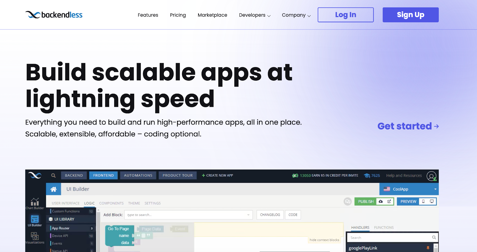
Image source: www.backendless.com
Features
- Backendless Core supports authentication, data storage, messaging, and custom logic.
- Manages data with a graphical browser, SQL search, and relations.
- Caching features optimize backend performance with efficient, in-memory data caching.
- Cloud Code customizes applications with API services and event handlers.
Pricing
Backendless offers three distinct pricing models. You can begin with a free Backendless Cloud plan that adjusts according to your needs as you expand, or opt for additional assistance and features through Backendless Pro and Managed Backendless.
- Backendless Cloud
Starter Plan: No subscription fee and designed for exploring and learning the platform.
Scale Plan: $15 monthly subscription fee and designed for developing your application, publishing it, and managing it.
- Backendless Pro
Single Server: $10k per year plan includes on-premise or virtual machine deployment (Ubuntu required), offering all Backendless features in the Limitless Edition, with regular updates and priority support, plus an additional 20% for support.
Clustered: $50k per year plan includes everything in the Single Server plan, with added features such as high availability mode to eliminate single points of failure, available for on-premise or virtual machine deployment with a minimum of 3 nodes, plus an additional 20% for support.
- Managed Backendless
Managed Backendless: Custom pricing plan with offering a fully managed, completely isolated cluster with 24×7 monitoring, ensuring smooth and reliable operation with no functional limits for your app’s growth. It combines the limitless features of Backendless Pro with the convenience of Backendless Cloud, providing guaranteed uptime, dedicated installation, and dedicated support for seamless migration and optimal user experience.
6. Bravo Studio
Next on our list is Bravo Studio, a unique no-code mobile app builder that seamlessly transforms Figma designs into functional iOS and Android apps. Its standout feature lies in giving designers full control over their app’s design, enabling them to leverage a familiar tool like Figma while incorporating pre-built components or external backends. This makes it an ideal choice for designers seeking flexibility in app creation or looking to connect their front-end designs with existing backends.
The platform offers personalized user onboarding assistance, catering to users unfamiliar with the interface. Additionally, Bravo Studio supports a range of native phone features, including camera usage and GPS tracking, enhancing the app development experience. With its intuitive integration with Figma and support for native app capabilities, Bravo Studio simplifies the process of bringing app ideas to life, making it a valuable choice in the no-code app development landscape.
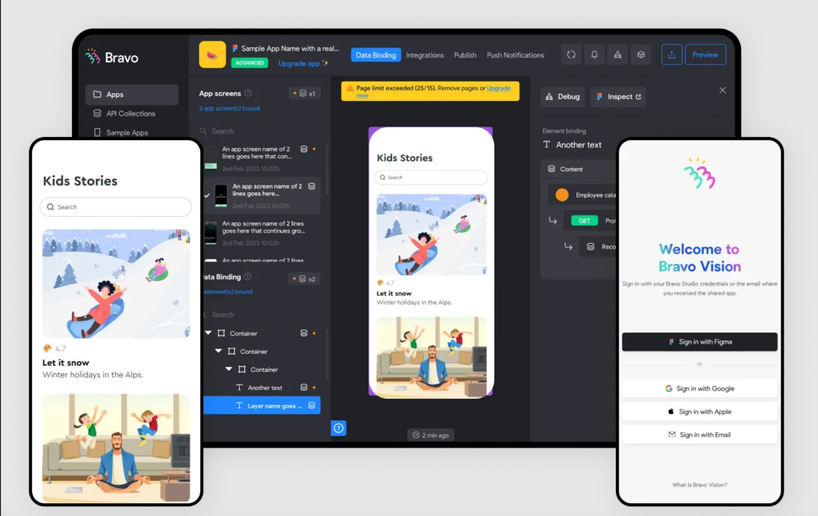
Image source: www.bravostudio.app
Features
- User-friendly login with Firebase.
- Payment features for convenience.
- Push notifications for engagement.
- Customize loading pages easily.
- Search and filter options.
- Direct publishing to App Store and Google Play.
- Collaborate with Figma for design integration.
Pricing
Bravo Studio offers separate pricing plans for individuals and businesses, each with different subscription options. Additionally, there is no charge for two months on annual subscriptions. For a more detailed comparison of pricing and features, we recommend checking out Bravo Studio’s pricing page.
- Individuals
Starter Plan: Designed for exploration and learning the platform, with no subscription fee.
Solo Plan: $18 per month, billed annually, and unlock additional features, including app store publishing.
Solo + Advanced Plan: $97 per month, billed annually, plus $80 per app, Solo offers an excellent option to expand your app and understand user behavior.
Solo + Business Plan: $195 per month, billed annually, plus $178 per app, Solo is ideal for high-volume businesses creating robust, monetizable apps.
- Teams
Starter Plan: Designed for exploration and learning the platform, with no subscription fee.
Teams: $37 per month per seat, billed annually with a minimum of 10 seats, this plan offers advanced collaboration features for teams along with premium support and additional benefits.
Teams + Advanced: $45 per month per team member, billed annually, plus $9 per app, this plan is ideal for scaling your app and gaining insights into user behavior.
Teams + Business: $55 per month per team member, billed annually, plus $19 per app, this plan is best suited for high-volume businesses creating robust and monetizable apps.
7. Glide
Our last app builder on the list is Glide. Glide is a no-code mobile app builder aimed at businesses, featuring advanced AI capabilities, sleek default designs, and a top-notch PWA experience. It specializes in PWAs and web apps, standing out for its visually appealing default designs and seamless integration of AI functionalities. Ideal for medium to large businesses, Glide’s standout feature is its AI capabilities, enabling tasks like text extraction from images and transcription of audio recordings within apps.
What distinguishes Glide is its focus on accessibility and simplicity. With just a Google account, anyone can start building and sharing apps effortlessly. Additionally, Glide enables users to publish their apps directly to app stores or share them as web apps.
Glide’s user-friendly approach to app development, caters to a diverse range of applications such as internal business tools, client portals, and event management systems. Its vibrant community provides invaluable resources and support, facilitating users throughout the codeless app creation journey.
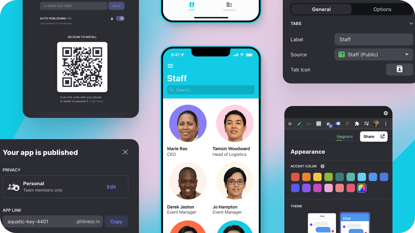
Image source: www.glideapps.com
Features
- Establish portals, dashboards, and directories.
- Synchronize and structure data effectively.
- Create personalized workflows.
- Automate tasks seamlessly.
- Integrate with various platforms and services.
Pricing
Glide Apps divides its payment plans into two main groups: “for makers” and “for companies,” and offers a flexible pricing policy. Users can enjoy up to a twenty percent discount with annual subscriptions, and Glide Apps provides convenience through its price calculator application. Here are the fees for each concept:
- For Makers
Free Plan: No subscription fee with usage limits of 10 personal users, 2 editors, and 1 app.
Maker Plan: $49 per month billed yearly, better for creating apps for your idea or community.
- For Community
Team Plan: $99 per month billed yearly, better for turning your spreadsheets into tools.
Business Plan: $249 per month billed yearly, better for turning your databases into software.
Enterprise Plan: $1,000 per month billed yearly, special for deploying powerful software at scale.
Conclusion
New trending no-code app builders have changed how mobile apps are made. They are letting anyone create them even without coding skills. Remarkable platforms like Jotform Apps or other options like Softr, Thunkable, Bubble, Backendless, Bravo Studio, and Glide offer various features and prices to suit the different needs of users. Whether you’re a designer, business owner, teacher, or big company, there’s a no-code app builder for you. We compiled a list of mobile app developers that are most suitable for you, without requiring any coding knowledge.
The post Best No Code App Builders of 2024 appeared first on noupe.