Guest Blogging: What, Why & How to Do it in 2024

Guest blogging has been a staple off-page SEO marketing strategy since time immemorial. When external websites accept guest posts, those articles become sources of backlinks that directly benefit the sender’s website.
However, many guest bloggers and websites overlook the fact that guest posts benefit both parties.
Case in point: I recently submitted a guest post to a company called Outreach Monks, which is now ranking 5th on Google for the query “link decay” (feel free to Google it).

In this case, not only did the guest blogging efforts benefit me, but even the site owner is actively benefiting through high-quality organic traffic, increased site visibility, and potentially boosted sales.
There’s no debate. Guest blogging is an essential content marketing tactic.
In this article, we’ll dive deeper into guest blogging, exploring its core definition, its immense benefits, and how you can do it.
What is Guest Blogging?
Guest blogging, also known as guest posting, is a content marketing tactic that involves writing, sending, and publishing articles on external websites.
Guest blogging differs from ghostwriting because writers receive no attribution with the latter.
When submitting a guest post, the author still receives full ownership of the article, as evidenced by the byline. The host blog may even highlight the article as ‘written by a contributor’ with your very own author bio.
A guest blogging strategy is rooted in link-building principles, where people write a guest post and receive a backlink in exchange. However, there are also some cases when a guest blogger receives monetary compensation for their contribution, or the blog owner demands payment for the opportunity to publish an article on their site.
Benefits of Guest Blogging
While getting backlinks is enough to convince websites to engage in guest blogging, it’s important to note that links are only the tip of the iceberg. Below, we’ll flesh out the benefits of submitting a guest blog post:
1. Build valuable links back to your website
Guest posting is one of the most known no-nonsense approaches to link building.
You simply find sites, pitch your guest post idea, and write the content according to the host website’s guidelines. Once published, you often get one or several backlinks in exchange for your efforts.
Since Google considers backlinks a ranking factor, more links from high-quality sites directly impact your website’s SEO performance. This results in a measurable increase in search engine rankings, increasing your website’s visibility while inviting more organic traffic.
2. Establishes thought leadership outside of your website
Guest authors also benefit from guest blogging as this lets them speak on a different platform and address a different audience.
Creating highly engaging, valuable, and amazing guest articles establishes yourself as a thought leader outside of your domain. This may expand your market and grow your audience.
Consider it from the perspective of an e-commerce owner. Guest blog posts offer free commercial real estate to promote one’s business. If you infuse some engaging direct-response copy into your content, some readers might feel compelled to buy your product.
Moreover, guest articles can potentially grow your readership since most feature your author’s bio at the bottom, which boosts brand awareness and may drive referral traffic back to your website.
3. Builds relationships with external websites
Contrary to popular belief, guest blogging goes beyond content creation and digital marketing. It is an interpersonal process.
Before writing guest posts, you start by pitching a guest post to the site owner first. This initial process requires communication and interpersonal skills; otherwise, the site owner might reject your pitch immediately.
In attempting to build rapport and pitch your idea, you’re actively engaging in professional collaboration. This networking establishes a connection between you and the host, which fosters mutual respect and trust.
Your content’s quality may also impact your relationship with the site owner, mainly when you follow the guidelines, do proper keyword research, adapt to their style guide, and tailor content to their audience. This may open doors to future opportunities, such as co-marketing, partnerships, or guest post exchanges.
4. Introduces fresh content to host websites
Every writer is different, and when you submit a guest article, your creative writing style, unique angles, and new perspectives can introduce new ideas that enrich the site’s content and satisfy its readers.
The readers might be inundated with the website’s conventional writing. Guest blogging opportunities break the monotony by offering a breath of fresh air to a host website.
How to Find Guest Post Opportunities?
So, do you want to write a guest article? Follow this step-by-step guide to guest blogging, and you will succeed!
Step 1: Find sites that are viable
First of all, what does “viable” even mean? In the case of guest posting, I defined viable in three ways:
A. The website is related to your niche
A simple Google search using your primary keywords reveals all websites relevant to your niche.
For example, if you sell food supplements, searching “health websites” will tell you which websites perfectly align with your niche. Pick websites of the same niche to increase your chances of being accommodated for a guest post.
However, you may also work with websites distant from your industry if you convince them that your guest post pitch will be relevant to the host site.
B. The website is actively accepting guest posts
What good is a relevant website if they don’t accept guest blogs? Sites that accept guest posts often have a dedicated page explaining their guidelines. Look for this specific page on the website.
If they lack this particular page, it doesn’t mean they are not open to accepting a contribution. Find their contact information on the website and reach out with your proposal.
C. The website is high-quality
Guest post farms are becoming popular, especially since SEO has become increasingly challenging. These spammy sites exist solely to accept payments and publish guest posts, even unrelated ones. Before pitching your idea, ensure it’s a reputable site with a respectable domain authority or rating.
Take time to review the blog page, too. Read the topics they publish and get a feel for the content. If the content is overly promotional and riddled with external links, it might indicate a red flag.
Step 2: Read their guest post guidelines
Once you find a viable website, read their guidelines first. The website might have some prior submission guidelines before you can successfully submit guest posts. For example, our website requires guest posters to email us with the subject line, “I have carefully read, and I accept the guidelines.” This tells us a lot about the sender’s dedication.
Take a look at some of our unreplied guest post proposal emails:

Even if they have good intentions, we found that people who do not use our prescribed subject line always submit substandard content that doesn’t get published.
Another reason to read the blog’s guest post guidelines page is to discover which topics they accept. This will guide you on what type of content to write and how to write it.
Step 3: Brainstorm mutually beneficial topic ideas
A guest blogging site’s blog owner or editor will always gravitate toward a topic that serves their website. To maximize the benefits you can reap from guest post submissions, conceptualize mutually beneficial topics. That means coming up with topic ideas that serve both the guest post website and the sender.
For example, if you sell internal linking software, you could conceptualize content ideas strictly about internal linking and submit them to an SEO website.
The topics will resonate with both parties while giving the sender more headroom in creating the content since it is their field of specialization. Plus, you can embed resource backlinks from the content to your website, which is a win-win!
Moreover, look for topics that haven’t been covered yet on the blog; otherwise, your suggestions might be rejected.
Step 4: Pitch your guest post idea
Once you’ve developed topics, it’s time to send them to the guest blogging sites. Some blogs might have specific submission guidelines and instructions, while others are loose on how you pitch your idea. Whatever it is, make sure you don’t beat around the bush and make your intention clear.
Here is an example guest post proposal that I appreciate:
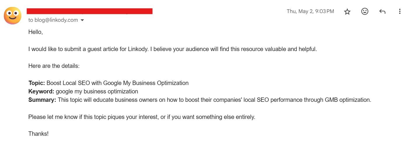
The content is straight to the point and covers all the essentials: topic, keyword, and summary or goal, which increases the chances of getting replied and accepted.
While the guidelines might specify it, you may also include a discussion on the terms of the guest post. For instance, how many contextual backlinks can you include in the post, and what will be the rel attribute of your links? Remember that it all depends on the host site’s preference.
In some isolated cases, the host site might reject your topic proposal but give you another subject to write about.
Step 5: Write your guest post
After you receive the sweet “yes,” it’s time to write the actual guest post and make it worth your and the host website’s time. Knowing your goals for the guest article will impact what and how you create the content.
Now, I won’t give you a template for structuring an article or give tips on writing the content because circling back to benefit #4, “every writer is different.”
We all bring unique flavors to the table; your writing style is your own personal branding.
Ready to Submit a Guest Post?
Successful guest blogging begins with a conscious decision to share your voice on different platforms from your own. Beyond being good for SEO, submitting guest posts helps establish you as a thought leader in your industry and builds rapport with other experts within your niche.
By following the steps above, you can also become a successful guest blogger.
Are you ready to publish a guest post?
Featured Image by Jakub ?erdzicki on Unsplash
The post Guest Blogging: What, Why & How to Do it in 2024 appeared first on noupe.


