10 Reasons to Invest in Internal Linking Software for SEO

May 30th, 2024 No comments

In today’s competitive SEO landscape, automation is the name of the game. From backlink analysis programs to keyword research tools, entrepreneurs need all the support possible to maximize their online real estate.

Internal linking software is the next step in this automated revolution. Automated internal linking does more than speed up the process of managing and creating internal links.

The question is: Do you need it?

Stay tuned as this resource dives into the 10 compelling reasons why internal linking software is an essential investment for any web owner serious about SEO.

What is Internal Linking?

Let’s go back to the basics.

Internal linking is the process of building links that take users from one page to another on the same website. 

These links serve as signposts to guide users to relevant pages in their search journey. On the other hand, search engines use internal links to explore the vast ends of a website.

What is Internal Linking Software?

Internal linking software is designed to streamline the creation and management of internal links on your website.

In its most basic functions, internal linking software identifies link gaps in your content and provides suggestions for bridging them. 

Some other tools may offer a more advanced toolset than others. It’s important to review all available offerings in the market to find the one suitable for your needs and goals.

10 SEO Benefits of Having an Internal Linking Software

(While different internal linking software also has varying functionality, we’ll use LinkStorm for the discussion below.)

Let’s explore how having an automated internal linking tool can benefit your SEO:

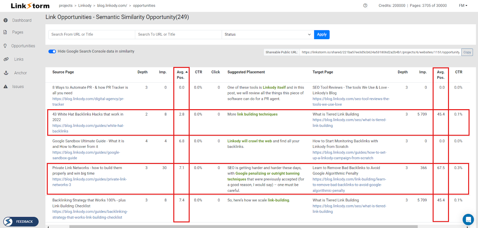
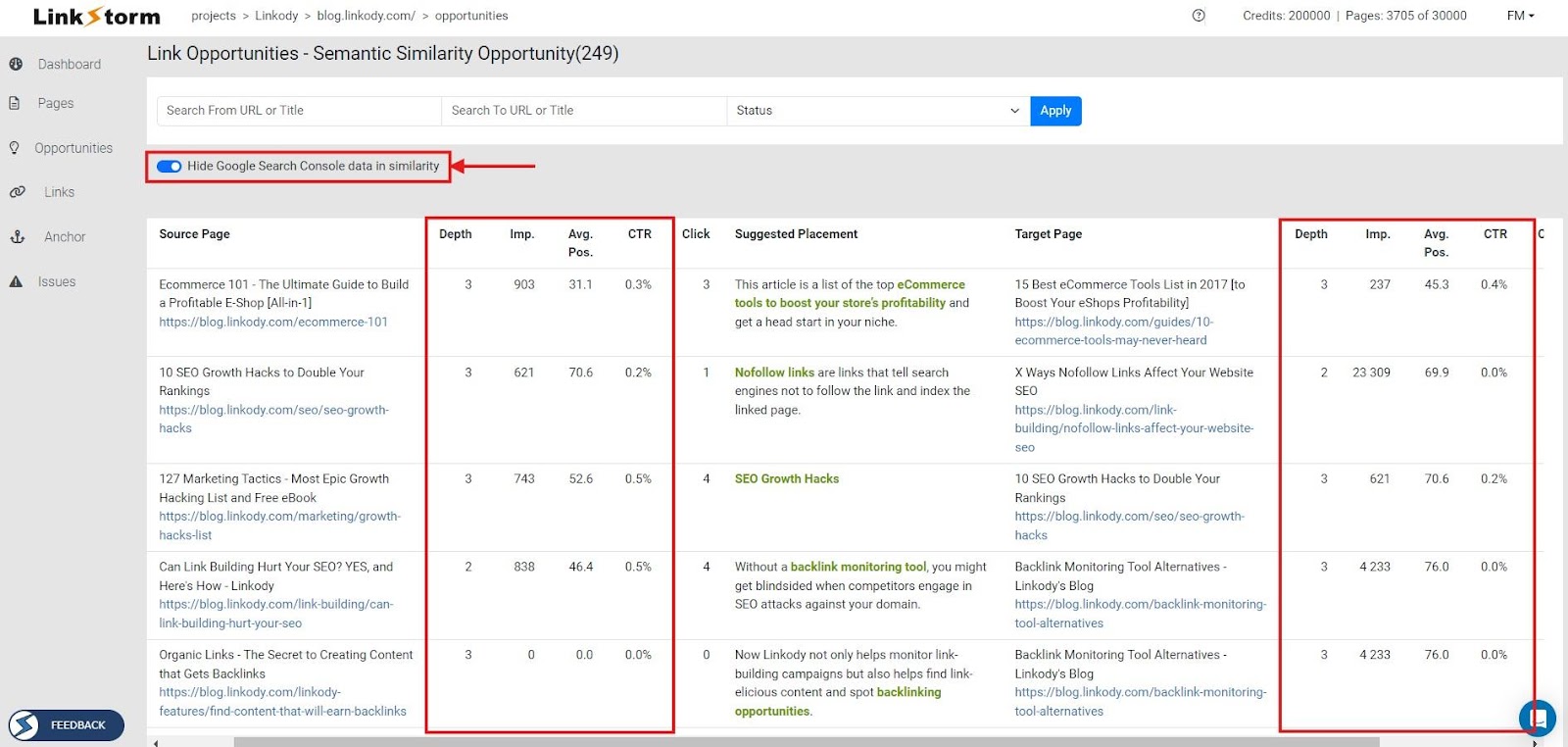
1. Unmask internal linking opportunities

Internal linking software helps uncover hidden linking opportunities within your website. These tools often come equipped with web crawlers that analyze content and structure and identify relevant connections that might not be obvious at first glance.

With LinkStorm, users can select between two algorithms to find internal link opportunities:

  • Semantic Similarity: Uses AI and semantic analysis to suggest contextually relevant internal links
  • Content Matching: Finds seed keywords between content to suggest relevant connections

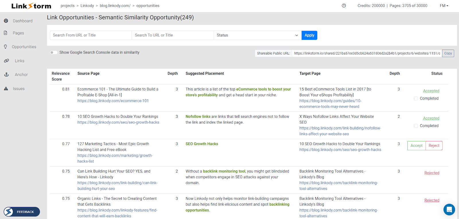
This automated discovery is essential for maintaining an organized, well-linked, and SEO-friendly site architecture, ensuring no potential internal link is overlooked.

2. Boost SEO performance

Like other link-building methods, internal links also help spread link value or link juice. With more internal links pointing to a page, the target page will have an improved PageRank and, theoretically, perform better in search results. 

Internal linking is a strategic process. Websites that build internal links indiscriminately will fail to maximize their SEO impact.

Directionally controlling the flow of internal links from high-performing to low-performing content can boost the performance of those inferior pages on SERPs. 

3. Improve user experience and navigation

A well-structured internal linking strategy creates a clear path for users to navigate your website. This allows them to find related content easily, keeps them engaged for longer, and ultimately improves the overall user experience.

Additionally, effective internal links allow web crawlers to explore websites better. This allows Googlebot to explore pages that have been buried deeply in a site’s architecture.

4. Anchor text optimization

Some tools may offer anchor text optimization functionality in addition to finding internal link opportunities. This allows you to diversify the anchor texts on your website, making them keyword-rich and more descriptive.

Ideally, a good internal linking tool lists all the anchor texts on your site with their distributions:

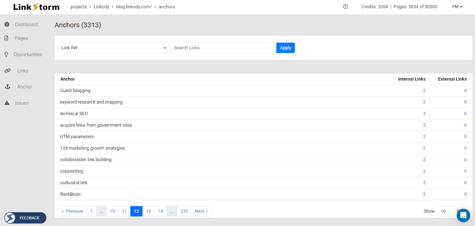
Using the same anchor texts on a website may make it look spammy in the eyes of search engines. Sites on a red alert with Google’s spam policy may suffer from penalties, resulting in a decrease in SERP performance.

5. Reduce click depth

Click depth is one of a website’s most inevitable and persistent issues. As more content is produced, the click depth of all pages increases. This makes them more difficult to reach for users and search engines. Moreover, stale content tends to fall off the SERP rankings.

Internal linking software show click depth to help users strategically maneuver their internal links. 

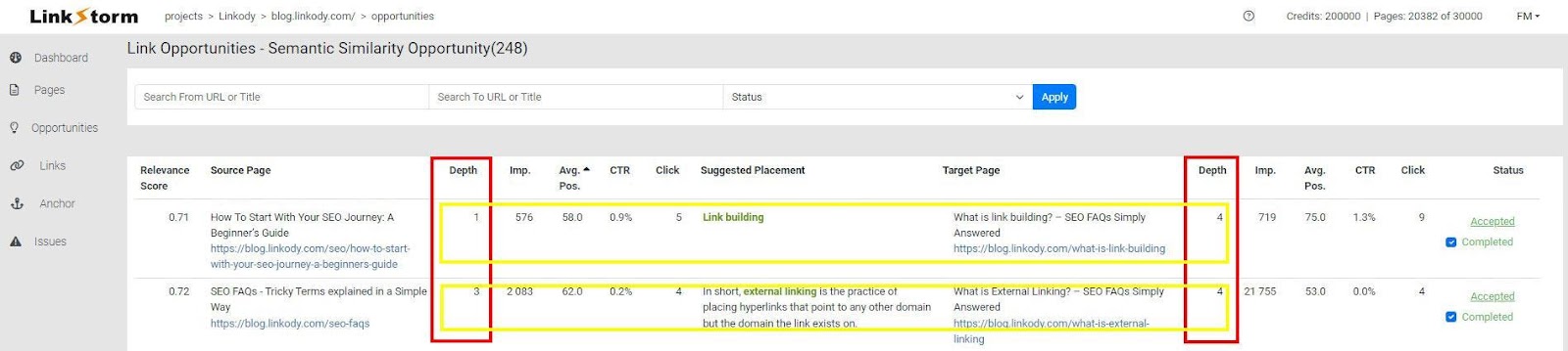
Building internal links from low-click depth to high-click depth pages minimizes the number of clicks needed to reach the target page. Plus, this increases the crawlability of websites.

6. Fix internal linking issues

Internal linking issues ruin users’ search experience. They also impede search engines from fully crawling a site, potentially preventing them from indexing new content and transferring valuable equity across web pages.

An internal linking software is designed not only to uncover linking opportunities but also to fix issues in your site’s link structure. Ideally, it should detect the following problems:

  • Broken links: website dead-ends; happens when the target link is non-existent
  • Redirects: sends users to a different page from the URL initially requested
  • No-follow: target links qualified with a rel=“nofollow” that are inaccessible for web crawlers

Here is what it looks like from LinkStorm’s interface:

By fixing these issues, the software ensures that users can effectively explore a website without any hassle. This also helps Googlebot crawl the whole website, improving the site’s overall efficiency.

7. Scalability and efficiency

Manual internal linking is manageable for small websites. Granted, the process will take several days to complete, but it is realistically doable. This fact changes when you own a website with thousands of pages.

Internal linking software is key to scaling SEO efforts efficiently across large and growing websites. These tools save significant time and reduce manual workload.

LinkStorm allows users to implement link suggestions automatically on the website after clicking the accept button.

To achieve this, users simply need to paste an HTML snippet into the website’s Head/Body/Footer and then verify the installation via LinkStorm.

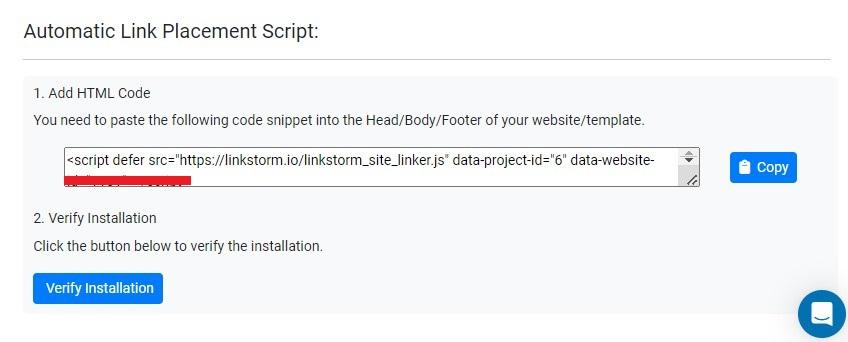
As your website expands, manually adding internal links becomes increasingly time-consuming. With this solution, you can ensure your website implements the tool’s intelligent link suggestions straight from the LinkStorm dashboard.

8. Data-driven insights

Data must be at the helm of any SEO strategy. Powered by data-driven insights, users will have a more systematic roadmap in achieving their SEO goals. 

A good internal linking software is founded on data. It provides detailed analytics on site performance and traffic flow. 

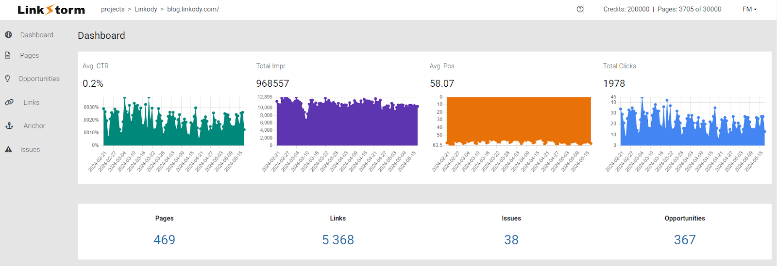
Moreover, the tool should also provide valuable insights into each individual link’s performance. 

LinkStorm integrates Google Search Console data into its link opportunities tab, enabling SEO professionals to make informed decisions about optimizing link placement.

9. Cost-effective in the long run

Like all other SEO tools, internal linking software requires upfront payment, and the cost can vary from tool to tool. This upfront cost is often the deal breaker for many SEOs and site owners. 

However, the benefits of having one far outweigh any upfront costs when considering the time and effort you save by having a tool at your disposal. 

Internal linking is less tedious than other SEO approaches. In other words, armed with a tool, you can manage your internal linking activities yourself without hiring an in-house or third-party SEO team, which costs way more.

Subscription costs of internal linking software vary. But for perspective, this is how much each plan costs for LinkStorm:

10. Convenience at its finest

Convenience is the number one reason for automation, and the same is true for internal linking software. 

An automated internal linking toolkit can complete in a few minutes what would normally take people several days or weeks. Unlike humans, its efficiency and effectiveness remain consistent even with continuous usage, preventing errors from arising. Ultimately, using a specialized tool is more economically viable in the long term.

Where humans are messy and complicated and error-prone, a system provides consistency and predictability.

Automate Your Busywork – Aytekin Tank, CEO of Jotform

Sure, users will have to shell out a few bucks upfront. But as the adage goes, “Time is money.” With more time in your hands, you can let the machine do its work while you focus on the revenue-generating aspects of your business.

Key Takeaways

Internal linking is crucial in any effective SEO strategy. 

Manually building internal links is possible, but it will take significant time and money. An internal linking tool expedites this process by automatically suggesting internal link opportunities and uncovering issues that permeate a website.

Every internal linking tool offers a unique range of functionality that benefits a business. You are responsible for choosing which tool can help you achieve your SEO goals in the shortest time and the least amount of money possible.

Our personal pick is LinkStorm, an AI-powered, all-in-one toolkit for helping SEOs and site owners manage their internal links effectively.

How about you? Which do you think is the best tool on the market? Tell us in the comments!

Featured Image by Stephen Phillips – Hostreviews.co.uk on Unsplash

The post 10 Reasons to Invest in Internal Linking Software for SEO appeared first on noupe.

Categories: Others Tags:

In Praise Of The Basics

May 30th, 2024 No comments

Lately, I’ve been thinking about the basics of web development. Actually, I’ve been thinking about them for some time now, at least since I started teaching beginning web development in 2020.

I’m fascinated by the basics. They’re an unsung hero, really, as there is no developer worth their salt who would be where they are without them. Yet, they often go unnoticed.

The basics exist in some sort of tension between the utmost importance and the incredibly banal.

You might even think of them as the vegetable side on your dinner plate — wholesome but perhaps bland without the right seasoning.

Who needs the basics of HTML and CSS, some say, when we have tools that abstract the way they’re written and managed? We now have site builders that require no technical knowledge. We have frameworks with enough syntactic sugar to give your development chops a case of cavities. We have libraries packed with any number of pre-established patterns that can be copy-pasted without breaking a sweat. The need to “learn” the basics of HTML and CSS is effectively null when the number of tools that exist to supplant them is enough to fill a small galaxy of stars.

Rachel Andrew wrote one of my all-time favorite posts back in 2019, equating the rise of abstractions with an increase in complexity and a profound loss of inroads for others to enter the web development field:

“We have already lost many of the entry points that we had. We don’t have the forums of parents teaching each other HTML and CSS, in order to make a family album. Those people now use Facebook or perhaps run a blog on wordpress.com or SquareSpace with a standard template. We don’t have people customising their MySpace profile or learning HTML via Neopets. We don’t have the people, usually women, entering the industry because they needed to learn HTML during that period when an organisation’s website was deemed part of the duties of the administrator.”

— Rachel Andrew, “HTML, CSS and our vanishing industry entry points

There’s no moment more profound in my web development career than the time I changed the background color of a page from default white to some color value I can’t remember (but know for a fact it would never be dodgerblue). That, and my personal “a-ha!” moment when realizing that everything in CSS is a box. Nothing guided me with the exception of “View Source,” and I’d bet the melting Chapstick in my pocket that you’re the same if you came up around the turn of the 21st century.

Where do you go to learn HTML and CSS these days? Even now, there are few dedicated secondary education programs (or scholarships, for that matter) to consider. We didn’t have bootcamps back in the day, but you don’t have to toss a virtual stone across many pixels to find one today.

There are excellent and/or free tutorials, too. Here, I’ll link a few of ’em up for you:

Let’s not even get into the number of YouTube tutorials. But if you do, no one beats Kevin’s incredible archive of recorded gems.

Anyway, my point is that there are more resources than ever for learning web development, but still painfully few entry points to get there. The resources we have for learning the basics are great, but many are either growing stale, are quick hits without a clear learning path, or assume the learner has at least some technical knowledge. I can tell you, as someone who has hit the Publish button on thousands of front-end tutorials, that the vast majority — if not all — of them are geared toward those who are already on the career path.

It was always a bit painful when someone would email CSS-Tricks asking where to get started learning CSS because, well, you’d imagine CSS-Tricks being the perfect home for something like that, and yet, there’s nothing. It’s just the reality, even if many of us (myself included) cut our chops with sites like CSS-Tricks, Smashing Magazine, and A List Apart. We were all learning together at that time, or so it seemed.

What we need are more pathways for deep learning.

Learning Experience Design (LXD) is a real thing that I’d position somewhere between what we know as UX Design and the practice of accessibility. There’s a focus on creating delightful experiences, sure, but the real aim of LDX is to establish learning paths that universally account for different types of learners (e.g., adults and children) and learning styles (e.g., visual and experiential). According to LDX, learners have a set of needs not totally unlike those that Maslow’s hierarchy of needs identifies for all humans, and there are different models for determining those needs, perhaps none more influential than Bloom’s Taxonomy.

These are things that many front-end tutorials, bootcamps, videos, and programs are not designed for. It’s not that the resources are bad (nay, most are excellent); it’s that they are serving different learners and learning types than what a day-one beginner needs. And let’s please not rely on AI to fill the gaps in human experiences!

Like I said, I’ve been thinking about this a lot. Like, a lot a lot. In fact, I recently published an online course purely dedicated to learning the basics of front-end development, creatively named TheBasics.dev. I’d like to think it’s not just another tutorial because it’s a complete set of lessons that includes reading, demonstrations, videos, lab exercises, and assessments, i.e., a myriad of ways to learn. I’d also like to think that this is more than just another bootcamp because it is curricula designed with the intention to develop new knowledge through reflective practices, peer learning, and feedback.

Anyway, I’m darn proud of The Basics, even if I’m not exactly the self-promoting type, and writing about it is outside of my comfort zone. If you’re reading this, it’s very likely that you, too, work on the front end. The Basics isn’t for you exactly, though I’d argue that brushing up on fundamentals is never a bad thing, regardless of your profession, but especially in front-end development, where standards are well-documented but ever-changing as well.

The Basics is more for your clients who do not know how to update the website they paid you to make. Or the friend who’s learning but still keeps bugging you with questions about the things they’re reading. Or your mom, who still has no idea what it is you do for a living. It’s for those whom the entry points are vanishing. It’s for those who could simply sign up for a Squarespace account but want to actually understand the code it spits out so they have more control to make a site that uniquely reflects them.

If you know a person like that, I would love it if you’d share The Basics with them.

Long live the basics! Long live the “a-ha!” moments that help us all fall in love with the World Wide Web.

Categories: Others Tags:

What is visual hierarchy, and why do you need it?

May 30th, 2024 No comments

Crowded and hard-to-navigate designs are two of the biggest reasons users leave a website. When users quickly leave, engaging them and boosting conversions is impossible. One way you can help keep users on your site engaged is by implementing a visual hierarchy.

What is visual hierarchy?

Visual hierarchy is one web design principle that involves arranging elements on a page or site in order of importance. This helps to avoid pages becoming overcrowded with design elements that detract from the user experience.

One of the most prominent problems users experience online is overcrowded websites, so visual hierarchy is crucial. Data from HubSpot estimates that around 84.6% of users find overcrowded web designs a mistake for small businesses.

Typically, the most important design elements are situated at the top of the page or in a prominent position so users can easily see them. Otherwise, every design element would have equal importance and provide no guide for overcoming customer needs.

A strong visual hierarchy will seek to place logos, whitespace, typography, visual storytelling, and more in a way that predicts the user’s flow. As such, you have a much greater influence over how users interact with your site.

A good visual hierarchy captures the user’s attention and guides them through the content using an intuitive flow and priority levels. Understanding visual processing can help create effective visual hierarchies in web design.

Why is visual hierarchy important?

Visual hierarchy in web design is essential for creating a positive user experience. User experience refers to how the different elements on a page or website make users feel and whether they help them achieve their goals.

A positive user experience is vital as it affects the likelihood of users staying on your site and whether they convert. There is a strong correlation between a strong visual hierarchy and positive user experience.

Aside from impacting a positive user experience, visual hierarchy is one of visual design’s four pillars (the other three are space, contrast, and scale). The four pillars work together to ensure a strategically organized website design.

It also helps guide users to take a specific action or highlight a certain message. This is crucial for creating strong first impressions and experiences that will bring users back.

Whether users are clicking a call-to-action (CTA), submitting a form, or registering for a newsletter, visual hierarchy ensures the important elements stand out so users can act when ready. Otherwise, there may be uncertainty about how to act and take the steps.

A good visual hierarchy grabs users’ attention when they first land on your site or webpage. Ensuring you capture their attention is vital, and it is the first important step to engaging users and keeping them on your site.

It also gives users a scannable layout. When important elements and items stand out on a page, users can scan the page to find what most appeals to them, allowing them to find solutions to their pain points quickly.

Understanding visual processing

Before creating a visual hierarchy, it’s important to understand how the brain processes visuals and eye movement. Eye tracking research has revealed two major methods humans use to process information: F-shape and Z-shape patterns.

F-shape pattern

The F-shape pattern is one method humans use to process information. Typically, users process and scan information from left to right, top to bottom. Placing elements in users’ gaze or eyeline makes a big difference.

The F-shape pattern involves organizing content into an F shape. It is the most common method for visual processing and is most widely used for text-heavy content without subheadings or visuals to guide users.

As a result, users will read the first few words or sentences at the top of the page and then scan the first words of each line or sentence to find certain words or phrases. In terms of visual web designs, this layout indicates poor formatting and visual hierarchy.

Z-shape pattern

This is where the Z-shape pattern comes in. Similar to the F-shape pattern, the Z-shape pattern follows a scanning or reading pattern of the letter Z. This layout pattern is much more effective for minimalist web designs that want to emphasize CTAs and forms more.

Unlike the F-shape pattern, the Z-shape pattern provides an excellent basis for a strong visual hierarchy that seeks to attract and engage the user. Using a landing page as an example, users will typically scan the page as follows:

When creating web designs with the Z-shape pattern in mind, there are some key considerations. First, you must prioritize what information or visuals you want the user to see. This will typically be something that captures the attention.

You must then consider what order or structure you want the user to follow. This includes content structure, visual layout, CTAs, etc. Finally, you need to decide on the action or outcome you expect a user to take from the page, e.g., submitting a form.

How can you implement visual hierarchy?

Now that we’ve covered what visual hierarchy is and why you need it, it’s time to explore some tips for implementing an impactful visual hierarchy.

Utilise size

Sizing and scaling are two methods for prioritizing content or visuals in web design. The content or visuals you want to emphasize should be much more prominent on the page.

Items with a larger size or scale will typically attract more attention. When using size and scale in the visual hierarchy, it’s important to use no more than three sizes and that the most important elements are the biggest.

Colour and contrast

Color and contrast can play a significant impact in creating an appealing visual hierarchy. The strategic use of color helps elements stand out and draws the eye to the areas or content you want users to see first.

For example, a CTA with a strong contrasting color will stand out more prominently to users. Understanding the psychology of color and its impact on users can help ensure you create a visual hierarchy with compelling visual components.

Whitespace

Whitespace is a crucial element of successful web design. The blank space or area within a page design, whitespace helps the different content on a page breathe and declutter the layout. It also adds legibility and a visual balance.

Using whitespace effectively between and around different elements on a page makes it much easier for users to absorb the information and removes potential distractions. While there is no set standard for how much whitespace you should use, aiming for at least 30% helps create a good visual hierarchy.

Repetition

The human brain is naturally wired to seek out patterns. Using repetition in a visual hierarchy can help the human brain better understand how content or elements on a page are related.

Repetition also creates a sense of unity within your web design. Repetition can apply to typography, shapes, image layout, or use of color. As a result, users’ understanding and recognition of your content are much stronger.

Alignment and composition

Another way to implement visual hierarchy in your web design is through alignment and composition. Good alignment and composition of elements in a visual hierarchy create a structure for design elements and a focal point for users.

Two methods can be used to implement alignment and composition in the visual hierarchy: the rule of thirds and the rule of odds. The rule of thirds refers to dividing the sections of a page into a horizontal grid of nine equally sized squares.

The intersection lines are focal points where you should consider placing important design elements on your page. Then, additional design elements are placed around these focal points. Consider placing hero images, CTAs, and headlines along the focal lines of the horizontal grid.

The rule of odds is another method of alignment and composition. It refers to creating pleasing and appealing visual hierarchies using an odd number of elements (most commonly 3) rather than an even number.

This creates a stronger dynamic and balance between the elements around a focal point. Using an even number of elements can create a symmetry that seems unnaturally static and less visually appealing to users.

Visual hierarchy keeps users engaged and more likely to visit your site. Implementing an effective visual hierarchy that emphasizes the most important elements ensures your web design has the desired impact on boosting conversions and driving success.

Featured image by Victor Freitas on Unsplash

The post What is visual hierarchy, and why do you need it? appeared first on noupe.

Categories: Others Tags:

Unlocking Possibilities: The Impact of QR Codes on Modern Marketing

May 29th, 2024 No comments

What do you know about a QR code, the little white and black square you see everywhere today? This basic pattern has a powerful ability to link physical and digital worlds. QR codes are digital barcodes that store tons of information. With almost 5 billion smartphone users in the world, you can only imagine how many times QR codes are scanned daily!

However, QR codes’ potential is much bigger than pure data storage. They enable businesses to create immersive experiences, drive customer interactions, and provide instant access to information or services. With the widespread adoption of smartphones, QR codes become a powerful marketing tool. Let’s explore how exactly they change modern marketing.

When and how QR codes appeared

It may seem that QR codes have been with us for a while! However, Quick Response codes were invented only in 1994 by a Japanese automotive company called Denso Wave. They were used to track vehicle parts during manufacturing processes. QR codes are associated with barcodes, but they store much more information and can be instantly scanned. You just need a smartphone equipped with a built-in camera or a special QR scanning app.

At first, QR codes were not widely spread; however, the 2020 pandemic gave them another birth. The need for touch-free solutions literally propelled QR code technology. Today, QR codes are practically everywhere—they are found on product packaging, advertisements, tickets, business cards, and more.  QR codes and branding can be a powerful combination. By placing a logo in the center of a QR code, businesses can create a stronger connection with potential customers. The company logo design instantly identifies the brand and builds trust, encouraging people to scan the code. This bridge between the physical and digital worlds allows for easy access to a company’s website, social media, or special offers, all while reinforcing brand recognition.

Diverse applications of QR codes in marketing

QR technology has reshaped digital marketing, and its impact will only keep expanding. As technology around us advances and consumers become increasingly tech-savvy, QR codes can be used for building groundbreaking marketing strategies. Here are a few examples.

  • The power of augmented reality. When you see an ad, it is enough to scan a QR code and see a 3D product model come to life on your smartphone screen. AR technology allows you to merge the real world with the virtual in just a click. Incorporate QR codes into your marketing materials to allow your users to enjoy interactive product demonstrations, virtual try-ons, or even games related to your brand. This creates a more immersive and engaging experience for your audience.
  • Geo-location targeting. QR codes with geo-location technology enable businesses to guide users to nearby locations. Geo-targeted QR codes sync with smartphones’ GPS to deliver location-specific content. Use this approach to promote local stores, highlight nearby places of interest, or offer targeted discounts to customers within a specific reach. Such a personalized approach makes marketing campaigns more relevant and impactful.
  • Social media engagement. QR codes already help businesses connect with customers via social media platforms, and the possibilities are limitless. Use QR codes to automate social media sharing of your promotional content. It works like this: a user scans a QR code on a product package and instantly posts a picture to their Instagram story with a branded hashtag. This encourages user-generated content and fuels viral marketing campaigns.
  • A new level of interactivity. QR codes can transform your marketing campaign from static to interactive. Gamification always adds special appeal to a marketing campaign. QR codes provide access to exclusive video content, hidden messages in scavenger hunts, or even interactive polls and feedback mechanisms. This two-way communication not only captures attention but also gathers valuable customer insights, allowing you to refine your marketing strategies and build a stronger connection with your target audience.

Tips to remember when using QR codes

If you build your marketing strategy with QR codes, here are some rules for success:

  • Add a clear call to action. It is crucial to include a clear and concise message next to your QR code. The message must tell users what they will gain by scanning it, such as “unlock a discount” or “get a discount code”.
  • Make your content mobile-friendly.  All the information behind the QR code should be optimized for different screens to provide a seamless user experience.
  • Track and measure results. Use QR codes with tracking capabilities to see how many times they are scanned to see whether these help you in achieving your marketing goals.

How companies utilize QR code power

Many companies have realized the unparalleled power of QR codes and implemented them in their marketing campaigns. Let’s see how they do it in practice.

M&M’s, the famous candy brand, used QR codes to add an interactive element to its marketing campaign. QR codes can be found on packaging and promotional materials. Customers are encouraged to scan the codes and access exclusive content. For example, a user may unlock a digital game or get access to the behind-the-scenes process of candy production. Additionally, M&M’s added QR codes to social media promotions and advertisements, redirecting users to interactive landing pages where they could learn more about the brand and its products. This approach enabled M&M’s to transform passive packaging into a gateway for immersive brand experiences and boost sales.

The Home Depot, a leading home improvement retailer, used QR codes to enhance the customer shopping experience and provide valuable product information. You can find a QR code on product labels. Once you scan it, you access detailed product specifications, how-to videos, and DIY project guides. For example, scanning a QR code on a power tool will lead you to instructional videos demonstrating proper usage and safety tips. This approach empowers customers to purchase more DIY projects and reduces unnecessary returns due to a lack of user knowledge.

HBO, the renowned entertainment network, introduced QR codes into its marketing campaign to promote its TV shows and movies. QR codes appeared in posters, trailers, and social media posts to encourage viewers to unlock exclusive content. For example, viewers can watch extended trailers and even participate in interactive quizzes. Additionally, HBO allows its customers to scan codes to receive special offers or enter contests. This QR code experiment helped HBO transform traditional advertising into interactive experiences and create buzz around its content.

Key takeaway

QR codes have quickly become essential tools in the modern marketing arsenal. They efficiently fill the gap between the physical and digital worlds. Just with a simple scan, customers can seamlessly access a wealth of information and interactive experiences. QR codes help brands make their marketing campaigns interactive and engaging. Modern tech-savvy consumers appreciate the ability to quickly get data-driven insights. What is more important, QR code technology not only enhances customer engagement but also allows marketers to track campaign performance and gather valuable data to refine their strategies for more results.

Featured Image by Brett Jordan on Unsplash

The post Unlocking Possibilities: The Impact of QR Codes on Modern Marketing appeared first on noupe.

Categories: Others Tags:

Best No Code App Builders of 2024

May 28th, 2024 No comments

Did you know that a software framework or application can be implemented without requiring any coding knowledge? In 2024, it’s possible to create a digital workplace, applications for internal management within an organization, or simply develop applications for fun, all without any coding knowledge. 

Thanks to technology, these no-code app builders allow users to easily and quickly create applications. We’ve compiled the 7 best no-code app builders of 2024 for you, where you can build your applications or even set up a digital shop. Here they are:

1. Jotform Apps

Jotform’s app builder, one of its significant products alongside its form builder, tables, report builder, and PDF editor, enables users to create applications effortlessly without requiring coding knowledge. With its diverse integrations and a wide array of ready-made templates, this app builder offers convenience for various purposes within the Jotform ecosystem.

Users can easily create a company portal or store internal documents for easy access using Jotform’s user-friendly drag-and-drop design interface, and effectively monitor data using its complementary tools like spreadsheets and streamlined collaboration through approval workflows. Additionally, users can download their apps on any smartphone, computer, or tablet and quickly share them via links, emails, or QR codes.

Moreover, through the app builder, users can create digital store apps with various payment integrations, enabling them to transition their businesses into the digital business environment.

Image source: www.jotform.com

Features

  • Customize your app with drag-and-drop forms and elements.
  • Choose from over 600 app templates to kickstart your app creation process.
  • Access various payment processing options across devices.
  • Easily share your app by generating a QR code.
  • Access your app from any device.
  • Customize CSS to tailor the appearance of your forms.
  • Integrate with CRM systems for streamlined data management.
  • Efficiently manage form submissions.

Pricing

Jotform’s pricing depends on the expected usage of your forms. All plans provide access to every feature except HIPAA friendly features. With yearly subscriptions, users receive a 20% discount. These subscriptions comprise of four distinct plans:

Starter Plan: Free, with a monthly limit of 100 submissions.

Bronze Plan: $34 monthly, allowing up to 1,000 submissions per month.

Silver Plan: $39 monthly, providing a monthly submission limit of 2,500.

Gold Plan: $99 monthly, offering a generous monthly submission cap of 10,000.

Moreover, there’s an Enterprise Plan with exclusive features and terms. It’s important to note that Jotform extends a 50% discount to educational institutions and non-profit organizations.

2. Softr 

Softr is differentiated from other builders by its functionality on client portals and internal tools. This platform connects complex data management systems like Airtable or Google Sheets with user-friendly, customizable applications, allowing users to create fully functional apps without any coding skills. Softr also comes with various integrations, like Stripe for payments and Mailchimp for email marketing.

Although Softr originally focused on assisting entrepreneurs in launching new apps and SaaS businesses—a capability it still excels at—the company has recently shifted its attention to aiding medium to large corporations in constructing internal tools for their operations. It’s worth noting that Softr is not classified as a full-fledged no-code web app builder due to its lack of a built-in database. In addition to accommodating this usage scenario, Softr offers robust SEO support, enhancing the discoverability of Softr-built applications.

Image source: www.softr.io

Features

  • Efficiently manage memberships.
  • Handle payments smoothly.
  • SEO for visibility.
  • Customize interfaces effortlessly.
  • Access various data sources.
  • Automate workflows seamlessly.
  • Manage users and permissions.

Pricing

Softr has five different plans for different purposes. These are annually billed prices:

Free Plan: Free for individuals building passion projects and 100 external app users limit.

Basic Plan: $49 monthly, allowing up to 1000 external app users.

Professional Plan: $139 monthly, allowing up to 5000 external app users.

Business Plan: $269 monthly, allowing up to 10000 external app users.

Enterprise Plan: Custom pricing for larger companies that want extra volume, security, and support.

Softr has 2 month-free campaign for annual plans and special plans for non-profits and educational organizations.

3. Thunkable

Whether you’re an entrepreneur with an innovative app idea or an educator seeking to engage students with interactive projects, Thunkable has you covered. Its user-friendly interface simplifies app development through drag-and-drop components, offering a diverse range from buttons to maps. Thunkable stands out for its ability to generate apps for both iOS and Android simultaneously, reaching a broader audience with a single design. With an extensive library of pre-built templates and components, you have plenty of options for customization, allowing you to bring your unique app ideas to life. 

Thunkable seamlessly integrates with various APIs and services, enabling the addition of advanced features like real-time data storage with Firebase or machine learning capabilities. Thunkable, designed specifically for native mobile app creation, offers in-depth logic capabilities for building complex and feature-rich apps. While these components may require additional setup, they significantly enhance app functionality.

Image source: www.thunkable.com

Features

  • Utilize drag-and-drop elements for easy app creation.
  • Develop apps for device-native experiences.
  • Publish directly without intermediaries.
  • Employ advanced logic blocks for intricate functionalities.
  • Integrate with various services and APIs for expanded capabilities.

Pricing

Thunkable’s pricing policy is simpler compared to other app builders. With three main tiers, Thunkable offers users a yearly subscription option with two months of free usage.

Free Plan: No subscription fee, and ideal for beginners just getting started.

Starter Plan: $13 monthly billed annually, and ideal for growing your initial idea.

Pro Plan: $38 monthly billed annually, and perfect for building and launching your app.

4. Bubble

Bubble is a comprehensive no-code web app builder renowned for its extensive functionality and adaptability, complemented by a vast ecosystem of third-party plugins, tutorials, and expert guidance. It specializes in developing web applications and, with the assistance of third-party plugins, can also create PWAs.

Bubble stands out for its ability to construct virtually any type of application without the need for coding. However, it’s important to note that the learning curve is steeper compared to platforms like Softr, and Bubble apps may not offer the highest level of performance. Bubble is best suited for individuals willing to invest time in mastering its learning curve and aspire to create apps or SaaS products with complex functionality.

The plugin marketplace within Bubble is an invaluable resource, offering pre-built features for a wide range of use cases. While gaining proficiency in app development principles is advisable, leveraging plugins allows users to assemble approximately 80% of their app through drag-and-drop functionality.

For those concerned about the longevity of no-code tools, it’s worth mentioning that Bubble has been in the sector for nearly 12 years and has continued to provide app development for over a decade.

Image source: www.bubble.io

Features

  • Responsive design for mobile devices and dynamic content.
  • Unlimited scalability for users, traffic, and data storage.
  • Password protection or OAuth 2.0 authentication.
  • Integration with email, SEO, analytics, and other services.
  • Enhanced user interaction with dynamic and static content elements.

Pricing

Bubble has different plans that are billed at annual prices.

Free Plan: Free, with a limit of 50k workload units/mo, and best for learning how to use Bubble.

Starter Plan: $29 monthly, with a limit of 175k workload units/mo, and best for launching your app and testing.

Growth Plan: $119 monthly, with a limit of 50k workload units/mo, and best for growing your user base.

Team Plan: $349 monthly, with a limit of 500k workload units/mo, and best for scaling your team and business.

Enterprise Plan: Best for maximum security and scale with custom pricing options.

Bubble provides discounts for both students and nonprofit organizations to support education and social impact initiatives.

5. Backendless

Backendless is another top no-code platform for developing apps, providing a strong visual programming interface and dependable hosting services. It caters to various app types, including web apps, native mobile apps, and PWAs, though some coding skills may be required for mobile projects. It’s popular for enterprise-level applications, but users need some technical knowledge to use it effectively. One noteworthy aspect of Backendless is its use of a visual programming language originally developed by MIT for teaching children programming. While more sophisticated, it remains accessible compared to traditional coding methods.

Backendless is suitable for individuals familiar with technology and corporate decision-makers seeking efficient app development solutions. It offers a user-friendly interface and various features for creating apps effortlessly. Additionally, it provides flexible deployment options to meet diverse needs without compromising quality or reliability.

Image source: www.backendless.com

Features

  • Backendless Core supports authentication, data storage, messaging, and custom logic.
  • Manages data with a graphical browser, SQL search, and relations.
  • Caching features optimize backend performance with efficient, in-memory data caching.
  • Cloud Code customizes applications with API services and event handlers.

Pricing

Backendless offers three distinct pricing models. You can begin with a free Backendless Cloud plan that adjusts according to your needs as you expand, or opt for additional assistance and features through Backendless Pro and Managed Backendless.

  • Backendless Cloud

Starter Plan: No subscription fee and designed for exploring and learning the platform.

Scale Plan: $15 monthly subscription fee and designed for developing your application, publishing it, and managing it.

  • Backendless Pro

Single Server: $10k per year plan includes on-premise or virtual machine deployment (Ubuntu required), offering all Backendless features in the Limitless Edition, with regular updates and priority support, plus an additional 20% for support.

Clustered: $50k per year plan includes everything in the Single Server plan, with added features such as high availability mode to eliminate single points of failure, available for on-premise or virtual machine deployment with a minimum of 3 nodes, plus an additional 20% for support.

  • Managed Backendless

Managed Backendless: Custom pricing plan with offering a fully managed, completely isolated cluster with 24×7 monitoring, ensuring smooth and reliable operation with no functional limits for your app’s growth. It combines the limitless features of Backendless Pro with the convenience of Backendless Cloud, providing guaranteed uptime, dedicated installation, and dedicated support for seamless migration and optimal user experience.

6. Bravo Studio

Next on our list is Bravo Studio, a unique no-code mobile app builder that seamlessly transforms Figma designs into functional iOS and Android apps. Its standout feature lies in giving designers full control over their app’s design, enabling them to leverage a familiar tool like Figma while incorporating pre-built components or external backends. This makes it an ideal choice for designers seeking flexibility in app creation or looking to connect their front-end designs with existing backends.

The platform offers personalized user onboarding assistance, catering to users unfamiliar with the interface. Additionally, Bravo Studio supports a range of native phone features, including camera usage and GPS tracking, enhancing the app development experience. With its intuitive integration with Figma and support for native app capabilities, Bravo Studio simplifies the process of bringing app ideas to life, making it a valuable choice in the no-code app development landscape. 

Image source: www.bravostudio.app

Features

  • User-friendly login with Firebase.
  • Payment features for convenience.
  • Push notifications for engagement.
  • Customize loading pages easily.
  • Search and filter options.
  • Direct publishing to App Store and Google Play.
  • Collaborate with Figma for design integration.

Pricing

Bravo Studio offers separate pricing plans for individuals and businesses, each with different subscription options. Additionally, there is no charge for two months on annual subscriptions. For a more detailed comparison of pricing and features, we recommend checking out Bravo Studio’s pricing page.

  • Individuals

Starter Plan: Designed for exploration and learning the platform, with no subscription fee.

Solo Plan: $18 per month, billed annually, and unlock additional features, including app store publishing.

Solo + Advanced Plan: $97 per month, billed annually, plus $80 per app, Solo offers an excellent option to expand your app and understand user behavior.

Solo + Business Plan: $195 per month, billed annually, plus $178 per app, Solo is ideal for high-volume businesses creating robust, monetizable apps.

  • Teams

Starter Plan: Designed for exploration and learning the platform, with no subscription fee.

Teams: $37 per month per seat, billed annually with a minimum of 10 seats, this plan offers advanced collaboration features for teams along with premium support and additional benefits.

Teams + Advanced: $45 per month per team member, billed annually, plus $9 per app, this plan is ideal for scaling your app and gaining insights into user behavior.

Teams + Business: $55 per month per team member, billed annually, plus $19 per app, this plan is best suited for high-volume businesses creating robust and monetizable apps.

7. Glide

Our last app builder on the list is Glide. Glide is a no-code mobile app builder aimed at businesses, featuring advanced AI capabilities, sleek default designs, and a top-notch PWA experience. It specializes in PWAs and web apps, standing out for its visually appealing default designs and seamless integration of AI functionalities. Ideal for medium to large businesses, Glide’s standout feature is its AI capabilities, enabling tasks like text extraction from images and transcription of audio recordings within apps. 

What distinguishes Glide is its focus on accessibility and simplicity. With just a Google account, anyone can start building and sharing apps effortlessly. Additionally, Glide enables users to publish their apps directly to app stores or share them as web apps.

Glide’s user-friendly approach to app development, caters to a diverse range of applications such as internal business tools, client portals, and event management systems. Its vibrant community provides invaluable resources and support, facilitating users throughout the codeless app creation journey.

Image source: www.glideapps.com

Features

  • Establish portals, dashboards, and directories.
  • Synchronize and structure data effectively.
  • Create personalized workflows.
  • Automate tasks seamlessly.
  • Integrate with various platforms and services.

Pricing

Glide Apps divides its payment plans into two main groups: “for makers” and “for companies,” and offers a flexible pricing policy. Users can enjoy up to a twenty percent discount with annual subscriptions, and Glide Apps provides convenience through its price calculator application. Here are the fees for each concept:

  • For Makers 

Free Plan: No subscription fee with usage limits of 10 personal users, 2 editors, and 1 app.

Maker Plan: $49 per month billed yearly, better for creating apps for your idea or community.

  • For Community

Team Plan: $99 per month billed yearly, better for turning your spreadsheets into tools.

Business Plan: $249 per month billed yearly, better for turning your databases into software.

Enterprise Plan: $1,000 per month billed yearly, special for deploying powerful software at scale.

Conclusion

New trending no-code app builders have changed how mobile apps are made. They are letting anyone create them even without coding skills. Remarkable platforms like Jotform Apps or other options like Softr, Thunkable, Bubble, Backendless, Bravo Studio, and Glide offer various features and prices to suit the different needs of users. Whether you’re a designer, business owner, teacher, or big company, there’s a no-code app builder for you. We compiled a list of mobile app developers that are most suitable for you, without requiring any coding knowledge.

The post Best No Code App Builders of 2024 appeared first on noupe.

Categories: Others Tags:

How to Use Color Psychology in Web Design for Marketing

May 28th, 2024 No comments

Most people are visual creatures. That’s why when many of us see an aesthetically pleasing product, we have to buy it.

What do you think makes up a product’s visual appeal? A lot of it has to do with color.

The same is true for web design. Marketers use color psychology to attract their audiences’ attention and stand out among the sea of noise.

We’re going to explore the benefits of using color in web design and uncover a few tips and tricks for using color psychology to drive conversions and sales.

What Is Color Psychology?

Color psychology is the process of using colors to incite action or emotion. Often, visual stimuli influence how we feel and perceive things.

How is this possible? Well, without getting too scientific, there’s a pretty intricate connection between the visual cortex and the limbic system, which regulates emotions in the brain.

That’s why many people can have a strong emotional response just by looking at something, including colors. These include warm colors, cool colors, and neutral colors.

Different colors evoke different human emotions.

Red

We tend to associate red with energy, passion, and excitement. So, red has the power to stimulate the senses and convey feelings of urgency. It’s a dominant color. 

red colors
Image source

Orange

Orange is also a vibrant and energetic color. It can evoke feelings of warmth and creativity. Orange is a popular choice for grabbing attention, perfect for times when red’s intensity can be too strong.

Orange colors
Image source

Yellow

Yellow represents happiness, sunshine, and optimism. When people see the color yellow, they may feel joy and excitement.

yellow colors
Image source

Green

People tend to link green to nature, growth, and harmony. It’s a calming color that symbolizes freshness and balance.

Green colors
Image source

Blue

Blue can evoke feelings of peace, trust, and reliability. Like green, blue also has a calmness about it. Companies often use blue in their digital branding to convey professionalism and dependability.

blue colors
Image source

Purple

Purple is a versatile color. It can either be calming or stimulating, depending on the shade. Purple often adds a sense of elegance to a design.

Purple colors
Image source

Pink

Pink is a soft color. For that reason, it often instills feelings of love, nurturing, and compassion.

Pink colors
Image source

Brown

Brown conveys a sense of groundedness and authenticity. People tend to feel warmth, security, and comfort when they see the color brown.

brown colors
Image source

White and black aren’t technically colors. But they still play a key role in color psychology.

The presence of all colors in the light spectrum, white symbolizes purity, cleanliness, simplicity, and innocence. In design, people associate white with minimalism and airiness.

On the other hand, black, the absence of light and color, absorbs all colors on the spectrum. It represents mystery, power, sophistication, and seriousness.

Why Is Color Psychology Important in Web Design?

So, what does this all mean? Why do colors matter so much in web design? Can’t you just choose a nice-looking color scheme and call it a day?

Sure, you can. But you could be missing out on a big opportunity, especially if you’re trying to achieve a certain look or convey a particular message.

Nearly 40% of consumers focus on color schemes when visiting a website. So, when potential customers land on your website, they’ll typically form their first impression of your business based on what they see.

Do the colors go well together? What human emotions do the colors evoke? These are some of the questions marketers and web designers ask when they consider color psychology.

Let’s look at an example.

Adidas heavily uses black and white in its branding. Black helps communicate the brand’s commitment to timeless style and premium quality.

White gives Adidas’ branding and web design a modern look and feel, whether it’s through white space or a hero image.

This sense of timelessness, luxury, and exclusivity is what draws customers to Adidas.

Take a look at the brand’s webpage. Notice how it doesn’t fully rely on black and white to evoke strong emotion. Adidas still incorporates color to bring balance and avoid appearing sterile and cold.

Screenshot of Adidas new arrival page that uses monochromatic colors
Image source

How to Use Color in Web Design

Now, let’s talk about some strategies to use color in web design to ease navigation, create a connection, drive conversions, and improve the overall user experience (UX).

Choose Colors That Reflect Your Brand Personality and Values

Branding can increase a website’s conversion rate by 33%. In a study on logo recognition, 78% of participants were able to recall a logo’s primary color, while only 43% could remember the company’s name.

The moral of the story? Choose colors that make your brand memorable and stand out. And use those colors throughout your marketing materials and strategies, including your website.

It’s okay to vary your colors to keep things interesting and prevent your branding from becoming two-dimensional, but try to keep a general color scheme.

Creating a color palette can help you choose colors that allow you to have creative freedom and set standards at the same time.

The different types of color palettes are:

  • Analogous: Colors that are opposite each other on the color wheel and complement each other well (aka complementary colors).
  • Contemporary: A mix of bold, vibrant hues and light/muted tones to create contrast.
  • Monochromatic: Consists of different shades, tints, and tones of a single color.

Tip: Combine primary colors, secondary colors, and tertiary colors to give your website a dynamic look and feel.

Orange, for example, symbolizes enthusiasm and optimism, which could be perfect for a nutrition program that seeks to inspire optimism in patients.

Form health with orange accents
Image source

However, you can always combine colors. Let’s say this nutrition program wants to create a page dedicated to the weight loss medication Zepbound. They can combine both orange and blue for a better impact.

Combinations of colors
Image source

Consider Your Industry

Because different colors can communicate varying messages and evoke certain emotions, your industry matters.

For example, since blue creates a feeling of trust, a law firm might use this color in its branding and website design.

This divorce mediation firm, specializing in a wide range of areas, such as medication, child custody, and child support, uses blue to demonstrate reliability and trustworthiness.

Blue colors in for divorce firm
Image source

In this type of industry, this is key because clients put their future (and their kids’ future) in the hands of lawyers. And to do that, they need to trust them.

Looking at another example, let’s say a bride-to-be is looking for the perfect wedding bouquet.

What colors do you think the businesses that offer wedding flowers would use? You guessed it: soft, feminine colors like pink or purple.

Screenshot of pink in flower website
Image source

Here are some other examples of different industries and colors that evoke the desired emotion:

  • Red: Fashion, cosmetics, cuisine, relationships, gaming, merchandise, automotive
  • Orange: Drinks, retail, fitness
  • Yellow: Automotive, retail, food, construction
  • Blue: Medicine, science, utilities, government, technology, dental, corporate, construction 
  • Green: Medicine, science, government, human resources, finance, sustainability, tourism
  • Purple: Yoga, education, marketing
  • Pink: Cosmetics, food, retail
  • Brown: Natural and organic products, outdoor creation, coffee and drinks, real estate
  • Gray: Automotive, software and programming, entertainment, construction
  • White: Fashion, restaurants
  • Black: Nightlife, entertainment, technology, fashion

Use Color to Evoke Emotion in Your Target Audience

As you saw in the section above, the colors you incorporate into your website design will depend on the message you want to convey, which strongly relates to your industry.

Now, we can get a little more granular with it by using colors to meet a certain goal or evoke a certain emotion. 

For example, if you run an online cosmetics store, pink is one of your brand’s colors. You also incorporate the feminine color on your e-commerce website to attract women, your primary target audience.

But let’s say you want to build trust because you know that a lot of consumers are hesitant to enter their card information online. So, you decide to incorporate the color blue somewhere. This could be a call to action (CTA) button or a trust badge.

Or, if you want to promote a time-sensitive sale, you might use yellow to draw attention and create a sense of urgency.

Use Color to Influence Conversions

When designing for conversions, color can be a powerful tool to guide user attention and influence their actions. 

Warm hues like red and orange often evoke a sense of urgency, prompting users to take immediate action, such as clicking a call-to-action button. In contrast, cool colors like blue and green can convey a sense of trustworthiness, which is crucial for building user confidence and encouraging conversions.

Take the example of Dyte, a react video SDK platform. Dyte’s website prominently features a clean, white background that creates a minimalist, modern aesthetic. 

The primary call-to-action buttons are styled in a vibrant blue, aligning with the brand’s color palette and helping these important elements stand out and capture the user’s attention. 

CTA button colors
Image source

This strategic use of color helps to highlight Dyte’s key offerings and drive users towards desired conversion actions, such as signing up for the platform.

Conduct A/B Tests for Colors

You can make an educated guess about the colors that might resonate with your target audience. 

But there’s a way to make you feel more certain about your color choices, and that’s by conducting A/B tests.

Just choose a specific website element you want to test. That could be your CTA, headline, background color, or any other essential element you believe color could impact.

Then, create different variations of the element. Each should have a different color scheme to see which one gets the best response from your audience.

Split your website traffic so that some of your site visitors will see one color scheme (the control group) and the rest will see another (the experimental group). Evaluate the performance of each variation.

If one variation significantly outperforms the other, consider using it permanently on your website.

Select the Right Color Combos to Improve Site Navigation

Use colors to create visual hierarchies and guide users through your website. Implement bright hues and contrasting shades to draw the eye to important elements and drive action.

Notice how Shopify uses white text against a dark background overlay to draw users’ attention to its marketing message. This is a wonderful use of a monochromatic color scheme. 

You can also see that the menu options and the CTA buttons are white so that potential customers know exactly what to click to reach the desired page.

Shopify uses white text against a dark background overlay to bring users’ eyes to its marketing message.
Image source

Conclusion

Colors are everywhere. They’re in the clothes we wear, the food we eat, the places we go, and the products we buy.

They’re also on the websites we visit. These hues, shades, and tones influence how we feel, how we act, and what we see.

Are you using accent colors in web design to serve a certain purpose or incite emotion? If so, then you’re already taking the first step to using color psychology in marketing and design.

What color combinations will you use on your next web project?

Featured image by Mario Gogh on Unsplash

The post How to Use Color Psychology in Web Design for Marketing appeared first on noupe.

Categories: Others Tags:

Conversational AI And The Future Of The Hospitality Industry

May 28th, 2024 No comments

Customer relations remain one of the most important facets of running a hotel business in 2024. Since more than 60% of all bookings happen online, establishments need to make this process more comfortable for clients without overworking employees or spending too much on client service. This is where conversational AI solutions come into play.

Over 700,000 hotels worldwide already use them to handle various mundane processes. The hospitality industry’s increased interest in these products will contribute to growing the conversational AI market, which is expected to reach $73,05 billion in 2033. Our article covers the main use cases, benefits, and examples of these products.

What Is Conversational AI?

This is an umbrella term for software solutions capable of having conversations with users. They can be used for research and entertainment purposes and, in a business environment, fill some of the roles that were typically for employees only. These products use natural language processing and machine learning technologies to work with text and speech input. 

Large language models such as Llama and GPT are another important component of such tools as they provide the knowledge base for conversational tools. In many cases, LLMs use data scraped off the internet to answer various questions. AI software engineers can narrow down their knowledge and tailor the products for specific businesses and industries.

What makes AI-based products particularly helpful for commercial use is their capacity to self-learn. They handle themselves better the more they talk to people, and have vast databases of similar scenarios to draw from. These tools have long become a part of organizations working in healthcare, education, and finance.

How Hotels Use Conversational AI Products

Chatbots and other types of conversational tools have long been used as an alternative to managing large customer support teams. In the hospitality industry, organizations use them in several different areas of business, resulting in higher efficiency and profits.

  1. Supported booking journeys. AI-based helpers offer comprehensive assistance during the reservation-making process. These tools suggest suitable accommodation options and offer discounts, and deals, making the experience more tailored.
  2. Check-ins and check-outs. Kiosks that use artificial intelligence allow hotel customers to check in and out without waiting in lines. However, most establishments use mobile apps with conversational AI features to handle these operations and provide electronic receipts and room access codes.
  3. Daily hotel operations. Conversational AI tools help businesses in the hospitality industry handle mundane tasks more efficiently. They help coordinate staff activities, manage maintenance requests, and manage inventory levels, ensuring timely restocking and reducing waste.
  4. In-room services. At some hotels, guests use AI-based virtual concierges to get local information and order housekeeping or room services. These products also provide weather updates and news and answer frequently asked questions. In some cases, they even play music like Amazon Alexa.
  5. Tailored promotional campaigns. Hospitality businesses that work with conversational customer helpers have more effective ad campaigns. They know when people usually book reservations, their accommodation preferences, and other details that are used in marketing campaigns.

Why Hotels Invest In AI Solutions?

Increasingly, hotels, hostels, and other businesses in this industry are using these solutions due to AI technology’s inherent self-learning ability, accuracy, and speed. These features make it easier for smaller establishments to function well without a large customer support force and improve several other areas of the client experience.

  1. 24/7 service. Chatbots and other tools that work around the clock ensure that hotel clients get the necessary information whenever they please. They can be made available through mobile apps or website widgets, leading to a better experience at all stages of the stay.
  2. Increased revenue. Utilizing chatbots and assistants improves hospitality establishments’ income. Their personal touch, recommendations, and upselling capabilities increase the chances of positive reviews and recurring customers.
  3. Multilingual communications. Modern conversational AI tools help hotels engage with a global customer base as they can work with different languages. Solutions built using ChatGPT’s technology even converse with people in Arabic and Chinese.
  4. Personalized experiences. The information gathered during their conversations with helpers and chatbots lets hotels provide a more unique experience without extensive additional research. Establishments that know what their customers love to eat or when they usually wake up have higher chances of forming long-time clients.
  5. Up-sell and cross-sell opportunities. Chatbots and assistants learn about client preferences the more bookings they make. This knowledge allows them to effectively sell additional products, such as dinner reservations and airport pick-ups.

Best Examples Of Conversational Helpers In Hotels

The use of these AI-based tools doesn’t just bring theoretical benefits to members of the hospitality industry. Several hotel chains and brands already use these tools to their maximum effect in their daily work.

  1. Accor Hotels

This chain has been using a conversational AI solution called ChatBotlr since 2017. The AI-based product helps customers during their stay at one of Accor’s 5,584 locations. This chatbot works on mobile devices, offers information about hotel amenities, and can be used to order services. People also rely on the product to find out about local places of interest, such as shops, cafes, and museums.

  1. Caesars Entertainment

Since 2018, Caesars Entertainment hotels have been using its AI-based Ivy solution. The conversational helper makes the stay of the establishment’s clients more comfortable by assisting with restaurant reservations and booking rooms. It also helps out with ordering room service and making housekeeping requests.

  1. Hilton Hotels & Resorts

The world-famous Hilton hotel chain uses several products powered by artificial intelligence in its daily operations. In 2016 it unveiled Connie, a robot concierge that’s built using IBM’s Watson technology. She provides information about dining options, hotel services, and local sights. Hilton clients also interact with a customer service chatbot on its website and app to get information about common problems and make reservations.

  1. Marriott International

Chatbots and virtual assistants can be found on this chain’s website and mobile app. These solutions help Marriott clients to get answers to common questions and book their reservations at various hotels. Advanced AI algorithms allow the tools to offer personalized recommendations. The company is also working on an in-room voice assistant for its guests.

  1. Wynn Las Vegas

This Nevadan hotel decided not to invent the wheel and simply added Alexa-powered Echo devices to its 4,748 guest rooms. Perhaps the hotel felt that it was cheaper to spend thousands of dollars on the upgrade instead of building a conversational tool from scratch. People who stay at the Wynn in Las Vegas use the products to play music, control room settings, and learn about hotel services.

What The Future Holds For the Use Of AI Solutions In Hospitality

In the past couple of years, conversational tools have been continuously improving in both their quality and functions. This happens thanks to advancements in large language models such as GPT, Claude, and LLama. These components make chatbots and assistants more accurate and capable of handling complex conversations.

For the hospitality industry, these advancements mean more than chatbots and assistants being able to provide more precise responses. The booming market for open-source LLMs also means cheaper and faster development. As the technology behind them becomes more widespread and available, more businesses will use it to gain a competitive advantage.

The upcoming years will also see products that offer an even higher level of personalization. As AI algorithms become more nuanced, they will be able to identify client behavior and preferences even better. Things like predictive services, anticipatory assistance, and tailored recommendations will become more unique per customer, leading to better satisfaction.

Final Thoughts

Like many technologies, conversational AI has found its audience first among the giant chains that can afford its development and integration. However, the latest developments in this field demonstrate that products based on this technology will become a more common site worldwide, making the hospitality industry more automated and improving its figures.

Featured image by The Anam on Unsplash

The post Conversational AI And The Future Of The Hospitality Industry appeared first on noupe.

Categories: Others Tags:

The Era Of Platform Primitives Is Finally Here

May 28th, 2024 No comments

This article is a sponsored by Netlify

In the past, the web ecosystem moved at a very slow pace. Developers would go years without a new language feature or working around a weird browser quirk. This pushed our technical leaders to come up with creative solutions to circumvent the platform’s shortcomings. We invented bundling, polyfills, and transformation steps to make things work everywhere with less of a hassle.

Slowly, we moved towards some sort of consensus on what we need as an ecosystem. We now have TypeScript and Vite as clear preferences—pushing the needle of what it means to build consistent experiences for the web. Application frameworks have built whole ecosystems on top of them: SolidStart, Nuxt, Remix, and Analog are examples of incredible tools built with such primitives. We can say that Vite and TypeScript are tooling primitives that empower the creation of others in diverse ecosystems.

With bundling and transformation needs somewhat defined, it was only natural that framework authors would move their gaze to the next layer they needed to abstract: the server.

Server Primitives

The UnJS folks have been consistently building agnostic tooling that can be reused in different ecosystems. Thanks to them, we now have frameworks and libraries such as H3 (a minimal Node.js server framework built with TypeScript), which enables Nitro (a whole server runtime powered by Vite, and H3), that in its own turn enabled Vinxi (an application bundler and server runtime that abstracts Nitro and Vite).

Nitro is used already by three major frameworks: Nuxt, Analog, and SolidStart. While Vinxi is also used by SolidStart. This means that any platform which supports one of these, will definitely be able to support the others with zero additional effort.

This is not about taking a bigger slice of the cake. But making the cake bigger for everyone.

Frameworks, platforms, developers, and users benefit from it. We bet on our ecosystem together instead of working in silos with our monolithic solutions. Empowering our developer-users to gain transferable skills and truly choose the best tool for the job with less vendor lock-in than ever before.

Serverless Rejoins Conversation

Such initiatives have probably been noticed by serverless platforms like Netlify. With Platform Primitives, frameworks can leverage agnostic solutions for common necessities such as Incremental Static Regeneration (ISR), Image Optimization, and key/value (kv) storage.

As the name implies, Netlify Platform Primitives are a group of abstractions and helpers made available at a platform level for either frameworks or developers to leverage when using their applications. This brings additional functionality simultaneously to every framework. This is a big and powerful shift because, up until now, each framework would have to create its own solutions and backport such strategies to compatibility layers within each platform.

Moreover, developers would have to wait for a feature to first land on a framework and subsequently for support to arrive in their platform of choice. Now, as long as they’re using Netlify, those primitives are available directly without any effort and time put in by the framework authors. This empowers every ecosystem in a single measure.

Serverless means server infrastructure developers don’t need to handle. It’s not a misnomer, but a format of Infrastructure As A Service.

As mentioned before, Netlify Platform Primitives are three different features:

  1. Image CDN
    A content delivery network for images. It can handle format transformation and size optimization via URL query strings.
  2. Caching
    Basic primitives for their server runtime that help manage the caching directives for browser, server, and CDN runtimes smoothly.
  3. Blobs
    A key/value (KV) storage option is automatically available to your project through their SDK.

Let’s take a quick dive into each of these features and explore how they can increase our productivity with a serverless fullstack experience.

Image CDN

Every image in a /public can be served through a Netlify function. This means it’s possible to access it through a /.netlify/images path. So, without adding sharp or any image optimization package to your stack, deploying to Netlify allows us to serve our users with a better format without transforming assets at build-time. In a SolidStart, in a few lines of code, we could have an Image component that transforms other formats to .webp.

import { type JSX } from "solid-js";

const SITE_URL = "https://example.com";

interface Props extends JSX.ImgHTMLAttributes<HTMLImageElement> {
  format?: "webp" | "jpeg" | "png" | "avif" | "preserve";
  quality?: number | "preserve";
}

const getQuality = (quality: Props["quality"]) => {
  if (quality === "preserve") return"";
  return &q=${quality || "75"};
};

function getFormat(format: Props["format"]) {
  switch (format) {
    case "preserve":
      return"  ";
    case "jpeg":
      return &fm=jpeg;
    case "png":
      return &fm=png;
    case "avif":
      return &fm=avif;
    case "webp":
    default:
      return &fm=webp;
  }
}

export function Image(props: Props) {
  return (
    <img
      {...props}
      src={${SITE_URL}/.netlify/images?url=/${props.src}${getFormat(
        props.format
      )}${getQuality(props.quality)}}
    />
  );
}

Notice the above component is even slightly more complex than bare essentials because we’re enforcing some default optimizations. Our getFormat method transforms images to .webp by default. It’s a broadly supported format that’s significantly smaller than the most common and without any loss in quality. Our get quality function reduces the image quality to 75% by default; as a rule of thumb, there isn’t any perceivable loss in quality for large images while still providing a significant size optimization.

Caching

By default, Netlify caching is quite extensive for your regular artifacts – unless there’s a new deployment or the cache is flushed manually, resources will last for 365 days. However, because server/edge functions are dynamic in nature, there’s no default caching to prevent serving stale content to end-users. This means that if you have one of these functions in production, chances are there’s some caching to be leveraged to reduce processing time (and expenses).

By adding a cache-control header, you already have done 80% of the work in optimizing your resources for best serving users. Some commonly used cache control directives:

{
  "cache-control": "public, max-age=0, stale-while-revalidate=86400"

}
  • public: Store in a shared cache.
  • max-age=0: resource is immediately stale.
  • stale-while-revalidate=86400: if the cache is stale for less than 1 day, return the cached value and revalidate it in the background.
{
  "cache-control": "public, max-age=86400, must-revalidate"

}
  • public: Store in a shared cache.
  • max-age=86400: resource is fresh for one day.
  • must-revalidate: if a request arrives when the resource is already stale, the cache must be revalidated before a response is sent to the user.

Note: For more extensive information about possible compositions of Cache-Control directives, check the mdn entry on Cache-Control.

The cache is a type of key/value storage. So, once our responses are set with proper cache control, platforms have some heuristics to define what the key will be for our resource within the cache storage. The Web Platform has a second very powerful header that can dictate how our cache behaves.

The Vary response header is composed of a list of headers that will affect the validity of the resource (method and the endpoint URL are always considered; no need to add them). This header allows platforms to define other headers defined by location, language, and other patterns that will define for how long a response can be considered fresh.

The Vary response header is a foundational piece of a special header in Netlify Caching Primitive. The Netlify-Vary will take a set of instructions on which parts of the request a key should be based. It is possible to tune a response key not only by the header but also by the value of the header.

  • query: vary by the value of some or all request query parameters.
  • header: vary by the value of one or more request headers.
  • language: vary by the languages from the Accept-Language header.
  • country: vary by the country inferred from a GeoIP lookup on the request IP address.
  • cookie: vary by the value of one or more request cookie keys.

This header offers strong fine-control over how your resources are cached. Allowing for some creative strategies to optimize how your app will perform for specific users.

Blob Storage

This is a highly-available key/value store, it’s ideal for frequent reads and infrequent writes. They’re automatically available and provisioned for any Netlify Project.

It’s possible to write on a blob from your runtime or push data for a deployment-specific store. For example, this is how an Action Function would register a number of likes in store with SolidStart.

import { getStore } from "@netlify/blobs";
import { action } from "@solidjs/router";

export const upVote = action(async (formData: FormData) => {
  "use server";

  const postId = formData.get("id");
  const postVotes = formData.get("votes");

  if (typeof postId !== "string" || typeof postVotes !== "string") return;

  const store = getStore("posts");
  const voteSum = Number(postVotes) + 1)

  await store.set(postId, String(voteSum);

  console.log("done");
  return voteSum

});

Final Thoughts

With high-quality primitives, we can enable library and framework creators to create thin integration layers and adapters. This way, instead of focusing on how any specific platform operates, it will be possible to focus on the actual user experience and practical use-cases for such features. Monoliths and deeply integrated tooling make sense to build platforms fast with strong vendor lock-in, but that’s not what the community needs. Betting on the web platform is a more sensible and future-friendly way.

Let me know in the comments what your take is about unbiased tooling versus opinionated setups!

Categories: Others Tags:

3 Essential Design Trends, June 2024

May 27th, 2024 No comments

Summer is off to a fun start with some highly dramatic website design trends showing up in projects. Let’s dive in!

Categories: Designing, Others Tags:

Switching It Up With HTML’s Latest Control

May 24th, 2024 No comments

The web is no stranger to taking HTML elements and transforming them to look, act, and feel like something completely different. A common example of this is the switch, or toggle, component. We would hide a checkbox beneath several layers of styles, define the ARIA role as “switch,” and then ship. However, this approach posed certain usability issues around indeterminate states and always felt rather icky. After all, as the saying goes, the best ARIA is no ARIA.

Well, there is new hope for a native HTML switch to catch on.

Safari Technology Preview (TP) 185 and Safari 17.4 released with an under-the-radar feature, a native HTML switch control. It evolves from the hidden-checkbox approach and aims to make the accessibility and usability of the control more consistent.

<!-- This will render a native checkbox --//>
<input type="checkbox" />

<!-- Add the switch attribute to render a switch element --//>
<input type="checkbox" switch />
<input type="checkbox" checked switch />

Communication is one aspect of the control’s accessibility. Earlier in 2024, there were issues where the switch would not adjust to page zoom levels properly, leading to poor or broken visibility of the control. However, at the time I am writing this, Safari looks to have resolved these issues. Zooming retains the visual cohesion of the switch.

The switch attribute seems to take accessibility needs into consideration. However, this doesn’t prevent us from using it in inaccessible and unusable ways. As mentioned, mixing the required and indeterminate properties between switches and checkboxes can cause unexpected behavior for people trying to navigate the controls. Once again, Adrian sums things up nicely:

“The switch role does not allow mixed states. Ensure your switch never gets set to a mixed state; otherwise, well, problems.”

— Adrian Roselli

Internationalization (I18N): Which Way Is On?

Beyond the accessibility of the switch control, what happens when the switch interacts with different writing modes?

When creating the switch, we had to ensure the use of logical CSS to support different writing modes and directions. This is because a switch being in its right-most position (or inline ending edge) doesn’t mean “on” in some environments. In some languages — e.g., those that are written right-to-left — the left-most position (or inline starting edge) on the switch would likely imply the “on” state.

While we should be writing logical CSS by default now, the new switch control removes that need. This is because the control will adapt to its nearest writing-mode and direction properties. This means that in left-to-right environments, the switch’s right-most position will be its “on” state, and in right-to-left environments, its left-most position will be the “on” state.

See the Pen Safari Switch Control – Styling [forked] by @DanielYuschick.

Final Thoughts

As we continue to push the web forward, it’s natural for our tools to evolve alongside us. The switch control is a welcome addition to HTML for eliminating the checkbox hacks we’ve been resorting to for years.

That said, combining the checkbox and switch into a single input, while being convenient, does raise some concerns about potential markup combinations. Despite this, I believe this can ultimately be resolved with linters or by the browsers themselves under the hood.

Ultimately, having a native approach to switch components can make the accessibility and usability of the control far more consistent — assuming it’s ever supported and adopted for widespread use.

Categories: Others Tags: