Immersive Web Design Trends for the Festive Season: A 2024 Showcase

December 25th, 2023 No comments

The festive period is an opportunity to creatively use various web design techniques to offer visitors a jolly good experience on your website as they begin Christmas shopping.

The idea is to grab their attention instantly. And you only have a few seconds to do this, given how 94% of all users instantly judge a website based on how it looks. 

Let’s get straight into it — here are seven web design techniques to create a festive feel.

1. Use Interactive Elements

Start by considering how to incorporate interactive elements to wow your visitors and evoke a smile as soon as your page loads.

We are now at a point where the necessary technology (and internet speeds) exist for websites to move beyond simple static pages and be able to render animations and the like accurately.

Here are some ideas:

  • An interactive snowfall animation that follows the user wherever they move their mouse cursor.
  • Add a string of Christmas lights that twinkle at the top of every page.
  • Add a Santa hat logo to the mouse cursor. 

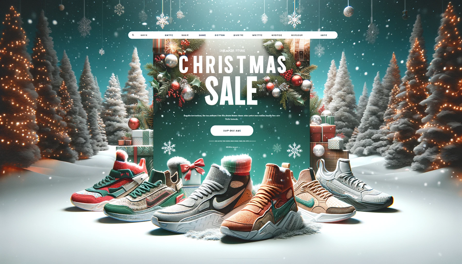
Want a visual to go along with it? Here’s an example of a fictitious Christmas landing page for Nike (created with Dall-E). Notice how it’s in full Christmas mode yet remains classy and functional.

fictitious Christmas landing page for Nike
Image provided by the author

You don’t want these to be in people’s faces. The elements must be noticeable enough to register in the user’s subconscious but subtle enough to not feel over the top.

The idea is to have something fun, playful, and uncomplicated, creating an engaging and festive atmosphere.

2. Play Around With Festive Fonts and Typography

The typography you choose is another subtle way to up the Christmas-O-Meter on your website.

Consider using decorative and playful fonts that reflect feelings of joy and celebration. You can also experiment with different font sizes, styles, and colors to create a visually appealing and festive look.

Check out these fonts for inspiration:

  1. Mountains of Christmas
  2. Festive
  3. Great Vibes
  4. Pacifico
  5. Lobster
  6. Dancing Script
  7. Indie Flower
  8. Alex Brush
  9. Cinzel
  10. Gochi Hand
  11. Berkshire Swash
  12. Festive

Think outside the box, and get creative with your typography. Try incorporating holiday-themed words, phrases, or symbols into your design. It can help set the tone and immediately convey the holiday spirit to your users.

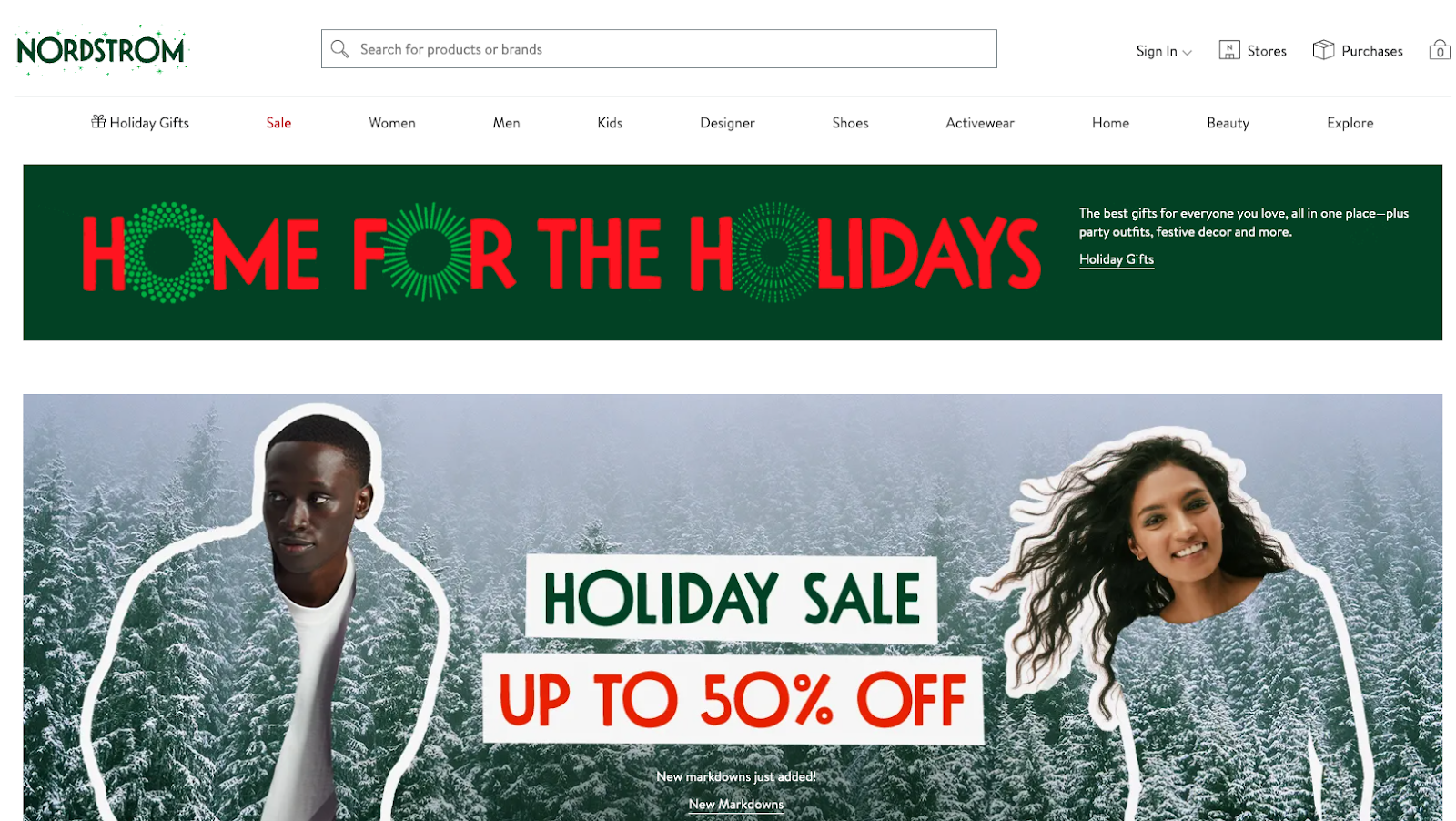
Need inspiration? Nordstrom really knows how to bring holiday cheer by swapping the letter “O” with a holiday wreath. 

Nordstorm holiday webpage with wreaths
Image Source

3. Turn Images Into the Main Attraction

Images are arguably the most important in setting the festive mood.

For example, an e-commerce site can display banners featuring products in a Christmas setting, like gifts under a beautifully decorated tree or products wrapped in holiday-themed packaging.

Images not only set the festive mood but also drive user engagement. So, take a creative leap as a web designer and incorporate interactive and animated elements into these images. 

Imagine a user hovering over a picture of a Christmas tree, and as they do, the tree’s lights begin to twinkle. Or snow starts to gently fall in the scene.

Such interactive elements catch the eye and provide a delightful user experience, encouraging visitors to spend more time exploring your site.

4. Never Underestimate the Power of Color

Of course, the classic combination of red and green instantly brings out that Christmas spirit. 

However, you can also explore subtle combinations, such as gold and silver for an elegant touch or blue and white for a wintry wonderland feel.

It’s challenging to look Christmassy without deviating from your regular brand colors, so here are some suggestions:

  1. Start by subtly infusing these colors into small elements like navigation bars, buttons, and banners that don’t disrupt the original look.
  2. Use red for headlines and green for call-to-action buttons to make important information stand out while maintaining the theme. 
  3. Sometimes, it’s OK to go off-brand (temporarily). Consider using a background with a gradient from deep green to vibrant red, giving your website a warm and inviting glow. 

Clean Origin’s homepage is a great example of a brand that seamlessly adapts to using Christmas images without losing its brand identity. 

Holiday themed photos from Clean Origin
Image Source

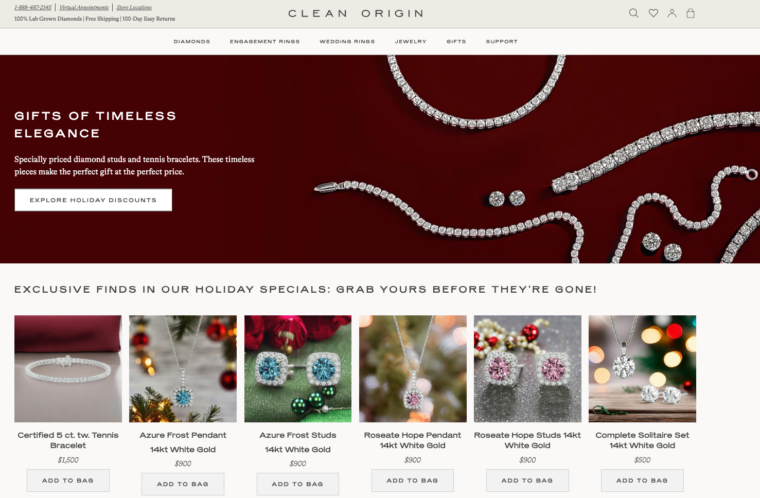
The homepage has a clean design, with lots of white space that makes it easy to understand what the company does. They also have updated their product pictures to go with the festive season.

The use of red and green, white and gold, and the close-ups of their high-quality diamonds add a nice holiday touch that puts website visitors in the mood for festivities!

In short, it’s important to strike a balance. Too much color becomes overwhelming. So, find the perfect balance between seasonal and brand consistency. 

5. Incorporate AI into Seasonal Web Design

Artificial intelligence (AI) has revolutionized many industries, including web design. During the festive season, AI can create personalized user experiences.

For example:

  • An AI-powered chatbot that assumes the persona of Santa Claus or a snowman can provide tailored recommendations for holiday gifts or help users find relevant information quickly.
  • Using AI to analyze user browsing history to provide recommendations with a festive twist. Products could be suggested with gift-wrapping options or as part of a holiday bundle.
  • AI image generators to create festive images and graphics if resources and time are lean.

6. Improve Engagement With Professional Voiceovers

Consider integrating audio elements that enrich the user experience to make your website unique and professional. Professional voiceovers can infuse an emotional and personal dimension, which is particularly effective in holiday themes. 

You can employ the same voice actors in your company’s future marketing materials to tell stories or present special offers on your website.

These small details create a consistent thread between customer touchpoints, transforming your website from a simple storefront to a comprehensive and engaging engagement platform.

7. Find Creative Uses for Augmented and Virtual Reality

Incorporating augmented reality (AR) and virtual reality (VR) into festive web design can transform a standard holiday browsing experience into an immersive and interactive adventure. 

AR from Crate and Barrel for Christmas decorations

For example:

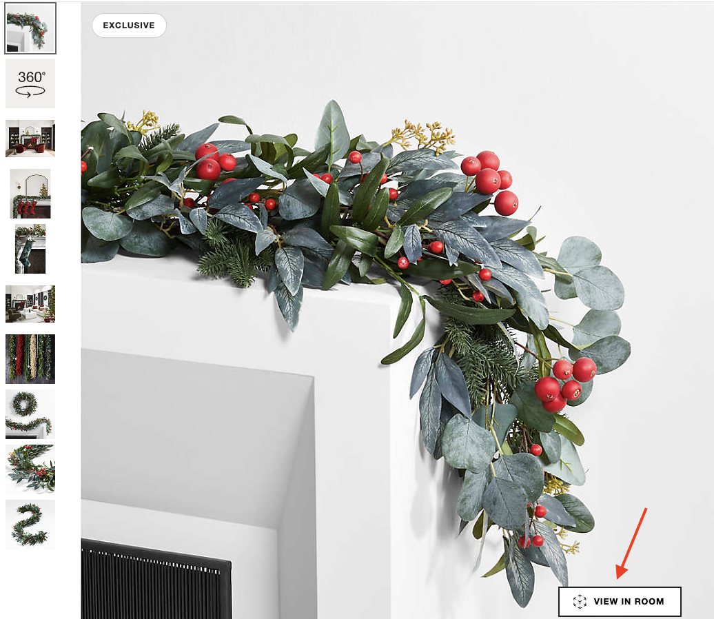
  1. A retail website could use AR to allow customers to visualize how holiday decorations would look in their homes (as Crate & Barrel does in the image above). 
  2. A VR experience could transport users to “Santa’s workshop,” where they could explore products in a fully immersive 3D environment. 
  3. Travel websites could use VR to offer virtual tours of holiday destinations, giving users a taste of the festive atmosphere in different cities worldwide. This could include virtual walks through decorated streets or immersive experiences of holiday traditions and markets.
  4. Fashion retailers could leverage AR for customers to try on holiday outfits virtually. This would allow shoppers to see how different clothes and accessories look on them without the need to physically try them on, which can be particularly handy during the busy holiday shopping season.

AR and VR make an interaction unique to the user and thus memorable — the two crucial ingredients in converting a visit into a purchase.

Wrapping Up

While adopting immersive web design trends for the holiday season can boost user engagement and provide a memorable experience, it’s critical to prioritize accessibility and mobile adaptability. 

Every festive element, from AR/VR integrations to festive animations and interactive features, should be built with accessibility in mind. This includes making your website navigable with assistive devices, providing alternative text for photos, and using clear, readable typefaces. 

Furthermore, in today’s mobile-first world, ensuring that your holiday designs transition smoothly to smaller screens is critical for reaching the broadest audience.

And it’s critical not to overdo the festive spirit in your design elements. The trick is to find a happy medium between celebration and functionality. 

It’s critical to conduct regular testing across various devices and browsers to ensure that your website stays user-friendly and accessible to everybody. 

By doing so, you spread holiday cheer and cultivate inclusivity where all users — regardless of ability or device — may enjoy the festive experience you’ve created on your website.

Featured image by Any Lane

The post Immersive Web Design Trends for the Festive Season: A 2024 Showcase appeared first on noupe.

Categories: Others Tags:

30 Best Fonts of 2023

December 21st, 2023 No comments

2023 has been a vintage year for fonts, with fantastic releases from major foundries and small independent designers.

Categories: Designing, Others Tags:

Web Development vs. Mobile App Development –  Which One is Right for Your Business?

December 18th, 2023 No comments

In the dynamic digital era, establishing a robust online presence is essential for the success of any business. One critical decision that business leaders must make is whether to invest in web development, mobile app development, or both. Each avenue offers unique advantages and considerations, and choosing the right path depends on various factors. 

In this comprehensive blog post, we will delve into the differences between web development and mobile app development, exploring their respective merits, challenges, and helping business leaders make informed decisions tailored to their specific needs.

Web Development: Unleashing the Power of the Browser

1. Accessibility and Cross-Platform Compatibility:

Advantage: Websites are inherently accessible across different devices and platforms. A well-designed website ensures a consistent user experience, regardless of whether the user is on a desktop, tablet, or smartphone.

Consideration: Responsive web design is crucial to ensure optimal user experience on various screen sizes. This involves designing and developing websites to adapt seamlessly to different devices.

2. Cost-Effectiveness:

Advantage: Web development is often more cost-effective than mobile app development. A single codebase can be used for multiple platforms, reducing development and maintenance costs.

Consideration: While initial costs may be lower, ongoing maintenance and updates are essential to keep the website secure, optimized, and aligned with evolving technologies.

3. Content Delivery and SEO:

Advantage: Web development facilitates easy content delivery, making it an ideal choice for businesses focused on content marketing. Additionally, search engines favour well-optimized websites, contributing to better visibility.

Consideration: SEO strategies require continuous attention to keep up with changing algorithms. Regular updates and fresh content are crucial to maintaining high search engine rankings.

4. Instant Updates:

Advantage: Web development allows for instant updates. Changes to the website can be made in real-time, ensuring that users always access the latest information.

Consideration: While instant updates are convenient, thorough testing is crucial to prevent unintended consequences or disruptions to the user experience.

Ongoing Web Maintenance:

Importance: Web development requires ongoing Web maintenance services to address security vulnerabilities, update content, and ensure compatibility with evolving technologies. Regular updates and patches are crucial for a seamless and secure user experience.

Strategy: Implement a robust maintenance schedule, including security updates, performance optimization, and content refreshes. Regularly test the website across different browsers and devices to identify and address any issues promptly.

Mobile App Development: Tailoring Experiences for Device Capabilities

1. Enhanced User Experience:

Advantage: Mobile apps provide a highly customized and interactive user experience, leveraging device capabilities such as GPS, camera, and push notifications.

Consideration: Designing for different mobile platforms (iOS and Android) may require separate development efforts, potentially increasing costs.

2. Offline Functionality:

Advantage: Mobile apps can offer offline functionality, allowing users to access certain features without an internet connection. This is particularly valuable for businesses with users in areas with limited connectivity.

Consideration: Implementing offline functionality requires careful planning and may not be applicable to all types of apps.

3. Monetization Opportunities:

Advantage: Mobile apps offer diverse monetization opportunities, including in-app purchases, subscriptions, and advertising.

Consideration: Monetization strategies should align with the app’s purpose and user expectations to avoid negatively impacting the user experience.

4. Brand Loyalty and Engagement:

Advantage: Mobile apps contribute to building brand loyalty through personalized experiences, push notifications, and direct interactions with users.

Consideration: Maintaining user engagement requires continuous effort, including regular updates, relevant content, and strategic use of push notifications.

Making the Right Choice for Your Business:

1. Nature of Business:

Consider the nature of your business and the goals you aim to achieve. If content delivery and accessibility across devices are primary concerns, web development may be the ideal choice. For businesses emphasizing interactive and personalized experiences, a mobile app might be more suitable.

2. Target Audience:

Understand your target audience and their preferences. If your audience primarily uses mobile devices and values the convenience of app-based interactions, a mobile app could enhance user engagement. For a broader audience that may access your services through various devices, a responsive website may be more practical.

3. Budget and Resources:

Evaluate your budget constraints and available resources. Web development is often more cost-effective initially, but ongoing maintenance costs should be factored in. Mobile app development may involve higher upfront costs but can offer unique monetization opportunities.

4. Long-Term Strategy:

Consider your long-term business strategy. If scalability, broad accessibility, and cost-effectiveness are top priorities, web development may align better with your goals. If building a dedicated user base, leveraging device capabilities, and fostering brand loyalty are crucial, mobile app development may be the strategic choice.

The Role of Ongoing Maintenance in Sustained Success:

Regardless of whether you choose web development, mobile app development, or both, ongoing maintenance is a non-negotiable aspect of a successful digital strategy. The digital landscape is dynamic, with technology, user preferences, and security threats constantly evolving. Regular maintenance ensures that your digital assets remain secure, up-to-date, and aligned with the latest industry standards.

Conclusion

In the digital landscape, the decision between web development and mobile app development is not a one-size-fits-all scenario. Both avenues offer distinct advantages and considerations, and the optimal choice depends on your business objectives, target audience, and resources. Some businesses may find success in a hybrid approach, combining a responsive website with a complementary mobile app. By carefully evaluating your business needs and aligning them with the strengths of each development avenue, you can chart a course that maximizes your online presence and positions your business for sustained success in the digital age.

Featured image by Christina Morillo

The post Web Development vs. Mobile App Development –  Which One is Right for Your Business? appeared first on noupe.

Categories: Others Tags:

10 Best Web Design Trends of 2023

December 18th, 2023 No comments

What website design techniques made the most impact in 2023? We’ve got a look back at the best trends of the year.

Categories: Designing, Others Tags:

Cloud Archiving vs On-Premise Archiving: Pros and Cons for Compliance

December 18th, 2023 No comments

In the ever-expanding universe of data administration, organizations grapple with a crucial decision—Cloud Archiving versus On-Premise Archiving—a choice that takes center stage in their quest for compliance excellence. 

In order to choose well, we need a detailed investigation that carefully looks at the pros and cons of each option. This involves understanding how different choices affect compliance in the complex world of digital data storage.

Pros of Cloud Archiving

One of the primary advantages of Cloud Archiving lies in its scalability and accessibility. 

Organizations can leverage the vast storage capabilities of cloud providers, adapting to the fluctuating volume of data seamlessly. 

Additionally, the cloud facilitates remote access, enabling users to retrieve archived data from anywhere with an internet connection. This accessibility enhances collaboration and simplifies compliance audits, allowing for swift data retrieval.

Cons of Cloud Archiving

However, concerns over data security and privacy persist with Cloud Archiving. 

Entrusting sensitive information to third-party cloud providers raises questions about unauthorized access and potential breaches. While reputable cloud service providers implement robust security measures, the perceived loss of control over data security remains a lingering reservation for some organizations, especially those operating in highly regulated industries.

Pros of On-Premise Archiving

On the flip side, On-Premise Archiving offers organizations greater control over their data. With the infrastructure maintained on-site, companies can implement customized security protocols and safeguards tailored to their specific needs. This level of control is particularly appealing for organizations handling highly sensitive data, where regulatory compliance demands stringent security measures.

Cons of On-Premise Archiving

However, the initial setup costs and ongoing maintenance of On-Premise Archiving can be substantial. The need for physical hardware dedicated IT personnel, and routine maintenance contributes to higher operational expenses. Additionally, the scalability of On-Premise Archiving may pose challenges as organizations expand, requiring continuous investment in infrastructure to accommodate growing data volumes.

The Role of Archiving Software

A pivotal consideration in the Cloud vs On-Premise Archiving debate is the utilization of archiving software

This specialized software plays a crucial role in streamlining the archiving process, automating data retention policies, and ensuring efficient retrieval during audits. The choice of archiving software can significantly impact the overall effectiveness of an organization’s archival strategy. 

Cloud Archiving often integrates seamlessly with this software provided by cloud service vendors, offering a user-friendly and cohesive solution. 

On the other hand, On-Premise Archiving demands careful selection and maintenance of archiving software to maximize efficiency and compliance.

Hybrid Solutions

Recognizing the nuanced needs of organizations, hybrid solutions that combine elements of both Cloud and On-Premise Archiving have gained prominence in recent years. 

This approach allows organizations to retain sensitive data on-premise while utilizing the scalability and accessibility of the cloud for less critical information. Hybrid solutions offer a middle ground, catering to diverse compliance requirements and striking a balance between security and flexibility.

Compliance Considerations

Several key considerations come to the forefront when evaluating archiving solutions for compliance. 

Regulatory bodies often impose specific requirements regarding data retention periods, encryption standards, and audit trails. Cloud Archiving, with its remote accessibility and seamless scalability, can facilitate compliance by enabling organizations to adapt to evolving regulatory landscapes efficiently. On the other hand, On-Premise Archiving provides a level of control that can be advantageous for organizations navigating stringent compliance frameworks.

Strategic Decision-Making for Tomorrow

In conclusion, the choice between Cloud and On-Premise Archiving transcends mere data storage preferences—it’s a strategic decision that shapes an organization’s compliance posture. As technology evolves and regulatory landscapes shift, the adaptability of chosen archiving solutions becomes paramount. The dynamic interplay between Cloud Archiving’s accessibility and On-Premise Archiving’s control underscores the need for organizations to align their archival strategies with their unique compliance requirements, ensuring a resilient and future-ready data management approach.

Continuous Evaluation for Optimal Compliance

Archiving is constantly changing, so an organization’s approach to compliance should keep up.

Beyond the initial choice of Cloud or On-Premise Archiving, a commitment to continuous evaluation, adaptation, and integration of cutting-edge archiving software ensures that compliance remains a checkbox and a proactive and evolving aspect of an organization’s data management strategy. 

Fostering a culture of agility and embracing emerging technologies, organizations navigate compliance intricacies with resilience and foresight.

Making the right choice

In the ever-evolving landscape of data management and compliance, the choice between Cloud Archiving and On-Premise Archiving is a strategic decision that demands careful consideration of an organization’s unique needs and regulatory obligations. 

While Cloud Archiving offers unparalleled scalability and accessibility, organizations must address concerns related to data security. On-premise archiving provides enhanced control over data security but requires significant upfront investments.

Conclusion

Regardless of the chosen approach, archiving software serves as the linchpin in the efficient data management process and compliance adherence. As organizations navigate the complexities of data archiving, integrating robust archiving software ensures compliance becomes an integral part of the archival process. 

Whether in the cloud or on-premise, the synergy between archiving solutions and compliance requirements is pivotal for organizations seeking to safeguard their data while meeting regulatory standards in an increasingly digital landscape.

Featured image by Pixabay

The post Cloud Archiving vs On-Premise Archiving: Pros and Cons for Compliance appeared first on noupe.

Categories: Others Tags:

3 Ways AI is Empowering Real Estate Entrepreneurs  

December 18th, 2023 No comments

In the last year, much has been written about how artificial intelligence (AI) is poised to upend virtually every industry you can name. Some see it as the “silver bullet” they’ve been waiting for on their quest to work smarter, not harder. Others fear that it may be a technological innovation that we ultimately cannot control – one that will eventually replace human jobs with automation to the detriment of us all.

While it’s difficult to say how AI will play out in the long-term, in the near future, artificial intelligence should be seen for what it really is: a productivity adrenalin shot in the best possible way. This is particularly true in terms of real estate investing, which is a notoriously time-consuming affair.

Think about everything one must devote themselves to for a successful real estate career. They need a deep understanding of the market – including not just where it is but where it has been and where it might be going. They need to wade through countless property listings until they find the right ones that meet their unique investment strategies. The list goes on and on.

Artificial intelligence can help with all of this, freeing up valuable time for real estate entrepreneurs so that they can focus on more important matters. In fact, AI is already empowering those entrepreneurs right now in a wide range of different ways, all of which are worth a closer look.

Actionable Information at Your Fingertips

One of the major ways that AI in real estate empowers young entrepreneurs has to do with the wealth of information it gives them access to in real-time.

Think about the sheer amount of human error you could be exposed to when performing something as seemingly straightforward as market analysis. Not only do you have to make sure your data comes from high-quality sources, but you also have to interpret it correctly. You need to be in a position to act on it, and you need to make informed choices when doing so.

AI algorithms can analyze massive volumes of data – far more than a human ever could. Not only will they be able to quickly verify trends and patterns in terms of things like property values, but they’ll do so with greater accuracy than even a team of people likely could.

You’re left with instant insight, illuminating the path you need to take to accomplish your investment goals. Is it impossible to get to this point without AI in real estate? Absolutely not – but it’s far easier and more efficient to lean into what technology has to offer.

Incredible Time-Savings

Another major way that AI in real estate empowers entrepreneurs is due to the sheer amount of time it can help someone save.

Think about how inherently complicated a traditional real estate transaction can be. Now, double that amount of effort within the context of wholesale real estate. This is because you’re now working with a buyer and a seller, as opposed to just one or the other.

If you already have a seller and know about the property in question, AI in real estate can help you finely target your marketing to get it in front of the people who are most likely to be interested as quickly as possible. In a situation that already has razor-thin profit margins, artificial intelligence can save as much time – and thus money – as possible. This helps to not only create that perfect situation that is beneficial to all parties, but it does so in a more cost-effective manner than ever. This preserves as much money as possible to go directly into your own pocket as profit.

The Property Management Advantages

There are those investors out there who are in it for the long game. They’re not just trying to buy a property to flip. They want to own, rent, and manage it to create passive income for themselves or boost their portfolio. This is another area where AI in real estate can absolutely come in handy.

Using sophisticated artificial intelligence-driven systems, it’s never been easier to monitor the conditions of a property. You can even see things on a unit-by-unit basis if you’re talking about a multi-family home like an apartment. You can predict maintenance requirements to fix small problems now before they become larger, more expensive ones later. You can take steps to reduce energy use and related costs, creating more profit for yourself. You can even allow AI to help with customer service to create a better tenant experience – something that will keep people satisfied, vacancies low, and your return on investment ultimately as high as it can go.

AI: Another Tool in Your Toolbox

In the end, it’s important to remember that in real estate, in particular, the one thing you’ll never be able to automate is a relationship. If you’re a seller, you need to find the right buyer and get them to trust you. If you’re a buyer, you need a seller. Wholesale real estate professionals need to forge two relationships to create a single positive outcome for everyone. All the innovative real estate software in the world will never change that.

But by freeing up their valuable time, artificial intelligence is ultimately empowering seasoned real estate entrepreneurs to do precisely that. They don’t have to spend countless hours pouring over historical data to determine which trends are on the rise and which are about to fizzle out. They don’t have to sink hours into examining properties until they find the best match for what they’re trying to accomplish. AI can do this with a fraction of the time and effort it used to require, all while generating results that are more accurate than a human is likely capable of.

This doesn’t mean real estate investment gets easier or that you can run your career on autopilot. It simply means that you’ve been gifted with more hours in a day to focus on what matters most: creating those mutually beneficial relationships. That’s an exciting position to be in regardless of how long you’ve been investing, and it’s something that was only possible thanks to the advent of artificial intelligence as we know it.

Featured Image by Austin Distel on Unsplash

The post 3 Ways AI is Empowering Real Estate Entrepreneurs   appeared first on noupe.

Categories: Others Tags:

Free Xmas Vector Clip-Art

December 13th, 2023 No comments

We’ve reached that time of year when all marketing is on a singular theme: snow, presents, and turkey (or nut roast, if that’s your preference).

Categories: Designing, Others Tags:

CSS Scroll Snapping Aligned With Global Page Layout: A Full-Width Slider Case Study

December 13th, 2023 No comments

You know what’s perhaps the “cheapest” way to make a slider of images, right? You set up a container, drop a bunch of inline image elements in it, then set overflow-x: auto on it, allowing us to swipe through them. The same idea applies nicely to a group of cards, too.

But we’ll go deeper than scroll snapping. The thing with sliders is that it can be difficult to instruct them on where to “snap.” For example, what if we want to configure the slider in such a way that images always snap at the left (or inline-start) edge when swiping right to left?

But that’s not even the “tricky” part we’re looking at. Say we are working within an existing page layout where the main container of the page has a set amount of padding applied to it. In this case, the slider should always begin at the inline starting edge of the inside of the container, and when scrolling, each image should snap to the edge rather than scroll past it.

Simply drop the slider in the layout container, right? It’s not as straightforward as you might think. If you notice in the illustrations, the slider is outside the page’s main container because we need it to go full-width. We do that in order to allow the images to scroll fully edge-to-edge and overflow the main body.

Our challenge is to make sure the slider snaps into place consistent with the page layout’s spacing, indicated by the dashed blue lines in the drawings. The green area represents the page container’s padding, and we want images to snap right at the blue line.

The Basic Layout

Let’s start with some baseline HTML that includes a header and footer, each with an inner .container element that’s used for the page’s layout. Our slider will sit in between the header and footer but lack the same inner .container that applies padding and width to it so that the images scroll the full width of the page.

<header>
  <div class="container">
    <!-- some contained header with some nav items -->
  </div>
</header>
<main>
  <section class="slider">
    <!-- our slider -->
  </section>
  <section class="body-text">
    <div class="container">
      <!-- some contained text -->
    </div>
  </section>
</main>
<footer>
  <div class="container">
    <!-- a contained footer -->
  </div>
</footer>

Creating The Container

In contrast to the emphasis I’ve put on scroll snapping for this demo, the real power in creating the slider does not actually start with scroll snapping. The trick to create something like this starts with the layout .container elements inside the header and footer. We’ll set up a few CSS variables and configure the .container’s properties, such as its width and padding.

The following bit of CSS defines a set of variables that are used to control the maximum width and padding of a container element. The @media rules are used to apply different values to these properties depending on the viewport’s width.


:root {
  --c-max-width: 100%;
  --c-padding: 10px;

  @media screen and (min-width: 768px) {
    --c-max-width: 800px;
    --c-padding: 12px;
  }
  @media screen and (min-width: 1000px) {
    --c-max-width: 940px;
    --c-padding: 24px;
  }
  @media screen and (min-width: 1200px) {
    --c-max-width: 1200px;
    --c-padding: 40px;
  }
}

The first couple of lines of the :root element’s ruleset define two CSS custom properties: --c-max-width and --c-padding. These properties are used to control the layout .container’s maximum width and padding.

Next up, we have our @media rules. These apply different values to the –-c-max-width and --c-padding properties depending on the screen size. For example, the first @media rule updates the value of --c-max-width from 100% to 800px, as well as the --c-padding from 10px to 12px when the screen width is at least 768px.

Those are the variables. We then set up the style rules for the container, which we’ve creatively named .container, and apply those variables to it. The .container’s maximum width and inline padding are assigned to the also creatively-named -c-max-width and --c-padding variables. This opens up our container’s variables at a root level so that they can easily be accessed by other elements when we need them.

I am using pixels in these examples because I want this tutorial to be about the actual technique instead of using different sizing units. Also, please note that I will be using CSS nesting for the demos, as it is supported in every major browser at the time I’m writing this.

The Scroll-Snapping

Let’s work on the scroll-snapping part of this slider. The first thing we’re going to do is update the HTML with the images. Remember that this slider is outside of the .container (we’ll take care of that later).

<header>
  <!-- .container -->
</header

<section class="slider">
  <div>
    <img src="..." alt="">
  </div>
  <div>
    <img src="..." alt="">
  </div>
  <div>
    <img src="..." alt="">
  </div>
  <!-- etc. -->
</section>

<footer>
  <!-- .container -->
</footer>

Now we have a a group of divs that are direct children of the .slider. And those, in turn, each contain one image element. With this intact, it’s time for us to style this as an actual slider. Flexbox is an efficient way to change the display behavior of the .slider’s divs so that they flow in the inline direction rather than stacking vertically as they naturally would as block-level elements. Using Flexbox also gives us access to the gap property to space things out a bit.

.slider {
  display: flex;
  gap: 24px;
}

Now we can let the images overflow the .slider in the horizontal, or inline, direction:

.slider {
  display: flex;
  gap: 24px;
  overflow-x: auto;
}

Before we apply scroll snapping, we ought to configure the divs so that the images are equally sized. A slider is so much better to use when the images are visually consistent rather than having a mix of portrait and landscape orientations, creating a jagged flow. We can use the flex property on the child divs, which is shorthand for the flex-shrink, flex-grow, and flex-basis properties:

.slider {
  display: flex;
  gap: 24px;
  overflow-x: auto;

  > * {
    flex: 0 0 300px;
  }
}

This way, the divs are only as big as the content they contain and will not exceed a width of 300px. But! In order to contain the images in the space, we will set them to take up the full 100% width of the divs, slap an aspect-ratio on them to maintain proportions, then use the object-fit property to to cover the div’s dimensions.

.slider {
  display: flex;
  gap: 24px;
  overflow-x: auto;

  > * {
    flex: 0 0 300px;
  }

  & img {
    aspect-ratio: 3 / 4;
    object-fit: cover;
    width: 100%;
  }
}

With this in place, we can now turn to scroll snapping:

.slider {
  display: flex;
  gap: 24px;
  overflow-x: auto;
  scroll-snap-type: x mandatory;

  > * {
    flex: 0 0 300px;
    scroll-snap-align: start;
  }

  /*
}

Here’s what’s up:

  • We’re using the scroll-snap-type property on the .slider container to initialize scroll snapping in the horizizontal (x) direction. The mandatory keyword means we’re forcing the slider to snap on items in the container instead of allowing it to scroll at will and land wherever it wants.
  • We’re using the scroll-snap-align property on the divs to set the snapping on the item’s start-ing edge (or “right” edge in a typical horizontal left-to-right writing mode).

Good so far? Here’s what we’ve made up to this point:

See the Pen Cheap Slider, Scroll Snapped [forked] by Geoff Graham.

Calculating The Offset Size

Now that we have all of our pieces in place, it’s time to create the exact snapping layout we want. We already know what the maximum width of the page’s layout .container is because we set it up to change at different breakpoints with the variables we registered at the beginning. In other words, the .container’s width will never exceed the value of --c-max-width. We also know the container always has a padding equal to the value of --c-padding.

Again, our slider is outside of the .container, and yet, we want the scroll-snapped images to align with those values for a balanced page layout. Let’s create a new CSS variable, but this time scoped to the .slider and set it up to calculate the space between the viewport and the inside of the .container element.

.slider {
  --offset-width: calc(((100% - (min(var(--c-max-width), 100%) + (var(--c-padding) * 2))) / 2) + (var(--c-padding) * 2)
  );
}

That is a lot of math! First, we’re calculating the minimum value of either the .container element’s max-width or 100%, whichever is smaller, then increasing this minimum value with padding on the .slider. This result is then subtracted from 100%. From this, we get the total amount of space that is available to offset either side of the .slider to align with the layout .container.

We then divide this number by 2 to get the offset width for each specific side. And finally, we add the .container’s inline padding to the offset width so that the .slider is offset from the inside edges of the container rather than the outside edges. In the demo, I have used the universal selector (*) and its pseudos to measure the box-sizing of all elements by the border-box so that we are working inside the .slider’s borders rather than outside of it.

*, *::before, *::after {
  box-sizing: border-box;
}

Some Minor Cleanup

If you think that our code is becoming a bit too chaotic, we can certainly improve it a bit. When I run into these situations, I sometimes like to organize things into multiple custom properties just for easy reading. For example, we could combine the inline paddings that are scoped to the :root and update the slider’s --offset-width variable with a calc() function that’s a bit easier on the eyes.

:root {
  /* previous container custom properties */

   --c-padding-inline: calc(var(--c-padding) * 2);
}

.slider {
  --offset-width: calc(((100% - (min(var(--c-max-width), 100%) + var(--c-padding-inline))) / 2) + var(--c-padding-inline));

  /* etc. */
}

That’s a smidge better, right?

Aligning The Slider With The Page Layout

We have a fully-functioning scroll scroll-snapping container at this point! The last thing for us to do is apply padding to it that aligns with the layout .container. As a reminder, the challenge is for us to respect the page layout’s padding even though the .slider is a full-width element outside of that container.

This means we need to apply our newly-created --offset-width variable to the .slider. We’ve already scoped the variable to the .slider, so all we really need is to apply it to the right properties. Here’s what that looks like:

.slider {
  --offset-width: calc(
    ((100% - (min(var(--c-max-width), 100%) + (var(--c-padding) * 2))) / 2) + (var(--c-padding) * 2)
  );

  padding-inline: var(--offset-width);
  scroll-padding-inline-start: var(--offset-width);

  /* etc. */
  }

The padding-inline and scroll-padding-inline-start properties are used to offset the slider from the left and right sides of its container and to ensure that the slider is always fully visible when the user scrolls.

  • padding-inline
    This sets spacing inside the .slider’s inline edges. A nice thing about using this logical property instead of a physical property is that we can apply the padding in both directions in one fell swoop, as there is no physical property shorthand that combines padding-left and padding-right. This way, the .slider’s internal inline spacing matches that of the .container in a single declaration.
  • scroll-padding-inline-start
    This sets the scroll padding at the start of the slider’s inline dimension. This scroll padding is equal to the amount of space that is added to the left (i.e., inline start) side of the .slider’s content during the scroll.

Now that the padding-inline and scroll-padding-inline-start properties are both set to the value of the --offset-width variable, we can ensure that the slider is perfectly aligned with the start of our container and snaps with the start of that container when the user scrolls.

We could take all of this a step further by setting the gap of our slider items to be the same as our padding gap. We’re really creating a flexible system here:

.slider {
  --gap: var(--c-padding);
  gap: var(--gap);
}

Personally, I would scope this into a new custom property of the slider itself, but it’s more of a personal preference. The full demo can be found on CodePen. I added a toggle in the demo so you can easily track the maximum width and paddings while resizing.

See the Pen Full width scroll snap that snaps to the container [forked] by utilitybend.

But we don’t have to stop here! We can do all sorts of calculations with our custom properties. Maybe instead of adding a fixed width to the .slider’s flex children, we want to always display three images at a time inside of the container:

.slider {
  --gap: var(--c-padding);
  --flex-width: calc((100% - var(--gap) * 2) / 3);

  /* Previous scroll snap code */

  > * {
    flex: 0 0 var(--flex-width);
    scroll-snap-align: start;
  }
}

That --flex-width custom property takes 100% of the container the slider is in and subtracts it by two times the --gap. And, because we want three items in view at a time, we divide that result by 3.

See the Pen Updated scroll container with 3 items fitted in container [forked] by utilitybend.

Why Techniques Like This Are Important

The best thing about using custom properties to handle calculations is that they are lighter and more performant than attempting to handle them in JavaScript. It takes some getting used to, but I believe that we should use these kinds of calculations a lot more often. Performance is such an important feature. Even seemingly minor optimizations like this can add up and really make a difference to the overall end-user experience.

And, as we’ve seen, we can plug in variables from other elements into the equation and use them to conform an element to the properties of another element. That’s exactly what we did to conform the .slider’s inner padding to the padding of a .container that is completely independent of the slider. That’s the power of CSS variables — reusability and modularity that can improve how elements interact within and outside other elements.

Categories: Others Tags:

Exploring the Top-Earning Opportunities: A Guide to the Highest Paid Programming Languages

December 12th, 2023 No comments

Computer programmers build web properties, software, and mobile apps. These specialists use programming languages like Ruby, Javascript, and C to accomplish this goal.

If you’re an aspiring software developer, it can be difficult to know which one to master. After all, there are dozens of programming languages available. The good news is that many programming languages have significant earning potential.

In this guide, we’ll cover the in-demand programming languages to master in your career.

The Highest-Paying Programming Languages by Average Salary

If you’re looking to advance your career and earn a high salary, you should learn and master these popular languages to get started:

  • Python: $141,658 /year
  • Ruby: $134,186 /year
  • C++: $120,212 /year
  • Golang: $120,086 /year
  • Java: $117,931 /year
  • Rust: $109,905 /year
  • SQL: $109,407 /year
  • Swift: $103,072/year

*All salaries are the US national average and sourced from ZipRecruiter

These aren’t only some of the highest-paying programming languages in the world, but they’re also the most popular.

Whether you take an online course, boot camp, or attend a community college, you shouldn’t have trouble learning these open-source programming languages.

How to Increase Your Earning Potential: Best Practices for Computer Programmers

It’s not enough to learn the highest-paying programming languages. If you want to become a successful computer scientist, here are some tips. 

Learn Different Programming Languages

There are dozens of programming languages in the world. Software development teams sometimes use several programming languages, artificial intelligence (AI), and machine learning to build dynamic mobile applications. 

On top of that, building integrations through APIs and SDKs means learning how different programming languages relate.

Image of how an API works

(Image Source)

To advance your career, you should invest time in learning different programming languages. This is especially true if you plan on working for Fortune 500 companies in the future. 

For example, Swift is commonly used in the Apple coding ecosystem. If working for Apple as a programmer is one of your career goals, Swift should definitely be on your priority list. 

Build Credibility

Another way to increase your earnings is by building credibility in your niche. There are several ways you can do this, including:

  • Creating thought-leadership content: Do you have something new to share with other coders? If so, you can write for other websites and produce content showing your level of expertise. 
  • Freelancing: You can also elevate your credibility by offering your services for side projects. This can give you some extra cash in your pocket, introduce you to new people, and expand your connections. 
  • Contributing to open-source projects: Open-source projects require volunteer community members to stay afloat. If you contribute to developing new software, patches, desktop applications, web architecture, and updates, your work will last for a long time and even catch the eyes of prospective employers. 
  • Participating in hackathons: These events feature countless hackers and computer programmers from all walks of life. Think of it as a networking opportunity – like LinkedIn, but for computer programmers and enthusiasts only.

Following these strategies can help you get your name out there, find new job opportunities, and connect with like-minded people who can become connections later. 

Continue Learning

The world of modern technology is always changing. The best computer programmers can stay on top of new developments and adapt their processes. There are many ways you can evolve your learning.

One way is by attending keynote speeches. Doing so lets you learn from some of the brightest minds in software testing. The good news is that these events are usually affordable and held in public places.

You can also meet other programmers and grow your network through public learning events. Another way you can continue your learning is by taking online boot camps.

coding boot camp infographic

(Image Source)

These online courses teach beginner, intermediate, and advanced web development trends. Upon completing a boot camp, you’ll receive a certificate, which you can add to your resume. 

Switch Companies

If you believe you’re stagnant in your current job, you should explore more opportunities. Software development is a continuously changing industry. The more ambitious you are as a computer programmer, the more likely you are to succeed over your peers. 

You should work with a company that’ll challenge you to learn something new daily and contribute to a world-changing project. 

Oh, and let’s not forget that you can see an average 15% salary increase when changing jobs. 

Start Your Own Business

Embarking on the journey of starting your own programming business can be a transformative step towards significantly increasing your earning potential. Start by doing some research and reading up on small business blogs to gain insights on starting and running a business.

Unlike traditional employment, running your own business in the tech industry means there’s no ceiling on how much you can earn. The more innovative and efficient your solutions are, the greater the demand and, consequently, the higher your potential income. 

Need inspiration? Ryan Hogue earned $85,000 a year as a full-time web developer. Now, he makes $14,600 a month in passive income. That’s an impressive jump. Talk about inspiring. 

However, an often overlooked but critical aspect of this process is the importance of registering your business with state authorities. This legal step is essential to avoid unnecessary fees or, worse, being denied the right to operate. 

By ensuring your business is registered and compliant with state and local regulations, you protect your venture and establish a foundation of credibility and trustworthiness in the market.

Final Words

Learning these popular programming languages can increase your earning potential and advance your career. 

It’s not uncommon for successful computer programmers to earn well over $100,000 a year or more in today’s digital world. Developer salaries are well above the median salary and some of the highest-paying jobs. 

If you’re ready to expand your horizons and learn some new programming languages, studying the ones in this guide is a great first step.

These languages are great for beginners because they’re often simple and easy to learn and have a wide range of applications.

You can use them for everything from web development to game design to software engineering. They’re constantly evolving, so new learning opportunities are always there across tech companies (or starting your own).

Here’s to your success as a software engineer or skilled developer! 

Featured Image by Kenny Eliason on Unsplash

The post Exploring the Top-Earning Opportunities: A Guide to the Highest Paid Programming Languages appeared first on noupe.

Categories: Others Tags:

40 Best New Websites, 2023

December 11th, 2023 No comments

What makes a website great? Is it the design, the functionality, the subject? Or is it specific design elements like the typography, or colors?

Categories: Designing, Others Tags: