Collected.li Gives New Web Design Inspo With Every Visit
August 25th, 2023
No comments
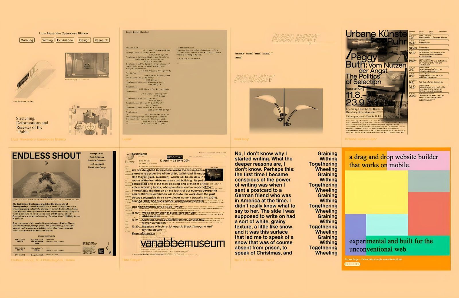
Collected.li is a web design gallery that shows eight inspirational sites on each visit. The sites shuffle each time you hit refresh.
Collected.li is a web design gallery that shows eight inspirational sites on each visit. The sites shuffle each time you hit refresh.

Ever wanted to launch a website that lives longer than you do? Well, now you can. WordPress’s new 100-year plan lets you purchase a domain for a century. Ready for your great-grandchildren to laugh at your outdated website in 2123?

Twenty-five years ago this month, Apple fans began unboxing the first iMacs. At the time, computers were beige boxes wired to other beige boxes, toyed with by people in beige sweater vests. Amidst the mundanity, the iMac felt like a revolution. For many of us, that first experience of an iMac was transformative; it created a vision of a technological world that wasn’t all about work. Suddenly, tech was cool.
Twenty-five years ago this month, Apple fans began unboxing the first iMacs. At the time, computers were beige boxes wired to other beige boxes, toyed with by people in beige sweater vests. Amidst the mundanity, the iMac felt like a revolution. For many of us, that first experience of an iMac was transformative; it created a vision of a technological world that wasn’t all about work. Suddenly, tech was cool.

Sales is an exciting journey filled with opportunities for growth, and it’s no secret that sales reps may occasionally require assistance in discovering prospects, customizing solutions to their unique needs, and persistently following up.
Throughout this process, they might encounter objections, challenges, and distractions. Regrettably, a significant portion of their valuable time may sometimes be invested in less fruitful prospects. But there’s a solution for this, and they are sales enablement tools.
So, to bring your business and sales teams the power to succeed, we’ve compiled a list of the best sales enablement tools you can leverage this year. Before we dive into it, let’s take a moment to get familiar with the basics that will set the stage for your future success.
Sales enablement is the strategic and ongoing process of equipping sales teams with the content, tools, knowledge, and support they need to effectively engage with prospects and close deals.
It involves providing sales representatives with the necessary training and resources to have meaningful conversations with potential customers at each sales cycle stage. In short, it is the secret sauce that fuels the sales organization, equipping sales reps with everything they need to close deals with finesse.
Sales enablement tools are intelligent software programs that help sales representatives create and access content throughout the sales process. They combine various data types, such as content analytics, business intelligence, CRM, customer experience data, automation, and sales analytics. These tools are essential in aligning sales and marketing efforts and connecting different departments.
In fact, 67% of sales professionals utilize four to 10 digital sales tools to supercharge their sales efforts. That’s quite an impressive number!
So, we scoured the market and handpicked seven incredible sales enablement tools guaranteed to up your sales game. Let’s take a closer look at each of them.

Highspot is a prevalent tool for sales representatives which is rated top by credible organizations such as Gartner, Forrester, G2, and many more. It offers various features to support sales professionals in managing their sales content, acquiring training, and monitoring performance.
One feature worth mentioning is its intelligent recommendations for product-related documentation, such as product overview decks, case studies, and more, making it easy for sales reps to share relevant materials with prospects.
Sales reps can access this content directly within Gmail using Highspot’s Chrome extension, eliminating the need to switch between their inbox and other platforms where the documentation is stored. This integration ensures efficient workflow for sales reps when emailing prospects.
Key Features:
Pricing:
Highspot offers custom pricing.

Showpad is another impressive tool for content management and sales enablement that tackles the typical problem sales representatives face when finding suitable content for their prospects.
Showpad eOS® centralizes content and sales tools for sales reps to effortlessly cater to the needs of the customers. It equips them with intelligent content recommendations, leveraging marketing rules and machine learning, and ensures easy access to the right content at the right time.
Key Features:
Pricing:
Showpad offers custom pricing.

With a G2 rating of 4.9/5, Beaconstac offers a game-changing solution for salesfolks with its digital business cards. It is a complete end-to-end networking solution that liberates businesses from the constraints of traditional business cards with ROI-driven, cost-effective, and eco-friendly business cards.
The tool has an intuitive card creation process and offers contactless sharing as Apple Wallet business cards or through Google Wallet passes. The in-built analytics lets you track the performance of your business cards, so you can network effortlessly while measuring your success.
Plus, Beaconstac offers Google Analytics integration so you can tap into user behavior data and other relevant scan data in-depth and gauge them to improve your networking process. They also offer a ‘lead collection’ feature, which enables a two-way contact-sharing medium. In this, your prospects can also share their contact information (email address, phone numbers, etc.) with you directly via your digital business card. These leads will be collected in the digital address book of your dashboard.
Key features:
Pricing:
Beaconstac offers digital business cards for individuals and businesses through four different pricing plans – solo, teams, businesses, and enterprises. Their basic plan starts from $6 per month per user.

Mindtickle is a sales enablement tool that drives revenue growth by enhancing knowledge, cultivating ideal sales behaviors, and embracing change. It has a rating of 4.7/5 on G2 and helps define your Ideal Rep Profile™ to create programs that reinforce knowledge, analyze sales meetings to optimize performance, and upgrade your entire sales process.
Key features:
Pricing:
Mindtickle offers custom pricing based on your requirements.

With a G2 rating of 4.4/5, Brainshark empowers your sales reps with flexible training resources, coaching modules, and practice opportunities to keep them at the top of their game. You can unlock the potential of your sales force with Brainshark’s comprehensive suite of tools designed to assess progress, reinforce effective sales tactics, and elevate overall team performance.
Key features:
Pricing:
Brainshark provides two plans, Pro and Premier, with annual subscriptions. Users can take advantage of the 90-day free trial period to explore the features and benefits of Brainshark before committing to a subscription.
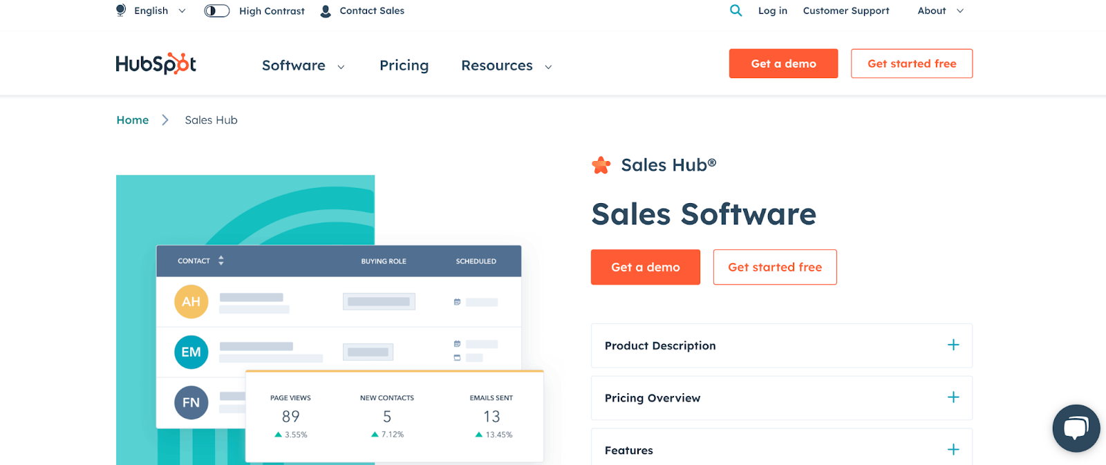
Designed to cater to businesses of all sizes, HubSpot Sales Hub offers a user-friendly experience and a bouquet of features. With easy-to-learn functionalities and uninterrupted integrations with platforms like NetSuite, QuickBooks, and Xero, HubSpot Sales Hub centralizes your sales work and boosts efficiency.
With an intuitive interface, Sales Hub empowers sales teams to efficiently manage leads, track customer interactions, and close deals effectively. The platform offers a comprehensive set of tools, including email tracking, document sharing, meeting scheduling, and pipeline management, all designed to enhance productivity and drive revenue growth.
Key features:
Pricing:
Hubspot comes with three different plans – Starter, Professional, and Enterprise. Prices start at $20 monthly for two users in the Starter plan.

Seismic offers a centralized hub for managing all your sales resources, information, and content, providing global version control and approval solutions. Trusted by over 2,000 organizations worldwide, from industry giants to startups and small businesses, Seismic is another unique choice for sales enablement.
It has a G2 rating of 4.7/5 and lets you access relevant information and personalized content for every buyer interaction, ensuring maximum sales productivity. Seismic also facilitates seamless integration with other sales and marketing tools, creating a unified ecosystem that drives efficiency and collaboration across teams. By providing intelligent recommendations and content suggestions, Seismic empowers sales reps to engage with prospects in a more targeted and effective manner, ultimately driving higher conversions and revenue growth.
Key features:
Pricing:
Seismic offers custom pricing based on your requirements.
Corefactors AI CRM is a RevOps-enabled centralized hub to unify your customer-facing teams and deliver exceptional customer experience. Break silos between teams by doing away with data fragmentation.
It has built-in cloud telephony, IVR, and third-party and vendor integrations. The automated lead management feature can capture leads from multiple sources. The dashboards help monitor lead stages and track productivity by analyzing metrics across different sales cycle stages.
It provides a 360° view of customer data through a content manager, lead box, and omnichannel communication options that can be triggered and automated throughout the customer lifecycle. It has a Capterra rating of 4.4 / 5 and is the proud recipient of the “Tech Startup of the Year 2023” at the TechIndia Transformation Awards.
Trusted by 12000+ users across India and SEA, Corefactors empowers SMBs and startups in BFSI, Real Estate, Education, Health Care, Manufacturing, Fintech, and B2B businesses with automated relationship management tools.
Key features:
Get a 360-degree view from lead capturing to lead conversion
Pricing:
Corefactors offers four different plans – Seed, Sapling, Tree, and For Enterprises. The prices start at INR 700 monthly per user in the Seed plan.
Choosing the right sales enablement tool can be daunting with the several available options. Here are a few factors to consider before making a choice:
By considering these factors and aligning them with your specific requirements, you can choose a sales enablement tool that best suits your team’s needs and boosts sales.
The landscape of sales enablement tools continues to evolve, offering an array of innovative solutions to empower sales teams and drive success. From comprehensive CRM platforms that centralize customer data to AI-powered analytics that provide invaluable insights, these tools have become indispensable assets for modern sales professionals.
So, take the plunge, explore these remarkable tools, and witness the transformation of your sales success in 2023 and beyond. Happy selling!
Featured Image by Chris Liverani on Unsplash
The post Best Sales Enablement Tools in 2023 appeared first on noupe.
Excited by the promise of AI but not sure how to get started? The look no further than this magical ChatGPT WordPress plugin.

Pornhub just started a logo feud. And this time, it’s serious. The opponent? A kebab shop in Lower Manhattan. No, seriously.

The tech giant is reportedly considering incorporating generative AI functionality into the much-beloved drawing program. No, God. Please no!

Midjourney has long been at the forefront of generative-AI technology. Now, they’ve released a new tool. This one could be a game-changer for designers and artists.

The world of post-modern web design is one where the light doesn’t cast many shadows. That doesn’t mean CSS shadows are going away. On the contrary, they’ve become more adaptive. Shadows are an incredibly useful design element. We know they add depth to an otherwise two-dimensional web design, but did you know we can stack, animate, and manipulate them in ways that go beyond that?
I’ve been experimenting with shadows. In this article, I’m going to share several “tricks” I’ve discovered along the way and how they can be used to create interesting effects that have little to do with their primary role of adding depth. We’ll look at an effect that works by stacking layers of shadows that transition on hover. After that, I will show you how to make a shadow of a shadow. Lastly, we’ll play with shadows on text as an alternative to color.
Ready for some fun? Let’s start with an interesting hover effect.
The Introspective Shadow Hover Effect
Most of us are familiar with the inset keyword. It’s an optional value of the CSS box-shadow property.
When inset is specified, the shadow is cast inside the element, directed inward. It’s commonly used to make it look as if an element has been stamped into the surface of the web page. We are going to push that shadow further, both metaphorically and literally, to create an overlay hover effect for image transitions.
Just as we can control the shadow’s blur radius — how far the shadow spreads outward — we can choose to apply no blur at all to the shadow. We can combine that with the fact that inset shadows are painted over an element’s background (unlike default shadows that are cast beneath the element) to create what I call a “veil” that sits on top of an element.
Let’s start with a single div in the HTML:
<div class="item"></div>
There’s nothing to see yet. So, let’s add some dimensions, a background color, and a border radius to make a green circle.
.item {
  width: 250px;
  height: 250px;
  background: green;
  border-radius: 50%;
}
This is nothing fancy so far. I merely want to demonstrate that we can essentially cover the green background with a red inset box-shadow:
.item {
  width: 250px;
  height: 250px;
  background: green;
  border-radius: 50%;
  box-shadow: inset 250px 250px 0 red;
}
Now we have a red circle with a green background beneath it. We can remove the red inset shadow on hover to reveal the green background:
.item:hover {
  box-shadow: none;
}
See the Pen Inward Shadow Pt. 1 [forked] by Preethi Sam.
Since shadows can be layered and are supported by CSS transitions, let’s incorporate that for a more fluid design. First, I’m going to update the HTML a bit by adding a span inside the .item:
    <div class="item">
      <span>The New York Times</span>
    </div>
    <!-- more items -->
For the CSS, it’s the same idea as before. We want a circle with an inset shadow and a background:
.item {
  width: 300px;
  height: 300px;
  background-image: url('nytimes.svg');
  border-radius: 50%;
  box-shadow: inset -300px -300px 0 black,
}
The difference so far is that I am using a background-image instead of a background-color. They are absolutely interchangeable for the hover effect we’re working on.
Next, I’m going to do two things. First, I’m going to stack more inset shadows inside the .item. Then I’m changing the text color to white, but only for a moment so the background image shows all the way through.
.item {
  width: 300px;
  height: 300px;
  background-image: url('nytimes.svg');
  border-radius: 50%;
  box-shadow:
    inset -300px -300px 0 black,
    inset 300px -300px 0 green,
    inset -300px 300px 0 blue,
    inset 300px 300px 0 yellow,
    0 0 20px silver; /* standard outset shadow */
  color: white;
  }
Even after we add those four extra shadows, we still are left with only a black circle that says “The New York Times” on it in white. The trick is to remove those shadows on hover, change the color of the text to transparent, and reveal the logo beneath our stack of inset shadows.
.item:hover {
  box-shadow:
    inset 0 0 0 transparent,
    inset 0 0 0 transparent,
    inset 0 0 0 transparent,
    inset 0 0 0 transparent,
    0 0 20px silver; /* retain the outset shadow */
  color: transparent;
}
That works! But perhaps we should add a little transition in there to smooth it out:
.item {
  width: 300px;
  height: 300px;
  background-image: url('nytimes.svg');
  border-radius: 50%;
  box-shadow:
    inset -300px -300px 0 black,
    inset 300px -300px 0 green,
    inset -300px 300px 0 blue,
    inset 300px 300px 0 yellow,
    0 0 20px silver; /* standard outset shadow */
  color: white;
  transition:
    box-shadow ease-in-out .6s,
    color ease-in-out .5s;
  }

.item:hover {
  box-shadow:
    inset 0 0 0 transparent,
    inset 0 0 0 transparent,
    inset 0 0 0 transparent,
    inset 0 0 0 transparent,
    0 0 20px silver; /* keeping the outset shadow */
  color: transparent;
}
The only other thing I think that’s worth calling out is that the outward shadow in the stack is not removed when the .item is hovered. I only want to remove the inset shadows.
Here’s the final result:
See the Pen Inward Shadow Pt. 2 [forked] by Preethi Sam.
I used CSS variables throughout so you can change the colors of the shadows and the size of the element.
Casting A Shadow Of A Shadow
If we learned anything from that last example, it’s that shadows are visually interesting: they can bend, fade, intersect, and transition. But what about a shadow casting another shadow? Can we create a shadow of an element’s shadow?
This is not the same as stacking layers of shadows as we did earlier. Rather, we will be making a silhouette of a shadow. And because we have a second way to add shadows to elements with the CSS drop-shadow() filter, we can do exactly that.
A drop-shadow() is a little different than a box-shadow. Where a box-shadow casts a shadow along the physical edges of the element’s bounding box, a drop-shadow() ignores the box and casts a shadow along the element’s shape.
When drop-shadow() is given to an element with a box-shadow, the shadow from the box-shadow will cast a shadow of its own. We can combine these to make interesting effects, like a Venn diagram shape.
.item {
  box-shadow: 0 0 20px black ;
  filter: drop-shadow(-30px 0 0 blue);
}
See the Pen Shadow of a Shadow Pt. 1 [forked] by Preethi Sam.
This simple combination of box and drop shadows can lead to interesting designs, like shadows that cast shadows. Let’s start with some HTML that includes the same .item element we used in the last section. This time, we’ll place two child elements inside it, another div and an img:
<div class="item">
  <div class="background"></div>
  <img src="image.jpeg" />
</div>

<!-- more items -->
The .item is merely serving as a container this time. The real work happens on the .background child element. The image is purely there for decoration. We’re going to set a box-shadow on the .background element, then add a stack of three drop-shadow() layers to it:
/* third circle in the following demo */
.item > .background {
    box-shadow: 0 0 40px rgb(255 0 0 / .5);
    filter:
      drop-shadow(-20px 0 0 rgb(255 0 0 / .5))
      drop-shadow(20px 0 0 rgb(255 0 0 / .5))
      drop-shadow(20px 0 0 rgb(255 0 0 / .5));
}
We can also use transitions with these effects (as in the middle circle below).
See the Pen Shadow of a Shadow Pt. 2 [forked] by Preethi Sam.
The Textual Shadow
The last effect we’re going to look at involves the CSS text-shadow property. It’s actually less of a complicated “trick” than it is a demonstration of using and showing just the shadow of a text element for color purposes.
Specifically, I’m talking about transparent text with a shadow on it:
/* second column in the below demo */
p {
  color: transparent;
  text-shadow: 1px 1px 0 black;
}
See the Pen Textual Shadow Pt. 2 [forked] by Preethi Sam.
Notice the emoji? Instead of the full-color deal, we normally get, this emoji is more like an icon filled with a solid color. This is one way to make a quick and dirty icon system without drawing them or working with files.
We could have also pulled this off with background-clip: text to clip around the shape of the emoji or apply a drop-shadow(). However, that affects the background, limiting where it can be used. Plus, I like the idea of using text-shadow with text elements since that’s what it’s used for, and emoji are part of the text.
You might think there’s a “gotcha” with underlines. For example, text-shadow ignores the text decoration of links.
See the Pen Text Shadow No Likey Link Underlines [forked] by Geoff Graham.
No big deal. If you need to support underlines, we can reach for the CSS text-decoration and text-underline-offset properties:
p {
  color: transparent;
  text-shadow: 1px 1px 0 black;
  text-decoration-line: underline;
  text-decoration color: black;
  text-underline-offset: 3px;
}
See the Pen Shadow-Only Link With Underline [forked] by Geoff Graham.
Conclusion
That’s a look at three interesting ways to use CSS shadows as more than that thing you use to add depth. We looked at one way that uses inset shadows to hide the contents of an element’s background for a neat hover effect. Then there was the idea of combining box-shadow and drop-shadow() to cast a shadow of another shadow. We capped things off with a quick way to manipulate text and emoji with text-shadow.
I hope these experiments give you the inspiration to do some CSS shadow experiments of your own. Shadows and gradients are perhaps the two most important CSS features for “drawing” with CSS, like many of the examples you’ll see on Lynn Fisher’s A Single Div project. Shadows have incredible browser support, so the options are plentiful as far as what we can do with them.