Archive

Archive for November, 2015

Web Development Reading List #114: Black Friday, UI Stack, Accessible Web Apps

November 27th, 2015 No comments

“Black Friday” has many explanations and various historical reasons. Besides that, every year it leads to people buying things just because retailers give huge discounts. But do you really need more? If you wouldn’t have bought something at its full price, you probably don’t need it at all.

The User Interface Stack

In a world where most of us have many things in their home untouched for months or years, we should focus on what is important. It’s not having the newest products, using the latest tools, using the latest cool startup service. It’s about helping other people, sharing real experiences and stories with your friends. Thank them and yourself this year without a bought gift.

The post Web Development Reading List #114: Black Friday, UI Stack, Accessible Web Apps appeared first on Smashing Magazine.

Categories: Others Tags:

HTML5: Create a Top-notch OnePager with Slides

November 27th, 2015 No comments

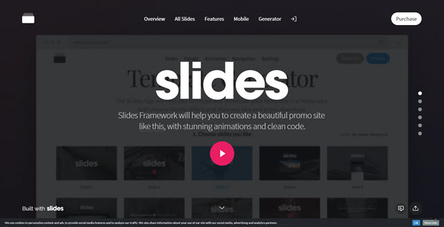
OnePagers, websites that consist of one page divided into two or more segments, are still growing in popularity. If I remember correctly, Apple were the ones who started that craze with their presentation of one of the later iPhones a few years ago. The classic OnePager consists of a full-screen presentation of a topic, garnered with large imagery, a subtle header with navigation, an as subtle footer, and navigation dots alongside the respective presentation screens. The new design framework Slides by Designmodo is your perfect helper to get such a website up and running in no time.

Slides: Get it on Black Friday and Save Massively

Before I show a little of what Slides can do for you, let me not forget to mention that now is the time to buy it. In honor of Black Friday Designmodo gives 60 percent rebate on all of its products. For Slides, this means that instead of 249 dollars, you will only have to pay 99 dollars which is a steal for what Slides offers you. Keep the coupon code BLACK close to your heart and only enter it during the checkout process in the Designmodo Shop.

Slides: Powerpoint on Steroids?

When I first encountered Slides, I couldn’t help but feel reminded of Powerpoint, the Microsoft dinosaur with a backlog of millions of boring meetings being worsened by the so-called presentations that Powerpoint was able to deliver in the hands of unskilled presenters. No worries. Slides is not as boring as Powerpoint, although there are some similarities.

Slides: OnePagers on Steroids

Slides provides you with slide-based presentations just like Powerpoint does. One slide represents one full screen. This is quite different to the regular website with its above and below the fold division and its potentially endless scroll area. In Slides, you create content page-based, one page at a time.

And this is perfect for many things, first and foremost – Apple taught us – for products, such as smartphones or apps or washing machines or whatever product or service you’d like to promote. The linear trail of storytelling is an ideal way of getting the message over without too much clutter and too many design decisions needed. Mobile devices are supported without additional effort as the sites scale entirely responsively to the required resolution.

While creating an attractive OnePager using your HTML5/CSS3 skills is certainly doable, creating one using Slides is much easier. It is not even only much easier; it is a true no-brainer. If you want to create a sophisticated OnePager for a product or service that you want to sell, take Slides. Period.

Slides: The Concept is Self-explanatory

The Slides Framework is an extensive toolkit to quickly create a website. It consists of around 70 individual slides, lots of headers and footers, some animations and almost a dozen templates to start with. Slides is a download that’s nearly 800 megabytes heavy, but can also be tailored down to size at the online Template Generator over at Designmodo. This spares you the full download and only delivers the chosen parts and parameters of the full framework.

The process using the Template Generator is as simple as can be. First you choose any combination of slides that you see fit for your intended project. Then you select a layout for the top and the footer bars. Set the animation you like to apply to your presentation and click “Download”. This will send a tailored version of the framework to your local desktop. Before you actually download the subset of the larger framework, you can tweak a few presets from the Generator and see the results per click on “Preview.”

Once the tailored Slides framework has reached your local hard drive in the form of a zip archive, decompress it. You’ll find a folder structure that contains all the needed assets and scripts as well as the index.html in the root of the folder structure. This idex.html is what you will want to edit using your favorite HTML editor. We have just recently put together collections of the best editors for Windows as well as Mac OSX.

The HTML is perfectly understandable as long as you are no complete noob. The source code is structured by comments that relate to the names and numbers used throughout the framework. So, should you have chosen the slide with the number 18 to be included in your index.html, you just search for that slide in the source code and apply the intended changes. Other assets such as images stick to the same naming convention. An image used for slide 18 will be named img–18.jpg. I think you get the concept?!

Replacing the assets has to be done manually, however, but is as easy as replacing a file with a different file of the same name. This is the appropriate way as it sticks to the conventions and keeps the concept intact. You can, of course, opt to change the names and even paths to the assets from the index.html, should you feel like it. Done right, you will not find any differences in functionality.

Take your time to watch the following video. It walks you through the whole process in about eight minutes. That’s all you need to know:

The best practice example of what Slides can do is its own product page. If you haven’t checked out Slides already, you should definitely do that now while their 60% discount is still at hand. I bet you will not regret it.

Before I forget it. You can create as many projects with Slides as you like. The license is not limited in any way. The only thing you are not allowed to do is distribute the framework as such. But that’s simple rules of fair play anyway. Besides all of the necessary assets to bring your OnePager to life, Designmodo also provides the underlying design files in their editable formats. All of the slides are delivered not only in HTML, but also in Photoshop and Sketch format.

To cut a long story short: Slides is a fantastic tool to easily create attractive OnePagers with HTML5, CSS3, and JavaScript. If you are fast to decide, you can spare 150 dollars and catch the product for a mere 99 dollars. I already did.

Categories: Others Tags:

A Visualization of Google’s Thanksgiving Search Trends

November 26th, 2015 No comments
Thanksgiving-searches

Google is usually buzzing around the Thanksgiving holiday season, as people turn to it for a variety of searches. From holiday facts, recipes, to the best methods to cook a turkey. Below are some interesting graphics Google shared, featuring information around Thanksgiving search trends. The data is cleverly designed in Google’s signature Material Design, we wouldn’t expect anything else.

What are people searching on Google this Thanksgiving?

Origins of the holiday and its traditions

ThanksgivingQuestions

Recipes that wow

Recipies_Google_ThanksgivingTrend_TW_v2

Regional variations of Recipes Searched

Thanksgiving recipes

How to cook a turkey

Google_CookTurkey_TW
Happy Thanksgiving from WebDesignLedger.com

Read More at A Visualization of Google’s Thanksgiving Search Trends

Categories: Designing, Others Tags:

Free download: Christmas Time Display font

November 26th, 2015 No comments

With holiday season upon us, and Christmas Day just four weeks away, now’s the time to get your cards, decorations, and promotions finalized. To help you deliver designs that Santa’s elves would be proud of, we’ve arranged this free font for Webdesigner Depot readers.

Designed by Lukasz Kulakowski, this festive font is an original typeface reminiscent of traditional American woodblock typefaces from the late 19th and early 20th centuries. The hand-lettered style is perfect for this winter’s festivities, but would be equally useful for any project that requires a unique, craft feel.

The font is all-caps, and provided as vector EPS and AI files, and as an OTF file. It’s free for personal use, and is donateware for commercial uses.

Download the files beneath the preview:

Please enter your email address below and click the download button. The download link will be sent to you by email, or if you have already subscribed, the download will begin immediately.

The Colorist Add-On, a 3-in-1 Color Editing Tool for Adobe Illustrator – only $4!

Source

Categories: Designing, Others Tags:

Lessons Learned After Shutting My Startup, Following A Six-Year Struggle

November 26th, 2015 No comments

On 12 January 2015, Getwear, an integrated custom jeans company, processed its last order. After that, the company shut down. Despite coming up with a unique custom production process and outstanding jeans, we didn’t achieve much success. Several months — and a lot of discussion and dissection — later, I figured out why.

Lessons Learned After Shutting My Startup, Following A Six-Year Struggle

It all started back in 2009, when I was finishing my marketing studies in Italy. I read a well-known article by Tim O’Reilly, “What Is Web 2.0,” and was stunned by an idea of bringing the concept to the world of “real” objects, through mass customization. Enabling users to make their own products should have transferred the power to make design decisions from the hands of the few to the hands of the people — or so I thought.

The post Lessons Learned After Shutting My Startup, Following A Six-Year Struggle appeared first on Smashing Magazine.

Categories: Others Tags:

Loco Translate: Localize WordPress Themes and Plugins Easily

November 26th, 2015 No comments
loco-translate-plugin

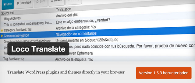
Until now, the plugin “CodeStyling Localization” was the measure of all things concerning the translation of WordPress themes or plugins. Unfortunately, the plugin will not be developed any further and can not be received from the WordPress plugin index. Finding a suitable replacement is not easy. I more or less randomly found the plugin “Loco Translate” and was positively surprised. It is easy to use and cleanly designed. It convinced me enough to make me want to introduce you to this plugin in detail.

The Loco Translate Plugin

The plugin supports the translation of themes and plugins directly from within the WordPress admin interface. It also offers support for PO features, comments, references, and plural forms. Configurable PO file backups are also possible.

  • Developer: Tim Whitlock
  • Actively developed: Yes
  • Latest Version from: 24th of July 2015
  • Cost: free, downloadable via WordPress.org
  • License: GNU GENERAL PUBLIC LICENSE
  • Unwanted effects in conjunction with other plugins: none known
  • Developer Homepage: not available
  • Download on WordPress.org

Loco Translate: It’s Really This Simple

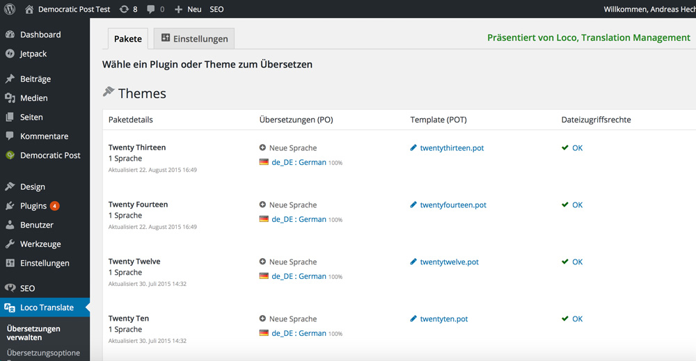
After the installation of the plugin, there is a new main menu button entitled “Loco Translate”. There, you will find a page that lists up all your installed plugins and themes as well as their respective translations. There is also a page with settings for the plugin. However, the settings can be ignored, as none are necessary.

Loco Translate

This main overview also shows you if the data access rights are sufficient to generate translations. When you don’t see a green check, you should directly set the required rights on your server or web hosting package via an (S)FTP program.

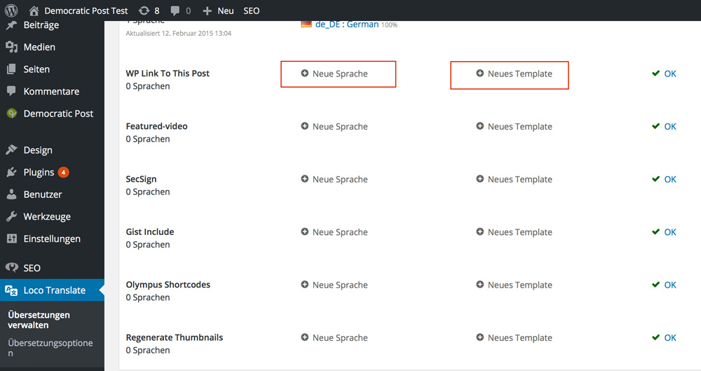
On the main menu, you can see the installed themes in the top area. Below that, you’ll see the installed plugins. Any plugin or theme displaying the options “New Language” and “New Template” is not prepared for translation. That means that there is no code within the plugin that can be translated. In these cases, you need to edit the code to prepare translations beforehand.

Loco Translate

Translating a WordPress Plugin or Theme

Now, scroll down the main overview until you find the theme or plugin that you want to localize. You have the option to optimize a poor translation or to add another language altogether.

The big advantage of Loco Translate is that no theme data has to be read like it was the case with CodeStyling Localization. Clicking the respective language file or the link “New Language” is enough.

To correct an insufficient translation just click the language data that you want to fix.

Loco Translate: Optimize a Translation

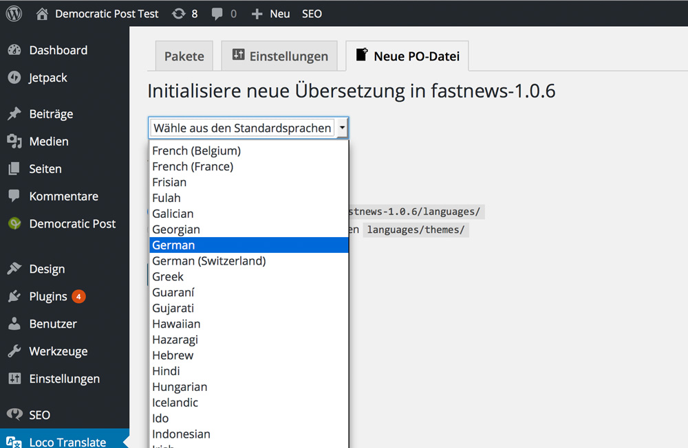
A new language can be added quickly via the link “New Language.” The following screen will appear:

Loco Translate: Choose Language

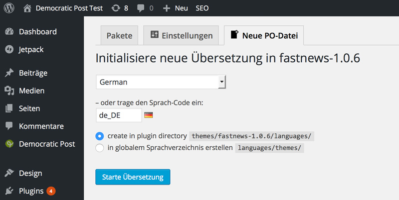
Loco Translate: Start the Translation

Should you know the correct language code, you can also directly enter it. In this example, the code is “de_DE” for an intended translation to German.

Starting a Translation

After clicking the button “Start Translation”, you are immediately good to go.

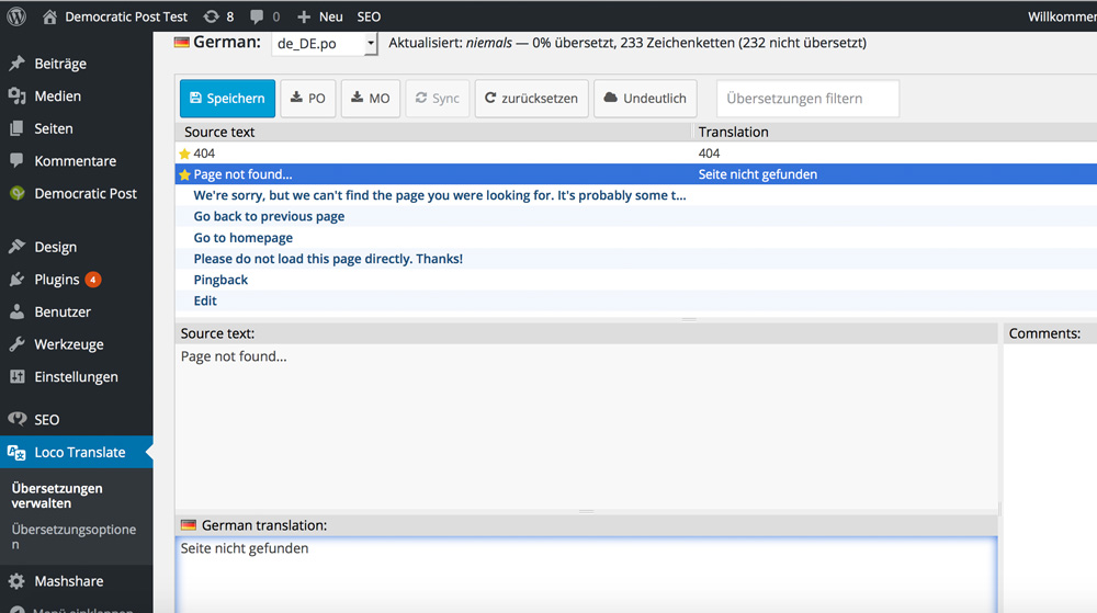
Loco Translate: Translation Screen

In the upper box, you find the original texts and in the lower box you enter the translation. Already translated passages are marked with a star in front of the original text.

When you’re done translating, just click the button “Save” from the top menu.

Loco Translate: Save the Results

Now you will see a green message, saying that the PO file has been saved, and the MO file has been compiled. The theme or plugin is now translated, which you can easily prove by accessing your website.

Conclusion

The looks of the translation page could use some work. I would prefer if the windows were not underneath but next to each other. Maybe this will be done in the future. Other than that, Loco Translate is a plugin that is much easier to use than CodeStyling Localization or just about any other tool ever was. Loco Translate is thought-through and simple. I wholeheartedly recommend it!

(dpe)

Categories: Others Tags:

Design Trends To Look For In 2016 (In The Form of Gifs!)

November 26th, 2015 No comments
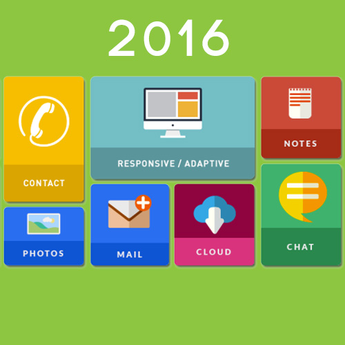
2016-design-trends

Design trends are developing in an exceptional speed and will continue to grow into the next year, with the increasing demands of the user. Here are a couple trends to keep in minds for a simple and worthwhile user-experience.

Scrolling above clicking: the user today views all but buys selectively. Since the concept using a scroll bar is obsolete, and people can just use their thumb, we should expect more websites to adopt scrolling first and clicking second.

scrolling

The fold is literally dead: since scrolling has become way easier, web designers now have the opportunity to do what magazines have been doing for ages, full-screen image image titles with no text/links visible until one scrolls down.

the-fold

Animation is back again: with the internet speed improving considerably, GIF’s and flash animations has become really popular. Since a flat design can look pretty monotonous, animation can help a website to stand out from the rest, and also pack more information into little space.

animation

CSS shapes: CSS shapes allow a designer to flow his/her layout into shapes like a circle. The outcome looks really cool, but as of yet, it is not supported by all browsers.

animation

When you are looking for ways to increase your call volume and inside the door traffic, that is both cost effective and also promises to be a long-term strategy, hiring an SEO agency in Syracuse is the perfect remedy. Creating the kind SEO results you want for your business isn’t difficult, but it definitely is time-consuming, and that is where an SEO agency in Syracuse can help your business.

Read More at Design Trends To Look For In 2016 (In The Form of Gifs!)

Categories: Designing, Others Tags:

Building effective web design teams

November 25th, 2015 No comments

When you are just starting out in a web development business, it can be really tempting to try to handle most (if not all) of the work entirely by yourself. It’s not hard to understand the logic: the more of the work you complete personally, the more of the profits you get to keep, right?

But there’s a side to this approach that many new entrants to the industry overlook when they decide to start up an independent business instead of joining an established agency: if you do most of the work yourself, you may end up spending nearly all your time working. Inevitably this means late nights, gallons of cola and countless home-delivered pizzas. You end up with red eyes, bad skin and a swollen belly…hardly what you envisioned when you first decided to go into business!

You also probably won’t make nearly as much money, because if you are immersed in code and dealing with customer problems and follow-up work, you can’t devote as much energy to generating new customer leads. Before you know it, many of these solo flyers are burnt out and nearly broke.

Fortunately it doesn’t have to come to that, because if you can see the wisdom of team-building, delegation, and sharing wealth for mutual benefit, then you’ve already improved your odds of success. There’s just one last thing standing in your way… you have to find the right people to work with.

Building a team: you need people with skills!

A good web development project nearly always has the following necessary roles:

  • Sales person – helps generate new customers for the business
  • Project architect – develops the overall concept of the project (not the design)
  • Project manager – manages the project and keeps everything on track
  • Site designer – designs the look and functionality of the site
  • Back-end developer – creates the framework the site interface will be placed on
  • Front-end developer – creates and implements interface components
  • Site tester – ideally does everything possible to try and break the site until it can be broken no more.

just because you are building a team does not mean that nobody can multi-task

In addition to the core roles listed above, there is sometimes a need for specialists:

  • UI specialist – works with front end developers to make more awesome interfaces
  • UX specialist – extensively examines the human factors of a site to ensure a good user experience
  • SEO specialist – determines (and possibly implements) an SEO strategy
  • Content writer – provides high quality text content
  • Graphic designer – creates custom graphics

Let me be clear that just because you are building a team does not mean that nobody can multi-task. So the team you put together does not necessarily have to be large, and in fact there can be disadvantages to having a team that’s too big.

Generally speaking, the larger and more important a project is, the more specialized your team needs to be. Smaller and less important projects allow more scope for individuals to perform multiple roles in the development process.

Who does what?

The first logical step is to determine your own role in the team.You may be tempted at this stage, since you’re the business owner, to automatically assume you should also be the project architect and project manager, since the names of those roles implies leadership.

Never let your ego get in the way of good business decisions

But stop and think for a moment… is this your strength? If you see yourself as more of a coder or an illustrator, then it may be wise to consider delegating the management roles to somebody with more experience or ability in those roles and taking responsibility for the area of expertise where you are strongest. Never let your ego get in the way of good business decisions.

Now you come to the fun part, which is also by far the most difficult part.It is time to select your co-workers. The first thing to know about this is that it’s usually better to maintain a permanent core team who perform the same roles in each project, and when necessary you can consider bringing in additional freelance workers on a temporary basis to fill special needs of a project.

If you have to mess around building new teams for every project, you’ll waste more time and spend more money, and occasionally you’ll get disappointing results. You could even lose clients. So find people that you like and trust, and make them a permanent part of your team.

Finding good team members

The mistake that many people make when hiring is to define lists of skills that are too complex and too restrictive. Sometimes hiring managers don’t even understand the role. For example, here are the requirements listed for a recently advertised front-end developer role:

  • Minimum 3 years experience in PHP development
  • Minimum 3 years experience in SQL/MySQL
  • Proficient in WordPress, custom themes, plugins, widgets, HTML, CSS, JS, JQuery.
  • Understand basic Unix CLI
  • Experience working with GIT
  • Experience with unit testing and QA
  • Strong knowledge of Unix Administration
  • Good knowledge of UI design
  • Experience with Agile Scrum methodology (essential)
  • Strong documentation skills
  • Experience in email marketing, SEO, and Social Media

If you can’t see the problems with the above, then you are part of the problem. Very few of the skills listed as required skills have anything to do with front-end development. Most of the skills are back-end, administration, and marketing skills. It absolutely does not make sense to require these skills for a front-end developer, and you may lose quality candidates by making such a restrictive list.

Another thing you need to know is that the requirement for familiarity with agile methodology is also ridiculous. Agile development is effective in software development where the projects are large and require months of high-level investment. Web projects are completely different and it’s just a straight-out waste of money to use agile methods in most web development environments as you’ll need to hire extra coders that you don’t really require.

A much better way to advertise for a front-end developer would be to simply specify:

  • Ability to write custom JavaScript code
  • Familiarity with CSS
  • Ability to think on your feet

During the interview process, focus mainly on the third factor, because it is far more important to the success of your projects than any amount of coding ability. You have to assume that anyone who can write quality custom JavaScript has the ability to look up how to do anything that needs to be done in some other more obscure language. Don’t list the obscure development language as a required skill, because you’ll miss getting a top-notch JavaScript programmer, which is more vital to your business.

Grow your team and your business at a sustainable rate

Most small development agencies should be able to fill all the required core roles with just 3 or 4 staff, appointing freelancers where necessary. As your business grows, you should start to think about narrowing down the tasks that each person has to cover and creating a bigger team.

Try to avoid developing a corporate hierarchy and culture. That kind of thing is what leads to the stagnation and failure of creative businesses; with an hierarchical structure, you get competition between your staff, you get people being promoted up to their level of incompetence, and you get divisiveness.

What you really want is everyone having equality within the organization, no major differences in pay between people with different roles, and everyone feeling like they make a valuable contribution to the success of the team. In this way you can ensure you have an effective development team who will grow your business and expand your portfolio more quickly.

Featured image, teamwork image via Shutterstock.

Award-Winning Adriane Text Font Family – only $15!

Source

Categories: Designing, Others Tags:

Web Designers, Are You Seeking or Setting A Trend?

November 25th, 2015 No comments
Trends

Web design is a process of conceptualizing and planning, using a set of HTML codes and JavaScript, to determine the layout, colours, style of text, images, graphic designs etc. Basically it is creating the structure of a web page.

Current web design trends include:

Video backgrounds: major non-banking virtual wallets like like PayPal and Squarespace (theirs is seriously great!) are making this switch. It is an innovation that can bid farewell to the image slider concept forever. However, the background video shouldn’t keep the customer or people visiting the web page, waiting. If the buffer is not instant, people will avoid visiting the site.

Grid layout: Pinterest’s grid layouts have certainly given web designers some inspiration. Businesses selling multiple products can use this idea, for a better user/customer experience. The idea is to make the users view each product one-by-one in an organised and logical way.

Grid layout

Large images and fonts: users today are extremely visually oriented. They would prefer a website with a simple and clear layout any day for their online transactions. Larger images and icons, and clear-cut fonts which are easier to read do not appear “greek” to the eyes of the customer, are always favoured. Banners and ads are to be avoided. ESPN is a good example.

Ghost buttons: the idea of ghost buttons can simply be explained by the display of “JARVIS” inside Tony Stark’s IronMan mask. This design element was made conventional by Apple in their IOS7. Ghost buttons are applicable when the only action needed to be performed is the one that this button offers. This is a partly futuristic design that offers a brilliant user experience. An example is that of the mobile app “XENDER”, used for wireless file transfer that has captured a major portion of the market, in spite of minimal marketing.

Gohst Buttons

Design trends have become exceptionally advanced and continue to grow in its sphere, with the increasing demands of the user for a simple and worthwhile user-experience. Search Engine Optimization is important to outrank your competitors in the business.

When you are looking for ways to increase your call volume and inside the door traffic, that is both cost effective and also promises to be a long-term strategy, hiring an SEO agency in Syracuse is the perfect remedy. Creating the kind SEO results you want for your business isn’t difficult, but it definitely is time consuming, and that is where an SEO agency in Syracuse can help your business.

<a target="_blank" href="http://Designed%20by%20Freepik” target=”_blank”>Image Credit FreePic

Read More at Web Designers, Are You Seeking or Setting A Trend?

Categories: Designing, Others Tags:

Design Inspiration: Data & Dashboard UI Design

November 25th, 2015 No comments
Data-Visual-UI

The increasing popularity of wearable technology like the Apple Watch, and activity trackers, think Fitbit and UP by Jawbone, has us thinking about design in a whole different way. These devices all make data readily available to wearers of the technology and with that comes a whole new opportunity for designing data.

This goes beyond numbers and charts. Designing data and dashboards, for mobile apps and desktops, requires a unique creative approach and visual discipline. The solution lies between representing the data in a way it can be best visualized and understood by the user, but also user-friendly, appealing and even interactive. A great execution of data visualization allows users to focus on a specific measure of data or the overall big picture.

Below are some examples of some beautifully represented data dashboards and UI Design.

To-Do Dashboard
by
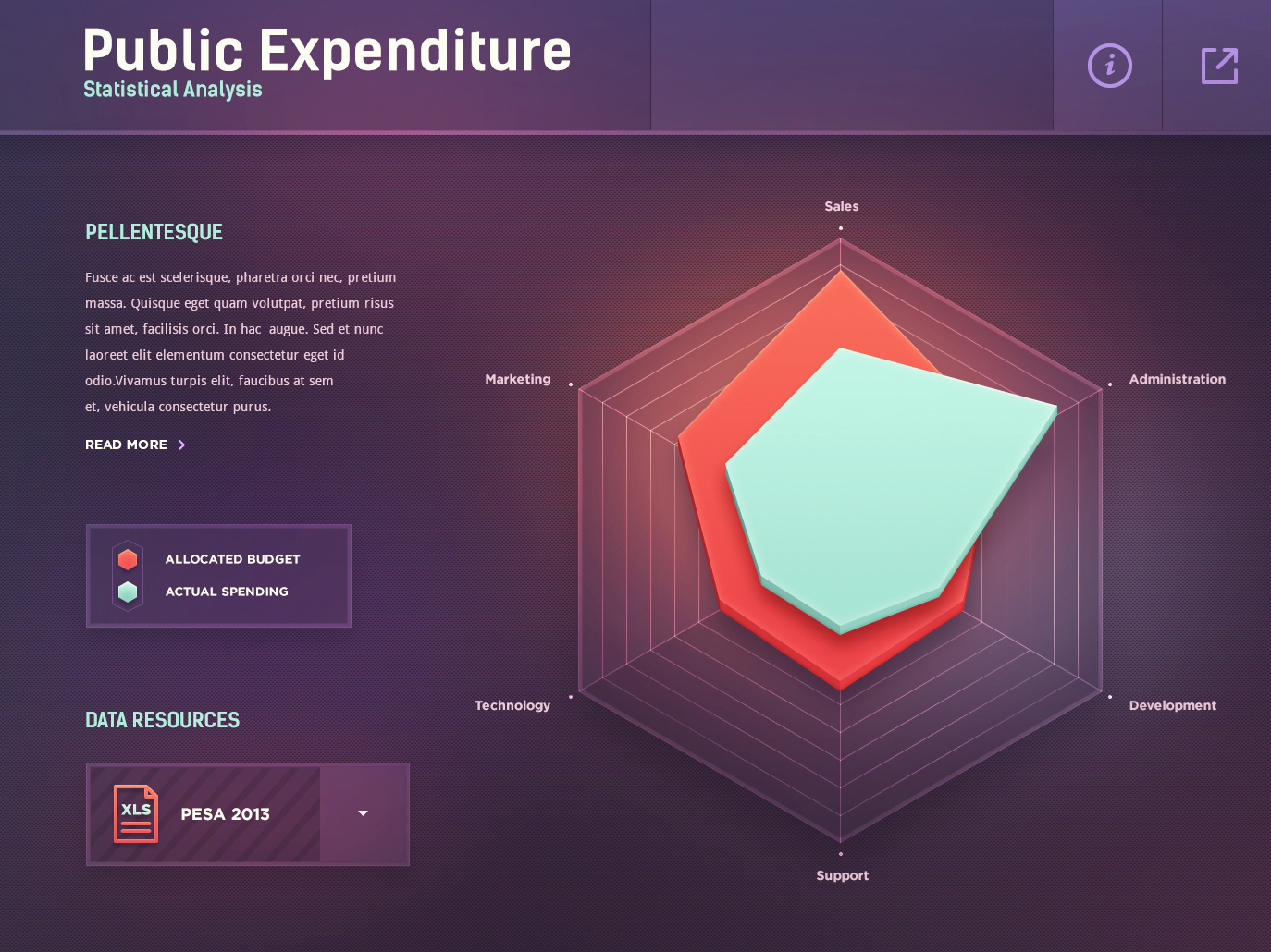
Statistics (radar chart)
by Mike | Creative Mints
Statistical_Analysis

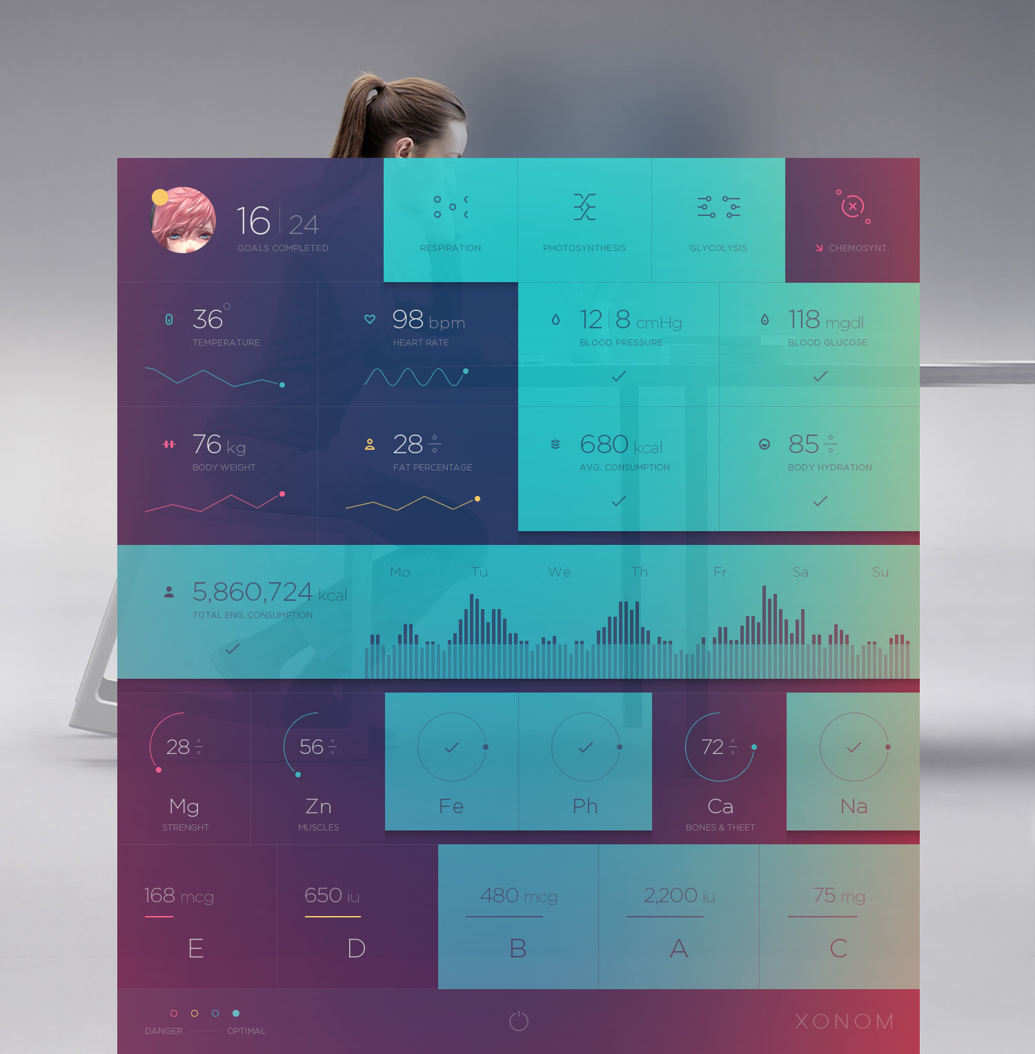
Xonom
by Cosmin Capitanu
Xonom-

Infographic Agro Chart Illustration (data visualization)
by Anton Egorov
Infographic Agro Chart

Training Application Marketing Site
by Sam Thibault for Handsome
Training Application Marketing Site

Medical App Design
by Ramotion
Medical-App-UI

Nest Control Concept
by ? Sam Thibault ?
for Handsome
nest

Read More at Design Inspiration: Data & Dashboard UI Design

Categories: Designing, Others Tags: