Archive

Archive for May, 2016

Free Download: 30 PSD Mock-ups

May 6th, 2016 No comments

It’s always easier to sell a design to clients when you can present the artwork in context. Anything that helps a client visualize your solution to their design conundrum can only help translate pitches into paying clients, as well as help secure client sign-off.

So we’re delighted that SmartyBundles have supplied these 30 new PSD Mock-ups for WebdesignerDepot readers, free for personal and commercial projects. They’re an ideal way to present branding, and cover art projects to clients on books, boxes, and packs.

All files are delivered in layered PSDs, and each file uses Smart Objects, so you can easily insert your own artwork and see it scaled and positioned automatically. What’s more, you can seamlessly adjust the colors and text in the mock-ups.

The download includes simple to follow instructions, and a link to an instructional video, so you’ll be up and running in no time.

Download the files below the previews:

Please enter your email address below and click the download button. The download link will be sent to you by email, or if you have already subscribed, the download will begin immediately.

The Creative Bundle: Textures, Patterns, Photos and more – only $27!

Source

Categories: Designing, Others Tags:

Web Development Reading List #136: Design Usability, Meaningful CSS And Project Include

May 6th, 2016 No comments

The past week showed yet again how fractured opinions in our industry can be and that to some problems there’s definitely more than just one answer, or we still have to figure out what the proper way is in the end. This is why talking about technical problems matters, and this should certainly be done from time to time with your colleagues.

Web Development Reading List #136: Design Usability, Meaningful CSS And Project Include

We all know that by sharing and talking to other people, our jobs get more interesting. So, let’s work together more instead of on our own — that would be my advice.

The post Web Development Reading List #136: Design Usability, Meaningful CSS And Project Include appeared first on Smashing Magazine.

Categories: Others Tags:

On Design Systems: Sell The Output, Not The Workflow

May 5th, 2016 No comments

So how do you sell a design system to the client? How do you establish a shared commitment within the company to put a pattern library on the roadmap? As designers and developers, we often know and see the benefits of an overarching system that radiates consistency throughout the different experiences of a company. But sometimes it’s seen as a very unpredictable investment, and the value isn’t necessarily visible right away.

You can illustrate how fractured an organization is by printing out its different presences online and putting them on a large board. Credit: Dan Mall

In his article on Selling Design Systems, Dan Mall suggests to illustrate how fractured an organization is by printing out its different presences online and putting them on a large board as an example of all the wasted money and effort that goes into making sites from scratch, one-by-one, needlessly reinventing the wheel every time.

The post On Design Systems: Sell The Output, Not The Workflow appeared first on Smashing Magazine.

Categories: Others Tags:

The Advice For Going Freelance Is Very Consistent

May 5th, 2016 No comments

I caught wind of a friend making the transition from in-house designer to freelancer or proprietor of a small design studio and looking for advice. I’ve never truly done the freelance thing, so I outsourced the advice thing to y’all on Twitter. It’s surprising how consistent the advice is, when distilled.

Save money

Having savings and being careful about maintaining and growing it is a big theme. I imagine it’s a cashflow thing. Times can be fat. Times can be lean. Savings will get you through the lean times.

@chriscoyier save your money.

— allan branch (@allanbranch) May 5, 2016

@chriscoyier have an emergency fund so you aren’t quite so worried about cash flow at the beginning.

— Susan Robertson (@susanjrobertson) May 5, 2016

@chriscoyier have 6 months expenses saved. Gives you time to establish a pipeline or find another job

— Timothy B. Smith (@ttimsmith) May 5, 2016

Charge more money

@chriscoyier double your rate

— Stuart Robson (@StuRobson) May 5, 2016

@chriscoyier double your rate and say “no” a lot.

— Greg Smith (@elmnt) May 5, 2016

@chriscoyier I’d urge them to resist the urge to under-price themselves in the hopes of generating a customer base and word of mouth.

— Douglas Hensel (@DougHensel) May 5, 2016

@chriscoyier charge more than you think and set and working hours.

— Anisha Giri-O (@anishagirio) May 5, 2016

@chriscoyier Charge an amount you feel is slightly ridiculous and learn to pick and choose your work. Remember to leave the house too!

— Stefanie Young (@Ninzaburoz) May 5, 2016

Do networking and build relationships

@chriscoyier Always be ready with a few words about what you do, just did, want to do next. So much work comes word-of-mouth.

— Erica Heinz (@ericaheinz) May 5, 2016

@mds @chriscoyier +1000. Always be networking. Send work you can’t do to other freelancers – it will come back to you. Blog.

— allanwhite (@allanwhite) May 5, 2016

@chriscoyier get an accountant. a lot time for networking to get new jobs organically, and schedule that in

— Stacey Mulcahy (@bitchwhocodes) May 5, 2016

@chriscoyier Networking, form bonds, work hard and make the move slowly!

— Ben! (@oBKSo) May 5, 2016

@chriscoyier Build and maintain good relationships. Don’t burn bridges. Be patient.

— Sara Soueidan (@SaraSoueidan) May 5, 2016

@chriscoyier Tell everyone you know that you’re looking for work. It’s tough to get gigs when no one knows you’re available.

— Dave Dawson (@davedawson) May 5, 2016

Get an accountant and think about taxes

@chriscoyier get an accountant. a lot time for networking to get new jobs organically, and schedule that in

— Stacey Mulcahy (@bitchwhocodes) May 5, 2016

@chriscoyier Get an accountant very early on. They will save you thousands in learning curve mistakes. The hustle is worth the freedom.

— Mike McAlister (@mikemcalister) May 5, 2016

@chriscoyier plan on a LOT more taxes and $ health insurance… And gray hair.

— Tory Moore (@electrodivanyc) May 5, 2016

@chriscoyier Be intentional about hanging with creatives. Charge enough to pay your taxes. And pay your taxes.

— Mike Rapp (@mikerapp) May 5, 2016

Build clients while it’s not risky

@chriscoyier stay in-house & moonlight if it’s not against your contract. Save lots, network EFFECTIVELY lots. Know your habits & strengths

— ? Dino Quarin ? (@Dino_Quarin) May 5, 2016

@chriscoyier: start doing side work while you’re employed full-time so you work out some kinks of running a biz while risk is low.

— Dan Mall (@danielmall) May 5, 2016

Know that “design” is only part of the job

@chriscoyier You’ll probably be spending most of your time doing non-design things.

— Kevin Crafts (@kevincrafts) May 5, 2016

@chriscoyier Don’t underestimate the amount of time you’ll spend managing your business, marketing, sales, prospecting, quoting, etc.

— Davy Wong (@nydavo) May 5, 2016

Wear Pants Sometimes

@chriscoyier don’t forget to wear pants some days!

— gold (@jongold) May 5, 2016

@chriscoyier don’t forget to wear pants once in a while.

— Catrina (@SoNotKidding) May 5, 2016

@chriscoyier make sure you get dressed everyday

— ReactJS Wisconsin (@reactjswi) May 5, 2016

@chriscoyier Be nice. Be connected. Do agency quality work for less than an agency would cost (2-3x your current rate). Wear sweat pants.

— Cory Shaw (@coryshaw) May 5, 2016

More

@chriscoyier Saying no to iffy projects means more availability to say yes to solid projects

— Dave DeSandro (@desandro) May 5, 2016

@chriscoyier always outline expectations and project scope before you start any work. A contract can be your friend. #freelance

— Sarah Binion (@SrhBinion) May 5, 2016

@chriscoyier Find some way of distinguishing between work/life. Never work in a room that’s not your office. Define work hours.

— Ben Hudson (@BennyHudson) May 5, 2016

@chriscoyier Find some way of distinguishing between work/life. Never work in a room that’s not your office. Define work hours.

— Ben Hudson (@BennyHudson) May 5, 2016

Suggested Reading


The Advice For Going Freelance Is Very Consistent is a post from CSS-Tricks

Categories: Designing, Others Tags:

Web Fonts for President 2016

May 5th, 2016 No comments

Zach Leatherman digs under the cover of the presidential candidates’ websites and reveals that font loading is a nuanced and complicated business:

Using a web font service doesn’t necessarily mean that your web site will use best practices. We must be knowledgeable about the internals of the tools we use in order to best utilize them to our advantage. At the end of the day if you don’t want to put any effort into it, it’s safer to use TypeKit.

Direct Link to ArticlePermalink


Web Fonts for President 2016 is a post from CSS-Tricks

Categories: Designing, Others Tags:

Top Reasons For Opting For PSD To HTML Conversion

May 5th, 2016 No comments
Reasons to Convert psd to html

With responsive design becoming the latest trend setter, the entire web development industry is looking for ways to come up with websites that are cross-browser compatible. This calls for the requirement of PSD to HTML Conversion because it permits a website to get accessible on all major devices and screens. The primary reason for converting a PSD file into HTML is allowing it to get browsed on all devices and screen sizes. The initial process of designing a website starts with the creation of a simple design for a web page in a program like Photoshop. When that design gets approved, the designer is asked to convert that particular PSD into a live web page with HTML, CSS, JavaScript, and jQuery. The entire process takes time but then it definitely yields great advantages for your business in the long run. The overall conversion process requires the thorough understanding of front-end development to design sites with clean navigation, quick loading speed, and enhanced usability.

Top reasons for opting for PSD to HTML have been discussed below. Let’s take a quick look-

psd to html

Compatibility across all different browsers and screen sizes

Compatibility across all different browsers and screen sizes

PSD to HTML Conversion is a prominent choice in most of the cases because it allows designing websites which are responsive and can adjust to the varying screen sizes of smartphone, tablets, and PCs. Apart from making a website device-compatible, it also offers seamless compatibility across different browsers. By supporting compatibility with different browsers like Chrome, Mozilla, it allows reaching out a maximum number of consumers online.

For Designing Websites Which Ensure Faster Loading

Faster Loading speed

The implementation of standard designing practices is involved in designing websites which load fast. Proper optimization by size and quality helps the page load progressively. Similarly, placing the stylesheets at the top and scripts at the bottom help the browser display content properly, thereby improving the user experience. The conversion from PSD to HTML allows using optimized images and animations, which makes the web pages light weighted to get browsed easily. By adding to the usability of your website, it provides a good layout with easier navigation which makes website attractive for the users. The increased number of visitors coming back to your site will definitely increase the page views.

Seamless Coding

Seamless Coding

From the slicing of images which are in PSD format to ensuring that the images are suitable for web display, the whole process is made easy. It ensures smooth validation of the standards set by World Wide Web Consortium (W3C) when coding, slicing, designing, or marking up the website. This is because the validation process relies on HTML as well as links and cascading sheets. Semantic coding in HTML provides the error-free websites. With the use of semantic coding, it becomes easy to locate errors, maintain the script with the help of pre-defined tag, and removing error. Secondly, it becomes easy to position elements of the site.

Strengthens Online Visibility

While promoting any brand online, business owners crave for online visibility on major search engines. PSD to HTML Conversion services help in achieving this by driving traffic to your website. HTML coding has got terrific features which allow it to get easily recognized by search engine robots; while this is not the case with PSD. Therefore, one needs to convert PSD to HTML.

Earns Brand Identity

Brand Identity

One of the flawless ways to increase brand reputation is converting from PSD to HTML. The conversion practices help in designing a website which gives identity that is unique to your business. You get to incorporate a design which provides a professional look while standing out from competitors.

Creation of Responsive Websites

Creation of Responsive Websites

Conversion from PSD to HTML makes a website load easily on any device, be it a smartphone, desktop, or tablet. This offers ease of accessing a site on the platform of user’s choice, thereby increasing the visibility.

Enhanced Website Quality and User Experience- PSD to HTML conversion marks an enhanced user experience and this is possible because it provides a premium look that offers superior quality of user experience.

Convenient Implementation of Dynamic Functionality- Technology is quite responsive to advanced changes, be it animation, instant commenting, parallax scrolling, online shopping, and lots more. With PSD, you can design static sites which are unable to perform dynamic functions. With HTML, deploying dynamic model is very easy that’s why PSD to HTML conversion is preferred by website owners and bloggers.

Table Less Website Design- If you intent to improve search engine rankings for your website, then CSS Table less design will help your cause. CSS Table less designs result in smaller web page file size, reduced code content ratio, elimination of “junk” HTML markup that many table-based web editors use. This makes it easier for search engines crawlers to crawl through your website and result in favorable search engine rankings.

Easy Integration With CMS of your choice- Websites can be easily sustained and managed by converting them from PSD to HTML. Further, they can also be integrated with any popular CMS.

Conclusion

conclusion

The above-mentioned reasons clearly suggest that having converted your website from PSD to HTML ensures cross-browser compatibility for brand awareness, increased load speed for maximum page visits and an ultimate brand reputation. So, if you are looking forward to enriching business communications with the advanced set of features, go for PSD to HTML Conversion.

Author Bio-

Nola Arney, having several years of expertise in designing responsive websites, is working as a senior HTML Developer at HTMLPanda .She is having resourceful knowledge on converting websites from PSD to HTML. She loves to share the same by writing articles and blogs on well-researched topics. Her blogs are written for the sake of enhancing readership and providing knowledge to the users.

Read More at Top Reasons For Opting For PSD To HTML Conversion

Categories: Designing, Others Tags:

Reading minds: the psychology behind UX design

May 5th, 2016 No comments

If we were to gather a hundred different designers into one room and ask them one-by-one how they approach UX design, we would get approximately one hundred different answers. It’s frightening to admit, but UX design isn’t an exact science.

There’s a wealth of psychology behind every element of the user experience, but knowing these elements, we can use them to create experiences that drive specific user behaviors. Today I will show you how to utilize this information to better your design and your results.

Before we can try to alter or modify user behavior, we first have to understand what makes them tick. To do this, we will start by looking at UX from a psychologist’s perspective. Specifically, we’ll look at common techniques used to appeal to the limitations and desires of our users.

1) Time and effort

When given a task, people will always do the least amount of work needed to accomplish their goals. When approaching simplicity in UX design, we must utilize progressive disclosure. This is the practice of giving users just enough information to entice them, and offering them the option for more.

The same goes with product details and features. Only show users what they need to see, otherwise you risk overwhelming them with too much information at once. Furthermore, you should always make your text easy to scan by using headers, bullet points, and short paragraphs (3-4 lines) to make your content easily digestible.

Don’t ask your users to multitask either. Most people can’t drive and talk on the phone at the same time without risking a crash, as research has defined. Don’t ask your users to do the equivalent on your website.

The key takeaway here is this: Don’t waste the time or energy of your users. Provide them with clear and concise pathways through your website. This is one of the key lessons from Steve Krug’s book, Don’t Make Me Think: A Common Sense Approach to Web Usability.

2) Social proof

The second key pillar of the user experience is the social proof that we use in our designs to trigger psychological motivations. Social proof is defined by as a phenomenon where people reference the behavior of others to guide their own actions.

A perfect example of this in our daily lives is the reaction people have when a new product or smartphone is released. As people begin to line up and make camp outside major stores, others will join them as the perceived value of the product continues to rise based on social proof.

Online we have different ways of utilizing social proof to encourage a specific behavioral response. For example, many websites will seek to build quality backlinks which act as recommendations from other sites, thus providing social proof from authoritative figures online. It’s a remarkably effective strategy, as shown in this link building case study. Here are some other examples:

a) User reviews

Providing user reviews like the ones shown below will influence new buyers who are looking at the product. Positive reviews will help convince the prospect that they will also like the product. Even negative reviews are helpful as well. They add further validation to the positive ones.

b) Behavioral social filters

Showcasing other products with a message such as “Customers who viewed this also bought…” provides further social proof by giving prospective customers personalized examples that other people with their interests looked at.

c) Like-minded opinions

A unique feature on Etsy allows users to say that they “admire” an item so that other people can see who also had an interest in the product they’re looking at. This reinforces their own interest in the product and taps into the scarcity principle by adding urgency knowing that others are viewing the same item in limited quantities.

3) Visual and unconscious processing

The last pillar is the aspect of our psychology that involves subconscious processing and visual interpretation of information. Since most mental processing occurs unconsciously, you can use that to trigger different aspects of your users’ emotions or actions.

From a basic standpoint, this involves using pictures and stories to trigger the emotional parts of a user’s brain. Emotions play a large part in decision making, so we can use this to alter user behavior.

Moving into the visual aspect of UX design, we can apply basic principles like font size, color patterns, and grouping to organize the visual information on a page. By looking at eye-tracking studies, we can deduce a few important lessons about visual processing in the context of UX design:

  • Don’t let visual “dead weight” hog your web pages
  • Videos tend to attract more attention than text or pictures
  • Faces of women and babies attract attention from visitors
  • People read web pages in an F-shaped pattern

Taking all of the psychological information into account, it’s time to put it into an actionable approach to UX design that drives desired behaviors.

Driving user behavior through UX design

We have a ton of information now that we can use to educate elements of our UX design, but how do we apply it to direct our user’s behavior to our ultimate goals? The answer lies in the Fogg Behavior Model:

This model dictates that three specific elements must occur at once for a behavior to trigger. Those elements are the following:

  • Motivation
  • Ability
  • Trigger

By taking these three elements into account, web designers can find out what’s holding back users from taking the actions they want. If you want people to write a review, but it’s not happening, you can use this model to see which of these three psychological triggers isn’t present in your design.

The first element can be further broken down into extrinsic and intrinsic types of motivation. The the first case, we’re referring to external factors that can motivate someone, such as a physical reward like money or a free gift.

Intrinsic factors are internal and represent things like enjoyment or satisfaction. There is, of course, the problem that in many cases what you’re asking your users to do is something they don’t typically enjoying doing, so how do we get around that?

The answer is simple: Provide them with a reward or incentive to complete the process. A great example is the Pact app, which is a fitness app that offers monetary rewards for reaching health goals. Since many people don’t particularly enjoy working out, this incentive gives them the drive to do so.

One thing we need to be cautious of, is the overjustification effect, which is what happens when you reward someone for something they already enjoy doing. In this case, when you remove the reward, they perform the activity less and less.

A website called Freeletics combats this in the realm of fitness by promoting high-intensity workouts that require a basic level of fitness to complete. Users who are already at a basic level will gain some enjoyment out of exercising, so this limits the aforementioned effects.

The extrinsic award here is composed of stars that are earned based on performance. They only receive the award if they do the task and do it well.

That would be an example of motivation, but how do we combine this with ability and triggers?

Combining the 3 triggers

Motivation alone is not enough to create behaviors. You may be entirely motivated to go fishing, but if you don’t have a fishing pole, bait, and a boat, you cannot do it. This is where things become specific to your audience more so than before.

In our example, the person would need motivation to go fishing in the form of a reward or because they like it, but they would also require supplies and a trigger to complete Fogg’s model. According to the model, behaviors will only occur if the motivation and ability are sufficiently high, and the trigger is used to initiate the action.

Of course, simply having these three factors in place isn’t enough. What motivates one person may do nothing for another. It is here that we must understand what motivates our audience if we truly wish to initiate certain behaviors. Deep and detailed research into your audience is required here. You must understand what motivates them from an intrinsic or extrinsic standpoint and use that to create a user experience design that taps into their desires.

Things like customer experience maps, buyer personas, and user journeys are all great tools to help you understand your buyers beyond simple things like age, zip code, and gender.

Here’s the bottom line

Users are motivated by different things. You need to let them see and use your product or at the very least, follow them through the processes you want them to complete. Find and remove barriers between them and your goal, and seek to understand their motivations so you can provide them with the ability and the trigger to create new behaviors.

In a nutshell, UX design is about using human psychology to get inside your user’s heads and find out what makes them tick. It provides us with insight that we can use to motivate and trigger behaviors that lead them to our common goal.

LAST DAY: Make Vintage Comics with The Retro Comic Book Tool Kit – only $7!

Source

Categories: Designing, Others Tags:

Freebie: Musical Instruments Icons (39 Icons, SVG, PNG)

May 5th, 2016 No comments

Music plays an important part in all cultures and comes in many forms. It’s a great way to stimulate our thinking and our creativity, and music instruments often even support therapy and healing.

Freebie: Music Instrument icons (39 icons PNG, SVG)

Designed by the team behind IconCrafts, this music instrument icon set is dedicated to all music lovers. It consists of 39 carefully crafted vector icons. All icons are available as 48, 64 and 128px PNG (+ @2x 256px versions + sprites), as well as SVG files. Five different styles are available.

The post Freebie: Musical Instruments Icons (39 Icons, SVG, PNG) appeared first on Smashing Magazine.

Categories: Others Tags:

Combining Typefaces Made Easy (Free eBook)

May 5th, 2016 No comments
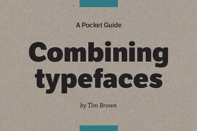
Combining Typefaces

Since the introduction of web fonts, the undivided variety of typography is available to web designers and their projects. However, combining the right fonts is easier said than done. The free ebook “Combining Typefaces” helps you find fonts that fit together nicely. So, which fonts suit my web layout and which fonts harmonize with each other? The ebook answers this and other questions on over 60 pages.

Introduction to the Basics of Typography

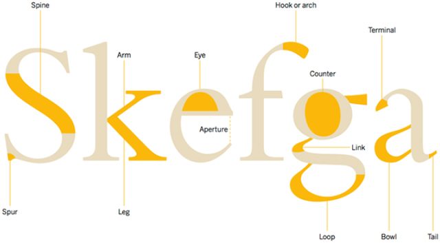
Everyone that wants to first read the basics will find a lot of general information on font and typography in the first chapter of “Combining Typefaces.” The chapter gives the reader an overview of the anatomy of letters, meaning that, among other things, it explains ascenders, descenders, and serifs. Foreign readers can learn the English expressions in this chapter. The ebook is written in English.

Combining Typefaces
Anatomy of the Letters

Whenever it gets very specific, the book refers to websites and books that allow you to deepen your knowledge. The classification of fonts – meaning the stylistic and historical placement of fonts – is only mentioned briefly. There are references to further literature on the topic, however.

Choosing and Combining Typefaces

The rest of the chapters deals with the actual issue. Which criteria should you follow when choosing one or multiple fonts? What do you want to achieve with the typography? There are many factors that play a major role when picking a font. For one, there’s the readability. Fonts can also be chosen and applied to attract the reader’s attention, however.

The book’s primary emphasis, the combination of fonts, is explained in a very detailed way. That’s because the combination of appropriate and harmonic fonts is not always easy. Those that would rather stay on the safe side stay within one font family and, for instance, combine a font without serifs with a serif font of the same family.

The ebook also gives a lot of useful advice on how to find fonts that suit each other outside of one font family. For example, it is helpful first to decide on one “anchor font,” the font that you will use for text blocks and is thus used for the majority of your texts.

Combining Typefaces
Comparing Fonts

You should choose a suitable font for the anchor font, which is used for headers, for example. Here, “Combining Typefaces” presents some criteria to keep in mind while selecting. Comparing the font’s proportions is very helpful as well. Compare the relation of the upper case letters to the lower case letters, as well as the letter width. This way, you’ll find fonts with similar proportions, which thus harmonize well with your anchor font.

Combining Typefaces: Well-Done Examples

In the final chapter, a couple of well-done examples of good font combination are presented. There are explanations as to why the fonts fit together and what makes the combination excellent and unique, according to specific scenarios.

Combining Typefaces
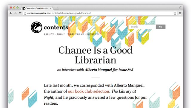
Example for Combined Fonts on a Website

For all presented fonts, there are links to the respective foundries. This way, you can possibly find one or two new fonts for inspiration, or maybe even a font provider that you didn’t know before.

Overall, “Combining Typefaces” is an extensive book that is interesting and helpful for both typography beginners, and advanced users. If you’re looking for a profound entrance into the topic of typography and the combination of fonts, this book certainly is a good choice for you.

The ebook covers 60 pages and weighs in at ten megabytes. It can be downloaded for free as a PDF file from Adobe’s font service Typekit.

(dpe)

Categories: Others Tags:

9 reasons hand-coding always beats site builders

May 4th, 2016 No comments

If you use any kind of social media like Facebook or Twitter, you won’t have been able to avoid the merciless onslaught of ads promoting WYSIWYG website development. I’m not talking about those fancy software applications like DreamWeaver, but actually hosted site building applications that offer drag-n-drop website building systems complete with predefined templates.

You could easily think that this is a great idea because on the face of it these kinds of systems are supposed to save you time and effort, but the reality is a little different. Here are just some of the reasons why you’re better off coding everything yourself.

1. You retain 100% control over your site and where it is hosted

Pages built on site builders stay on site builders (the same site builder). There is no easy way to transfer them out because the source code of your page is translated into metadata. Many similar services operate the same way. This means if you decide you want to change to a different hosting platform, you will have to reconstruct the pages and whatever functionality they contain.

2. Free WYSIWYG sites aren’t really free

What did you actually expect? But the issue here is that if you don’t want to provide free advertising for the service you built your site on, or you don’t want to have any restrictions over what you can do on your own site, you’ll have to pay extra for it, and the price will be typically higher than it would be for normal hosting.

3. You make yourself seem irrelevant to clients

If you build websites for other people, the last thing you should be doing is promoting websites that encourage them to use a DIY approach. You’ll practically be declaring that they’ve wasted their money by hiring you for a job they can do themselves.

Most clients can’t make websites, but they can be given the impression that they can do it. That’s really dangerous because it means there’s an awful lot of really bad websites out there. One of the most interesting observations is that clients always notice every flaw (real or imagined) in anything you create and will use that to make your life hell, but they never notice the massive and very real flaws in whatever they create.

4. You understand your own code

If you’re any good at coding, writing fresh code line-by-line doesn’t take more time than building stuff using code created by other people, and may even take less time. If you’re not that good, and you’re selling websites, consider that you may be in the wrong line of business.

When you use code from third parties, you have to spend a lot of time working out how to integrate it and then finessing it to do what you want. In some cases, you may not understand everything that third party software does and it may do some completely undesirable things. In the worst cases, it may do undesirable things of which you never become aware.

The other obvious issue is that if there is a flaw or bug in the third party code, you have to spend much more time diagnosing and fixing the bug than you would have to do if it was your own code. The same holds true if you want to add extra functionality or you want to change the way it works.

That’s not a suggestion you should never use third party materials, because there’s some really great stuff out there for you to use. But you have to accept that by incorporating those items into your design, you are also accepting the risks and complications that come with them. Just choose wisely.

5. Your own code is nearly always more efficient

Those WYSIWYG sites add additional complexity to your design. Look at the source code of any site builder template, and you’ll see a lot of weird metadata that contains hundreds of URL instructions. If it’s a free site, then extra lines will be added for the mandatory advertisement.

Having so many URLs indicates a heavy dependency on external components. This increases the chance of your site failing on a technical level. Less is more, and you need to keep things as local as you can if you want to avoid worrying about dependency problems.

6. Your own code is more secure

This one is fairly obvious. Your own code isn’t inherently more secure than a site builder’s, in fact it may be worse. But site builders use the same code for all sites, so they’re an attractive target. Economics of scale mean that hacking every template site churned out by a site builder may be worth it, hacking your code probably isn’t.

7. It’s easier to iterate your own code

Need to move a component in your directory structure to make it more secure? Need to use custom PHP code to translate or encrypt something? Want to do some kind of fancy database stuff that doesn’t fit into a cookie-cutter design model? When you write your own code, there are no limits or restrictions on what you can do. You are literally the webmaster!

8. Your own code is original

Have you ever noticed that some websites have a lot in common? And then, every once in a while, you’ll come across two or more sites that have way too much in common? That’s the problem of template-based design.

There’s nothing wrong with templates if you’re properly customizing them and turning them into something completely original, but huge numbers of people just seem to be too lazy for that. The result of that lack of effort is going to be less customers for you (or your client) because they don’t see your site as offering anything unique.

9. Writing your own code helps you grow as a developer

All the challenges that you’ll face and overcome in creating a website that is based mostly on your own efforts will help you become better at coding. It all adds up to more experience, and that means you become more efficient as a coder over time. Eventually you can face any challenge with confidence, as you’ll develop coding fluency.

So there you have it. Nine reasons why you should not be relying on WYSIWYG too much or even at all. Writing your own code is more rewarding in a lot of ways, and as you get better at it, you may even find that you save more time than if you struggled around trying to understand other people’s templates, other people’s WYSIWYG systems, and other people’s source code. You also keep control over your website hosting, your domain name, and who benefits from your work.

Mega Bundle of 48 Vintage, Grunge Fonts – only $19!

Source

Categories: Designing, Others Tags: