Archive

Archive for June, 2016

Comics of the week #344

June 18th, 2016 No comments

Every week we feature a set of comics created exclusively for WDD.

The content revolves around web design, blogging and funny situations that we encounter in our daily lives as designers.

These great cartoons are created by Jerry King, an award-winning cartoonist who’s one of the most published, prolific and versatile cartoonists in the world today.

So for a few moments, take a break from your daily routine, have a laugh and enjoy these funny cartoons.

Feel free to leave your comments and suggestions below as well as any related stories of your own…

A common influence

Legal hair splitting

A small family

Can you relate to these situations? Please share your funny stories and comments below…

100+ Geometric Patterns from You And I Graphics – only $24!

Source

Categories: Designing, Others Tags:

How to Use the Blend Tool in Illustrator

June 17th, 2016 No comments
Dansky_Learn How to Use the Blend Tool in Adobe Illustrator

In this tutorial, we’re going to learn how to use the Blend Tool in Adobe Illustrator.

The Steps (1-9)

1. Create a New Document.

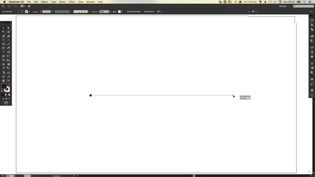
2. Select the Ellipse Tool, Left-click and hold Shift to create a small circle. Position this circle over to the far left side of your artboard.

blend-tool-adobe-illustrator-1

3. Left-click and hold Alt + Shift to create a copy of this circle, and drag this copy over to the far right side of your artboard.

4. Zoom in to each of the circles. Make sure that the circle on the left is smaller, and the circle to the right larger. To adjust the size of each circle proportionally, Left-click a corner point, hold Shift and drag to increase/decrease the size of each circle.

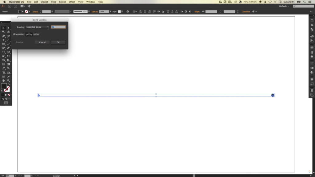
blend-tool-adobe-illustrator-2

5. With both circles selected, go to Object > Blend > Blend Options. From the dropdown menu select Specified Steps, and enter a value on the right (eg. 70).

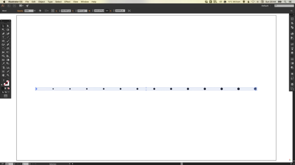
6. Next, select the Blend Tool from the Toolbar on the left. Left-click on the smaller circle first, and then Left-click on the larger circle. This will create the specified number of steps in between the two shapes.

blend-tool-adobe-illustrator-3

7. With both circles still selected you can go to Object > Blend > Blend Options, select the Preview box, and adjust the values as desired.

8. As you adjust either the smaller or larger circle, the steps in between these two circles will update. For example, if the larger circle was doubled in size, all of the steps in between would adjust in size to accommodate this change.

blend-tool-adobe-illustrator-4

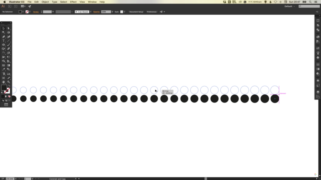
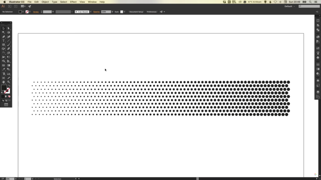
9. Once you’ve created all of your circles in a row, you can also Left-click and hold Alt + Shift to drag this row upwards or downwards to create a copy. Once you have created a copy, press Cmd/Ctrl + D to repeat your last action within Illustrator. This can be repeated as many times as necessary, and is a good way to save time when copying more complex objects and shapes within Illustrator.

blend-tool-adobe-illustrator-5

Download Adobe Illustrator.

Read More at How to Use the Blend Tool in Illustrator

Categories: Designing, Others Tags:

Style Guide Driven Development with Atomic Docs

June 17th, 2016 No comments

The following is a guest post by Nick Berens, a senior front-end developer at wisnet.com. Nick and his team have been building websites through custom style guides for years. Over those years, Nick has been building and evolving a tool to help with this process. I’ll let Nick explain both the philosophy and the tool.

I bet you’ve heard about style guides. Perhaps you’ve heard about style guide driven development (SDD)?

I’m a front end developer at wisnet.com, an agency specialising in PHP and WordPress development. This is a brief intro into style guides and our team’s experience with style guide driven development.

Over last 2 years I have been practicing SDD with a tool I wrote called Atomic Docs, a front-end style guide generator and Sass partial manager. I’d like to introduce Atomic Docs and some of it’s features that have made SDD a simple and essential part of our workflow.

What is a style guide?

There are two types of style guides we work with at wisnet. A static design style guide and a more dynamic front end style guide.

Design style guides

Our design style guides are static Photoshop (PSD) files cataloging a project’s global design elements. They document a project’s colors, fonts, headings, button states, link states, lists etc.

Example style guide from Medialoot

Front-end style guides

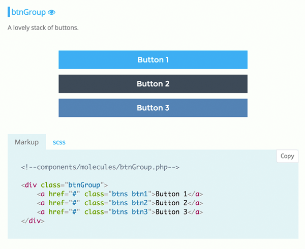
Our front-end style guide, which is generated by Atomic Docs, provides documentation for the code associated with the front-end components of a project. Think of the documentation site for Bootstrap. It provides notes and markup examples for each of its components making it easy to reference, understand and use each component.

Living style guides

A living style guide is a system that allows the components within the style guide to remain in sync with the components in the site, without having to update the code in both places!

For large projects, a living style guide is the key for a successful system.

What is style guide driven development?

To help illustrate, I’ll briefly outline our process at wisnet.

It starts with design

At wisnet, our style guide process begins with our designers. Every project they hand off comes with two deliverables. A traditional PSD comp of the full page layouts as well as a design style guide documenting the project’s global styles.

On to the front end

Once complete, the PSD comp and design style guide are handed off to a front end developer. The first thing I do is open up Atomic Docs and start documenting the global design elements as defined in the design style guide.

After adding the global design elements, I open up the PSD comp which has the full design. Since I use Brad Frost’s Atomic Design principles, this is when I start analyzing the design and deciding what design elements will come together to compose the design’s Atoms, Molecules, Organisms, Templates and Pages. Organizing and managing components in this fashion is where Atomic Docs is really helpful.

Once all of the components are built, categorized and documented in Atomic Docs, it is simply a matter using the components like lego blocks to build out the pages and views.

The back end

If the project is an application, I will hand off the static views along with the Atomic Docs style guide. With the style guide as a reference, it is easy for the backend developers to make adjustments to the front end as needed without having to interrupt their workflow by handing it back to a front end dev.

As you might suspect, the development process is never quite this linear (there can still be lots of back and forth between teams), but the use of style guides provides a common design language which enforces design and code consistency throughout the lifespan of a project.

What are the advantages of SDD?

By building components outside of any context, you have code that’s modular and free to move around your site or application

We’re not designing pages, we’re designing systems of components.

Stephen Hay’s quote is at the heart of SDD.

We’re no longer building a button to be red when it’s in the context of a sidebar. We’re now just building a red button that’s going to be red whether it’s in a sidebar, footer or header.

When you build without context, the side effect is a front-end codebase that’s far more scalable, modular, and maintainable.

Making the components more approachable for less front-end savvy backend developers and designers

Style guides have encouraged our designers and junior developers to build pages and views quickly without having a deep understanding of HTML/CSS/JS. And since each component is isolated, it makes it easier to understand the code that created it.

Every project I finish has a bootstrap-like documentation showing the relevant HTML/CSS associated with each component

No matter how big or small, every project our team completes has full documentation of its front end design system. This makes every project far more maintainable. It is especially useful for the organizations we’ve worked with that have internal development teams. It has made it a lot easier for these groups to make changes and scale their projects and has been valuable.

Enforcing brand integrity

Since the style guide contains the project’s color and font definitions along with logos and other graphic assets, it can be viewed as the design source of truth.

About Atomic Docs

Atomic Docs has two primary features.

SCSS partial manager

Being able to break up my CSS into small partial files is one of my favorite Sass features. Managing all of these partial files is not.

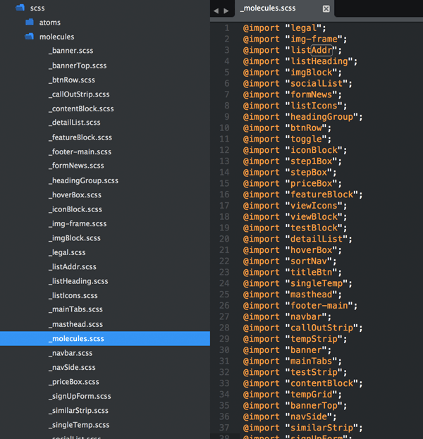
Here’s a screenshot of a molecules category and root `molecules.scss` file.

Creating this structure is wonderful for organization and overall developer sanity. But as the project grows, creating and managing the partial files becomes a pain point in my workflow.

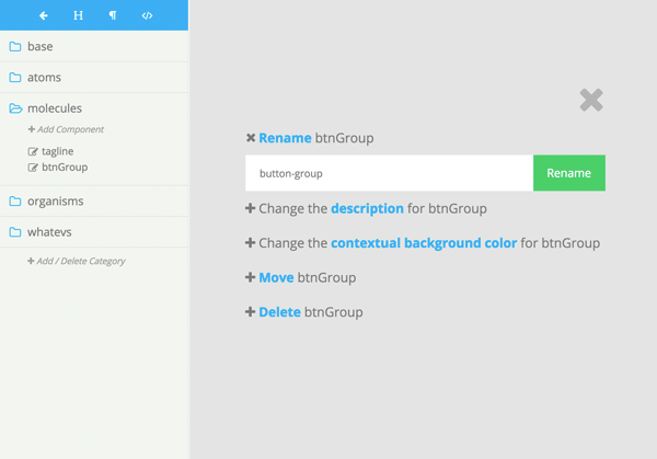
Atomic Docs provides a GUI for handling the creation and management of these partial files along with writing the @import my-component string to the corresponding root `.scss` file. Through this interface you can also rename files, move them to different categories, and delete them.

You might be thinking that I’m super lazy and creating partial files isn’t really that big of a deal, but it’s truly my favorite part of Atomic Docs.

The (generated) style guide

Perhaps the biggest advantage to using Atomic Docs is how easy it is to get up and running with the style guide.

  • No complex configuration files
  • No need to add redundant markup comments to your CSS files
  • Name your components and categories whatever you’d like
  • Not opinionated about the preprocessor you use. You can use Grunt, Gulp, Code Kit, Prepros or whatever.

This isn’t meant to diminish the projects that are more complex in nature. That complexity allows them to have some really advanced features. I just wanted a solution that was a little simpler that our team could get up and running with little friction.

Using Atomic Docs as a living style guide

Atomic Docs can be configured as a living style guide. If the file atomic-head.php is in the root of your project Atomic docs will include it in it’s section. So if you were working with a simple PHP app for example, in atomic-head.php you could include to connect the database to Atomic Docs as well as to share your app’s functions.

Now you can work with your app’s data and functions in the components you create. Then it’s just a matter of including in your application. Since this component is already being included in Atomic Docs every change you make in `components/modules/my-component.php` will be reflected in both the style guide and everywhere you include the component in your application.

Other resources

Atomic Docs is great for our workflow and our development stack at wisnet. If it is not a fit for you there are many great solutions.

  • Styleguides.io has a wonderful collection of articles, books, tools and talks to help you make the right decision for you and your team.
  • For a more in-depth look at style guides, checkout this great article on Medium.

Conclusion

After two years, style guide driven development has proven to be a valuable addition to our workflow at wisnet. Whether you’re using Atomic Docs or any of the other great tools out there, I think you’ll find that SDD will help provide design consistency and scalability to all of your projects.


Style Guide Driven Development with Atomic Docs is a post from CSS-Tricks

Categories: Designing, Others Tags:

Free download: Avatar vector collection

June 17th, 2016 No comments

With the amount of time we spend online, it seems like more people know us by our avatars than by our faces these days. But who wants a dodgy iPhone selfie, when you can have one of these awesome vector avatars?

This set of cool avatars, designed by VectorOpenStock.com exclusively for WebdesignerDepot, features 54 stylish designs, sure to spruce up any social media profile.

Is that Mia Wallace we spy there? Perhaps a young Benicio Del Toro? Surely that’s Leonard McCoy? Whomever you see in the minimal, colorful portraits, you’re bound to find one that feels like you. And if one of the 42 humans doesn’t fit, there are a dozen animals to choose from.

This set of vectors is also perfect for interface designers who need consistent avatars for flat, Material Design-style dashboard designs.

The avatars are all in vector format so they’ll scale to any size, and are free for personal and commercial use. Download the files beneath the preview:

Please enter your email address below and click the download button. The download link will be sent to you by email, or if you have already subscribed, the download will begin immediately.

LIFETIME ACCESS: 130+ Premium Responsive WordPress Themes – only $27!

Source

Categories: Designing, Others Tags:

Ezoic Optimizes Your Ads

June 17th, 2016 No comments
ezoic

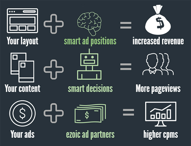
Earning money from advertisements is not that easy anymore. Certainly, services like Google AdSense make it completely simple for website owners to display ads on their blog, for example. However, the sheer presence of ads doesn’t make them successful. The placement, as well as the size of the ads, plays an important role when it comes to how the ads will be perceived by your website’s visitors. Luckily, Ezoic has developed the Ad Tester tool, which will identify the best performing ad units for you. This article will teach you how to get started improving your site today.

Log in, Integrate a Website and Get Started

After you registered a free Ezoic account, you need to integrate your site. This can be done by switching your nameservers at your registrar. If you are using CloudFlare on your site, Ezoic has a partnership with CloudFlare that allows you to integrate via your CloudFlare account. If you do not have control over your DNS, there is a JavaScript integration method, though it is not recommended.

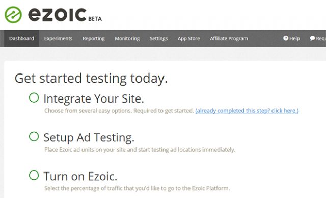
The service’s dashboard will inform you about the current state of progress.

ezoic_start
Integration of Your Website, Setup of the Ad Tester and “Turn On.”

After that, you can start to configure the ad tester. First, a JavaScript snippet, which is specially made for ad testing will have to be placed in the header of your site during setup.

Creating Ad Units and Placing Them on Your Website

When you’re done configuring up to this point, it’s time to create the so-called ad placeholders. These placeholders are blank divs that represent potential ad placements. In total, there are four different types available: Display, native-horizontal, native-vertical, as well as link-ad-units.

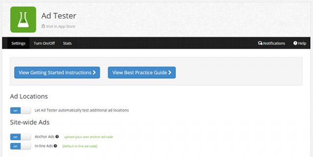
ezoic_adtester
The Ad Tester

The display ad units represent classic display formats. They exist in different sizes, such as leader, banner, square, and skyscraper. For each placeholder, you choose which sizes will be tested on your website. It’s recommended to include as many sizes as possible so that the system has more to test. Additionally, you also determine if the ad should be displayed on desktop devices, smartphones and tablets, or on all of them. Some sizes are only available on certain devices.

The native-horizontal, and native-vertical ad units don’t have a fixed size, but adjust depending on the browser window size, or the display’s viewport, respectively.

The link-ad-units are unique prompts that show a list of website links. These can also be obtained in different sizes.

ezoic_adtester_adunit
Ad Unit With All Possible Display Sizes and Devices

You’ll receive an HTML snippet to place on your website for each unit you create. To get the largest possible variety of different ad sizes and positions, you should add between 15 and 20 placeholders onto every page of your site. Of course, Ezoic will never display all the placeholders you added at once – the algorithm will automatically test the allowable number of ads per page (If you use Ezoic, you can show 5 Google ads per page!).

You’ll need to enter a position for each unit. In total, there are eight different placement options to choose from. For example, some possible locations are the Top of Page, Mid Content, Sidebar, as well as the space beneath the first or second paragraph. Ezoic will only display one ad per position.

How Does This Affect Your Original Site?

If you’re already using Google AdSense or another ad network on your site, working with Ezoic will not cause conflict. All you do is enclose your existing AdSense ad code with an Ezoic placeholder snippet.

When the ad tester is not in effect, an AdSense ad is displayed just as usual. While the ad tester is active, the AdSense ad is replaced by the ad unit’s advertisement.

Activating Ezoic for Device Types and Starting the Ad Tester

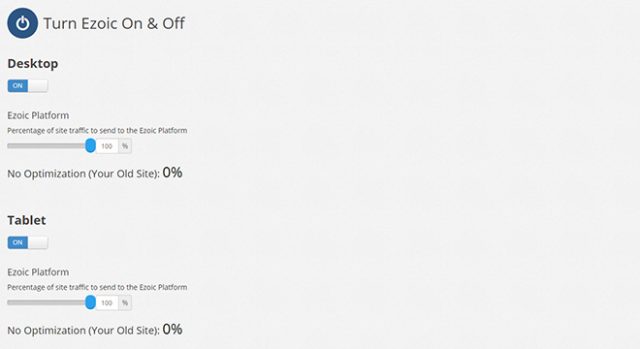
To test your ad units, you only need to switch on Ezoic. First, navigate to “Turn Ezoic On & Off”. There, you turn the service on and off for each device type, such as desktop, tablet, and smartphone. Use a slider to decide the percent of your visitors you want to show the ad test to, and how many percents shall see the “default” page with possibly already existing AdSense ads.

ezoic_turnon
Activating Ad Testers for Different Devices

So, when entering 50 percent for desktop devices, half of your visitors will see your website the usual way, and the other half will see an ad test, where different ad formats and positions will be displayed.

This means that users will get to see different compositions. Ezoic will evaluate how successful each composition was. The more ad placeholders that are placed on a page; the more combinations can be tested and evaluated. This will determine how meaningful the test results are. Over time the Ezoic system will user data from visitors to determine the right ad combination on each page.

Chrome Extension for Easy Placement of Ad Units

There’s a Chrome extension by Ezoic, which lets you see all placeholder ads. Normally, the placeholders aren’t visible, and only a part of them will be filled with ads, even for the visitors that participate in the ad test.

If you entered different sizes for the single ad units, you could also make it show you every possible size in the browser. This would give you an impression of what the ads can look like.

ezoic_extension
Display of the Ad Placeholders Via Chrome Extension

Thus, the extension helps you keep an overview of all integrated ad units. Additionally, you have the option to find out if there’s an ad size that causes problems with your page’s layout.

The extension also allows you to place additional placeholders for ad units on your website. This way you can test which ad sizes and placements are problematic in advance.

Connecting an AdSense Account With Ezoic

Optionally, you could link your AdSense and other ad network accounts to your Ezoic account. This is done using the Mediation app. The connection to AdSense comes with advantages.

When connected, your AdSense ads will be considered during the real time bidding process for the ad tests. This guarantees you the you’re getting the highest price for your ads. Ezoic will also report on your AdSense ads.

Testing Ezoic for 30 Days and Cancelling at Any Time

Ezoic is available for free for 30 days, giving you the chance to test it extensively. After that, you have to decide whether you want to continue using the service for free (where Ezoic will collect the revenue from one ad at the bottom of the page) or if you want to become a paying customer. The monthly costs depend on the monthly profit you make off of Ezoic.

ezoic_services

According to Ezoic, most publishers who use it end up making a net profit of 60% or more. Ezoic is free for non-commercial, and charitable organizations. Simply set up an account and contact the Ezoic staff.

Conclusion

The testing of ads becomes a rather simple thing to do when using the ad tester by Ezoic. Instead of placing different ad formats and evaluating their success by hand, Ezoic will take a significant amount of work off of you by dynamically changing the ad combinations.

By the way, Ezoic doesn’t only offer the ad tester, but also other services which allow you to test layout and content for your website, for example. Thus, taking a look at the ad tester and Ezoic’s other services is definitely worth it.

(dpe)

Categories: Others Tags:

25 Responsive HTML5 Templates for Personal and Business Websites

June 17th, 2016 No comments
1-intense

If you are in search of a well-built and professionally designed HTML5 template for your personal or business project, then go no further. In a compilation listed below we have highlighted 25 of the most popular and freshly released responsive HTML5 templates for 2016. Their visual appeal and the abundance of features will please both web developers and regular web users. Just look through the compilation and see them in action for yourself.

Intense

Demo | More info

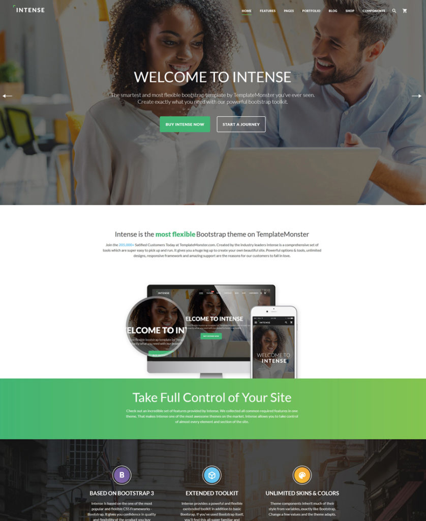
This is a responsive multipurpose HTML5 template that was created just recently, but has already managed to win the hearts of hundreds of avid web design fans. Its rich and diverse pack of visual elements, pre-designed layouts and custom pages, modules and extensions, multiple working forms, and a whole lot of other smart features, will appeal to DIY guys and pro developers alike. The template includes free 24/7 support and lifetime updates. In addition, there is an ever-growing gallery of child themes, which all Intense owners can use for free.

Grand Vector
21-grand-vector responsive HTML5 templates

Demo | More info

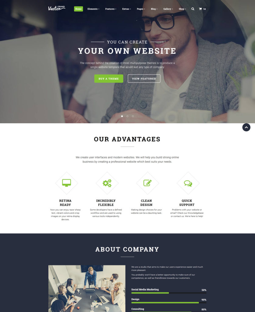
Grand Vector is another great point on the list of responsive HTML5 templates. This multipurpose template is packed full with a number of impressive features that enhance the template’s visual appeal and its functionality. By saying that it is multipurpose we mean that the template can be used for literally any business field and for any web project that you may have in mind. The template is pre-loaded with a gallery of blog and eCommerce pages, which are ready to go live with some minor adjustments. In addition to the impressive parallax scrolling effect, the template is loaded with a number of gallery types. The template takes one of the best palaces in TemplateMonster’s inventory of website templates.

Marketing Agency
20-marketing-agency

Demo | More info

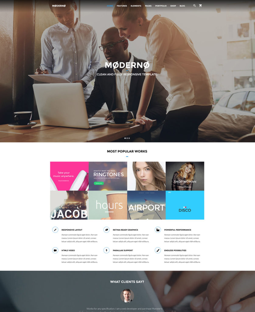
This is a multipurpose HTML5 template built with Bootstrap 3.3, which can be easily customized to suit a variety of purposes. The template is SEO and mobile friendly. Featuring a rich UI kit, it comes packaged with a host of pre-designed pages, which will help you customize the look and feel of your site in no time. Also, the template includes 50+ pre-designed HTML5 pages, multiple header and footer layouts, multiple UI elements and blocks, stunning animation effects, live search, and a set of working forms, etc.

Modicate
2-modicate responsive HTML5 templates

Demo | More info

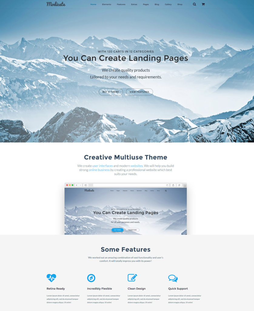
This is another cool item on the list of responsive HTML5 templates. With its help you can build blogs, business and personal web pages, as well as eCommerce sites, hassle-free. The template’s package features a number of ready-made page layouts and working forms, which can go live out of the box. In addition, the template includes a host of stunning visual elements, impressive galleries and sliders, which are intended to captivate the users’ attention once they land on your page.

Bellissimo
17-bellissimo

Demo | More info

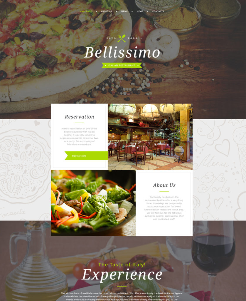
This cafe and restaurant responsive HTML5 template was specifically developed to let the users sense the delicious taste of Italian cuisine when they reach your site. When you take a look at the template’s layout, you will be captivated by the abundance of quality images that are featured in the large hero area, backgrounds, galleries, sliders, etc. The template is fully adaptive to any screen size, and the grid-based Bootstrap framework provides for a better browsing experience across a variety of latest-generation devices.

Consulting
3-consulting

Demo | More info

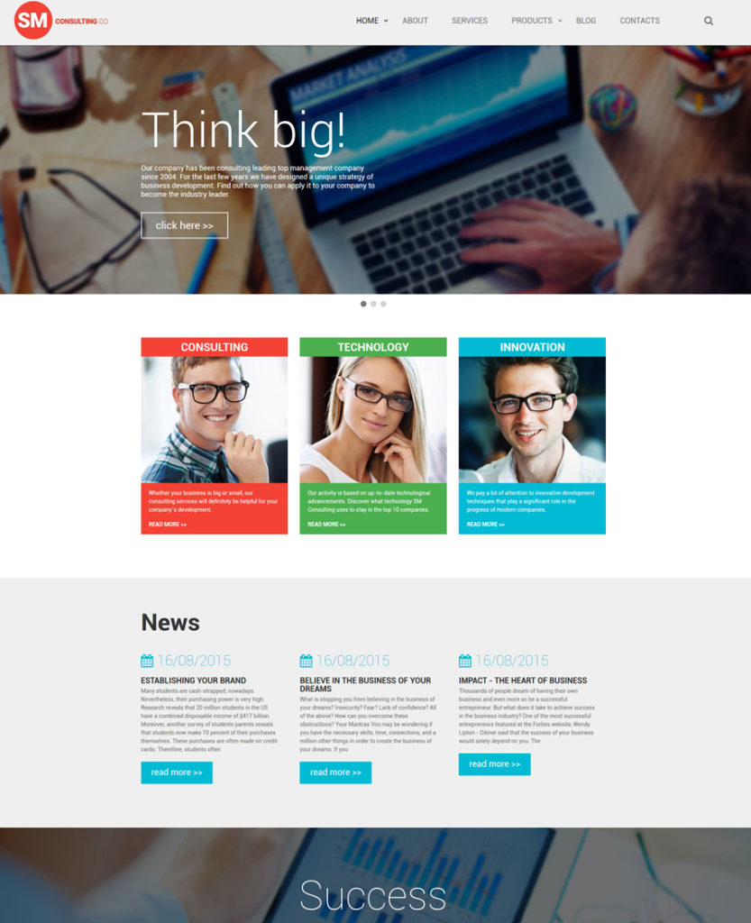
The more responsive HTML5 templates the better, right? Time to see “Consulting”. This template will become a rock-solid starting point for any business web project. Its clean layout lures with its simplicity. Every detail of the design was optimized to make it easier, even for first-time visitors, to browse your pages effortlessly. The template’s navigation has been enhanced with a sticky customizable MegaMenu. When navigating the pages, you will enjoy clear content hierarchy and a perfect balance of written and visual data. The template features lots of white space, which makes the content more prominent. Full-width photo backgrounds with the parallax scrolling effect enhance the template’s visual appeal.

Grand Estate
4-grand-estate responsive HTML5 templates

Demo | More info

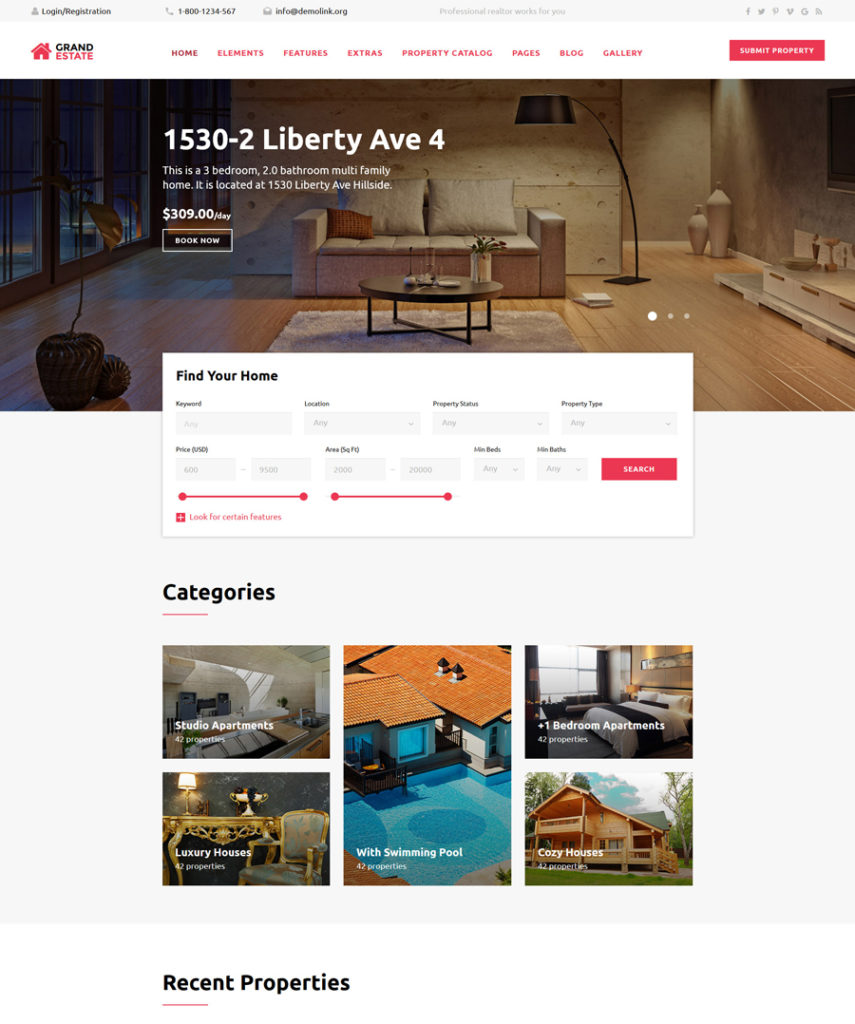
Real estate, hotel and travel websites can safely use this HTML5 template to their benefit. Pre-loaded with a booking form, it invites the users to make quick reservations on your site. A simple, easy-to-follow layout is enhanced with a sticky MegaMenu, which lets people reach any page of your site any time they wish. The template is built with valid code and enhanced with Bootstrap functionality, which ensure seamless performance across a variety of handheld and desktop devices. Multiple header and footer variations as well as a pack of working forms let you manage the template’s look and feel effortlessly.

Communications
5-communications

Demo | More info

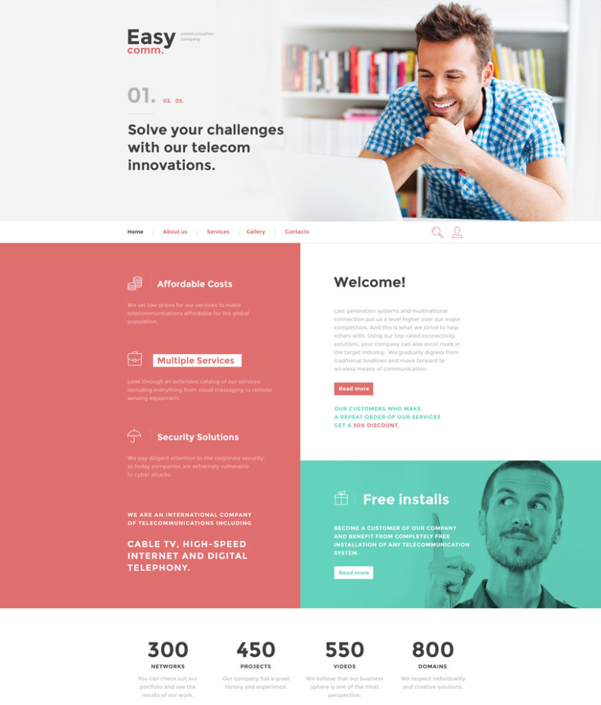
Featuring a minimalist design built in neutral, easy-on-the-eyes colors, this responsive HTML5 template can be used for communications as well as transportation, electronics, software or any other business. The template’s functionality is very diverse, letting you craft websites of any level of complexity. Valid code, Bootstrap 3, crossbrowser compatibility and SEO optimization ensure that your site will become visible on the web. The template’s card-based layout features clear content hierarchy, which is achieved thanks to readable fonts and enumerated blocks.

FairyStyle
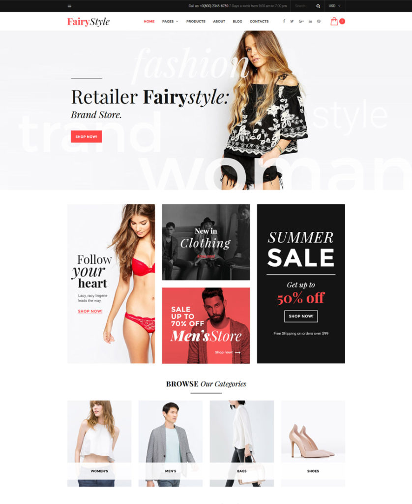
6-fairystyle

Demo | More info

Fashion eCommerce sites will have an impressive look when built with the help of this HTML5 template. Its trendy and stylish look is intended to appeal to true fashionistas. The template’s layout features a perfect balance of written and visual data, making the users’ browsing experience way more enjoyable. The template is pre-loaded with a set of custom pages for multiple post formats, footer and header styles, sidebars and blog pages. The latter, by the way, can be organized in a 3-column grid or masonry view, or simply feature a boxed structure.

Tripplic
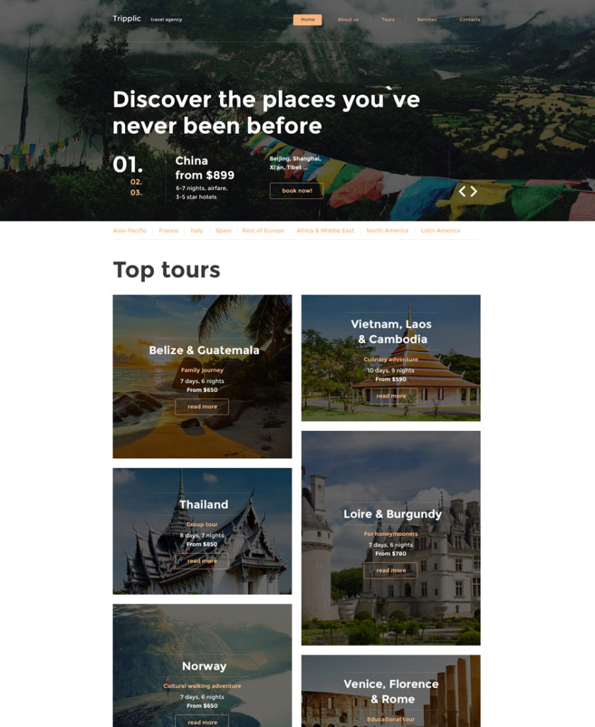
7-tripplic responsive HTML5 templates

Demo | More info

Tripplic also deserves to be on the list of the most attractive responsive HTML5 templates. This is a powerful, ready-made HTML5 template for travel and hotel related websites. The layout has been pre-loaded with lazy load effect, so even content-heavy web projects will perform lightning-fast across a variety of devices. The template runs on a fully responsive framework, so you may be certain that desktop and mobile users will be able to enjoy a top-notch browsing experience on any gadget. In addition to intuitive navigation, the template features niche-specific font icons, which are intended to look pixel-perfect on the latest-generation screens.

Real Estate
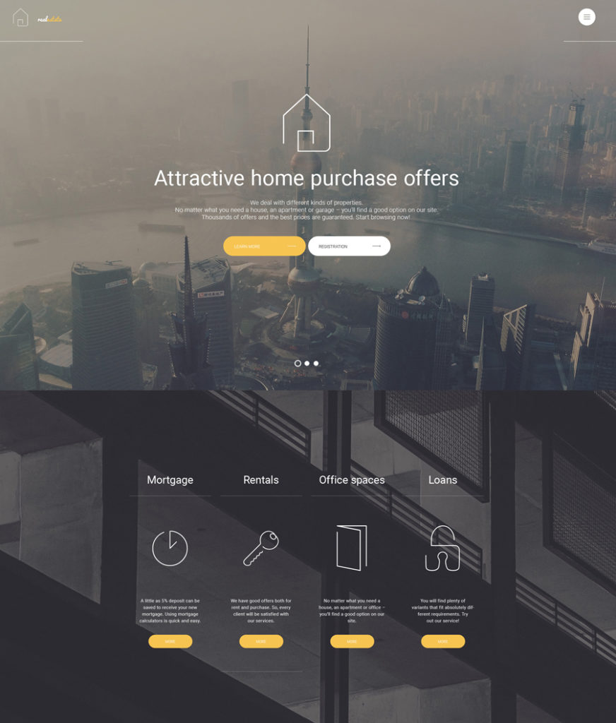
8-real-estate

Demo | More info

This image-heavy HTML5 website template will be a perfect fit for presenting real estate, hotel, travel, cafe and restaurant websites. Its layout is enhanced with stunning animation effects, which let the web users become immersed in the atmosphere of your business. Thus, full-width photo backgrounds feature the parallax scrolling effect, while banners, featured products and photo galleries are integrated with hover effect. The template’s menu is presented with a hamburger icon, which reveals all menu items with a click.

Corporational Inc.

9-corporational-inc

Demo | More info

A light blue color scheme is the #1 choice of business and corporate websites. On the other hand, the template’s clean, minimalist layout is loaded with 2-dimensional parallax scrolling backgrounds, which add more depth to the design. A customizable full-width slider welcomes every visitor who reaches your site, letting them better understand what kind of services you represent. A set of Google font icons as well as multiple color options, detailed documentation and layered PSD files have all been added to the package, thus making it much easier for you to tweak the design.

Corporate
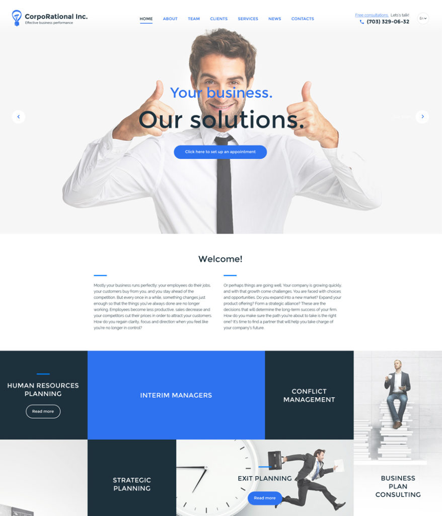
10-corporate responsive HTML5 templates

Demo | More info

Today’s list of responsive HTML5 templates wouldn’t be complete without “Corporate”. This responsive HTML5 template will fit personal or large business projects that strive to create a professional and reliable online presence. Featuring a clean, minimalist style, the template ensures that the users focus on your site’s content, without being distracted by any heavy design elements. Being fully optimized for top-notch performance across all the major web browsers and devices, the template is also pre-loaded with lazy load effect, which guarantees that all of your site’s content will load flawlessly as a user navigates your pages.

Ambulance
11-ambulance

Demo | More info

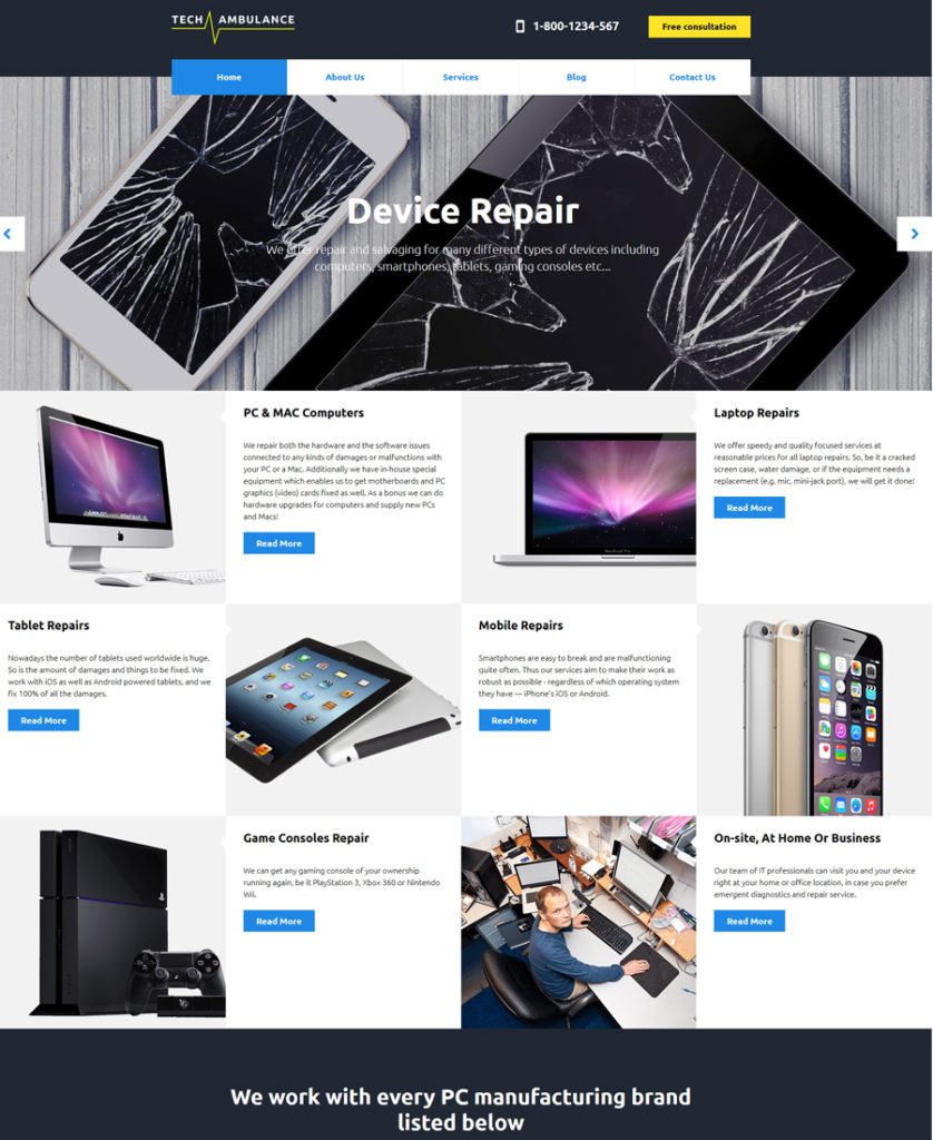
The next item on the list of responsive HTML5 templates is Ambulance. The template is perfectly suited for websites promoting tech repair services. Its layout is content heavy, however, thanks to the clever content positioning, users will feel the ease of reading the necessary pieces of information. The services that a company provides are organized into a grid-based list, with images being accompanied by text explanations. About the company and brands sections have been visually divided from the rest of the content by means of a bold headline and contrasting background colors. With the purpose of looking more credible and helping people reach your physical location, the Google map widget has been added to the template’s front page.

The Good Book
12-the-good-book

Demo | More info

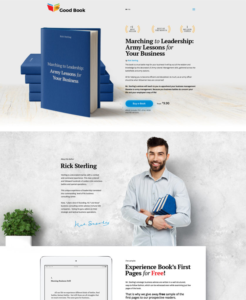
The template looks simple yet functional. Its front page features clearly defined content blocks, which make it way easier to scan the content. The main navigation menu is presented by means of a hamburger icon, which remains fixed to the top right corner of the page. Audio and video integration make the design way more captivating. Alongside a list of books that you have on offer, the template’s front page includes a section with the pricing plans and bold CTAs.

Delterro
13-delterro responsive HTML5 templates

Demo | More info

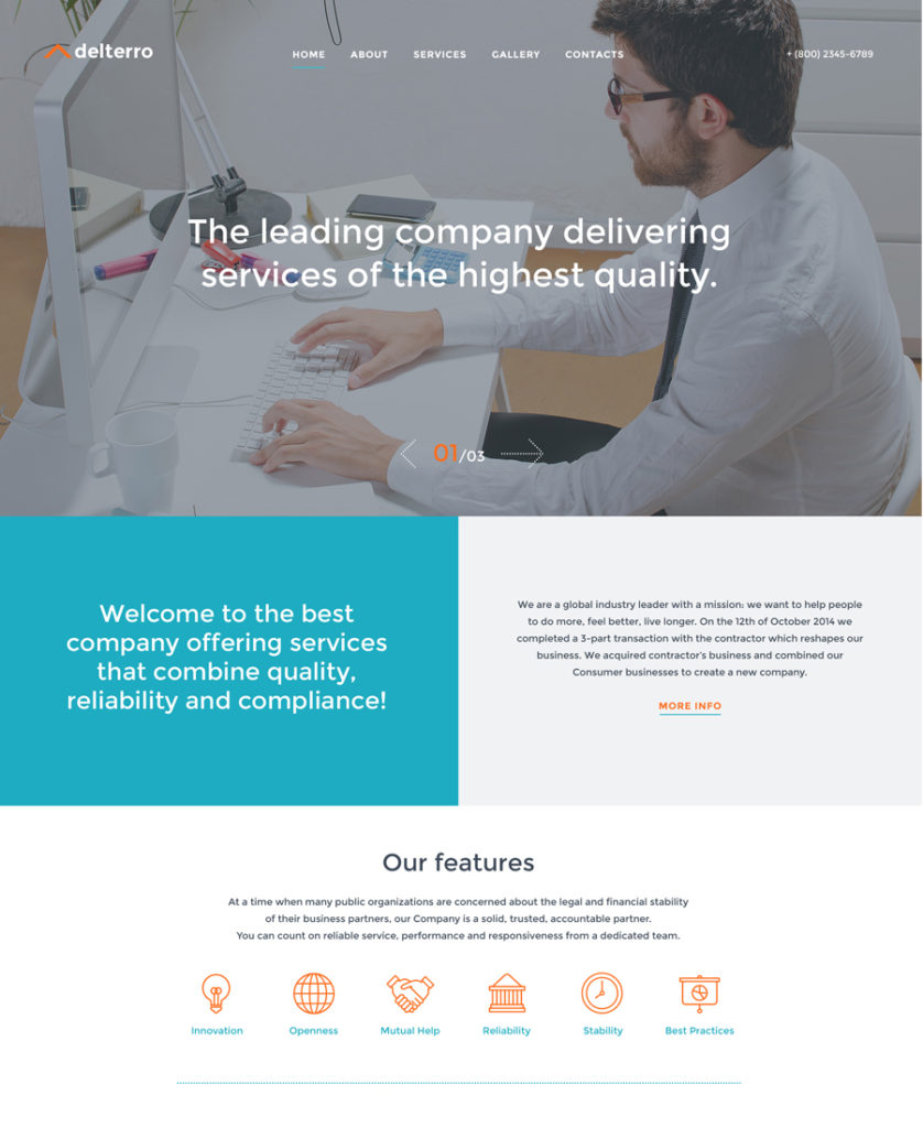
As you may have already guessed, our compilation is rich in responsive HTML5 templates for business sites. The next one will also be a perfect fit for that purpose. It is clear and concise. The chosen fonts contribute to better readability of the template. A fixed navigation panel lets the users reach any content right away. Integrated with the social sharing options, the template also features a built-in Google map. A set of pre-designed custom page templates have been added for a quick start to your business.

Web Design
14-web-design

Demo | More info

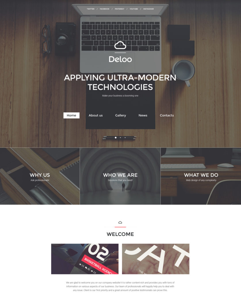
If you are working on a web design and looking for some inspiration on how to upgrade your website with style, then this template may come in handy. Featuring stylish backgrounds, elegant design elements and smart template options, it stands out with its professionalism and visual appeal. A list of social sharing options is placed at the very top of the page. A large hero slider is accompanied with a set of grid-based banners, highlighting the key benefits of your agency. To gain customer loyalty, the home page is also pre-loaded with a carousel slider of user testimonials.

Cafe and Restaurant
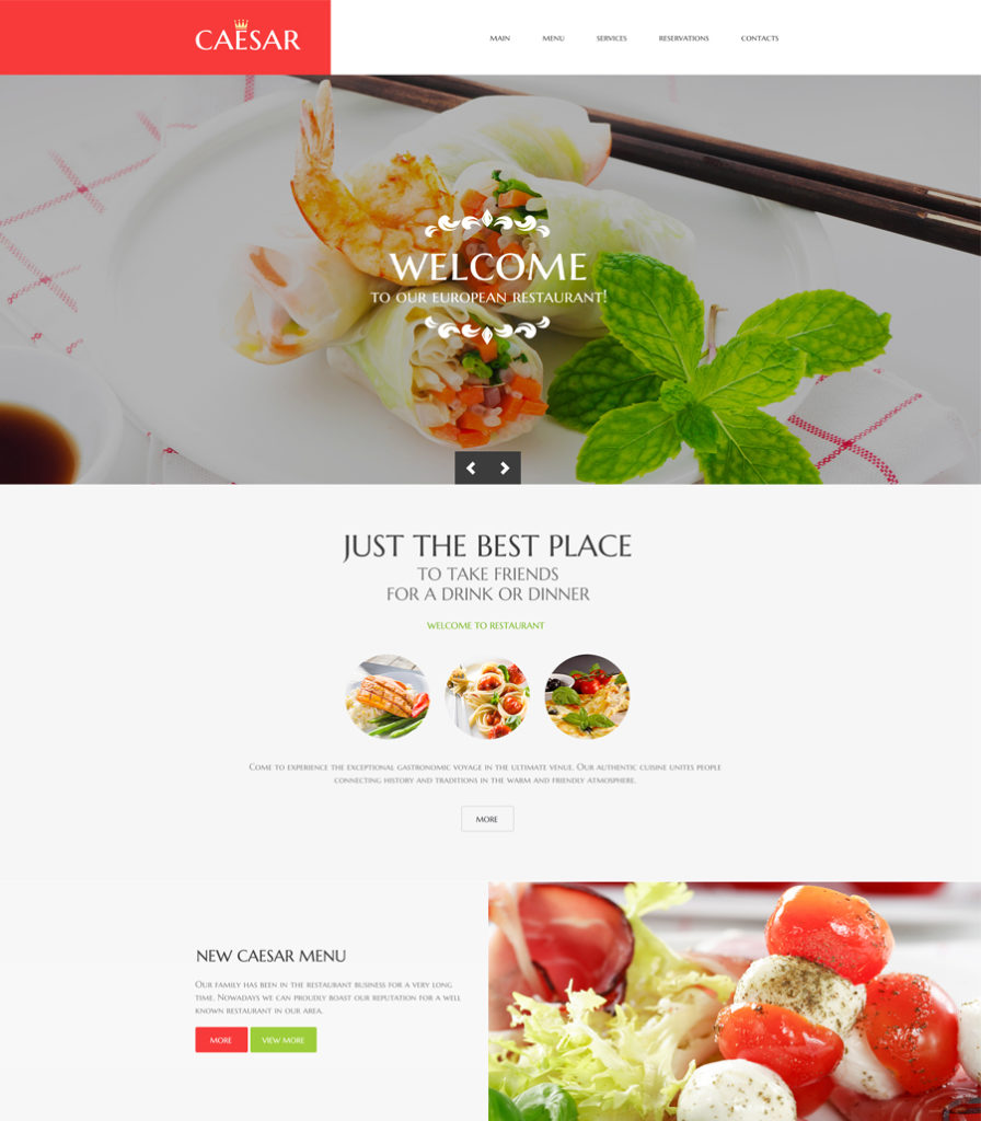
15-cafe-restaurant

Demo | More info

Food related websites need to look appetizing, otherwise how can they pique people’s desire to order anything online? This cafe and restaurant HTML5 template is intended to make the users’ mouth water. Bold, quality images are featured everywhere on the page. A large hero slider, backgrounds, menu, blog highlights – every element of the template’s layout is enhanced with appetizing images. In order for all content to be properly displayed across a variety of devices, the template runs on a 100% responsive framework. However, it’s quite natural as you’re browsing a list of responsive HTML5 templates :-).

Candini
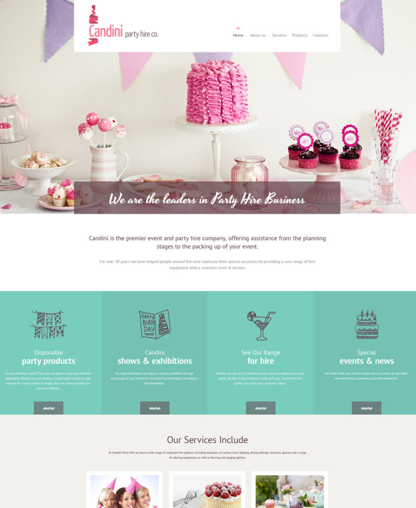
16-candini responsive HTML5 templates

Demo | More info

Here is another cool design that uses the power of visuals to the fullest. Beautiful handwritten fonts, soft colors, swirls and curls in the logo add a refined look to the template. A list of services is organized into a grid-based gallery on the front page of the template. The most popular offerings are highlighted by means of colored backgrounds, guiding the users’ eye to the content that is supposed to be of the greatest importance.

RadioFM
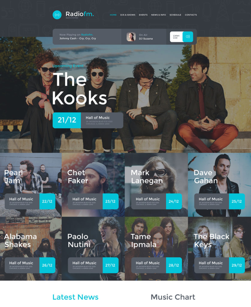
18-radiofm

Demo | More info

RadioFM also takes its place on today’s list of responsive HTML5 templates. This responsive HTML5 template will work perfectly for presenting various media projects on the web. By default, it is intended for a radio station. However, if you play in a band or are a soul singer, you can safely use it for creating or upgrading your site. In terms of functionality, the template features everything that you need for a more effective presentation of your business. By that we mean audio and video support, charts, live streaming, a schedule of upcoming events organized into a carousel gallery, a newsletter subscription form, social media options, built-in Google map, and so much more. The template includes a host of customization options, so that you will be able to tweak it in any way you wish.

Teeth Whitening
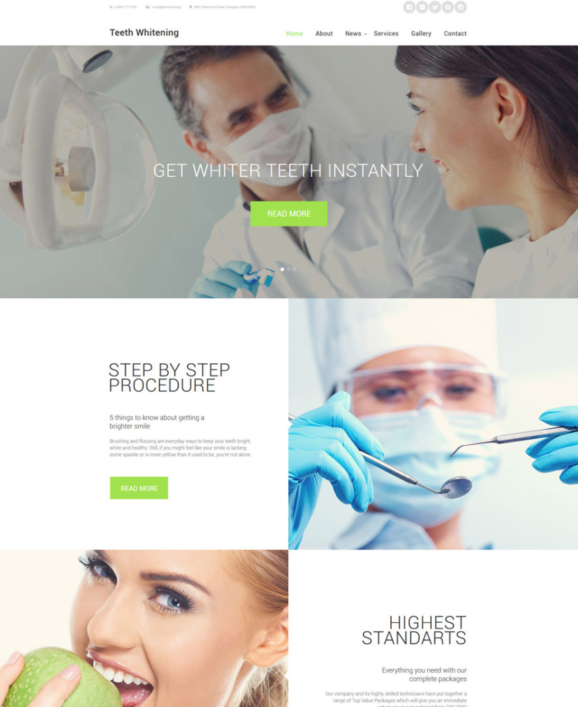
19-teeth-whitening responsive HTML5 templates

Demo | More info

Medical and healthcare websites will look amazing based on this HTML5 template. Its clean style makes the template both elegant and refined. An expansive collection of template options is integrated to facilitate the template’s customization. A fully responsive framework ensures that all of your site’s content will adapt to any screen size automatically. A spacious layout of the template lets you place loads of data on its pages, with the templates remaining readable and easy-to-navigate. In addition to the functional dashboard, the template features a usable color switcher tool, which enables you to tweak the template’s color scheme with a click.

Barber Shop
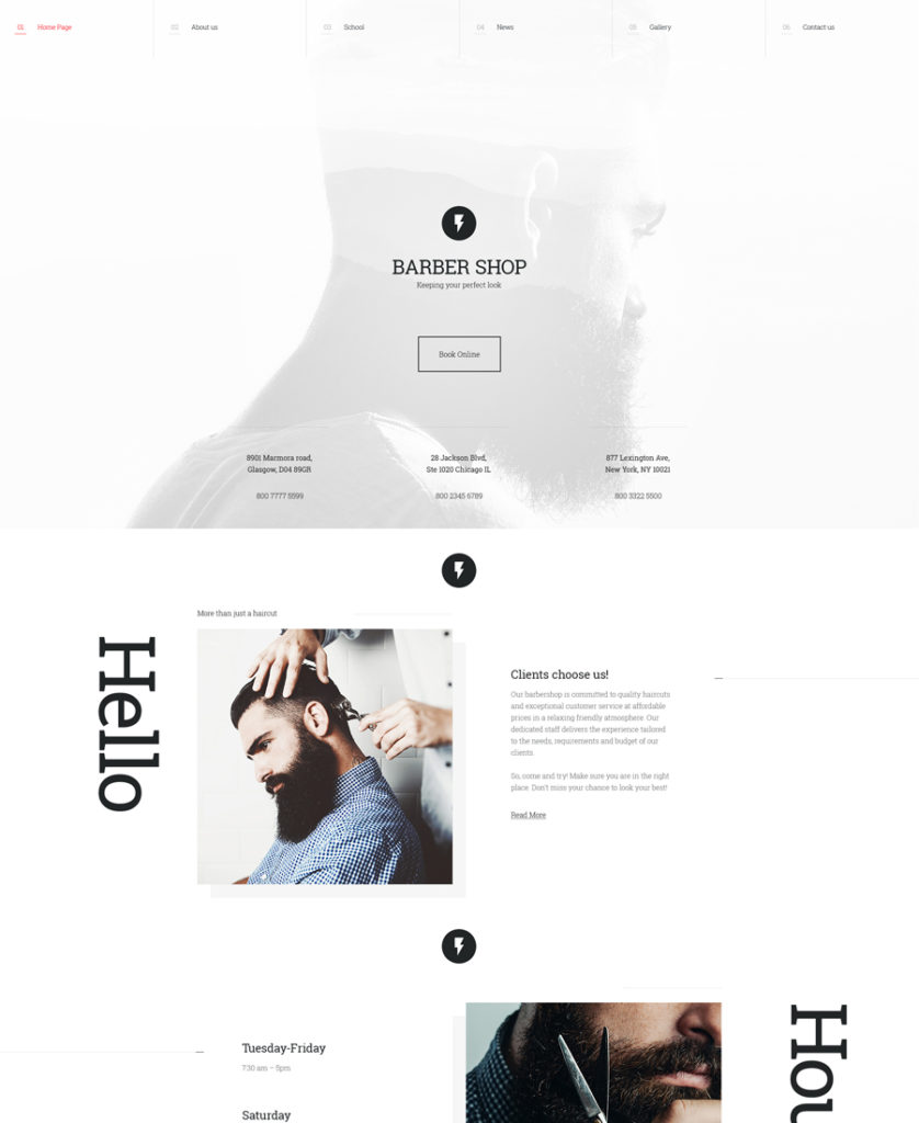
22-barber-shop

Demo | More info

Barber Shop is one of the most stylish item on this list of responsive HTML5 templates. The primary goal of this minimalist HTML5 website template is to bring the user’s focus of attention to your services and price list. The template’s header is enhanced with a fixed MegaMenu and a large hero area featuring readable contact details. The template is integrated with the lazy load effect, ensuring that even content-heavy web resources will boast lightning fast speeds. The template’s front page features non-standard content positioning, which makes it no less impressive. Photos demonstrating the types of services that you provide are accompanied by brief texts, making it way easier for the web audience to understand what your site is all about.

Car Club
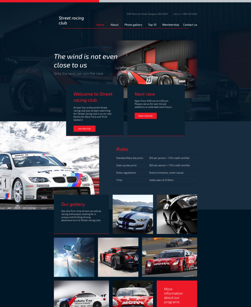
car-club-responsive-template responsive HTML5 templates

Demo | More Info
In this collection of responsive HTML5 templates, you can find a solution for auto dealers, car clubs, service stations, etc. Designed in a dark blue tone, its layout is dotted with red elements that accentuate titles, CTA buttons, and other small, yet important, details. To display the content, you can use a slider, gallery with a quick view option, and carousel. The template is packed with comprehensive documentation and entitles you to free, lifetime support.

Organic – Agriculture Farm
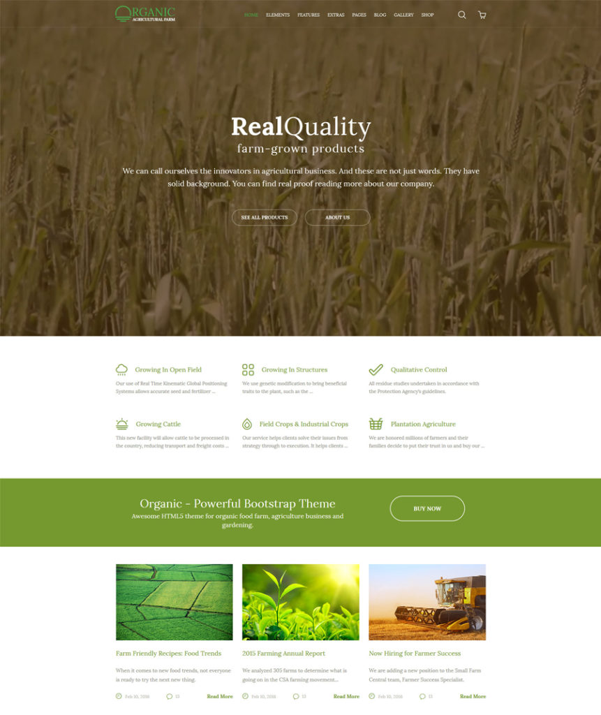
24-organic-agriculture-farm

Demo | More info

The template’s header is enhanced with a full-width background video, which serves as a great attention-getter. By watching a short video clip the users will get a better understanding of exactly what your website offers. The light green color scheme of this agriculture website template adds a fresh, natural look to the design. A set of niche-specific recognizable icons on the front-page guides the users through your content, letting them better understand what services or products you provide.

Arcitex
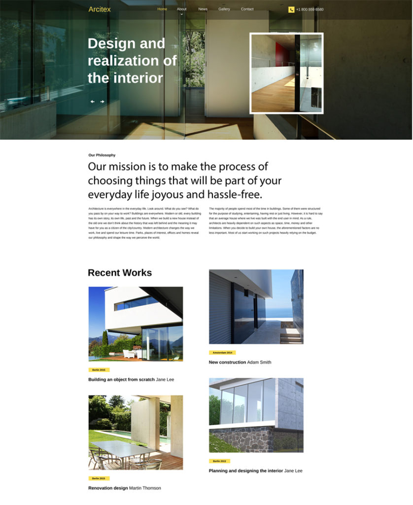
25-architex responsive HTML5 templates

Demo | More info

This is the last, but not the least, responsive HTML5 template on our chart of the top responsive HTML5 templates for 2016. Developed in line with the latest web standards, it is optimized for all of the major web browsers and latest-generation devices. The template is integrated with a contact form, letting the users reach you directly any time they need to. A newsletter subscription form is also included, so people can subscribe to your updates simply by leaving their email address in the corresponding field. A selection of Google web fonts and font icons, as well as pre-designed pages, are intended to facilitate the template’s customization.

This was our selection of the top responsive HTML5 templates that have been in high demand among web users in 2016. Multipurpose and niche-specific, all of the aforementioned templates come loaded with advanced customization options, letting you tweak their look and feel just the way you want. So, if you’ve found a design that can match your business requirements, go ahead and see it live, and do not forget to take a closer look at its technical details.

Read More at 25 Responsive HTML5 Templates for Personal and Business Websites

Categories: Designing, Others Tags:

Shortcuts And Tips For Improving Your Productivity With Sublime Text

June 17th, 2016 No comments

Sublime Text is, no doubt, one of the most powerful text editors out there. The number of satisfied users attests to that. If you explore it, you will eventually see how beautifully its powerful features are hidden behind a simple and elegant interface.

Shortcuts And Tips For Improving Your Productivity With Sublime Text

If you have been using Sublime Text for some time, now is the time to upgrade your arsenal with new ammunition. I’ll be taking you through some of my favorite tips and tricks. Knowing them might just unleash your hidden powers as a programmer to the world.

The post Shortcuts And Tips For Improving Your Productivity With Sublime Text appeared first on Smashing Magazine.

Categories: Others Tags:

How to Start an Email Newsletter Using MailChimp and WordPress

June 17th, 2016 No comments
How to Start an Email Newsletter Using MailChimp and WordPress

The importance of email campaigns is not only high regarding e-commerce, WordPress blogs can also benefit from a frequently sent out email newsletters. A newsletter is an effective way to keep the readers of your blog updated. This way, you can turn visitors into regular readers, as offering an email newsletter solves a problem of your visitor. Not every person has enough interest or time to visit a blog on a regular basis, to check it for new articles. However, some blog owners don’t offer a newsletter for the sole reason that they don’t know how easy it is to set one up. Thus, today’s article will show you how to create a free newsletter using MailChimp and WordPress.

Why Choose MailChimp as Your Newsletter Provider?

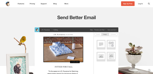
MailChimp is one of the largest providers for email campaigns, and is free to use for up to 2,000 email recipients. The interface is user-friendly, and there are many pretty templates for the newsletters. It is also possible to create a custom template to meet your own requirements. Realizing a corporate design is no problem either, using the free MailChimp account. The free account allows you to send up to 12,000 emails a month to up to 2,000 recipients. This should be more than enough for the average blogger.

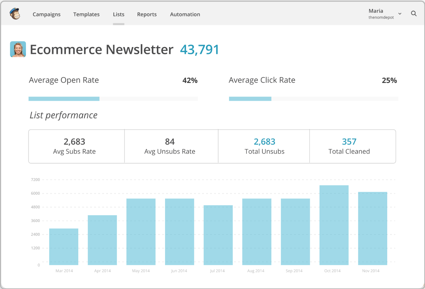
The free account also comes with a simple analysis function. If you need more, you need to upgrade to a paid account. The paid accounts start at 10 USD a month.

How to Start an Email Newsletter Using MailChimp and WordPress

MailChimp Newsletter With WordPress – How to

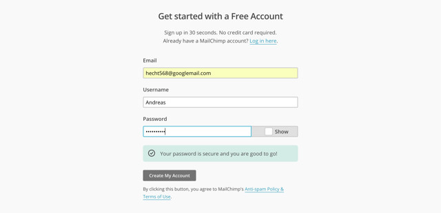
Before we get started, set up a free MailChimp account. Visit the MailChimp website and click the red “Signup Free” button. Afterwards, fill in the form, and when asked for the company, enter the blog name. Your address is also important, as it has to be placed in the end of the newsletter later on.

How to Start an Email Newsletter Using MailChimp and WordPress

After confirming your email address, it becomes fit for use. Now, execute the remaining steps one by one.

Step 1: Creating an Email List

How to Start an Email Newsletter Using MailChimp and WordPress

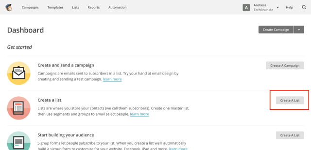
The first step is the creation of an email list that stores all email addresses that you want to send the newsletter to. As you don’t have a list yet, click “Create List” in the next window. Fill in the entire form. You’ll be asked things like the name of the list, the email address, and the name that will be entered as the sender, as well as the reason why the recipients receive the newsletter, and so on.

Step 2: Creating the Signup Form

How to Start an Email Newsletter Using MailChimp and WordPress

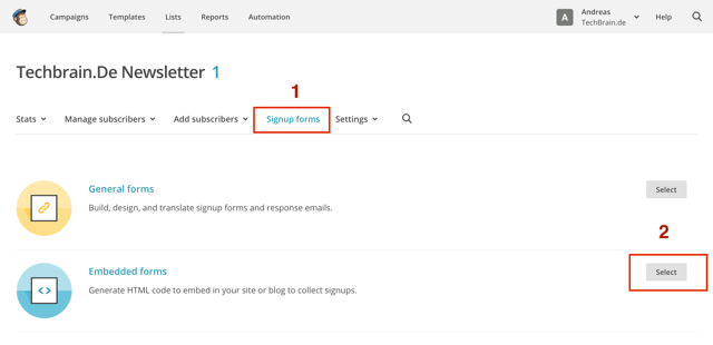
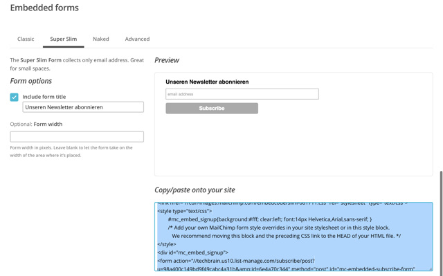
To create a subscription form for your newsletter, first click on Signup forms, and then on Select. You’ll then be redirected to a page where you can choose between a couple of options for a signup form. Choose a variant and then copy the displayed code.

How to Start an Email Newsletter Using MailChimp and WordPress

Step 3: Integrating the Signup Form Into the WordPress Website

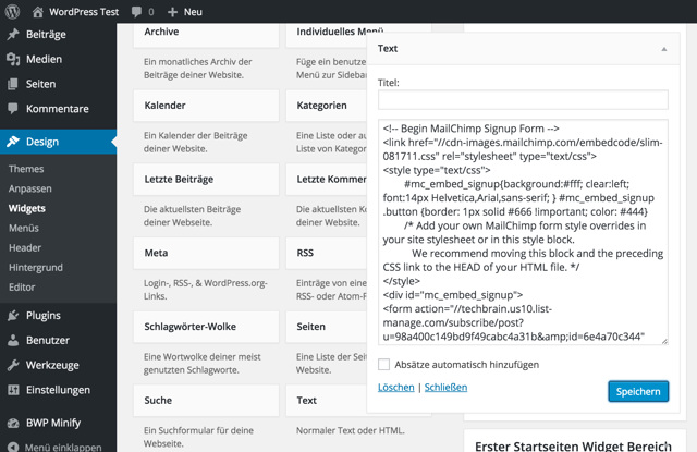
Log into your WordPress site and go to the widget page. Choose a text widget and place it in the sidebar. Enter the copied code into the text widget and save it.

How to Start an Email Newsletter Using MailChimp and WordPress

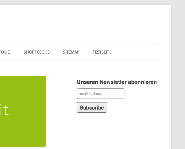
Now, you have a signup form for the newletter on your blog, which allows you to start collecting email addresses.

How to Start an Email Newsletter Using MailChimp and WordPress

Of course, there are many different, and more successful integrations of a newsletter signup form, but considering all the variants would blow up this article. Thus, let’s stick to the simple default signup form.

Step 4: Setting Up an RSS Feed Newsletter

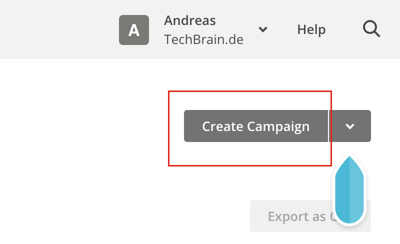
Once you collected a couple of email addresses, it’s important to start sending newsletters. Of course, you can always log into your MailChimp account and manually send a newsletter. However, it seems much more useful to send automated campaigns. For that, we’ll use the WordPress blog’s RSS feed. To start an RSS newsletter campaign, log into your MailChimp account and click on “Campaigns => Create Campaign”.

How to Start an Email Newsletter Using MailChimp and WordPress

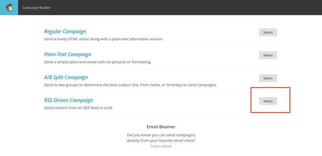
Then choose the “RSS-Driven Campaign” in the next window.

How to Start an Email Newsletter Using MailChimp and WordPress

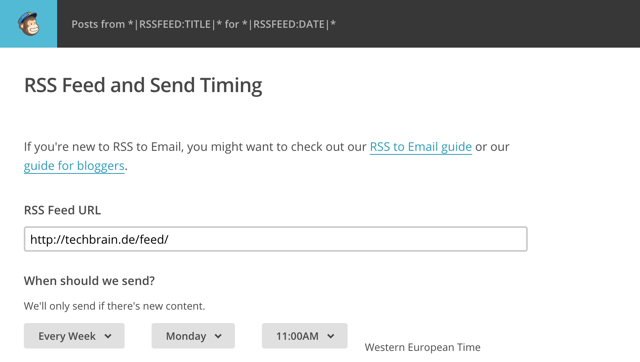
Enter your RSS feed adress in the opening window, choose which day of the week you want the newsletter to be sent out, and how frequent, as well as at which time you want it to be sent.

How to Start an Email Newsletter Using MailChimp and WordPress

Now click on “Next” in the bottom right to continue. Then, MailChimp will ask for the email list that you want the newsletter to be sent to. Choose your list and click on “Next” once more.

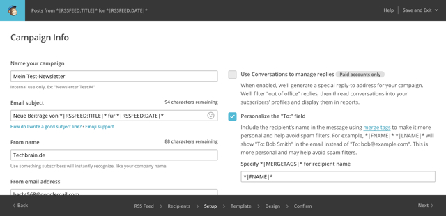
In the following window, we’ll assign a name to the campaign (this will only be used internally), and make some smaller adjustments. Them, click “Next” again.

How to Start an Email Newsletter Using MailChimp and WordPress

Step 5: Choosing a Template

How to Start an Email Newsletter Using MailChimp and WordPress

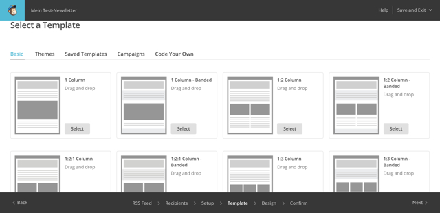
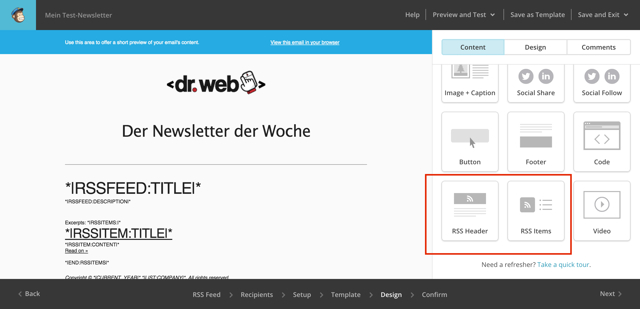
Choose one of the templates or themes and click “Select”. MailChimp will then allow you to make some adjustments to your newsletter. You can place a logo, add content blocks, change text colors and fonts, and a lot more.

The important thing here is, that your newsletter has to contain the “RSS Header”– and “RSS Items”-content blocks, as empty emails will be sent out otherwise.

How to Start an Email Newsletter Using MailChimp and WordPress

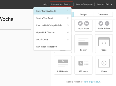
In the upper bar, there are multiple ways to test your newsletter before sending it. You can view an email preview under “Preview and Test”.

How to Start an Email Newsletter Using MailChimp and WordPress

If you feel like your newsletter is complete, you can send a test mail to yourself.

My advice to you: do some in-depth testing before sending your first newsletter. When everything looks or works the way you want it to, click on “Save and Exit” in the top right corner.

Further steps are not necessary, you’ve now successfully created an RSS feed newsletter with MailChimp.

Conclusion

We hope that this article was able to help you set up an automated email newsletter. Of course, MailChimp offers a lot more options for the creation of newsletters. Nonetheless, getting started is not too difficult.

Related Links

(dpe)

Categories: Others Tags:

.NET Fringe is back!

June 17th, 2016 No comments

And we’re back!

Yes it’s true, .NET Fringe is back! We’re gathering back in Portland from July 10th through 12th for 3 days of unadulterated .NET OSS awesomeness. Last year we had a magical event, and we heard you tell us that you couldn’t wait for next year. So this year we’re back and we’re taking it up a notch! You can hear more about why we’re doing .NET Fringe and our plans for this year in our recent Channel 9 Interview.


The Topics

We’ve got a rich and diverse set of topics this year that is very timely and relevant to what is happening in the industry. Just look at the list!

  • .NET Core
  • DevOps
  • Docker
  • Hadoop
  • IOT
  • Kubernetes
  • Linked Data
  • Microservices
  • Machine Learning
  • Mobile
  • Spark
  • Xamarin
  • JSON.NET
  • IOT
  • OSS Project Management

The Speakers

And an excellent lineup of speakers starting with our keynotes. We are thrilled that the list includes Don Syme, the creator of F#!

Screen Shot 2016-06-16 at 8.24.28 PM


Lightning Talks

This year back by popular demand we’ll be having about 15 Lightning talks split across the two days. Got an idea you’d like to speak on, we’re open for submissions.

Workshops

Once again we’ll have workshops free for attendees on July 10th. Aaron Stannard is back with more AKKA.NET goodness, and we have several other workshops. Stay tuned to dotnetfringe.org.

Everything else

There’s a ton of other cool stuff, like another awesome venue, the Geek Train from Seattle, a bike ride around Portland, live music, some great food oh and Portland!

Discounts for bloggers

Are you wanting to attend .NET Fringe but are short on cash?

Go write a blog post (and no, not just a one liner) either about your .NET Fringe experience last year, or why you want to attend this year. Then follow @dotnetfringe, tweet with your blog post and include @dotnetfringe or #dotnetfringe. We’ll follow you back and then DM you a 70% DISCOUNT CODE.

Don’t wait

.NET Fringe is around the corner. It’s going to be amazing. Go register and come join us!


Categories: Others, Programming Tags:

.NET Fringe is back!

June 17th, 2016 No comments

And we’re back!

Yes it’s true, .NET Fringe is back! We’re gathering back in Portland from July 10th through 12th for 3 days of unadulterated .NET OSS awesomeness. Last year we had a magical event, and we heard you tell us that you couldn’t wait for next year. So this year we’re back and we’re taking it up a notch! You can hear more about why we’re doing .NET Fringe and our plans for this year in our recent Channel 9 Interview.

The Topics

We’ve got a really set of topics this year that is very timely and relevant to what is happening in the industry. Just look at the list!

  • .NET Core
  • DevOps
  • Docker
  • Hadoop
  • IOT
  • Kubernetes
  • Linked Data
  • Microservices
  • Machine Learning
  • Mobile
  • Spark
  • Xamarin
  • JSON.NET
  • IOT
  • OSS Project Management

The Speakers

And an excellent lineup of speakers starting with our keynotes. We are thrilled that the list includes Don Syme, the creator of F#!

Screen Shot 2016-06-16 at 8.24.28 PM

Lightning Talks

This year back by popular demand we’ll be having about 15 Lightning talks split across the two days. Got an idea you’d like to speak on, we’re open for submissions.

Workshops

Once again we’ll have workshops free for attendees on July 10th. Aaron Stannard is back with more AKKA.NET goodness, and we have several other workshops. Stay tuned to dotnetfringe.org.

Everything else

There’s a ton of other cool stuff, like another awesome venue, the Geek Train from Seattle, a bike ride around Portland, live music, some great food oh and Portland!

Discounts for bloggers

Are you wanting to attend .NET Fringe but are short on cash?

Go write a blog post (and no, not just a one liner) either about your .NET Fringe experience last year, or why you want to attend this year. Then follow @dotnetfringe, tweet with your blog post and include @dotnetfringe or #dotnetfringe. We’ll follow you back and then DM you a 70% DISCOUNT CODE.

Don’t wait

.NET Fringe is around the corner. It’s going to be amazing. Go register and come join us!

Categories: Others, Programming Tags: