Anime.js Makes Animating CSS and SVG Easy
Anime.js is another one in an already impressive row of frameworks for animations. In contrast to all the other ones, anime.js does not only allow for the animation via CSS attributes. You can also alter SVG and HTML attributes with animations. It’s hard to image modern web design without the SVG format. This framework came at the right time.
Simple CSS Animations
Once you’ve implemented the JavaScript anime.js, creating animations based on CSS attributes becomes a rather easy thing to do. Call up “anime()”, to define one or multiple targets, meaning elements you want to animate. After that, define the CSS attributes that you want the animation to change.
anime({ targets: [document.getElementsByTagName("div")[0]], translateX: "300px", rotate: 180, duration: 2000, direction: "alternate", loop: true, elasticity: 600, easing: "easeOutElastic" }); |
In the example, “targets” is used to define a “

During an Animation
Generally, this simple example is also possible without JavaScript, by using the “@keyframes” rules in conjunction with “animation”. However, anime.js adds the particular attribute “elasticity” that allows you to add said elasticity to an animation. The higher the value, the higher the elasticity of the motion. This means, that the animation won’t stop abruptly once it’s done, but oscillates instead. This allows users to create very natural looking movements.
30 Easing Effects
Just like classic CSS3 animations, anime.js gives you the option to add an easing to an animation. In total, there are 30 different easing effects available, which is significantly more than CSS3 offers.
When giving out “anime.easings” via the browser console, you’ll receive a list of all effects. Aside from the usual, in conjunction with “elasticity”, fascinating effects can be created.
SVG Path Animations
As mentioned before, animations with SVG attributes, like the “d” attribute of a path, are possible. This allows you to quickly realize an animation alongside a path.
To do so, first define a “” element via SVG, as well as another element, like a “
anime({ targets: [document.getElementsByTagName("div")[0]], translateX: anime.path(document.getElementsByTagName("path")[0]), translateY: anime.path(document.getElementsByTagName("path")[0]), rotate: anime.path(document.getElementsByTagName("path")[0]), duration: 5000, loop: true, easing: "linear" }); |
The element you want to animate is once again referenced via “targets”. Then, use “translatex”, “translateY”, and “rotate” to define the SVG path, alongside which you want the “
SVG Morphing
Due to Google sounding the death knell for SMIL, animated form changes of SVG elements won’t be possible anymore, at least in future browser versions. However, anime.js lets you continue to create these animations with ease.
To do so, first, define an SVG path which you can later quickly morph into a different shape.
anime({ targets: [document.getElementsByTagName("path")[0]], d: "M140,51.75A51.75,51.75,0,0,0,99.2,35.27a83,83,0,1,0,65.13,65.67A51.76,51.76,0,0,0,140,51.75Z", duration: 1000, loop: true, direction: "alternate", easing: "linear" }); |
In the example above, an SVG path is referenced as “targets”. “d” is used to define a target path which determines the shape into which you want the “” element to morph. An identical amount of points on the source and destination path is necessary. Otherwise, there will be messy effects instead of a pretty morphing.
Interactive Animations
Last but not least, anime.js also allows you to create interactive animations. For instance, there are ways to control the playback called “play()”, “pause()”, and “restart()”. You could also use “seek()” to skip to a certain point in the animation. For that, you need to either enter a time or percentage value.
On top of that, there are the attributes “begin”, “update”, and “complete”, letting you transfer a function. This function will then be executed at the beginning, after changes, or at the end of the animation, respectively.
Conclusion

Example on CodePen
anime.js has everything you need for simple as well as complex CSS and SVG animations. There’s a clear API reference with a couple of examples. Additionally, the framework runs under all standard browsers, including the Internet Explorer starting at version 10.
The code examples presented above can also be found on CodePen:
(dpe)
Introducing the Web Design Ledger Shop
We’re thrilled to announce the launch of our new online shop! The Web Design Ledger shop is packed with great deals on everything from gadgets and gear to software, web services, and online courses. We even have special sections dedicated to design and development to ensure you save money on the items you need to do what you love.
Deals have limited lifespans so signing up for an account is a great way to stay up-to-date. As an added bonus, the shop will offer a number of freebies you won’t want to miss out on. All you need to do is login and share the offer with your friends.
A few of our staff’s favorite items currently in the shop are:
- Pixel Perfect Design Icon Bundle ($19), which gives you 1,200 resizeable, royalty free vector icons.
- Stone River Academy Lifetime Subscription ($89), giving readers access to over 2,000 hours of online learning on everything from game app creation to 3-D animation.
- The powerful, palm-sized Code Black Drone with HD Camera ($69.99), a great introductory drone for anyone looking to dominate the sky.
These are just a few of the awesome products you can find in the Web Design Ledger shop. To kick-off off today’s launch, we’re offering readers 10% off their first purchase with code WDLShop10. This code is good to July 31st at 11:59 pm PST, so hurry and claim your discount today!
Read More at Introducing the Web Design Ledger Shop
How to Skew a Circular Symbol in Illustrator
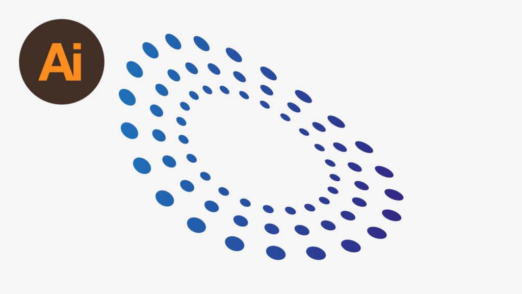
In this tutorial, we’re going to learn how to draw and skew a circular symbol in Adobe Illustrator.
The Steps (1-11)
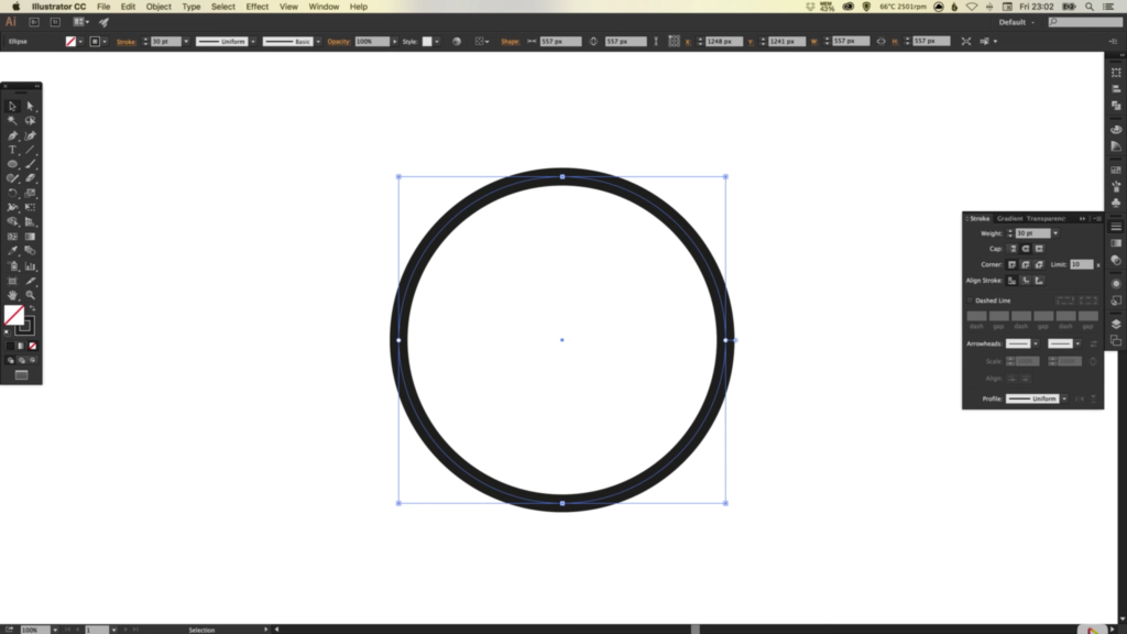
1. Create a New Document.
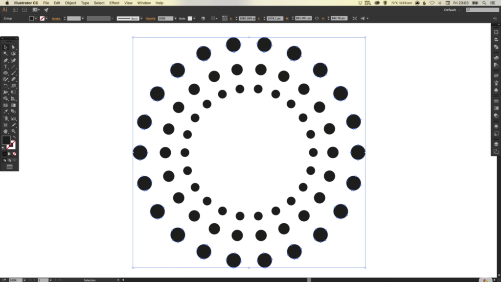
2. Select the Ellipse Tool, Left-click and hold Shift to draw a circle. Remove any Fill and apply a Stroke width of your choice. For this tutorial, I’ve used a Stroke Width of 30 pixels, and given the colour black #000000.
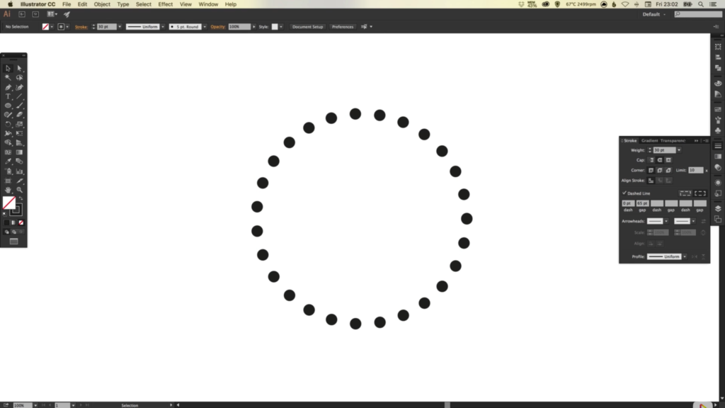
3. In the Stroke Palette, select the box labeled Dashed Line, select 0 for the Dash, and approximately 65 for the Gap. Also select Round as the Cap. If done correctly, you should now have a circle made up of a dotted stroke.
4. Once you are happy with the size and spacing of your dotted stroke, go to Object > Expand, and click OK.
5. Left-click on the circle, and holding Alt + Shift, scale up from the centre and also create a larger copy of the dotted circle.
6. Repeat Step 5 as many times as you like, depending on the number of rings you wish to include in your design.
7. Drag over all shapes with your mouse to select everything on the artboard, and Left-click in the Gradient Palette to apply the default black/white gradient.
8. Next, select two colours of your choice, and drag each of the these colours in turn, to either end of the Gradient Slider. Each of the circles that make up your design should now have a gradient individually applied to them, with the two colours that you selected.
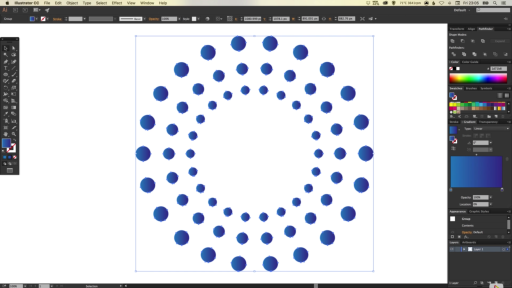
9. To make the gradient flow through the entire shape as a whole (rather than each circle individually), go to Object > Compound Path, and select Make.
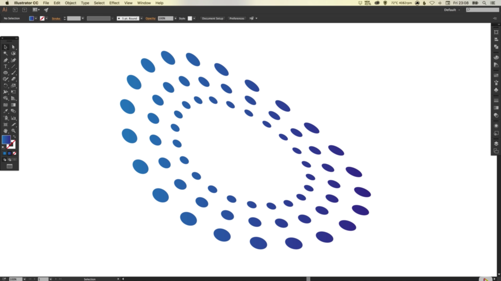
10. Lastly, to distort the shape, go to Effect > Distort, and select Free Distort. Adjust the anchor points in the preview box until you are happy and click OK.
11. To edit the distorted shape, select the Free Distort effect listed in the Appearance Palette.
Read More at How to Skew a Circular Symbol in Illustrator
In Praise of the Peculiar: How and Why to Use Surreal Images

By: Anastasia Dyakovskaya
“Humans are complex and unpredictable, and there’s no reason why brand visuals can’t be, too.” – Lauren Catten, Art Director at Getty Images
Imagination is one of the four factors that make for a powerful image, and nothing stirs it more than Surreality – one of iStock & Getty Images’ 2016’s top visual trends.
The reason is simple: these original and sometimes peculiar compositions trigger a feeling of pleasure in experiencing the unpredictable. The aesthetic can transform an ordinary topic into something new and exciting. It can help distinguish a brand in a sea of similarity, making for memorable content that leaves a lasting impression. And, thanks to its hyper-immersive, psychedelic visuals, it has very broad appeal.
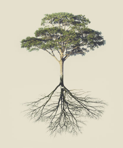
Nature-related images work as a particularly potent metaphor in this realm, leaving room for interpretation and creating meaningful connections with your content.
Here, iStock by Getty Images explain how to use captivating Surreality to illustrate some common concepts:
Growth in Business
Frame conversations regarding market or business growth with photography that depicts flourishing flora. With a touch of fantasy, images of lush green plants and verdant pastures go far beyond a basic gardening blog, serving as an apt allusion to fruitful endeavors in any field.


Numbers, Data and Metrics
Content that deals with data and metrics works well with interesting, high-quality images focused on patterns, textures, and repetition found in nature. A quarterly report might feature a seasonally appropriate yet abstract visual, while numbers-driven blogs, articles, or internal documents may be enriched by images depicting some kind of quantifiable element wrapped up in a visually pleasing configuration.


Health and Wellness
Healthcare and pharmaceutical businesses can benefit from incorporating altered images in an attempt to stand out in a crowded market. Double exposure, layering, and playing with proportion are all creative ways to illustrate topics on wellbeing or mental illness, while creating new layers of meaning.


Invention and Innovation
Innovation or thought leadership content lends itself to images that stand out due to unexpected choices related to color, light and depth of field. Vivid hues are always attention grabbing, while focusing on a certain point and blurring out the rest suggests the highlighting of something special.


Financial Concepts and Banking
Banking and financial organizations might try to spice things up with a series of psychedelic landscapes serving as background or header images. For those industries that find it most challenging to tell a visual story or maintain an engaging array of images, Surreality may yet prove most effective when thoughtfully applied.


Beauty and Fragrance
Beauty brands featuring herbal, fruit, or floral ingredients in particular might attempt to stand out with unexpected compositions using abstract angles and extreme close-ups. A vibrant burst of color accompanied by a surprise element is sure to draw attention and spark curiosities.

Supply Chain, Systems and Distribution
Distribution and supply-chain topics across industries pair well with kaleidoscopic images that evoke a web or span of networks due to design elements like refraction, replication, and abstraction. The modern, technological flair of such shapes and lines makes for a kind of psychedelia-meets-Photoshop, alternate reality that stretches the limits of image manipulation and is just the thing to keep eyes lingering longer.


Explore more Surreality images at iStock by Getty Images.
Read More at In Praise of the Peculiar: How and Why to Use Surreal Images
Learning to COPE with Microservices

I vividly remember my first encounter with a content management system: It was 2002 with a platform called PHP-Nuke. It offered a control panel where site administrators could publish new content that would be immediately available to readers, without the need to create/edit HTML files and upload them via FTP (which at the time was the only reality I knew).
Once I’d made the jump to a CMS, I didn’t look back. CMSs quickly became part of my toolkit as a web developer, and I didn’t really stop to question how they worked. I spent a lot of time learning my way around the various components of the web stack; falling in and out of love with different languages, paradigms, frameworks and tools. It took me a long time to stop and think about the most important part of any system: how it manages and stores content.
I set out on a quest to learn more about what’s under the hood of a CMS: how it really works and what it actually does when we ask it to handle things like users, articles or taxonomy.
I realised there’s something curious about the way platforms like WordPress or Drupal had evolved, in that they became much more than just content editing tools, gradually turning into the backbone of entire systems. These platforms – which power millions of websites – control everything from the database and its structure to the business logic, all the way down to the front-end templates.
This seemed to me to be a lot of power and responsibility for a single tool. I wanted to find out if that could be a problem.
Looking around and ahead
We live in a multi-channel and multi-device world. It’s critical that different types of systems – like third-party websites or native applications – are able to interact with your data. Are the current crop of CMS platforms prepared for this?
For example, WordPress runs on PHP with a MySQL database. Does that mean that every other system that needs to communicate with it needs to run PHP? If other systems want to insert new data, do they need to be able to connect to a MySQL database?
In an ideal world, the system would be able to communicate using a language that others could understand, regardless of the technology it’s written in.
And what happens if your content management requirements change? Editorial workflow plays a fundamental role in many organisations, and as they evolve and grow (or shrink!) it’s only natural that their processes will need to change too. Some CMSs can adapt to meet a new set of requirements, but many can’t.
If your CMS can’t adapt to changing requirements you could easily find yourself looking for a new system. This raises many more questions:
- What happens to the existing data structure? Is it flexible enough to be plugged into another platform?
- Are you wed to your existing tech stack?
- How much refactoring will be required to adapt your front-end templates to a new CMS?
It’s also important to consider a more extreme scenario: what if there isn’t a website at all? Downplaying the role of a web presence in favor of a native application is a fairly common occurrence. Indeed many projects might not involve a website at all. Is it still okay for a traditional web CMS to be running the show?
From my perspective I want to give editors a single platform that they can use to publish content, regardless of the end systems that will consume it. Remember that for an editor the CMS is their only window to the world; they spend time working with the editing interface. Changing their interfaces to allow support for different devices over time, or as is more common, forcing them to create and publish content in more than one place to target those devices, has a severe impact on productivity.
Headless CMS and COPE
A typical CMS is a monolithic application with at least four components under the hood:
- A data layer where all the content is stored;
- A web-based interface where editors can create and edit content, as well as manage taxonomy and multimedia assets (CRUD UI);
- An interface where site administrators can create and design pages in the form of templates;
- A system that applies content from the database against the templates, generating an output to be consumed by end users (in the case of a website, this will be HTML).
The concept of a “headless CMS” sets out to tackle this tight coupling of components, removing the concerns highlighted above. The idea is simple: separate numbers 1 and 2 from 3 and 4, adding an API layer that receives and delivers data to the database and communicates with the outside world using a universal language (typically JSON).
Working in this way the front-end is completely decoupled from the data that feeds it, which means it’s no longer limited by the tech stack adopted by the CMS – you could have a Node.js server pulling data from a headless Drupal running PHP, or even a static HTML page getting data from the API using a client-side JavaScript application.
Because pretty much anyone can speak JSON, this also creates the possibility for other systems to consume the data, without forcing editors to publish it multiple times on different platforms. This key principle is the basis of COPE (Create Once, Publish Everywhere) and is a powerful way of delivering content to a multi-medium, multi-device audience.
This was the approach I took when asked by a publishing company to make their WordPress installation capable of delivering content to multiple front-end systems running on different tech stacks (as well as native mobile applications and advertising units).
I created a custom API layer, on top of WP REST API, and documented the journey in an article that you can find here. What you’re now reading is a follow up to that: my continued pursuit of a truly decoupled, flexible and scalable COPE system.
Enter Microservices
The headless CMS approach solved most of my concerns, but not all of them. Even though the data was now detached from the front-end, the database and the CMS were still very much coupled together: still a problem if I wanted to change the CMS because, as the diagram shows, everything that goes in and out of the database still goes through it. (Even the new shiny API that communicates with the outside world.)
This setup also raises questions about scalability: with the CMS and API glued together, how easy is it to scale the system? For example the nature of the traffic hitting those two components will be significantly different, so it would probably make sense to put them under different load balancers.
To tackle this I wanted to split the CMS from the API and run them both as self-contained and deployable services. I started working with the guys at DADI, using their open-source platform for content and data management, which is built specifically in support of microservices and the principle of COPE. Their stack is a suite of modular, interchangeable and deployable services, built on Node.js, with the following components:
API
A high-performance RESTful API. Content is stored as documents and grouped in collections. Each collection is defined with a JSON schema file, where fields, validation rules and other data attributes are defined.
Documents are stored and retrieved by querying collections on specific REST endpoints. In addition to this, API also exposes endpoints to edit any configuration file, such as collection schemas, meaning that you can also use REST to create or edit collections.
To provide maximum flexibility it also offers custom endpoints, which can respond to any of the REST verbs with custom logic (and make use of the data models to query the database), as well as hooks that trigger custom routines at key moments in the lifecycle of a request.
To make the integration of API with other systems even easier, there’s a suite of libraries like Passport, to abstract the authentication layer (available for Node.js, PHP and React Native), or API wrapper, a high level toolkit for performing CRUD operations.
Web
A schemaless templating layer that can operate as a standalone platform or with DADI API as a full stack web application. Currently ships with Dust.js as its templating engine (support for more engines is in the works), allowing templates to be rendered both on the server and on the client.
When connected to an DADI API instance, DADI Web can make use of data sources to access collections, with documents made available to the templates automatically. Similarly to hooks in DADI API, it offers maximum flexibility in the form of events, which are modular pieces of functionality that can be attached to a page and executed at render time.
Publish
Full-featured editorial and content management interfaces designed to optimise editorial workflow.
Built with flexibility at its core, it features an advanced layout builder to create article-like documents, with the power to mix and match different elements (like paragraphs, images or media embeds) in a single construct whilst still storing them individually as separate fields.
This makes it easy to generate different versions of an article without having to scrape Markdown or HTML: for example, you can get a version of an article with just the images along with their captions, the pull quotes and the title, or the first three paragraphs.
It ships with collaboration and full revision history baked in.
CDN
A just-in-time asset manipulation and delivery layer designed as a modern content distribution solution.
It has full support for caching, header control, image manipulation, image compression and image format conversion. From a raw image, you could request multiple variations on-the-fly, such as crops with different sizes and resolutions (think responsive images) or even a blurred version.
CDN includes a content-aware cropping tool that is capable of analysing the content of an image to automatically find a good crop for a certain size, which is a game changer for image art direction.
The next version will introduce the concept of routes, a set of rules that allow you to deliver different variations of an asset based on conditions like the user’s device, language, location or connection type.

When compared to existing headless CMS solutions, which are really just monolithic applications adapted to provide an API-first approach as an afterthought, the DADI platform is actually COPE by design, and the separation of concerns using microservices is at its core.
A Real Case
My team has just helped a digital publishing platform startup get their product live. The deliverables included two native mobile applications (Android and iOS), a responsive website, and a CMS, all within a very challenging timeline (think days and weeks, not weeks and months).
Because all of the components of the DADI stack are independent from each other, we could build most of the deliverables in parallel. The first component to be designed was the API layer, as it was responsible for feeding the content to all the user-facing applications, as well as to multiple syndication platforms and a third-party email delivery platform used for all marketing and customer communication.
By directly translating business logic into data structures and validation patterns we established a format for data representation, and with the API ready early in the process, the different teams could work simultaneously on their deliverables without affecting others.
We had one team working on the native mobile applications, another working on the responsive website (using DADI Web), an engineer deploying and customising an installation of DADI Publish and another handling asset manipulation and delivery using DADI CDN.
This separation of concerns liberates people to focus on their own area of expertise. A front-end engineer could complete the web layer having consumed data from API without ever having to see its implementation.
One of the features of the native applications is a basic content management interface, where editors can easily create new articles on the move, meaning that the apps themselves are fulfilling a key role from a traditional CMS. Of course because everything is modular, that is absolutely fine.
The beauty of building with microservices is that it works for projects of any size: a small project where the same instance runs an API, a web layer and editorial interfaces; a large project with dozens of APIs feeding multiple Web fronts controlled by one or more Publish instances; and anything in between. With any possible combination of components, the system can gradually scale from one extreme to the other as the requirements change over time.
This gets even more interesting when cloud computing services such as Amazon AWS are thrown into the mix. If a system has a sudden traffic spike, it can be quickly scaled to tens of instances within a particular layer instead of one, scaling back down to normal when things calm down.
Wrapping Up
We’ve come a long way since 2002 and PHP-Nuke! Our expectations as users and editors have increased exponentially, and the device landscape has changed beyond all recognition.
It’s difficult to predict what the next challenge will be, and of course no system is completely future proof. But I believe that the clean separation of concerns that microservices enable get you as close to that unobtainable goal as possible.
For me the most exciting thing about all of this is that the platform I’ve showed you is available for anyone to use and mess around with. If you’re really game, you can even contribute to the projects.
Feel free to ping me on Twitter if you have any questions or need a hand with setting up DADI.
Learning to COPE with Microservices is a post from CSS-Tricks
Free download: 100 Web Design Icons from freepik.com

A picture is worth a thousand words, or so they say. When it comes to icons, we’d definitely agree; and it follows that this colorful freebie from freepik.com is worth 100,000 words because it features 100, on-trend icons, free for use in both personal and commercial projects.
Pumped full of Material Design charm, these vector icons will bring character to any site or app. They cover every aspect of web design, from color palette selection, to file formats, to responsive layouts. Some of our favorites include the DSLR, the colorful data list, and man…is it good to have a consistent set of file format icons that includes Sketch!
With so many sites looking the same these days, this is a simple, effective way to add some major personality to your portfolio.
All of the icons are supplied as individually named .svg and .png files for easy reference, and are 100% vector, so you can rescale them to any size you like, without losing quality.
Download the files beneath the preview:

Please enter your email address below and click the download button. The download link will be sent to you by email, or if you have already subscribed, the download will begin immediately.
| Party With Uptown Sans: A Playful, Mischievous Sans Serif Font – only $12! |
Web Development Reading List #146: Peermaps, Passive Event Listener Note, And A Shift Of Focus

|
|
So, what do we have this week? Well, it’s quite a lot actually. For example, there’s now a deal that might make Opera’s browser a Chinese business, leaving all privacy and security efforts that have recently been made in the browser uncertain.

If you want to dive into learning ECMAScript 6, Wes Bos has published a huge series of ES6 screencasts this week that are absolutely worth the money. Besides, there are a few other recommendations for you to read this week. Let’s get started.
The post Web Development Reading List #146: Peermaps, Passive Event Listener Note, And A Shift Of Focus appeared first on Smashing Magazine.
The Aesthetic Of Non-Opinionated Content Management: A Beginner’s Guide To ProcessWire
|
|
Systems for managing content are more often than not rather opinionated. For example, most of them expect a certain rigid content structure for inputting data and then have a specific engraved way of accessing and outputting that data, whether or not it makes sense. Additionally, they rarely offer effective tools to break out of the predefined trails if a case requires it.

ProcessWire is a content management system (CMS) distributed under the Mozilla Public License version 2.0 (MPL) and MIT License. It is designed from the ground up to tackle the issues caused by exactly this kind of opinionatedness (which, inevitably, results in frustrated developers and users) by being — you guessed it — non-opinionated. At its heart, it is based on a few simple core concepts and offers an exceptionally easy-to-use and powerful API to handle content of any kind. Let’s get right into it!
The post The Aesthetic Of Non-Opinionated Content Management: A Beginner’s Guide To ProcessWire appeared first on Smashing Magazine.
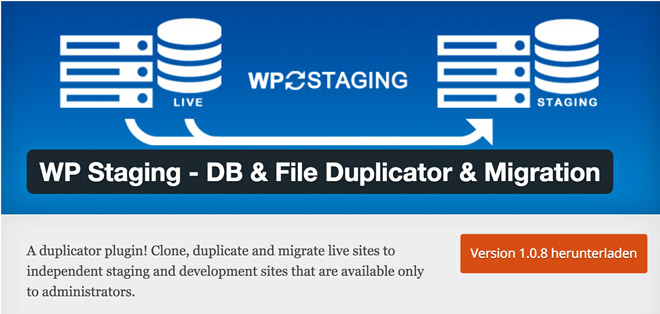
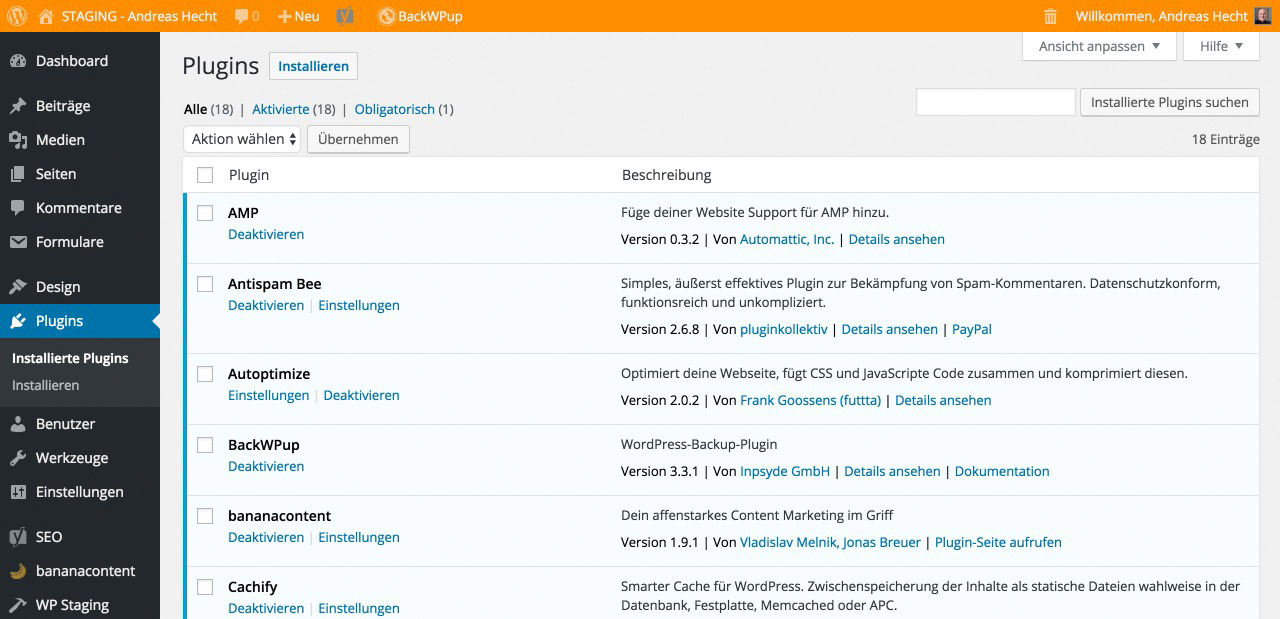
WP Staging: Cloning WordPress Websites per Click
WP Staging is one of the most interesting WordPress plugins I tested recently. With just a few clicks, you can create an exact clone of an entire website. You need a developer page to test plugins and themes? You want to create a new design for your website? Then, this plugin is the one for you.
A pure developer page is useful for many different purposes. One of the most intelligent application areas is testing updates, whether it be theme or plugin updates. An update doesn’t always end up well. Unfortunately, I can tell you a thing or two about that.
Sometimes, a simple update makes your website crock and nothing works anymore. Unlikely? That’s what I thought as well. Until it happened to me. After a bit of research, I found the WP Staging Plugin and immediately tested it. It’s a true sleeper, at least for websites that don’t have the size of Noupe yet.
We’d still have to test how simple and fast the process is for really large websites. For regular websites that are based on a reasonable server, the process is done rapidly and without errors.
WP Staging – DB & File Duplicator & Migration
The good thing about the plugin is, that it can be accessed for free on WordPress.org. It is constantly in development by renowned German developer René Hermenau, who also developed the Mashshare-Plugin, and provides good support.
- Developer: René Hermenau, WP-Staging
- Work in progress: yes
- Latest version from: three weeks ago
- Costs: free via WordPress.org
- License: GNU GENERAL PUBLIC LICENSE
- Known compatibility issues: unknown
- Developer homepage: unknown
- Download on WordPress.org
Cloning a Website Using WP Staging
The cloning process is straightforward. No settings need to be made, even though it would be possible. For one, the DB Copy Query Limit could be defined, which means the amount of database tables that are processed with an ajax request, as well as the File Copy Batch Size, the buffer size in MB.
During my testing, I didn’t make any changes and I didn’t get any error notifications. However, this could be different for cheaper shared hostings, which is why there are settings.
Please create a complete database backup before cloning the website. The free plugin BackWPup is a good choice for that purpose.
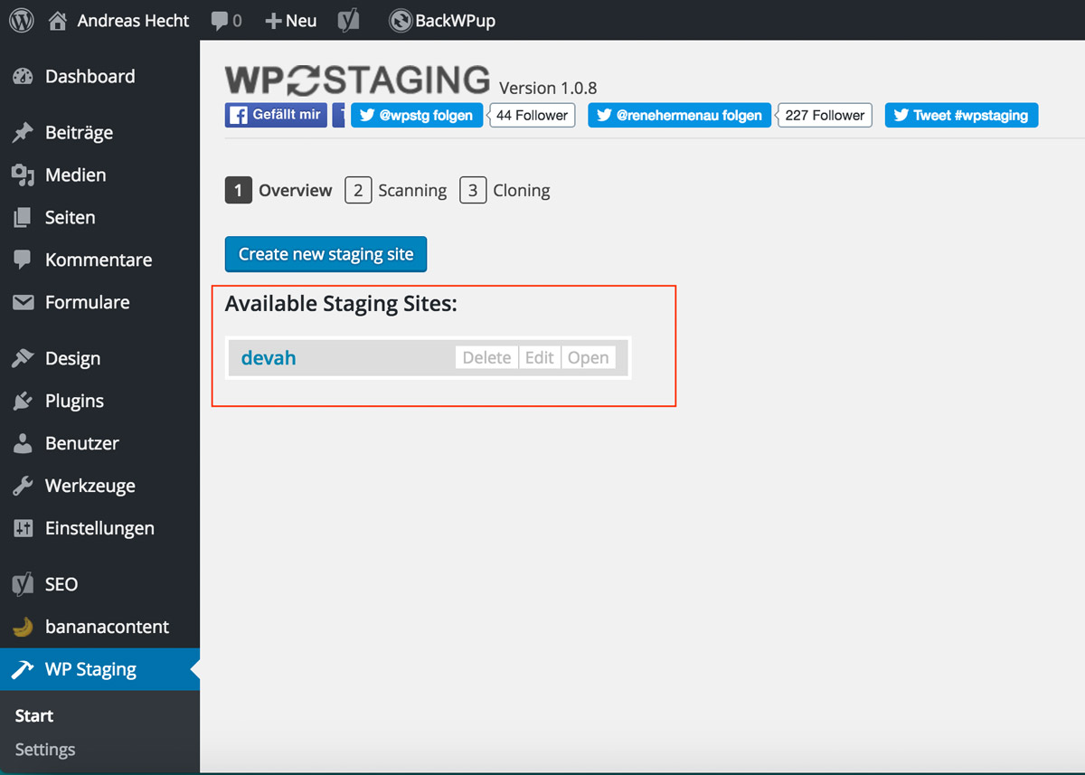
1 – Starting the Duplication Process
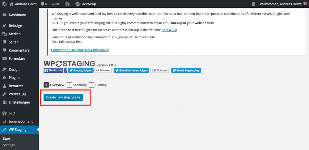
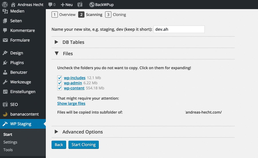
A click on “Create new staging site” will start the process. In the next step, a name is assigned to the cloned page. Here, you should keep it short. The sub folder of the WordPress installation will be where you create the duplicated website in. In this step, you also get to choose the database tables you want to have copied, as well as the WordPress folders that you don’t want it to copy.
I haven’t made any settings here, either. This would make little sense for a pure copy.
2 – Website Scan and Name Assignment
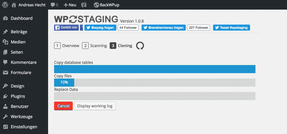
After clicking “Start Cloning”, the entire website is copied. This can take a few minutes, depending on the website’s size. My small website was copied after two minutes.
3 – The Duplication Begins
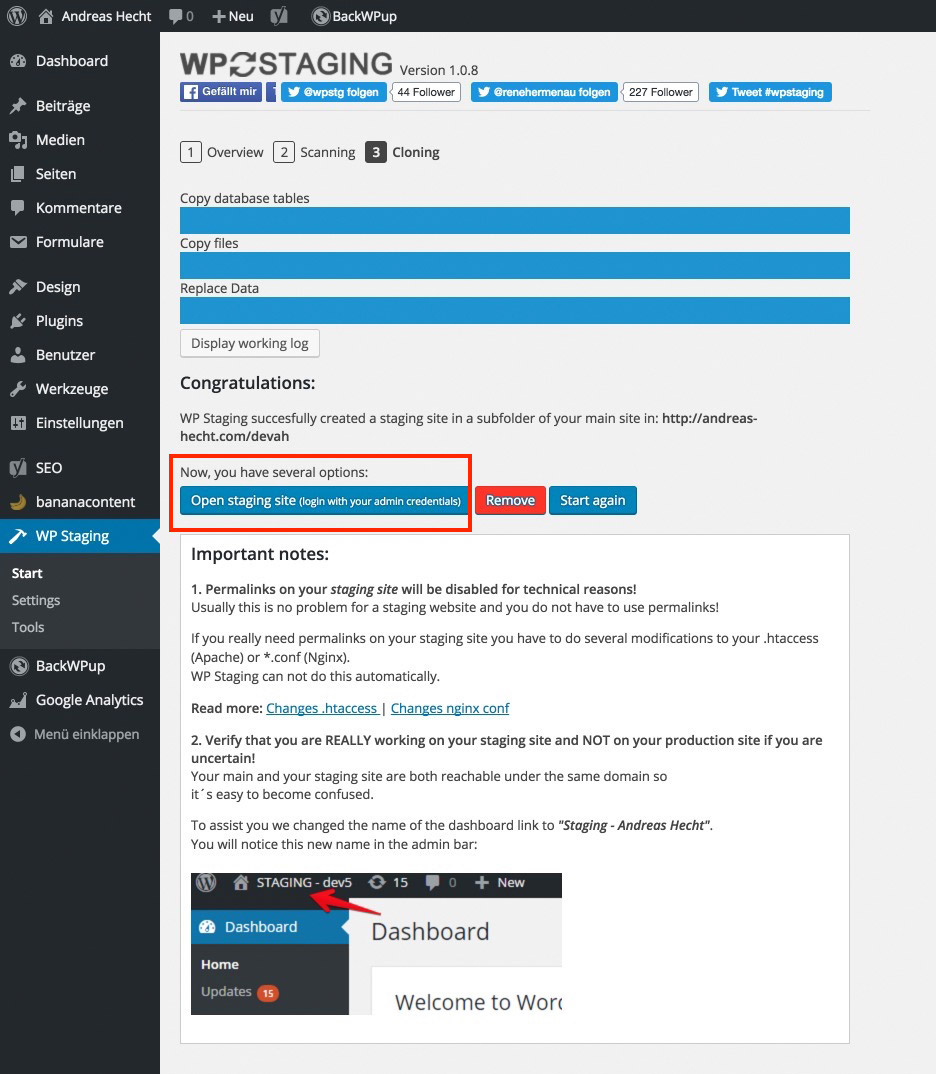
4 – Done. The Cloned Website is Ready to be Used
After a short while, the duplication and installation of the cloned website is done. Yes, you read that correctly. The website is not only cloned and duplicated with all of its settings and activated plugins, it’s also installed right away. A click on the highlighted button lets you log into the developer website using your admin access information.
The only thing that is not copied are the permalinks. The developer page runs using the conventional “messy-links”. If you really need permalinks for your clone, you can activate them with a respective .htaccess file.
The Finished Developer Page
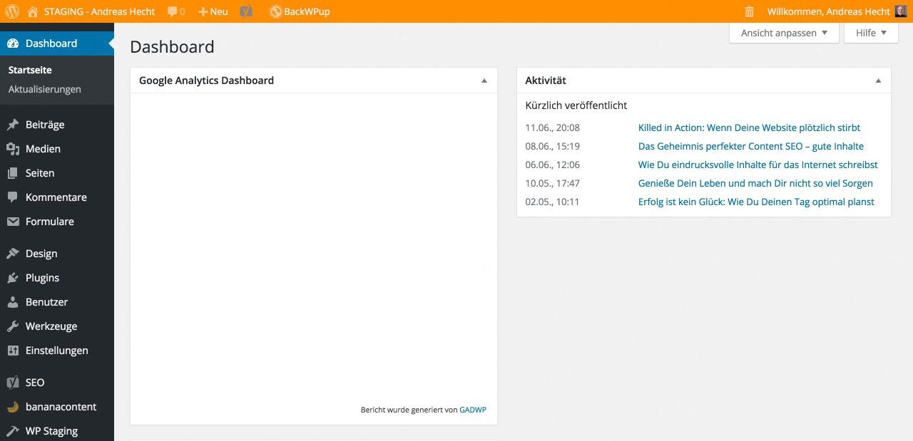
To show you that you logged into your developer page, it has flashy colors in the upper admin bar. This allows you to prevent making accidental changes within the wrong website. By the way, all of your plugins have been activated as well, as you can see here:
The Accessibility – for Admins Only
Your developer page is only accessible to admins, and not to the public. Calling up the URL will cause an error message. Before the website can be viewed, an admin needs to be logged in. This is an important security bonus. On top of that, public accessibility doesn’t make sense.
You are able to call up and use your newly cloned website, by saving the admin access as a bookmark in the browser, or via the landing page’s plugin settings. There, you have the option to edit your developer page after changes have been made. This way, your developer page will always be an exact copy with just a few clicks.
Deleting or editing your cloned website, after installing a new plugin, for example, is done just as easily. You are even able to create an entirely new copy.
Conclusion
This small plugin is extremely powerful and useful. With only a few clicks, you have created an absolutely identical copy of your website that you can test freely, without having to fear a crash. In my testing, the plugin worked without any error. I strongly recommend it.
(dpe)
CSS Hero: Customize WordPress Themes Easily
While it is common knowledge that there are a large number of WordPress themes out there that can lend your website or blog a unique look. You can opt for a simple free WordPress theme, or go with a premium theme, or even select a framework or starter theme and build your own.
In other words, the possibilities are endless when it comes to WordPress themes, and so are the potentials for customization.
However, there is a small downside to this advantage too: you are not the only one with access to premium or free WordPress themes. As such, for every website that you make, there might be hundreds others built with the same theme.
So, how do you truly tweak the appearance of your website so that it stands out?
Of course, the answer is that you customize your WordPress theme. But what if you are not comfortable coding? Or, what if you do not have the time to code a child theme or make changes to functions and hooks?
If any of the above questions sound like something you can relate with, this post has all the answers you need! Today, we present to you a unique solution that lets you do more with your WordPress themes: CSS Hero.
CSS Hero: Customize WordPress Themes Easily
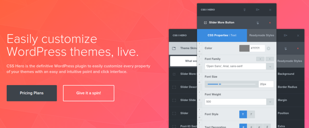
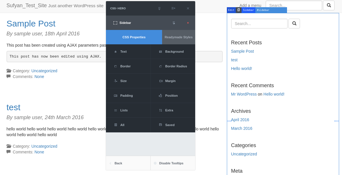
CSS Hero is a premium WordPress plugin that allows you to design your own WordPress theme without writing a single line of code.
Sounds fancy? Imagine it to be a visual page builder, on steroids. CSS Hero works by allowing you to select and modify elements of your website. The editor is displayed on the front end of your website and customizing each element is as simple as point and click.
Using CSS Hero is extremely simple! Just upload and activate the plugin, and you are good to get started with customizing your website.
Customizations are applied separately to your original theme styles by generating an additional CSS stylesheet that works on top of and in assonance with your theme’s actual stylesheet. And before you ask, yes, you do have the ability to undo the changes that you make via CSS Hero. All changes are saved therein, which means you can upgrade your WordPress theme without worrying about losing the changes.
But there is more to CSS Hero than just point, click, edit, save. In fact, it allows full control on every element of your WordPress theme. CSS Hero currently works with and supports more WordPress themes than I can ever count, and the list is growing as we speak — other than popular free and premium themes, it is also compatible with frameworks such as Genesis, Thematic, etc. Also, if you have other plugins on your site, WooCommerce or Wordfence or likewise, CSS Hero plays well with all of them.
Major Features
CSS Hero has a long list of tools and features in its arsenal, such as:
- A huge collection of Google Fonts
- Color Picker to experiment with and make background changes
- Easy editing of element sizes such as margins and sliders
- Special effects like shadows and transitions as well as animations
- Easy undo by keeping track of your editing history
- CSS Hero is ready for the mobile web: it supports responsive design
- Outputs clean, legible CSS stylesheets
But, wait, the above features are present in virtually every other visual editor for WordPress, isn’t it?
Well, there is more. Some exclusive CSS Hero features, shall we?
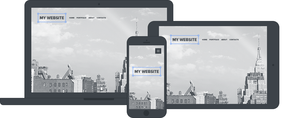
- Live Device Mode: Lets you adjust and customize your theme the way you want it to look across devices, such as smartphones, tablets, laptops, desktops, etc.
- Cross-App Color Picker: Lets you pick colors from other apps right within the editor.
- Detailed History: When I mentioned easy undo of changes, I did not mean one change or two. You can browse through the detailed steps and undo selectively.
- CSS Hero Inspector: Inspector is a CSS Hero plugin which allows additional control on code generated by CSS Hero. Relying on CSSLint, it performs syntax checks on the code, so that you can easily refine, edit, and even remove CSS code and stylesheets or add your own.
- Rocket Mode: CSS Hero comes with an experimental feature named Rocket Mode. It tries to guess the CSS selectors from your WordPress theme, all by itself. Thus, if you ever manage to run a theme that CSS Hero does not officially support, you can still edit that given theme with no hassles, as Rocket Mode can “guess” the CSS selectors by itself.
As you can see, no visual editor plugin can actually beat CSS Hero. Oh, and did I mention it does not operate on the basis of “shortcodes” and custom tweaks that force you to stay loyal to it? It is just pure CSS — even if you remove CSS Hero, you can still have all the CSS code in the world to play with.
Animator Plugin For WordPress
CSS Hero also has a free Animator WordPress plugin. It works fully independent of the CSS Hero main plugin, and it lets you add CSS animations to your website without having to deal with any level of coding.
Pricing
CSS Hero offers three separate plans, so you can pick the one that best suits your needs:
- Starter Plan: Costs $29 per year, and lets you work with one website. It does not include the CSS Inspector feature.
- Personal Plan: Costs $59 per year, and lets you work with five different websites.
- Pro Plan: Costs $199 per year, and lets you work with 999 websites.
CSS Hero also has a 30-day refund policy, so you have nothing to lose. Plus, all plans come with a year of premium grade support and upgrades. The Inspector feature, however, is part of the Pro and Personal plans only.
Conclusion
All said and done, CSS Hero is lightweight and easy to use WordPress plugin that is the definitive solution when it comes to customizing your WordPress themes using an easy and intuitive WYSIWYG interface.
If you already have some skills in terms of design, this plugin will make the overall process a lot quicker. However, if you are a total newbie, CSS Hero can still help you manifolds as it renders clean and well-coded CSS based on your customizations, thereby helping you learn CSS and the art of web design in a swift manner.
Even more so, it goes without saying that CSS Hero leaves no footprints. It uses resources only if you launch the live CSS editor; otherwise, it will not consume any server memory per se. As such, CSS Hero does not slow your website down, nor does it compel you to remain tied to it. All it does is output great CSS code that you can use as per your needs, even if you ever choose to migrate away from the plugin!
CSS Hero is a really impressive solution for folks who need to quickly and easily customize and tweak the appearance of their WordPress themes. See it in action on the live demo, or visit the CSS Hero homepage to learn more.
Read More at CSS Hero: Customize WordPress Themes Easily
