No business can go without a rock-solid online presentation. With the intention of saving the time and effort of web development, both business owners and web design agencies opt for ready-made website templates, which can go live out of the box. For this blog post we have hand-picked 30 responsive eCommerce templates, both premium and free. To make it easier to browse the chart, we have grouped all of the designs by the platforms with which they are compatible. So, get ready to see responsive Magento themes, PrestaShop themes, Shopify themes, Opencart templates and WooCommerce Themes.
A selection of the latest Magento themes is first on the list. We’ll start with premium solutions and move on to their free equivalents. We will repeat the same in each subsequent block. So, browse the compilation, view the themes’ live demos and pick the ones that meet your business needs perfectly.
Responsive eCommerce Templates for Magento
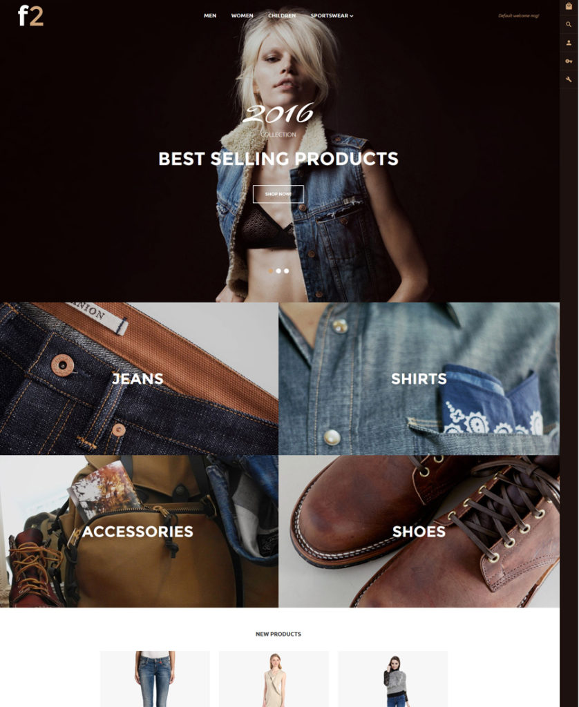
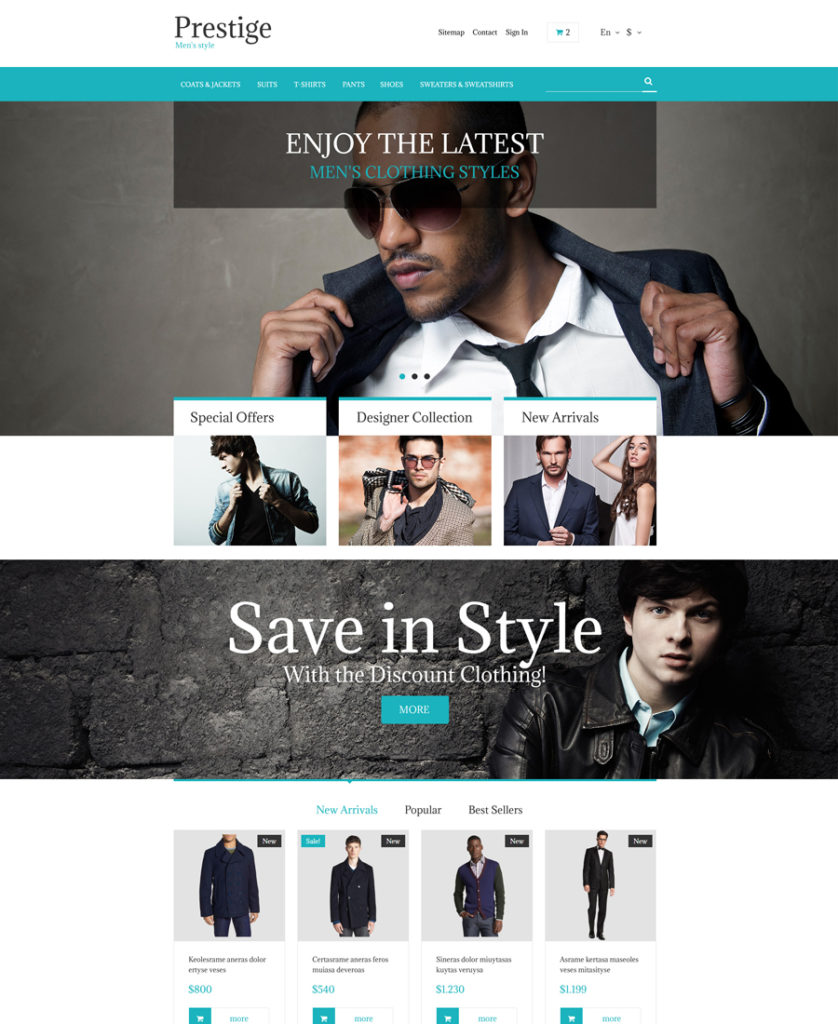
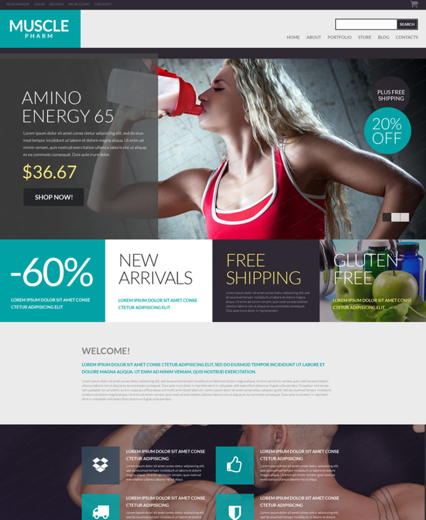
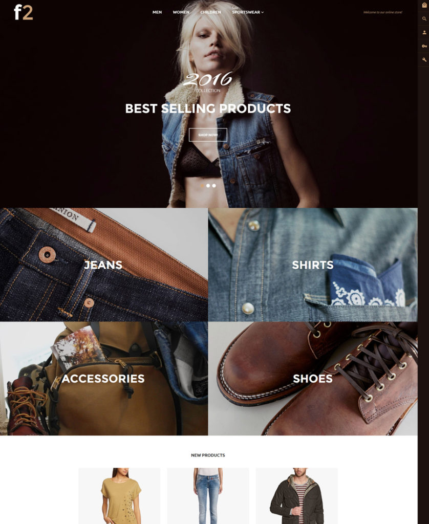
F2 – Fashion Boutique Magento Theme
Demo | More info
F2 is a fully featured, 100% responsive Magento theme best suited for fashion and beauty stores. Running on Magento 2.0 framework, it includes a set of custom TM modules, which all of the theme’s owners can use for free. So, by downloading the theme you will have access to MegaMenu, Film Slider, Ajax Search, Newsletter popup, and Ajax Filer premium extensions. Featuring configurable swatches, carousel product slider, a sticky MegaMenu and live search functionality, the theme is intended to provide your web audience with top-notch online experience.
2YOU Magento Theme
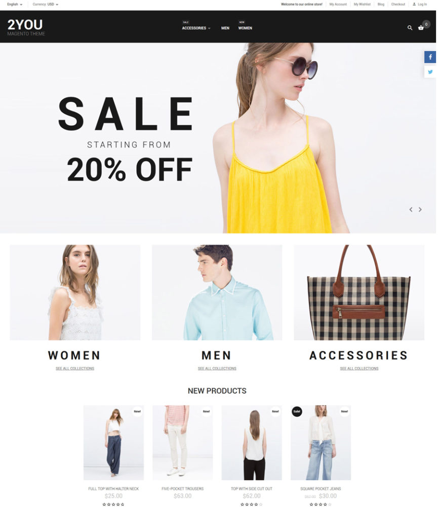
Demo | More info
Featuring a clean design, this eCommerce theme is no less elegant. Fashion outfit stores will look amazing when built with its help. Simple and intuitive in navigation, the template allows the users to locate desired items effortlessly. Thought-out content positioning, live search and functional MegaMenu facilitate navigation to a great extent. All elements of the theme’s design and functionality can be tweaked via a feature-rich dashboard.
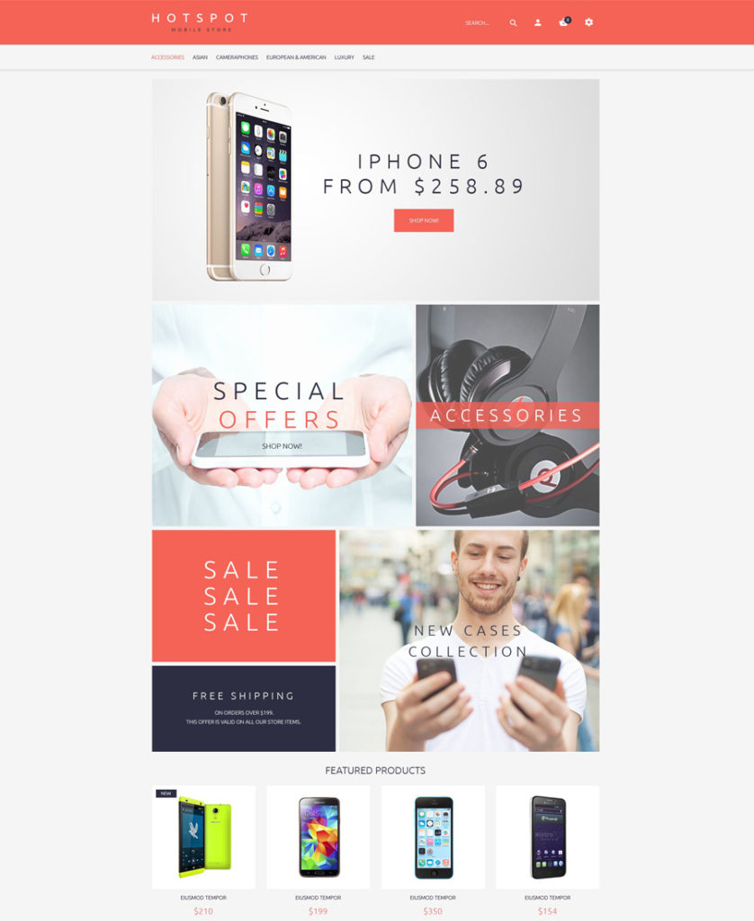
Watches Magento Theme
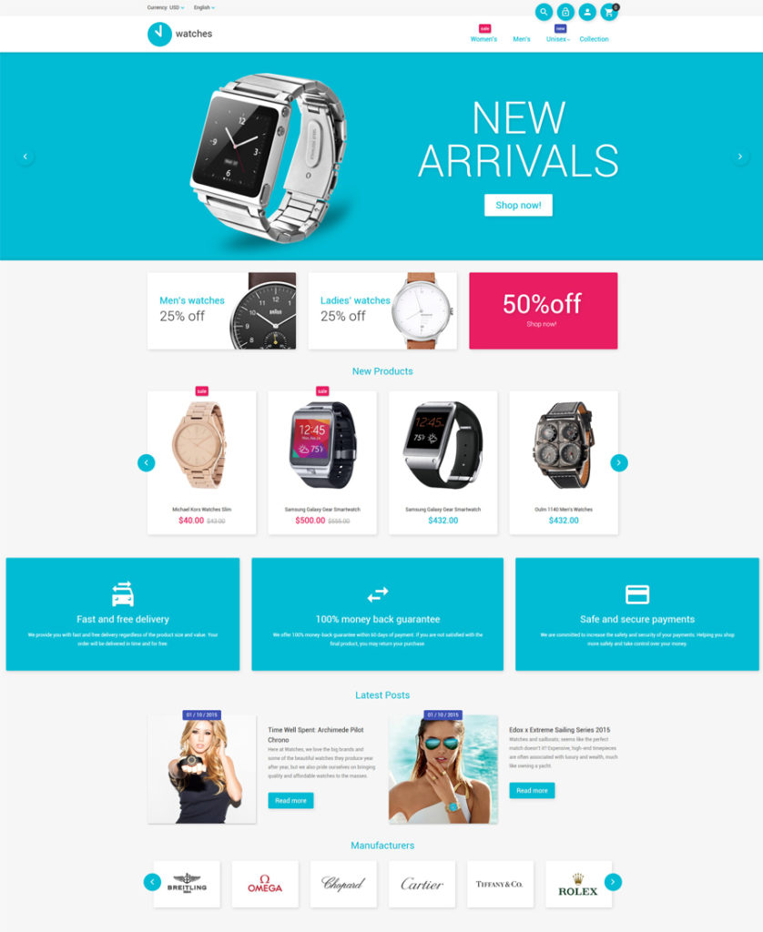
Demo | More info
This fully responsive eCommerce theme is built in clean, flat style, which lets you bring the users focus of attention to your store’s content. By default, the theme is intended for accessories stores. However, it will work well for any other purpose, once you have applied relevant changes to the theme’s look and feel. For example, it will work well for electronics, software, tools and equipment stores. The theme is pre-loaded with social sharing options, letting your audience spread the word about their preferred items with a click.
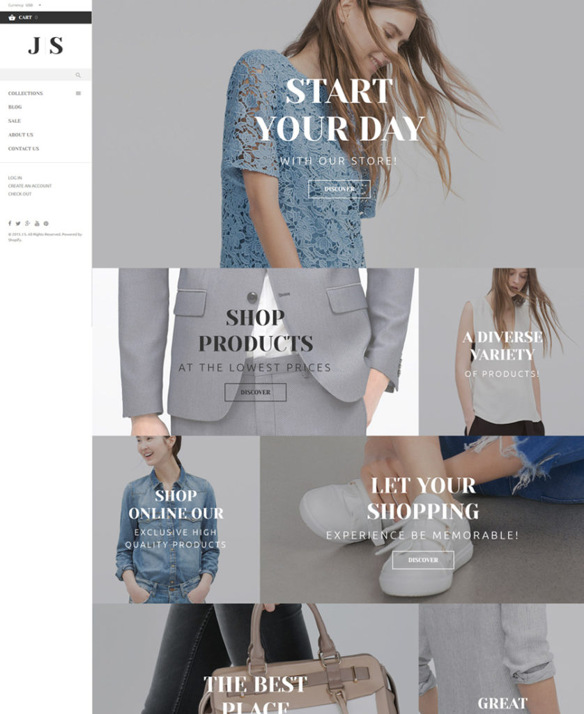
Vini – Fashion shop Magento Theme
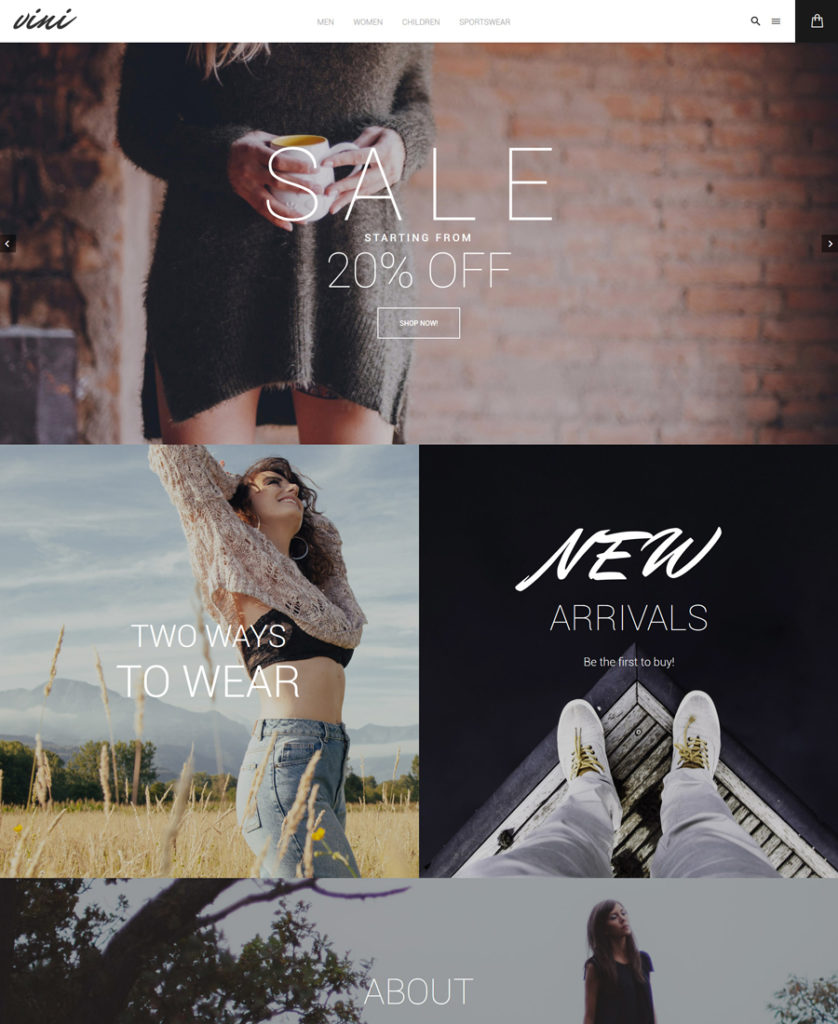
Demo | More info
This is one of the most recent Magento 2.0 themes from TemplateMonster. The theme runs on Magento 2.0 framework. Boasting lightning-fast page loading speeds, the theme is also crafted to adjust flawlessly to any screen size automatically. Loaded with pre-designed templates for home, product, category and other pages, the theme also includes custom-made extensions, which will enhance your work with Vini to a great extent.
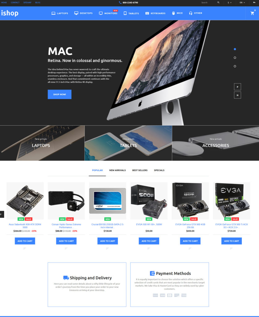
iShop – Electronic Magento Theme
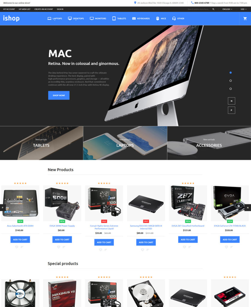
Demo | More info
Like the rest of the responsive eCommerce templates in this compilation, it is fully editable and designed as per the latest web standards. Flat, minimalist layout of this theme, built with attention to detail, will be a perfect fit for websites selling tech gear. A set of custom TM modules is also added to the theme’s pack.
F2 – Magento 2.0 Theme (Free)
Demo | More info
Remember, earlier in this post we were talking about a premium F2 Magento theme? Here is its free equivalent. Looking pretty much the same as the paid solution, the theme features the basic elements, which will help you get started with your site in no time. For example, the pack includes unique category and product pages, a fully responsive Magento 2.0 framework, image slider, dropdown menu, configurable swatches, carousel product listing, and more. One of the main differences is that the free F2 theme lacks the custom TM modules, which are integrated into the premium F2 Magento theme.
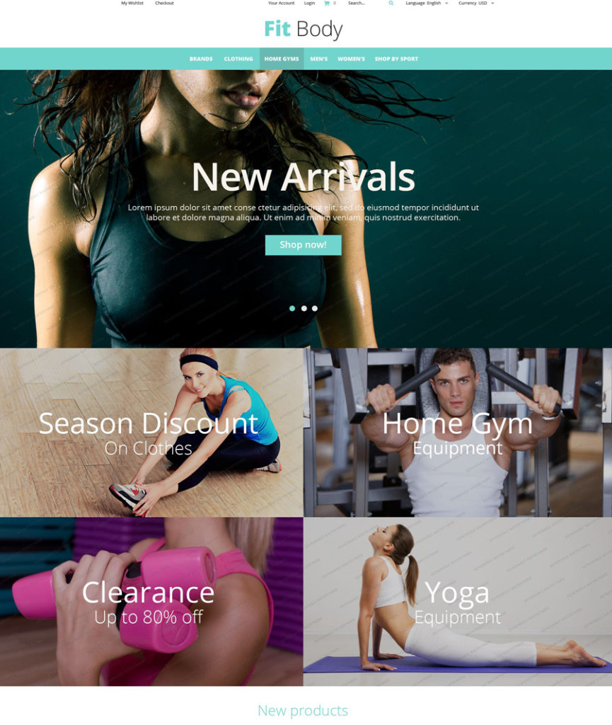
Fitness Magento Theme (Free)
Demo | More info
This fully-customizable free Magento theme is intended to bring more elegance and style to sport related websites. The theme runs on Bootstrap framework, and is cross-browser compatible. Featuring a bold slider, retina-ready images, sticky navigation and lazy load effect, the theme provides the users with outstanding viewing and shopping experiences.
Responsive eCommerce Templates for PrestaShop
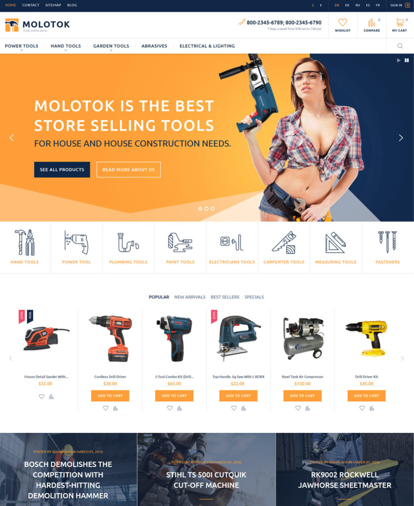
Molotok PrestaShop Theme
Demo | More info
This is one of the latest and most popular responsive eCommerce templates from TemplateMonster (a certified PrestaShop themes developer). This is an ever-growing PrestaShop theme, which gets bigger and better with the passage of time. You’ll like Molotok if you need a megamenu, a stylish slider, parallax effect, a theme color switcher, lots of premium modules worth $174 and other great stuff.
Btw, you can manage the theme’s layout in any possible way. For example, your web shop might have 1 sidebar, 2 sidebars or no sidebar at all. It should be also mentioned that Molotok has multiple demos, so we suggest that you check the theme yourself and see all the options it has to offer.
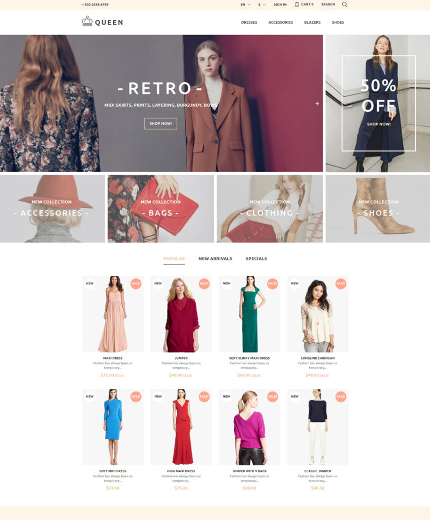
Queen – Women’s Clothes PrestaShop Theme
Demo | More info
This is one more fully-featured responsive PrestaShop Theme. Its vintage-styled layout looks charming. Fashion and beauty related stores captivate with their non-standard online presentation, when built with the help of this template. A set of pre-loaded custom modules let you save more than $300 when purchasing the theme. In addition to its impressive visual presentation, it boasts a powerful admin panel, which brings Queen in alignment with other top-rated responsive eCommerce templates.
Bikerita – Responsive PrestaShop Theme
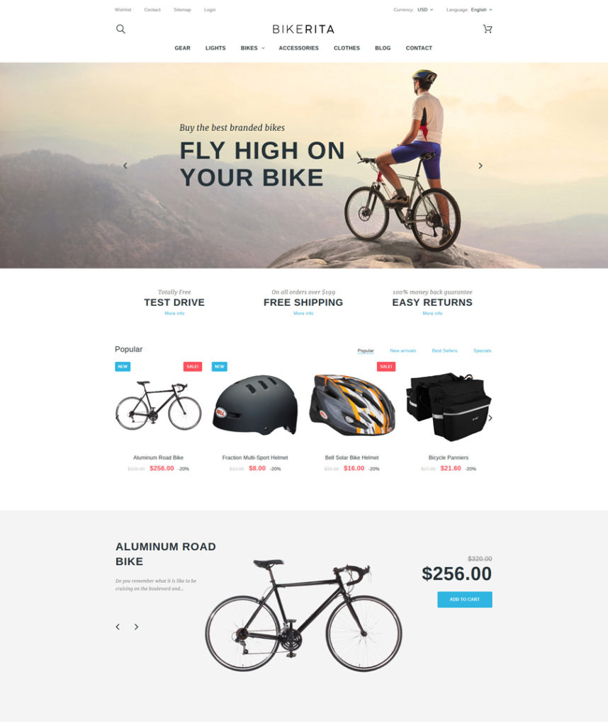
Demo | More info
Bikerita is one of those PrestaShop themes that come pre-loaded with premium modules and extensions, which everyone who downloads the theme can use for free. Best suited for sport and adventure related sites, it looks very straightforward and dynamic. Photo sliders and parallax scrolling backgrounds make the theme eye-catching and interactive. Featuring multilingual and multicurrency support, the theme is enhanced with a newsletter popup – a fully editable element, which you can adjust in any way you wish.
iShop – Computer Store PrestaShop Theme
Demo | More info
iShop is one of those responsive eCommerce templates that is intended for selling computers, mobile phones and other tech gear on the web. Neutral color scheme of its design creates a calming atmosphere on the page, letting the users focus their attention on the store’s products. Bold sliders, product and category banners as well as a set of featured items allow you to showcase your offerings in style.
Computer Hardware PrestaShop Theme
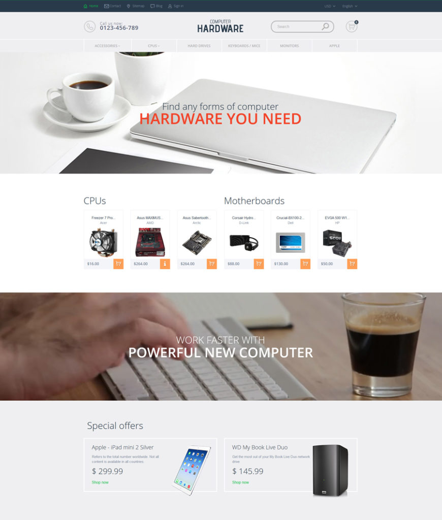
Demo | More info
Similar to the aforementioned PrestaShop themes, this ttheme runs on a 100% responsive Bootstrap framework. Cross browser compatible and SEO-friendly, it ensures top-notch performance of your store across a variety of web browsers and in search results. The sleek and stylish layout of this theme built in pale hues will make your eCommerce site look spacious and easy-on-the-eyes. Photo and video backgrounds, featuring parallax scrolling effect, add more depth and dynamism to the theme.
PrestaShop Theme for Book Website (Free)
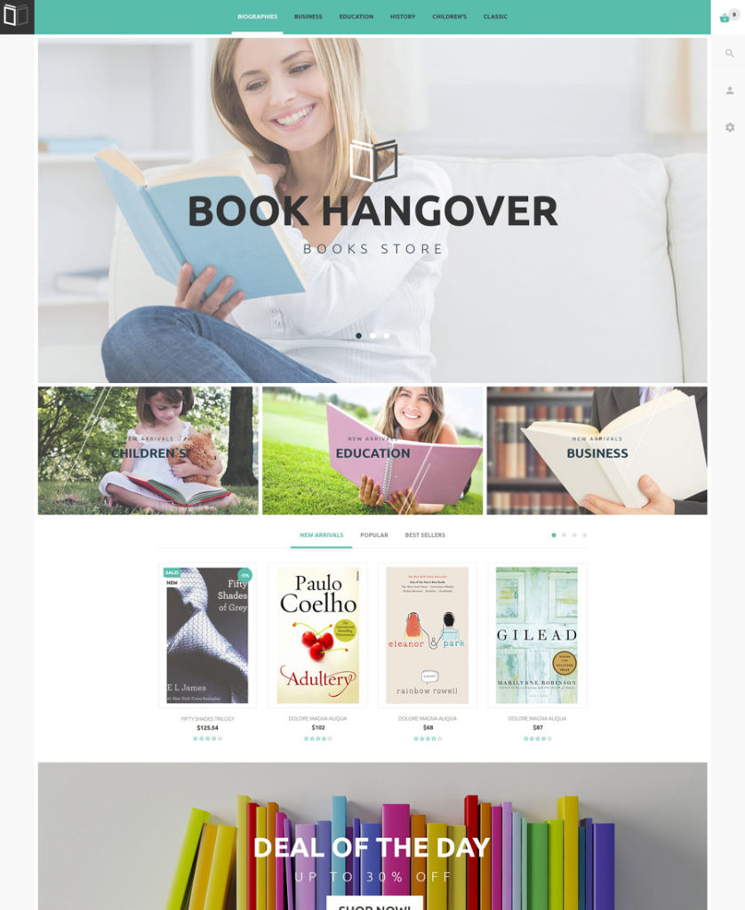
Demo | More info
Stylish and dynamic, this freebie can go hand-in-hand with premium PrestaShop themes. Its layout is fully adaptive. A theme color switcher tool lets you manage the theme’s color scheme effortlessly, watching the changes live, without reloading the page. The theme’s header is enhanced with a sticky MegaMenu. Integration of social media tools lets your visitors share their preferred content with a click.
Fashion Store PrestaShop Theme (Free)
Demo | More info
The theme looks simple yet functional. Built with attention to detail, it lets online shoppers locate desired items in no time. A sticky MegaMenu and live search functionality are added to enhance navigation onsite. On the front page, featured items are organized into a grid-based list. The parallax scrolling backgrounds featuring the store’s fashion items, draw the users’ attention to the highlighted items.
Responsive eCommerce Templates for Shopify
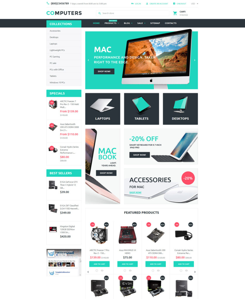
Computers Shopify Theme
Demo | More info
Let’s begin our selection of responsive Shopify themes with a responsive ready-made solution for electronics stores. Featuring a customizable slider in the header of the front page, the theme captivates the users’ attention with your store’s offerings. The product carousel and product badges allow the users to browse your inventory effortlessly and locate the right products in no time. The integrated Google map widget shows the shortest route to your physical location, whereas a set of social sharing options welcomes the users to subscribe to your updates on Facebook, Twitter or any other social media platform.
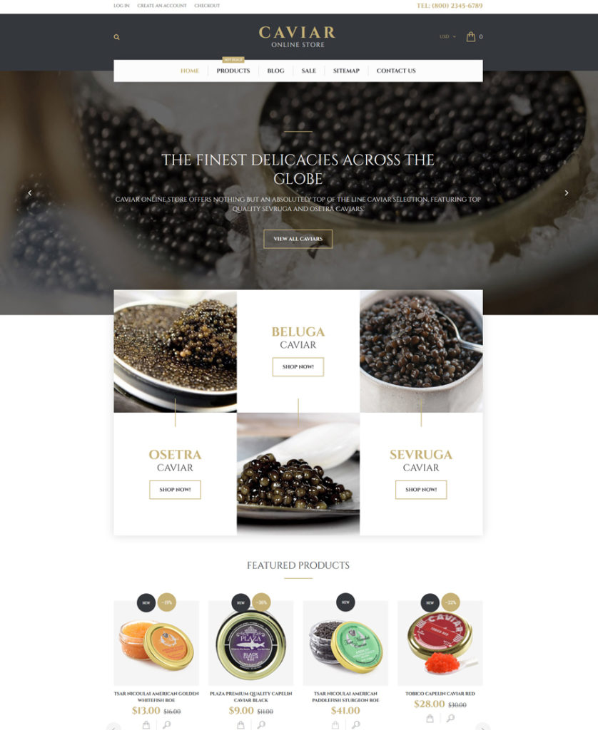
Caviar Shopify Theme
Demo | More info
This simple and intuitive responsive eCommerce template is best suited for food and drink related websites. Its functional and easy to navigate layout features a host of elements providing for an effective presentation of your store’s offers on the web. A built-in promo banner, customizable MegaMenu, product badges, Elevate Zoom, live search, and more handy elements are provided to enhance your clients’ shopping experience.
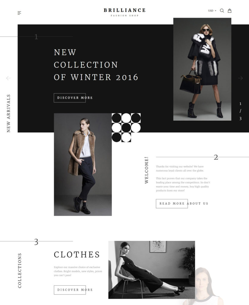
Brilliance Shopify Theme
Demo | More info
A classic combination of black and white colors makes this fashion Shopify theme so elegant and trendy. Enumerated content blocks make it easier to scan the page. Visual and written content make up a perfect balance on the page. Product Quick View option lets the users look through the product details without navigating to a separate page.
Apparel Responsive Shopify Theme
Demo | More info
This is one of the most popular fashion Shopify themes from TemplateMonster. The template is pre-loaded with customized modules. A selection of custom page templates will help you get started with your web store in no time – just replace the default content with yours and get your site live.
Time Craft Shopify Theme
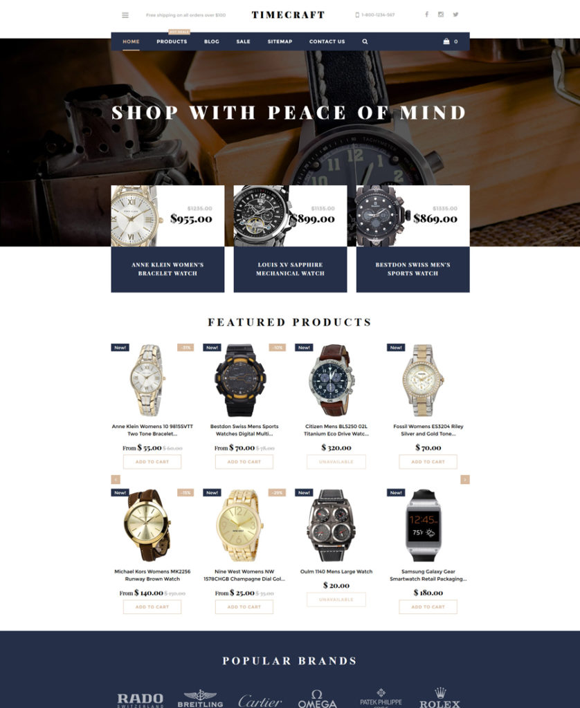
Demo | More info
In addition to a fully featured blog, the template is integrated with blog functionality. To help you manage the theme’s color palette, it is pre-loaded with a theme color switcher tool. With its help you can choose from the existing color combinations without the need to reload the page. Ajax cart, live search, sticky MegaMenu, product badges and the Elevate zoom feature are added to provide the users with a seamless shopping experience.
Fleur de lis Shopify Theme (Free)
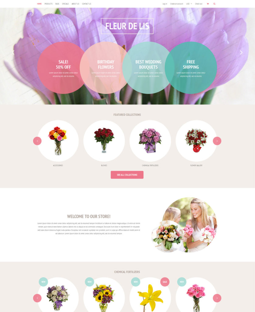
Demo | More info
This is one of those free responsive eCommerce templates that can easily compete with premium solutions thanks to their functional filling and visual appeal. The clean and minimalist style of the theme is enhanced with stunning visuals, creating a cheerful and optimistic atmosphere on the page. A 2-column layout is spacious enough to share loads of data in an easy-to-browse manner. Featuring a fully responsive framework, the theme will adjust all of your site’s content to any screen resolution.
Responsive eCommerce Templates for Opencart
FLO OpenCart Template
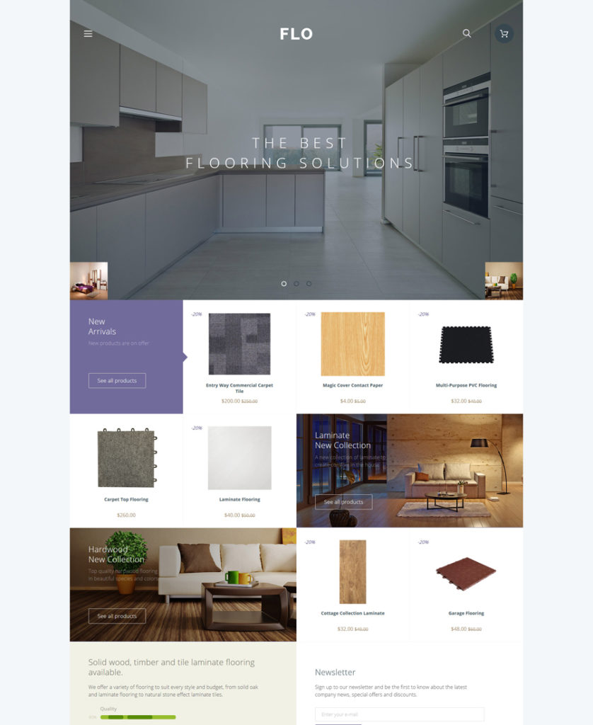
Demo | More info
Like the majority of OpenCart templates from TemplateMonster, this template is intended to perform smoothly across all the major web browsers. As the name implies, the template will work well for interior design and furniture web stores. Traditionally, the theme’s layout is fully customizable and can be adjusted to fit a number of other niches. Custom page templates, customized modules, Google web fonts, a selection of web forms, and more advanced features are integrated to let you create a versatile web page.
VIVA OpenCart Template
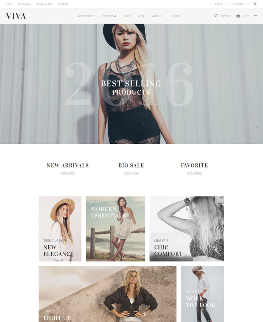
Demo | More info
The theme looks both trendy and functional. The clean layout is enhanced with bold images and easy-to-follow navigation. When reaching your site, the users will be introduced to a newsletter popup form. A fully editable dropdown menu remains fixed to the top of the page as a user navigates your content. Wishlist and shopping cart options are also sticky.
Status OpenCart Template
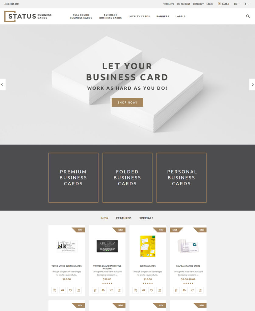
Demo | More info
The next theme on the list of premium Opencart templates is best suited for print shops. The layout includes a number of elements providing for an effective online presentation of your store’s offerings. A page-width slider, quality product thumbnails, easy to scan features and special items invite the users to start making purchases right from the theme’s front page. All of the store’s items are supplied with ratings, facilitating the users’ decision-making to a great degree.
Organic Cosmetics OpenCart Template
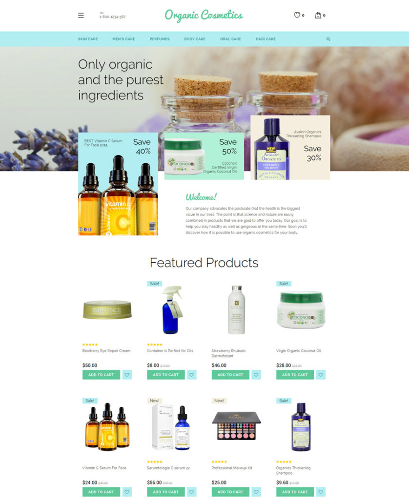
Demo | More info
The theme will bring more style and elegance to beauty and fashion related web stores. Its greenish color scheme makes the design so fresh and natural. The layout is built with the focus on the store’s products. Grid/list views, products compare, wishlist, product badges, sticky MegaMenu, and more features are built into the theme and can be managed via the dashboard.
Shine OpenCart Template
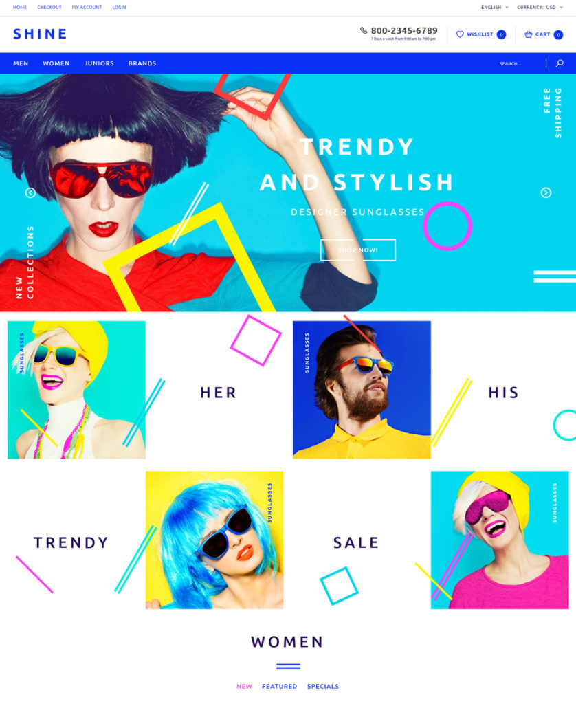
Demo | More info
The bold metro style of the template’s layout makes it stand out from the rest of the OpenCart templates. Impressive visuals combined with a powerful set of features make the theme a rock-solid foundation for beauty, fashion and accessories stores. The theme runs on a fully adaptive framework, which ensures that all of the store’s content (including visuals) will scale to any display size.
Mobile Shop OpenCart Template (Free)
Demo | More info
The free OpenCart template is best suited for tech gear shops. A card-based layout structure is both trendy and user-friendly. A set of featured products placed below the product banners is supplied with a cool hover effect, which reveals CTAs and star rating on the mouse-over. An informative footer will take the users to the rest of your site’s pages with a click, whereas integrated social media options will guide them to your social media profiles.
Responsive eCommerce Templates for WooCommerce
Fairy Style WooCommerce Theme
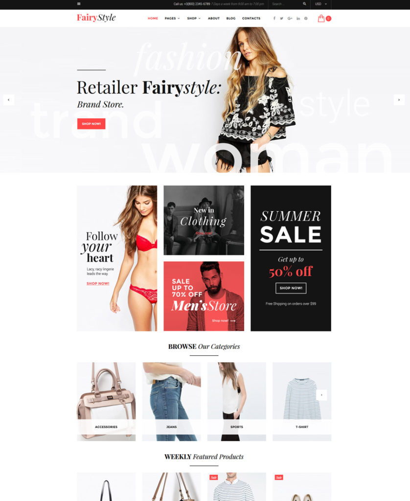
Demo | More info
Fairy Style is the first on the list of the best WooCommerce themes from TemplateMonster for 2016. Simple and intuitive in its management, it includes a WordPress Live Customizer feature, which allows you to apply quick changes to your store’s layout while simply dragging and dropping different design elements. On top of that, the theme is licensed under GPL v3.0, which means that you can install it on as many sites as you wish and tweak the template’s code in multiple ways.
Wilson Smith WooCommerce Theme
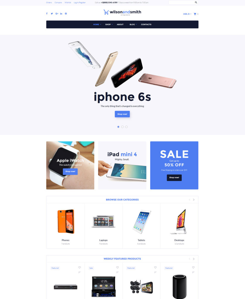
Demo | More info
The theme is built with valid, semantic code. Running on Bootstrap framework, it is fully adaptive to all screen sizes. Similar to the previously mentioned theme, this one is GPL licensed. WordPress Live Customizer is also included. A simple and easy-to-navigate layout structure makes it an optimal solution for eCommerce web projects selling electronics.
Fishing Online Store WooCommerce Theme
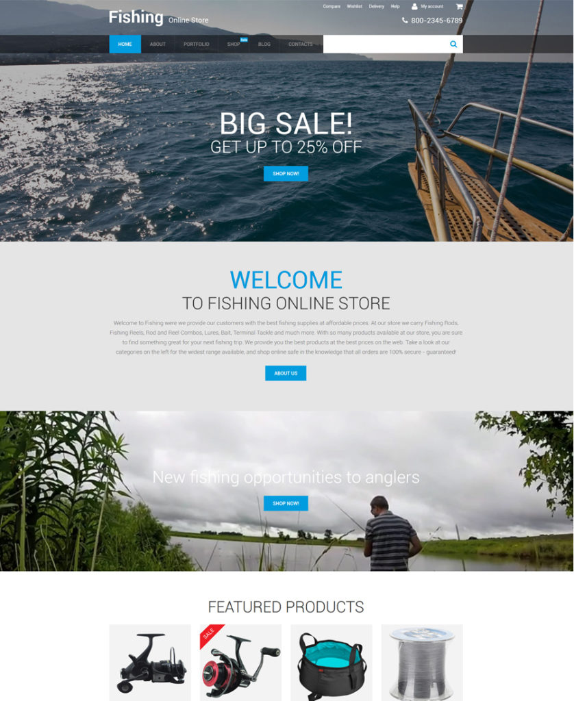
Demo | More info
The theme will work well for content-heavy web stores. Best suited for fishing, sport and travel sites, it is abundant in bold visuals both in the backgrounds and on product pages. Thanks to the lazy load effect, the theme will load all content smoothly across a variety of devices. Cherry Framework with a selection of handy shortcodes will enhance the look and feel of your pages.
Drug Store WooCommerce Theme (Free)
Demo | More info
This is the last, but not the least theme on this list of responsive eCommerce templates. Its pixel-perfect design will work well for a variety of web projects, including sport, travel, electronics, entertainment, hobbies, gifts and others. Featuring stunning animation effects and parallax scrolling images, it is intended to present your store’s offerings in the best way possible. A fully editable layout, as well as Cherry Framework with its advanced set of features, is included as well.
Final Words
These are 30 of the most popular and trending responsive eCommerce templates. See all of them in action while browsing live demos, try how freebies perform and enrich your collection of cool web design stuff with more premium ready-made solutions.
Read More at 30 Free and Premium Responsive eCommerce Templates


