When optimizing your website’s speed while following the GooglePage Speed Insights guidelines, you’ll know this alert. Activate “Leverage Browser Caching” for the Google Analytics Script. Often, this alert is to be blamed when a website doesn’t reach the infamous 100 of 100 PageSpeed points. That’s exactly where the problem is, because how can you cache a file that is not on your server? Today, we’ll show you three solutions.
Google Analytics is a good thing and still the tool of choice for every user that wants to take a close look at their website’s traffic. However, the script can also cause quite a headache when the goal is to optimize your website to achieve the famous 100 points from GooglePage Speed.
One problem is that some of the aspects desired and recommended by Google will not accelerate your blog, so they are not recommendable. For example, when you implement your entire CSS (often multiple files, including the plugin stylesheets) in the HTML inline, Google will congratulate you for making this decision.
However, when you only have a small perfectly cacheable stylesheet in the header, and the rest of the CSS in the footer, Google will try to tell you that this will slow your website down. Of course, the opposite is the case.
The same applies for the Google Analytics error. The script will be cached by Google for two hours. However, Google wants to have a longer period. This doesn’t increase your website’s speed either.
Google criticizes the short caching of the Analytics script, and thus, it only shows a maximum of 99 out of the 100 points. To solve this, there are multiple options. Three of which I’ll introduce you to today.
Before We Start: Make Sure To Use Browser Caching
If you’re still not using a code for a caching in your .htacess file, it’s about time. A simple browser caching combined with a compression of files already causes a significant speed boost. Here, you’ll find the necessary code, add it into the .htaccess in your blog’s main index.
Host the script on your server. This solution is ambivalent. On one hand, it immediately removes the error, and you’ll easily get the 100 points. On the contrary, it is quite troublesome, as you have to make sure that the script is getting updated.
To me, this solution seems to be good, as firstly, the script is delivered faster on my server, and secondly, with a little effort, it can also be updated automatically if you can start the proper cronjob on your hosting package.
Step 1: Downloading Analytics.js
Download the script used in the Google Analytics code. The URL is the following:
https://www.google-analytics.com/analytics.js
Load the script into the WordPress main index. The new path to the file could look like this:
https://yourwebsite.com/analytics.js
Now, search for your Google Analytics code in the theme or your plugins. If you happen to use a plugin that adds your Analytics code to the theme, deactivate the automatic addition to your theme. Otherwise, look in the header.php or the footer.php. You might also find it in your theme’s functions.php.
Replace the Original URL With Your URL. View Script:
Copy this file into your WordPress’ main index and call up the file in the browser:
http://yourwebsite/dir.php
The lower path is correct, copy it, and replace the information in the analytics-update.php in line 6 with it.
Afterward, delete the dir.php from your server, as it poses a security risk. Now make sure that both files on your server are writable. The file rights CHMOD 755 should be okay and work.
Now, all you need to do is create a cronjob that calls up the analytics-update.php once a week. This works differently for each host and operating system so that I won’t post a code for this job.
If your server doesn’t allow for Cronjobs, use an external service like cronjob.de.
By hosting it on our server, the file can be moved into the cache, and GooglePage Speed Insights now shows the desired 100/100 points.
Solution 2: Use ga-lite.js Instead of Google-Analytics.js
Ga-Lite is a slim version of the Google Analytics script. It was developed and optimized to have the best speed and optimal browser caching. It works perfectly and records the basic functions of the original code by Google Analytics. Another advantage: the ga-lite.js script loads much faster than the original.
When you don’t just want to trick Google, but want to do something for the performance of your website, ga-lite is the right choice.
However, it does have downsides at the moment. Custom quotations can not be used. The bounce rate can not be adjusted, and links can not be tracked. By now, the IPs can be marked up anonymously, however.
The Installation of ga-lite:
Implement the following code into the footer.php of your theme, above or below of wp_footer().
ga-lite will also get you to the desired result at GooglePage Speed.
Solution 3: We Outsmart Google
You’re using an adjusted Analytics code, and both solutions are out of the question? You want to keep everything the way it is, but you still want the 100 points for your ego?
No problem, we also got an ego-solution to offer. For that, we use a small PHP function that simply makes the Google Analytics code “invisible” for PageSpeed Insights. This way, the Analytics.js works perfectly fine everywhere, except for the page of Google PageSpeed.
This code also gets you to the 100 points, but won’t speed up your website. This code is only there for your ego and lets you reach the 100 points without any significant modifications.
Conclusion:
The first solution seems to be the best to me but is not recommended by Google. It can only be used with a cronjob that always keeps the local file updated. Without this update step, the first solution is not recommendable at all. The second one is ideal when you have not made any changes to the Google Analytics code yet, and only use the analysis software’s default functions. You’ll still have access to them without any issues, and your website will be sped up at the same time.
The third solution also works, but I don’t recommend it. Personally, I would prefer living with 99 points or less. The main thing is that my websites load in much less than a second.
Every week users submit a lot of interesting stuff on our sister site Webdesigner News, highlighting great content from around the web that can be of interest to web designers.
The best way to keep track of all the great stories and news being posted is simply to check out the Webdesigner News site, however, in case you missed some here’s a quick and useful compilation of the most popular designer news that we curated from the past week.
Note that this is only a very small selection of the links that were posted, so don’t miss out and subscribe to our newsletter and follow the site daily for all the news.
Browser Trends September 2016: Are the Browser Wars Over?
10 Skills Every Designer Needs on their Resume
How I Designed a Website (this One) in 8 Days
Responsive Web Considered Harmful
Logo Design: Creative Stages
4 Simple Ways to Personalize UX
I was Roasted by Over 100 Photoshop Experts, Here’s the Aftermath
Colorize – Turns any Word or Phrase into a Hex Color
Microsoft is Allegedly Creating a Slack Competitor
Designer’s Guide to Working with Style Guides & Style Tiles
The Inaccessible Web: How We Got into this Mess
Apple is Using Wizardry to Tweet Without Tweeting
The Irony of Apple’s War on Design Theft
Duotone in Web Design
Has Jonathan Ive Designed Himself Out of Existence?
The Future of Branding is Debranding
LinkedIn Publishing: It’s as Beautiful as your Ideas
Site Design: Proud & Punch
4 Tips for Landing your Dream Job at a Creative Company
Sans Francisco: A Collection of Tools to Help Designers Craft Delightful Experiences
Site Design: Stripe.com/apple-pay
Pegg: Slack Bot for Tracking your Income and Expenses
40 Hours to Prototype
How to Pretend You’re a Great Designer
Apple’s New Wireless Earbuds are the Most Apple Product Ever
Want more? No problem! Keep track of top design news from around the web with Webdesigner News.
Every week we feature a set of comics created exclusively for WDD.
The content revolves around web design, blogging and funny situations that we encounter in our daily lives as designers.
These great cartoons are created by Jerry King, an award-winning cartoonist who’s one of the most published, prolific and versatile cartoonists in the world today.
So for a few moments, take a break from your daily routine, have a laugh and enjoy these funny cartoons.
Feel free to leave your comments and suggestions below as well as any related stories of your own…
Pained vacation
No cash
Everything but money
Can you relate to these situations? Please share your funny stories and comments below…
Who doesn’t love to travel? Whether it’s the charms of a Paris café, or the heights of Machu Picchu, we all love getting away from the daily norm.
So we’re delighted to be able to bring you this awesome set of 60+ travel icons designed by Icons8. This set is sure to traverse any language barrier, featuring as it does, some of the most iconic sights, and sites, from around the globe.
You’ll find a cruise ship, a London bus, the Statue of Liberty, a hot spring, a zip line, a ticket, a camp fire, and tons more… Our personal favorite may be the ancient vase, closely followed by that cool looking RV.
All of the icons are supplied as EPS, PDF, large and small PNGs, and SVG files. And even better, they’re all free for personal and commercial use.
Please enter your email address below and click the download button. The download link will be sent to you by email, or if you have already subscribed, the download will begin immediately.
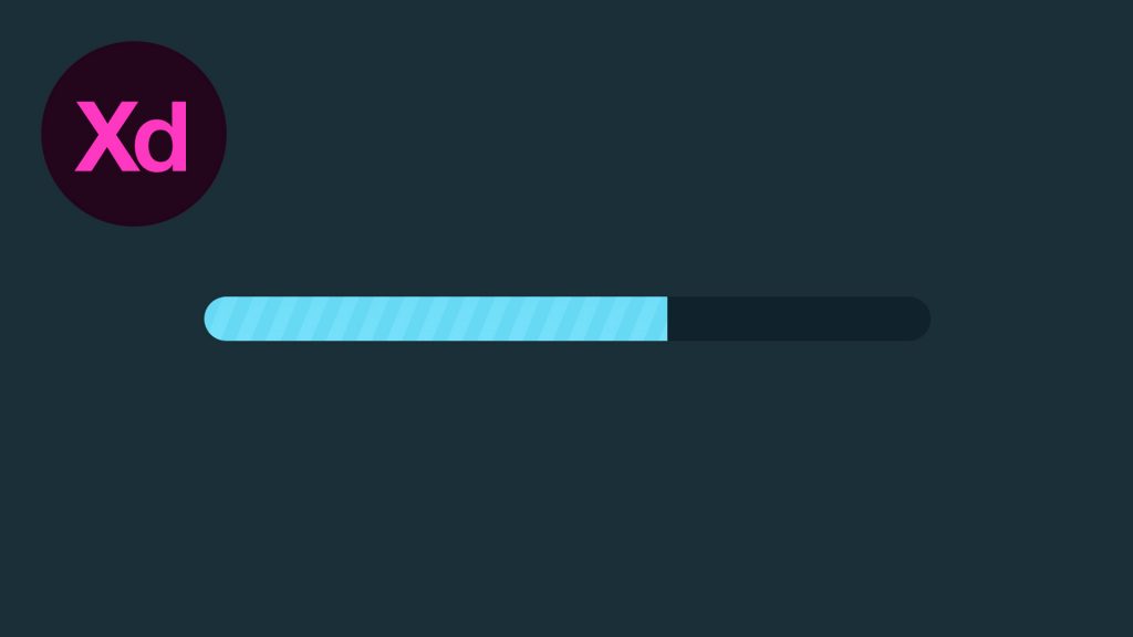
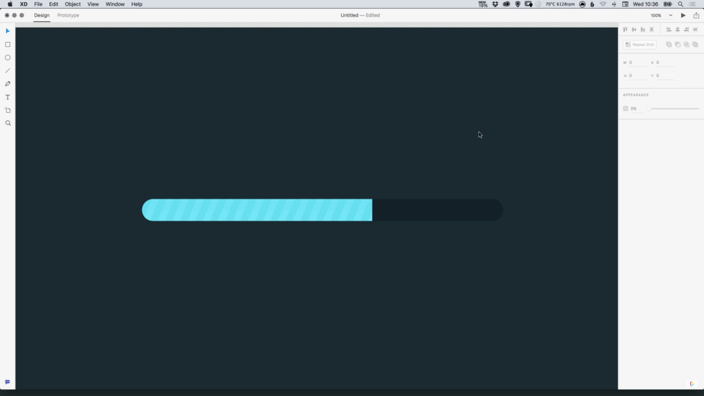
In this tutorial, we’re going to learn how to design a progress bar in Adobe XD.
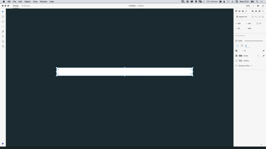
1. Create a new artboard 1920 x 1080.
2. Select the artboard by Left-clicking on the artboard name top-left, and in the Property Inspector on the right, select a Background Fill Colour. In this tutorial the colour used was #182F38.
3. Select the Rectangle Tool, and draw a long thin rectangle the size that you would like your progress bar to be. In the Property Inspector change the radius to a particularly high number, to fully round off all corners. Select either the colour #FFFFFF or #10232C.
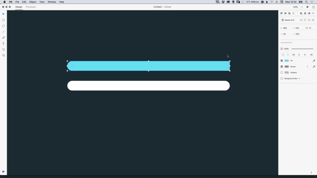
4. Press Cmd/Ctrl + D to duplicate the rectangle, and in the Property Inspector, select the other radius icon that will allow you to edit the radius of each corner individually. Change the top-right and bottom-right radius to 0.
5. Next, with the rectangle selected, set the Fill colour to #67D9F4 or a colour of your choice.
6. Double-click the coloured rectangle, and drag from the right edge to adjust the completion percentage for your progress bar.
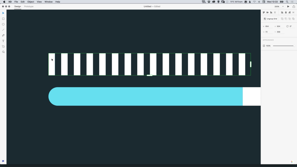
7. To add some texture to the progress bar, select the Rectangle Tool and create a small vertical rectangle that is either equal to, or greater than, the height of your progress bar. The angle of this rectangle can also be adjusted.
8. Select the Repeat Grid Tool in the Property Inspector and Drag from the right edge to repeat the shape up to where your coloured rectangle ends. Adjust the spacing between each of the copied shapes by hovering between the gaps and Left-clicking and dragging when the pink guides appear.
9. Select the coloured part of your progress bar, and press Cmd/Ctrl + D to create a copy, and move this shape up on top of the repeated shapes/bars. Select both the repeated shapes and the coloured rectangle copy, and in the Pathfinder options in the Property Inspector, select Intersect. Selecting this option will crop the repeated shapes/bars to the dimensions of the coloured shape.
10. A Fill or Gradient can also be applied to the cropped version of the repeated shapes, and it can then be moved back down to sit on top of the original coloured shape, giving it some texture. The Opacity of the repeated shapes/bars can also be adjusted.
11. Drag over all of your shapes and go to Object > Group to group all shapes together and move around as one object.
The following is a guest post by Ahmad Shadeed. Ahmad has put together a ton of examples to show off how using relative units can benefit us. I think a lot of us think of units like em as being for font-size, which it is, but can also be for lots of other things, tying together typographic sizing and other visual elements.
We are living in a dynamic world, everything we do could be changed at anytime. We, as Front-End Developers should build our layouts in a dynamic approach.
In this article, we will explore a concept that lets us resize our components by using CSS relative units (%, em, or rem). Not just the type size, but all the UI in that component. We’ll look at practical examples, pros and cons of the approach, and even a complete web page built out in this manner.
The only way to resize the entire component proportionally, then, is to adjust the font-size of each element manually to match each other at a new size. Perhaps your client tells you they’d like to see that area 1.5× bigger, you’d have to adjust those sizes to 21px and 54px respectively.
To make things a bit easier to adjust, we could use percentage font sizing.
This is saying: the font-size should be 85% of its closest parent element with a defined font-size.
We could set that font-size on the parent element:
.post {
  font-size: 24px;

  /*
    Child elements with % font sizes...

    85%
    0.85 * 24 = 20.4

    135%
    1.35 * 24 = 32.4
  */
}
The browser calculates those font sizes for you when you use percentages and you don’t really need to care what the final values are. It’s just a proportion.
We could do the exact same thing with em values if we wanted. With font-size, percentage and em are kinda the same thing.
.post-category {
  font-size: 85%;
  /* the same as */
  font-size: 0.85em;
}
.post-title {
  font-size: 135%;
  /* the same as */
  font-size: 1.35em;
}
When we use em for values other than font-size, the computed pixel value it represents is still based on font-size. This is unlike, say, percentages, where a percentage width is based on the width of the parent, not the font-size!
In the following interactive demo, the slider changes the font-size on both components. The first everything set in pixels: font-size, border, margin, and padding. The second sets all those things in ems:
Proportional scaling for everything!
Proportional Buttons
Sometimes we need variations of a button. Perhaps a bigger version to emphasize a more important call to action. We can benefit from em units by using it for the padding, that way we can easily increase the size of the button through both font-size and padding.
Here’s an example where we need to keep an image avatar a bit bigger than the byline and publication date. Notice the blue highlight. Its height should change as we scale the font-size.
The HTML could be like:
<div class="bio">
  <img src="author.jpg" alt="Photo of author Ahmad Shadeed">
  <div class="bio__meta">
    <h3><b>By:</b> Ahmad Shadeed</h3>
    <time>Posted on August 5, 2016</time>
  </div>
</div>
And we’d set not only the font sizes in em values but also the width and height of the image. Make sure the image itself is big enough to scale without losing too much quality!
Another property that is happy to be set in em values: box-shadow.
We already know borders can be scaleable with em values. Here, we’ll set the “height” of an inset box-shadow with an em value so it scales with the size of the text.
Note: we could have also pulled this off with CSS gradients with hard color stops, as those stops could be set at em values as well!
Making Room for Icons
Say we have a decorative
with a custom icon in the upper left. We should account for the scenario when the font size changes. Relative units can help again here.
<blockquote class="quote">
  <p>
    <span>
      Building dynamic web components using modular design concepts is awesome.
      <em>- Ahmad Shadeed</em>
    </span>
  </p>
</blockquote>
We’ll set everything with relative units like we’ve touched on already. The decorative icon we will place with an SVG image applied via a pseudo element. We’ll position that pseudo element absolutely, again with relative positioning and sizing, leaving enough space for it (with relative padding) on the parent element.
With that in place, if we change the font size, everything scales fine:
Notice how everything scales up proportionally, just as it would if we grouped these elements and drag-scaled it up in a design application!
If we used pixel values instead, things wouldn’t have scaled quite so nicely. The icon, in particular, could get awkwardly close to the text, or awkwardly far away:
Interactive example:
Figure with a caption
Imagine a photo and caption arranged like this:
We can make much of this design based on the font-size, like amount it is offset to the left and top, the padding, and even the shadow.
<figure class="figure">
  <img src="sunrise.jpg" alt="Sunrise">
  <figcaption>The feeling you got from watching the sunrise is amazing.</figcaption>
</figure>
Take this darkened circle behind the title in this content block:
Let’s make sure it sizes accordingly when the font size changes. But there are more subtle details here. The border-radius should be relative, as well as the thickness of that dashed line.
<section class="block">
  <h3 class="block__title">Content outline</h3>
  <div class="block__content">
    <p>Description to be there....</p>
  </div>
</section>
Using relative units for as much as we can here, everything scales:
A Search Input with Icon
It’s common to use icons with buttons, but you can use them within inputs too. This is a common example where we indicate a search input by using a magnifying glass icon:
The icon is placed using background-image, and padding-left is added to keep the text from overlapping it. If the font size increases, we should increase the size of that icon commensurately.
<form class="search">
  <label for="search">Enter keyword:</label>
  <input type="search" id="search" placeholder="What are you searching about?">
</form>
All the classics are set in relative units here: padding, border, border-radius… but we’ve also used relative units for both the background-position and the background-size. Now it all scales up nicely!
Toggle
Consider a customized checkbox in the form of a back-and-forth toggle switch:
Nothing in here we can’t scale!
<form action="" class="switch">
  <p>Do you want to subscribe?</p>
  <input type="checkbox" name="" id="switch" class="off-screen">
  <label for="switch"><span class="off-screen">Do you want to subscribe?</span></label>
</form>
We have quite a bit of horizontal space there. Without limiting anything, the line length of that paragraph would have been a bit too long to be comfortable. Setting max-width is a great way to limit line-length. We probably wouldn’t set it in pixels (for all the same reasons we’ve been covering all along: it doesn’t scale) and we probably wouldn’t use percentages either, as at narrower widths, 100% is likely fine. Relative units it is!
<div class="hero">
  <h2>This is title for this hero section</h2>
  <p>And this paragraph is a sub title, as you know I'm writing an article about using em units to build dynamic components.</p>
  <a href="#">Read about hero</a>
</div>
Now the line length is capped, but will happily go full width when less width is available.
SVG Icons in Buttons
One of the reasons people cite liking working with icon fonts is that the font is automatically sized along with the text. But that can also work with (as we’ve seen), and can work with inline icons as well!
We’ll use em values to set the width and height, and then the icons will scale proportionally as the font scales.
<ul class="social">
    <li class="social__item">
      <a href="#">
        <svg width="32" height="32" viewBox="0 0 32 32">
        <!-- SVG Data -->
        </svg>
        Like on Facebook
      </a>
    </li>
    <li class="social__item">
      <a href="#">
        <svg width="32" height="32" viewBox="0 0 32 32">
        <!-- SVG Data -->
        </svg>
        Follow on Twitter
      </a>
    </li>
    <li class="social__item">
      <a href="#">
        <svg width="32" height="32" viewBox="0 0 32 32">
        <!-- SVG Data -->
        </svg>
        Follow on Dribbble
      </a>
    </li>
</ul>
Say we made a list with custom designed counters. With text set into containers like that, we’d better make sure everything scales proportionately or have a problem like this:
<ul class="list">
  <li>Go to example.com and click on Register</li>
  <li>Enter your email address</li>
  <li>Pick a strong password</li>
  <li>Congrats! You now have an account</li>
</ul>
I think you’re getting the point now, so let’s do a few more examples with just a demo where you can see for yourself how relative scaling is helpful:
Hamburger Menu Icon
Perhaps you’ve “faked” an icon by building it out of elements and pseudo elements. That should be scaleable too.
Gradients
We already looked at how we can use relative units for background-size. We also eluded to the fact that a color stop in a gradient could be set with a relative unit. Let’s do just that!
Some things have fixed sizes that are a lot easier to think about in pixels, like raster images. But that doesn’t mean we still can’t work with them in relative units. If we combine background-position and background-size in ems, we can use CSS sprites that can scale in size.
Combining em and rem
We’ve mainly used the em unit throughout this article. We established that the em unit is based on font-size and cascades. But em has a cousin unit: rem. The rem unit is still relative, but relative only to the root (e.g. html {} or :root {}). So it doesn’t really cascade like em does, but if you change the root font-size, it will change accordingly.
By combining em and rem, we can keep some sizes fixed and keep the other dynamic. For example, say you wanted the text in these components to be only relative to the root, but have other elements be relative to the more immediate font size. Like the image, for example:
See how adjusting the immediate font-size only affects the image now:
Building a complete site with relative sizes
I built an entire page to demonstrate how we can apply the concept of dynamic components to something real-world and not just isolated to a single example.
Everything here is dynamically sized: logo, tags, title, author, section title, numbered lists, form inputs, buttons, blockquotes… just about everything.
If we were to change the default browser font size from 16px to 20px, this is how the site scales:
Awesome, right? Did you notice how everything scaled, not just the type? That’s the beauty of em! ?
Note that the font-size changes with a media query breakpoint as well.
Zooming
Our em-based design is happily compatible with browser zooming as well.
While the pixel-based design can run into issues:
Challenges with em
One thing to keep in mind when using em is that when you set the font-size in it, it’s based on the nearest parent element with a declared font-size.
.parent {
  font-size: 20px;
  .child {
    /* This is based on 20px, so it's 30px */
    font-size: 1.5em;
  }
}
I think we’ve established that pretty clearly.
But when we size other things in em, it’s now based on the newly-adjusted font-size of the current element. For example:
.parent {
  font-size: 20px;
  .child {

    /* This is based on 20px, so it's 30px */
    font-size: 1.5em;

    /* This is based on 1.5em (not 20px), so it's also 30px */
    border: 1em solid black;

  }
}
It just can be weird to see two different em values in the same element evaluating to the same end value.
This is in addition to the fact that the cascading effect of ems is sometimes challenging in itself. If you size things inside components in ems and those components can be nested, that can cause cascading of sizes that may be undesirable.
Closing up
Sizing in pixels is harder to maintain. They aren’t relative to anything else. You need to manually adjust all of them to change a proportion. Difficult, time consuming, error prone.
Settings values in ems makes things proportional to the font-size, so changing the font-size scales all the values on that element (and cascades to the children).
Setting font sizes in pixels may prevent the user from changing their default font size via their browser settings, which is no good for accessibility.
At long last, Adobe has discovered the text editor. Yes, I’m kidding, but let’s not lie to ourselves; the main feature of the DW series has always been the drag ‘n’ drop editor. Sure, you could use it as a code-only editor, but there were always much cheaper alternatives that did it better.
They also did it faster.
Well the new Dreamweaver Beta 3 is out, and Adobe is trying to shake off the specter of versions past. I gave it a whirl, and found plenty to like, and a few things to be sarcastic about— it’s a win-win for me.
First, let’s tackle the latest features, most of which have to do with the “code workspace” (that is, the text editor). Firstly, Dreamweaver now supports PHP 5.6 all the way. That’s great for everybody who hasn’t moved to the latest stable version of PHP, which is 7.0.1—Ah, they’ll get there.
The full screen mode for the text editor now works on Mac. “That’s good, probably,” said the Windows/Linux guy.
You can now compile LESS and SASS on demand, or automatically. Take your pick. Files inside of your “Site” or project folder get compiled automatically. Files outside of the project folder can be compiled by hitting F9.
Lastly, they made some small tweaks and improvements to the find/replace function.
Now I’d like to mention some things that I liked about it when I tried it out:
They’re making it even easier to work with media queries in Live Mode. You can add them straight from the rulers on the top and sides now.
Emmet seems to be a default feature. Always a win for us front-end guys.
They have pre-installed snippets for Bootstrap components, jQuery UI, jQuery Mobile, and other popular frameworks. We can probably expect to see this list grow over time.
It really does run a lot faster than I remember it running in the old days. It seems Adobe is pushing for better performance in all of their products, and Dreamweaver got the treatment too.
Dreamweaver is still a huge application, and doesn’t have that beautiful sense of focus that you get from text editors like Atom, Sublime Text, or even Visual Studio Code. It is making a lot of progress in the right direction, though. I can easily see it being used in multidisciplinary teams and agencies, where some might design primarily in live mode, and others focus on the back end.
With the current pricing scheme, it probably won’t be competing with design teams that want a purely visual tool. They’ll still be flocking to the cloud applications.
To justify that monthly price per person, it’s for people who need both.
Hot on the heels of the latest Vivaldi release, the freeware web browser unveils another round of updates to improve the user experience even further. Taking control seems to be the theme of Vivaldi version 1.4, which is characterized by theme scheduling for more flexibility and improvements to its web-panels feature for more depth.
In a recent press release, the company reveals another evolution in the series of Vivaldi updates for this year. If you’ve ever wanted your browser to fit your mood as it changes throughout the day, then 1.4 is the browser for you. In what’s a first for browsers, 1.4 lets users customize their themes whenever the fancy strikes them. Other browsers may allow users to change their themes, but 1.4 helps users to actually set their favorite themes to their preferred times throughout the day.
Users simply have to enable a theme in Vivaldi’s Settings and then configure its scheduling. The theme scheduling puts an emphasis on total customizability, as they have the chance to switch out their theme of choice numerous times in a 24-hour period.
Users can customize their preferred theme according to their schedule. For example, do they want to see a new theme when they depart for work, but then see another theme by the time they arrive at their office? If so, 1.4 makes this flexibility a cinch, so their themes can change automatically as their schedules change throughout the day.
Here’s a helpful and clever animated explainer video from Vivaldi, showing you in a nutshell how this theme scheduling works over the course of your average day.
Now, theme scheduling is already quite exciting, but 1.4 features another big change from the last update that’s well worth a more in-depth look.
In keeping with the theme of making already established features even better, 1.4 improves web panels, a signature Vivaldi feature. Web panels are browser tools that let users add individual sites to Vivaldi’s side panels, so they can browse right alongside their main browser window. Think of it like this: It’s essentially quick-browsing of news or social-media sites without the hassle of having to switch tabs each time.
The big change with web panels now is that more controls and customized widths for various web panels have been added. On the whole, this provides users with more flexibility over how web content is presented to them.
Another bonus is less time lost when users accidentally close a tab they didn’t want to close. Everyone’s experienced this aggravating reality of browsing. Thanks to 1.4, users are now able to efficiently restore their last, closed tab just by middle-clicking on the trash bin icon. This is a very convenient way of restoring tabs that never were meant to be closed in the first place.
With these straightforward, but useful, changes, 1.4 continues the Vivaldi tradition of offering deep customizability to heavy web power users who want more from their browsing experiences. You can download Vivaldi version 1.4 today right here.
The best user experience is the one the user doesn’t notice. It appears smooth and simple on the surface, but hundreds of crucial design decisions have been made to guide, entertain and prevent trouble. If the user experience design does what it’s supposed to do, the user won’t notice any of the work that went into it.
The less users have to think about the interface or design, the more they can focus on accomplishing their goal on your website. Your job as a designer is to give them a straight path to their goal by clearing out the obstacles beforehand.


