Archive

Archive for September, 2019

Logical Operations with CSS Variables

September 11th, 2019 No comments
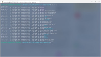
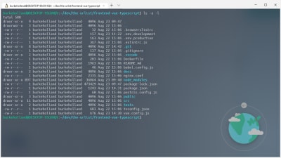
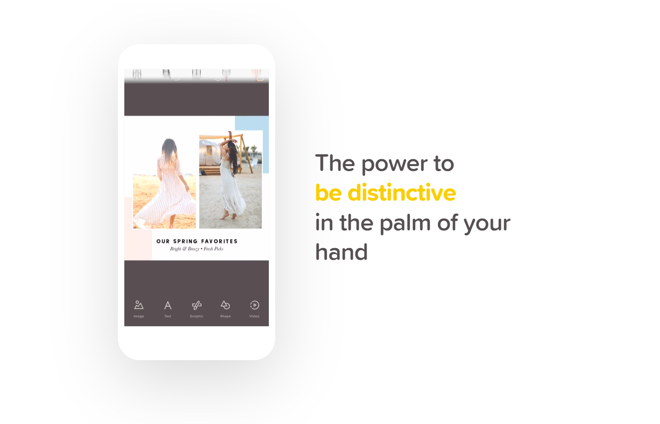
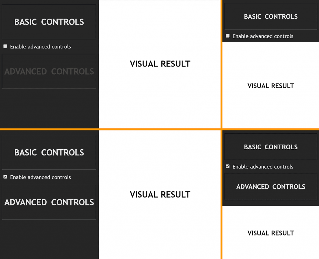
Screenshot collage.

Very often, while using switch variables (a variable that’s either 0 or 1, a concept that’s explained in a greater detail in in this post), I wish I could perform logical operations on them. We don’t have functions like not(var(--i)) or and(var(--i), var(--k)) in CSS, but we can emulate these and more with arithmetic operations in a calc() function.

This article is going to show you what calc() formulas we need to use for each logical operation and explain how and why they are used with a couple of use cases that lead to the writing of this article.

How: the formulas

not

This is a pretty straightforward one: we subtract the switch variable (let’s call it --j) from 1:

--notj: calc(1 - var(--j))

If --j is 0, then --notj is 1 (1 - 0). If j is 1, then --notj is 0 (1 - 1).

and

Now, if you’ve ever taken electronics classes (particularly something like Programmed Logic Systems or Integrated Circuits), then you already know what formula we need to use here. But let’s not jump straight into it.

The and of two operands is true if and only if both are true. The two operands in our case are two switch variables (let’s call them --k and --i). Each of them can be either 0 or 1, independently of the other. This means we can be in one out of four possible scenarios:

  • --k: 0, --i: 0
  • --k: 0, --i: 1
  • --k: 1, --i: 0
  • --k: 1, --i: 1

The result of the and operation is 1 if both our switch variables are 1 and 0 otherwise. Looking at it the other way, this result is 0 if at least one of the two switch variables is 0.

Now you need to think of it this way: the result of what arithmetic operation is 0 if at least one of the two operands is 0? That’s multiplication, as multiplying anything by 0 gives us 0!

So, our --and formula is:

--and: calc(var(--k)*var(--i))

Considering each of our four possible scenarios, we have:

  • for --k: 0, --i: 0, we have that --and is 0 (0*0)
  • for --k: 0, --i: 1, we have that --and is 0 (0*1)
  • for --k: 1, --i: 0, we have that --and is 0 (1*0)
  • for --k: 1, --i: 1, we have that --and is 1 (1*1)

nand

Since nand is not and, we need to replace the --j in the not formula with the formula for and:

--nand: calc(1 - var(--k)*var(--i))

For each of our four possible scenarios, we get:

  • for --k: 0, --i: 0, we have that --nand is 1 (1 - 0*0 = 1 - 0)
  • for --k: 0, --i: 1, we have that --nand is 1 (1 - 0*1 = 1 - 0)
  • for --k: 1, --i: 0, we have that --nand is 1 (1 - 1*0 = 1 - 0)
  • for --k: 1, --i: 1, we have that --nand is 0 (1 - 1*1 = 1 - 1)

or

The result of the or operation is 1 if at least one of our switch variables is 1 and 0 otherwise (if both of them are 0).

The first instinct here is to go for addition, but while that gives us 0 if both --k and --i are 0 and 1 if one is 0 and the other one is 1, it gives us 2 if both of them are 1. So that doesn’t really work.

But we can use the good old De Morgan’s laws, one of which states:

not (A or B) = (not A) and (not B)

This means the result of the or operation is the negation of the and operation between the negations of --k and --i. Putting this into CSS, we have:

--or: calc(1 - (1 - var(--k))*(1 - var(--i)))

For each scenario, we get:

  • for --k: 0, --i: 0, we have that --or is 0 (1 - (1 - 0)*(1 - 0) = 1 - 1*1 = 1 - 1)
  • for --k: 0, --i: 1, we have that --or is 1 (1 - (1 - 0)*(1 - 1) = 1 - 1*0 = 1 - 0)
  • for --k: 1, --i: 0, we have that --or is 1 (1 - (1 - 1)*(1 - 0) = 1 - 0*1 = 1 - 0)
  • for --k: 1, --i: 1, we have that --or is 1 (1 - (1 - 1)*(1 - 1) = 1 - 0*0 = 1 - 0)

nor

Since nor is not or, we have:

--nor: calc((1 - var(--k))*(1 - var(--i)))

For each of our four possible scenarios, we get:

  • for --k: 0, --i: 0, we have that --nor is 1 ((1 - 0)*(1 - 0) = 1*1)
  • for --k: 0, --i: 1, we have that --nor is 0 ((1 - 0)*(1 - 1) = 1*0)
  • for --k: 1, --i: 0, we have that --nor is 0 ((1 - 1)*(1 - 0) = 0*1)
  • for --k: 1, --i: 1, we have that --nor is 0 ((1 - 1)*(1 - 1) = 0*0)

xor

The result of the xor operation is 1 when one of the two operands is 1 and the other one is 0. This feels trickier at first, but, if we think this means the two operands need to be different for the result to be 1 (otherwise it’s 0), we stumble upon the right arithmetic operation to use inside calc(): subtraction!

If --k and --i are equal, then subtracting --i from --k gives us 0. Otherwise, if we have --k: 0, --i: 1, the result of the same subtraction is -1; if we have --k: 1, --i: 0, the result is 1.

Close, but not quite! We get the result we want in three out of four scenarios, but we need to get 1, not -1 in the --k: 0, --i: 1 scenario.

However, one thing that -1, 0 and 1 have in common is that multiplying them with themselves gives us their absolute value (which is 1 for both -1 and 1). So the actual solution is to multiply this difference with itself:

--xor: calc((var(--k) - var(--i))*(var(--k) - var(--i)))

Testing each of our four possible scenarios, we have:

  • for --k: 0, --i: 0, we have that --xor is 0 ((0 - 0)*(0 - 0) = 0*0)
  • for --k: 0, --i: 1, we have that --xor is 1 ((0 - 1)*(0 - 1) = -1*-1)
  • for --k: 1, --i: 0, we have that --xor is 1 ((1 - 0)*(1 - 0) = 1*1)
  • for --k: 1, --i: 1, we have that --xor is 0 ((1 - 1)*(1 - 1) = 0*0)

Why: Use cases

Let’s see a couple of examples that make use of logical operations in CSS. Note that I won’t detail other aspects of these demos as they’re outside the scope of this particular article.

Hide disabled panel only on small screens

This is a use case I came across while working on an interactive demo that lets users control various parameters to change a visual result. For more knowledgeable users, there’s also a panel of advanced controls that’s disabled by default. It can, however, be enabled in order to get access to manually controlling even more parameters.

Since this demo is supposed to be responsive, the layout changes with the viewport. We also don’t want things to get crammed on smaller screens if we can avoid it, so there’s no point in showing the advanced controls if they’re disabled and we’re in the narrow screen case.

The screenshot collage below shows the results we get for each the four possible scenarios.

Collage of the possible cases.

So let’s see what this means in terms of CSS!

First off, on the , we use a switch that goes from 0 in the narrow screen case to 1 in the wide screen case. We also change the flex-direction this way (if you want a more detailed explanation of how this works, check out my second article on DRY switching with CSS variables).

body {
  --k: var(--wide, 0);
  display: flex;
  flex-direction: var(--wide, column);
	
  @media (orientation: landscape) { --wide: 1 }
}

We then have a second switch on the advanced controls panel. This second switch is 0 if the checkbox is unchecked and 1 if the checkbox is :checked. With the help of this switch, we give our advanced controls panel a disabled look (via a filter chain) and we also disable it (via pointer-events). Here, not comes in handy, as we want to decrease the contrast and the opacity in the disabled case:

.advanced {
  --i: var(--enabled, 0);
  --noti: calc(1 - var(--i));
  filter: 
    contrast(calc(1 - var(--noti)*.9)) 
    opacity(calc(1 - var(--noti)*.7));
  pointer-events: var(--enabled, none);
	
  [id='toggle']:checked ~ & { --enabled: 1 }
}

We want the advanced controls panel to stay expanded if we’re in the wide screen case (so if --k is 1), regardless of whether the checkbox is :checked or not, or if the checkbox is :checked (so if --i is 1), regardless of whether we’re in the wide screen case or not.

This is precisely the or operation!

So we compute an --or variable:

.advanced {
  /* same as before */
  --or: calc(1 - (1 - var(--k))*(1 - var(--i)));
}

If this --or variable is 0, this means we’re in the narrow screen case and our checkbox is unchecked, so we want to zero the height of the advanced controls panel and also its vertical margin:

.advanced {
  /* same as before */
  margin: calc(var(--or)*#{$mv}) 0;
  height: calc(var(--or)*#{$h});
}

This gives us the desired result (live demo).

Use the same formulas to position multiple faces of a 3D shape

This is a use case I came across while working on the personal project of CSS-ing the Johnson solids this summer.

Let’s take a look at one of these shapes, for example, the gyroelongated pentagonal rotunda (J25), in order to see how logical operations are useful here.

The shape we want to get.

This shape is made up out of a pentagonal rotunda without the big decagonal base and a decagonal antiprism without its top decagon. The interactive demo below shows how these two components can be built by folding their nets of faces into 3D and then joined to give us the shape we want.

See the Pen by thebabydino (@thebabydino) on CodePen.

As it can be seen above, the faces are either a part of the antiprism or a part of the rotunda. This is where we introduce our first switch variable --i. This is 0 for the faces that are a part of the antiprism and 1 for the faces that are a part of the rotunda. The antiprism faces have a class of .mid because we can add another rotunda to the other antiprism base and then the antiprism would be in the middle. The rotunda faces have a class of .cup because this part does look like a coffee cup… without a handle!

The rotunda looks like an upside down up cup without a handle.
.mid { --i: 0 }
.cup { --i: 1 }

Focusing only on the lateral faces, these can have a vertex pointing up or down. This is where we introduce our second variable --k. This is 0 if they have a vertex pointing up (such faces have a .dir class) and 1 if they’re reversed and have a vertex pointing down (these faces have a class of .rev)

.dir { --k: 0 }
.rev { --k: 1 }

The antiprism has 10 lateral faces (all triangles) pointing up, each attached to an edge of its decagonal base that’s also a base for the compound shape. It also has 10 lateral faces (all triangles as well) pointing down, each attached to an edge of its other decagonal base (the one that’s also the decagonal base of the rotunda and is therefore not a base for the compound shape).

The rotunda has 10 lateral faces pointing up, alternating triangles and pentagons, each attached to the decagonal base that’s also a base for the antiprism (so it’s not a base for the compound shape as well). It also has 5 lateral faces, all triangles, pointing down, each attached to an edge of its pentagonal base.

The interactive demo below allows us to better see each of these four groups of faces by highlighting only one at a time. You can use the arrows at the bottom to pick which group of faces gets highlighted. You can also enable the rotation around the y axis and change the shape’s tilt.

See the Pen by thebabydino (@thebabydino) on CodePen.

As previously mentioned, the lateral faces can be either triangles or pentagons:

.s3gon { --p: 0 }
.s5gon { --p: 1 }

Since all of their lateral faces (.lat) of both the antiprism and the rotunda have one edge in common with one of the two base faces of each shape, we call these common edges the base edges of the lateral faces.

The interactive demo below highlights these edges, their end points and their mid points and allows viewing the shapes from various angles thanks to the auto-rotations around the y axis which can be started/ paused at any moment and to the manual rotations around the x axis which can be controlled via the sliders.

See the Pen by thebabydino (@thebabydino) on CodePen.

In order to make things easier for ourselves, we set the transform-origin of the .lat faces on the middle of their base edges (bottom horizontal edges).

SVG illustration.
Highlighting the base edges and their midpoints (live).

We also make sure we position these faces such as to have these midpoints dead in the middle of the scene element containing our entire 3D shape.

Having the transform-origin coincide with the midpoint the base edge means that any rotation we perform on a face is going to happen around the midpoint of its base edge, as illustrated by the interactive demo below:

See the Pen by thebabydino (@thebabydino) on CodePen.

We place our lateral faces where we want them to be in four steps:

  1. We rotate them around their y axis such that their base edges are now parallel to their final positions. (This also rotates their local system of coordinates — the z axis of an element always points in the direction that element faces.)
  2. We translate them such that their base edges coincide with their final positions (along the edges of the base faces of the two components).
  3. If they need to have a vertex pointing down, we rotate them around their z axis by half a turn.
  4. We rotate them around their x axis into their final positions

These steps are illustrated by the interactive demo below, where you can go through them and also rotate the entire shape (using the play/pause button for the y axis rotation and the slider for the x axis rotation).

See the Pen by thebabydino (@thebabydino) on CodePen.

The y axis rotation value is based mostly on the face indices and less on our switch variables, though it depends on these as well.

The structure is as follows:

- var n = 5; //- number of edges/ vertices of small base

section.scene
  //- 3D shape element
  .s3d
    //- the faces, each a 2D shape element (.s2d)
    
    //- lateral (.lat) antiprism (.mid) faces, 
    //- first half pointing up (.dir), others pointing down (.rev)
    //- all of them being triangles (.s3gon)
    - for(var j = 0; j < 4*n; j++)
      .s2d.mid.lat.s3gon(class=j < 2*n ? 'dir' : 'rev')
    
    //- lateral (.lat) rotunda (.cup) faces that point up (.dir), 
    //- both triangles (.s3gon) and pentagons (.s5gon)
    - for(var j = 0; j < n; j++)
      .s2d.cup.lat.s3gon.dir
      .s2d.cup.lat.s5gon.dir
    //- lateral (.lat) rotunda (.cup) faces that point down (.rev)
    //- all of them triangles (.s3gon)
    - for(var j = 0; j < n; j++)
      .s2d.cup.lat.s3gon.rev

    //- base faces, 
    //- one for the antiprism (.mid), 
    //- the other for the rotunda (.cup)
    .s2d.mid.base(class=`s${2*n}gon`)
    .s2d.cup.base(class=`s${n}gon`)

Which gives us the following HTML:

<section class="scene">
  <div class="s3d">
    <!-- LATERAL faces -->
    <div class="s2d mid lat s3gon dir"></div>
    <!-- 9 more identical faces, 
         so we have 10 lateral antiprism faces pointing up -->

    <div class="s2d mid lat s3gon rev"></div>
    <!-- 9 more identical faces, 
         so we have 10 lateral antiprism faces pointing down -->

    <div class="s2d cup lat s3gon dir"></div>
    <div class="s2d cup lat s5gon dir"></div>
    <!-- 4 more identical pairs, 
         so we have 10 lateral rotunda faces pointing up -->

    <div class="s2d cup lat s3gon rev"></div>
    <!-- 4 more identical faces, 
         so we have 5 lateral rotunda faces pointing down -->

    <!-- BASE faces -->
    <div class="s2d mid base s10gon"></div>
    <div class="s2d cup base s5gon"></div>
  </div>
</section>

This means faces 0... 9 are the 10 lateral antiprism faces pointing up, faces 10... 19 are the 10 lateral antiprism faces pointing down, faces 20... 29 are the 10 lateral rotunda faces pointing up and faces 30... 34 are the 5 lateral rotunda faces pointing down.

So what we do here is set an index --idx on the lateral faces.

$n: 5; // number of edges/ vertices of small base

.lat {
  @for $i from 0 to 2*$n {
    &:nth-child(#{2*$n}n + #{$i + 1}) { --idx: #{$i} }
  }
}

This index starts at 0 for each group of faces, which means the indices for faces 0... 9, 10... 19 and 20... 29 go from 0 through 9, while the indices for faces 30... 34 go from 0 through 4. Great, but if we just multiply these indices with the base angle1 of the common decagon to get the y axis rotation we want at this step:

--ay: calc(var(--idx)*#{$ba10gon});

transform: rotatey(var(--ay))

…then we get the following final result. I’m showing the final result here because it’s a bit difficult to see what’s wrong by looking at the intermediate result we get after only applying the rotation around the y axis.

See the Pen by thebabydino (@thebabydino) on CodePen.

This is… not quite what we were going for!

So let’s see what problems the above result has and how to solve them with the help of our switch variables and boolean operations on them.

The first issue is that the lateral antiprism faces pointing up need to be offset by half of a regular decagon’s base angle. This means adding or subtracting .5 from --idx before multiplying with the base angle, but only for these faces.

See the Pen by thebabydino (@thebabydino) on CodePen.

The faces we want to target are the faces for which both of --i and --k are 0, so what we need here is multiply the result of their nor with .5:

--nor: calc((1 - var(--k))*(1 - var(--i)));
--j: calc(var(--idx) + var(--nor)*.5);
--ay: calc(var(--j)*#{$ba10gon});

transform: rotatey(var(--ay));

The second issue is that the lateral rotunda faces pointing down are not distributed as they should be, such that each of them has a base edge in common with the base pentagon and the vertex opposing the base in common with the triangular rotunda faces pointing up. This means multiplying --idx by 2, but only for these faces.

See the Pen by thebabydino (@thebabydino) on CodePen.

What we’re targeting now are the faces for which both --i and --k are 1 (so the faces for which the result of the and operation is 1), so what we need is to multiply --idx with 1 plus their and:

--and: calc(var(--k)*var(--i));
--nor: calc((1 - var(--k))*(1 - var(--i)));
--j: calc((1 + var(--and))*var(--idx) + var(--nor)*.5);
--ay: calc(var(--j)*#{$ba10gon});

transform: rotatey(var(--ay));

The next step is the translation for which we use translate3d(). We don’t move any of our faces left or right, so the value along the x axis is always 0. We do move them however vertically (along the y axis) and forward (along the z axis)

Vertically, we want the cup faces that will later get rotated to point down to have their base edge in the plane of the small (pentagonal) base of the cup (and of the compound shape). This means the faces for which --i is 1 and --k is 1 get moved up (negative direction) by half the total height of the compound shape (a total height which we have computed to be $h). So we need the and operation here.

// same as before
--and: calc(var(--i)*var(--k));
--y: calc(var(--and)*#{-.5*$h});

transform: rotatey(var(--ay)) 
           translate3d(0, var(--y, 0), var(--z, 0));

We also want all the other cup faces as well as the antiprism faces that will eventually point down to have their base edge in the common plane between the cup and the antiprism. This means the faces for which --i is 1 and --k is 0 as well as the faces for which --i is 0 and --k is 1 get translated down (positive direction) by half the height of the compound shape and then back up (negative direction) by the height of the antiprism ($h-mid). And what do you know, this is the xor operation!

// same as before
--xor: calc((var(--k) - var(--i))*(var(--k) - var(--i)));
--and: calc(var(--i)*var(--k));
--y: calc(var(--xor)*#{.5*$h - $h-mid} - 
          var(--and)*#{.5*$h});

transform: rotatey(var(--ay)) 
           translate3d(0, var(--y, 0), var(--z, 0));

Finally, we want the antiprism faces that will remain pointing up to be in the bottom base plane of the compound shape (and of the antiprism). This means the faces for which --i is 0 and --k is 0 get translated down (positive direction) by half the total height of the compound shape. So what we use here is the nor operation!

// same as before
--nor: calc((1 - var(--k))*(1 - var(--i)));
--xor: calc((var(--k) - var(--i))*(var(--k) - var(--i)));
--and: calc(var(--i)*var(--k));

--y: calc(var(--nor)*#{.5*$h} + 
          var(--xor)*#{.5*$h - $h-mid} - 
          var(--and)*#{.5*$h});

transform: rotatey(var(--ay)) 
           translate3d(0, var(--y, 0), var(--z, 0));

See the Pen by thebabydino (@thebabydino) on CodePen.

Along the z direction, we want to move the faces such that their base edges coincide with the edges of the base faces of the compound shape or the edges of the common base (which is not a face of the compound shape) shared by the two 3D components. For the top faces of the cup (which we later rotate to point down), the placement is on the edges of a pentagon, while for all the other faces of the compound shape, the placement is on the edges of a decagon.

This means the faces for which --i is 1 and --k is 1 get translated forward by the inradius of the pentagonal base while all the other faces get translated forward by the inradius of a decagonal base. So the operations we need here are and and nand!

// same as before
--and: calc(var(--i)*var(--k));
--nand: calc(1 - var(--and));
--z: calc(var(--and)*#{$ri5gon} + var(--nand)*#{$ri10gon});

transform: rotatey(var(--ay)) 
           translate3d(0, var(--y, 0), var(--z, 0));

See the Pen by thebabydino (@thebabydino) on CodePen.

Next, we want to make all .rev (for which --k is 1) faces point down. This is pretty straightforward and doesn’t require any logical operation, we just need to add a half a turn rotation around the z axis to the transform chain, but only for the faces for which --k is 1:

// same as before
--az: calc(var(--k)*.5turn);

transform: rotatey(var(--ay)) 
           translate3d(0, var(--y), var(--z))
           rotate(var(--az));

See the Pen by thebabydino (@thebabydino) on CodePen.

The pentagonal faces (for which --p is 1) are then all rotated around the x axis by a certain angle:

--ax: calc(var(--p)*#{$ax5});

In the case of the triangular faces (for which --p is 0, meaning we need to use --notp), we have a certain rotation angle for the faces of the antiprism ($ax3-mid), another angle for the faces of the rotunda that point up ($ax3-cup-dir) and yet another angle for the rotunda faces pointing down ($ax3-cup-red).

The antiprism faces are those for which --i is 0, so we need to multiply their corresponding angle value with --noti here. The rotunda faces are those for which --i is 1, and out of these, the ones pointing up are those for which --k is 0 and the ones pointing down are those for which --k is 1.

--notk: calc(1 - var(--k));
--noti: calc(1 - var(--i));
--notp: calc(1 - var(--p));

--ax: calc(var(--notp)*(var(--noti)*#{$ax3-mid} + 
                        var(--i)*(var(--notk)*#{$ax3-cup-dir} + var(--k)*#{$ax3-cup-rev})) +
           var(--p)*#{$ax5});

transform: rotatey(var(--ay)) 
           translate3d(0, var(--y), var(--z))
           rotate(var(--az)) 
           rotatex(var(--ax));

This gives us the final result!

See the Pen by thebabydino (@thebabydino) on CodePen.


1For any regular polygon (such as any of the faces of our shapes), the arc corresponding to one edge, as well as the angle between the circumradii to this edge’s ends (our base angle) is a full circle (360°) over the number of edges. In the case of an equilateral triangle, the angle is 360°/3 = 120°. For a regular pentagon, the angle is 360°/5 = 72°. For a regular decagon, the angle is 360°/10 = 36°. ??

See the Pen by thebabydino (@thebabydino) on CodePen.

The post Logical Operations with CSS Variables appeared first on CSS-Tricks.
Categories: Designing, Others Tags:

Some HTML is “Optional”

September 11th, 2019 No comments

There is a variety of HTML that you can just leave out of the source HTML and it’s still valid markup.

Doesn’t this look weird?

<p>Paragraph one.
<p>Paragraph two.
<p>Paragraph three.

It does to me, but the closing

tags are optional. The browser will detect it needs them and manifest correctly in the DOM anyway.

This probably happens to HTML you write and you don’t even know it. For example…

<table>
  <tr>
    <td></td>
  </tr>
</table>

That looks perfectly fine to me, but the browser will inject a

in there around that

for you. Optional in HTML, but the DOM will put it in anyway.

Heck, you don’t really even need a in the same fashion! Jens Oliver Meiert shares more:

<link rel=stylesheet href=default.css>

Some attributes are “optional” too in the sense that they have defaults you can leave out. For example, a

Categories: Designing, Others Tags:

5 Problems That Every Entrepreneur Could Face and How To Solve Them

September 11th, 2019 No comments

The evolution of technology today occurs at an alarmingly fast rate. Just within the last ten years, technology has grown, transformed, and is almost unrecognizable to what it was before.

Many would attribute that growth to the boom in the business, a technological gold rush if you will. With more and more tech startups on the market, more entrepreneurs are vying for their slice of the pie. Indeed, running a tech startup involves innovation and keeping your business a cut above the rest.

Entrepreneurs looking to build or even grow their tech startup are likely to come across challenges on the road to success. Managing a business often means juggling marketing, sales, and just about everything else at the same time. A lack of understanding on how to handle issues as they arise can send your startup to an early grave. Here are five challenges that tech entrepreneurs could face and how to overcome them.

A Faulty First Step

Trends shift rapidly, especially in the world of technology. If your startup isn’t able to reach its objectives in time, you can lose out on a lot of profit. In a tech startup, the best thing to do is get back on your feet and try, try again.

“A faulty first step can cause entrepreneurs to remain idle too long or stop work altogether because they took that loss far too seriously. Doing this may only exacerbate the already negative situation. Therefore, entrepreneurs should know how to learn from their mistakes, adapt their business to the new circumstances, and move forward.” — Jeremy Pendercki, Marketing Specialist at WoWGrade writing service.

Solution: The only way to recover from a faulty first step is to be tenacious. You must continue to try and not throw in the towel until your business succeeds. Consider startups like Google and Facebook that failed and then restarted again after which the company finally took off. Know how to recover from failure and don’t give up.

The Startup’s Ecosystem

When your startup finally takes off and starts to grow, it will all happen so quickly that you might get whiplash. To ensure the long-term success of your startup, you need to create a stable ecosystem for everyone to thrive within. That ecosystem includes infrastructure management, the company culture, employee requirements, and executive decision-making.

“Tech entrepreneurs should have well-defined goals for their startup and a clearly outlined company culture. They should also have a way to measure employee performance, as well as a plan to maximize and optimize employee skills.” — Maria Hernandez, Marketing Strategist at Supreme Dissertations.

Solution: Managing a startup’s ecosystem can be one of the biggest issues for an entrepreneur. One of the best solutions would be to find a mentor or partner who can guide the way. Entrepreneurs should also create a business and governance plan that addresses goals, company culture, decision-making procedures, and expectations of employee performance.

Entering the Marketplace

For your product or service to succeed, there needs to be a place for it in the market. Fortune listed the top reason for startups failing is that they developed products no one wanted. Tech startups will often struggle to incorporate their product into the market when it lacks tangibility. Consider that tech developments such as voice control and artificial intelligence still only have a minimal impact on the market. While they have plenty of investment and development, they aren’t entirely tangible yet, and that stunts their advancement.

Solution: Ensure that your product or service can incorporate itself well into the market. Conduct plenty of research and then conduct more research after that. Guarantee your product’s success by highlighting a need for it in the market. Avoid the intangible technology limbo by providing a product or service that people need and can use now.

Managing Cash Flow

Don’t think that it won’t happen to your startup, because bad money management runs rampant in the tech world. Perhaps you’re finally starting to see some profit from your product or service, the market looks good, and then all of the sudden crash. Starting strong in the marketplace doesn’t assure that your startup is in the clear. As income increases, expenses do, too. Tech entrepreneurs looking to stay in the black should keep an eagle eye on their money before it’s too late.

Solution: Avoid your startup going kaput by carefully managing your finances. Keep track of your profits and losses, don’t ignore your taxes, and always have a backup plan. If you aren’t confident in your ability to manage your finances alone, hire a financial consulting firm. Great ideas won’t save you from a loss of funding or bankruptcy.

Finding Talent

In a startup, finding the right candidate for a job can be quite an obstacle. With all of the competition out there and the globalized nature of tech, hiring isn’t always easy. The reality is that finding the right personnel for the job helps the startup deliver on their promise.

Talent also helps with innovation, which is vital to the product and the startup’s overall success. More and more businesses are learning that sometimes the best person for the job is on the other side of the country or globe.

It is also imperative to identify the right situations to delegate projects such as content creation and marketing materials, rather that hiring an entire in-house team. There are now many products and services like Studicus and Grammarly that can assist you with writing and editing your marketing material.

Solution: Define your hiring process to ensure that your candidates can meet expectations and uphold the company culture. Don’t ignore what other tech startups are offering. Provide a competitive offer to any prospective employees. Last but not least, embrace the idea of working with a remote team. Startups that have a strong company culture and effective remote teams are more likely to succeed.

Useful Tools For Efficient Marketing

Tech entrepreneurs should also know how valuable writing and marketing is for their startup. Whether you’re writing a letter to possible investors or typing up a job listing, good writing makes a world of difference. Here are a few tools that can help you with the task at hand.

Hemingway

This editor app goes beyond spellchecker to check your style. With Hemingway you can organize your thoughts better and get your idea across more clearly and efficiently. Ensure that your writing is readable and easy to follow with the Hemingway app. While the desktop version costs $19.99, you can snag the app version for free.

Marketing Plan App

If you’re a solo entrepreneur, this marketing app will be valuable to you. This app helps define your market niche, analyze competitors, find your target market, and explore advertising options. Marketing Plan App takes all of your information and creates a comprehensive, executive summary that you can digitally export

Back To You

There are plenty of possible pitfalls that come with the territory of being an entrepreneur. Although being aware and prepared for them can help you solve the problem when it arises. Even though startup success statistics are relatively gloomy, that doesn’t mean that your startup can’t be the exception to the rule.

Categories: Others Tags:

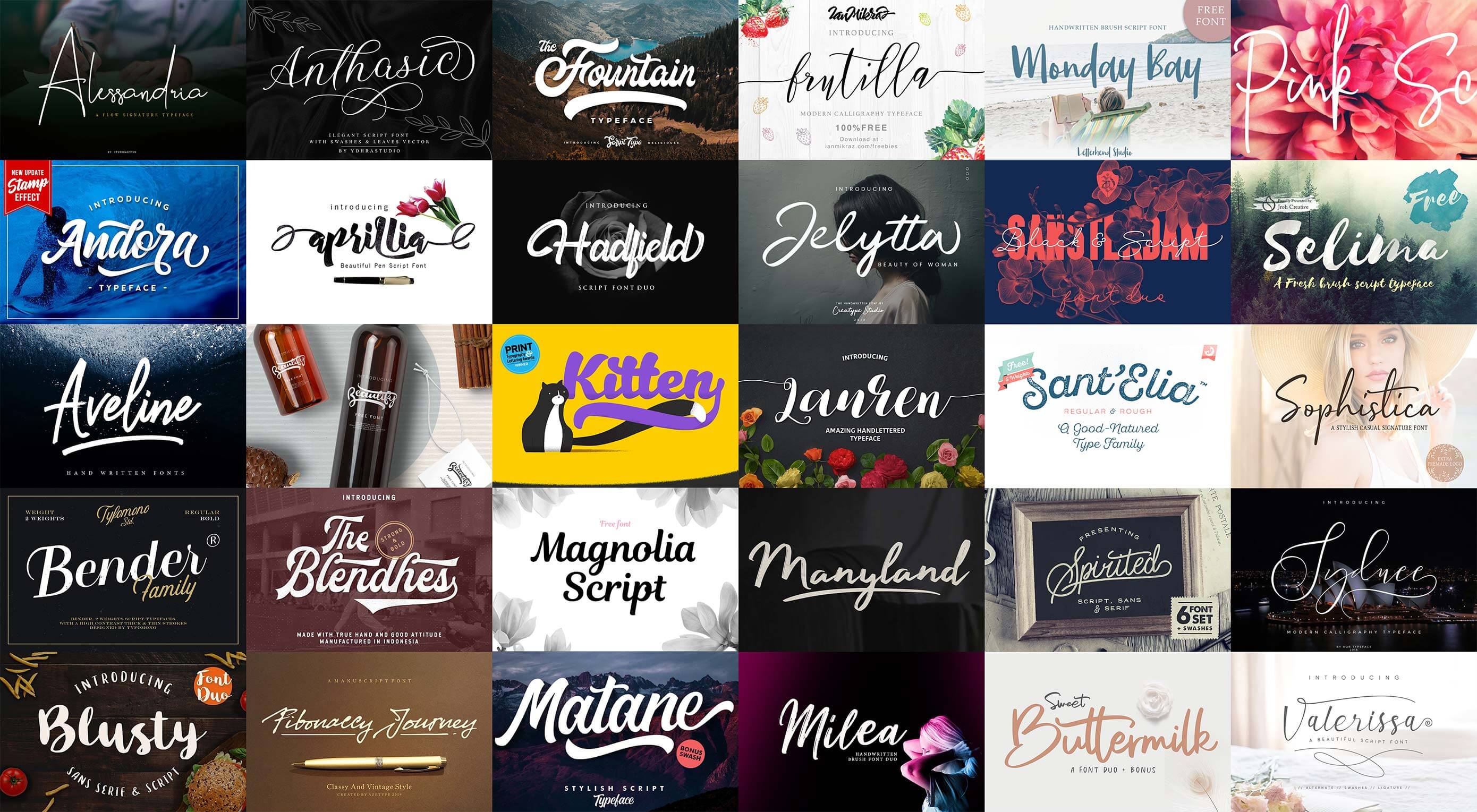
Free Download: 30 Script Fonts

September 11th, 2019 No comments

The foundation of all typography is your choice of font. The font creates the voice of your text, its character and personality. For designers who aim to produce vital and engaging designs, a well-stocked font menu is a must.

Of all the varieties of typeface, the most expressive, the most characterful, are script faces. The hand-drawn, hand-written, and hand-painted qualities make them ideal for designs that eschew the corporate grey of Helvetica.

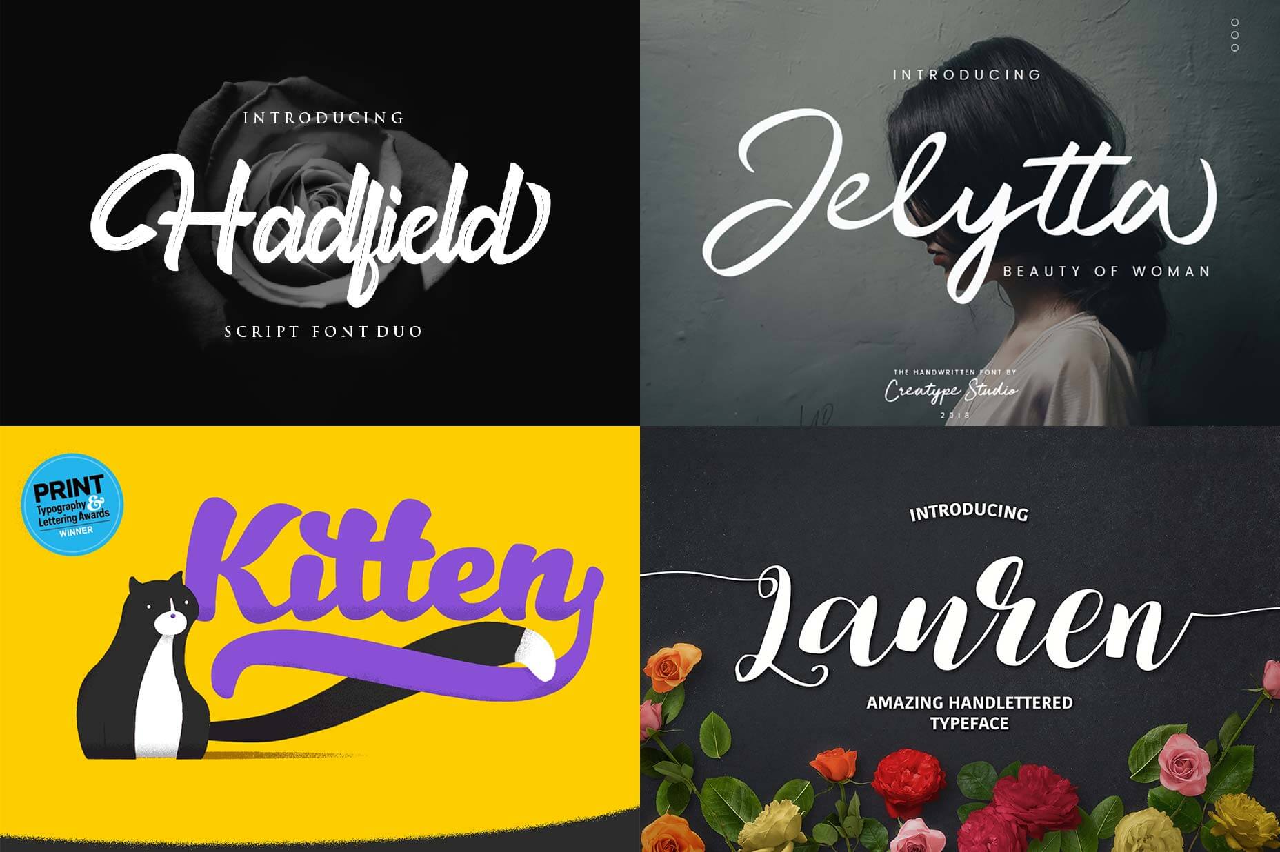
This fantastic free download is brought to you by Mighty Deals. The collection includes scripts ideal for branding, scripts perfect for imitating lettering, and scripts made for communicating. There are masculine scripts and feminine scripts, traditional scripts and contemporary scripts, elegant scripts and grungy scripts. 30 different voices for expressive typography. Once you take into account the variations in weight, style, and swashes, there are 65+ font files to download and enjoy.

In the download you’ll find: Alessandria, Andora, Anthasic, Aprillia, Aveline, Beautify, Bender, Blendhes, Blusty, Fibonaccy Journey, Fountain, Frutilla, Hadfield, Jelytta, Kitten, Lauren, Magnolia, Manyland, Matane, Milea, Monday Bay, Pink, Sansterdam, Santelia, Selima, Sophistica, Spirited, Sweet Buttermilk, Sydnee, and Valerissa.

Download the files below.

Please enter your email address below and click the download button. The download link will be sent to you by email, or if you have already subscribed, the download will begin immediately.

Source

Categories: Designing, Others Tags:

Moving Your JavaScript Development To Bash On Windows

September 11th, 2019 No comments
Windows Insider Program settings menu option

Moving Your JavaScript Development To Bash On Windows

Moving Your JavaScript Development To Bash On Windows

Burke Holland

2019-09-11T12:30:59+02:002019-09-11T12:35:08+00:00

I’m one of those people who can’t live without their Bash terminal. This sole fact has made it difficult for me to do frontend work on Windows. I work at Microsoft and I’m on a Mac. It wasn’t until the new Surface hardware line came out a few years ago that I realized: I gotta have one of those.

So I got one. A Surface Book 2 running Windows 10 to be exact. I’m drafting this article on it right now. And what of my sweet, sweet Bash prompt? Well, I brought it along with me, of course.

In this article, I’m going to take an in-depth look at how new technology in Windows 10 enables you to run a full Linux terminal on Windows. I’ll also show you my amazing terminal setup (which was named “best ever” by “me”) and how you too can set up your very own Windows/Linux development machine.

If you’ve been craving some of that Surface hardware but can’t live without a Linux terminal, you’ve come to the right place.

Note: At the time of this writing, a lot of the items in this article will require you to use or switch to “preview” or “insiders” builds of various items, including Windows. Most of these things will be in the main Windows build at some point in the future.

Windows Subsystem For Linux (WSL)

The Windows Subsystem for Linux, or, “WSL” is what enables you to run Linux on Windows. But what exactly is this mad science?

The WSL, in its current incarnation, is a translation layer that converts Linux system calls into Windows system calls. Linux runs on top of the WSL. That means that in order to get Linux on Windows, you need to do three things:

  1. Enable the WSL,
  2. Install Linux,
  3. Always include three items in a list.

As it turns out, that translation layer is a tad on the slow side — kind of like me trying to remember if I need splice or slice. This is especially true when the WSL is reading and writing to the file system. That’s kind of a big problem for web developers since any proper npm install will copy thousands of files to your machine. I mean, I don’t know about you, but I’m not going to left-pad my own strings.

Version 2 of the WSL is a different story. It is considerably faster than the current version because it leverages a virtualization core in Windows instead of using the translation layer. When I say it’s “considerably faster”, I mean way, way faster. Like as fast as me Googling “splice vs slice”.

For that reason, I’m going to show how to install the WSL 2. At the time of writing, that is going to require you to be on the “Insider” build of Windows.

First things first: follow this short guide to enable the WSL on Windows 10 and check your Windows version number.

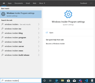
Once you have it installed, hit the Windows key and type “windows insider”. Then choose “Windows Insider Program Settings”.

Windows Insider Program settings menu option

(Large preview)

You’ll have a couple of different options as to which “ring” you want to be on. A lot of people I know are on the fast ring. I’m a cautious guy, though. When I was a kid I would go down the slide at the playground on my stomach holding on to the sides. Which is why I stay on the slow ring. I’ve been on it for several months now, and I find it to be no more disruptive or unstable than regular Windows.

It’s a good option if you want the WSL 2, but you don’t want to die on the slide.

Windows Insider settings screen showing “Slow” ring

(Large preview)

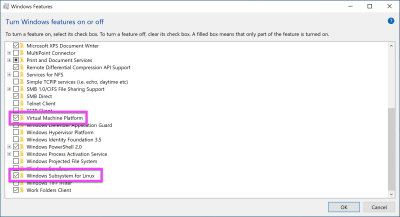
Next, you need to enable the “Virtual Machine Platform” feature in Windows, which is required by the WSL version 2. To get to this screen, press the Windows key and type “windows features”. Then select “Turn Windows Features on or off”. Select “Virtual Machine Platform”. The “Windows Subsystem for Linux” option should already be enabled.

The “Windows Features” screen with “Virtual Machine Platform” and “Windows Subsystem for Linux” highlighted

(Large preview)

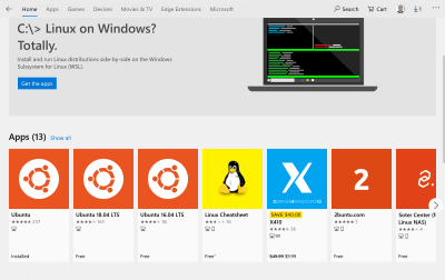
Now that the WSL is enabled, you can install Linux. You do this, ironically enough, directly from the Windows Store. Only in 2019 would I suggest that you “install Linux from the Windows store”.

There are several different distributions to choose from, but Ubuntu is going to be the most supported across all the tools we’ll configure later on — including VS Code. All of the instructions that come from here on out with assume a Ubuntu install. If you install a different distro, all bets are off.

Search for “Ubuntu” from the Windows Store. There will be three to choose from: Ubuntu, Ubuntu 18.04, and Ubuntu 16.04. Ubuntu really likes that 04 minor version number, don’t they?

The “Ubuntu” item in the Windows Store

(Large preview)

The “Ubuntu” distro (the first one in this screenshot) is the “meta version”, or rather a placeholder that just points to the latest version. As of right now, that’s 18.04.

I went with the meta version because later on I’ll show you how to browse the Linux file system with Windows Explorer and it’s kinda messy to have “Ubuntu 18.04” as a drive name vs just “Ubuntu”.

This install is pretty quick depending on your internet connection. It’s only about 215 megabytes, but I am on a gigabit connection over here and how do you know if someone is on a gigabit connection? Don’t worry, they’ll tell you.

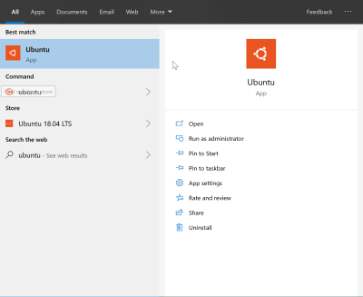
Once installed, you’ll now have an “Ubuntu” app in your start menu.

Ubuntu installed and showing up in the Windows Start menu

(Large preview)

If you click on that, you’ll get a Bash terminal!

The Ubuntu terminal running on Windows

(Large preview)

Take a moment to bask in the miracle of technology.

By default, you’ll be running in the WSL version 1. To upgrade to version 2, you’ll need to open a PowerShell terminal and run a command.

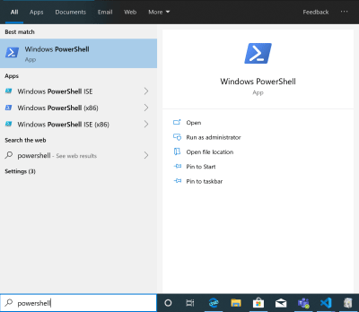
Hit the “Windows” key and type “Powershell”.

The “Powershell” item in the start menu

(Large preview)

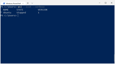
From the PowerShell terminal, you can see which version of the WSL you have by executing wsl --list --versbose.

Doing a verbose list of all WSL instances running from within Powershell

(Large preview)

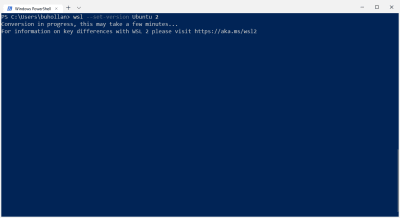
If you’re showing version 1, you’ll need to execute the --set-version command and specify the name of the instance (Ubuntu) and the version you want (2).

wsl --set-version Ubuntu 2

Setting the version of WSL to version 2 with Powershell

(Large preview)

This is going to take a bit, depending on how much meat your machine has. Mine took “some minutes” give or take. When it’s done, you’ll be on the latest and greatest version of the WSL.

The Is Your Brain On Linux… On Windows.

Linux is not Windows. WSL is not a bash prompt on top of a Windows operating system. It is a full operating system unto itself with its own folder structure and installed applications. If you install Node with the Windows installer, typing node in Linux is going to fail because Node is not installed in Linux. It’s installed on Windows.

The true magic of the WSL, though, lies in the way it seamlessly connects Windows and Linux so that they appear as one file system on your machine.

File And Folder Navigation

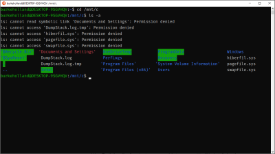
By default, the Ubuntu terminal drops you into your Linux home directory (or /home/your-user-name). You can move onto the Windows side by going to /mnt/c.

The Ubuntu terminal with the contents for the C drive listed out

(Large preview)

Notice that some permissions are denied here. I would have to right-click the Ubuntu icon and click “Run as Administrator” to get access to these files. This how Windows does elevated permissions. There is no sudo on Windows.

Launching Applications

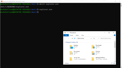
You can launch any Windows application from the Ubuntu terminal. For instance, I can open Windows Explorer from the Unbuntu terminal.

The Windows Explorer and the the Ubuntu terminal

(Large preview)

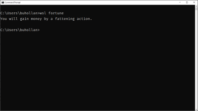
This also works in reverse. You can execute any application installed on the Linux side. Here I am executing “fortune” installed in Linux from the Windows command line. (Because it ain’t a proper Linux install without random, meaningless fortunes.)

The Windows Command Line executing the Linux “fortune” program

(Large preview)

Two different operating systems. Two different file systems. Two different sets of installed applications. See how this could get confusing?

In order to keep everything straight, I recommend that you keep all your JavaScript development files and tools installed on the Linux side of things. That said, the ability to move between Windows and Linux and access files from both systems is the core magic of the WSL. Don’t forget it, cause it’s what makes this whole setup better than just a standard Linux box.

Setting Up Your Development Environment

From here on out, I’m going to give you a list of opinionated items for what I think makes a killer Linux on Windows setup. Just remember: my opinions are just that. Opinions. It just happens that just like all my opinions, they are 100% correct.

Getting A Better Terminal

Yes, you got a terminal when you installed Ubuntu. It’s actually the Windows Console connected to your Linux distro. It’s not a bad console. You can resize it, turn on copy/paste (in settings). But you can’t do things like tabs or open new windows. Just like a lot of people use replacement terminal programs on Mac (I use Hyper), there are other options for Windows as well. The Awesome WSL list on Github contains a pretty exhaustive list.

Those are all fine emulators, but there is a new option that is built by people who know Windows pretty well.

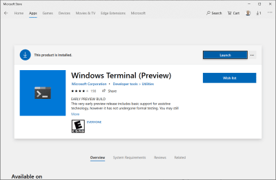
Microsoft has been working on a new application called “Windows Terminal”.

The Windows Terminal item  in the Windows Store

(Large preview)

Windows Terminal can be installed from the Windows Store and is currently in preview mode. I’ve been using it for quite a while now, and it has enough features and is stable enough for me to give it a full-throated endorsement.

The new Windows Terminal features a full tab interface, copy/paste, multiple profiles, transparent backgrounds, background images — even transparent background images. It’s a field day if you like to customize your terminal, and I came to win this sack race.

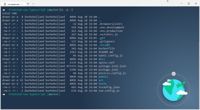
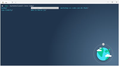
Here is my current terminal. We’ll take a walk through some of the important tweaks here.

The author's current terminal: Dark blue background with a cartoon planet in the bottom right-hand corner. Green and white text.

(Large preview)

Windows terminal is quite customizable. Clicking the “?” arrow at the top left (next to the “&plus;” sign) gives you access to “Settings”. This will open a JSON file.

Bind Copy/Paste

At the top of the file are all of the key bindings. The first thing that I did was map “copy” to Ctrl + C and paste to Ctrl + V. How else am I going to copy and paste in commands from Stack Overflow that I don’t understand?

{
  "command": "copy",
  "keys": ["ctrl+c"]
},
{
  "command": "paste",
  "keys": ["ctrl+v"]
},

The problem is that Ctrl + C is already mapped to SIGINT, or the Interrupt/kill command on Linux. There are a lot of terminals out there for Windows that handle this by mapping Copy/Paste to Ctrl + Shift + C and Ctrl + Shift + V respectively. The problem is that copy/paste is Ctrl + C / Ctrl + V every other single place in Windows. I just kept pressing Ctrl + C in the terminal over and over again trying to copy things. I could not stop doing it.

The Windows terminal handles this differently. If you have text highlighted and you press Ctrl + C, it will copy the text. If there is a running process, it still sends the SIGINT command down and interrupts it. The means that you can safely map Ctrl + C / Ctrl + V to Copy/Paste in the Windows Terminal and it won’t interfere with your ability to interrupt processes.

Whoever thought Copy/Paste could cause so much heartache?

Change The Default Profile

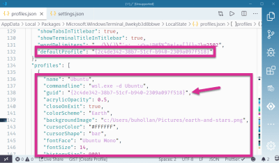
The default profile is what comes up when a new tab is opened. By default, that’s Powershell. You’ll want to scroll down and find the Linux profile. This is the one that opens wsl.exe -d Ubuntu. Copy its GUID and paste it into the defaultProfile setting.

I’ve moved these two settings so they are right next to each other to make it easier to see:

The default Terminal profile highlighted in the settings.json file

(Large preview)

Set The Background

I like my background to be a dark solid color with a flat-ish logo in the right-hand corner. I do this because I want the logo to be bright and visible, but not in the way of the text. This one I made myself, but there is a great collection of flat images to pick from at Simple Desktops.

The background is set with the backgroundImage property:

"backgroundImage": "c:/Users/YourUserName/Pictures/earth.png"

A blue sqaure image with a cartoon planet in the bottom right-hand corner

(Large preview)

You’ll also notice a setting called “acrylic”. This is what enables you to adjust the opacity of the background. If you have a solid background color, this is pretty straightforward.

"background": "#336699",
"useAcrylic": true,
"acrylicOpacity": 0.5

The terminal with the background slightly transparent

(Large preview)

You can pull this off with a background image as well, by combining the arcylicOpacity setting with the backgroundImageOpacity:

"backgroundImage": "c:/Users/username/Pictures/earth-and-stars.png",
"useAcrylic": true,
"acrylicOpacity": 0.5

The terminal with both a transparent image and a trasparent background

(Large preview)

For my theme, transparency makes everything look muted, so I keep the useAcrylic set to false.

Change The Font

The team building the Windows Terminal is also working on a new font called “Cascadia Code”. It’s not available as of the time of this writing, so you get the default Windows font instead.

The default font in the Windows Terminal is “Consolas”. This is the same font that the Windows command line uses. If you want that true Ubuntu feel, Chris Hoffman points out how you can install the official Ubuntu Mono font.

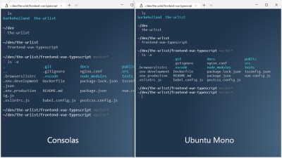
Here’s a before and after so you can see the difference:

"fontFace": "Ubuntu Mono"

A side-by-side comparison of Consolas and Unbuntu Mono fonts in the terminal

(Large preview)

They look pretty similar; the main difference being in the spacing of Ubuntu Mono which makes the terminal just a bit tighter and cleaner.

Color Schemes

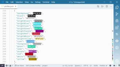
The color schemes are all located at the bottom of the settings file. I copied the “Campbell” color scheme as a baseline. I try to match colors with their names, but I’m not afraid to go rogue either. I’ll map “#ffffff” to “blue” — I don’t even care.

The color scheme settings from the settings.json file

(Large preview)

If you like this particular scheme which I’ve named “Earth”, I’ve put together this gist so you don’t have to manually copy all of this mess out of a screenshot.

Note: The color previews come by virtue of the “Color Highlight” extension for VS Code.

Change The Default Starting Directory

By default, the WSL profile drops you into your home directory on the Windows side. Based on the setup that I am recommending in this article, it would be preferable to be dropped into your Linux home folder instead. To do that, alter the startingDirectory setting in your “Ubuntu” profile:

"startingDirectory": "\wsl$Ubuntuhomeburkeholland"

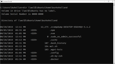
Note the path there. You can use this path (minus the extra escape slashes) to access the WSL from the Windows command line.

A “dir” command run against the Linux home directory from the Windows Command Line

(Large preview)

Install Zsh/Oh-My-Zsh

If you’ve never used Zsh and Oh-My-Zsh before, you’re in for a real treat. Zsh (or “Z Shell”) is a replacement shell for Linux. It expands on the basic capabilities of Bash, including implied directory switching (no need to type cd), better-theming support, better prompts, and much more.

To install Zsh, grab it with the apt package manager, which comes out of the box with your Linux install:

sudo apt install zsh

Install oh-my-zsh using curl. Oh-my-zsh is a set of configurations for zsh that improve the shell experience even further with plugins, themes and a myriad of keyboard shortcuts.

sh -c "$(curl -fsSL https://raw.githubusercontent.com/robbyrussell/oh-my-zsh/master/tools/install.sh)"

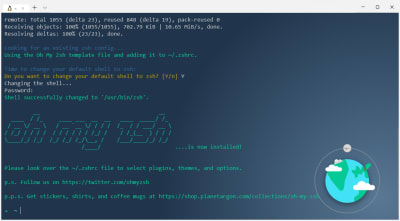
Then it will ask you if you want to change your default shell to Zsh. You do, so answer in the affirmative and you are now up and running with Zsh and Oh-My-Zsh.

The terminal asking if you would like to change the default shell

(Large preview)

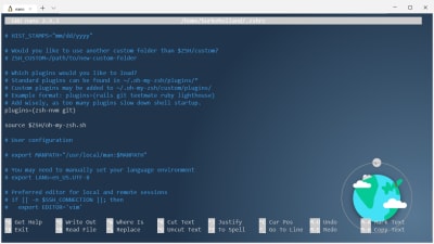
You’ll notice that the prompt is a lot cleaner now. You can change the look of that prompt by changing the theme in the ~/.zshrc file.

Open it with nano, which is kind of like VIM, but you can edit things and exit when you need to.

nano ~/.zshrc

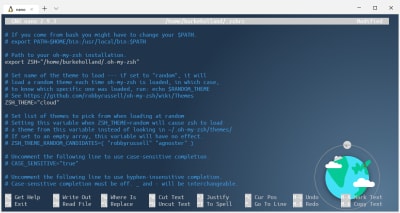
Change the line that sets the theme. There is a URL above it with an entire list of themes. I think the “cloud” one is nice. And cute.

The “cloud” theme being set in the zshrc file

(Large preview)

To get changes to the .zshrc picked up, you’ll need to source it:

source ~/.zshrc

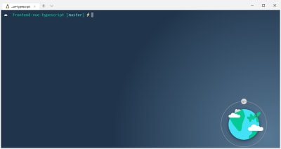
The “cloud” theme prompt

(Large preview)

Note: If you pick a theme like “agnoster” which requires glyphs, you’ll need a powerline infused version of Ubuntu Mono that has… glyphs. Otherwise, your terminal will just be full of weird characters like you mashed your face on the keyboard. Nerd Fonts offers one that seems to work pretty well.

Now you can do things like changing directories just by entering the directory name. No cd required. Wanna go back up a directory? Just do a ... You don’t even have to type the whole directory name, just type the first few letters and hit tab. Zsh will give you a list of all of the files/directories that match your search and you can tab through them.

The terminal with one of many paths highlighted

(Large preview)

Installing Node

As a web developer, you’re probably going to want to install Node. I suppose you don’t have to install Node to do web development, but it sure feels like it in 2019!

Your first instinct might be to install node with apt, which you can do, but you would regret it for two reasons:

  1. The version of Node on apt is dolorously out of date;
  2. You should install Node with a version manager so that you don’t run into permissions issues.

The best way to solve both of these issues is to install nvm (Node Version Manager). Since you’ve installed zsh, you can just add the nvm plugin in your zshrc file and zsh takes care of the rest.

First, install the plugin by cloning in the zsh-nvm repo. (Don’t worry, Git comes standard on your Ubuntu install.)

git clone https://github.com/lukechilds/zsh-nvm ~/.oh-my-zsh/custom/plugins/zsh-nvm

Then add it as a plugin in the ~/.zshrc file.

`nano ~/.zshrc`

plugins (zsh-nvm git)

The zshrc file with the zsh-vnm-plugin added

(Large preview)

Remember to source the zshrc file again with source ~/.zshrc and you’ll see nvm being installed.

The terminal showing the install progress of nvm

(Large preview)

Now you can install node with nvm. It makes it easy to install multiple side-by-side versions of node, and switch between them effortlessly. Also, no permissions errors when you do global npm installs!

nvm install --lts

I recommend this over the standard nvm install because the plugin gives you the ability to easily upgrade nvm. This is kind of a pain with the standard “curl” install. It’s one command with the plugin.

nvm upgrade

Utilize Auto Suggestions

One of my very favorite plugins for zsh is zsh-autosuggestions. It remembers things you have typed in the terminal before, and then recognizes them when you start to type them again as well as “auto-suggests” the line you might need. This plugin has come in handy more times than I can remember — specifically when it comes to long CLI commands that I have used in the past, but can’t ever remember.

Clone the repo into the zsh extensions folder:

git clone https://github.com/zsh-users/zsh-autosuggestions ~/.oh-my-zsh/custom/plugins/zsh-autosuggestions

Then add it to your zsh plugins and source the zshrc file:

nano ~/.zshrc

# In the .zshrc file
plugins(zsh-nvm zsh-autosuggestions git)

source ~/.zshrc

The plugin reads your zsh history, so start typing some command you’ve typed before and watch the magic. Try typing the first part of that long clone command above.

The terminal showing zsh autosuggestions auto completing a git clone command

(Large preview)

If you hit ?, it will autocomplete the command. If you keep hitting ?, it will cycle through any of the commands in your history that could be a match.

Important Keyboard Shortcuts

There are a few terminal shortcuts that I use all the time. I find this with all of my tools — including VS Code. Trying to learn all the shortcuts is a waste of time because you won’t use them enough to remember them.

Here are a few that I use regularly:

Terminal Shortcut What does it do?
Ctrl + L This clears the terminal and puts you back to the top. It’s the equivilant of typing “clear”.
Ctrl + U This clears out the current line only.
Ctrl + A Sends the cursor to the beginning of the command line.
Ctrl + E Move to the end of the line.
Ctrl + K Delete all the characters after the cursor.

That’s it! Everything else I’ve probably learned and then forgotten because it never gets any use.

Configuring Git(Hub/Lab/Whatevs)

Git comes on Ubuntu, so there is no install required. You can follow the instructions at your source control hoster of choice to get your ssh keys created and working.

Note that in the Github instructions, it tells you to use the “copy” utility to copy your ssh key. Ubuntu has the “xcopy” command, but it’s not going to work here because there is no interop between the Linux and Windows in terms of a clipboard.

Instead, you can just use the Windows Clipboard executable and call it directly from the terminal. You need to get the text first with cat, and then pipe that to the Windows clipboard.

cat ~/.ssh/id_rsa.pub | clip.exe 

The Github docs tell you to make sure that the ssh-agent is running. It’s not. You’ll see this when you try and add your key to the agent:

The terminal showing that the ssh agent is not running

(Large preview)

You can start the agent, but the next time you reboot Windows or the WSL is stopped, you’ll have to start it again. This is because there is no initialization system in the WSL. There is no systemd or another process that starts all of your services when the WSL starts. WSL is still in preview, and the team is working on a solution for this.

In the meantime, believe it or not, there’s a zsh plugin for this, too. It’s called ssh-agent, and it comes installed with oh-my-zsh, so all you need to do is reference it in the .zshrc file.

zsh-nvm zsh-autosuggestions ssh-agent git

This will start the ssh-agent automatically if it’s not running the first time that you fire up the WSL. The downside is that it’s going to ask you for your passphrase every time WSL is started fresh. That means essentially anytime you reboot your computer.

The terminal prompting for the passphrase for the rsa key

(Large preview)

VS Code And The WSL

The WSL has no GUI, so you can’t install a visual tool like VS Code. That needs to be installed on the Windows side. This presents a problem because you have a program running on the Windows side accessing files on the Linux side, and this can result in all manor of quirks and “permission denied” issues. As a general rule of thumb, Microsoft recommends that you not alter files in the WSL side with Windows programs.

To resolve this, there is an extension for VS Code called “Remote WSL”. This extension is made by Microsoft, and allows you to develop within the WSL, but from inside of VS Code.

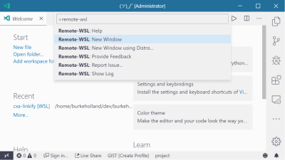
Once the extension is installed, you can attach VS Code directly to the Ubuntu side by opening the Command Palette (Ctrl + Shift + P) and select “Remote-WSL: New Window”.

VS Code with the “Remote WSL: New Window” command highlighted in the Command Palette

(Large preview)

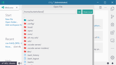
This opens a new instance of VS Code that allows you to work as if you were fully on the Linux side of things. Doing “File/Open” browses the Ubuntu file system instead of the Windows one.

The VS Code “Open File” view

(Large preview)

The integrated terminal in VS Code opens your beautifully customized zsh setup. Everything “just works” like it should when you have the Remote WSL extension installed.

If you open code from your terminal with code ., VS Code will automatically detect that it was opened from the WSL, and will auto-attach the Remote WSL extension.

VS Code Extensions With Remote WSL

The Remote WSL extension for VS Code works by setting up a little server on the Linux side, and then connecting to that from VS Code on the Windows side. That being the case, the extensions that you have installed in VS Code won’t automatically show up when you open a project from the WSL.

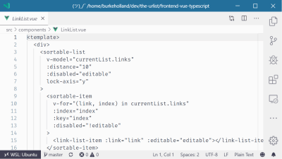
For instance, I have a Vue project open in VS Code. Even though I have all of the right Vue extensions installed for syntax highlighting, formatting and the like, VS Code acts like it’s never seen a .vue file before.

A .vue file open in VS Code with no syntax highlighting

(Large preview)

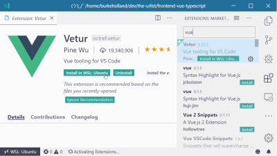
All of the extensions that you have installed can be enabled in the WSL. Just find the extension that you want in the WSL, and click the “Install in WSL” button.

The Vetur VS Code extension landing page in VS Code

(Large preview)

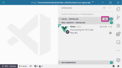
All of the extensions installed in the WSL will show up in their own section in the Extensions Explorer view. If you have a lot of extensions, it could be slightly annoying to install each one individually. If you want to just install every extension you’ve got in the WSL, click the little cloud-download icon at the top of the ‘Local – Installed’ section.

The Extensions view in VS Code with the install all extensions in WSL icon highlighted

(Large preview)

How To Setup Your Dev Directories

This is already an opinionated article, so here’s one you didn’t ask for on how I think you should structure your projects on your file system.

I keep all my projects on the Linux side. I don’t put my projects in “My Documents” and then try and work with them from the WSL. My brain can’t handle that.

I create a folder called /dev that I put in the root of my /home folder in Linux. Inside that folder, I create another one that is the same name as my Github repo: /burkeholland. That folder is where all of my projects go — even the ones that aren’t pushed to Github.

If I clone a repo from a different Github account (e.g. “microsoft”), I’ll create a new folder in “dev” called /microsoft. I then clone the repo into a folder inside of that.

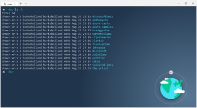
Basically, I’m mimicking the same structure as source control on my local machine. I find it far easier to reason about where projects are and what repos they are attached to just by virtue of their location. It’s simple, but it is highly effective at helping me keep everything organized. And I need all the help I can get.

The authors opinionated folder structure listed in the terminal

(Large preview)

Browsing Files From Windows Explorer

There are times when you need to get at a file in Linux from the Windows side. The beautiful thing about the WSL is that you can still do that.

One way is to access the WSL just like a mapped drive. Access it with a wsl$ directly from the explorer bar:

wsl$

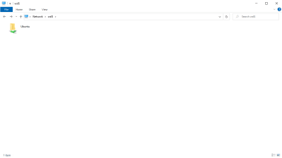
The Windows Explorer the Ubuntu installation as a mounted directory

(Large preview)

You might do this for a number of different reasons. For instance, just today I needed a Chrome extension that isn’t in the web store. So I cloned the repo in WSL, then navigated to it as an “Unpacked Extension” and loaded it into Edge.

One thing that I do with some frequency in Linux is to open the directory that contains a file directly from the terminal. You can do this in the WSL, too, by directly calling explorer.exe. For instance, this command opens the current directory in Windows Explorer.

$ explorer.exe .

This command is a bit cumbersome though. On Linux, it’s just open .. We can make that same magic by creating an alias in the ~/.zshrc.

alias open="explorer.exe"

Docker

When I said all tooling should be on the Linux side, I meant that. That includes Docker.

This is where the rubber really starts to meet the road. What we need here is Docker, running inside of Linux running inside of Windows. It’s a bit of a Russian Nesting Doll when you write it down in a blog post. In reality, it’s pretty straightforward.

You’ll need the correct version of Docker for Windows. As of the time of this writing, that’s the WSL 2 Tech Preview.

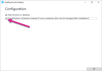
When you run the installer, it will ask you if you want to use Windows containers instead of Linux containers. You definitely do. Otherwise, you won’t get the option to run Docker in the WSL.

The Docker Installation screen with “Use Windows Containers” option selected

(Large preview)

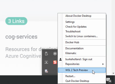
You can now enable Docker in the WSL by clicking on the item in the system tray and selecting “WSL 2 Tech Preview”:

The WSL2 Tech Preview Option in the Docker Daemon context menu

(Large preview)

After you start the service, you can use Docker within the WSL just as you would expect to be able to. Running Docker in the WSL provides a pretty big performance boost, as well as a boost in cold start time on containers.

Might I also recommend that you install the Docker extension for VS Code? It puts a visual interface on your Docker setup and generally just makes it easier to work with Docker because you don’t have to remember all those command-line flags and options.

Get More Bash On Windows

At this point, you should get the idea about how to put Bash on Windows, and how it works once you get it there. You can customize your terminal endlessly and there are all sorts of rad programs that you can add in to do things like automatically set PATH variables, create aliases, get an ASCII cow in your terminal, and much more.

Running Bash on Windows opened up an entirely new universe for me. I’m able to combine Windows which I love for the productivity side, and Linux which I depend on as a developer. Best of all, I can build apps for both platforms now with one machine.

Further Reading

You can read more about Bash on Windows over here:

Special thanks to Brian Ketelsen, Matt Hernandez, Rich Turner, and Craig Loewen for their patience, help, and guidance with this article.

(rb, dm, il)
Categories: Others Tags:

10 Best Free Insta Story Apps That Will Help You Slay the Instagram Game

September 11th, 2019 No comments
unfold best free insta story app

Seeing all the time, effort, emojis, drawings, and true works of art put into an Insta story, we know for sure stories are not what they once were. They’re no longer just pictures and videos shot in real-time. Stories have become a true marketing platform, with intensely strategic moves behind each piece of content published. Every Insta story most likely has a cool (maybe expensive) story app that was used to produce the content.

With Insta stories looking more polished and aesthetically pleasing than ever, as a designer, you have to be on top of your game. But to what end and to what cost?

I’m here to help you save a good buck. I’ve got the 10 best free Insta story apps for you to use to improve your Insta stories game without breaking the bank. Without further ado, let’s jump right in.

10 Best Free Insta Story Apps

1. Unfold

unfold best free insta story app

Unfold is an amazing Insta story app that is free, but also has in-app purchases if you fancy a certain look and template theme. With many texts and elements to choose from, and themes spanning from elegant or retro, there’s something for everyone.

Try it out today for free: https://unfoldstori.es/

2. Jane

best free insta story app jane

A very underappreciated and not talked about enough app, in my opinion, is Jane. The app is free and has very many free beautiful templates for you to use to spice up your stories. They are quite girly and are perfect for maintaining an elegant or playful story vibe. Create amazing videos with royalty-free music and amazing visuals. Again, this app is free but has in-app purchases.

Try it out free today: https://apps.apple.com/us/app/%E7%AE%80%E6%8B%BC-jane/id891640660

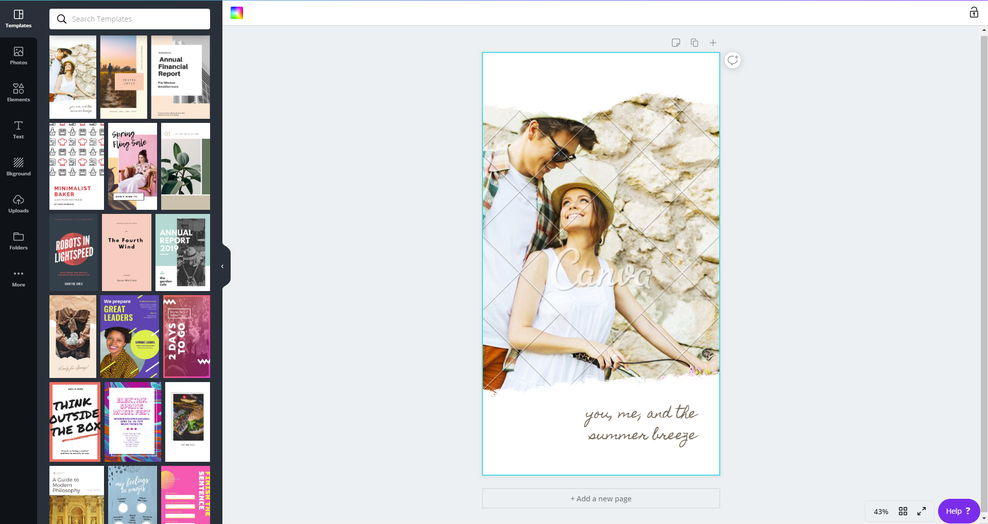
3. Canva

canva free insta story app

Canva is hands-down one of the best online CMP’s out there. It’s great for beginner and advanced designers alike. With tons of templates to choose from and customize, you’ll surely find the one that suits your style best. The mobile app is free and has in-app purchases, although you can totally rock with all the free elements and templates and just tune them to your liking.

Try out this app out for free today:https://www.canva.com/app/

4. Hype Type

hype type free insta story app

With a vast and wide collection of fonts, you can do some serious designing with this app. Hype type is absolutely killing the font game. If you’re focused on spreading a message, then this is absolutely the app for you. The app is free with some paid features, but it’s up to you to decide if they’re a necessary buy.

Check out their app now: https://apps.apple.com/us/app/hype-type-moving-text-photo-s/id1152687277

5. Cut Story

Cut story free insta story app

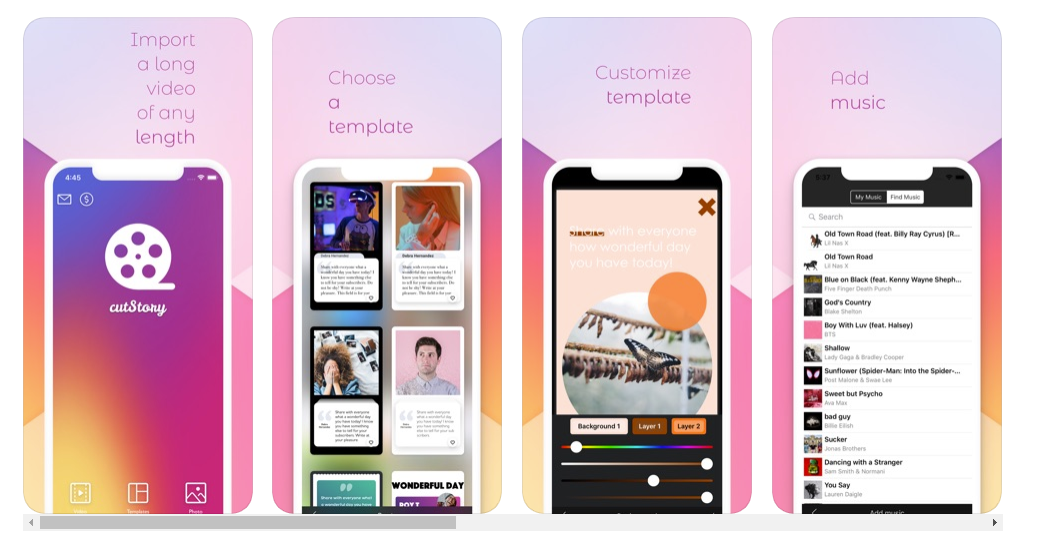
Another great app for managing your stories is Cut Story. Cut Story’s is an amazing video editing app where you can create engaging videos and add music, texts, elements, your logo and more to your video. There are special features that you can buy to enhance your UX, but only if you deem necessary.

Try out their free Insta story app now:https://apps.apple.com/us/app/cutstory-for-instagram-stories/id917630934

6. Mojo Story Maker

free insta story app mojo story

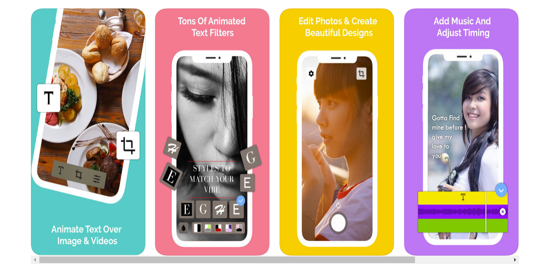
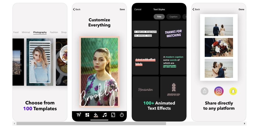
Mojo is the way to go for Insta stories because they have 100 templates for you to choose from! Customize your stories with text to create relevance, engage with your followers and make them feel what you feel, and share the message you want to portray with them. A huge plus to this app is that you can share your new and improved story directly to your Instagram and also your Snapchat!

Try this Insta story app now: https://apps.apple.com/us/app/mojo-stories-editor/id1434861974

7. InShot

in shot free insta story app

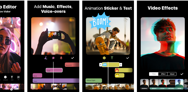
For all my influencers out here, Inshot is the app for you. We don’t always have time to film, import, and edit our footage on our laptops or computers, so having this app will be a valuable asset for you. Edit all your video content in a single app on your phone and import it directly to your Instagram. This app is truly a gift to all of us creators out there.

Give it a try if you haven’t already: https://play.google.com/store/apps/details?id=com.camerasideas.instashot&hl=en

8. Adobe Spark Post

free insta story app adobe spark

Adobe, king of all things editing programs, in my own personal opinion. Adobe has great editing programs, from video-editing to photoshopping images, and when they saw an opportunity to create an app to help you create amazing stories to tell your followers, well, we all know they wouldn’t pass that up. With this app you can do more than edit stories photos, you can also edit video and image posts. The app is initially free and then they offer you the chance to upgrade if you end up falling in love with the app.

Go ahead and give this Insta story maker a go: https://spark.adobe.com/features

10. Over

over best free insta story appbest free insta story app Over

And last, but not least, we have the app called Over. I love that when you visit their webpage, it’s just absolutely inspiring. It inspires you to be different, to stand out, the influence others. A great app for you to use to for free to make your Insta stories more engaging for your followers and for you to really create a brand name and grow your recognizability.

Stand out of the crowd and try this amazing app free today: https://www.madewithover.com/

Now that you have 10 new and fresh apps for you to choose from to start stepping up your Insta story game, it’s time for you to hop on it. Download any one of these apps and tag us in any of your Instagram stories for a chance to be featured on our stories. Our Instagram handle is @webdesignledger.

Don’t sleep on these amazing free Insta story apps! Try them out today.

Until next time,

Stay creative.

Read More at 10 Best Free Insta Story Apps That Will Help You Slay the Instagram Game

Categories: Designing, Others Tags:

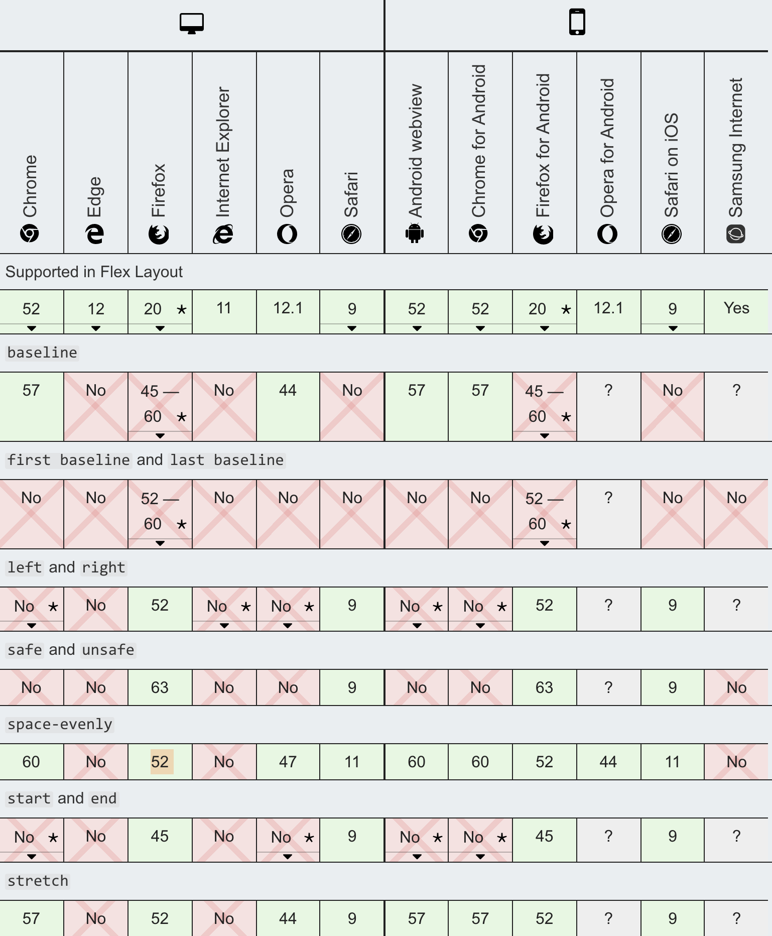
Caniuse and MDN compatibility data collaboration

September 10th, 2019 No comments

Second only to “silly GIFs,” I’d guess screenshots of caniuse are the most common slide graphic at web conferences. It’s become the ultimate source for looking at web compatibility data in the hearts and minds of web developers.

Can I use CSS filter in Firefox? Yes. Can I use the filter() function? No.

But of course, MDN has incredible web platform documentation that also includes compatibility data. So it’s nice to see them collaborate. And not just theoretically — it’s already happening.

Florian Scholz and Alexis Deveria:

Before we began our collaboration, the caniuse website only displayed results for features available in the caniuse database. Now all search results can include support tables for MDN compat data. This includes data types already found on caniuse, specifically the HTML, CSS, JavaScript, Web API, SVG & and HTTP categories. By adding MDN data, the caniuse support table count expands from roughly 500 to 10,500 tables! Developers’ caniuse queries on what’s supported where will now have significantly more results.

Massive upgrade, already live on the site. I absolutely love real collaboration like this when it actually happens. I remember back in 2012 when WebPlatform.org launched and every single major web company gave lip service that they were going to contribute and consolidate their documentation there. Sounded too good to be true. Launched before that work actually happened. Died unglamorously a few years later.

The caniuse database, I believe, is basically this 2MB JSON file on GitHub. We use that right here on CSS-Tricks. We pull it in and use the data in it to display our support tables, crediting caniuse while we do it.

Here’s backdrop-filter:

This browser support data is from Caniuse, which has more detail. A number indicates that browser supports the feature at that version and up.

Desktop

Chrome Opera Firefox IE Edge Safari
76 No No No 17 9*

Mobile / Tablet

iOS Safari Opera Mobile Opera Mini Android Android Chrome Android Firefox
9.0-9.2* No No No No No

It doesn’t sound like the MDN data is going to make its way into that JSON, so I guess my big hope is that that dataset continues to be updated, or that if it is someday replaced, it is in a place that is similarly easy to access.

I totally get why they are just combining the data sources out of the gate, as MDN digs into individual features in a way that caniuse typically doesn’t. For example, the individual values for justify-content are super complicated!

I imagine that kind of detail might require a deeper architectural change that wasn’t right for a Version 1 integration.

Direct Link to ArticlePermalink

The post Caniuse and MDN compatibility data collaboration appeared first on CSS-Tricks.

Categories: Designing, Others Tags:

Hamburger Menu with a Side of React Hooks and Styled Components

September 10th, 2019 No comments

We all know what a hamburger menu is, right? When the pattern started making its way into web designs, it was both mocked and applauded for its minimalism that allows main menus to be tucked off screen, particularly on mobile where every pixel of space counts.

CSS-Tricks is all about double the meat.

Love ‘em or hate ‘em, hamburger menus are here and likely will be for some time to come. The problem is how to implement them. Sure, they look simple and straightforward, but they can be anything but. For example, should they be paired with a label? Are they more effective on the left or right side of the screen? How do we tackle closing those menus, whether by click or touch? Should the icon be an SVG, font, Unicode character, or pure CSS? What about a meatless option?

I wanted to build one of those but failed to find a simple solution. Most solutions are based on libraries, like reactjs-popup or react-burger-menu. They are great, but for more complex solutions. What about the core use case of a three-line menu that simply slides a panel out from the side of the screen when it’s clicked, then slides the panel back in when it’s clicked again?

I decided to build my own simple hamburger with sidebar. No pickles, onions or ketchup. Just meat, bun, and a side of menu items.

Are you ready to create it with me?

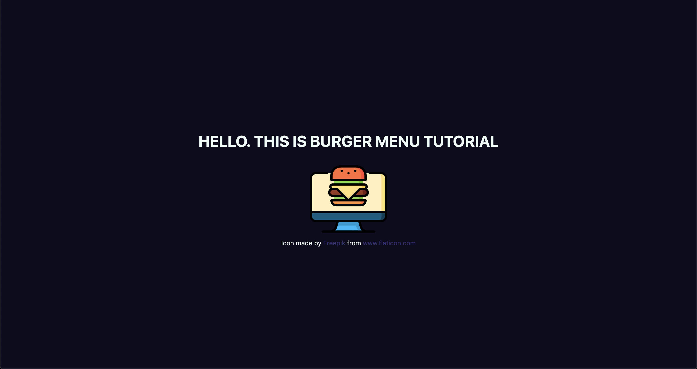
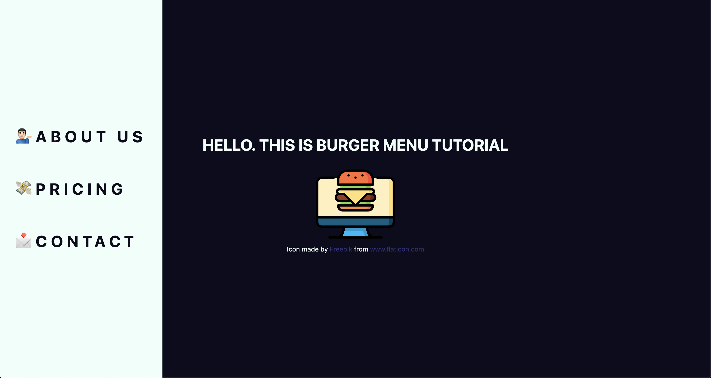
Here’s what we’re making

See the Pen
Burger menu with React hooks and styled-components
by Maks Akymenko (@maximakymenko)
on CodePen.

We’re building use React for this tutorial because it seems like a good use case for it: we get a reusable component and a set of hooks we can extend to handle the click functionality.

Spin up a new React project

Let’s spin up a new project using create-react-app, change to that folder directory and add styled-components to style the UI:

npx create-react-app your-project-name
cd your-project-name
yarn add styled-components

Add basic styles

Open the newly created project in your favorite code editor and start adding basic styles using styled-components. In your src directory, create a file called global.js. It will contain styles for the whole app. You can write your own or just copy what I ended up doing:

// global.js
import { createGlobalStyle } from 'styled-components';

export const GlobalStyles = createGlobalStyle`
  html, body {
    margin: 0;
    padding: 0;
  }
  *, *::after, *::before {
    box-sizing: border-box;
  }
  body {
    align-items: center;
    background: #0D0C1D;
    color: #EFFFFA;
    display: flex;
    font-family: -apple-system, BlinkMacSystemFont, "Segoe UI", Roboto, Helvetica, Arial, sans-serif, "Apple Color Emoji", "Segoe UI Emoji", "Segoe UI Symbol";
    height: 100vh;
    justify-content: center;
    text-rendering: optimizeLegibility;
  }
  `

This is only a part of global styles, the rest of it you can find here.

The CreateGlobalStyle function is generally used for creating global styles that are exposed to the whole app. We’ll import it so we have access to these styles as we go.

The next step is to add a theme file that holds all our variables. Create a theme.js file in the src directory and add following:

// theme.js
export const theme = {
  primaryDark: '#0D0C1D',
  primaryLight: '#EFFFFA',
  primaryHover: '#343078',
  mobile: '576px',
}

Add layout, menu and hamburger components ?

Go to your App.js file. We’re going to wipe everything out of there and create the main template for our app. Here’s what I did. You can certainly create your own.

// App.js
import React from 'react';
import { ThemeProvider } from 'styled-components';
import { GlobalStyles } from './global';
import { theme } from './theme';

function App() {
  return (
    <ThemeProvider theme={theme}>
      <>
        <GlobalStyles />
        <div>
          <h1>Hello. This is burger menu tutorial</h1>
          <img src="https://image.flaticon.com/icons/svg/2016/2016012.svg" alt="burger icon" />
          <small>Icon made by Freepik from www.flaticon.com</small>
        </div>
      </>
    </ThemeProvider>
  );
}
export default App;

Don’t forget to add the line with the small tag. That’s how we credit flaticon.comhttp://flaticon.com) authors for the provided icon.

Here’s what we’ve got up to this point:

Let me explain a little bit. We imported ThemeProvider, which is a wrapper component that uses the Context API behind the scenes to make our theme variables available to the whole component tree.

We also imported our GlobalStyles and passed them as a component to our app, which means that our application now has access to all global styles. As you can see, our GlobalStyles component is inside ThemeProvider which means we can already make some minor changes in it.

Go to global.js and change the background and color properties to use our defined variables. This helps us implement a theme rather than using fixed values that are difficult to change.

// global.js
background: ${({ theme }) => theme.primaryDark};
color: ${({ theme }) => theme.primaryLight};

We destructure our theme from props. So, instead of writing props.theme each time, we’re using a bunch of brackets instead. I’ll repeat myself: the theme is available because we’ve wrapped our global styles with ThemeProvider.

Create Burger and Menu components

Create a components folder inside the src directory and add two folders in there: Menu and Burger, plus an index.js file.

index.js will be used for one purpose: allow us to import components from one file, which is very handy, especially when you have a lot of them.

Now let’s create our components. Each folder will contain three files.

What’s up with all the files? You’ll see the benefit of a scalable structure soon enough. It worked well for me in a couple of projects, but here is good advice how to create scalable structure.

Go to the Burger folder and create Burger.js for our layout. Then add Burger.styled.js, which will contain styles, and index.js. which will exporting the file.

// index.js
export { default } from './Burger';

Feel free to style burger toggle in a way you want, or just paste these styles:

// Burger.styled.js
import styled from 'styled-components';

export const StyledBurger = styled.button`
  position: absolute;
  top: 5%;
  left: 2rem;
  display: flex;
  flex-direction: column;
  justify-content: space-around;
  width: 2rem;
  height: 2rem;
  background: transparent;
  border: none;
  cursor: pointer;
  padding: 0;
  z-index: 10;
  
  &:focus {
    outline: none;
  }
  
  div {
    width: 2rem;
    height: 0.25rem;
    background: ${({ theme }) => theme.primaryLight};
    border-radius: 10px;
    transition: all 0.3s linear;
    position: relative;
    transform-origin: 1px;
  }
`;

The transform-origin property will be needed later to animate the menu it toggles between open and closed states.

After adding the styles, go to Burger.js and add the layout:

// Burger.js
import React from 'react';
import { StyledBurger } from './Burger.styled';

const Burger = () => {
  return (
    <StyledBurger>
      <div />
      <div />
      <div />
    </StyledBurger>
  )
}

export default Burger;

After that look at the left top corner. Do you see it?

Time to do the same with the Menu folder:

// Menu -> index.js
export { default } from './Menu';

// Menu.styled.js
import styled from 'styled-components';

export const StyledMenu = styled.nav`
  display: flex;
  flex-direction: column;
  justify-content: center;
  background: ${({ theme }) => theme.primaryLight};
  height: 100vh;
  text-align: left;
  padding: 2rem;
  position: absolute;
  top: 0;
  left: 0;
  transition: transform 0.3s ease-in-out;
  
  @media (max-width: ${({ theme }) => theme.mobile}) {
    width: 100%;
  }

  a {
    font-size: 2rem;
    text-transform: uppercase;
    padding: 2rem 0;
    font-weight: bold;
    letter-spacing: 0.5rem;
    color: ${({ theme }) => theme.primaryDark};
    text-decoration: none;
    transition: color 0.3s linear;
    
    @media (max-width: ${({ theme }) => theme.mobile}) {
      font-size: 1.5rem;
      text-align: center;
    }

    &:hover {
      color: ${({ theme }) => theme.primaryHover};
    }
  }
`;

Next, let’s add the layout for the menu items that are revealed when clicking on our burger:

// Menu.js
import React from 'react';
import { StyledMenu } from './Menu.styled';

const Menu = () => {
  return (
    <StyledMenu>
      <a href="/">
        <span role="img" aria-label="about us">💁🏻‍♂️</span>
        About us
      </a>
      <a href="/">
        <span role="img" aria-label="price">💸</span>
        Pricing
        </a>
      <a href="/">
        <span role="img" aria-label="contact">📩</span>
        Contact
        </a>
    </StyledMenu>
  )
}
export default Menu;

We’ve got nice emojis here, and best practice is to make them accessible by wrapping each one in a span and adding a couple of properties: role="img" and aria-label="your label". You can read more about it here.

Time to import our new components into our App.js file:

// App.js
import React from 'react';
import { ThemeProvider } from 'styled-components';
import { GlobalStyles } from './global';
import { theme } from './theme';
import { Burger, Menu } from './components';

// ...

Let’s see, what we’ve got:

Take a look at this nice navigation bar! But we’ve got one issue here: it’s opened, and we want it initially to be closed. We only need to add one line to Menu.styled.js fix it:

// Menu.styled.js
transform: 'translateX(-100%)';

We are well on our way to calling this burger cooked! But first…

Adding open and close functionality

We want to open the sidebar when clicking the hamburger icon, so let’s get to it. Open App.js and add some state to it. We will use the useState hook for it.

// App.js
import React, { useState } from 'react';

After you import it, let’s use it inside the App component.

// App.js
const [open, setOpen] = useState(false);

We set the initial state to false, because our menu should be hidden when the application is rendered.

We need both our toggle and sidebar menu to know about the state, so pass it down as a prop to each component. Now your App.js should look something like this:

// App.js
import React, { useState } from 'react';
import { ThemeProvider } from 'styled-components';
import { GlobalStyles } from './global';
import { theme } from './theme';
import { Burger, Menu } from './components';

function App() {
  const [open, setOpen] = useState(false);
  return (
    <ThemeProvider theme={theme}>
      <>
        <GlobalStyles />
        <div>
          <h1>Hello. This is burger menu tutorial</h1>
          <img src="https://media.giphy.com/media/xTiTnwj1LUAw0RAfiU/giphy.gif" alt="animated burger" />
        </div>
        <div>
          <Burger open={open} setOpen={setOpen} />
          <Menu open={open} setOpen={setOpen} />
        </div>
      </>
    </ThemeProvider>
  );
}
export default App;

Notice that we’re wrapping our components in a div. This will be helpful later when we add functionality that closes the menu when clicking anywhere on the screen.

Handle props in the components

Our Burger and Menu know about the state, so all we need to do is to handle it inside and add styles accordingly. Go to Burger.js and handle the props that were passed down:

// Burger.js
import React from 'react';
import { bool, func } from 'prop-types';
import { StyledBurger } from './Burger.styled';
const Burger = ({ open, setOpen }) => {
  return (
    <StyledBurger open={open} onClick={() => setOpen(!open)}>
      <div />
      <div />
      <div />
    </StyledBurger>
  )
}
Burger.propTypes = {
  open: bool.isRequired,
  setOpen: func.isRequired,
};
export default Burger;

We destructure the open and setOpen props and pass them to our StyledBurger to add styles for each prop, respectively. Also, we add the onClick handler to call our setOpen function and toggle open prop. At the end of the file, we add type checking, which is considered a best practice for aligning arguments with expected data.

You can check whether it works or not by going to your react-dev-tools. Go to Components tab in your Chrome DevTools and click on Burger tab.

Now, when you click on your Burger component, (don’t mix it up with the tab), you should see, that your open checkbox is changing its state.

Go to Menu.js and do almost the same, although, here we pass only the open prop:

// Menu.js
import React from 'react';
import { bool } from 'prop-types';
import { StyledMenu } from './Menu.styled';
const Menu = ({ open }) => {
  return (
    <StyledMenu open={open}>
      <a href="/">
        <span role="img" aria-label="about us">💁🏻‍♂️</span>
        About us
      </a>
      <a href="/">
        <span role="img" aria-label="price">💸</span>
        Pricing
        </a>
      <a href="/">
        <span role="img" aria-label="contact">📩</span>
        Contact
        </a>
    </StyledMenu>
  )
}
Menu.propTypes = {
  open: bool.isRequired,
}
export default Menu;

Next step is to pass open prop down to our styled component so we could apply the transition. Open Menu.styled.js and add the following to our transform property:

transform: ${({ open }) => open ? 'translateX(0)' : 'translateX(-100%)'};

This is checking if our styled component open prop is true, and if so, it adds translateX(0) to move our navigation back on the screen. You can already test it out locally!

Wait, wait, wait!

Did you notice something wrong when checking things out? Our Burger has the same color as the background color of our Menu, which make them blend together. Let’s change that and also animate the icon a bit to make it more interesting. We’ve got the open prop passed to it, so we can use that to apply the changes.

Open Burger.styled.js and write the following:

// Burger.styled.js
import styled from 'styled-components';
export const StyledBurger = styled.button`
  position: absolute;
  top: 5%;
  left: 2rem;
  display: flex;
  flex-direction: column;
  justify-content: space-around;
  width: 2rem;
  height: 2rem;
  background: transparent;
  border: none;
  cursor: pointer;
  padding: 0;
  z-index: 10;

  &:focus {
    outline: none;
  }

  div {
    width: 2rem;
    height: 0.25rem;
    background: ${({ theme, open }) => open ? theme.primaryDark : theme.primaryLight};
    border-radius: 10px;
    transition: all 0.3s linear;
    position: relative;
    transform-origin: 1px;

    :first-child {
      transform: ${({ open }) => open ? 'rotate(45deg)' : 'rotate(0)'};
    }

    :nth-child(2) {
      opacity: ${({ open }) => open ? '0' : '1'};
      transform: ${({ open }) => open ? 'translateX(20px)' : 'translateX(0)'};
    }

    :nth-child(3) {
      transform: ${({ open }) => open ? 'rotate(-45deg)' : 'rotate(0)'};
    }
  }
`;

This is a big chunk of CSS, but it makes the animation magic happen. We check if the open prop is true and change styles accordingly. We rotate, translate, then hide the menu icon’s lines while changing color. Beautiful, isn’t it?

Okay, folks! By now, you should know how to create a simple hamburger icon and menu, that incorporates responsiveness and smooth animation. Congratulations!

But there’s one last thing we ought to account for…

Close the menu by clicking outside of it

This part seems like a small bonus, but it’s a big UX win because it allows the user to close the menu by clicking anywhere else on the page. This helps the user avoid having to re-locate the menu icon and clicking exactly on it.

We’re going to put more React hooks to use to make this happen! Create a file in the src directory, called hooks.js and open it. For this one, we’re gonna turn to the useEffect hook, which was introduced in React 18.

// hooks.js
import { useEffect } from 'react';

Before we write the code, let’s think about the logic behind this hook. When we click somewhere on the page, we need to check whether the clicked element is our current element (in our case, that is the Menu component) or if the clicked element contains the current element (for instance, our div that wraps our menu and hamburger icon). If so, we don’t do anything, otherwise, we call a function, that we’ll name handler.

We are going to use ref to check the clicked element, and we will do so every time someone clicks on the page.

// hooks.js
import { useEffect } from 'react';

export const useOnClickOutside = (ref, handler) => {
  useEffect(() => {
    const listener = event => {
      if (!ref.current || ref.current.contains(event.target)) {
        return;
      }
      handler(event);
    };
    document.addEventListener('mousedown', listener);
    return () => {
      document.removeEventListener('mousedown', listener);
    };
  },
  [ref, handler],
  );
};

Don’t forget to return the function from useEffect. That’s so-called “clean up” and, basically, it stands for removing an event listener when the component unmounts. It is the replacement of componentWillUnmount lifecycle.

Now let’s hook up the hook

We’ve got our hook ready, so it’s time to add it to the app. Go to the App.js file, and import two hooks: the newly created useOnClickOutside and also useRef. We’ll need the latter to get a reference to the element.

// App.js
import React, { useState, useRef } from 'react';
import { useOnClickOutside } from './hooks';

To get access these in the current element, we need to get access to the DOM node. That’s where we use useRef, also, the name node perfectly reflects the point of this variable.

From there, we pass the node as a first argument. We’ll pass the function that closes our menu as a second argument.

// App.js
const node = useRef(); 
useOnClickOutside(node, () => setOpen(false));

Lastly, we need to pass our ref to the DOM element. In our case, it will be div, that holds the Burger and Menu components:

// App.js
<div ref={node}>
  <Burger open={open} setOpen={setOpen} />
  <Menu open={open} setOpen={setOpen} />
</div>

Your App.js should look similar to this:

// App.js
import React, { useState, useRef } from 'react';
import { ThemeProvider } from 'styled-components';
import { useOnClickOutside } from './hooks';
import { GlobalStyles } from './global';
import { theme } from './theme';
import { Burger, Menu } from './components';
function App() {
  const [open, setOpen] = useState(false);
  const node = useRef();
  useOnClickOutside(node, () => setOpen(false));
  return (
    <ThemeProvider theme={theme}>
      <>
        <GlobalStyles />
        <div>
          <h1>Hello. This is burger menu tutorial</h1>
          <img src="https://media.giphy.com/media/xTiTnwj1LUAw0RAfiU/giphy.gif" alt="animated burger" />
        </div>
        <div ref={node}>
          <Burger open={open} setOpen={setOpen} />
          <Menu open={open} setOpen={setOpen} />
        </div>
      </>
    </ThemeProvider>
  );
}
export default App;

Check this out! It works as expected, and it’s fully functional and responsive.

Congratulations, everyone! You did a great job! Happy coding!

View on GitHub

The post Hamburger Menu with a Side of React Hooks and Styled Components appeared first on CSS-Tricks.

Categories: Designing, Others Tags:

“Off The Main Thread”

September 10th, 2019 No comments

JavaScript is what they call “single-threaded.” As Brian Barbour puts it:

This means it has one call stack and one memory heap.

We all feel a symptom of that regularly in the form of performance jank and non-interactivity on elements or entire sites. If we give JavaScript lots of jobs and it gets really busy doing them, then it’s not doing other things, like, say, handling our event handlers quickly.

There has been an interesting point/counter-point combo recently along these lines.

Das Surma has been advocating for moving as much JavaScript off the main thread as you possibly can. In fact, when it comes to using Web Workers, he suggests:

You should always use Web Workers.

Web Workers being the primary way to run JavaScript off the main thread.

There is lots to consider, of course, but I like how he compares this to how other languages call the main thread the “UI thread.” If what you are doing is UI-related, do it on the main thread; if it’s not, do it off the main thread. An example? State management.

David Gilbertson must have read that and wrote:

I saw an article recently making the case that updating a Redux store was a good candidate for Web Workers because it’s not UI work (and non-UI work doesn’t belong on the main thread). Chucking the data processing over to a worker thread sounds sensible, but the idea struck me as a little, umm, academic.

David’s main point, it seems to me, is that some of the hefty JavaScript things we need to do are in response to user-initiated actions where the user needs to wait for things to finish anyway, so an unresponsive UI during that time is OK. But for anything that isn’t user-initiated — and takes longer than say 100ms — he agrees a Web Worker is helpful.

(Looking at that 100ms thing, it’s worth noting that a major point Das Surma is making is that the world is full of low-end phones — and who knows what 100ms on a high-end phone is when translated to on a low-end phone.)

The post “Off The Main Thread” appeared first on CSS-Tricks.
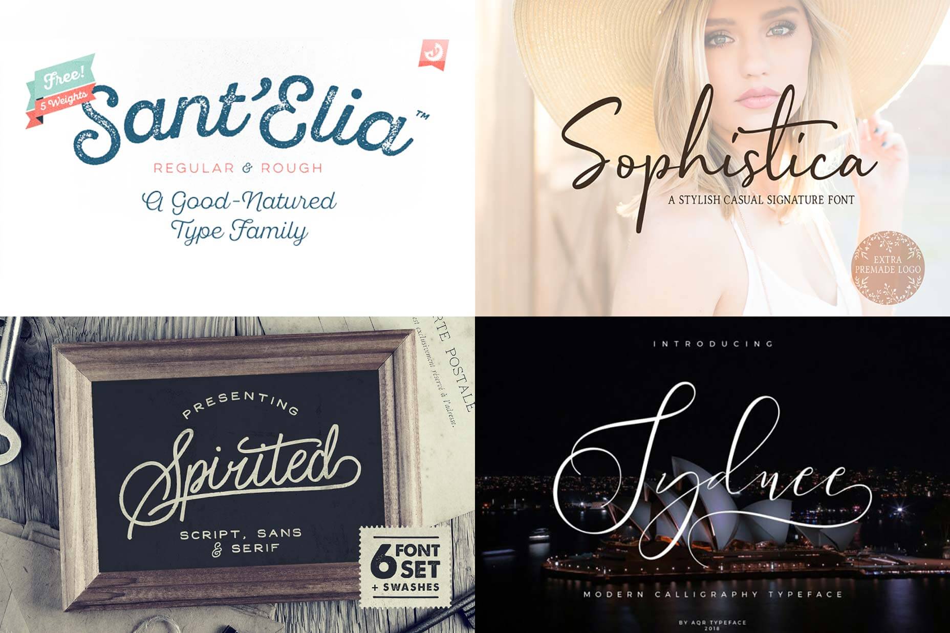
Categories: Designing, Others Tags:

Android Fans Rejoice, Vivaldi Has Arrived

September 10th, 2019 No comments

It’s time for me to go all fanboy on you guys, because Vivaldi is on Android, ya’ll! Vivaldi the browser, that is. You know, the one made by former Opera devs, and which is aimed at power users who want loads of customization and choice, plus a little privacy.
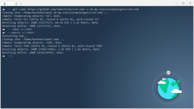
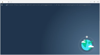
It’s the browser I’ve been using and only mildly worshipping for a while, now. Look, it’s just best if we make it clear that I am biased. Though I do worry that too many browsers are based on the Chromium project these days, I give Vivaldi a pass because it’s just that good. It’s been my day-to-day browser on the desktop since version 2.0 released in October 2018, and now it’s going to be my main browser on my phone.

Well, I might wait until it’s out of beta. We’ll see.

So what do you get in this version of Vivaldi for Android?

Vivaldi Features

Encrypted Sync – You can synchronize all of your bookmarks, history, and other data with the mobile version, no problem. Not done reading an article you started on your desktop or laptop? Open the menu and hit “Recent Tabs”. Tabs from other devices will be there too.

Notes: This is end-to-end encryption, so the people that make Vivaldi never see your data. It won’t sync your extensions, for obvious reasons.

Lite Mode – This is a browsing mode designed to save you data while you’re on the go. Like Opera’s Turbo Mode before it, it routes your browsing through their own servers, where they compress the data you receive on your end. I have no idea if this is encrypted, though. I haven’t been able to find too much in-depth information on this feature.

Notes – The Notes app in Vivaldi’s desktop version made it to the mobile version. They’re dead-simple text based notes, but they do get synced across devices with everything else.

Page Capture – It does what it says on the tin. You can capture what’s visible on your screen, or you can capture the whole darned page. Keep in mind that mobile pages can get very, very long, as the page’s width gets squished down to mobile sizes.

Search Engine Nicknames – So when you’re typing in a URL bar, you can type “g ducks” to search on Google for ducks, or “w ducks” to search Wikipedia, or “b Google” for reasons that I’m sure you can guess.

Reader Mode – This is a great feature that many other browsers already have, but hey, it’s good that Vivaldi has it, too. Cut out all distractions, and just get to the article already with the push of a button.

Tab Management – Okay, let’s be real. It’s easy enough to browse through your existing tabs, recently closed tabs, and even tabs from other devices. Those features are all well and good, but you’re just not going to get the same depth of tab organization tools. At least… not yet. It’s a beta of the first version, so I’d expect more advanced tab management to come along, down the road.

(Oh, and in this beta version, tab previews don’t always load.)

Private Browsing – It would be dumb if they didn’t have it.

Important features they didn’t bother to mention – As with the desktop version, one of Vivaldi’s strongest selling points is the feature that you will probably use only once: the settings screen. They’ve got loads of options that allow you to customize how the browser works, particularly in regards to privacy.

First Impressions of Vivaldi for Android

It feels snappy. For context, my current phone is a Xiaomi Redmi Note 5A; it’s not particularly high-end, but it’s not slouch either. Even so, I’ve had Chrome and even Firefox sometimes feel sluggish and annoying. I’ve just started using Vivaldi, but I can say that so far it feels faster and smoother.

Will it stay that way? Time will tell.

As it is, they also pay attention to detail, and they are considering the needs of a variety of users. Case in point: there’s a button that allows you to access the search/URL bar at the bottom of the screen, so you can use the browser one-handed. Heck, it even makes two-handed browsing easier, depending on the size of your phone.

The one thing I most miss from the desktop version is an ad blocker. That’s right, no native ad blocking with Vivaldi on Android. It’s very sad.

All in all, though, I believe Vivaldi’s mobile version is a strong contender.

Source

Categories: Designing, Others Tags: