Archive

Archive for February, 2020

SFTP & Database Access on WordPress.com

February 11th, 2020 No comments

(This is a sponsored post.)

Wait what?

That’s right, direct access to the files and data storage that power your site on WordPress.com, just like you have if you self-host a WordPress site. You can read their announcement here. Note this is for Business and eCommerce plans only.

All you have to do is flip it on in the settings (Manage > Hosting Configuration) and it’ll give you the SFTP credentials.

SFTP and database access can be configured right in the WordPress Manage settings.

Here’s me using an SFTP client and logging in no problem, and what I have access to:

Notice I can sneak right into super important folders like plugins, themes, and uploads. That’s right:

  • You can upload and use your own themes
  • You can upload and use your own plugins
  • You can mass upload assets if you need to

All that stuff is ?mind-blowing to me. It used to be pretty locked in my mind that you use WordPress.com if you want to use WordPress and get all the speed, security, and lack of any worry, but at the cost of some lack of control. Now that all this control is there too, the line gets a lot fuzzier on when to self-host and when not to. You’ll have to make that call for yourself.

And I haven’t even mentioned that there is a button in the settings to pop open phpMyAdmin, giving you direct access to the database as well.

There are some limitations, which I think make a lot of sense.

For example, when I started Email is Good, I chose the TwentySixteen theme because I think it works really nicely for a straightforward blog like this site is. But when I log in via SFTP, I can’t directly edit the theme. Instead, I see a symlink there in the themes folder, which I can’t touch. That symlink is to an official copy of the TwentySixteen theme, which WordPress.com themselves will keep up to date. If I want to customize it, I could upload my own copy of that theme (or any other theme), and then I’m on my own to update it.

If this weren’t enough, there’s one more small but key thing WordPress.com makes easy: switching PHP versions. That’s something that often takes a support request or requires more than a simple shared hosting plan, but it readily accessible in the WordPress.com site settings.

None of this is required, of course. You don’t ever have to fiddle with any of this stuff to run a WordPress.com site. This is for people who need deeper control and like to hack on stuff (like me). There is also no prescribed way to use this. You could just pop in over SFTP to edit a few little things in a template or asset. Or, you could have a full-blown load dev environment for your site and deploy it over SFTP on demand.

Direct Link to ArticlePermalink

The post SFTP & Database Access on WordPress.com appeared first on CSS-Tricks.

Categories: Designing, Others Tags:

What Makes a Good User Interface?

February 11th, 2020 No comments

Two-thirds of users will rather read beautifully designed content in case they only have 15 minutes to stay online according to HubSpot.

What does it teach us?

In the modern economy, people are not buying products or services anymore. They are buying experiences (Forbes) or, in other words, visual satisfaction and usability.

So, to keep ahead of a pack in these realia, one should think about staying up to date with the latest trends. Yet, implementing AR features or adding a voice control function to an app is not the warranty of success. These are the simplicity and clearness that make users stay with your online platform, website or app.

Complexity is annoying. Even loyal customers will bounce if they cannot complete the basic operation after the UI update. The same refers to acquiring new customers. Both acquisition and retention processes depend strongly on the level of their satisfaction.

To achieve a high user satisfaction rate, it is possible to make use of the plethora of practices teaching about what makes a good user experience.

All of them can be described in one formula: CSF-A-CSF (consistency, simplicity, familiarity, attractiveness, conciseness, seamless navigation, forgiveness).

Consistency

This feature caters to a smooth user journey through different interface elements. If the latter is consistent, a user will find the needed option fast, therefore the whole experience will be successful and customers will develop usage patterns quickly.

Conciseness

Stands for the application of the rule: less is more. According to the data from Nielsen Norman Group’s research, a customer usually stays 10-20 seconds on a page. On average, users will read only a quarter of information presented on the web page unless the writing is exclusively clear. Therefore, all the content displayed on the page should be exclusively clear.

Simplicity

We are living in a highly competitive reality, where a customer can find an alternative solution just a click away. To avoid bounce, it’s important to bypass any error scenarios and make sure that if any of them still happens, a solution should be right at hand. (Forbes)

Seamless navigation

The inpatient users of today won’t spend time navigating through multi-step systems for finding the right solution. Therefore, it is recommended to consolidate navigation and minimize the number of tasks users should perform.

Familiarity

When starting a journey, a customer expects to take familiar steps, like finding a search button on the navigation pane, etc. Therefore, keeping things looking like something your customers have encountered before is important.

Forgiveness

A forgiving design is one that makes users avoid mistakes or makes them feel insufficient. For example, if a customer misspelled a search term, a system should gently prompt the right variant. The same refers to products or services that are not currently available. A great user experience presupposes offering alternatives instead of empty, zero-result pages.

Attraction

According to HubSpot, 38% of users will leave a website if the presented information or layout is not attractive. Therefore, an attractive design is what makes users want to return to the resource, therefore it makes every session a pleasure.

Yet, these guidelines are too general to give you complete assistance in this area. To find out what practical steps to undertake we recommend conducting market research to know exactly what your customers love or hate.

To increase your chances of building a successful user interface design, you should interact with your future audience in the very beginning. The interaction may be performed in the following ways:

2. Interviewing customers

It is better to do that by collaborating with an independent third-party agency that will apply a 100% unbiased approach. Of course, it is possible to get a bunch of data from analytics. That is why web owners tend to disregard the user-interviewing process. Yet, it leads to opinion-driven conclusions, that may be mistaking.

2. Learning customer journeys

Knowing exactly what goals your customers follow when using your digital service, what tasks they accomplish, and what steps they undertake will help you to virtually escort your customers through the process and make their journey a success.

3. Testing with early adopters

Every product or service will definitely be interesting to a certain bunch of people, called early adopters. It is strongly recommended to refer to their opinion before the project launch. This practice is an incomparable source of valuable feedback and advice.

Profound market research, checking on the competitive services as well as conducted user polls helps create a great user interface for any digital project.

Cost of a Good User Interface

A good user interface usually means a lot of research and analytics that require solid investment. 50% of website owners would reject improvements on the design due to high costs. An average yearly salary of the UI designer reaches up to $76K according to Glassdoor.

Yet, companies like Google and Apple, offer $ 116K and $ 123K respectively for the services of a highly efficient UI designer.

Hiring a full-time UI designer may not be a cost-efficient option, especially for a small-size project, like building a mobile app. Therefore, it may be more rational to hire a contractor for the time of the project. For example, an hourly rate of a contractor at Google is from $46 to $59, according to Glassdoor, and an average hourly rate of the UX designer on Upwork is $30-$125.

Improving user experience on your digital resource is often about rebuilding. Therefore, it is more reasonable to think about the user experience from scratch. Many companies offer web and mobile app development that already includes best practices of user experience design in the price of its implementation.

If you are interested to know the cost to make a great UI design for an app, for example, you may just inquire how much does it cost to make an app with a company that offers software development services. In such a case you will get a complete quote on the whole spectrum of services including both, design and development.

Takeaways

These days, users are valuing positive experience over everything. Thus, a good user interface design is a must-have in the experience-centric economy in order to influence the decision making of any client.

The key secret of success is paying much attention to analysis and real-life customer feedback. Aside from collecting these data, it is necessary to follow simple guidelines like keeping the design consistent, simple, familiar, attractive, concise, seamless, and forgiving.

Frame PSD created by BiZkettE1 – www.freepik.com

Categories: Others Tags:

29 Best Airline Logos and Their Story

February 11th, 2020 No comments
50-popular-airline-logos

Billions of people use airlines to travel across the globe every year. Between local and global airlines, there are hundreds of airlines that compete with each other to provide the best travel experience. As a result, airline logos play a crucial part as branding is extremely important.

Airlines don’t hesitate to pay huge amounts to get their airline logos designed. Airplane body logos, tail logos, tv ads, billboards, etc. they utilize every possible option to influence people’s views on their brand.

The best 29 Airline Logos and their stories

1. Qatar Airways

Qatar Airways has a unique logo. Unlike many other airline tail logos that, in some way, resemble a bird or a wing, Qatar’s logo is that of an Oryx which is the national symbol of the country. The burgundy and white colors used on the logo are taken from the country’s flag.

2. Singapore Airlines

Singapore Airlines has had the same logo since its split from Malaysian Airlines. The airline logo features a bird called the silver kris. It’s derived from a dagger named keris, which plays a prominent role in the region’s folklore. The ‘silver’ kris appears on the airplane’s tail as a golden bird and the theme is used in various different services offered by the airlines.

3. Qantas Airways

Qantas Airlines has a Kangaroo symbol in its logo as an Australian logo. The kangaroo symbol used in the airline logo was inspired by the Australian one-penny. The airplane tail logo used by Qantas is a little different than other airlines and warrants its spot on the list. The tail logo instead of covering only the tail-wing covers a much larger portion of the airplane’s tail and even if the colors are quite popular among other airlines, it makes it stand out.

4. Lufthansa Airlines

The German airlines has gone through various name changes since it was first founded in 1919. However, the airline logo has remained almost the same. The logo features a crane in a circle and its color has changed from yellow to ultramarine. It was designed by Otto Firle in 1918.

5. Virgin Atlantic

While the airline tail logo isn’t all that unique, Virgin Atlantic Airways was famous for it’s flying lady icon. In 2019, the airlines changed its logo to feature 5 different characters for more diversity.

6. Turkish Airlines

The logo of Turkish Airlines features a wild goose. The goose is white on a red background which is the same color as the Turkish flag. The airlines have picked the wild goose as it’s the worlds highest-flying bird that can go as high as 29 thousand feet.

7. Garuda Indonesia

Garuda Indonesia hasn’t changed the logo too much. Only the fonts have been adjusted to make the logo look a bit more modern. Like many other airlines, Garuda Indonesia also features a bird, in this case, it has a bird that resembles an eagle.

8. Southern China Airlines

Going through numerous mergers and rebrandings, China Southern Airlines has a unique airline logo. It doesn’t look like the best logo but it changes some unpopular colors used by other airlines. The logo consists of a red Kapok Flower on a bright blue background. The Kapok flower is also the symbol of the airlines’ hometown Guangzhou.

9. Austrian Airlines

While its logo is a rather simple one. Austrian Airlines has recently ‘tweaked’ their airline logo. The change was made to make the logo fit with the modern trends. Its text is a bit bolder and the tail logo has become more 3d.

10. Air New Zealand

Air New Zealand has an extremely unique logo. The airline logo features the Maori symbol of Koru which symbolizes prosperity, growth, new life, and peace. It also resembles wind which fits perfectly as an airline symbol. The Koru symbol is also quite prominent in Maori culture.

11. Hawaiian Airlines

This airline logo definitely makes it into the list as it’s quite different from other airline logos. It is one of the few airlines that features a person on their logo rather than a type of bird or something associated with flying. It was recently updated too with a more modern font and the gradient used in the background added to that.

12. Korean Air

No, this airline logo wasn’t stolen from Pepsi. It’s actually, much older than the Pepsi Logo. Korean Air’s logo features the ‘Taegeuk’, the symbol of the ultimate reality. The Taegeuk is also featured on the Korean Flag.

13. Ryanair

Known for its cheap flights across Europe, Ryanair actually has an interesting tail logo. The Irish airline’s logo consists of a cross-over between an angel and a harp. Both items are somewhat significant in Irish culture, while they are much less known outside. The airlines is well-known due to its controversial advertisement strategies. The airline logo has fallen somewhat short as the company’s advertisement controversies spear-head its branding strategy.

14. AeroMexico

AeroMexico is another airline with an interesting logo. It’s one of the other few airline logos that cover a person. In this case, its logo has the symbol of an Aztec eagle warrior called ‘cu?uhtli’. The eagle warriors were the most feared class in the Aztec military and eagles symbolize the sun and the skies.

15. PNG Air

This airline logo is probably the most interesting and is praised by many people. Hailing from Papua-New Guinea, PNG Air has a rather detailed and unique looking airline tail logo. The airline is quite young and it has gained a lot of traction with its unique logo. The logo symbolizes the diversity of the culture of Papua-New Guinea, which is by far the most diverse country in the world.

16. EgyptAir

EgyptAir, has gone through numerous rebrandings and has changed its owner many times. When it finally settled on the name ‘EgyptAir’ in 1971 it adopted its current airline logo. The logo depicts the head of ‘Horus’ which is one of the sun gods in Egyptian mythology. Horus has the head of a falcon and is believed to be the creator of the universe. However, the sun god RA also has a falcon head and represents the same things as Horus. The controversy between which god is the real one has led to them to be merged as Ra-Horakthy. EgyptAir prefers to refer their logo as Horus though.

17. Aer Lingus

Unlike Ryan Air, the Irish airline Aer Lingus has adopted a more well-known Irish symbol for its airline logo. Aer Lingus features the ‘Shamrock’ in its logo. The Shamrock is a traditional Irish symbol of clover with 3 leaves. As the Shamrock is a little inverted in the logo, it’s referred to as the tipsy-shamrock, highlighting the Irish stereotype.

18. Japan Airlines

Japan Airlines makes it into the list because, unlike other airlines, they changed their logo and had to revert to their original logo as consumers didn’t like the re-branding. The airline logo has a red Japanese crane on a white background. As with many airlines, Japan Airlines has opted for a bird, but the crane is actually a good choice as they can gain immense heights and can fly long distances. Also, many think that the logo resembles the Rebel Alliance symbol from Star Wars.

19. SWISS

Referred to as SWISS, Swiss International Airlines, has a relatively simple airline tail logo. It contains the Swiss national flag in the shape of an airplane tail. It’s simple yet effective as it screams Swiss at you.

20. IranAir

Previously called Iran National Airlines, IranAir started to search for its logo after it was rebranded. A competition was announced in Iran, and the logo that contained a Huma bird was the winner. The Huma bird plays a significant role in Iranian folklore. The bird is to bring good fortune and it never leaves the skies. It’s called by various names also including ‘bird of paradise’. The Huma bird in some interpretations resembles a phoenix and in some, it’s depicted like a griffin. IranAir has opted for the griffin version and the airline is referred to as Huma inside of Iran.

21. Sri Lankan Airlines

It’s vibrant, it’s big, and it’s unique. Sri Lankan Airlines has come up with a beautiful logo during its rebranding in 1999. It features a peacock in red, green, orange. The font of the logo also pushes it even further. According to local tales, a flying machine once existed in Sri Lanka and it resembled a peacock.

22. Ethiopian Airlines

In 2010, Ethiopian Airlines was invited to join the Star Alliance under the mentorship of Lufthansa. This made Ethiopian Airlines the third airline from Africa to join the alliance. During its admission period to the alliance, the airline started a re-branding campaign and modernized its logo. It assumed the tail logo that contained the colors on the Ethiopian national flag. It also has Ethiopian in both English and Amharic text.

23. Delta Airlines

When listed based on revenue, Delta Airlines is the #1 airline in the world. It’s the second-largest based on the number of passengers it carries. The airline logo features a triangle that looks like it’s designed in 3D while in reality, it isn’t. The triangle is cut from its center and with clever coloring, it looks as if it was 3D. The triangle also resembles the Greek letter delta as in the name of the airlines itself.

24. AirFrance

One of the two airlines that operated faster-than-sound flights, AirFrance is one of the top airlines in the world. It frequently flew Concorde jets between Europe and the US until 2003. Its original logo was that of a seahorse, but its more contemporary logo that consists of a single red stripe with the color scheme of the French national flag was adopted after its merger with KLM.

25. Aeroflot

The Russian airlines is one of the oldest airlines in the world. It served during the Soviet period as the biggest airline in the world. After the dissolution of the USSR, the airline transformed into a semi-private company. The airline logo, however, kept using the sickle and hammer logo even after the dissolution of the union. Its main difference is that it avoids the color red in it.

26. Finnair

The Finnish Airlines is listed as the safest airline in the world with zero fatal accidents in the last 57 years. The logo of the airlines is quite simple yet really effective. The tail logo consists of an ultramarine ‘F’ letter that stretches out. The color scheme is that of the national flag and the F stands for Finland. The stretched F greatly resembles the cross on the national flag too.

27. Easyjet

EasyJet makes it into the list not because its design stands out but because it’s such an unusual and simple logo. Simply, it’s just the brand logo in white on an orange background. That’s it. No cultural, national symbolism.

28. Aegean Airlines

If you’ve read this far, you might have realized that there are two main trends in airline logos. One is dominated by red and white while the other is dominated by ultramarine and white. Aegean Airlines, is in the second camp. Its logo is quite simple but carries the Aegean vibes with the sunset and the birds flying over the Mediterranean.

29. Air Asia

While the logo greatly resembles the logo of Virgin Airways, the airline logo is quite simple with the name on a red background. The airline faced some controversy when a runway accident caused a backlash. When the plane had the accident, the runway operators tried to cover the airline logo so that it wasn’t associated with Air Asia. Well, it didn’t work out too much.

Even though we’ve seen that there are two major trends in airline logos, a white icon on a red background and a white icon on an ultramarine background, there are also quite unique and well-designed icons. Our two favorites were the airline logo of Hawaiian Airlines and the airline logo of PNG air. Which ones were your favorite?

Did we miss any interesting airline logos? Let us know in the comment section below.

Categories: Others Tags:

How To Book More Appointments And Events With A WordPress Booking Plugin

February 11th, 2020 No comments
Appointment booking buttons

How To Book More Appointments And Events With A WordPress Booking Plugin

How To Book More Appointments And Events With A WordPress Booking Plugin

Suzanne Scacca

2020-02-11T12:00:00+00:002020-02-11T12:09:04+00:00

When it comes to running a service-based business online, scheduling appointments with prospects and clients is critical. The downside of that, of course, is that it takes a lot of time to manage appointments and event bookings if you do it on your own.

With WordPress, however, there are a bunch of booking plugins that’ll get the job done. Put one of them in place and you can kiss many of those tedious appointment management tasks goodbye.

But all this is contingent on using the right WordPress booking plugin.

Today, I’m going to introduce you to the Amelia appointments and events WordPress booking plugin. But rather than show you how to install and use the plugin (which is very easy), I want to spend this time showing you how to design an effective booking system using it.

How To Book More Appointments And Events With Amelia

There are many kinds of clients that would benefit from a booking system:

  • Salons, spas, fitness centers with services or classes at specific times;
  • Service providers that work by appointment only (e.g. mechanics, plumbers, etc.);
  • Real estate agents that host open houses or schedule property walk-throughs;
  • Companies that put out webinars, virtual classes and so on;
  • Freelancers and small businesses (like yours) that use discovery calls to vet prospects.

Now, they could use a third-party reservation system, but they’re often costly and difficult to manage. Not to mention the fact that some of these systems aggregate competitor listings. This might make it more convenient for the user to sift through a number of options at once, but this kind of booking system is just begging to pull prospective customers’ attention away from you.

By building a booking system right into your client’s website, you can avoid all of these possible issues. What’s more, you can automate the tedious tasks they would have resorted to doing on their own without a proper booking system option. For instance:

  • Capturing prospects’ correct contact information.
  • Figuring out a day and time that works best for both parties.
  • Managing reschedules and cancellations.
  • And more.


Consider how grateful your clients will be if you build a booking system that relieves them of this time-consuming burden.

That said, there’s more to creating a WordPress booking system than just activating a plugin and embedding a shortcode. To help your clients effortlessly capture more appointments and events with the Amelia booking plugin, you’ll need to do the following:

1. Add Search And Filter Elements To Reduce Decision Fatigue

This won’t be the case for every booking system, but for businesses that offer a variety of options, appointments, service providers and so on, reducing decision fatigue is very important at this stage.

Take, for instance, a spa or salon website:

Appointment booking buttons

An example of how you might present appointment and event bookings to customers on a WordPress website. (Source: Amelia) (Large preview)

Many times, these kinds of businesses have a multitude of services (or on-site events) they offer. You could let your visitors click on “Book Appointment” or “Book Event” and sort through every service offering and provider on their own. Or you could improve the process by adding a search bar to your booking widget like this:

Amelia appointment search

Amelia booking widgets enable customers to quickly search for a service or provider. (Source: Amelia) (Large preview)

The sidebar filters also help — especially if customers aren’t necessarily sure what service they need or what it’s called. The pre-populated options make it easier to make those on-the-spot decisions.

In this example, the spa allows customers to filter services by:

  • Appointment Date,
  • Time Range,
  • Services (which are all visible and multiple options can be selected),
  • Employees.

Amelia booking filters

Amelia booking widgets enable customers to use filters to look up services and providers. (Source: Amelia) (Large preview)

This is a great example of how you can decrease decision fatigue with just a few design tweaks and help users book appointments more confidently and quickly.

2. Shorten The Signup And Sales Process

Think about the use case for your own business (as well as services providers like yourself).

Let’s say you want to set up an appointment scheduler for web design discovery calls. Wouldn’t it be useful to allow prospects to upload files when booking their appointments? They’d be able to share important documents like their style guide, logo and even their content before the appointment takes place.

As for how you build this into the booking widget, it’s fairly straightforward with your WordPress appointment plugin.

By default, Amelia allows you to control essential details about your “Events” and “Services”:

  • Name of the event,
  • Date and time options,
  • Recurring schedule,
  • Booking time period,
  • Staff available,
  • And so on.

Create a new event or service in Amelia

Creating a new event or service with the Amelia plugin is easy. (Source: Amelia) (Large preview)

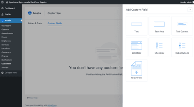
To allow prospects to upload files, you’ll need to go to the “Customize” tab and create a custom field for it:

Amelia Custom Fields

To enable users to upload files, use Amelia Custom Fields. (Source: Amelia) (Large preview)

Click “Add Custom Field” and you’ll see an option for “Attachment”:

Amelia file attachment field

Add a file attachment field to your booking form with Amelia. (Source: Amelia) (Large preview)

All you need to do is give the new Attachment field a label (so people know what to upload) and then add it to any service or event you want it to appear in the booking widget for:

Amelia file attachment customization

Customize the file attachment field so that users see it at the right times and know what exactly to upload. (Source: Amelia) (Large preview)

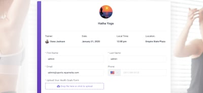
On the front end of the site, the new Attachment field will look like this:

Amelia booking file uploads

Amelia booking widgets enable customers to upload files at the time of booking. (Source: Amelia) (Large preview)

It’s intuitive in design and, so long as you label it well, your users should find this additional field (required or not) one they want to take advantage of — especially if it means less work later.

For your own purposes, think about how great it would be to have a form like this in your appointment scheduler.

This would allow you to come fully prepared to the meeting rather than have to devise a rough plan on the spot. It would also shorten the lifecycle of your projects as you wouldn’t have to sit around waiting for clients to deliver essential documentation and content. (This would also be useful for people like healthcare practitioners or lawyers who need special waivers before they can take on new patients or clients.)

Plus, prospects that are this prepared in the initial booking stage are the kind of clients you want to be working with, so think of this feature as another way to vet your prospects (and help your clients do the same).

3. Make The Booking Widget As Effective As A Personal Assistant

Even if your clients aren’t the ones actually taking and managing appointments for their businesses, they have an assistant who is. While that’s a useful resource to have for this task, humans are prone to errors — especially when trying to capture someone’s contact information over the phone. (I can’t tell you how frequently I show up to appointments or reservations with my name misspelled or email written incorrectly).

Your WordPress schedule plugin, however, captures this information exactly as your users input it. So long as they don’t introduce any errors themselves, this will greatly improve the accuracy of your bookings.

So, what can you do to turn your booking widget into a digital personal assistant?

Obviously, including an intuitive form with well-labeled fields will be a huge help. But you have to think beyond that. There are things a human assistant would do, like cross-reference requested appointment times with actual availability as well as add buffer times between appointments, that improve the experience for all.

You can program the Amelia booking plugin to do the same.

For starters, create custom schedules and booking parameters for each service offering or event.

Amelia customize appointment times

Create custom appointment date and time options for each event or service. (Source: Amelia) (Large preview)

This is useful for a number of reasons.

For one, it ensures that customers only book on days and times when an appointment is available. In addition, it allows your client to control how many customers show up to events, classes, services and so on. That way, even if the 12-to-1 slot is the most popular time (because that’s when everyone’s on lunch), your client won’t get overwhelmed with appointments and be unable to serve everyone who booked at that time.

If appointments are booked with certain employees or providers, that’s another layer of complexity that should be accounted for in the design of your booking widget.

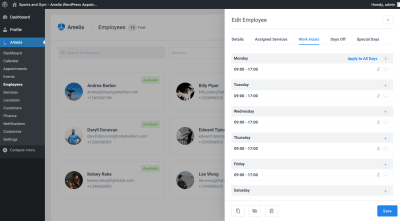
When setting up a new Employee option in Amelia, don’t just focus on the superficial stuff like who they are and which services they provide.

Amelia service provider schedules

Set custom schedules for employees and service providers in Amelia. (Source: Amelia) (Large preview)

Set specific work hours, days off and holidays when they’re available. That way, users won’t be tempted to book their favorite provider when they aren’t around. They’ll only see the date and time options that are open.

Another thing you can do to improve the accuracy of bookings is by building buffer times around them.

Buffers give your clients and their teams time to:

  • Properly set up for upcoming appointments (e.g. brushing up on a prospect or setting up a virtual conference room).
  • “Clean up” after an appointment (e.g. physically cleaning up the surrounding space or capturing notes from a call).

It’s also a good idea to have buffer times in case there are overzealous prospects or customers who just want to talk and talk and talk or otherwise push the appointment over the allotted time. By having a buffer in place, it can help keep other customers’ appointments from starting late and, thus, starting the experience off on the wrong foot.

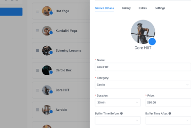
Under each Service you’ve created in Amelia, you have the option to add a buffer time before and after the time slots:

Amelia appointment buffer times

Add a buffer to appointment times in Amelia. (Source: Amelia) (Large preview)

Definitely make use of this so you don’t end up creating more work or headaches for your client in the end.

Oh, and if it’s just a solo provider you’re building this appointments system for, you don’t have to set up all of these individual schedules or buffer times. You can create universal scheduling rules from the Settings tab.

4. Collect Payments At The Time Of Booking

No matter how much you do to ensure that appointments can easily be booked by customers and managed by your clients, that doesn’t stop customers from flaking out on appointments.

You’re probably aware of what kind of effect this has in your business. When someone’s a no-show, you’re left sitting around waiting for them to hop onto Zoom or Skype. You give it 10 or 15 minutes before shooting off an email to reschedule and then you get back to work. Another consequence is that you’re now left with an opening that could’ve been filled by another interested prospect (and new source of revenue).

Whether your clients are booking online events or in-person appointments or classes, they experience a similar kind of time-waste and profit loss. So, to encourage more customers to actually attend their bookings, you can set up the scheduler to collect payments upfront.

The first thing to do in Amelia is to add a price to all of your services and events. Even if you don’t plan on charging upfront, this is a good idea anyway as it reminds customers what they’ll owe in the end.

Amelia service price

Set per-service or per-event prices in Amelia. (Source: Amelia) (Large preview)

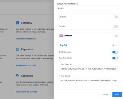
To take it to the next step, enable payment collection and set up a payment processor (either Stripe or PayPal). You’ll find this under Amelia’s “Settings” and “Payments”:

Amelia payment processor setup

How to configure your Amelia booking plugin to accept payments for appointments. (Source: Amelia) (Large preview)

When this setting is enabled, customers will automatically be taken to your payment processor after clicking the “Confirm” button on their appointment:

Amelia appointment confirmation and payment

When customers ‘Confirm’ their event, they’ll be asked for payment. (Source: Amelia) (Large preview)

So, one thing I would advise is to include a note in the form — somewhere around the price — to let them know that payment will be collected now instead of when the service is rendered.

You could also use this for a business like your own by charging a small fee or retainer for the initial discovery call.

Another thing you can do to ensure that clients don’t lose potential revenue from missed appointments is to integrate the booking system with an external CRM or email marketing software. That way, you’ll capture users’ contact information outside of WordPress and can set up automated follow-up messages if or when they miss an appointment.

It might not help your clients recapture all of that missed business, but it’ll help restore some of it.

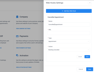
There are two ways to set this up. The first is using the Web Hooks Settings in Amelia:

Amelia Web Hooks

Use Web Hooks in Amelia to connect booking system to other platforms. (Source: Amelia) (Large preview)

If a customer cancels, reschedules or otherwise changes their appointment, you can trigger the plugin to send that information to their third-party software. And with other automated events set up (like to invite a customer who canceled to reschedule a couple of weeks later), your client won’t have to do much to try to reconnect with the customer. Think of this as a cart abandonment feature, only for appointments.

You can also use Zapier integrations and webhooks to do the same thing.

5. Automate Emails And SMS

While it’s important to try to recapture potentially lost business with follow-ups, they’re not the only customers your booking system should be in contact with. All customers matter.

As such, you should use automated emails and SMS to:

  • Send a confirmation email with all the details of a booking to a customer (in addition to an .ics file that enables them to quickly add it to their personal calendar).
  • Set up the same confirmation messaging for employees to notify them when they’ve been scheduled.
  • Remind customers of an upcoming appointment with options to reschedule (or cancel) if they can’t make it.
  • Send a “thank you” after the appointment is done. In some cases, you may invite them back for another one. In other cases (like your own), you could use this to send information on next steps.
  • Email them to wish them a happy birthday, congratulate them on an anniversary or celebrate some other special day (perhaps with a goodie inside).

Bottom line: While you can certainly wow customers during a booking, you can sustain that wow for much longer by showing that it’s not just about the exchange of time and money at the time of the appointment. And that you really appreciate their business and loyalty.

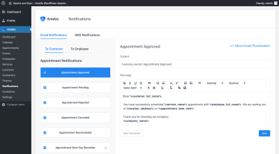
With Amelia, a lot of this work is done for you already:

Amelia appointment notifications

The Amelia plugin comes with pre-made and written customer appointment emails and SMS. (Source: Amelia) (Large preview)

Common email and SMS notifications have already been created and written for you. Even better, they included personalized placeholders so messages don’t have to go out to customers sounding cold and detached.

If there are any messages not included that you want to automate, you can use your Zapier integration and third-party marketing software to handle that piece. However, what’s included here is pretty robust and covers all the bases when it comes to managing appointments.

Wrapping Up

You know how tedious and time-consuming it is having to manually manage your own appointments and events. Worse, the manual approach increases the risk of error, either losing track of the appointment altogether or not capturing details correctly and never being able to connect with the prospect as intended.

But with the help of the Amelia appointments and events WordPress booking plugin, you can automate a ton of this work. Not only that, you can elevate your booking system so that more prospects are encouraged to sign up.

(ms, ra, yk, il)
Categories: Others Tags:

What Is Data Security?

February 11th, 2020 No comments
What Is Data Security?

Data security is a complex and often hard-to-grasp topic — unless you’re an IT professional who regularly deals with data and cybersecurity problems.

If that doesn’t describe you (and it probably doesn’t), it’s still important to understand data security so that you can ensure your sensitive data is properly safeguarded. After all, data is integral to business success, so data security must be a top priority.

But what exactly is data security? To summarize, it’s the collection of digital privacy measures, policies, processes, and strategies necessary to prevent unauthorized access and use of devices and media that contain or transmit data.

There’s a lot more to data security than a simple summary can convey. This five-chapter guide will help you understand concepts and actionable steps related to data security. Below is a synopsis of what this guide covers. Hopefully the many insights we’ve put together with the help of data security and privacy experts will help you better understand data security and keep your data safe.

Chapter synopsis

Remember to bookmark this guide for later reference. Data security is a complex subject, and you’ll no doubt need a reminder about terms and next steps to take in your security journey.

Why is data security important?

If you care about the reputation of your company, the security of your intellectual property, and the financial welfare of your customers, then you’re in a position to understand the importance of data security. Without properly safeguarding your data — whether in huge data centers or on mobile devices — the unthinkable can happen: Your trade secrets get leaked to your competitors, your customers’ identities are stolen, and people lose trust in your business.

“In this digital age, data is like gold to businesses — it’s extremely valuable. Remaining successful and competitive requires securing that data and overcoming the challenges associated with that responsibility,” says Jamal Ahmed, privacy and GDPR consultant at Kazient Privacy Experts.

Data breaches

Evan Francen, cofounder and CEO of FRSecure, reiterates the importance of data security when talking about data breaches. There’s always someone who suffers when companies fail to protect confidentiality, integrity, and/or data availability. “Data security isn’t about data or security as much as it is about people. If no one suffered from a breach, nobody would care.”

What is a data breach? Here’s how Francen breaks down the term:

A data breach is a confirmed, unauthorized disclosure or alteration of data. The potential consequences are almost endless, depending upon the data and/or circumstances: identity theft, financial fraud, intellectual property theft, and holding data for ransom, among others. According to some estimates, global cybercrime costs world economies more than $1 trillion annually.

Data security threats

Threats to data security come in many forms, especially as bad actors continue to find new ways of breaking into seemingly secure networks and data stores. And with the increasing reliance on cloud technology, it’s important to ensure systems are up to snuff.

For example, there are a lot of ways data can be transferred from account to account in the cloud. Kevin Hyde, president and cofounder of Layer 8 Security, says if the infrastructure and digital connections aren’t properly secured and configured, your network could have security holes. You might not comply with laws and standards like HIPAA and GDPR. “To ensure you cover your bases and have the right controls in place, you should be using a certified data center,” Hyde says.

Bad actors are constantly looking for weaknesses that will allow them to infiltrate an organization’s network. Below are several of the most common ways they exploit those weaknesses; being aware of them will help inform your data security efforts.

7 network security threats

The types of computer viruses vary, but they all have something in common: They are threats to network security and are detrimental to your organization’s data security. Some viruses or malware (malicious software) open the door for malicious pieces of code, while others focus on corruption and destruction.

Spyware

Spyware is a broad category of malicious software that’s installed on a computer or mobile device without the end user’s knowledge (which is what makes it spyware). The term can refer to many different types of viruses. Some examples of spyware are Trojans, adware, and keystroke loggers.

Trojan horses

What is a Trojan horse virus? Like the Greek story it’s named after, a Trojan horse is a computer program that appears harmless but actually has nefarious intentions.

“Trojans often mask their entrance into a network by posing as simple executable files — think PDFs, Excel spreadsheets, Word documents, and even internet browser plug-ins,” explains Hyde. Unsuspecting employees then download and open these files, providing an opening for malware hidden inside the Trojans to wreak havoc on the user’s computer and the network it’s connected to.

Adware

Adware refers to software that displays advertising through popup windows or sidebars while a program or app is running.

Unlike spyware, adware is not necessarily malicious. In some cases, adware is used to help recover development costs, such as the spend on developing a free game.

Adware examples include in-app ads shown on mobile games and banner ads shown on social media sites. Adware that tracks users’ personal information or browsing habits without the users’ consent can be classified as spyware.

Computer worms

What is a computer worm? It’s malware that replicates itself within a computer’s automated, hidden system files, typically with the intention of opening a backdoor for remotely controlling the computer.

Detecting worms is difficult, and most users don’t suspect their computer has been infected unless the replication consumes too many system resources and negatively impacts functionality. Worms duplicate to spread to other computers while remaining on the originally infected machine.

Rootkits

A rootkit is a program or collection of software tools that enables bad actors to remotely access or control a computing system. Not all rootkits are malicious in nature. For example, rootkits are used to provide remote end-user support (think of a Help Desk). However, rootkits are dangerous because they provide a backdoor for bad actors to deliver malware to the system and can even prevent detection of malware by antivirus software.

DDoS

What is DDoS? DDoS stands for distributed denial of service. In a DDoS attack, multiple compromised systems attack a network resource, such as a website or server, and make it extremely difficult or impossible for legitimate users to access that resource.

Bad actors often exploit a vulnerability in one computer, take control of it, and then do the same to other networked computers. The bad actors then use the collection of hijacked computers in a DDoS attack. For example, an e-commerce company might employ a DDoS attack to crash a competitor’s website.

Phishing

What is phishing? In short, phishing is digital fraud. When a bad actor performs a phishing attack, they pose as a reputable individual or business in an email or other communication medium and distribute malicious links or attachments.

Phishing is much easier than hacking. “It’s much easier and faster to trick people through social engineering than it is to break into a system,” explains Hyde.

Defending against threats to data security

Hyde notes that organizations can take steps to defend themselves against the above network security threats. You can start by understanding there’s no “magic bullet” that can keep your organization secure. “You need to take a layered defense approach since you can never be 100 percent sure where your defenses will fail. It could be your cloud settings, one of your employees, or something you haven’t even considered.”

Here are a few of Hyde’s recommendations for data security:

  • Use a spam filter. Since a lot of malware makes its way into the organization through emails and attachments, spam filters can mitigate this risk by stopping the emails altogether — or at least stripping out any attachments that are deemed unsafe.
  • Employ a firewall. A firewall forms a digital barrier between your network and the wild west that is the internet. Set security rules to help control ingoing and outgoing traffic.
  • Implement a SIEM system. A security information and event management (SIEM) system aggregates data from multiple sources to identify and take action on deviations from normal system behavior. This type of system typically integrates with other enterprise security tools to more cohesively improve data security.

While these network security threats may leave you concerned about your data security, the next chapter will give you great tips on creating a more secure work environment to protect against more than just viruses.

Data security best practices

Securing your organization’s data can be like climbing a mountain, especially if you’re not sure what to do or what advice to follow. To make your climb easier, we’ve gathered some data security best practices for specific areas of concern below. (For a more general list of data security best practices, check out this post.)

Data security policy: 4 best practices to follow

Workforce

“The human element of data security is always the most vulnerable,” says Ahmed. Even with the best security policies and procedures in place, people can often circumvent your plans — whether intentionally or accidentally.

For example, an employee may forget to remove personal information before sending it to a third party, mistakenly leave a laptop unattended, or neglect to encrypt devices like USBs or mobile phones. All of these actions represent weak points in data security, which is why data security training is so important.

Training your workforce on proper data security protocols is necessary to safeguard your data. Ahmed says you can deliver training modularly through digital means, bring in an onsite trainer, send monthly newsletters, perform simulations, or do some combination of these methods.

“The important thing is that you deliver training in some form continuously. Data security training should be an ongoing effort,” Ahmed says.

Training is particularly important in the healthcare industry. Medical facilities like clinics and hospitals collect sensitive patient information and medical histories. If bad actors stole this information, patients could face financial harm such as long-term credit issues and insurance complications due to their medical data being used fraudulently. To help guard against this risk, follow these steps.

Francen emphasizes the importance of instilling a culture of data security in the workplace and helping employees to internalize it. He says that people are naturally creatures of habit, and nothing motivates them more than their own personal matters. With this in mind, companies should focus on helping employees develop good security habits at home, where security has a more direct impact.

“If people learn good security habits at home — where they’re protecting themselves and their families — those same habits will translate into better security habits at work,” Francen says.

Identity and access management

Identity and access management (IAM) is a role-based framework that manages digital identities. The purpose of IAM is to control user access to important or sensitive information.

According to Ahmed, IAM is an important risk mitigator: Limiting access by user identity limits the likelihood of users getting their hands on something they shouldn’t be able to see in the first place. “In addition, if a breach should occur, IAM can help you quickly identify who was involved with user access logs,” Ahmed says.

He adds that effective IAM requires assessing each user and their job role individually, then creating a tailored access profile: What does each user need to access in order to perform their duties?

Francen notes that companies often fail at managing IAM because they try to tackle multiple areas — identification, authentication, authorization, and accounting — all at once. “Master identity management first before attempting to master the other areas.”

Network security monitoring

With network security monitoring (NSM), a system — or hybrid system and service provider — continuously monitors your network for security threats, vulnerabilities, and abnormal behavior. NSM can be simple or complex and cover a range of areas, from access control and antivirus to intrusion prevention and behavior analytics.

Francen says that normal network traffic looks one way, while threat traffic looks anomalous in some respect. Identifying threats and/or data leakage early can mitigate financial and reputational damage to the company. “But the keyword here is early,” Francen says. “Threats don’t always manifest themselves at the time of compromise. Oftentimes, there’s a threat pattern that tips off a security professional to an impending compromise.”

Data backup

Ahmed recalls the old adage, “Don’t put all your eggs in one basket.” It’s the perfect saying for data backup because not backing up your data puts your company at risk of losing important data.

“Data is a valuable commodity, so performing regular and consistent data backups will minimize data loss and operational downtime,” Ahmed says. “You can restore your lost data and get back up and running much quicker.”

Francen provides steps you can take to determine your best path forward with data backups:

  1. Get management approval before starting.
  2. Identify system and data owners.
  3. Conduct a business impact analysis.
  4. Use the recovery point objective (RPO) and recovery time objective (RTO) to determine
    1. The technology you need to use
    2. How often you should back up the data
    3. What type of backup you’ll use (full, incremental, differential, etc.)
    4. Where backup data will be stored
    5. How backup data will be transferred to storage
  5. Document the backup strategy in a way that an outsider would understand.
  6. For every repeatable process, document a procedure.
  7. Define test and review schedules.
  8. Get final approvals.

With these best practices out of the way, next we’ll move into useful data security solutions you can employ.

Data compliance regulations

HIPAA

Short for the Health Insurance Portability and Accountability Act, HIPAA was passed by the U.S. legislature in 1996. It applies to all healthcare entities, including hospitals, care providers, health insurance companies, and so on. It also encompasses third-party organizations that do business with these healthcare entities.

HIPAA consists of three rules, as defined by the U.S. Department of Health & Human Services:

  • The Privacy Rule ensures that individuals’ health information is properly protected while it’s used to provide and promote high-quality healthcare.
  • The Security Rule protects individuals’ health information and allows covered entities to adopt new technologies to improve the quality and efficiency of patient care.
  • The Breach Notification Rule forces HIPAA-covered entities to notify affected individuals, the government, and, in certain circumstances, the media, following a breach of unsecured, protected health information.

Francen notes that, while it’s made great strides, HIPAA hasn’t impacted data security as much as some hoped. “Healthcare entities take compliance seriously, but enforcement throughout the industry has been spotty at best.”

GDPR

The European Union (EU) passed the General Data Protection Regulation (GDPR) in April 2016, and it went into full effect in May 2018. Ahmed says that GDPR is the most overarching law around the globe because it’s applicable to EU citizens and any company that processes data associated with EU citizens. The EU has already initiated numerous enforcement actions, which shows the industry that the EU is taking compliance seriously.

Organizations across the globe have also taken GDPR compliance seriously, spending millions to achieve and maintain compliance. This isn’t surprising given how large noncompliance fines can be: anywhere from 2 percent of the worldwide annual revenue of the prior financial year on the lower level to 4 percent on the upper level, depending on the infringements. This could amount to tens of millions of Euros. “GDPR might be the most impactful data privacy law in history,” says Francen.

Privacy Shield Framework

The Privacy Shield Framework (PSF) is a safeguarding mechanism maintained by the U.S. Department of Commerce. Its purpose is to facilitate commerce and data transfer between U.S. and European countries in a way that’s consistent with EU law.

European countries aren’t permitted to transfer data to the U.S. or any other country that has less stringent data privacy laws than the EU. “The framework is voluntary and facilitates GDPR compliance, but it doesn’t substitute for GDPR compliance,” explains Francen.

Companies can self-certify their compliance with certain principles to join the PSF. To note, both Ahmed and Francen indicate that the PSF supersedes Safe Harbor and its certification.

PCI DSS certification

The Payment Card Industry Data Security Standard (PCI DSS) is a set of security requirements established by the main industry players — VISA, Mastercard, Discover, etc. — to protect payment card data security. This industry standard was originally developed to stem legislative action. “It has significantly improved the security of payment card data,” says Francen.

He notes there are four levels of compliance, which are based on how an organization collects, stores, creates, and/or transmits payment card data and in what quantity. “Generally, more data — and more interaction with that data — equates to more scrutiny.”

Now that you have an idea of the importance of data security, let’s move on to the top data security threats facing organizations like yours.

Data security solutions

There are countless tools and methods for securing your data, ranging from simple key fobs to complex data scrambling techniques. Each has its place, but which ones you implement will depend on the sensitivity of your data and the level of rigor you want to establish within your organization.

Below are several key data security solutions you should consider adding to your arsenal.

Data security solutions to implement

Encryption key management

Encryption key management (EKM) is the collection of policies and processes that help protect, store, organize, and back up encryption keys — access mechanisms that safeguard data by scrambling and unscrambling it for authorized users.

“The point of EKM is to ensure no one sees your information, except for those who are supposed to see it, by keeping the keys used to decrypt your data separate and secure,” says Russo. For an example of what encryption looks like, he tells people to check their browser for the padlock symbol in the navigation bar. That lock indicates there’s an encrypted connection between the web server and your browser.

Russo says that EKM is important for securing sensitive data — even more so for industries like healthcare, where companies need to comply with strict HIPAA regulations. If a laptop is stolen, for example, encryption could save the day: “If properly encrypted, a laptop would be fully protected. The thief could make off with it and still not be able to read it. The laptop and the data stored on it would basically be useless unless the thief has the private keys used to scramble the data. Utilizing proper EKM would prevent that scenario.”

We answer several FAQs about EKM in this post, including the challenges organizations face regarding this practice and how bad actors might circumvent your encryption efforts.

Data classification

Data classification involves organizing data into specific categories for greater effectiveness and efficiency, making it easier to find and use. The classification scheme you devise should be simple enough for all employees to abide by with ease; otherwise, you run the risk of employees misclassifying data, which limits the effectiveness of the process and makes data less (or more) secure than it needs to be.

Classification schemes differ from company to company. Some consist of five categories, with higher categories containing more sensitive data. The first category might be everyday information that anyone can access, such as price lists. Data in the fifth category might be highly confidential and present financial risk, such as employee social security numbers or customer credit card numbers.

Cloud data security

Cloud data security involves the technologies and policies designed to protect information, applications, and infrastructure associated with cloud computing and storage.

Tim Russo, president of Wireguided, says that unsecured cloud data is vulnerable to bad actors like hackers. He notes that many companies assume any data in the cloud is automatically secure and don’t take the necessary steps to ensure that security.

“A problem can occur when sharing data with third parties,” Russo says. “A few cases have been made public where these entities left other companies’ private information wide open for anyone to access on the internet — sometimes for years. Organizations need to employ additional security measures when utilizing the cloud, such as multifactor authentication.”

Strong customer authentication

Two-factor authentication has graduated to strong customer authentication (SCA) and now includes additional authentication methods. SCA is based on using at least two of three verification elements:

  • Knowledge: something only the user knows, like a password or pin number
  • Possession: something only the user possesses, such as a debit or credit card, a key fob or token, or a text (if the user has a mobile phone)
  • Inherence: something the user is, which typically involves a biometric identifier like facial or voice recognition, a fingerprint scan, or even behavioral biometrics like speech patterns

Generally, the more sensitive the data is, the harder it should be to access. That means employing an additional verification element or a more complex option within a verification element — such as using speech patterns instead of simply a voice.

Tokenization

As a process, tokenization replaces sensitive data with unique symbols that retain all the essential information about the data without compromising its security.

This process helps secure information in transit and at rest, and can help comply with regulations like PCI DSS, HIPAA, and GDPR. Unlike encryption, which this process is often compared to, tokenized data never leaves the organization.

Tokenization is often used with point-of-sale systems to convert credit card numbers into randomly generated values, or tokens. That token is only relevant to a specific context, such as an individual transaction with a particular merchant. If a hacker does manage to steal the data, tokenization ensures the bad actor cannot identify actual card numbers.

Other examples of tokenization usage include bank transactions, vehicle driver information, and any context where randomizing values can help conceal or obscure identifying information.

Data masking

Data masking creates fictitious — but seemingly authentic — data that can be used for things like software testing and user training. This tactic protects the real data but gives developers and other IT personnel meaningful data points to work with as needed. Note that the format of the data doesn’t change, though the values do.

Data masking is useful, but it’s not necessarily a highly secure practice. Ahmed says that masked data can often be cracked if you have the right information. “As long as it’s relevant to the data, one piece of information can unlock all your masked data. For example, all a bad actor might need is a date of birth or zip code.”

Next up, we dive into a specific tool businesses use to collect data (and that must be protected): forms.

Form security solutions

At some point, almost every organization needs to use a form. Forms are a critical component of a number of business activities, including:

  • Customer product ordering
  • Online payments
  • Data collection for market research
  • Customer contact
  • Employee satisfaction surveys
  • Customer feedback

The list is endless. But if you use forms, you need to protect the information you collect with them — much of which is sensitive. JotForm is an easy-to-use, secure form builder — which means you’ll never have to worry about whether your data is safe.

JotForm and data security

JotForm uses Hypertext Transfer Protocol Secure (HTTPS). (Recall the padlock example from Chapter 4.) This protocol ensures that any data transferred between a user’s web browser and a website is secured through SSL — an encryption technique that prevents bad actors from reading or using data, even if they are able to extract it during transit.

So when users access your form and fill in the requested details, you (and your users!) can rest assured that data is secure while in transit between your browser and JotForm’s servers.

Form data encryption

Beyond the standard HTTPS usage that provides you with secure forms, you can also encrypt your forms. With encrypted forms, sensitive data is also encrypted at rest — not just in transit. JotForm offers many encrypted forms, complete with an encryption key only you have access to. Only the key holder can read encrypted data. (A data privacy expert provides a great metaphor for better understanding the concept of an encryption key in this post.)

This additional layer of security enables JotForm to offer HIPAA-compliant forms — so healthcare organizations can collect and organize medical information, patient feedback, employee applications, and payments in one place.

Mobile data security

Data security doesn’t stop at the desktop. Everyone’s mobile these days, and a smaller screen shouldn’t limit your ability to do business using forms. You need forms that are mobile-friendly and just as secure as their desktop counterparts.

JotForm takes care of that with JotForm Mobile Forms, an app for iOS and Android. Even if you create your form on a web browser, you’ll still be able to view, complete, and edit it with the app. Plus, you can fill out forms offline, so you don’t need to worry when there’s no Wi-Fi available or your mobile data is spotty or limited. Just like with web forms, secure mobile forms come standard, and you can add encryption for extra security.

Data privacy

You must log into your JotForm account to view your submission data. If someone knew the unique, almost impossible-to-guess URL of a single submission, they could view only that particular submission (not all of your submissions). This is incredibly unlikely to happen, but you can add an extra layer of protection to your form by requiring a login to view each submission.

Pro Tip

Ready to build some secure forms for your business? Get started with JotForm today.

More about your data security guides

Evan Francen

Evan Francen is the cofounder and CEO of FRSecure, an information security consulting company with more than 1,000 clients across the U.S. He’s also the author of Unsecurity: Information security is failing. Breaches are epidemic. How can we fix this broken industry? Prior to starting FRSecure, Francen spent more than 15 years working as an information security professional and corporate leader at private and public companies.

Jamal Ahmed

Jamal Ahmed is the lead privacy and GDPR consultant at Kazient Privacy Experts, a firm that provides EU representative and data protection officer solutions to organizations globally. He is a Certified EU GDPR practitioner, Certified Information Privacy Professional Europe (CIPPE), and Certified Information Privacy Manager (CIPM). Ahmed also has nearly a decade of global experience in data protection and security across financial services, home security, real estate, human resources, and nonprofit sectors.

Kevin Hyde

Kevin Hyde is the president and cofounder of Layer 8 Security, a cybersecurity consulting, advisory, and technical services company that creates risk management solutions for evolving information security and compliance needs.

Tim Russo

Tim Russo is the president of Wireguided, a company that provides managed IT services, cloud solutions, training, and other IT solutions. He has six professional certifications and works with his team at Wireguided to help organizations manage their IT infrastructure.

Categories: Others Tags:

Smashing Podcast Episode 9 With Stéphanie Walter: How Can I Work With UI Frameworks?

February 11th, 2020 No comments
Stéphanie Walter

Smashing Podcast Episode 9 With Stéphanie Walter: How Can I Work With UI Frameworks?

Smashing Podcast Episode 9 With Stéphanie Walter: How Can I Work With UI Frameworks?

Drew McLellan

2020-02-11T05:00:00+00:002020-02-11T12:09:04+00:00

As a developer myself, one of the things that I like about UI frameworks is that they often come with default styling, but is that something that we should be relying on in projects? Simply using the default styling and trusting that whoever produced the framework has done a really good job in designing those components? Join me for today’s podcast episode where I speak to UX Designer Stéphanie Walter about things we should be considering when building on a UI framework.

Show Notes

Weekly Update

Transcript

Drew McLellan: She’s a user centered designer and expert in mobile experience, who crossed delightful products and interfaces with a special focus on performance. She’s worked on projects for clients such as the University of Luxembourg, European Investment Bank, BMW and Microsoft to name but a few, and she helps those clients deliver successful projects to their audience all the way from strategy to the final product. She’s a Google Developer expert in product design and a passionate teacher sharing her knowledge in numerous blog posts, articles, workshops and conference presentations. So we know she’s an expert user experience designer, but did you know she once had a job fitting carpets with Sir Elton John? My Smashing friends, please welcome Stéphanie Walter. Hello Stéphanie, how are you?

Stéphanie Walter: Hi, I’m smashing and loved the introduction.

Drew: So I wanted to talk to you today about a particular issue and that’s the subject of using off-the-shelf user interface frameworks. Now you’re a user experience designer and you work with lots of different clients and your job is to help those clients create the best possible user experiences through crafting highly usable user interfaces. So the idea of being able to do that with an off-the-shelf set of tools seems like a bit of a stretch to me. Is the use of UI framework something you see a lot throughout your work?

Stéphanie: Yeah, it’s something I’ve seen a lot, especially in the last few years because I started working with an agency and now I work within the company. So in those super big IT tech teams and yeah, at the moment there’s a lot of framework UIs like the one that I’ve seen the most is Material-UI, basically Material design is a Google design kind of guidelines and thing, and Material-UI is the team from Angular, but also the team from React. They created their own framework using kind of the look and feel of the Material design from Google. But it has nothing to do with Google anymore. It’s just like they, I don’t know, I think they liked the look and feel. So at the moment, those are the two main UI framework I work with. And also there’s something called Ant Design, that’s grew quite popular.

Stéphanie: It’s a React framework. I don’t know if they have Angular too. I think it was made by a team in China. And it’s interesting because not only does it provide the components, everything in React, but if you go to their website you’ll also get the scratch files, which is actually quite interesting because then it kind of motivates or helps the designer build or shape the interface into the UI components used by that framework. So yeah, it’s something I’ve seen a lot, especially in big IT teams because most of the times those don’t have a designer. At the moment I’m basically UX team of one in a small team at a European investment bank. So it’s me as a UX designer. I work with a team of developers, business analysts, all the good people, but still is one designer for the whole project.

Stéphanie: Until I arrived there was no designer. So it’s kind of a solution implemented in a lot of companies, especially on internal products for instance. Where they usually say, okay, we don’t really need a designer for that. We just need something that works for our internal users and let’s just use a framework because it’s convenient for the developers. Most of the components are already there and since they don’t have designers in the team, then it’s kind of replacing, as to say, the role of a UI designer. Yeah, problem with that is that, okay, then you have the components, but the role of the UI designer is not just to decide about should the button be red, green, orange, blue, whatever. Usually the role of the UI designer is information architecture, understanding user needs. So everything that goes beyond the interface. So even if you have this kind of framework that kind of takes care of the whole UI, So visually what you see on the screen.

Stéphanie: You still need someone at some point to do the job of understanding what do we put on the screen, how is it going to behave? What happens when we click here? How does the user accomplish their goal? How do we go from point A to point B? Because we can use a model, we can use tabs, we can use all of the components. So that’s why it’s always kind of a little bit complex and tricky.

Drew: Is it possible, do you think be able to create a usable user interface using an off the shelf UI framework, or is it always going to be a bit of a compromise?

Stéphanie: I kind of hope so. I kind of hope so because otherwise I’m building not usable interfaces. So this answer is totally biased, but yeah, I think it is, but it also depends on the level of compromise you’re willing to do and there’s compromises on both sides. At the moment I’m compromising a lot of buttons for instance, because you have some really specific buttons in Material-UI, and I don’t really like the ripple effect on the button. I think it works great on mobile because on mobile you need a kind of a big feedback when user clicks on or touches the button. But then the steps is kind of ripple effect that goes all the way on the button. It’s a little bit overkill, especially when there’s a lot of button. But still we are going to keep this ripple effect because it would be super complex to remove it because this was built in to the React framework. And to have another hover effect on this button, something more subtle that will not be this kind of whooshy thing here. It would be super complex.

Stéphanie: So this is the kind of compromises you do. But on the meantime, I don’t compromise on specific things which is custom components. Where I was working before, the current client for a travel and airline company. And airline has some really, really super specific needs. The calendar for the airline for instance, you want to put prices, you want to put… if you don’t travel to this destination on a specific date, you don’t know when to put that, you have this departure and arrival and the basic calendar of most of those UI frameworks don’t provide these kind of things. So at some point you can say, okay, we will just use the calendar they have. And that’s it. You need to go beyond that. So most of the compromises are basically built on, do we use the basic component? Do we create a custom one that will fit the user needs? Or do we make a mix of the two? In the case of the calendar, for instance, we use the calendar grid, so we use the basic component and then we enhanced it with customization on top of that. So it was a lot of React development for that one.

Stéphanie: And yeah, so usually you do a lot of compromises.

Drew: So it sounds like using a user interface framework can get you a certain amount of the way there, but to really have a good user interface as a result of it, you need to do quite a bit of customization on top?

Stéphanie: Usually. Yeah.

Drew: Does that customization go beyond theming?

Stéphanie: Yeah, my developer wished it wouldn’t go beyond theming. Eugene If you listen to me. I think he would be super happy if we would just change a few colors on everything. But yes, at some point you need to go beyond the customization because first, like UI frameworks are like Lego tools is kind of a toolbox. So you have a lot of different components in the box, but this doesn’t build a page. You still need a header, you still need a footer. You still need extra content that was not in the framework. So sometimes you can tweak a component into what you needed. From what I understood, we are using the card component to build a modal windows, but the thing with the modal windows is that it doesn’t really behave like a card.

Stéphanie: You are kind of going a little bit beyond that. You need a background with obscurification. You need to trigger it on click while usually your card is already there in the interface. So we are using this card component because it has a lot of the things we need like the background, a header and a title at the top, some buttons at the bottom. So we have the structure and then we tweak it a little bit. But we end up with some conflict sometimes about semantics, HTML as well. Because for instance, I wanted to have buttons that didn’t have button shapes, so just like link button and the developer said, “Okay, so we use a link like your href link.” I said, “No, this is not a link. It’s a button. When they click it, it doesn’t open a new page. It clears everything that is into the form.”

Stéphanie: So it should be technically from a semantical point of view, it should be a button. “Yeah. But it doesn’t exist in the framework.” I say “So okay, I know so what do we do?” So usually you start discussing these little things and since I’m really annoying my developers with accessibility also, this is another extra layer of trying to make sure that we have the basic components that they work well with. But also that they are semantically like I don’t want to have buttons with gifs within gifs within gifs. Otherwise we’ll have issues in the end.

Drew: I guess starting a new project that’s going to use a UI framework, you probably need to start with some sort of user research.

Stéphanie: Yes.

Drew: Is that fair?

Stéphanie: You should. You need to. So yes, usually you can have all the components you want. You still need to know what do your users need on the pages, how are they going to navigate? You need to build a flow. So usually even before deciding on a framework, what we do is we go to our users, we talk to them, we try to understand their needs. So at the moment I’m quite lucky because the users are internally within the bank. So we do a lot of workshops with them and you have to imagine it’s a super complex interface. We are migrating from something that was built, I don’t know, I think 10 or even 15 years ago to something all new shiny using Material-UI React. So it’s quite a big change and you have to understand that during those 15 years, everyone who wanted something could go to the support and then they ask the IT team to implement it. So at the moment my interface is like 400 pages with tables, within tables, within tables, with other tables, and stuff that shouldn’t even be in tables.

Stéphanie: Like we have a lot of things that are just key value, key value, key value. So they build the table with two columns. I’m like, “Nope, maybe we can do something better with that.” So at the moment what we are doing is we did some user research to understand the different goals of the users. So what we identified is that what they do with the interface, they have some planification goals. They need to plan their work. So I want to know that this operation is going to go to this meeting, so I need that on that schedule, stuff like that. They want to monitor a thing, they want to report the data. So monitoring is just like looking at the data and making sure everything is fine. Reporting is being able to exploit the data, to do something with it they want to share and to kind of collaborate with colleagues and all of that we discovered by discussing directly with the users.

Stéphanie: And what we discovered is that actually some of the things we were planning on migrating at the end are some of the most important things on a daily basis for the user. So the planification user goal is one of the kind of biggest one at the moment. So we are really, really working on that. So yeah we do use the interview and now we are in the phase where at the moment we are super high level saying okay we need to build the shell, we need to understand navigation. But at the moment we didn’t really go through all of the data and this is now what we are going to do. And it’s interesting because we have a lot of tables and we said we can either go the kind of not smart way and just put the tables in the new interface and we’re done, or we can say, okay, let’s try to understand what those tables are, What do our users use this table for?

Stéphanie: And then maybe some of the tables could be displayed as data visualization and then to do that you need to understand the whole business So that the data makes sense. So if you have a nice framework and you say, okay, let’s use this chart… I think is called chart JS framework. You have a lot of things, you can have histogram, pie charts and graphs and everything, but at some point you still need a designer to help you decide. Okay, this data, does it make sense if we show it into a graph or it makes more sense to show it as a pie because we want to show part of the whole, or we want to compare evolution for one country in the last 10 years, then a histogram is more interesting. So based on what the user wants to do with the data, you are going to display them a whole other way.

Stéphanie: And usually it’s not a developer job to do that. Our developer, they’re super smart guy. I’m sorry, but I honestly work with guy developers, I wish I had some ladies, but no. None of them are women. So super smart guys but they are not super qualified to say, okay, this data should be displayed like that, that, that and that. So in the end you still need some designers go to talk to the users, understand what you can do with the data and this goes far beyond just saying, okay, this should be a tab bar or this should be a navigation on the left.

Drew: And after making those sorts of decisions based on talking to the users. Would you typically take the resulting prototypes or designs back to users to test them again to see if they understand your type of chart choice for example?

Stéphanie: Yeah, we did that a lot actually, which is really nice because then you don’t develop something until you know it’s going to be useful and usable. So it depends. If it’s quicker to actually develop the thing because they have already most of the components, what I usually do is I do really quick paper prototyping and then we develop the thing because it’s quick, even without the data. If it’s something complex, something really, really new that will take a lot of time to develop, then we say, okay, we design a few screens and we do some testing directly on the screen. So we have a tool it’s called InVision, where basically you put all of your design, you can create links between the different parts. The thing is it also depends what you want to test. If you want to test phones for instance, it’s a nightmare to test those in InVision because the people can’t really feel them and especially on mobile phone for example.

Stéphanie: So it’s always kind of being smart. What’s the fastest and cheapest way? Is it faster and cheaper to test only designs. Is this enough? For forms usually, not really because you have auto completes all of the heavy lifting you put in the front end who have actually the user fill a form so for forms, maybe it’s more efficient to actually build a form and test it. But for new things, yeah, we do a lot of designs. We go to the users. So at the moment we either do one-on-ones, but my users are really busy people. It’s a European investment bank so they don’t have that much time. So what we usually do is that if we come to one-on-one with the users, we do some small meetings, like more like focus groups. And it’s also interesting because then you have kind of a confrontation sometimes. Some people say, “Yeah, I think it works for me because I work like that and that,” and then there’ll be other people who are like, “Oh you work like that? Actually no, I do it like that and that.”

Stéphanie: So it’s also interesting to kind of have a few people in the room and to listen just to the conversation, taking notes and say, “Oh maybe then we could do that” and “This component would be better based on what I just heard.” And things like that.

Drew: If you’re working with a more general audience for your product. So perhaps not internal users like you have, but more the general public, are there inexpensive ways that designers can get that use of research in? Are there easier ways if you don’t know directly who your users are going to be?

Stéphanie: You should know who they are going to be otherwise it does the job of the marketing people before building the product. But yeah, we did some guerrilla user testing for instance, You can still use InVision for instance. So you can build some prototypes in InVision and then you can recruit the users through social media, for instance. I was working for a product that helped, what is the name, car dealerships mechanics who repair things and then to also inform the client about extra repairs, things like that. So we had already kind of a growing community on LinkedIn and Facebook. So what you can do is you can recruit those people. You can do remote testing, like we are having conversation in a tool like an online tool. You can do some screen sharing. So we did that for some project also.

Stéphanie: I would just give you one advice is test the tool before, because I was using, it was called appear.in. But I think they changed the name to Whereby or something, but it’s really in the browser who I said, okay, it’s nice because then the users don’t need to install anything but do users were not on a real computer. They were into VM, into a Citrix and they didn’t have microphones so what we ended up doing is like they used my tool to share the screen. They were clicking on the prototype and at the same time I had them over the phone, like a landline phone, to talk to them directly. So there’s always, this was a quite cheap because it was a wonderful day of recruiting, I think we had 10 users or something like that. Yeah, you can do a lot of things even if you can’t go face to face, I’ve done a lot of usability testing directly on Skype or things like that. So there’s always some cheap ways to do that.

Drew: When it comes to choosing a UI framework to work with, if that’s the route that you’re going, is that something that you would leave just to the developers or is that something that designers should get involved in too?

Stéphanie: For me, you should involve the whole team. Like the designers, the developers, maybe also architects if you have some, because how the framework is built might also influence these kind of things. Unfortunately, most of the time when they arrive on the project, the framework was already decided. No, actually it’s funny, either it’s already decided or they ask me to validate their choice of the framework, but I didn’t do any reviews or research. I have strictly no idea what’s in the project because they didn’t even show me their screens. They’re like, “Yeah, do your thing. We can use this framework.” I don’t know. Well, do we have a screen? So they ended up showing you a few screens, which was a Windows native app they wanted to migrate in the cloud. They said, “Yeah, we only need the buttons and mostly like forms and things like that.”

Stéphanie: But it’s really hard to say, “Yeah, go for this framework, we have all of the components we need.” Or like, “Don’t go if you don’t have a rough idea of what’s your content going to be, what is the navigation.” So I think you should still have kind of a global overview before choosing your frameworks unless you’re 100% sure you have all of the components. But I have a feeling that most of the time the framework choice is basically based on what technologies do developer like at the moment, do they have experience with a framework before that? We used Ant on some projects just because a few developers had experience with that and they really liked it and they were kind of efficient using Ant. And for the Material React UI it’s the same. It’s like because the developer already used it on previous projects, so they are efficient with it.

Drew: So really it’s got to be a balance between what the developers are comfortable with, what they know, what’s going to work with their technology stack and then what the requirements of the product are in terms of creating a good user interface. And you somehow need to balance the two of those to find the ideal framework for it.

Stéphanie: Yes. I have a kind of a specific requirement for some project, which is… I’m in Luxembourg, we have a lot of European institutions and things like that, so we have an extra accessibility requirement for some of those. And usually when the framework was decided, they didn’t really check about the accessibility of their framework and then they come back a few months after the beginning of the project saying, “Oh, just told us that there’s this new law and we should be accessible but we don’t know how to do that.” Like yeah, it’s a little bit too late. So for me, to choose a framework you need really to know all of the constraints at the beginning of the project and if accessibility is one of them you need to test your components and make sure that they are going to be accessible. But I am not a React or Angular developer, but I’m pretty sure that it’s super complex to turn a not accessible UI framework into something accessible. I guess it might be a little bit complex to rebuild all of the components, so things like that.

Drew: If you find yourself working on a project where that process hasn’t taken place and a UI framework has already been chosen, is there a danger that the user interface could start being influenced by the components that already exist within that framework rather than being driven by the needs of the user?

Stéphanie: It really, honestly, most of the projects I worked on, eventually you end up having a lot of trade offs, even if you really try to push. So it’s mostly about balance and discussing with the developers. So usually what I do is we do some wire frames, even quick paper wire frames, say okay, on this page we will need that and that and that component, the first thing I do is I ask the developer do we have that in our framework at the moment? What does it look like? And then we decide together, okay, this is a component that would do the job or okay this will not do the job. Do we tweak it? Like do we still keep the component but change it a little bit so that it does the job, or do we build something from scratch?

Stéphanie: And at the end of the day it will depend on the budget of course. So you ended up doing trade offs. Like I would be okay for small components that are almost never used if they’re not perfect and there’s kind of few issues. But for main navigation, main structure, things that you see all the time on the screen, for instance, this really needs to work. The user’s needs to understand how they work efficiently and yeah, it’s, as you said, finding a balance between the ideal experience you wish you would have if you didn’t have any framework and what you have at hand and the budget and also the timing. If we say, okay, for these sprints, the feature needs to be finished at the end of this sprint, and then they say, okay, but if you want your components we will never finish the feature at the end of this sprint then you start discussing, okay, do we finish this feature in the next screen, do we take more time to do it properly? And usually it really depends.

Stéphanie: The things that frustrate me the most is when I know that we use a crop fix component and they say to me like, Oh no, don’t worry. We will fix that later. And I knew that the later unfortunately might never happen. So depends on the team. But after a while you have the experience and you know, will this later arrive and or will it not? Yeah, it’s about compromises. When you are working with these kind of tools.

Drew: As a developer myself, one of the things that I like about UI frameworks is that they often come with default styling. So that means that I don’t necessarily need to have a designer maybe to help me with the look and feel of all the components. Is that something that we should be relying on in projects? Just the default styling and trusting that whoever produced the framework has done a really good job in designing those components? Or would you be styling those components yourself?

Stéphanie: I think it truly depends. The problem for instance with Material-UI is the look and feel of your a web app will be basically the configured Google products. So if you don’t actually change the font, change a few colors and kind of bring your own brand identity and do that, you’ll have a product that will just looked like any Google product, which could be a good thing because if your users are used to Google products it might help them understand it. So usually if you don’t have a designer in the team, do you have any choice? Like a lot of the different work I’ve seen, they come with custom themes so at least you can change the colors. I think you can change the fonts also pretty easily. But again, like if you change the colors and you’re not super good at design or even accessibility, maybe the colors you will use will clash, they might have contrast problems.

Stéphanie: For instance, I love orange, but it’s one of the most annoying color to work with because to have a real accessible orange, for instance, as a button with white text, it almost looks brownish. And if you want to have this really shiny orange, you need dark text on top of it to make it readable but it kind of makes your interface look like Halloween at the end of the day. Yeah, I see you laughing. But it’s true. So it’s always about these kind of compromises and say if you’re a developer and you want to use the framework as it is and you don’t have a designer, I think it’s still better than not having anything and building it from scratch and then it’s super complex to use. But the thing is, just because you have the components doesn’t mean you will build a great interface. It’s like Lego bricks. If you have the Lego bricks, okay it’s fine, but you can do a real nice spaceship or you can do something that isn’t holding together and will fall apart because you didn’t have really a plan.

Stéphanie: So design is kind of more than that. Design is about really understanding what’s going to be on the screen, how it will work. And I know some developers who actually have the capability to do that. So they are really good with usability guidelines and they understand a lot of design rules, for instance. So when it comes to choosing the components, they’re really good at that. And I know developers who have no idea what components to choose and choose the first one that does the job. But after a while it doesn’t work anymore. Like tabs for instance, we had an interface where some developers chose tabs. I think it makes sense at the beginning when you only have three items. But then there was 12 items on the screen and then you have the tabs that are three lines of tabs, and all of those are the same level one tabs, and there’s tabs within tabs. So they had the component, it looked nice because they use the framework, but it wasn’t really usable.

Stéphanie: And I had the same with like a modal windows for instance. Where they build the projects without a designer and after a while I think the client asked for more and more stuff into this modal. So they ended up with a screen with a table and when you click on add a row, you open a modal, and in this modal you have two tabs, and then in one of those tabs you even have another table and then they wanted to add an extra stuff into that, I was like, okay, maybe we can put a modal on top of a modal. And at some point the designer would reply, okay, if you have that much content in the modal, it should not be a modal window. It should be a page. So even if you have the component, you still need kind of an architect to do the plan and make sure that all of those components work well together.

Drew: So if as a designer, you’re being asked to change the styling of some components, would you just try and change all of the styling? Would you customize all of it or are there certain areas that you’d focus on?

Stéphanie: Colors I think because it’s the first thing you see, colors can actually bring you identity. If you have like a strong brand identity, at least having the colors of your product on the buttons or the icons and things like that, already helps you customize the framework. Fonts because I think it’s easy, if the framework is well-built, usually you change the whole font family in someplace and then it should kind of cascade on the rest of the site. So colors and fonts is I think two easy ways to quickly customize the framework. Icons is another nice way to bring personality, but it might be difficult because from what I’ve seen, most of the framework come with custom icons or Font Awesome or like a library already built in. So to replace those, first you need a lot of icons if you want to replace them all. So it might be a little bit complex. I have also seen frameworks that lets you choose which icon pack you want to use. like Font Awesome, Glyphicons and some of the other ones. So this is the kind of things you can quite easily customize.

Stéphanie: And then it’s about look and feel, for instance the header, usually you have different kinds of headers, footers. How do you navigate things like that. So there’s already a lot of small customization you can bring so that it doesn’t look Material-UI-ish, it more looks like your brand and then you can play around with border radius’s for instance. Whether you want completely rounded buttons, or you want square buttons or you want something in the middle like shadows also. So some small stuff that are kind of usually easy to customize because most of those frameworks have them in CSS variables. This is the kind of small things that you can customize without I think a lot of effort, except for these ripple effects. I hate that. I’m going to fight it. I kind of hope they change it eventually.

Drew: I guess things like that, that might seem obvious might seem just like a surface level effect, Do you think that would be easy to change and in this case it turns out it wasn’t easy to change? Is that just a case of speaking to your developers to find out what’s going to be easy to customize and what’s not going to be easy?

Stéphanie: Yeah, usually, especially if they’re used to work with the framework, they know what’s easy to change on it. It depends on the developer, I had discussion with one developer and I asked him if we can not have like uppercase buttons, because they are kind of a little bit hard to read, especially in the font we were using, he went into the documentation and say, I don’t know if we can customize it because I can’t see it in the API. I was like, what API? It’s like CSS class, CSS definition. You remove the uppercase from the CSS and it’s done. So he was like looking for an API to change just the font, how does the font look like. And I was like, yeah, but if there’s no API for that, I think you can change it in CSS.

Stéphanie: But then it’s complex because if you have to change this in like all of the CSS line. So it’s usually kind of a big discussion. It was the same… was like drop downs. So Material-UI, the React version we use, has some customized drop downs. So when you have a select box like form element, the select it opens these custom components and I don’t know why but we have a big problem with that on Internet Explorer. We are going to migrate to windows 10 and Edge. I’m looking forward to it, but we are still Internet Explorer 11 at the moment. And what’s happened is whenever you use or you open one of those components, it freezes the screen behind it and you have a scroll bar, so it kind of jumps around whenever you want to use one of those.

Stéphanie: And at some point we discuss with the developer, is the customizing of that worth the screen jumping around whenever users click on that. And it’s like, honestly for me, no, I prefer it not to jump and we use the select in the browser, then it will not look the same if our users have Edge and, no not Edge, IE. Or if some users are using Firefox, okay? So it will not look the same but it will be the native one and it will not make the page jump around every time someone clicks. So it’s this kind of discussion also, do we want to customize it but then it’s kind of clumsy or do we say, okay we are not going to customize it. We had the same debate with a scroll bar because we had another project we had drop-downs and they were 100 elements at some point in the drop downs. So there’s an auto complete but you can still scroll inside the drop down. And the developer said, yeah but this is looking really ugly on IE, the default scroll bar.

Stéphanie: And they investigated, they found JavaScript library that would let us have this really small little a scroll down you have on Mac and have it everywhere. Then we said, okay, is it worth investigating? We need to investigate, test it, put it everywhere, test all of the browsers. So we said we are going to do it, but only if it doesn’t damage the performance and if he doesn’t damage the rest of your experience, otherwise it’s perfectly normal that the browser element don’t look the same on any browsers. So at the end, don’t customize everything.

Drew: I guess it’s a collaborative team effort, then? Everyone needs to discuss and balance up again all the different performance factors, ease of customization and where that customization happens. So once you’ve got your UI framework in place, you’ve got all your components specified and built out and customized and styled to how you want them. I guess you need to document that in some way to maintain consistency?

Stéphanie: So at some point as a designer what we usually do, we already document them in our sketch files. So we have the working files with every single screen and everything. And in the sketch files we have really specific art boards where we put all of the different components. So that if another designer works on the project, they know that the components already exist and they can just drag and drop it in a new page and reuse it afterwards. So we have this system where we document the components also we document the use, like when do you use this component? When do you use that one? Where is this one working better? So all of the different states for instance, like inputs, we have I think 10 of those, like a focus with a placeholder, without a place holder, with content like arrows and things like that. So again, we bring consistency and then the development parts, it really depends on the kind of maturity of the communication of the team. So what we are currently building is basically a library of components and we are also building the tool around it.

Stéphanie: So my developer is currently building that and the idea is to build the component first in our kind of a sandbox, document it. Also he builds things where you can change the colors and if have a button for instance, you can change the icon, you can change the text to see if it will still work with longer text, smaller text, things like that. So we are building this sandbox and in the sandbox, you have a ‘Read me’ tab where you have documentation for how should this look, how should this component be used, when, how is it supposed to behave? Like auto complete for instance, seems to be something really, really easy, But if you start actually designing the flow of the auto complete, what happens when you put the focus in the field? Do you start auto completing or offering suggestion after one character after two, after three? If it’s after three, what happens in the meantime?

Stéphanie: So there’s a lot of different questions about that that we also document, which is really going super deep into that so that if this auto complete gets implemented on another project or gets used by another team, they know exactly how it’s supposed to work as well. So we kind of do the same. The two of us, so designers are documenting into the design tools and usually in the design tool we document the colors and shadows and gradients so that the developer don’t have to look around and try to remember exactly what the hexadecimal code for this button was and things like that. So in the end it’s kind of you have this UI framework that was super generic and you customized it, you made sure that the components you use are actually the ones that are going to help your user accomplish their goals.

Stéphanie: Everything you’ve customized is kind of starting to become your own little design system. So at the end you’re building a design system, but instead of building it from scratch, you’re basically building it using React, Material or, what was the other one? Ant or something like that. So it’s the same constraints.

Drew: Would you go back to user testing at this point after things have actually been built? Would you go back and test things with users again?

Stéphanie: We have tests, like real people testing, like regression testing and making sure that everything works. Like when you click it works, when you hover it works, stuff like that. But yes in the end, especially if we didn’t do a prototype, if we did the user testing in mockups, we want sometimes to test it again with the real users who have a feeling that everything is still working. So yeah, sometimes we go again into user testing at the end. We do that usually at the end of a few sprints where the features were implemented. So usually what happens is like we do the research, we design the feature into design tools, we do quick testing at the beginning, then it’s implemented, we do tests to make sure it works. And then again we go back to the users.

Stéphanie: And it’s also interesting because we are building a community with the users. So they’re actually quite eager to see that. The first testing was a little bit kind of a sneak peek, like, Oh, this is what it might look like. And then they are super curious about how it works and how it looks like at the end. So we go back usually in one-on-one testing for that or if we don’t have the time, we do just like panels and also we deploy it. So sometimes we do AB testing also sometimes if we don’t have time for the user testing one-on-ones, we deployed it and then we say, okay, it was deployed. If you have any feedback, please come back to us. Also if you see bugs, because sometimes we compete, the team missed a bug or something, so if we don’t have time for re testing it, we still try to find and manage to find some ways to gather feedback even after it’s deployed.

Drew: And over time, one of the things that might be a concern probably from a technical point of view is that you’ve built on top of a UI framework and then a new version of that framework comes out and things have changed. Is that a situation that you’ve experienced where a new version has come, your developers want to update but it might have implications on the design?

Stéphanie: Yeah. The thing is we have test environments, so they’re really quick and easy thing to do is like, okay, let’s put in your version in one of those secure environment and see what is broken. So from when designers most of the time when they do a new version they tell developers, is it going to break? Like is this new version something completely new and it’s not compatible with the old version? Or is this new version something that is just an announcement and you might not break that many things. So yeah, obviously sometimes when you put a new version it completely breaks, but this is again, then you have like testing stories and like technical investigation stories to decide if we are going to migrate or not. Also like from what I understand in some of the environment I worked on, they kind of encapsulated those in web components.

Stéphanie: So they’re already has kind of two different version of Angulars on some components, it was using one version on the other ones it was using the other one and from what I understood it works because then you only encapsulate what you need. So this apparently is also a solution is then you can use whatever version you want, but I’m not a developer but I feel at some point you’ll be like, okay, this component is using that version of Angular and this one, this and this maybe kind of becomes super hard to maintain. Do you know?

Drew: Yup.

Stéphanie: It does. Okay. So yeah, you make sure it still works, but I don’t have the feeling that Material-UI are like those frameworks, even bootstrap for instance, they don’t have any new version every year or something. It’s a long lifecycle and in the case of my tool, I think this tool will be here for the next year, so we have eventually to update. But if you’re building kind of a online tool, more like a B to B product. Most of the time you revise every three years or something. And usually there is a new technology. I was talking to a friend and they’re currently working on a project where they’re rebuilding and riffing on React. The first version was built three years ago with another technology. I really don’t remember the technology, but they say, okay, we are three years later, they’re already rebuilding it. And I think in like three years, they will re-rebuild it. So at some points if you’re in like in B to C products, I even wonder if you update your framework or if you are going to change the design and rebuild it anyway in a few years from scratch.

Drew: Is there anything else that we should be considering when building on a UI framework?

Stéphanie: I feel we covered a lot of things. Well, the thing is like, there’s always a way to do it quick, user research, talk to users or at least do usability testing. Make sure you don’t design or build in a silo and try to have other people at least look at what you’ve created to make sure that the components as a developer, that you used as a developer I really do wonder are going to do the job. And don’t ask the designer to put paint on top of the framework at the end of the project because it’s kind of already too late to do big infrastructure on changes. It might not work.

Drew: So at Smashing, we have books, we have conferences, and of course, we have Smashing Magazine, a website with loads of articles. We’re all about learning. So what is it that you’ve been learning lately?

Stéphanie: I’ve been taking online introduction to psychology class.

Drew: Tell us a bit about that.

Stéphanie: Last lesson was actually super interesting. We were talking about visual illusions and how they work with your brain. So it’s really super complex and there’s… Apparently not everyone agrees on the explanation of most of those illusions, but it’s interesting because I had a small psychology lesson, like I read books on cognitive sciences and things like that. So I already knew kind of the basics, but it’s interesting to see like all the different aspects of psychology. So the interesting part of this course is it’s an introduction but it explains to you kind have all the branches from say child development psychology to trauma psychology to intercultural psychology. So and then illusions and I think this week it’s actually about cognitive psychology and how to apply psychology to interfaces. So all of those really, really interesting topics. And it’s nice because it’s an online class, so I’m basically learning stuff on my couch with some tea, and yeah, that’s really, really cool.

Drew: Oh, that’s super interesting. If you, dear listener, would like to hear more from Stéphanie. You can follow her on Twitter where she’s @WalterStephanie, or find her on the web at stephaniewalter.design. Thanks for joining us today, Stéphanie. Do you have any parting words for us?

Stéphanie: Thanks for having me. It was a smashing experience.

(dm, ra, il)
Categories: Others Tags:

Design Systems Blogathon

February 11th, 2020 No comments

It was fun watching a bunch of back and forth blogging between a bunch of smart people quoting a bunch of smart people last week. If you missed it, you might wanna start at the end and work backward.

I only have one tidbit to add. I don’t do much with design systems as someone who works on pretty small teams, any of which have found a system that works for them that doesn’t involve what anyone would probably call a design system. When we have intentionally wandered in the direction of a design system, we found ourselves not as architects or gardeners, but as zookeepers. We were just documenting what we already had, which was fine as an exercise, but not particularly useful in practice. Again, just for us.

The post Design Systems Blogathon appeared first on CSS-Tricks.

Categories: Designing, Others Tags:

Building the Web We Want

February 10th, 2020 No comments

On the Microsoft Edge team, we’re committed to an open web and helping to drive innovation forward, which is why we’ve kicked off a new initiative in collaboration with Google, Mozilla, Samsung Internet, Igalia and — most importantly — the web community, called The Web We Want.

The Web We Want is an open initiative for web developers and designers (or anyone who builds things for the web) to tell browser vendors what we should focus on building or fixing. The overarching question we’re asking is this: If you had a magic wand and could change anything about the web platform, what would it be? What are problems you’ve encountered with the web that you need to hack around or what tools need to be improved or built to help you do your job better? What’s something you think you should be able to do natively but can’t? These are just a few questions to get you thinking about submissions to the initiative.
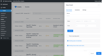
Some of the submissions we’ve had so far span from specific feature requests to broader problems with the web platform:

This is just a snapshot of the feedback we’re getting. The whole list is available for you to browse.

Why should I submit to the Web We Want?

This is an opportunity to make your voice heard and help us determine where the future of the web platform is headed. Once you’ve submitted your problem or feature, we’ll determine if your want is something that browser vendors can tackle directly or if it’s something that needs more scoping and is suited for Web Standards discussions.

This is an opportunity for all of us to take a step back and reassess where the future of the web is heading and figure out where the gaps are that make building for the web difficult today.

How can I participate?

There are a few different ways you can participate and there are a few different components to the Web We Want. First, think about what you think browser vendors should go fix and submit your ideas at webwewant.fyi. And that could be all that you want to do, which is great! We want any and all feedback about the platform and we have folks from different browsers constantly watching what’s being submitted.

There’s a second, optional aspect to the Web We Want, which is a great way to get involved in the web community and dip your toes in the public speaking pool. We’ve been running the Web We Want as a community-focused panel session at conferences around the world.

If you submit and are attending one of the events we’ll be at, your submission could be picked to be presented in a 3-5 minute lightning pitch to a panel of judges during the session, like an episode of Shark Tank but for tech. The live sessions we run are a way to get feedback and opinions from industry experts like Rachel Andrew, Jen Simmons, Miriam Suzanne, and Marcy Sutton.

Even if you’re not attending one of the events in person, you can still participate! We want to be mindful that not everyone can attend conferences so if you your submission is selected and you indicate you’re not attending an event,you’ll have an opportunity to record your lightning talk ahead of time and we’ll include it in the live session.

The live session culminates with the judges deliberating and deciding on the most pressing “want” pitched during the session. We also have a community voting aspect that allows the event audience to rank what they think is the most pressing thing for browser vendors (or standards bodies) to work on. Even if you’re not attending an event, you can still vote for your favorite “wants” on the website as well as by sharing them on social media.

So far we’ve run sessions at An Event Apart DC, Smashing Conf, and View Source, and the community participation and panel discussion of wants has been fantastic. If you run a meetup or a conference and are interested in facilitating this session, reach out to Stephanie Stimac or Aaron Gustafson.

The Web We Want

We’re at a point in the web platform where browser vendors and standards bodies are eager to know what it is web developers and designers need in the platform. We need to know where to invest resources. Hop over to the Web We Want and let us know what you think the web platform needs so that we can shape the future of the web together.

The post Building the Web We Want appeared first on CSS-Tricks.

Categories: Designing, Others Tags:

The Case of the Stolen Domain Names

February 10th, 2020 No comments

Back in 2011, the domain name for this site, css-tricks.com, was stolen. “Domain Hijacking,” they call it. It wasn’t just this site, but around 12 others in the design and development space. To this day, none of us really know how it happened and who was behind it, although I believe all the domains are back to their original owners now.

The registrants involved varied, so even that wasn’t a common thread. My best guess was that the bad guys got access to my email but deleted all trace of emails related to domain transfers. Or it was an inside job.

One odd thing about it, for me, was that they never got around to changing any DNS information even though domain name itself was stolen. So the site remained up and I had access to it the whole time. I blogged about it in real time and then again once it was safe.

No amount of backups in the world can save you from a domain name getting stolen. If the DNS, which you no longer control, is changed away from your current hosting, that’s it, it’s gone and it isn’t coming back until you reassert control over that domain name and re-point the DNS.

Another site that was affected was David Walsh’s site. David got it worse because he actually lost access for a while, and got a ransom email like I never did. David’s domain registrar was name.com, and they were the ones who fought on his behalf to get it back. They produced a cool little video about it all:

We’re counting down our favorite videos from 2019. #1 is a clear winner: the retelling of @DavidWalshBlog‘s missing domain name. Such a cool guy with a massive following. It took us 7 years to get up to Wisconsin and put this together, but it’s well worth it. pic.twitter.com/fxex660l1p

— name.com (@namedotcom) December 31, 2019

An especially vile twist to all this was the fact that the domains weren’t just transferred away from one domain registrar to another, but they made three “hops” through different registrants. The whole purpose of that is to make it especially hard to ever get back.

In my case, my domain registrant was GoDaddy, and the story is remarkably similar to David’s. They had to go to war with the situation and get the domain transferred back to them, back through all the hops. I remain grateful to GoDaddy to this day for how they were willing to fight that war, and especially grateful that they won, although I do still remain curious how it happened. These days all my domains remain on GoDaddy, and css-tricks.com especially has just about every lock you can possibly put on the dang thing.

David got his back because name.com literally called up the bad guy and apparently applied enough threats that the bad guy himself transferred it back. I believe mine was more of a company-to-company affair.

I feel especially bad for people this happens to who don’t have the ability to make as big of a stink about it as David and I did. Without using Twitter to, as David put it, “put pressure on” (he had a hashtag and everything), he might not have gotten fires that were hot enough and under the right butts to get it done. As we can see with the video above, a good outcome on something like this is good marketing; and a bad outcome is, well, exactly the opposite.

Just three years after that saga went down, my website host was compromised, and that was another whole saga. (I don’t think it was related, but who knows.) The bad guy in that story went by the name Earl Drudge and we even interviewed him on ShopTalk Show.

The post The Case of the Stolen Domain Names appeared first on CSS-Tricks.

Categories: Designing, Others Tags:

Helping Browsers Optimize With The CSS Contain Property

February 10th, 2020 No comments

There is a growing number of things that we have to do to help the browser achieve for peak performance.

  • Responsive image syntax has several. For example, needing to tell the browser how large the image will be in our layout with the sizes attribute and how big the images are with w descriptors.
  • Regular images have always had width and height presentational attributes, which have always been somewhat useful and are now really useful.
  • The will-change property in CSS is sometimes needed for more performant animation.
  • If you want any offline capability at all, or exotic performance improvements, you have to write custom service workers code.

Now we have CSS contain, the point of which is to tell the browser about your layout so it can do things faster. You don’t need to use it, but it’s a nice enhancement for optimization.

.item {
  contain: layout;
  contain: paint;
  contain: size;

  contain: content; /* same as `layout paint` */
  contain: strict;  /* same as `layout paint size` */
}

Here’s Rachel specifically about layout:

With layout containment enabled, the browser knows that nothing outside the element can affect the internal layout, and nothing from inside the element can change anything about the layout of things outside it. This means that it can make any possible optimizations for this scenario.

These things have real implications, like kicking off z-index contexts, clearing floats, and hiding overflow, so they definitely fall into the “know what you are doing” territory. Rachel is right though about design systems:

I would suggest that this is a great thing to add to any components you create in a component or pattern library, if you are working in this way it is likely each component is designed to be an independent thing that does not affect other elements on the page, making contain: content a useful addition.

Direct Link to ArticlePermalink

The post Helping Browsers Optimize With The CSS Contain Property appeared first on CSS-Tricks.

Categories: Designing, Others Tags: