Archive

Archive for September, 2020

The Flavors of Object-Oriented Programming (in JavaScript)

September 28th, 2020 No comments

In my research, I’ve found there are four approaches to Object-Oriented Programming in JavaScript:

Which methods should I use? Which one is “the best” way? Here I’ll present my findings along with information that may help you decide which is right for you.

To make that decision, we’re not just going to look at the different flavors but compare conceptual aspects between them:

What is Object-Oriented Programming?

Object-Oriented Programming is a way of writing code that allows you to create different objects from a common object. The common object is usually called a blueprint while the created objects are called instances.

Each instance has properties that are not shared with other instances. For example, if you have a Human blueprint, you can create human instances with different names.

The second aspect of Object-Oriented Programming is about structuring code when you have multiple levels of blueprints. This is commonly called Inheritance or subclassing.

The third aspect of Object Oriented Programming is about encapsulation where you hide certain pieces of information within the object so they’re not accessible.

If you need more than this brief intro, here’s an article that introduces this aspect of Object-Oriented Programming if you need help with it.

Let’s begin with the basics — an introduction to the four flavors of Object-Oriented Programming.

The four flavors of Object-Oriented Programming

There are four ways to write Object-Oriented Programming in JavaScript. They are:

Using Constructor functions

Constructors are functions that contain a this keyword.

function Human (firstName, lastName) {
  this.firstName = firstName
  this.lastName = lastName
}

this lets you store (and access) unique values created for each instance. You can create an instance with the new keyword.

const chris = new Human('Chris', 'Coyier')
console.log(chris.firstName) // Chris
console.log(chris.lastName) // Coyier

const zell = new Human('Zell', 'Liew')
console.log(zell.firstName) // Zell
console.log(zell.lastName) // Liew

Class syntax

Classes are said to be the “syntactic sugar” of Constructor functions. As in, Classes are an easier way of writing Constructor functions.

There’s serious contention about whether Classes are bad (like this and this). We’re not going to dive into those arguments here. Instead, we’re just going to look at how to write code with Classes and decide whether Classes are better than constructors based on the code we write.

Classes can be written with the following syntax:

class Human {
  constructor(firstName, lastName) {
    this.firstName = firstName
    this.lastName = lastName
  }
}

Notice the constructor function contains the same code as the Constructor syntax above? We need to do this since we want to initialize values into this. (We can skip constructor if we don’t need to initialize values. More on this later under Inheritance).

At first glance, classes seem to be inferior to constructors — there’s more code to write! Hold your horses and don’t form a conclusion at this point. We have a lot more to cover. Classes begin to shine later.

As before, you can create an instance with the new keyword.

const chris = new Human('Chris', 'Coyier')

console.log(chris.firstName) // Chris
console.log(chris.lastName) // Coyier

Objects Linking to Other Objects (OLOO)

OLOO was coined and popularized by Kyle Simpson. In OLOO, you define the blueprint as a normal object. You then use a method (often named init, but that isn’t required in the way constructor is to a Class) to initialize the instance.

const Human = {
  init () {
    this.firstName = firstName
    this.lastName = lastName
  }
}

You use Object.create to create an instance. After creating the instance, you need to run your init function.

const chris = Object.create(Human)
chris.init('Chris', 'Coyier')

console.log(chris.firstName) // Chris
console.log(chris.lastName) // Coyier

You can chain init after Object.create if you returned this inside init.

const Human = {
  init () {
    // ...
    return this 
  }
}

const chris = Object.create(Human).init('Chris', 'Coyier')
console.log(chris.firstName) // Chris
console.log(chris.lastName) // Coyier

Factory functions

Factory functions are functions that return an object. You can return any object. You can even return a Class instance or OLOO instance — and it’ll still be a valid Factory function.

Here’s the simplest way to create Factory functions:

function Human (firstName, lastName) {
  return {
    firstName,
    lastName
  }
}

You don’t need new to create instances with Factory functions. You simply call the function.

const chris = Human('Chris', 'Coyier')

console.log(chris.firstName) // Chris
console.log(chris.lastName) // Coyier

Now that we’ve seen these four OOP setup possibilities, let’s look at how you declare properties and methods on each of them so we can get a little better understanding of working with them before getting to the bigger comparisons we’re trying to make.


Declaring properties and methods

Methods are functions declared as an object’s property.

const someObject = {
  someMethod () { /* ... */ }
}

In Object-Oriented Programming, there are two ways to declare properties and methods:

  1. Directly on the instance
  2. In the Prototype

Let’s learn to do both.

Declaring properties and methods with Constructors

If you want to declare a property directly on an instance, you can write the property inside the constructor function. Make sure to set it as the property for this.

function Human (firstName, lastName) {
  // Declares properties
  this.firstName = firstName
  this.lastname = lastName

  // Declares methods
  this.sayHello = function () {
    console.log(`Hello, I'm ${firstName}`)
  }
}

const chris = new Human('Chris', 'Coyier')
console.log(chris)

Methods are commonly declared on the Prototype because Prototype allows instances to use the same method. It’s a smaller “code footprint.”

To declare properties on the Prototype, you need to use the prototype property.

function Human (firstName, lastName) {
  this.firstName = firstName
  this.lastname = lastName
}

// Declaring method on a prototype
Human.prototype.sayHello = function () {
  console.log(`Hello, I'm ${this.firstName}`)
}

It can be clunky if you want to declare multiple methods in a Prototype.

// Declaring methods on a prototype
Human.prototype.method1 = function () { /*...*/ }
Human.prototype.method2 = function () { /*...*/ }
Human.prototype.method3 = function () { /*...*/ }

You can make things easier by using merging functions like Object.assign.

Object.assign(Human.prototype, {
  method1 () { /*...*/ },
  method2 () { /*...*/ },
  method3 () { /*...*/ }
})

Object.assign does not support the merging of Getter and Setter functions. You need another tool. Here’s why. And here’s a tool I created to merge objects with Getters and Setters.

Declaring properties and methods with Classes

You can declare properties for each instance inside the constructor function.

class Human {
  constructor (firstName, lastName) {
    this.firstName = firstName
      this.lastname = lastName

      this.sayHello = function () {
        console.log(`Hello, I'm ${firstName}`)
      }
  }
}

It’s easier to declare methods on the prototype. You write the method after constructor like a normal function.

class Human (firstName, lastName) {
  constructor (firstName, lastName) { /* ... */ }

  sayHello () {
    console.log(`Hello, I'm ${this.firstName}`)
  }
}

It’s easier to declare multiple methods on Classes compared to Constructors. You don’t need the Object.assign syntax. You just write more functions.

Note: there’s no , between method declarations in a Class.

class Human (firstName, lastName) {
  constructor (firstName, lastName) { /* ... */ }

  method1 () { /*...*/ }
  method2 () { /*...*/ }
  method3 () { /*...*/ }
}

Declaring properties and methods with OLOO

You use the same process for declaring properties and methods on an instance. You assign them as a property of this.

const Human = {
  init (firstName, lastName) {
    this.firstName = firstName
    this.lastName = lastName
    this.sayHello = function () {
      console.log(`Hello, I'm ${firstName}`)
    }

    return this
  }
}

const chris = Object.create(Human).init('Chris', 'Coyier')
console.log(chris)

To declare methods in the prototype, you write the method like a normal object.

const Human = {
  init () { /*...*/ },
  sayHello () {
    console.log(`Hello, I'm ${this.firstName}`)
  }
}

Declaring properties and methods with Factory functions

You can declare properties and methods directly by including them in the returned object.

function Human (firstName, lastName) {
  return {
    firstName,
    lastName, 
    sayHello () {
      console.log(`Hello, I'm ${firstName}`)
    }
  }
}

You cannot declare methods on the Prototype when you use Factory functions. If you really want methods on the prototype, you need to return a Constructor, Class, or OLOO instance. (Don’t do this since it doesn’t make any sense.)

// Do not do this
function createHuman (...args) {
  return new Human(...args)
}

Where to declare properties and methods

Should you declare properties and methods directly on the instance? Or should you use prototype as much as you can?

Many people take pride that JavaScript is a “Prototypal Language” (which means it uses prototypes). From this statement, you may make the assumption that using “Prototypes” is better.

The real answer is: It doesn’t matter.

If you declare properties and methods on instances, each instance will take up slightly more memory. If you declare methods on Prototypes, the memory used by each instance will decrease, but not much. This difference is insignificant with computer processing power what it is today. Instead, you want to look at how easy it is to write code — and whether it is possible to use Prototypes in the first place.

For example, if you use Classes or OLOO, you’ll be better off using Prototypes since the code is easier to write. If you use Factory functions, you cannot use Prototypes. You can only create properties and methods directly on the instance.

I wrote a separate article on understanding JavaScript Prototypes if you’re interested in finding out more.

Preliminary verdict

We can make a few notes from the code we wrote above. These opinions are my own!

  1. Classes are better than Constructors because its easier to write multiple methods on Classes.
  2. OLOO is weird because of the Object.create part. I gave OLOO a run for a while, but I always forget to write Object.create. It’s weird enough for me not to use it.
  3. Classes and Factry Fufnctions are easiest to use. The problem is that Factory functions don’t support Prototypes. But like I said, this doesn’t really matter in production.

We’re down to two. Should we choose Classes or Factory functions then? Let’s compare them!


Classes vs. Factory functions — Inheritance

To continue the discussion on Classes and Factory functions, we need to understand three more concepts that are tied closely to Object-Oriented Programming.

  1. Inheritance
  2. Encapsulation
  3. this

Let’s start with Inheritance.

What is Inheritance?

Inheritance is a loaded word. Many people in the industry use Inheritance incorrectly, in my opinion. The word “inheritance” is used when you receive things from somewhere. For example:

  • If you get an inheritance from your parents, it means you get money and assets from them.
  • If you inherit genes from your parents, it means you get your genes from them.
  • If you inherit a process from your teacher, it means you get that process from them.

Fairly straightforward.

In JavaScript, Inheritance can mean the same thing: where you get properties and methods from the parent blueprint.

This means all instances actually inherit from their blueprints. They inherit properties and methods in two ways:

  1. by creating a property or method directly upon creating the instance
  2. via the Prototype chain

We discussed how to do both methods in the previous article so refer back to it if you need help seeing these processes in code.

There’s a second meaning for Inheritance in JavaScript — where you create a derivative blueprint from the parent blueprint. This process is more accurately called Subclassing, but people sometimes will call this Inheritance as well.

Understanding Subclassing

Subclassing is about creating a derivative blueprint from a common blueprint. You can use any Object-Oriented Programming flavor to create the Subclass.

We’ll talk about this with the Class syntax first because it’s easier to understand.

Subclassing with Class

When you create a Subclass, you use the extends keyword.

class Child extends Parent {
  // ... Stuff goes here
}

For example, let’s say we want to create a Developer class from a Human class.

// Human Class
class Human {
  constructor (firstName, lastName) {
    this.firstName = firstName
    this.lastName = lastName
  }

  sayHello () {
    console.log(`Hello, I'm ${this.firstName}`)
  }
}

The Developer class will extend Human like this:

class Developer extends Human {
  constructor(firstName, lastName) {
    super(firstName, lastName)
  }

    // Add other methods
}

Note: super calls the Human (also called the “parent”) Class. It initiates the constructor from Human. If you don’t need extra initiation code, you can omit constructor entirely.

class Developer extends Human {
  // Add other methods
}

Let’s say a Developer can code. We can add the code method directly to Developer.

class Developer extends Human {
  code (thing) {
    console.log(`${this.firstName} coded ${thing}`)
  }
}

Here’s an example of an instance of Developer:

const chris = new Developer('Chris', 'Coyier')
console.log(chris)
Instance of a Developer class.

Subclassing with Factory functions

There are four steps to creating Subclasses with Factory functions:

  1. Create a new Factory function
  2. Create an instance of the Parent blueprint
  3. Create a new copy of this instance
  4. Add properties and methods to this new copy

The process looks like this:

function Subclass (...args) {
  const instance = ParentClass(...args)
  return Object.assign({}, instance, {
    // Properties and methods go here
  })
}

We’ll use the same example — creating a Developer Subclass — to illustrate this process. Here’s the Human factory function:

function Human (firstName, lastName) {
  return {
    firstName,
    lastName,
    sayHello () {
      console.log(`Hello, I'm ${firstName}`)
    }
  }
}

We can create Developer like this:

function Developer (firstName, lastName) {
  const human = Human(firstName, lastName)
  return Object.assign({}, human, {
    // Properties and methods go here
  })
}

Then we add the code method like this:

function Developer (firstName, lastName) {
  const human = Human(firstName, lastName)
  return Object.assign({}, human, {
    code (thing) {
      console.log(`${this.firstName} coded ${thing}`)
    }
  })
}

Here’s an example of a Developer instance :

const chris = Developer('Chris', 'Coyier')
console.log(chris)
Example of a Developer instance with Factory functions.

Note: You cannot use Object.assign if you use Getters and Setters. You’ll need another tool, like mix. I explain why in this article.

Overwriting the Parent’s method

Sometimes you need to overwrite the Parent’s method inside the Subclass. You can do this by:

  1. Creating a method with the same name
  2. Calling the Parent’s method (optional)
  3. Changing whatever you need in the Subclass’s method

The process looks like this with Classes:

class Developer extends Human {
  sayHello () {
    // Calls the parent method
    super.sayHello() 

    // Additional stuff to run
    console.log(`I'm a developer.`)
  }
}

const chris = new Developer('Chris', 'Coyier')
chris.sayHello()
Overwriting a parent's method.

The process looks like this with Factory functions:

function Developer (firstName, lastName) {
  const human = Human(firstName, lastName)

  return Object.assign({}, human, {
      sayHello () {
        // Calls the parent method
        human.sayHello() 

        // Additional stuff to run
        console.log(`I'm a developer.`)
      }
  })
}

const chris = new Developer('Chris', 'Coyier')
chris.sayHello()
Overwriting a parent's method.

Inheritance vs. Composition

No talk about Inheritance ever concludes without the mention of Composition. Experts like Eric Elliot often suggests we should favor Composition over Inheritance.

“Favor object composition over class inheritance” the Gang of Four, “Design Patterns: Elements of Reusable Object Oriented Software”

“In computer science, a composite data type or compound data type is any data type which can be constructed in a program using the programming language’s primitive data types and other composite types. […] The act of constructing a composite type is known as composition.” ~ Wikipedia

So let’s give Composition a deeper look and understand what it is.

Understanding Composition

Composition is the act of combining two things into one. It’s about merging things together. The most common (and simplest) way of merging objects is with Object.assign.

const one = { one: 'one' }
const two = { two: 'two' }
const combined = Object.assign({}, one, two)

The use of Composition can be better explained with an example. Let’s say we already have two Subclasses, a Designer and Developer. Designers can design, while developers can code. Both designers and developers inherit from the Human class.

Here’s the code so far:

class Human {
  constructor(firstName, lastName) {
    this.firstName = firstName
    this.lastName = lastName
  }

  sayHello () {
    console.log(`Hello, I'm ${this.firstName}`)
  }
}

class Designer extends Human {
  design (thing) {
    console.log(`${this.firstName} designed ${thing}`)
  }
}

class Developer extends Designer {
  code (thing) {
    console.log(`${this.firstName} coded ${thing}`)
  }
}

Now let’s say you want to create a third Subclass. This Subclass is a mix of a Designer and a Developer they — can design and code. Let’s call it DesignerDeveloper (or DeveloperDesigner, whichever you fancy).

How would you create the third Subclass?

We cannot extend Designer and Developer classes at the same time. This is impossible because we cannot decide which properties come first. This is often called The Diamond Problem.

Diamond problem.

The Diamond Problem can be easily solved if we do something like Object.assign – where we prioritize one object over the other. If we use the Object.assign approach, we may be able to extend classes like this. But this is not supported in JavaScript.

// Doesn't work
class DesignerDeveloper extends Developer, Designer {
  // ...
}

So we need to rely on Composition.

Composition says: Instead of trying to create DesignerDeveloper via Subclassing, let’s create a new object that stores common features. We can then include these features whenever necessary.

In practice, it can look like this:

const skills = {
  code (thing) { /* ... */ },
  design (thing) { /* ... */ },
  sayHello () { /* ... */ }
}

We can then skip Human altogether and create three different classes based on their skills.

Here’s the code for DesignerDeveloper:

class DesignerDeveloper {
  constructor (firstName, lastName) {
    this.firstName = firstName
    this.lastName = lastName

    Object.assign(this, {
      code: skills.code,
      design: skills.design,
      sayHello: skills.sayHello
    })
  }
}

const chris = new DesignerDeveloper('Chris', 'Coyier')
console.log(chris)
Composing methods into a class

You can do the same with Developer and Designer.

class Designer {
  constructor (firstName, lastName) {
    this.firstName = firstName
    this.lastName = lastName 

    Object.assign(this, {
      design: skills.design,
      sayHello: skills.sayHello
    }) 
  }
}

class Developer {
  constructor (firstName, lastName) {
    this.firstName = firstName
    this.lastName = lastName 

    Object.assign(this, {
      code: skills.code,
      sayHello: skills.sayHello
    }) 
  }
}

Did you notice we’re creating methods directly on the instance? This is just one option. We can still put methods into the Prototype, but I think the code looks clunky. (It’s as if we’re writing Constructor functions all over again.)

class DesignerDeveloper {
  constructor (firstName, lastName) {
    this.firstName = firstName
    this.lastName = lastName
  }
}

Object.assign(DesignerDeveloper.prototype, {
  code: skills.code,
  design: skills.design,
  sayHello: skills.sayHello
})
Composition via Classes by putting methods into the Prototype.

Feel free to use whatever code structure you’re attracted to. The results are kinda the same anyway.

Composition with Factory Functions

Composition with Factory functions is essentially adding the shared methods into the returned object.

function DesignerDeveloper (firstName, lastName) {
  return {
    firstName,
    lastName,    
    code: skills.code,
    design: skills.design,
    sayHello: skills.sayHello
  }
}
Composing methods into a factory function

Inheritance and Composition at the same time

Nobody says we can’t use Inheritance and Composition at the same time. We can!

Using the example we’ve ironed out so far, Designer, Developer, and DesignerDeveloper Humans are still humans. They can extend the Human object.

Here’s an example where we use both inheritance and composition with the class syntax.

class Human {
  constructor (firstName, lastName) {
    this.firstName = firstName
    this.lastName = lastName
  }

  sayHello () {
    console.log(`Hello, I'm ${this.firstName}`)
  }
}

class DesignerDeveloper extends Human {}
Object.assign(DesignerDeveloper.prototype, {
  code: skills.code,
  design: skills.design
})
Subclassing and Composition at the same time.

And here’s the same thing with Factory functions:

function Human (firstName, lastName) {
  return {
    firstName,
    lastName,
    sayHello () { 
      console.log(`Hello, I'm ${this.firstName}`)
    }
  }
}

function DesignerDeveloper (firstName, lastName) {
  const human = Human(firstName, lastName)
  return Object.assign({}, human, {
    code: skills.code,
    design: skills.design
  }
}
Subclassing and Composition in Factory functions

Subclassing in the real world

One final point about Subclassing vs. Composition. Even though experts have pointed out that Composition is more flexible (and hence more useful), Subclassing still has its merits. Many things we use today are built with the Subclassing strategy.

For example: The click event we know and love is a MouseEvent. MouseEvent is a Subclass of a UIEvent, which in turn is a Subclass of Event.

MouseEvent is a subclass of UIEvent.

Another example: HTML Elements are Subclasses of Nodes. That’s why they can use all properties and methods of Nodes.

HTMLElement is a subclass of Node.

Preliminary verdict

Classes and Factory functions can both use Inheritance and Composition. Composition seems to be cleaner in Factory functions though, but that’s not a big win over Classes.

We’ll examine Classes and Factory Functions more in detail next.


Classes vs. Factory functions — Encapsulation

We’v looked at the four different Object-Oriented Programming flavors so far. Two of them — Classes and Factory functions — are easier to use compared to the rest.

But the questions remain: Which should you use? And why?

To continue the discussion on Classes and Factory functions, we need to understand three concepts that are tied closely to Object-Oriented Programming:

  1. Inheritance
  2. Encapsulation
  3. this

We just talked about Inheritance. Now let’s talk about Encapsulation.

Encapsulation

Encapsulation is a big word, but it has a simple meaning. Encapsulation is the act of enclosing one thing inside another thing so the thing inside doesn’t leak out. Think about storing water inside a bottle. The bottle prevents water from leaking out.

In JavaScript, we’re interested in enclosing variables (which can include functions) so these variables don’t leak out into the external scope. This means you need to understand scope to understand encapsulation. We’ll go through an explanation, but you can also use this article to beef up your knowledge regarding scopes.

Simple Encapsulation

The simplest form of Encapsulation is a block scope.

{
  // Variables declared here won't leak out
}

When you’re in the block, you can access variables that are declared outside the block.

const food = 'Hamburger'

{
  console.log(food)
}
Logs food from inside the blog. Result: Hamburger.

But when you’re outside the block, you cannot access variables that are declared inside the block.

{
  const food = 'Hamburger'
}

console.log(food)
Logs food from outside the blog. Results: Error.

Note: Variables declared with var don’t respect block scope. This is why I recommend you use let or const to declare variables.

Encapsulating with functions

Functions behave like block scopes. When you declare a variable inside a function, they cannot leak out of that function. This works for all variables, even those declared with var.

function sayFood () {
  const food = 'Hamburger'
}

sayFood()
console.log(food)
Logs food from outside the function. Results: Error.

Likewise, when you’re inside the function, you can access variables that are declared outside of that function.

const food = 'Hamburger'

function sayFood () {
  console.log(food)
}


sayFood()
Logs food from inside the function. Result: Hamburger.

Functions can return a value. This returned value can be used later, outside the function.

function sayFood () {
  return 'Hamburger'
}

console.log(sayFood())
Logs return value from function. Result: Hamburger.

Closures

Closures are an advanced form of Encapsulation. They’re simply functions wrapped in functions.

// Here's a closure
function outsideFunction () {
  function insideFunction () { /* ...*/ }
}

Variables declared in outsideFunction can be used in insideFunction.

function outsideFunction () {
  const food = 'Hamburger'
  console.log('Called outside')

  return function insideFunction () {
    console.log('Called inside')
    console.log(food)
  }
}

// Calls `outsideFunction`, which returns `insideFunction`
// Stores `insideFunction` as variable `fn`
const fn = outsideFunction() 

// Calls `insideFunction`
fn()
Closure logs.

Encapsulation and Object-Oriented Programming

When you build objects, you want to make some properties publicly available (so people can use them). But you also want to keep some properties private (so others can’t break your implementation).

Let’s work through this with an example to make things clearer. Let’s say we have a Car blueprint. When we produce new cars, we fill each car up with 50 liters of fuel.

class Car {
  constructor () {
    this.fuel = 50
  }
}

Here we exposed the fuel property. Users can use fuel to get the amount of fuel left in their cars.

const car = new Car()
console.log(car.fuel) // 50

Users can also use the fuel property to set any amount of fuel.

const car = new Car()
car.fuel = 3000
console.log(car.fuel) // 3000

Let’s add a condition and say that each car has a maximum capacity of 100 liters. With this condition, we don’t want to let users set the fuel property freely because they may break the car.

There are two ways to do prevent users from setting fuel:

  1. Private by convention
  2. Real Private Members

Private by convention

In JavaScript, there’s a practice of prepending underscores to a variable name. This denotes the variable is private and should not be used.

class Car {
  constructor () {
    // Denotes that `_fuel` is private. Don't use it!
    this._fuel = 50
  }
}

We often create methods to get and set this “private” _fuel variable.

class Car {
  constructor () { 
    // Denotes that `_fuel` is private. Don't use it!
    this._fuel = 50
  }

  getFuel () {
    return this._fuel
  }

  setFuel (value) {
    this._fuel = value
    // Caps fuel at 100 liters
    if (value > 100) this._fuel = 100
  }
}

Users should use the getFuel and setFuel methods to get and set fuel.

const car = new Car() 
console.log(car.getFuel()) // 50 

car.setFuel(3000)
console.log(car.getFuel()) // 100 

But _fuel is not actually private. It is still a public variable. You can still access it, you can still use it, and you can still abuse it (even if the abusing part is an accident).

const car = new Car() 
console.log(car.getFuel()) // 50 

car._fuel = 3000
console.log(car.getFuel()) // 3000

We need to use real private variables if we want to completely prevent users from accessing them.

Real Private Members

Members here refer to variables, functions, and methods. It’s a collective term.

Private Members with Classes

Classes let you create private members by prepending # to the variable.

class Car {
  constructor () {
    this.#fuel = 50
  }
}

Unfortunately, you can’t use # directly inside a constructor function.

<img src="https://paper-attachments.dropbox.com/s_AB4BC977DF2BBAB3F9B097592E16C7567C493B52A668B2A322B5360BC04D43E9_1597998874977_class-private.png" alt="Error when declaring # directly in constructor function.”>

You need to declare the private variable outside the constructor first.

class Car {
  // Declares private variable
  #fuel 
  constructor () {
    // Use private variable
    this.#fuel = 50
  }
}

In this case, we can use a shorthand and declare#fuel upfront since we set fuel to 50.

class Car {
  #fuel = 50
}

You cannot access #fuel outside Car. You’ll get an error.

const car = new Car()
console.log(car.#fuel)
Cannot access #fuel.

You need methods (like getFuel or setFuel) to use the #fuel variable.

class Car {
  #fuel = 50

  getFuel () {
    return this.#fuel
  }

  setFuel (value) {
    this.#fuel = value
    if (value > 100) this.#fuel = 100
  }
}

const car = new Car()
console.log(car.getFuel()) // 50

car.setFuel(3000)
console.log(car.getFuel()) // 100

Note: I prefer Getters and Setters instead of getFuel and setFuel. The syntax is easier to read.

class Car {
  #fuel = 50

  get fuel () {
    return this.#fuel
  }

  set fuel (value) {
    this.#fuel = value
    if (value > 100) this.#fuel = 100
  }
}

const car = new Car()
console.log(car.fuel) // 50

car.fuel = 3000
console.log(car.fuel) // 100

Private Members with Factory functions

Factory functions create Private Members automatically. You just need to declare a variable like normal. Users will not be able to get that variable anywhere else. This is because variables are function-scoped and hence encapsulated by default.

function Car () {
  const fuel = 50 
}

const car = new Car() 
console.log(car.fuel) // undefined 
console.log(fuel) // Error: `fuel` is not defined

We can create getter and setter functions to use this private fuel variable.

function Car () {
  const fuel = 50 

  return {
    get fuel () { 
      return fuel 
    },

    set fuel (value) {
      fuel = value 
      if (value > 100) fuel = 100
    }
  }
}

const car = new Car()
console.log(car.fuel) // 50

car.fuel = 3000
console.log(car.fuel) // 100

That’s it! Simple and easy!

Verdict for Encapsulation

Encapsulation with Factory functions are simpler and easier to understand. They rely on the scopes which are a big part of the JavaScript language.

Encapsulation with Classes, on the other hand, requires prepending # to the private variable. This can make things clunky.

We’ll look at the final concept — this to complete the comparison between Classes and Factory functions — in the next section.


Classes vs. Factory Functions — The this variable

this (ha!) is one of the main arguments against using Classes for Object-Oriented Programming. Why? Because this value changes depending on how it is used. It can be confusing for many developers (both new and experienced).

But the concept of this is relatively simple in reality. There are only six contexts in which you can use this. If you master these six contexts, you’ll have no problems using this.

The six contexts are:

  1. In a global context
  2. Inan object construction
  3. In an object property / method
  4. In a simple function
  5. In an arrow function
  6. In an event listener

I covered these six contexts in detail. Give it a read if you need help understanding this.

Note: Don’t shy away from learning to use this. It’s an important concept you need to understand if you intend on mastering JavaScript.

Come back to this article after you’ve solidified your knowledge on this. We’ll have a deeper discussion about using this in Classes and Factory functions.

Back yet? Good. Let’s go!

Using this in Classes

this refers to the instance when used in a Class. (It uses the “In an object property / method” context.) This is why you can set properties and methods on the instance inside the constructor function.

class Human {
  constructor (firstName, lastName) {
    this.firstName = firstName
    this.lastName = lastName
    console.log(this)
  }
}

const chris = new Human('Chris', 'Coyier')
<img src="https://paper-attachments.dropbox.com/s_AB4BC977DF2BBAB3F9B097592E16C7567C493B52A668B2A322B5360BC04D43E9_1597998979647_class.png" alt="this points to the instance”>

Using this in Constructor functions

If you use this inside a function and new to create an instance, this will refer to the instance. This is how a Constructor function is created.

function Human (firstName, lastName) {
  this.firstName = firstName 
  this.lastName = lastName
  console.log(this)  
}

const chris = new Human('Chris', 'Coyier')
<img src="https://paper-attachments.dropbox.com/s_AB4BC977DF2BBAB3F9B097592E16C7567C493B52A668B2A322B5360BC04D43E9_1597998999533_class.png" alt="this points to the instance.”>

I mentioned Constructor functions because you can use this inside Factory functions. But this points to Window (or undefined if you use ES6 Modules, or a bundler like webpack).

// NOT a Constructor function because we did not create instances with the `new` keyword
function Human (firstName, lastName) {
  this.firstName = firstName 
  this.lastName = lastName
  console.log(this)  
}

const chris = Human('Chris', 'Coyier')
<img src="https://paper-attachments.dropbox.com/s_AB4BC977DF2BBAB3F9B097592E16C7567C493B52A668B2A322B5360BC04D43E9_1597999027058_factory-1.png" alt="this points to Window.”>

Essentially, when you create a Factory function, you should not use this as if it’s a Constructor function. This is one small hiccup people experience with this. I wanted to highlight the problem and make it clear.

Using this in a Factory function

The correct way to use this in a Factory function is to use it “in an object property / method” context.

function Human (firstName, lastName) {
  return {
    firstName,
    lastName,
    sayThis () {
      console.log(this)
    }
  }
}

const chris = Human('Chris', 'Coyier')
chris.sayThis()
<img src="https://paper-attachments.dropbox.com/s_AB4BC977DF2BBAB3F9B097592E16C7567C493B52A668B2A322B5360BC04D43E9_1597999047100_factory-2.png" alt="this points to the instance.”>

Even though you can use this in Factory functions, you don’t need to use them. You can create a variable that points to the instance. Once you do this, you can use the variable instead of this. Here’s an example at work.

function Human (firstName, lastName) {
  const human = {
    firstName,
    lastName,
    sayHello() {
      console.log(`Hi, I'm ${human.firstName}`)
    }
  }

  return human
}

const chris = Human('Chris', 'Coyier')
chris.sayHello()

human.firstName is clearer than this.firstName because human definitely points back to the instance. You know when you see the code.

If you’re used to JavaScript, you may also notice there’s no need to even write human.firstName in the first place! Just firstName is enough because firstName is in the lexical scope. (Read this article if you need help with scopes.)

function Human (firstName, lastName) {
  const human = {
    firstName,
    lastName,
    sayHello() {
      console.log(`Hi, I'm ${firstName}`)
    }
  }

  return human
}

const chris = Human('Chris', 'Coyier')
chris.sayHello()
<img src="https://paper-attachments.dropbox.com/s_AB4BC977DF2BBAB3F9B097592E16C7567C493B52A668B2A322B5360BC04D43E9_1597999097985_hello.png" alt="Runs chris.sayHello“>

What we covered so far is simple. It’s not easy to decide whether this is actually needed until we create a sufficiently complicated example. So let’s do that.

Detailed example

Here’s the setup. Let’s say we have a Human blueprint. This Human ha firstName and lastName properties, and a sayHello method.

We have a Developer blueprint that’s derived from Human. Developers can code, so they’ll have a code method. Developers also want to proclaim they’re developers, so we need to overwrite sayHello and add I'm a Developer to the console.

We’ll create this example with Classes and Factory functions. (We’ll make an example with this and an example without this for Factory functions).

The example with Classes

First, we have a Human blueprint. This Human has a firstName and lastName properties, as well as a sayHello method.

class Human {
  constructor (firstName, lastName) {
    this.firstName = firstName
    this.lastname = lastName 
  }

  sayHello () {
    console.log(`Hello, I'm ${this.firstName}`)
  }
}

We have a Developer blueprint that’s derived from Human. Developers can code, so they’ll have a code method.

class Developer extends Human {
  code (thing) {
    console.log(`${this.firstName} coded ${thing}`)
  }
}

Developers also want to proclaim that they’re developers. We need to overwrite sayHello and add I'm a Developer to the console. We do this by calling Human‘s sayHello method. We can do this using super.

class Developer extends Human {
  code (thing) {
    console.log(`${this.firstName} coded ${thing}`)
  }

  sayHello () {
    super.sayHello()
    console.log(`I'm a developer`)
  }
}

The example with Factory functions (with this)

Again, first, we have a Human blueprint. This Human has firstName and lastName properties, as well as a sayHello method.

function Human () {
  return {
    firstName,
    lastName,
    sayHello () {
      console.log(`Hello, I'm ${this.firstName}`)
    }
  }
}

Next, we have a Developer blueprint that’s derived from Human. Developers can code, so they’ll have a code method.

function Developer (firstName, lastName) {
  const human = Human(firstName, lastName)
  return Object.assign({}, human, {
    code (thing) {
      console.log(`${this.firstName} coded ${thing}`)
    }
  })
}

Developers also want to proclaim they’re developers. We need to overwrite sayHello and add I'm a Developer to the console.
We do this by calling Human‘s sayHello method. We can do this using the human instance.

function Developer (firstName, lastName) {
  const human = Human(firstName, lastName)
  return Object.assign({}, human, {
    code (thing) {
      console.log(`${this.firstName} coded ${thing}`)
    },

    sayHello () {
      human.sayHello()
      console.log('I'm a developer')
    }
  })
}

The example with Factory functions (without this)

Here’s the full code using Factory functions (with this):

function Human (firstName, lastName) {
  return {
    firstName,
    lastName,
    sayHello () {
      console.log(`Hello, I'm ${this.firstName}`)
    }
  }
}

function Developer (firstName, lastName) {
  const human = Human(firstName, lastName)
  return Object.assign({}, human, {
    code (thing) {
      console.log(`${this.firstName} coded ${thing}`)
    },

    sayHello () {
      human.sayHello()
      console.log('I'm a developer')
    }
  })
}

Did you notice firstName is available within the lexical scope in both Human and Developer? This means we can omit this and use firstName directly in both blueprints.

function Human (firstName, lastName) {
  return {
    // ...
    sayHello () {
      console.log(`Hello, I'm ${firstName}`)
    }
  }
}

function Developer (firstName, lastName) {
  // ...
  return Object.assign({}, human, {
    code (thing) {
      console.log(`${firstName} coded ${thing}`)
    },

    sayHello () { /* ... */ }
  })
}

See that? This means you can safely omit this from your code when you use Factory functions.

Verdict for this

In simple terms, Classes require this while Factory functions don’t. I prefer Factory functions here because:

  1. The context of this can change (which can be confusing)
  2. The code written with factory functions is shorter and cleaner (since we can use encapsulated variables without writing this.#variable).

Next up is the last section where we build a simple component together with both Classes and Factory functions. You get to see how they differ and how to use event listeners with each flavolr.

Classes vs Factory functions — Event listeners

Most Object-Oriented Programming articles show you examples without event listeners. Those examples can be easier to understand, but they don’t reflect the work we do as frontend developers. The work we do requires event listeners — for a simple reason — because we need to build things that rely on user input.

Since event listeners change the context of this, they can make Classes troublesome to deal with. At the same time, they make Factory functions more appealing.

But that’s not really the case.

The change in this doesn’t matter if you know how to handle this in both Classes and Factory functions. Few articles cover this topic so I thought it would be good to complete this article with a simple component using Object-Oriented Programming flavors.

Building a counter

We’re going to build a simple counter in this article. We’ll use everything you learned in this article — including private variables.

Let’s say the counter contains two things:

  1. The count itself
  2. A button to increase the count

Here’s the simplest possible HTML for the counter:

<div class="counter">
  <p>Count: <span>0</span>
  <button>Increase Count</button>
</div>

Building the Counter with Classes

To make things simple, we’ll ask users to find and pass the counter’s HTML into a Counter class.

class Counter () {
  constructor (counter) {
    // Do stuff 
  } 
}

// Usage 
const counter = new Counter(document.querySelector('.counter'))

We need to get two elements in the Counter class:

  1. The that contains the count – we need to update this element when the count increases
  2. The
Counter () {
  constructor (counter) {
    this.countElement = counter.querySelector('span')
    this.buttonElement = counter.querySelector('button')
  }
}

We’ll initialize a count variable and set it to what the countElement shows. We’ll use a private #count variable since the count shouldn’t be exposed elsewhere.

class Counter () {
  #count
  constructor (counter) {
    // ...

    this.#count = parseInt(countElement.textContent)
  } 
}

When a user clicks the

Categories: Designing, Others Tags:

How Language Learning Can Help Improve Your Career Prospects

September 28th, 2020 No comments

In today’s day and age, learning a new language is almost as easy as learning how to drive. Yet for some reason, many people neglect picking up this skill altogether.

Naturally, it is easy to see why someone might overlook learning a whole new language: it is a difficult and extremely time-consuming feat. But one thing many people overlook is the potential for all that hard work to lead to some nifty dividends overtime — both figuratively and literally.

There are many advantages to developing good language skills, especially for your career. If you’ve been stuck in a rut or simply looking for ways to bring greater value to your career, keep reading!

How to Go About Training in a Foreign Language for Organizations or Just Yourself

Due to the increased demand for multilingual employees as well as the advantages of a second language in certain jobs, many workplaces have begun to seek outside organizations to help train their employees.

One such service is Preply corporate language training. Preply provides users with an easy-to-use online video platform, where students can engage with tutors 1:1 and gain real-time feedback as they progress. Luckily, the service is not only relegated to companies —anyone can use the service to enlist the perfect tutor to suit their needs.

The platform provides a flexible and convenient learning tool that can fit into any particular schedule or lifestyle.

Outside of that, you can also supplement your tutoring with some helpful tools and methods, including:

  • Apps
  • Foreign language podcasts
  • Television and film (w/ subtitles)
  • YouTube tutorials

Which Foreign Language Is Good for a Career?

If you’ve read this far, you no doubt have a few thoughts going through your head at the moment:

  • Which is the best foreign language for getting a job?
  • Which foreign language is in demand?

These are valid questions — especially when considering the level commitment that underlies learning a new language. But it isn’t such a clear cut answer.

According to an article from the Economist, the premiums that come with learning a new language vary from one another. For example, learning Spanish will only yield a 1.5% premium, yet French and German can net you premiums of 2.3% and 3.8% respectively.

This is all attributable to a given language’s saturation. Spanish is widespread in the United States. On paper, this may seem like a good thing but in actuality, it means you have a lot more competition to contend with than if you were to learn something a little more niche (i.e. Mandarin). Yes, Mandarin is more widespread in terms of worldwide speakers, but it’s far more valuable within the context of the United States.

Context is something that needs to play into this decision. You need to take a deeper look at the industry you want to be involved in, including:

  • Which companies are power players?
  • Where are these companies situated?
  • What language do they speak?

Knowing the answer to these questions will help you pinpoint the right foreign language for you to learn.

What Are the Potential Career Advantages of Learning a New Language

Learning a new language has an abundance of benefits. However, for this article, we will only be focusing on the ones that deal directly with your career. These are some advantages to learning a new language that can completely shift the trajectory of your career.

Job Opportunities

One of the primary advantages that comes with learning a new language is opening yourself up to new opportunities. You can now contend for job opportunities that were never available to you before.

With a solid grounding in English (the lingua franca of the world) and fluency in an additional language of your choosing, you could easily find the job of your dreams — especially if it is overseas.

But learning a new language doesn’t just open you up to new opportunities in other countries. Just last year, the U.S. Bureau of Labor and Statistics reported that the interpreter/translator occupation is poised to see a 20% job increase between now and 2029. According to the bureau, this job increase is much faster than the average occupation, with over 15,000 jobs created in just 10 years.

Income

There has been a lot of controversy surrounding the claim that learning a new language can significantly increase one’s wages. An episode of the popular Freakonomics podcast downplayed the effects on wages as only constituting a 2% increase in income. Roughly speaking, someone earning $30,000 a year would only see an increase of $600.

However, this article from the Economist puts things in a different perspective. The article reframes the argument in a way that highlights the wage benefits overtime. A 2% increase may not seem like much, but it’s quite valuable after the compounding effect of a typical 40-year career.

The article estimates that someone with a $45,000 starting wage who experiences a 1% yearly wage increase and a 2% average real return, could easily come away with an extra $67,000 in their retirement fund.

It Improves Your Native Tongue

In addition to the benefit of knowing a new language, you’ll also be working towards improving your skills in your native tongue.

The reason for this is that learning a new language requires you to become hyper-aware of the mechanics of language. Everything from grammar to sentence structure and conjugations will now be a more pronounced part of your daily life.

By making you more aware of how these concepts come into play within English, you will become a much sharper and more efficient communicator. This, in turn, will make you a more valuable employee and, thus, likelier to succeed in your career.

Conclusion

It’s plain to see that learning a foreign language has the potential to greatly bolster your career prospects and value in the job marketplace.

Sure, it may seem like an insurmountable task — especially if you’re already trying to build your career as it is — but doing so has the potential to help establish a far more fulfilling and lucrative future for yourself. And this is made all the more enticing by how simple and convenient it is to learn a new language these days.

Ultimately, it’s up to you to assess these facts however you’d like, but it would certainly be in your best interest to consider the potential benefits that may come from being multilingual.


Photo by Saulo Mohana on Unsplash

Categories: Others Tags:

How To Pick The Right Color Suited With The Brand Personality

September 28th, 2020 No comments

Whether you are launching an innovative startup or starting a new business, knowing the right color dynamics on the behavior of your customers can boost the chances of success for your brand.

Most clients believe that color is the main trigger when selecting a certain product or service. In this article, we will assist you in selecting the right color for your app idea or creating a website.

What makes brand colors important

First impressions matter a great deal. This is even more for your brand, as the color you choose is the first thing the clients will see in UI/UX branding. Colors trigger feelings and emotions, and they help communicate certain information. This makes sure that the customers have a certain impression without even using your product. It thus suffices to say that brand colors are vital towards ensuring that the clients engage or not.

How then, do clients react to colors?

Different colors have the information they communicate; for instance, white means peace, red means danger, and green means nature. These colors have more meaning different from them. Understanding colors and how they get used will always be to your advantage as a brand.

Most of the brand assessment gets based on color; hence you must get your color choice right.

Golden steps to getting the right color for your brand

Incorporate branding; a lot of research has gone into the color aspect. Trying to figure out the story behind the colors can get you lost while looking for the story behind each color. Here is a quick summary to give you a fair idea about the story behind each color.

Photo by Pawe? Czerwi?ski on Unsplash
  • Pink: This is a feminine color that is romantic and sentimental. Shades such as hot pink can be quite bold and youthful.
  • Red: This is a color that suggests danger, energy, and excitement. The color is also regarded as the color for compassion and love.
  • Orange: Orange is a color that is full of vitality and freshness. It is adventurous, creative, and is cost-effective.
  • Green: This is a natural color, and it gets used for demonstrating sustainability. It can mean wealth and prestige.
  • White: This color means purity, and it communicates innocence and simplicity with a minimalistic ambiance.
  • Brown: This color is honest and down-to-earth, and it gets used for organic product brands.
  • Black: This color is both elegant and sophisticated, and it can be luxurious and formal but can also stand for sorrow.
  • Multi-colour: This signifies open-mindedness, and it shows that there is a spirit of diversity.

1. Know the essence of your brand

When handling UI UX branding, you need to identify your brand. People like Richard Branson identified his brand b before he selected the red color which Virgin uses today. This created a feeling of confidence and boldness among his clients.

The first step to real success is understanding what your brand represents and what the objectives and goals are. You also need to know how you want your target audience to feel. This knowledge will help you make the ideal choice at the end of the day.

There are three things you need to consider when you are thinking about your brand. First, you need to have brand goals, also, you need to know your personality traits, and then you have to understand the target audience.

How you want your potential customers to see you can go a long way in ensuring that you narrow down your color choice.

2. A little spying won’t hurt

Your brand color should stand out or at least be easy to recognize. Because your brand’s product will feature alongside competitors, you mustn’t look exactly like your competitors. For instance, agricultural firms are always in color green while tech companies are in blue. When your product looks the same as others, chances are that it would get ignored.

It is thus wiser that you think about what makes your brand unique. If you do not want to get lost in the crowd, try to combine the different positive points from your competitors and create something unique.

3. Create the killer brand color palette

There are different shades to every color out there, so let’s take a look at some of the shades.

Color types

  • Colour Shades: This applies when black gets added to a certain color, and the shaded amount refers to the black that gets added.
  • Colour Hues: This talks about the primary color variations, such as blue, red, and yellow. These colors can create other colors depending on the mixing ratio.
  • Colour Tint: This represents the white version of shade, and it involves adding white to make the color lighter.
  • Colour tone or saturation: This occurs when you alter the appearance of the color by adding white and black

Brand palette

The majority of brands often have at least one color. The logo may be green, but the website may come in yellow or blue. This scenario is a brand palette, and those colors must work together. Choosing the right color palate in UI UX branding can be quite challenging; you may not need a designer to do it. There are tools you can use to generate the ideal palette.

4. Where my brand should colors show

The moment you get done with the research and see your desired color and create the palette that features the colors, you will now put them to work. Ensure that your chosen color has the effect you desire, and you will get your desired result. Some of the places you need brand colors to include the instore, logo, advertising, events, and Social media.

Summary

On a final note, you must understand and embrace what each color stands for and know what your brand is all about, so you will be using the right colors. Make sure you factor in your competitors in your UI/UX branding efforts as well. Colour palettes should also get created with creativity. These are enough to help you make the right choices.


Photo by David Pisnoy on Unsplash

Categories: Others Tags:

20 Freshest Web Designs, September 2020

September 28th, 2020 No comments

This month we’re going big and bold. Oversized type, strong colors, in-your-face layouts, and little touches of playfulness exude confidence and make a statement. There are some quieter moments too, with thoughtful illustration and more gentle use of color. Animation still features strongly in the details, with circles proving popular in rollover effects. Enjoy.

Fledge

Fledge is a film production company based in Belgium. Their site uses split screen with looped text scrolling in opposite directions on each side. A minimal color palette adds extra punch.

2ºC Earth

2ºC Earth is a beautiful and also scary website that explores the effects of rising global temperatures by focusing on 5 specific locations. Some stunning photography and subtle use of sound take you to these locations as they are now, then show what they could become. The experience is both immersive and unsettling.

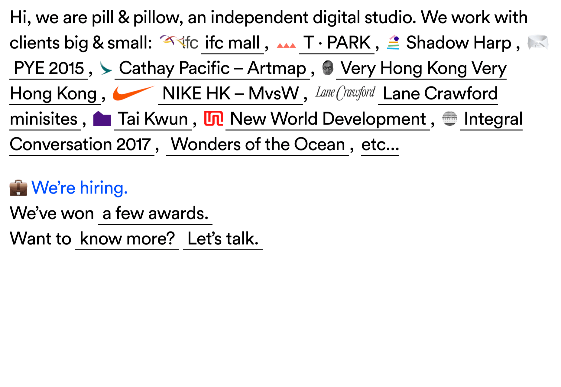
pill&pillow

Unlike many digital studios who use the design of their own site to demonstrate their skills, pill&pillow have taken a very basic approach. It is very self-assured, and it works. Random colored strikethroughs on visited links add a nice touch of playfulness.

Ferrum Pipe

Metal fencing is not the most interesting of subjects to most of us, but this site for Ferrum Pipe is surprisingly appealing. On scroll animation and some off-grid image layout brings life to what would normally be, well, a bit dull.

Lucciano’s

With its focus on mouth-watering photography and videography, the site for gelato makers Luccianos, will have you checking your freezer for any leftover salted caramel or stracciatella. The zoom on rollover is a nice effect, and the use of circles with ice cream color backgrounds for rollover text reinforces the gelato theme.

Björn Wieland

UI designer and artist Björn Wieland has created a portfolio site with a simple, relaxed feel and pleasing transitions. It feels simple, but behind the scenes there is quite a lot going on.

Coloursmith

Coloursmith is a tool from Taubmans paint company which allows you to create a custom paint color by uploading a photo. You name your color and can add a story, then you order a test pot. colors are presented well, in different light and with suggestions for complementary colors.

Finn

Finn make diet supplements for dogs. Their site is fun, modern and clean. Bright colors and an illustration that manages to be cute but not too cutesy make a bold impression.

Highcourt

Highcourt is a new private membership leisure club set to open in New York in spring 2021. Dark blue text on cream gives a softer edge than black on white. The background color changes on scroll are pleasing, and simple line illustrations with occasional gentle animation add to the overall sense of calm.

Elevence

Elevence is the company of product designer Kazuo Kobayashi. The site uses only black, white, and grays allowing the color photos of his work to really stand out. Circular thumbnails are used to good effect, appearing on rollover.

Playtype

Playtype is a Danish type foundry whose site seems to fit their name. It has a playful, almost chaotic feel, with bright blocks of color and occasional animation. Some pretty nice typefaces too.

Neri Oxman

Neri Oxman is many things: architect, scientist, engineer, inventor, and designer. This site feels like a really beautiful coffee table art book that you want to pick up and look through every so often. There are some nice details too, like the lens ‘reveal’ effect on rollover in a few places.

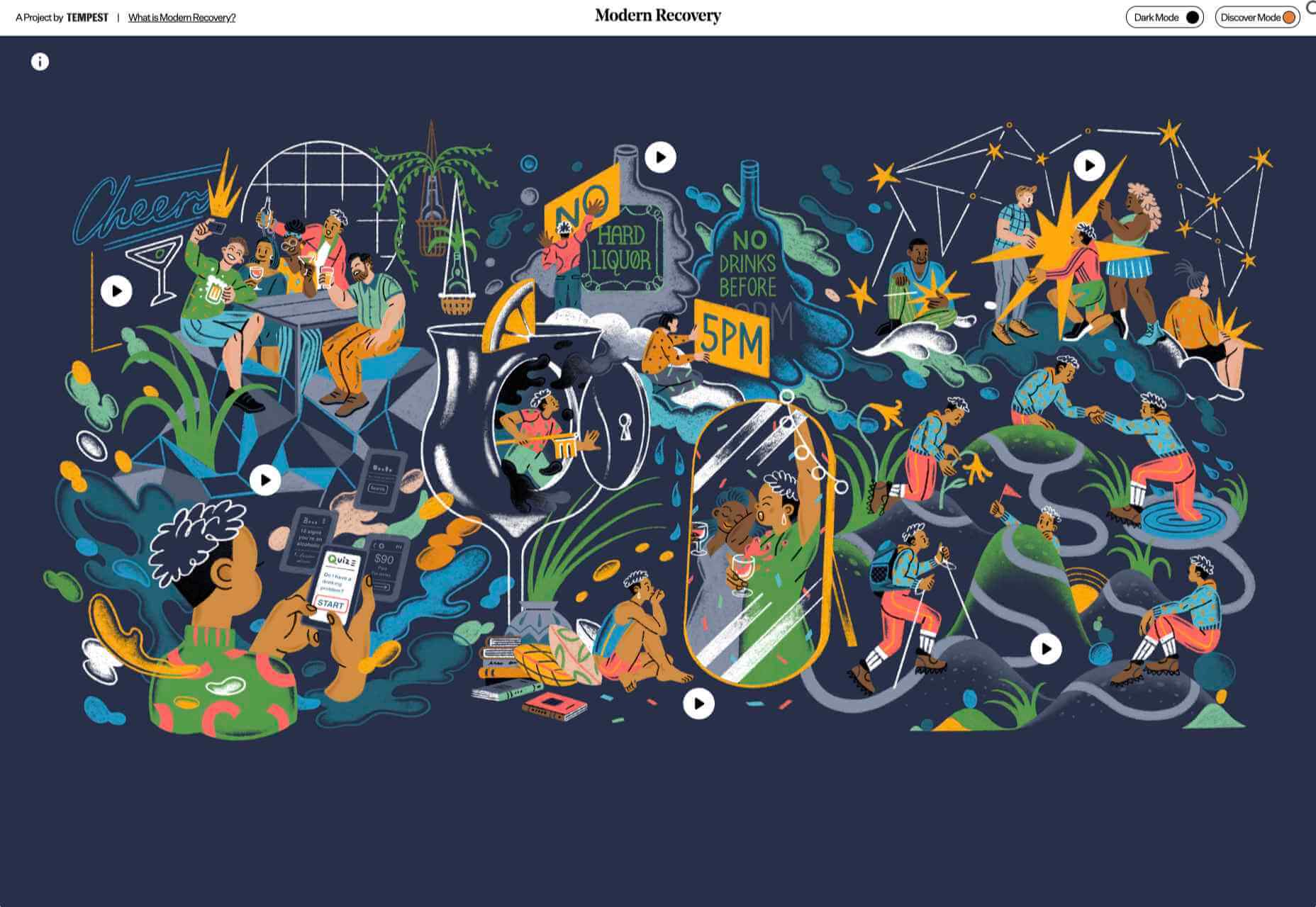
Modern Recovery

Modern Recovery is a project by sobriety program Tempest. The interactive illustration encourages exploration, to discover different stages of recovery from alcohol abuse and insights from others who have followed the program. The aim is to change our social attitudes towards alcohol and not drinking.

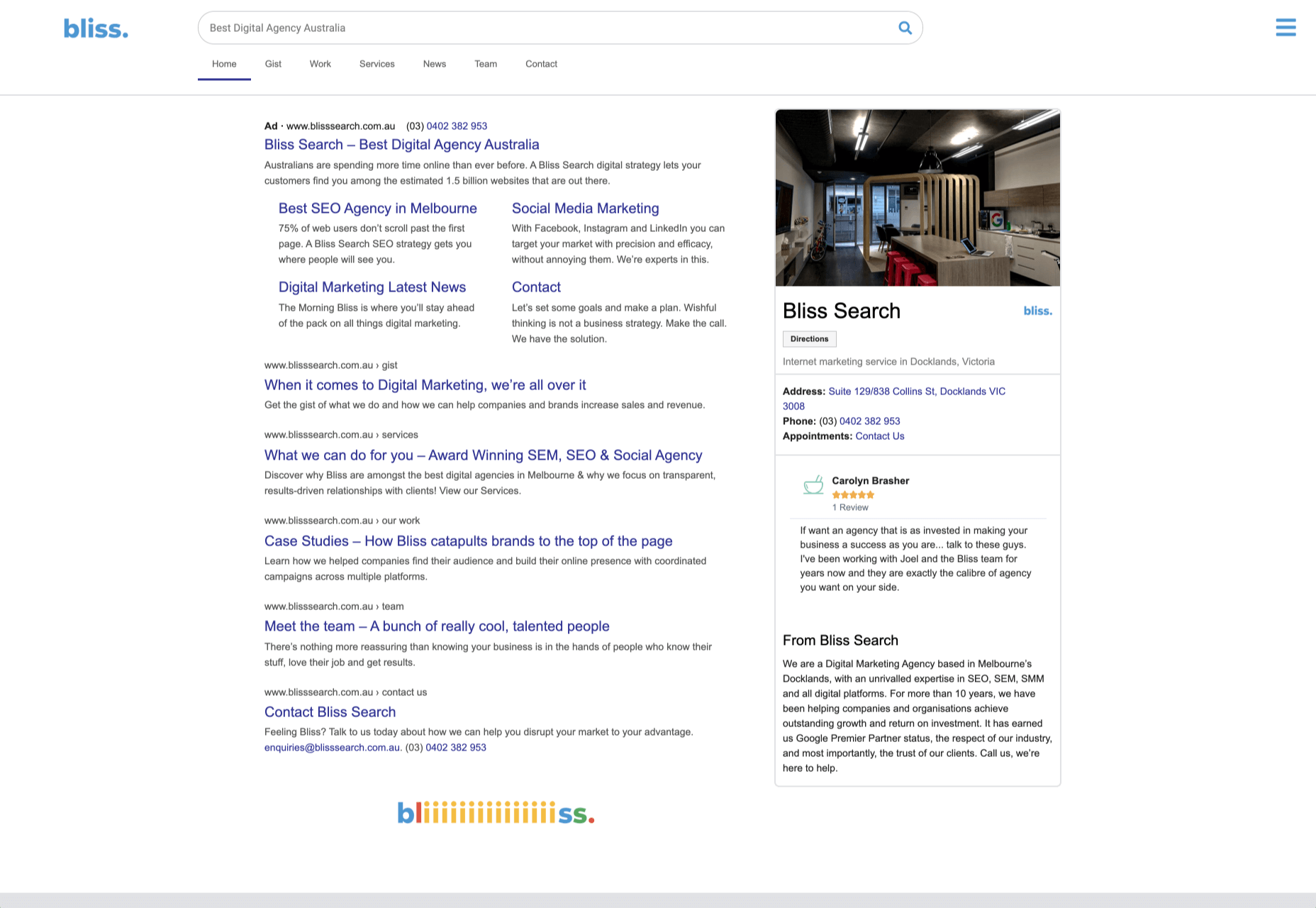
Bliss

Have you clicked on the link to visit Bliss Search? Yes, the link is correct, no you haven’t been redirected to a Google search results page. This Australian digital marketing company have copied the appearance of different well-known sites for their pages — Google, Instagram, LinkedIn, Tinder all make an appearance. The humor in this approach shows confidence, and makes it memorable.

Miilkiina

Miilkiina describe themselves as a digital media space and creative agency. Punchy typography, with great use of blackletter, well chosen images, and a strong header video give this home page an in-your-face edge.

Ukrainian Railroad Ladies

Ukrainian Railroad Ladies is a book by photographer Sasha Maslov. Its subjects are the, mostly, women who work as traffic controllers and safety officers at railroad crossings in Ukraine. It’s a simple site — outsized type, black and white, basic image grid, only very brief text — but it is effective in its simplicity.

Una Europa

Una Europa is an alliance of 8 European universities with the aim of offering joint research and study programs. There is some playful scrolling behavior with geometric shapes moving and changing color that enlivens what could otherwise be quite a dry site.

Bureau Cool

There’s a bit of an old school feel about the site of digital design studio Bureau Cool, with its recent traffic animation. The changing backgrounds on scroll are a nice touch.

Gridspace

Gridspace is a multimedia entertainment studio based in Montreal, and their website is a visual feast. Lots of movement, lots of video, some good use of sideways scrolling.

Nolii

Nolii make cases and accessories for iPhone that work together. The sorbet color palette complements the product colors and the block layout provides a visual reflection of the interlocking of the different products.

Source

Categories: Designing, Others Tags:

How Can Solopreneur Designers Make Their Business More Efficient?

September 28th, 2020 No comments

Becoming more efficient is something every business can benefit from. It helps you to work faster and more accurately, ensuring that projects are completed on time and within budget.

Solopreneur designers can benefit even more from increasing their efficiency because their margins for error and wastage are so much smaller — an inefficient project could be the difference between your company taking the next step or going under.

We’ve highlighted four ways you can become more efficient. Read them now and then put them into practice today.

Start by focussing on a single niche (not everything)

Design is an extremely broad discipline.

Graphics, animation, and motion are just three of the many types of interconnected designers. Chances are that you can do many (if not all) of the specialisms that are linked to the type of design work you do. And chances are that you’ll be tempted to pick up any related work.

This is an inefficient way of working, particularly when you’re a solopreneur.

The reason for this is that you won’t excel at all of these things. The result is that you’ll take longer to do the design work you can do, but aren’t as experienced in. This could see your projects running into a position where you’re making little money from them.

Your solution is to be a specialist (a master of one, not an adequate of some) by focusing on a few things you’re great at.

Your business will become more efficient because of this, as you’ll be able to work quicker and more accurately. You’ll then expand your portfolio and will be able to charge more for your work. You may also be able to get recommendations from your clients and broaden your client base.

And once you’ve built yourself up you can start to broaden your specialisms.

Create a clear client briefing process

Work is wasted when you create something a client doesn’t want.

They won’t accept the work you’ve delivered. They’ll ask you to start again. And they may not pay you for the time that you’ve already spent on it, pending on the terms of the agreement that you entered into with them.

This is an inefficient way of running a business. The solution is to have a briefing process.

Client briefs are the perfect way to get the people you’re working for to tell you exactly what they want in a way from the projects you’ve signed up to. They outline their KPIs and expectations, enabling you to build a picture of what the end product should look like.

You can design your own, bespoke client briefing doc. However, a more efficient way of doing it is to take an existing example and then make it fit your needs.

Smartsheet has an excellent example. Its creative brief template includes a range of helpful sections that allows your client to explain what’s needed, who it’s for, and the budget that’s been allocated. Using this template (or your own version) will make your business more efficient by making sure your work is completely accurately and within budget.

Use the right equipment for your work

You need to have the correct equipment if you’re going to work efficiently.

You need a laptop you’re comfortable with and that operates at the right speed. You need software that allows you to fulfill the briefs you’re given. And you need the accessories that enable you to set up an optimal workstation.

These things can be taken for granted but not having them in place will make you inefficient.

Everyone has their own preferences for the equipment that works best for them. Your task is to know what’s right for you and then ensure that you have it. This is because it allows you to work at the correct pace, as you’ll be familiar with the tools at your disposal.

Apple Macs are renowned for being great tools for designers. They’re an ideal tool to use. There’s a huge range of software that you can use for design work and Adobe has a great selection. You also need the right equipment for your workstation. This ranges from things as small as audio cables up to things as large as an ergonomic chair. The point is that it’s whatever the right equipment is for you — for your method of working and way of operating.

Good workers never blame their tools because they have the right ones. Bad workers blame their tools because they have the wrong ones. So, make sure you have everything in place to be able to work in the most efficient way possible.

Work at optimal times (where possible)

Lockdown has forced changes in work habits.

Many people are working from home, having client meetings on Zoom, and communicating with remote teams. While these are some of the more obvious changes to work patterns, one of the most significant has been to the hours’ people work — especially creatives.

The onus during lockdown has been on efficiency and optimizing how people work. This means that if you can extract more productivity by working outside the normal 9-5 pattern then you should do so (where possible).

There’s a science to optimising your work times. Indeed, John Trougakos, an associate professor of organizational behavior at the University of Toronto in Canada, explains that 75% of workers are at their most efficient from 9 am-11 am. Another study highlights that sleepiness peaks at 2 p.m., making it an inefficient time to work.

Another important thing to consider is the type of work you’re doing. This is because problems that need you to use open-ended thinking are best worked on during the evening.

What can we take from these things? The most efficient way for you to work is to tackle problems in the evening, put the solutions into place the following morning from 9-11, and cut out the middle part of your day. So, where possible, use this pattern and your business will become more efficient.

Focussing on a single niche, creating a clear client briefing process, getting the right equipment, and working at the optimal times are all great ways to make your business more efficient.

So, put the advice from this article into practice now and your company will soon see the benefits.


Photo by ruben daems on Unsplash
Creator, Rodney Laws, Check out his reviews on EcommercePlatforms.io and you’ll find practical tips that you can use to build the best online store for your business. Connect with him on Twitter @EcomPlatformsio

Categories: Others Tags:

5 Best Analytics Tools to Boost SEO

September 28th, 2020 No comments

It is never easy to discover the best SEO analytics tool that can grow your site. With so many metrics and insights to consider when managing your site, it is crucial to select an efficient and reliable tool.

Why is Web Analytics Important?

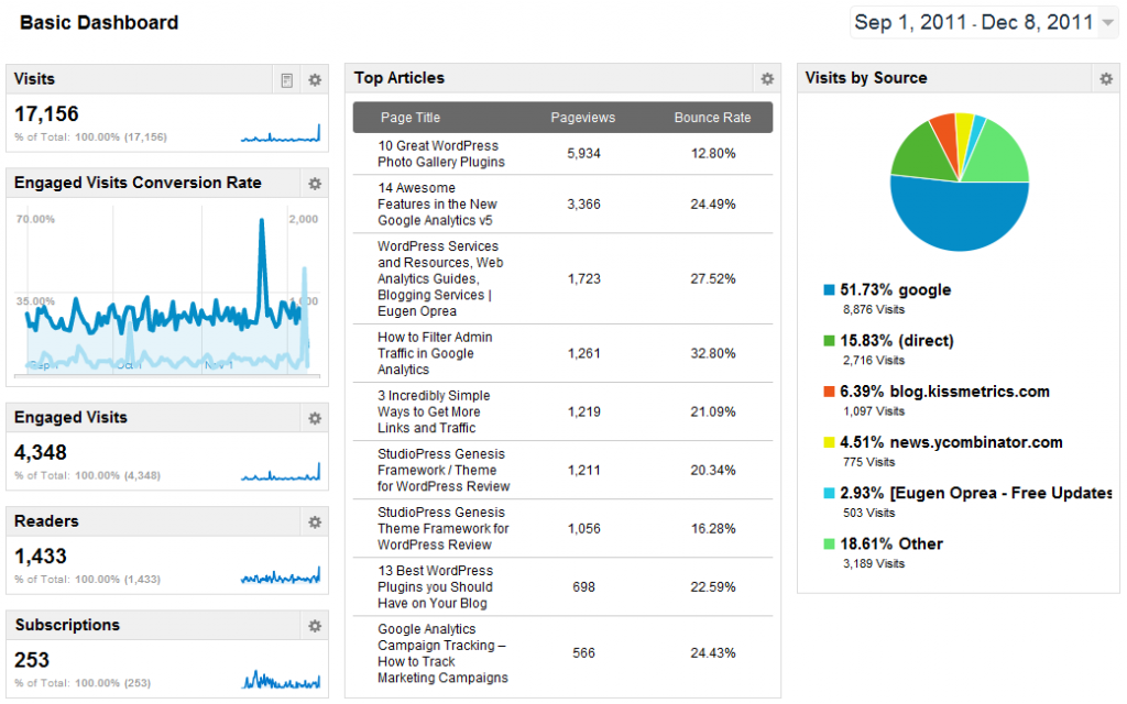
Web analytics offers insights that help to understand the needs of your site visitors and their behaviors. You can adjust your content, CTA, and product offerings based on the gathered data.

Funnel analysis plays a crucial role in conversion rate optimization. Web analytics tools let you set customer journey funnels so that you can accurately track all the stages of the user journey right from being a visitor to becoming a customer.

Some useful data you can gather web analytics tools are:

  • Which pages are the users entering on your site?
  • What is the bounce rate or average time on the page of your site?
  • Which keywords are driving the maximum traffic?
  • Which products or service pages are the visitors viewing the most?
  • What are the sources of traffic?
  • What action does the user take after entering your site?
  • Which CTAs are being clicked the most?
  • How many conversions is your website getting?
  • Which products or pages are generating the maximum conversions?

Answers to questions like these and several others can be accurately obtained using a combination of web analytics tools.

Here are the top five SEO analytics tools that can help you identify and fix the bottlenecks in your SEO strategy.

1. Google Analytics

Google Analytics is amongst the best analytics tools for SEO. It provides a range of features that you need to improve your website SEO and rank high on search engines.

With Google Analytics, you can analyze every data about every site visitor and track your site performance across various platforms.

If you recently established an online store and want to know where most of your customers originate, Google Analytics can help you locate that. With this tried-and-tested SEO tool, you can track site traffic, user behavior, customer conversions, and optimize other crucial metrics such as the bounce rate.

Google Analytics uses a JavaScript tracking code to gather all the information about how users interact with your site. It does this by dropping cookies on browsers. When the users accept cookies when visiting your site, Google Analytics collects all the useful information you need to improve the user experience.

Key features

  • It comes with a traffic reporting feature that helps you tell how many people visit your website daily.
  • It comes with a Real-time Report feature that enables you to determine the real-time traffic revenue from your pages or products.
  • The tool comes with a pivot view and social report feature that you can use to create detailed data. This way, it exempts you from exporting data to Google Sheets.
  • It has advanced filters like Audience Data & Reporting that enable data segmentation so that you focus more on what is essential for your SEO. For example, you can filter visitors who have added some products in their cart but didn’t complete the purchase.
  • It provides detailed reports using the in-page analytics feature that help you segment data and make the right decisions on your marketing campaign.

Benefits of Google Analytics

  • You can link it to Google Ads and keep track of all your PPC campaigns.
  • GA keeps track of essential metrics like site bounce rate, site speed, and dwell time, which helps you optimize your site to enhance user experience.
  • It is a useful tool for content marketing because it provides significant insights for customer conversion. You can use it to determine what customers are looking for whenever they visit your site.
  • You can use it to find out which keywords people are using to find your site.
  • You can use this tool to determine the third-party sites that send you traffic so that you can focus more on them to power up your content strategy.

2. Finteza

Finteza is an advanced web analytics platform. The tool provides you with real-time data in the form of diagrams, charts, and reports, which makes it useful for on-page optimization.

The tool analyses your site base unique parameters such as events, visit sources, page addresses, and UTM parameters. For instance, by using Finteza, you can discover useful information about mobile users in a click. This feature is available on the ‘devices’ section on the Finteza dashboard.

Key features

  • It has a ‘Funnels’ section that helps you detect all the fake conversions.
  • It features user behavior tracking and a comprehensive botnet analysis that enables you to discover low-quality data from multiple channels.
  • You can generate an efficiency report on your adverts with a few clicks.
  • It has a Time on Site Tracking feature you can use to determine how long users stay on your website.
  • It comes with an in-built advertising engine that helps you sell your advertising space and accept payments.

Benefits of Finteza

  • It provides detailed user analytics. You can use it to identify bad traffic and advanced audience data.
  • It features a distributed system architecture that ensures no additional site load.
  • You can use the tool to measure the quality of data from affiliate and partner sites.
  • It helps you cut your marketing cost by providing useful data for your digital campaigns.
  • You can use Finteza to collect information from all users that click on your Google Ads regardless of their location.
  • It provides accurate and real-time data without extrapolation and sampling.

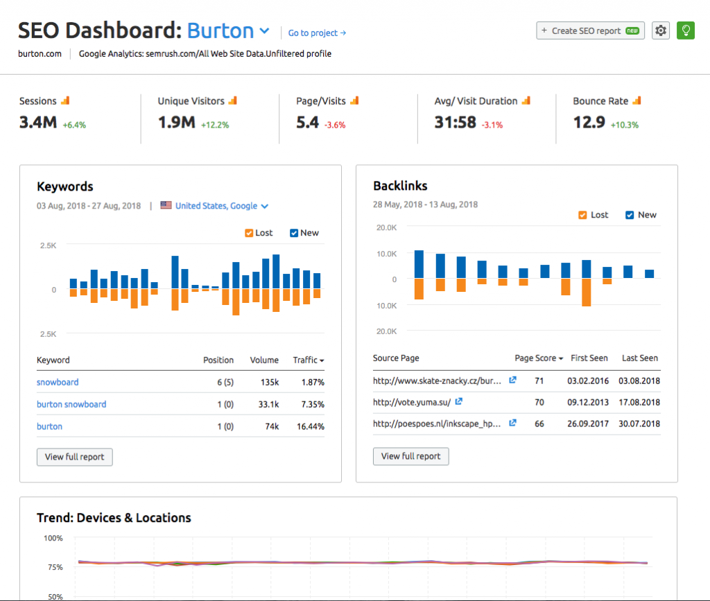
3. SEMrush

SEMrush is one of the best all-inclusive SEO analytics tools you can have for your website. This SEO tool comes with all the essential features and an elaborate dashboard that helps you manage your site.

With this tool, you can improve your technical SEO, find the best link building opportunities, and create high-quality content for your site.

If you are finding it difficult to audit your site for SEO, SEMrush can rescue you. With this tool, you can discover any underlying issues on your site that are stopping it from appearing on organic search results.

Key features

  • It comes with a complete SEO toolkit to help you to audit your web pages and make them more attractive to visitors.
  • It has a ‘Social Media’ management tool. You can use this tool to conduct a thorough social media posting and analytics.
  • It has a link building tool that enables you to analyze a link profile and create a reliable user outreach strategy.
  • It has a PPC keyword research tool you can use to build a paid search campaign.
  • It comes with a ‘content feature’ that helps you to create and share your social media posts to a large audience.

Benefits of SEMrush

  • You can use SEMrush to establish new ways to create marketing content. For example, you can check all the important keywords in your content space and use it to create useful blog posts.
  • It is a useful tool for developing a content strategy backed with data-driven solutions to market your site content to a broader audience.
  • It is useful for conducting a competitor analysis. You can use the tool to find out what your competitors are doing to incorporate in your marketing campaigns.
  • It is faster and helps you create your marketing campaign in minutes.
  • It is cost-effective and comes with three different pricing plans, Pro, Guru, and Business.

4. WooRank

WooRank is another useful SEO analytics tool that provides you with useful information on optimizing your web pages and making it more useful for your target audience.

It provides critical data to boost your marketing efforts. As an inclusive site review tool, it offers a lot of information that you can use to drive more users to your website, increase the number of leads, and convert more visitors to customers.

It comes with a day free trial to all new users. You can take advantage of the free trial version of this tool to improve your site and subscribe to the paid version in the future.

Key features

  • WooRank features a keyword tool that you can use to compare how your site ranks to your competitors and discover new keywords for your site content.
  • It comes with the ‘site crawl’ feature that ensures search engines crawl, access, and understand your site to rank your site on the organic search results.
  • The ‘SEO Monitoring’ tool helps you discover which of your site landing pages drive more traffic to your site.
  • The Sales Tool features help you identify successful leads and send them custom pitches based on how they interact with your site.
  • WooRank comes with a ‘traffic estimation’ feature that helps you compare your site traffic to that of competitors.

Benefits of WooRank

  • It offers services in six different languages including Spanish and Portugese.
  • It covers multiple areas including SERP ranking, server optimization, backlinks, and social media data.
  • WooRank offers you a money-back guarantee if you are not satisfied with their services.
  • WooRank is available on a 14 day free trial when you subscribe for the first time.
  • It provides a lead generation tool that you can use to convert your visitors to successful leads.

5. Moz

Moz is another best SEO analytics tool you can try out for your site. This excellent tool comes with a minimalist dashboard that makes it easy to use for any beginner in SEO. You can use MOZ to gain some insights on useful links to your website.

This tool is available on both a free and paid version. You can get a full link analysis feature on a free version to perform some link-building to increase traffic.

With this tool, you can determine all the useful keywords helping your site grow and work towards creating useful content based on your keyword research.

Key features

  • It comes with a complete SEO toolbar for keyword research, rank tracking, and domain analysis.
  • It offers a ‘Local Marketing’ feature that helps you with business listing audit and citation management.
  • The SEO Audit & Crawl feature can crawl the most extensive sites and keep a record of all recurring issues on the site which need immediate fixing.
  • The ‘My Online Presence’ feature on Moz helps you determine how your business location appears on directories and local search engines.
  • The tool comes with the ‘Stat’ feature useful for daily SERP tracking and competitor intelligence for experts.

Benefits of Moz

  • It crawls your site weekly and provides real-time alerts on critical issues that need your attention.
  • It comes with a paid and free version. Each version has some unique features that help you optimize your site to improve usability.
  • It helps you come up with different topics for your content strategy. You can use this tool to optimize your site for relevant topics and specific keywords.
  • It provides free domain analysis for any site. You can use it to see your competitors’ top ranking keywords and web pages.
  • The tool provides custom reports on the website crawl data, rankings, links, and competitors. This way, you can track your site progress and determine if you are on the verge of maximizing your ROI

Final Thoughts

There are many SEO analytics tools you can use to improve your site and make it rank at the top of the search results.

If you are looking for the best tool to optimize your site for search engines, I recommend these five. You can start using Google Analytics as a beginner. Once you’ve gained more experience, then you can use more sophisticated tools like Finteza, Moz, and SEMrush. These tools are affordable and provide you all the useful insights you need.


Photo by Markus Winkler on Unsplash

Categories: Others Tags:

ooooops I guess we’re* full-stack developers now

September 27th, 2020 No comments

*by “we’re” i mean front-end developers

This is a written version of a talk from Jamstack Conf London in 2019 that I put together for attendees. Because, the day before I was to board a flight for that trip, I flew off my mountain bike and broke both my arms. I felt bad that I couldn’t deliver the talk, so I both recorded it and made this. I’m moving it here because I like to keep a lot of my writing under one roof and to have a little fun with WordPress Gutenberg.

? Hey! I’ve spent my whole career self-identifying as a front-end developer and trying to help others become better at it.

and boy are my arms tired

I run the site CSS-Tricks (which recently had its 12th birthday), a resource site all about building websites.

I also co-founded the site CodePen, a social coding platform all about building things with front-end technology.

I also co-host a podcast called ShopTalk Show which is going on 400 episodes.

I’m sure I’ve talked to thousands of other developers over the years, which has helped me understand the industry and the spectrum of work it takes to make websites happen.

What is a front-end developer?

? It’s a job and a common job title.

This is important because it’s not just semantics. It’s a job that people are hired to do, and it is their job title at work. Nothing more personal than money.

How we define what this job is and what the expectations are is personal.

Look at any job board that has technology jobs on it and you’ll see postings for front-end developers.

What is a front-end developer?

? It deals very directly with the browser, devices, and users.

Everybody that works on websites probably has their browser open all day, but front-end developers live in there. They have DevTools open. They have multiple browsers open and test across versions and platforms.

Crucially, they care about the users that interact with those browsers and assistive technology.

Mina Markham explains what a front-end developers is at a high level:

There is a distinction from back-end developers. Its not that back-end developers don’t care about users, it’s just that responsibility is delegated.

Monica Dinculescu puts it well:

The browser is at the heart of the job of front-end development. Whatever you are doing, if your concern is how things ultimately look and work in a browser, that’s front-end development.

It’s harder than it gets credit for.

What is a front-end developer?

? There are loads of tools involved, but ultimately it comes down to HTML, CSS, and JavaScript.

Those are the languages that browsers speak. Yes yes, there is SVG and PNG and whatever else also, but you know what I mean.

Whatever other tooling you use, it all comes down to what ships to the browser, and front-end developers are responsible for that.

They are gonna come up at work.

Not all front-end developers know all the languages equally well. In fact, there are lots of developers out there who hardly write any JavaScript at all, but who are otherwise very successful front-end developers. And there are also a lot of front-end developers who write almost nothing but JavaScript. ?

My article The Great Divide digs into the split between front-end developers who are deeply into JavaScript and those who are not.

It’s not just my thoughts, but a collection of quotes from many others who feel the divide.

Brad Frost coins the terms “Front of the Front” and “Back of the Front” as a way to describe another sort of divide. He points out that it’s not a weakness, but a strength in putting those different people together.

At Google we have Front End Software Engineers and UX Engineers to attempt to address these differences. The two career ladders are very different with different expectations and different criteria for advancement.

— Steve Paulo (@StevePaulo) January 21, 2019

At Google, the divide is recognized and split by job title. Plus, those two career ladders get paid the same.

Front-End Developer is a real and meaningful term.

There is no doubt about it. Particularly since about 2015, JavaScript has exploded as a language.

(If you need to look at these bigger, use DevTools or whatever. C’mon you’re front-end developers right?)

Our jobs are already facinating! So we all deal with browsers and users and devices. That’s core. But we all know different stuff, and actually put that knowledge to work.

Some of us are designers. Some of us are photographers. Some of us know the law really well. Some of us are way into performance. Some of us specialize in accessibility. Some of us embrace social media.

Metaphorically, you could map us like this tree.

This metaphor probably doesn’t hold up quite perfectly, but the divide looks a little something like this. We still share some fundamentals, and we still branch out and know lots of different stuff, but one side is heavily focused on JavaScript and “Back of the Front” type work and the other is not.

Since this talk is about the slow morphing of front-end developers starting to do more full-stack work and having that role grow wider and wider, let’s just assume we’re talking about front-end developers who go down the heavier JavaScript road.

A bunch of stuff you need to do to build websites has sort of moved stacks.

Back End ? JavaScript

That is, from more of a back-end-and-friends skillset to a front-end-and-friends skillset.

Component-Driven Design & Development

Thanks, Obama JavaScript.

It seems to me non-JavaScript server-side rendered projects never really embraced components. (There are examples, don’t @ me, but I mean across the gigantic PHP CMS landscape and Ruby on Rails and huge players like that.) You had templates and includes, but they are a pale comparison to real component-driven development.

It’s facinating to see that while there is a wide variety of JavaScript-based frameworks that all disagree on plenty of things, one thing they all agree on is the idea of components. Even native web components… it’s right in the name.

Let’s take a quick look at CodePen, which is a React powered site (mostly) these days.

Even this tiny little SVG icon? It’s a component. We call it an component because it nicely abstracts away a few things that are useful to us.

Pairing an icon with a number is another component, because it is another repeated pattern and might have additional responsibility, like being clicked.

That whole row of MetaItem components might become a component, along with other aspects of an Item’s display

So of course the whole Item itself becomes a component.

These are visual and functional abstractions of what we need to build the UIs. There is semantic HTML underneath, but the abstractions are building blocks of our own devise.

Larger and larger areas become components. In this case, it makes sense that a grid of items becomes a component, so that it can handle that layout and things like pagination.

It’s true! Not only are components capable of being intelligent building block abstractions for UIs for front-end developers, but designers are also largely already working this way. Tools like Figma, Sketch, and Adobe XD tout things like “symbols” which are spiritually connected.

I find other developers are like “cool, components, I get it”.

Site-Level Architecture / Routing

Back End ? JavaScript

OK I guess this is my job now. It makes sense and I like the control, but it’s a big serious job.

Dealing with URLs and overall site structure used to feel primarily like a back end concern. These days, “routing” is becoming more and more a front-end concern.

<Suspense fallback={<Spinner />}>
  <Route
    exact
    path={['/', '/picked-pens']}
    component={anon ? AnonHomepage : Homepage}
  />
  <Route path={['/topics', '/topic']} component={Topics} />
  <Route path={['/challenges']} component={Challenges} />
  <Route path="/instagram" component={Instagram} />
  <Route path="/dashboard" component={Dashboard} />
  <Route
    path={['/profile_new/:username', '/profile_new/team/:teamname']}
    component={Profile}
  />
</Suspense>

Looking back at the CodePen UI, the components don’t stop at the grid. Literally everything becomes a component. The tabs, the titles, the buttons…

… the forms, the menus, the sidebar…

Ultimately the whole gosh-darned page becomes a component.

Once the whole page is a component, what you’ve really done is turned the the URL into a component.

And now that the URL is a component, all the URLs are components, and you’re controlling the whole site.

You’ve become an architect of the entire site, in a sense.

That’s… a lot. Think of all the work you already have to do as a front-end developer. None of that goes away. You’re just responsible for a lot more now. It’s no wonder that front-end developers are feeling more and more full-stack-y.

State Management + Getting & Mutating Data

Back End ? JavaScript

Another thing that has fallen into the hands of front-end developers is state management. Now that’s kind of at the core of most JavaScript frameworks and it’s a pretty great concept that wipes away a lot of front-end spaghetti problems of the past.

But state is often filled from getting data, and that’s now often on our shoulders as well.

Even more complicated is changing that data when necessary and sending data back to servers when required.

GraphQL is a pretty great answer to some of this. GraphQL is a lot of things and meaningful to different people in different ways. But to me, it’s about empowerment.

With a strong GraphQL endpoint in place, and tools like Apollo giving me tools to use in my JavaScript framework, I can, as a front-end developer, get my hands on any data I need to build UI.

import gql from "graphql-tag";
import { Query } from "react-apollo";

const GET_DOGS = gql`
  {
    dogs {
      id
      breed
    }
  }
`;

const Dogs = () => (
  <Query query={GET_DOGS}>
    {({ loading, error, data }) => {
      if (loading) return `Loading...`;
      if (error) return `Error`;

      return (
        {data.dogs.map(dog => (
          <div key={dog.id}>
            {dog.breed}
          </div>
        ))}
      );
    }}
  </Query>
);

Note that not only am I getting all my own data, but I’m also managing the asynchronous nature of the component. Should I show a skeleton right away? A spinner? Should I delay rendering until the data is ready? What happens if it times out or there is another error?

Not only can I get data, but it’s on me update that data and send it back through GraphQL in the form of mutations.

mport gql from "graphql-tag";
import { Mutation } from "react-apollo";

const ADD_TODO = gql`
  mutation AddTodo($type: String!) {
    addTodo(type: $type) {
      id
      type
    }
  }
`;

const AddTodo = () => {
  let input;

  return (
    <Mutation mutation={ADD_TODO}>
      {(addTodo, { data }) => (
        <div>
          <form
            onSubmit={e => {
              e.preventDefault();
              addTodo({ variables: { type: input.value } });
              input.value = "";
            }}
          >
            <input
              ref={node => {
                input = node;
              }}
            />
            <button type="submit">Add Todo</button>
          </form>
        </div>
      )}
    </Mutation>
  );
};

Mutations aren’t terribly more complicated than queries, but it’s all the more work that is on my plate as a front-end developer. Work that was almost surely in the realm of back-end development before.

Note that the above examples were illustrative of GraphQL, but done through Apollo Client implemented in React.

While we’re talking about components, queries, and mutations, let’s throw one more thing on the pile: styling.

Front-end developers have always been in charge of styling, but in a land of components that are self-contained in so many other ways, it starts to make sense to co-locate the styling information as well.

Here we’re using CSS modules to scope the styles to a specific component. We can and do still have global styles, and we even continue to use Sass for useful global abstractions.

.root {
  display: grid;
}
import styles from './styles.scss';

<NewsItems className={styles.root} />

The result of this componentization and co-locating is nice little folders that have everything from logic, to view templates, to queries and mutations, to styling all together.

It’s convenient, but it has cool interesting side effects. For example, JavaScript bundles may contain what they need (code splitting). Styling doesn’t get bloated because when components stop being used because their styles leave with them. Not to mention naming things is a lot less stressful since the naming is file-scoped.

The GraphQL documentary is kinda fun. I like what Kyle Mathews says (about 20:24) about React wiping away a whole class of front-end development problems, and how GraphQL does a similar sort of thing.

For every project? Of course not. But for the somewhat large and complex apps that we’re so often expected to build and maintain: yes.

All the very huge responsibilities front-end developers already have:

  • Pulling of the design
  • Making the design part of a system
  • Making sure it is accessible
  • Worrying about the performance
  • Testing things across browsers
  • Testing things across devices
  • Sweating the UX

Oh hello, big pile of new responsibilities

  • Component-driven design, designing our own abstractions
  • Site-level architecture
  • Routing
  • Fetching our own data
  • Talking to APIs
  • Mutating data
  • State management

The haystack of responsibilities grows and grows and grows.

That’s not to say that all of us need to know every single part of this and do it perfectly well, but it is to say that these are tasks that fall within the realm of front-end web development.

Peggy Rayzis talks about how wide the term front-end developer has gotten and that it’s likely we’re specializing.

Again, a bunch of tasks have sort of moved stacks. From what used to be rather back-end jobs to being in the JavaScript realm.

Let’s draw a spectrum and see how that has morphed through time.

LAMP is Linux, Apache, MySQL,and PHP. It’s a rather old stack, but it’s still very huge. It’s what an awful lot of CMS’s run. LAMP is how the stack is talked about.

If I’m a front-end developer working in that stack, I’m way over on the other side of the spectrum, not touching much of the technology the stack is referring to.

MEAN is another stack, referring to MongoDB, Express, Angular, and Node. Notice the OS isn’t mentioned anymore.

Notably, Angular is a front-end framework, so the stack is starting to include that. If I’m a front-end developer, what I’m working on overlaps with the stack.

Serverless moves the stack further to the right. We don’t even care what servers the code runs on anymore, it’s just server-side code using and creating APIs.

If I’m a front-end developer working in this world, I overlap in that I might even be using my JavaScript abilities to be writing these serverless functions and digesting the APIs.

Shawn Wang called Design Systems, TypeScript, Apollo GraphQL, and React a STAR app.

That’s… like… all front end stuff.

It seems to me the way we talk about the important technology that powers websites shifts more and more toward the front-end developer spectrum.

Let’s take a quick look at how serverless is expanding our front-end powers.

I made a website about serverless stuff because I think it’s cool and a big deal.

I consider JAMstack to essentially be a part of the serverless movement. Natch.

Javascript, APIs, and Markup. Although I would say, half tongue-in-cheek, that SHAMstack makes a bit more sense.

Here’s a perfect example of a JAMstack site that leverages serverless tech to do the things it needs to do.

It’s a site that lists upcoming conferences related to front-end development.

---
title: JAMstack_conf_ldn
url: 'https://jamstackconf.com/london/'
cocUrl: 'https://jamstackconf.com/london/code-of-conduct'
date: 2019-07-09T08:00:00.000Z
endDate: 2019-07-10T16:00:00.000Z
location: 'London, England'
byline: 'Learn how to design, develop, and deploy fast, modern web projects that run without web servers.'
---

Following the inaugural [JAMstack_conf in San Francisco](https://2018.jamstackconf.com/) in 2018, we're now also bringing an edition to London where we'll have talks about how to design, develop, and deploy fast, modern web projects that run without web servers.

Each conference is a Markdown file with Front Matter to describe meta data associated with the conference, like the city and dates.

I wasn’t deliberately trying to avoid a database, but this just seemed like the perfect kind of site to use a static site generator for and the data needs are so basic that flat Markdown files are a natural fit.

So each conference is a Markdown file, and there are some basic templates in Nunjucks, and Eleventy is wonderful for processing that kind of setup.

The site is a public repo on GitHub. That seems obvious, perhaps, but I think it’s hugely significant here.

It means that:

  1. The entire site is in the repo. To run it, you pull it down and run a single command.
  2. There is no fiddling with log ins, permissions, or credentials.
  3. It opens up the content of the site for public contributions, as well as the design and functionality. This has been huge.

The site being on GitHub means I could just leave it on GitHub Pages, but it’s like a 2-second process to put in on Netlify, which is a massive improvement. Here’s a few reasons:

  • Deploy previews. When I get a Pull Request, I can take a look at a live URL of what the site will be like with that Pull Request merged. Amazing.
  • I can activate Analytics on the site and get the most accurate possible numbers.
  • I can fiddle with my images programmatically.

There are a couple other big ones though…

With Netlify CMS, I get a UI to edit content right on the site itself. No code editing or Git involved at all once it’s set up.

I don’t even need Netlify to use Netlify CMS, but Netlify Identity makes the auth part a million times easier.

Check out this feature of the conference site. For each conference, you can click a button that reveals an email input form. Enter an email and submit, and the site fires off an email with details about the conference.

That’s a back-end thing. You can’t really send email with client-side technology alone. You can communicate with APIs that will send email, but even that requires API keys that need to be kept secret via back-end code.

const SparkPost = require('sparkpost');
const client = new SparkPost(process.env.SPARKPOST);

exports.handler = function(event, context, callback) {
  client.transmissions
    .send({
      content: {
        from: 'chris@css-tricks.com',
        subject: `Conference!`,
        html: `
          <html>
            <body>
              <h1>Hello, World!</h1>
            </body>
          </html>`
      },
      recipients: [{ address: email }]
    })
    .then(data => {
      callback(null, {
        statusCode: 200,
        body: `Message sent!`
      });
    });
};

I’ll use Sparkpost to send the email. They offer APIs to send email (that’s the entire point). They also offer a Node.js library to make it very easy. Ultimately just a few lines of code.

And that code? It’s JavaScript. I’m a JavaScript developer. This is not a stretch.

How do I run this?

That’s the meat and potatoes of serverless: cloud functions. I’m talking about AWS Lambda, Azure Functions, Google Cloud Functions, etc.

The Netlify version, which is AWS Lamba under the hood, is Netlify Functions. It’s stupid easy. You just toss your functions in a `/functions/` folder and run them by hitting a relative URL.

It feels very powerful to be able to build the entire site from front to back like that.

Let’s revisit the spectrum of technology again with this modern stuff in mind.

I don’t really have to care about operating systems and servers. Entire products can be built without having to care about these.

I probably don’t need to care much about databases either. It’s not that databases aren’t important, it’s just that my dealing with data is likely to happen through APIs. Perhaps a Headless CMS (e.g. Contentful). Perhaps a data storage tool that is designed to work through APIs (e.g. FaunaDB) or on-page libraries (e.g. Firestore).

So now I’m left with a spectrum of technology where I can work with all parts of it.

So I’m feeling pretty full-stacky already. But you take all that and add in:

  • I know Git
  • I can write tests
  • I design
  • I know about build processes
  • I care about performance
  • I can make sites accessible
  • I can set up a basic deploy pipeline

?
You’re Gosh
Danged Right
I’m a Full-Stack
Developer!

butttttt

The haystack of skills here is getting extremely large.

You can totally specialize. You probably will anyway. That’s good.

“Actual” unicorns, those people that are very good at every task across the entire spectrum of building websites: as rare as actual unicorns.

I’m also not trying to insinuate that back-end developers are becoming obsolete. In fact, the fact that building websites has gotten so damn complex, they are more important than ever.

Right now, I can open up the CodePen issue tracker and see 89 issues that I can’t solve alone. I need back-end developer help to dig into them and fix them. I can think of myself as full-stacky if I want, but I know that back-end stuff is where my rough edges are.

Things tend to end up a bit more like this.

“Fullstack” developer. pic.twitter.com/yfymQmJJgq

— Brian Holt (@holtbt) March 24, 2018

Or in my case, more like this:

That’s not to make fun of anybody. I mean, maybe a little, but it draws a nice metaphor that is kinda perfect for this talk. We are the whole horse! The whole dragon! But we’ve got rough edges. So what.

It’s cool to see the tech around our job evolve to the point that we can reach our arms around the whole thing. It’s worthy of some concern when we feel like complication of web technology feels like it’s raising the barrier to entry. That happens sometimes and it’s not great. But it’s also worthy of cheer when web technology becomes simple enough that people can build things from start to finish all by themselves. That’s pretty cool.

While we’re being all productive and amazing, let’s just remember that doing a good job is everybodies job.

  • Good UX is everyone’s job
  • Good performance is everyone’s job
  • Good security is everyone’s job
  • Good accessibility is everyone’s job
  • Doing right by the people that use your website is everyone’s job

Even if you aren’t writing the code that directly affects any of those things, you care about them and fight for them to be handled well.

CodePen PRO (support your local artisanal craft software products with money)


The post ooooops I guess we’re* full-stack developers now appeared first on CSS-Tricks.

You can support CSS-Tricks by being an MVP Supporter.

Categories: Designing, Others Tags:

Popular Design News of the Week: September 21, 2020 – September 27, 2020

September 27th, 2020 No comments

Every week users submit a lot of interesting stuff on our sister site Webdesigner News, highlighting great content from around the web that can be of interest to web designers.

The best way to keep track of all the great stories and news being posted is simply to check out the Webdesigner News site, however, in case you missed some here’s a quick and useful compilation of the most popular designer news that we curated from the past week.

The Core Concepts of Bold Web Design

Chrome Extensions Every Web Developer Must Have

How to Use Email Infographics to Engage Subscribers

30+ Free Graphic Templates for SaaS Social Media

Searchbox – A Lightweight JavaScript Library for Building Search UIs

Twake – Open Source Collaboration Platform for Teams

Synthesia – Generate Professional-looking AI Videos from Text in Minutes

Design Resources

19 Trippy & Glitchy CSS Distortion Effects

Update on Firefox Send and Firefox Notes

The Rounded User Experience

Chinese Approach to 3D Illustration and Character Design

Sapiens Character Builder

ComicA11y

Here’s How You Measure the Success of a UX Design Project

Tools Should not Only Be for Experts – They Should Turn Us into Them

Designing with Accessible Color Contrast on the Web

The Future of Experiences, According to a Theme Park Designer

How to Make an App – The Ultimate Guide

Page Experience: A Guide on Google’s Newest Ranking Factor

Visual Mind AI – How Attractive is your Website?

The Untold History of MacOS System Preferences

Bringing Context to Design Systems

How to Market Yourself as a Creative Entrepreneur

Magic Startup Shell – Validate your Startup Idea

Want more? No problem! Keep track of top design news from around the web with Webdesigner News.

Source

Categories: Designing, Others Tags:

AccessiBe Review 2020: Solving Web Accessibility with AI and Scalability

September 25th, 2020 No comments

Web accessibility is important for two reasons:

  1. Being ADA & WCAG compliant is required by law (we’ll explain this further) so if your website isn’t compliant, you can get sued.
  2. It allows people with disabilities to browse your website, which increases your potential audience and it is the decent thing to do.

In this accessiBe review, we’ll cover:

How Does accessiBe Work

accessiBe is an automated solution that combines two applications to achieve full compliance.

Foreground application: the accessibility interface. This is the accessibility menu that allows users with disabilities to adjust the various UI and design elements on your website so it meets their unique needs.

Background application: proprietary AI technology that’s responsible for the ‘heavy lifting’, screen-reader, and keyboard navigation optimization.

The combination of these two applications is unique for accessiBe for a few reasons. While most available accessibility solutions offer just one of the two or rely on manual remediation, accessiBe checks both boxes and does it in a fully automated way.

Additionally, and most importantly, accessiBe continuously scans your website, every 24 hours, identifying and fixing new accessibility issues as they arise. Websites are dynamic – meaning, keep updating constantly with new content, pages, images and so on; being ADA and WCAG compliant is an ongoing concern, not a one-time fix.

How to Install and Setup accessiBe

You install accessiBe by inserting a single line of code on your website.

From your end, that’s all it takes.

The first thing that happens is that the accessibility interface appears on your website. The menu is available via the accessibility icon (that also appears automatically.)

Source: accessiBe website

Next, the AI application scans and analyzes your website for accessibility issues and compatibility with screen-readers and keyboard navigation requirements and fixes them. This automated process takes 48 hours.

Once the initial 48 hours have elapsed, your website is compliant.

From here on, accessiBe automatically scans your website every 24 hours to identify and fix new accessibility issues as they arise due to website updates.

Why Ongoing Compliance is Important

We’ve mentioned this already, but it’s important to stress this point.

Whether you have an e-commerce website or a company website, you keep updating and changing your website; new items go up for sale, new videos and content pieces are added. Every addition or removal from your website has the potential of creating accessibility gaps (like missing alt text for images.)

By continuously scanning and fixing your website, accessiBe ensures that you stay compliant. An accessibility audit remediates your website for the specific point in time the audit took place. Meaning, you’ll need to audit your website periodically to remain compliant, which is a costly affair. With accessiBe you don’t need to worry about this.

accessiBe Front End Features – The Accessibility Interface

The accessiBe accessibility interface (the menu that is available for users) is installed automatically on your website once you insert the line of code. Let’s look at the various features that are available for people with disabilities.

Accessibility Profiles Explained

First, it allows you to choose from a pre-defined set of profiles optimized for various disability needs:

When one of the profiles is selected, the required adjustments are instantly applied to your entire website.

For example, The ADHD Friendly Profile creates a reading mark that follows your mouse movements that diminish distractions and allows better focus:

The Cognitive Disability Profile frames all the elements in bounding boxes and adds an ‘reading cursor’ that acts as your mouse to allow enhanced orientation:

Each of the predefined profiles includes a suite of features that target the unique accessibility needs of the disability; the Epilepsy Safe Profile prevents videos from playing automatically, dims all the colors on your website and eliminates flashing and blinking animations; the Visually Impaired Profile enhances all your website’s visuals, enlarges all fonts to allow most visual impairments conditions (degrading eyesight, tunnel vision, cataract, glaucoma and more) to be able to browse your website with ease.

The last two profiles, Blind Users and Keyboard Navigation, work in unison. They allow blind and motor-impaired individuals to browse and use your website as they are used to, through screen-readers and keyboard functionality, respectively.

Two things need to be mentioned here:

  1. Blind individuals have screen-readers installed on their computers in the OS-level, meaning, on the hard drive of the computer. They use them to navigate the internet by having the software read for them every text that appears on the screen. As can be seen in the screenshot above, the Blind User profile is ‘launched’ automatically once accessiBe detects that the user is using a screen-reader. This is a crucial functionality since obviously blind users aren’t able to locate the accessibility icon.
  2. The same goes for individuals that are using the keyboard instead of a mouse to navigate the web, both the motor-impaired and the blind. accessiBe detects and automatically enables keyboard navigation on your website.

On top of the predefined accessibility profiles, accessiBe’s interface allows for further adjustments that can be controlled specifically to allow a personalized browsing experience according to the user’s needs. Let’s look at these adjustments.

Accessibility Content Adjustments Explained

The content adjustments allow you to control every aspect of the written content on your website. The menu looks like this:

Each of these elements allows for granular control of the way content, or text, is presented. From altering the entire website’s text to a readable, sans-serif font that is easier to follow, to highlighting titles and links, to adjusting font size, the spacing between lines and letters and using a text magnifier that follows your cursor on the screen.

Here’s how it looks with Highlight Titles and Highlight Links turned on:

You can see all the links are highlighted with an orange bounding box while all titles are highlighted with a blue bounding box.

Accessibility Color Adjustments Explained

The color adjustments allows users to control every aspect of the color scheme on the website:

From adjusting contrast and saturation, to switching the entire website to a monochrome color scheme, to adjusting textual elements and background colors. Let’s look at a few examples.

Here’s a side-by-side of default appearance and the Dark Contrast adjustment turned on:

And here’s how it looks with the Monochrome adjustment turned on:

Accessibility Orientation Adjustments Explained

The orientation adjustments allow full control of ‘distractions’ that make it hard for individuals with epilepsy, ADHD, and cognitive disability to browse the web:

As such, the orientation adjustments allow users to mute sound, hide images, stop animations and additional ‘focus’ features such as an enlarged cursor and reading assistance that highlights the text being read.

Here’s how the Remove Images adjustment works:

accessiBe Back End Features

Unlike ‘accessibility plugins’ (more on that later) accessiBe provides a comprehensive back end treatment to your website – automated, AI-powered analysis of compatibility with accessibility requirements and fixing of the elements that need adjustment.

It should be noted that 70% of the WCAG compliance requirements deal with screen-reader and keyboard navigation compatibility and all these requirements are not answered by installing an accessibility interface widget that merely makes UI and design adjustments.

For example, an accessibility widget will enable you to enlarge the font on your website, to adjust the saturation or to highlight links, but it won’t enable a blind individual to differentiate between a shopping cart icon and a checkout icon, nor will it enable a motor impaired individual to easily navigate a menu.

This is a crucial consideration to make when choosing a web accessibility solution. Being WCAG compliant is a YES / NO situation. Your website is either compliant or it’s not, there is no middle ground here.

accessiBe’s back end features come to solve and answer all these compatibility issues that enable full screen-reader and keyboard navigation functionalities.

Screen Reader Compatibility Explained

Screen Reader is a software for blind individuals to use computers and browse the web. As the name suggests, the software reads aloud what is seen on the screen for blind individuals.

The screen reader software is installed on the computer. But in order for it to work with websites, the website needs to be compatible with the software. To achieve compatibility with screen reader software, WCAG requires that a website should adhere to a set of attributes called Accessible Rich Internet Applications (ARIA) that are installed within the website’s code, allowing it to ‘communicate’ with the screen reader.

Let’s take social icons as an example. We are all familiar with those icons – Facebook, Twitter, Instagram – they are instantly recognizable for us visually. A screen reader software doesn’t actually ‘see’ elements on the screen, rather it scans the website’s code to understand what appears on the screen. As such, a Facebook icon code simply says ‘link’ and has the URL that directs the user when clicking the link.

So with a website that isn’t compatible with a screen reader, that doesn’t have ARIA tags implemented, the screen reader will read to the blind person “link” for the Facebook icon; not very helpful, is it?

When ARIA tags are implemented, additional information is added to the Facebook icon – and any other visual link on the website – that describes what is the link. So the screen reader will read to the blind person “Facebook link”.

It’s not difficult to imagine the scope and effort of the work needed in order to implement ARIA tags on your entire website.

Keyboard Navigation Compatibility Explained

Keyboard navigation means that motor-impaired individuals are using their computers only through their keyboard, rather than a mouse. Scrolling, clicking links and menu buttons, opening and closing tabs – everything is done using designated keys.

There are many issues relating to keyboard navigation as today’s websites are highly complex, layered with content elements, and react dynamically to user behavior. Any element of the website must be compatible to allow full keyboard navigation.

Let’s look at a popup as an example.

Popups can be triggered for a variety of reasons. For mouse users, it is a simple occurrence; you can bring the cursor to the area of the popup, click on one of the fields to input details or click the X to close the popup.

But how do you handle the popup using only the keyboard? How do you differentiate between ‘regular’ functionalities of the website and that of the popup? How do you ‘shift the focus’ of the keystrokes to a layered element? You need to allow unique keystrokes to operate the popup, keystrokes that are activated only when a popup appears.

It’s one example of the many challenges making your website compatible with keyboard navigation. The list of WCAG requirements for compatibility with keyboard navigation is a long one, and understandably so as it needs to enable motor-impaired individuals to navigate your website with the same ease as the rest of us using a mouse.

How accessiBe’s Background Processing Achieves Screen Reader and Keyboard Navigation Compatibility

Without getting too technical, what accessiBe does is scan the entire code of your website and adds keyboard functionalities and ARIA tags to various elements on your website directly. It won’t interfere with your site’s code, but rather add an additional ‘layer’.

accessiBe’s AI ‘learned’ all of ARIA’s tags and keyboard functionalities required by WCAG and when scanning your website’s code implements all the required adjustments to achieve full compliance.

How accessiBe Makes Menus Accessible

Menus are a good example for understanding what the accessiBe background processing does and the benefits it provides.

We recognize menus on websites instantly, because we saw thousands and thousands of them. We know how they look, we know what their functionality is, and we know where to hover and click in order to reach the various pages of the website.

But if you remember, we said that screen readers don’t ‘look’ at the screen, but rather scan the site’s code to understand structure, identify links and read them aloud with all the text that appears on the page.

So menus are coded as a list structure, because in a way they are. A screen reader will announce a menu as a list, which might be confusing for a blind user. Additionally, many menus have drop-down sub-menus, accessible via a hover or by clicking a little triangle. Without proper ARIA tagging, a screen reader will miss the sub-menu.

What accessiBe does is adding readable tags for every element in the menu so a screen reader will recognize and announce each element properly. The ‘list’ code structure will get a “menu” tag, and the sub-menu will get a tag for ‘sub-menu’, thus allowing the blind individual to utilize the full functionality of the website.

Additionally, accessiBe alternates the tags on-the-fly while the site is being browsed. Once a sub-menu has been opened, a tag that says “sub-menu open” will be added to indicate to the screen reader what has happened, and will be changed with the tag “sub-menu close” once the sub-menu has been closed.

Image Recognition

One of the key elements of accessibility compliance with screen readers is to provide accurate alternative descriptions for images, known as alt text.

accessiBe utilizes various image, object and character recognition technologies (OCR and Iris) to provide highly descriptive and accurate depictions of images displayed on the website. Without adding screen-reader compatible alt tags to images a blind individual would simply not be aware of the existence of images, and miss out on the information usually displayed on images.

Let’s look at the following banner images from an e-commerce website:

As you can see, valuable information is communicated via the images – sales and discounts – the kind of information any shopper would want to know.

This is the descriptive text that accessiBe’s AI assigned to these images, completely automated with no human intervention (from left to right):

  • Image contains: shopping, stock, shop, option, fashion; image text: extra 30% off shop now
  • Image contains: Illustration, design; image text: sale Black Friday
  • Image contains: wood, luggage, retro, travel, design; image text: travel shopping 50% off

Again, doing this kind of work for the hundreds to thousands of images that are displayed on every e-commerce website requires a lot of time and effort. accessiBe achieves this in a completely automated way, and every image added to your website instantly gets its alt text.

In-Depth Feature Review and Demo of accessiBe

?

Comparison of accessiBe with Accessibility Plugins

There are many web accessibility plugins out there. They offer a ‘quick fix’ for ADA and WCAG compliance – add an accessibility menu and you’re done.

As tempting as it may sound, the distinction between an accessibility menu and being fully compliant must be made.

As we’ve mentioned earlier, there are two parallel tasks that need to handle in order to achieve ADA and WCAG compliance:

  • Front end – UI and design adjustments, achieved by the Accessibility Interface (the visible menu for content, font, color and orientation adjustments)
  • Back end – screen-reader and keyboard navigation compatibility, achieved by implementing ARIA tags and further code adjustments

Reminder: 70% of accessibility compliance requirements deal with back end adjustments, meaning, screen-readers, and keyboard navigation compatibility.

Accessibility plugins, whether free or paid, only answer the front-end requirements. Meaning, after installing an accessibility plugin, you are just 30% compliant. Since accessibility compliance is not a scale (you don’t ‘get points’ for making it halfway through) you’ll need to turn to an additional provider to do the back end work.

accessiBe, on the other hand, provides a full accessibility compliance solution, covering both UI and design requirements through the accessibility interface AND screen-reader and keyboard navigation compatibility requirements through it’s automated AI technology that analyzes and makes adjustments in the code-level of the website.

Benefits of Using accessiBe Over Accessibility Plugins

  • Achieving complete accessibility compliance
  • Dealing with a single provider, rather than two or more
  • Cost-efficiency (manual audit and remediation service are expensive)
  • Complete compatibility with screen-readers and keyboard navigation
  • Enabling true accessibility to individuals with disabilities

Comparison of accessiBe with Manual Accessibility Services

Manual accessibility services can help you achieve full accessibility compliance, but it comes with two major disclaimers:

  1. You’ll still need an additional solution for an accessibility interface, which the service companies don’t provide
  2. The compliance achieved is for the point in time the audit and remediation were performed. Let’s explain this point further.

Companies that offer a manual accessibility service assign a team of accessibility experts to do an audit of your website. The result of this audit is a lengthy document detailing all the accessibility faults that your website has. It is a valuable document as it gives you a precise depiction of what needs to be fixed in order to achieve compliance.

From here there are two possible paths:

You can either take the audit results to your development team and have them remediate your website accordingly.

Or, some of the service companies offer a remediation service, meaning, they’ll assign their own engineers to manually make the necessary changes in your website. Needless to say this extra service isn’t given for free.

In both cases, you are looking at a process that takes weeks if not months (depending on the number of pages your website has.)

Additionally, since it is a manual process done by experts, it comes with a hefty price tag.

But most importantly, the audit and remediation hold for the time they were done. Unless you have a 100% static website, meaning, you do not make any changes to your website – never add or remove products, never update content – the ‘effect’ of the audit and remediation fades away with time.

Since the process was manual, any changes you make to your website must be handled manually accessibility-wise. You added a new banner with a link to items on sale, you’ll need to go into the code and add ARIA tags. You added a new image, you’ll need to go into the code and add alt text compatible with screen-readers. And so on.

Some of the manual accessibility service companies offer maintenance services as well. They will periodically audit your website (manually) and provide a remediation document that will need to be implemented (manually) either by your development team or by theirs for an additional cost.

These costs add up. Having your website audited and remediated for compliance on an ongoing basis takes time, effort, and money. But you don’t have a choice. Being ADA and WCAG compliant is an ongoing task, since websites are dynamic and being updated regularly.

accessiBe, on the other hand, offers a 100% automated and ongoing compliance solution. The initial audit and remediation process is carried out – with no human intervention – in 48 hours (compared to weeks or months by a manual provider). Then, your website is scanned every 24 hours to identify and fix accessibility issues using accessiBe AI technology. Meaning, compliance maintenance is constantly carried out ‘in the background’ keeping you ADA & WCAG compliant at all times.

Which brings us to another crucial point regarding manual accessibility services. They make it extremely hard for you to scale up. Every business has a constant aim to grow, but with a manual accessibility service, scalability becomes a pain point. The more you grow the more time, effort and money you need to put in to remain compliant. You want to add another section to your website, you want to launch an additional website? Using a manual accessibility service will hold you back. You’ll need to account for additional time before going live to manually enable accessibility and additional funds. For fast-moving companies, time becomes a serious burden.

Since accessiBe offers an automated and ongoing accessibility solution, scalability is not an issue.

Benefits of Using accessiBe Over Manual Accessibility Services

  • Time-efficient
  • Cost-effective
  • 100% automated
  • Ongoing compliance
  • Infinite scale
  • Single provider for full compliance (front end and back end)

How to Check Your Web Accessibility Compliance Level

Before you get started on your path to being ADA & WCAG compliant it’s important to understand the current state of accessibility your website provides.

Obviously, if you’ve never taken any steps to make your website accessible to individuals with disabilities, there’s no need for this – your website isn’t accessible in any way.

This is actually highly important if you have taken steps to make your website accessible, like for example, installing one of the accessibility plugins. You might be under the impression that by doing so your website is both compliant and accessible to individuals with disabilities.

There’s a simple and quick way to face the accessibility reality.

accessiBe offers a free, automated compliance audit tool available online named aCe. It uses accessiBe AI technology to scan your site, detect accessibility issues and provide quite a detailed report on the various elements that impact your website’s accessibility, and those include:

  • General score
  • Clickables
  • Titles
  • Orientation
  • Menus
  • Graphics
  • Forms
  • Documents
  • Readability
  • Carousels
  • Tables

Each of these elements is given a score and some explanations to the specific issues that need attention within the context of these elements.

In addition to gaining a compliance audit with the remediation steps needed to be taken in order to fix these issues, aCe gives you a very clear idea of where you stand and what needs your attention in order to achieve compliance.

We gave it a try. We ran a website that has installed one of the accessibility plugins (which was recognized, by name, by the aCe audit tool) and the results cement the point that these plugins aren’t comprehensive enough of a solution for true ADA & WCAG compliance.

Here are the results:

As can be expected, the UI and design side got relatively high scores, due to the accessibility plugin installed on the website, but anything that has to do with back end compatibility with screen readers and keyboard navigation got a failing score.

Conclusion

accessiBe is an automated and comprehensive web accessibility solution that achieves ongoing compliance with ADA and WCAG regulations for your website.

It offers a unique combination of front end and back end compatibility, meaning, it provides an end-to-end solution for both user-facing accessibility interface, and compatibility with screen readers and keyboard navigation.

The solution offered by accessiBe is a no-touch, no-code, continuous compliance utilizing proprietary AI technology that audits and remediates your website.

It is by far one of the most affordable web accessibility solutions, starting at $490 for websites with up to 1,000 unique pages.

When compared to accessibility plugins, accessiBe’s offering is robust and comprehensive, delivering full compliance that plugins aren’t able to.

When compared to accessibility manual services, accessiBe offers a speedy and automated audit and remediation process compared to the lengthy, manual and highly expensive offering of the service companies. Additionally, accessiBe, unlike accessibility manual services, delivers ongoing compliance and the ability to scale with ease and speed.

The combination of AI-based audit and remediation, the most comprehensive accessibility interface on the market, ongoing compliance, scalability, and a highly affordable plan makes accessiBe stand out from the competition by offering a unique end-to-end solution for achieving ADA and WCAG compliance in a fast and simple way.

[– accessiBe is a partner of WebdesignerDepot –]

Featured image via Unsplash.

Source

Categories: Designing, Others Tags:

Linearly Scale font-size with CSS clamp() Based on the Viewport

September 25th, 2020 No comments

Responsive typography has been tried in the past with a slew of methods such as media queries and CSS calc().

Here, we’re going to explore a different way to linearly scale text between a set of minimum and maximum sizes as the viewport’s width increases, with the intent of making its behavior at different screen sizes more predictable — All in a single line of CSS, thanks to clamp().

The CSS function clamp() is a heavy hitter. It’s useful for a variety of things, but it’s especially nice for typography. Here’s how it works. It takes three values:

clamp(minimum, preferred, maximum);

The value it returns will be the preferred value, until that preferred value is lower than the minimum value (at which point the minimum value will be returned) or higher than the maximum value (at which point the maximum will be returned).

In this example, the preferred value is 50%. On the left 50% of the 400px viewport is 200px, which is less than the 300px minimum value that gets used instead. On the right, 50% of the 1400px viewport equals 700px, which is greater than the minimum value and lower than the 800px maximum value, so it equates to 700px.

Wouldn’t it just always be the preferred value then, assuming you aren’t being weird and set it between the minimum and maximum? Well, you’re rather expected to use a formula for the preferred value, like:

.banner {
  width: clamp(200px, 50% + 20px, 800px); /* Yes, you can do math inside clamp()! */
}

Say you want to set an element’s minimum font-size to 1rem when the viewport width is 360px or below, and set the maximum to 3.5rem when the viewport width is 840px or above.

In other words:

1rem   = 360px and below
Scaled = 361px - 839px
3.5rem = 840px and above

Any viewport width between 361 and 839 pixels needs a font size linearly scaled between 1 and 3.5rem. That’s actually super easy with clamp()! For example, at a viewport width of 600 pixels, halfway between 360 and 840 pixels, we would get exactly the middle value between 1 and 3.5rem, which is 2.25rem.

Line chart with the vertical axis measured in font size rem unites from 0 to 4, and the horizontal axis measuring viewport width from 0 to 1,060 pixels. There are four blue points on the grid with a blue line connecting them.

What we are trying to achieve with clamp() is called linear interpolation: getting intermediate information between two data points.

Here are the four steps to do this:

Step 1

Pick your minimum and maximum font sizes, and your minimum and maximum viewport widths. In our example, that’s 1rem and 3.5rem for the font sizes, and 360px and 840px for the widths.

Step 2

Convert the widths to rem. Since 1rem on most browsers is 16px by default (more on that later), that’s what we’re going to use. So, now the minimum and maximum viewport widths will be 22.5rem and 52.5rem, respectively.

Step 3

Here, we’re gonna lean a bit to the math side. When paired together, the viewport widths and the font sizes make two points on an X and Y coordinate system, and those points make a line.

A two-dimensional coordinate chart with two points and a red line intersecting them.
(22.5, 1) and (52.5, 3.5)

We kinda need that line — or rather its slope and its intersection with the Y axis to be more specific. Here’s how to calculate that:

slope = (maxFontSize - minFontSize) / (maxWidth - minWidth)
yAxisIntersection = -minWidth * slope + minFontSize

That gives us a value of 0.0833 for the slope and -0.875 for the intersection at the Y axis.

Step 4

Now we build the clamp() function. The formula for the preferred value is:

preferredValue = yAxisIntersection[rem] + (slope * 100)[vw]

So the function ends up like this:

.header {
  font-size: clamp(1rem, -0.875rem + 8.333vw, 3.5rem);
}

You can visualize the result in the following demo:

CodePen Embed Fallback

Go ahead and play with it. As you can see, the font size stops growing when the viewport width is 840px and stops shrinking at 360px. Everything in between changes in linear fashion.

What if the user changes the root’s font size?

You may have noticed a little flaw with this whole approach: it only works as long as the root’s font size is the one you think it is — which is 16px in the previous example — and never changes.

We are converting the widths, 360px and 840px, to rem units by dividing them by 16 because that’s what we assume is the root’s font size. If the user has their preferences set to another root font size, say 18px instead of the default 16px, then that calculation is going to be wrong and the text won’t resize the way we’d expect.

There is only one approach we can use here, and it’s (1) making the necessary calculations in code on page load, (2) listening for changes to the root’s font size, and (3) re-calculating everything if any changes take place.

Here’s a useful JavaScript function to do the calculations:

// Takes the viewport widths in pixels and the font sizes in rem
function clampBuilder( minWidthPx, maxWidthPx, minFontSize, maxFontSize ) {
  const root = document.querySelector( "html" );
  const pixelsPerRem = Number( getComputedStyle( root ).fontSize.slice( 0,-2 ) );

  const minWidth = minWidthPx / pixelsPerRem;
  const maxWidth = maxWidthPx / pixelsPerRem;

  const slope = ( maxFontSize - minFontSize ) / ( maxWidth - minWidth );
  const yAxisIntersection = -minWidth * slope + minFontSize

  return `clamp( ${ minFontSize }rem, ${ yAxisIntersection }rem + ${ slope * 100 }vw, ${ maxFontSize }rem )`;
}

// clampBuilder( 360, 840, 1, 3.5 ) -> "clamp( 1rem, -0.875rem + 8.333vw, 3.5rem )"

I’m deliberately leaving out how to inject the returned string into the CSS because there are a ton of ways to do that depending on your needs and whether your are using vanilla CSS, a CSS-in-JS library, or something else. Also, there is no native event for font size changes, so we would have to manually check for that. We could use setInterval to check every second, but that could come at a performance cost.

This is more of an edge case. Very few people change their browser’s font size and even fewer are going to change it precisely while visiting your site. But if you want your site to be as responsive as possible, then this is the way to go.

For those who don’t mind that edge case

You think you can live without it being perfect? Then I got something for you. I made a small tool to make make the calculations quick and simple.

All you have to do is plug the widths and font sizes into the tool, and the function is calculated for you. Copy and paste the result in your CSS. It’s not fancy and I’m sure a lot of it can be improved but, for the purpose of this article, it’s more than enough. Feel free to fork and modify to your heart’s content.

How to avoid reflowing text

Having such fine-grained control on the dimensions of typography allows us to do other cool stuff — like stopping text from reflowing at different viewport widths.

This is how text normally behaves.

It has a number of lines at a certain viewport width…
…and wraps it’s lines to fit another width

But now, with the control we have, we can make text keep the same number of lines, breaking on the same word always, on whatever viewport width we throw at it.

Viewport width = 400px
Viewport width = 740px

So how do we do this? To start, the ratio between font sizes and viewport widths must stay the same. In this example, we go from 1rem at 320px to 3rem at 960px.

320 / 1 = 320
960 / 3 = 320

If we’re using the clampBuilder() function we made earlier, that becomes:

const text = document.querySelector( "p" );
text.style.fontSize = clampBuilder( 320, 960, 1, 3 );

It keeps the same width-to-font ratio. The reason we do this is because we need to ensure that the text has the right size at every width in order for it to be able to keep the same number of lines. It’ll still reflow at different widths but doing this is necessary for what we are going to do next.

Now we have to get some help from the CSS character (ch) unit because having the font size just right is not enough. One ch unit is the equivalent to the width of the glyph “0” in an element’s font. We want to make the body of text as wide as the viewport, not by setting width: 100% but with width: Xch, where X is the amount of ch units (or 0s) necessary to fill the viewport horizontally.

To find X, we must divide the minimum viewport width, 320px, by the element’s ch size at whatever font size it is when the viewport is 320px wide. That’s 1rem in this case.

Don’t sweat it, here’s a snippet to calculate an element’s ch size:

// Returns the width, in pixels, of the "0" glyph of an element at a desired font size
function calculateCh( element, fontSize ) {
  const zero = document.createElement( "span" );
  zero.innerText = "0";
  zero.style.position = "absolute";
  zero.style.fontSize = fontSize;

  element.appendChild( zero );
  const chPixels = zero.getBoundingClientRect().width;
  element.removeChild( zero );

  return chPixels;
}

Now we can proceed to set the text’s width:

function calculateCh( element, fontSize ) { ... }

const text = document.querySelector( "p" );
text.style.fontSize = clampBuilder( 320, 960, 1, 3 );
text.style.width = `${ 320 / calculateCh(text, "1rem" ) }ch`;
Umm, who invited you to the party, scrollbar?

Whoa, wait. Something bad happened. There’s a horizontal scrollbar screwing things up!

When we talk about 320px, we are talking about the width of the viewport, including the vertical scrollbar. So, the text’s width is being set to the width of the visible area, plus the width of the scrollbar which makes it overflow horizontally.

Then why not use a metric that doesn’t include the width of the vertical scrollbar? We can’t and it’s because of the CSS vw unit. Remember, we are using vw in clamp() to control font sizes. You see, vw includes the width of the vertical scrollbar which makes the font scale along the viewport width including the scrollbar. If we want to avoid any reflow, then the width must be proportional to whatever width the viewport is, including the scrollbar.

So what do we do? When we do this:

text.style.width = `${ 320 / calculateCh(text, "1rem") }ch`;

…we can scale the result down by multiplying it by a number smaller than 1. 0.9 does the trick. That means the text’s width is going to be 90% of the viewport width, which will more than account for the small amount of space taken up by the scrollbar. We can make it narrower by using an even smaller number, like 0.6.

function calculateCh( element, fontSize ) { ... }

const text = document.querySelector( "p" );
text.style.fontSize = clampBuilder( 20, 960, 1, 3 );
text.style.width = `${ 320 / calculateCh(text, "1rem" ) * 0.9 }ch`;
So long, scrollbar!

You might be tempted to simply subtract a few pixels from 320 to ignore the scrollbar, like this:

text.style.width = `${ ( 320 - 30 ) / calculateCh( text, "1rem" ) }ch`;

The problem with this is that it brings back the reflow issue! That’s because subtracting from 320 breaks the viewport-to-font ratio.

Viewport width = 650px
Viewport width = 670px

The width of text must always be a percentage of the viewport width. Another thing to have in mind is that we need to make sure we’re loading the same font on every device using the site. This sounds obvious doesn’t it? Well, here’s a little detail that could throw your text off. Doing something like font-family: sans-serif won’t guarantee that the same font is used in every browser. sans-serif will set Arial on Chrome for Windows, but Roboto on Chrome for Android. Also, the geometry of some fonts may cause reflow even if you do everything right. Monospaced fonts tend to yield the best results. So always make sure your fonts are on point.

Check out this non-reflowing example in the following demo:

CodePen Embed Fallback

Non-reflowing text inside a container

All we have to do is now is apply the font size and width to the container instead of the text elements directly. The text inside it will just need to be set to width: 100%. This isn’t necessary in the cases of paragraphs and headings since they’re block-level elements anyway and will fill the width of the container automatically.

CodePen Embed Fallback

An advantage of applying this in a parent container is that its children will react and resize automatically without having to set their font sizes and widths one-by-one. Also, if we need to change the font size of a single element without affecting the others, all we’d have to do is change its font size to any em amount and it will be naturally relative to the container’s font size.

CodePen Embed Fallback

Non-reflowing text is finicky, but it’s a subtle effect that can bring a nice touch to a design!

Wrapping up

To cap things off, I put together a little demonstration of how all of this could look in a real life scenario.

CodePen Embed Fallback

In this final example, you can also change the root font size and the clamp() function will be recalculated automatically so the text can have the right size in any situation.

Even though the target of this article is to use clamp() with font sizes, this same technique could be used in any CSS property that receives a length unit. Now, I’m not saying you should use this everywhere. Many times, a good old font-size: 1rem is all you need. I’m just trying to show you how much control you can have when you need it.

Personally, I believe clamp() is one of the best things to arrive in CSS and I can’t wait to see what other usages people come up with as it becomes more and more widespread!


The post Linearly Scale font-size with CSS clamp() Based on the Viewport appeared first on CSS-Tricks.

You can support CSS-Tricks by being an MVP Supporter.

Categories: Designing, Others Tags: