Archive

Archive for March, 2021

Where the World Wide Web Shines

March 31st, 2021 No comments

Here’s a fabulous post by Vitaly Friedman that looks at how to make accessible front-end components and what problems there are today when it comes to building them.

There’s so much great info packed into this one post that I’m going to keep it open in a tab for quite some time. But I have two thoughts here. First, just skimming through the article is enough to make anyone realize that accessibility is a complex subject and it’s so very easy to get things wrong; colors, images, text, HTML, mouse pointer vs. touch, small screens vs. large screens, charts and data viz, form components, layout and semantic ordering. The list goes on and on. It’s clear to me now (and I am late to the party) that accessibility is a full-time job.

Second, Vitaly makes note of some of the excellent work that the Government Digital Service (GDS) is doing in the UK by releasing open-source components such as accessible-autocomplete. And I have to say, I think the work that GDS is doing is so very inspiring to me as a web designer and developer.

Here’s a story: a few years ago I had to book an appointment to get a driver’s license. I hopped on the website and, immediately, I recognized that it was using the GDS design system. That gave me a great sigh of relief, but then I found myself sailing through this form at lightning speed. By the end, I realized that this is what every website should feel like; I used the site, did what I needed to do as quickly as possible, and then left.

It was one of the most shocking experiences for me as a web designer because there was no cruft, no junk, and no messing around with the experience in any way. It was fast, didn’t break down, crash the browser, or confuse me at all. The form inputs were big and clickable and the correct keyboard was selected when I viewed it on my phone. All of this accessibility work that they’ve poured into making things just work is a joyous thing.

This reminds me of something that Jeremy Keith wrote about the other day when he used another government website to get vaccinated:

[…] it’s a sequence of short forms, clearly labelled. Semantic accessible HTML, some CSS, and nothing more. If your browser doesn’t support JavaScript (or you’ve disabled it for privacy reasons), that won’t make any difference to your experience. This is the design system in action and it’s an absolute pleasure to experience.

[…] Maybe I’ll never need to visit that URL again. In the case of the NHS, I hope I won’t need to visit again. I just need to get in, accomplish my task, and get out again. This is where the World Wide Web shines.

Direct Link to ArticlePermalink


The post Where the World Wide Web Shines appeared first on CSS-Tricks.

You can support CSS-Tricks by being an MVP Supporter.

Categories: Designing, Others Tags:

Overlay Fact Sheet

March 31st, 2021 No comments

I would hope all our web designer/developer spidey senses trigger when the solution to an accessibility problem isn’t “fix the issue” but rather “add extra stuff to the page.” This Overlay Fact Sheet website explains that. An “Overlay” is one of those “add extra stuff to the page” things, ostensibly for improving accessibility. Except, even though marketing may suggest they are a silver bullet to accessibility, they are… not.

The site does a much better job laying that out than I can, so go check it out. As I write, it’s signed by 352 people, mostly people who are accessibility professionals.

Direct Link to ArticlePermalink


The post Overlay Fact Sheet appeared first on CSS-Tricks.

You can support CSS-Tricks by being an MVP Supporter.

Categories: Designing, Others Tags:

15 Useful Tools & Resources Worth Checking Out

March 31st, 2021 No comments

As a web designer, you face plenty of challenges, both good and bad. One of the bad ones is to suddenly find out that you’re either in danger of missing a client’s deadline or will be unable to meet it at all.

A missed deadline could be due to something beyond your control and no fault of your own. There are measures you can take to avoid what you do have control over. Such as not having the right design tool or design resources to do a task that has to be done.

An ounce of prevention can definitely be worth a pound of cure in this case. Before starting a project, make sure the tool or tools you will be using will be up to the task.

The 15 design tools presented here are the tops in their respective categories. You should be better able to handle whatever is thrown at you.

1. Be Theme

Its more than 200,000 sales to date have certainly established the BeTheme multipurpose WordPress theme as an all-time favorite among web designers.

In truth, “multipurpose” doesn’t do BeTheme justice. Users might argue that “all-purpose” would be a more accurate description.

Be’s 40+ core features give web designers plenty to work with in terms of page-building tools, design aids, design options, and special effects.

Most notably:

  • The Muffin Builder, which when used with other core features, makes building a website quick, easy, and coding-free;
  • The Admin Panel/Shortcode Generator combo gives all the flexibility designers need;
  • BeTheme’s 600+ customizable pre-built websites could well be the star of the show. They cover 30 business sectors and all the popular website types, they are customizable, responsive, and feature cool UX features, and they can get any project off to a rapid start.

Click on the banner to learn more about Be’s other core features.

2. Timezy Booking Software

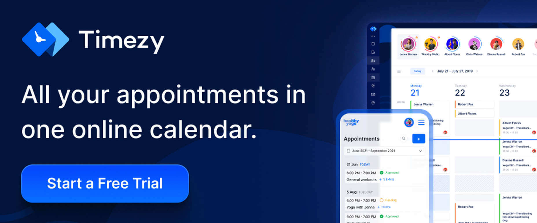
Timezy will help you create a booking environment that works best for your business by allowing clients and customers to book your services as easily as possible. You can then integrate Timezy into your website to streamline and speed up your booking operation.

  • Clients and customers can book appointments online 24/7;
  • They can receive real-time email notifications and reminders;
  • Timezy can be integrated with Zoom;
  • You can reorder steps on the booking form to fit your needs;
  • Timezy can be used to manage employee assignments and schedules, vacations, and special days.

If you lack a website of your own, Timezy will provide you with a modern web page you can customize to fit your brand for clients to book appointments at any time.

3. wpDataTables

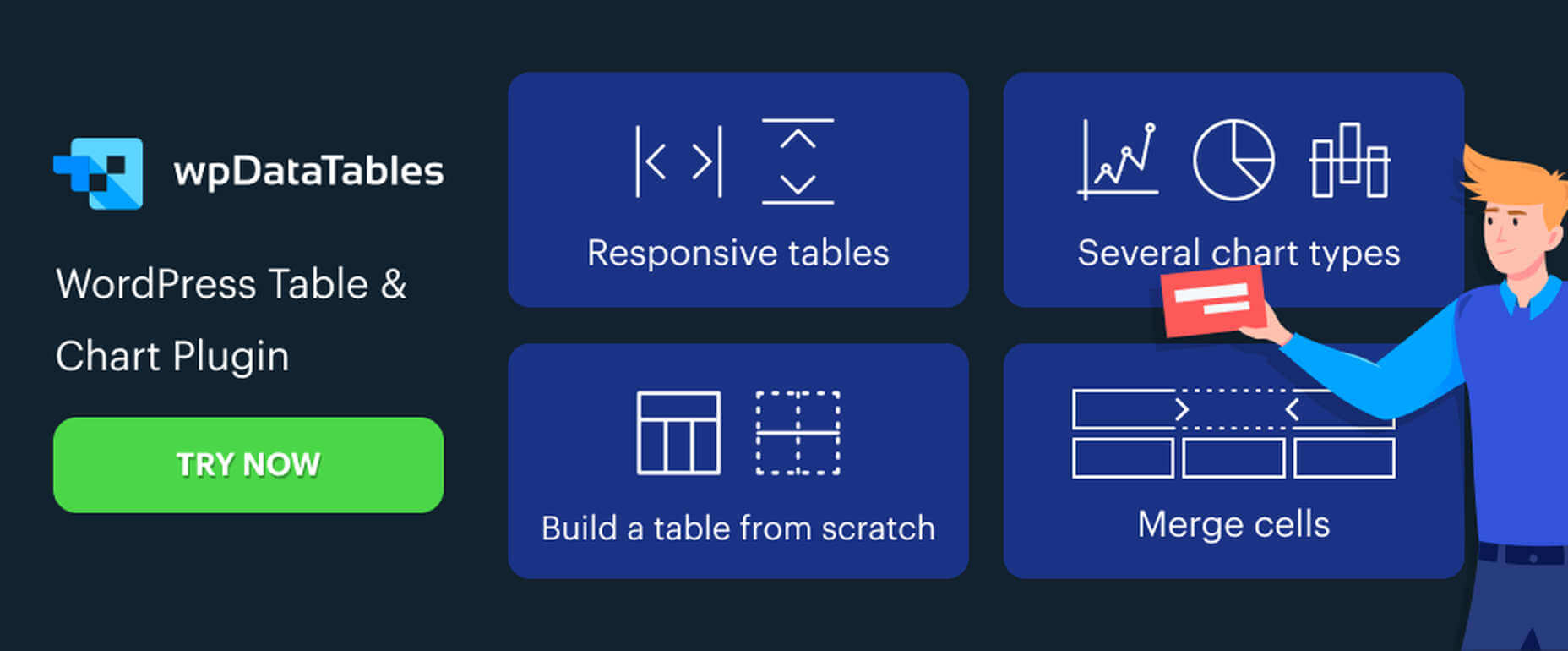
wpDataTables is the top-selling and most powerful WordPress table and chart-building plugin on the market. There are other good ones, but their table and chart-building capabilities quickly become inadequate as you go down the list of what wpDataTables can do that most others cannot.

wpDataTables key features and capabilities:

  • The ability to create interactive and responsive tables and charts;
  • The ability to create frontend editable and easily maintainable tables and charts;
  • The ability to rapidly process massive amounts of data that come in various formats and from various sources;
  • The ability to build tables and charts using real-time data.

You can also brighten up or improve a table or chart’s readability by highlighting or color-coding key information.

Click on the banner to find out more about what this plugin can do for you.

4. LayerSlider

LayerSlider is not for sliders only. This multipurpose WordPress tool can also be used to create eye-catching animations and engaging content.

  • Add a little spice to a stale website;
  • Create popups with stunning effects to interact better with visitors;
  • Avoid coding, since LayerSlider is drag and drop.

This popular design tool has been assisting web designers for nearly a decade and serves millions of active monthly users.

5. Amelia Booking Plugin

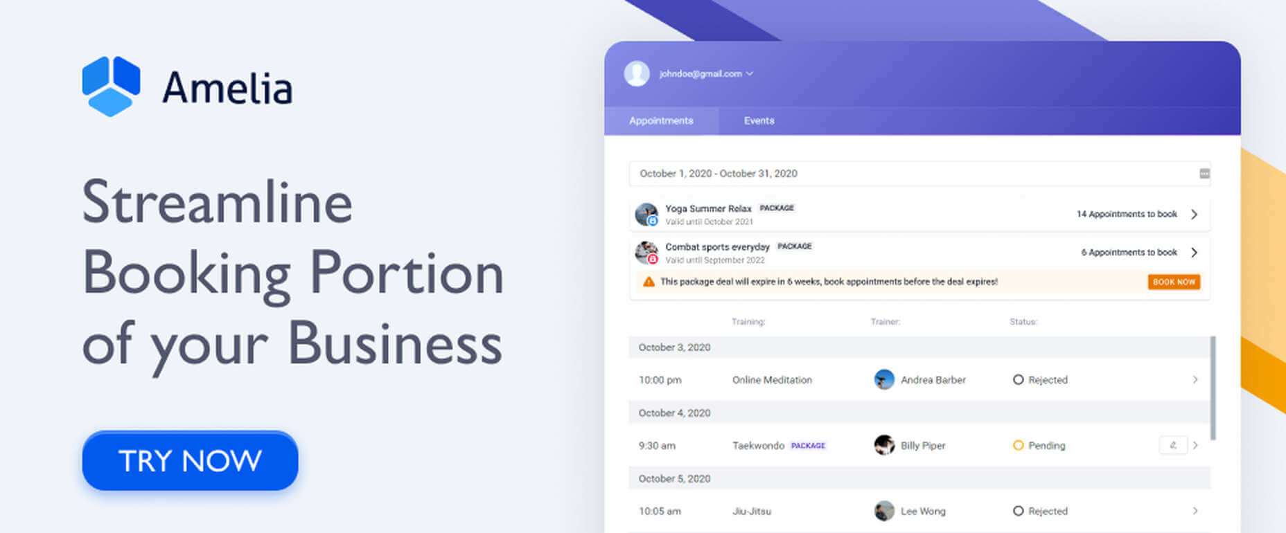
Amelia is a user-friendly WordPress booking plugin you can use to manage your appointments and events on a single platform.

  • Clients can instantly book, change, or cancel appointments online 24/7;
  • Employees and customers can manage meetings, appointments, and events from their own dashboards;
  • Amelia can be integrated with Zoom to conduct training or consultation sessions;
  • Amelia can also create packages of services with discounts and validity periods.

Amelia can service multiple business locations.

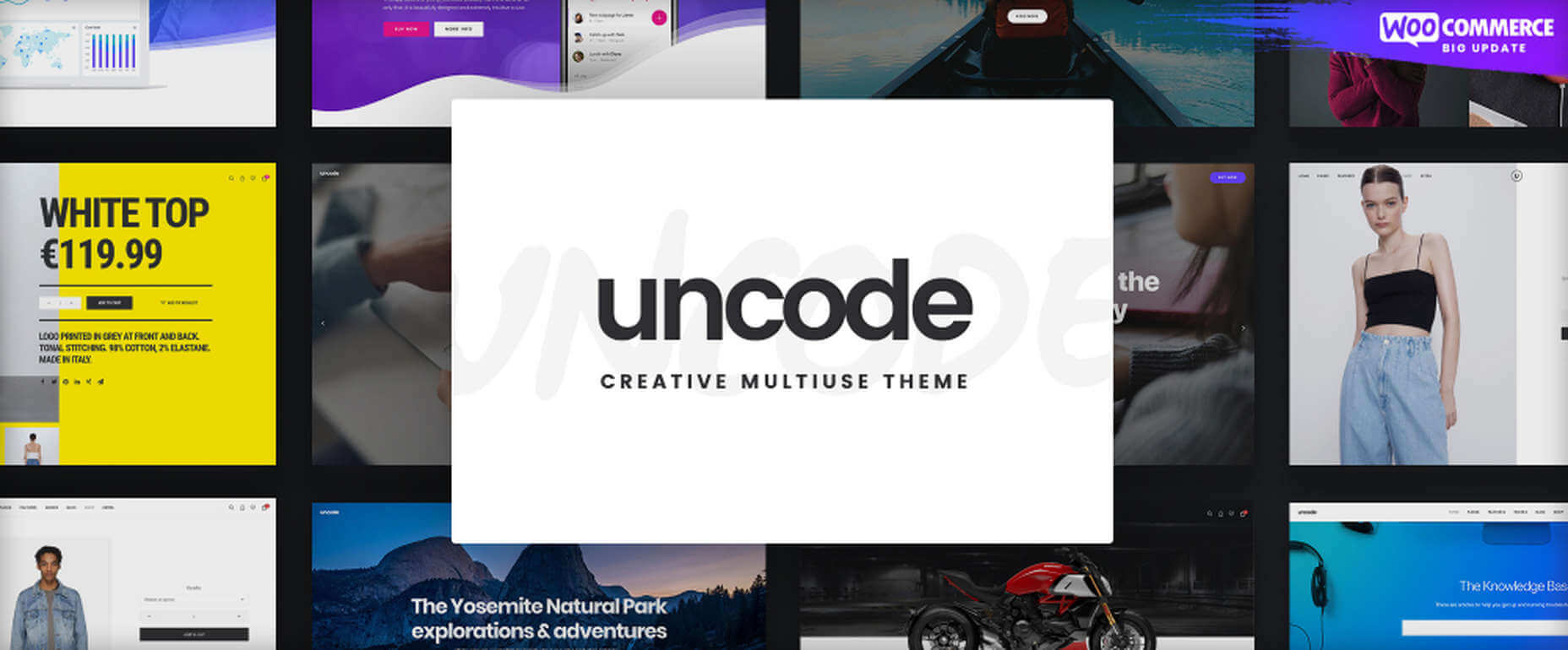
6. Uncode – Creative Multiuse & WooCommerce WordPress Theme

With its more than 80.000 sales to date, Uncode has become one of ThemeForest’s all-time best sellers.

  • You can create custom layouts and designs with Uncode’s Dynamic Content feature and use them as templates for category pages;
  • Uncode features the WooCommerce Product Builder, custom Checkout, Cart, My Account, Quick-View, etc.

Uncode has a comprehensive library of tutorial videos and a showcase of user-created websites that is well worth visiting.

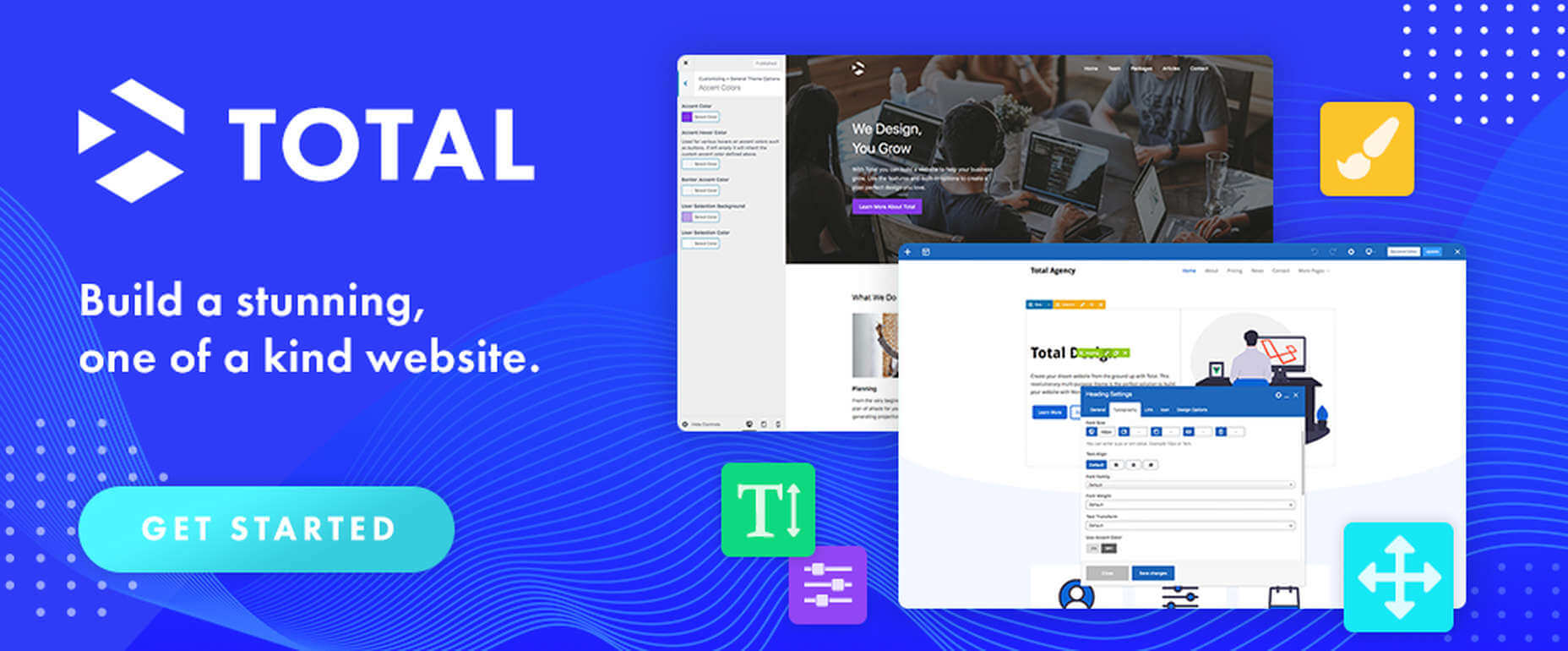
7. Total WordPress Theme

Created with perfection in mind, Total is nonetheless an extremely user-friendly WordPress theme.

  • This drag and drop website building tool’s extreme flexibility allows users to create any type or style of website;
  • The WPBakery page builder is accompanied by an assortment of custom modules;
  • Total is RTL and Translation-ready and easily integrates with WooCommerce;
  • Total is developer-friendly.

Click on the banner to learn more.

8. Dr. Link Check

Dr. Link Check saves you the inconvenience of having to periodically conduct a manual search of your site for broken links.

Dr. Link Check inspects for:

  • Broken links and improper URL formatting;
  • Blacklisted malicious content links;
  • Websites that do not contain any valuable content, including ad-only sites.

Dr. Link Check publishes downloadable daily, weekly, or monthly reports.

9. Mobirise Website Builder

Mobirise is not only a top tool for creating fast, responsive, user-friendly websites. It also has the advantages of being offline. Mobirise is also free.

Factors that contribute to Mobirise’s excellent performance include:

  • Google Amp and Bootstrap 4 frameworks;
  • Professionally-crafted website templates, popups, sliders, and eCommerce features;
  • Mobirise is all drag and drop.

Click on the banner to download your very own copy.

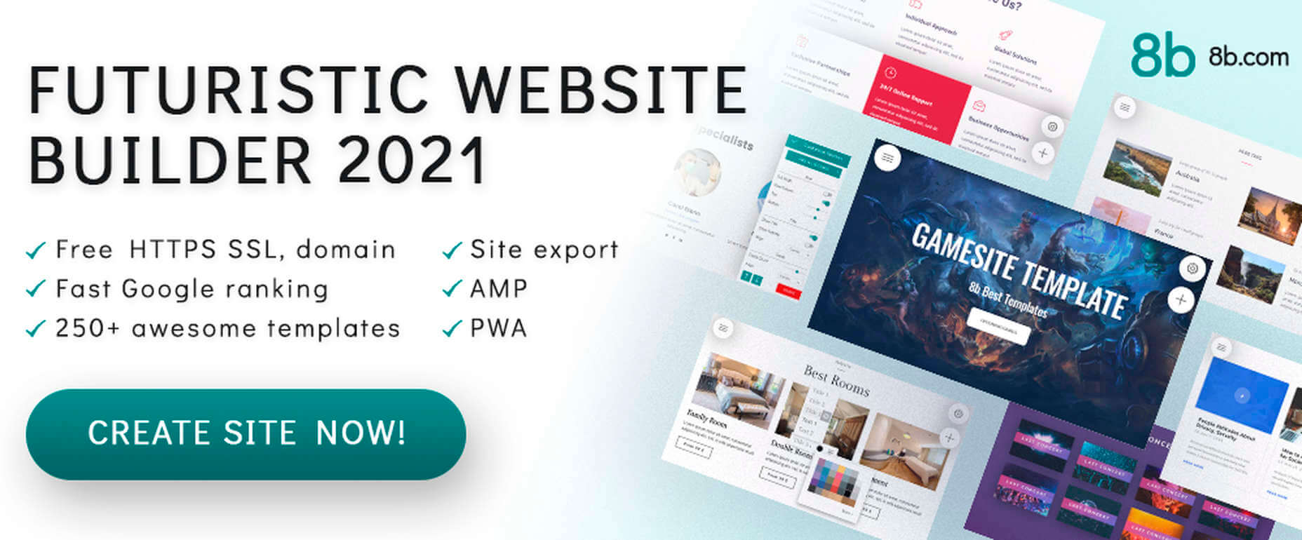
10. 8b Website Builder

When a website builder is fast, free, responsive, user friendly, and Google-friendly as well, it is certainly worthy of consideration.

The 8b website builder:

  • Allows you to create websites at home or on the go on any device;
  • Features templates and website sections designed to get projects off to a rapid start;
  • It gives your site a Google ranking with a couple of clicks;
  • It can be hosted wherever you want.

Download your copy now.

11. WHATFONTIS

WhatFontIs, with its database of more than 700K commercial and free fonts and font-finding AI functionality enables you to identify fonts from images you upload.

This top-of-the-line font-finding tool:

  • Identifies an uploaded font 90% of the time;
  • Gives answers in seconds;
  • Identifies cursive fonts (the letters in the image must be separated);
  • Displays 60+ similar fonts for each uploaded image.

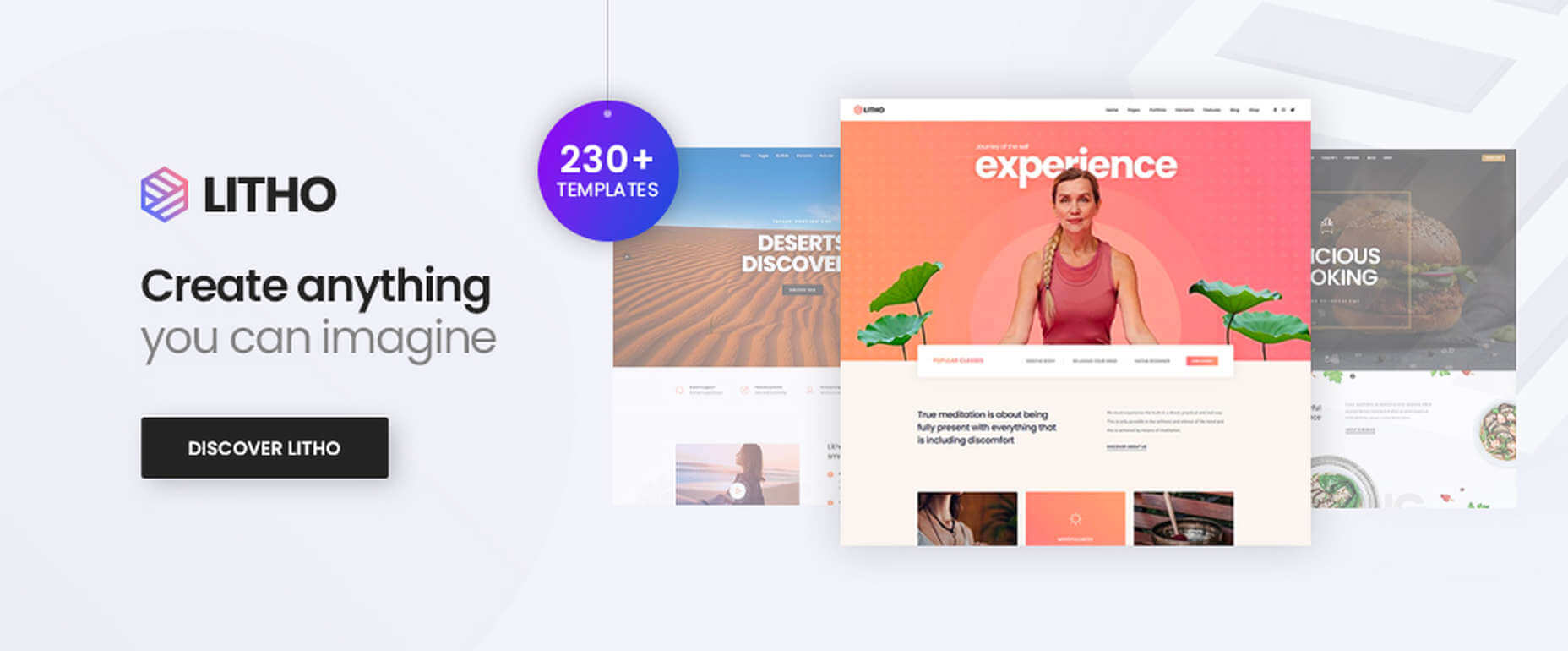
12. Litho – The Multipurpose HTML5 Template

Litho is a responsive multipurpose Bootstrap 4 HTML5 template that gives startups, design agencies, and other businesses an ideal website-building starting point.

Litho’s features include:

  • Cool selections of ready-made home pages, inner pages, and template blocks;
  • Page styles for portfolio, shop, and blogging sites;
  • Sliders, banners, forms, and other creative design elements.

Litho offers 5-star professional support.

13. XStore – The Most Customizable WooCommerce Theme Ever

XStore may be the best tool anyone could have at their fingertips when looking for a fast and easy way to create a high-performance eCommerce website –  for only $39.

XStore’s key features include:

  • 100+ customizable ready-to-go shops;
  • $500+ worth of premium WordPress plugins;
  • A Single Product builder and a Header builder.

14. Goodiewebsite

GOODIE’s web development platform assists clients who are eager to get a professionally-coded website quickly up and running.

GOODIE’s services focus on:

  • Web designers seeking a development partner;
  • Startups looking for ways to test their ideas and concepts;
  • Small businesses seeking an online presence or improvement of an existing one.

GOODIE’s specialties include 1-10 page, WordPress, and eCommerce websites.

15. Heroic Inbox

There are several excellent reasons for letting Heroic Inbox manage your business’s departmental email inboxes.

They include:

  • Encouraging efficient staff collaboration on email assignments and responses;
  • Helping staff members accomplish and maintain Inbox Zero status;
  • Tracking key team performance metrics.

Two key Heroic Inbox features are its smart workflows and a fast and friendly UI.

Every web designer owns a toolbox of tips and tricks they use in their website building projects. Even when a toolbox is superbly stocked, it is always challenging to keep it up to date. Doing so requires maintaining a knowledge of the latest and greatest web design resources and tools—some of which you may need to meet ever-changing industry demands.

This article features the top tools & resources for designers and agencies for 2021. Choosing one or more of them could not only help you stay on top of your game but could even make your day.

Source

The post 15 Useful Tools & Resources Worth Checking Out first appeared on Webdesigner Depot.

Categories: Designing, Others Tags:

This Web Site is a Tech Talk

March 31st, 2021 No comments

This literal tech talk (YouTube video embedded in there) by Zach Leatherman is a good time. The talk is sprinkled with fun trickery, so I’m just taking notes on some on it here:

  • I have no idea how he pulled off the “bang on the keyboard and get perfect code” thing, but it reminds me of Jake Albaugh’s “Self-Coding” Pens.
  • Adding contenteditable on the makes the whole page editable! Did you know document.designMode = "on" does the same thing in JavaScript? (More on making DevTools a design tool.)
  • There’s a short bit where the typing happens in two elements at once. CodePen supports that! Just CMD + click into the editor where you want another one to be, or make it part of a snippet.
  • System fonts are nice. I like how easy they are to invoke with system-ui. Firefox doesn’t seem to support that, so I guess we need the whole stack. I wonder how close we are to just needing that one value. Iain Bean has more on this in his “System fonts don’t have to be ugly” post.
  • box-decoration-break is a nice little touch for “inline headers.” The use of @supports here makes great sense as it’s not just that one property in use, but several. So, in a non-support situation, you’d want to apply none of it.
  • Slapping a in some
  • elements to compare rendering strategies is a neat way to get some perfect UI without even a line of CSS.
  • Making 11ty do syntax highlighting during the build process is very cool. I still use Prism.js on this site, which does a great job, but I do it client-side. I really like how this 11ty plugin is still Prism under the hood, but just happens when the page is built. I’d love to get this working here on this WordPress site, which I bet is possible since our code block in the block editor is a custom JavaScript build anyway.
  • In the first bullet point, I wrote that I had no idea how Zach did the “bang on the keyboard and get perfect code” but if you watch the bit about syntax highlighting and keep going, Zach shows it off and it’s a little mind spinning.

I think Zach’s overall point is strong: we should question any Single-Page-App-By-Default website building strategy.

As a spoonful of baby bear porridge here, I’d say I’m a fan of both static site generators and JavaScript frameworks. JavaScript frameworks offer some things that are flat-out good ideas for building digital products: components and state. Sometimes that means that client-side rendering is actually helpful for the interactivity and overall feel of the site, but it’s unfortunate when client-side rendering comes along for the ride by default instead of as a considered choice.

Direct Link to ArticlePermalink


The post This Web Site is a Tech Talk appeared first on CSS-Tricks.

You can support CSS-Tricks by being an MVP Supporter.

Categories: Designing, Others Tags:

5 Dos and Don’ts of Email Marketing in 2021

March 31st, 2021 No comments

Last year, Cyber Monday sales reached over $10 billion in the U.S alone and in 2021, it’s predicted that the number of online shoppers will increase by 1.32% to 230 million.

There’s no doubt about it – eCommerce is growing faster than ever. And email marketing is a vital aspect of that growth. So if you’re looking to expand your eCommerce business or even just improve your current email marketing program, here are some tips to help you create truly impactful email marketing campaigns in 2021.

What to do

DO – Use human-centric language

In 2020, we realized the true power of humanity. If you want your customers to form a real connection with your brand and keep returning to your site, you should ensure that all your email marketing campaigns have a human touch. Use simple, relatable language, write with a friendly tone and make your message absolutely clear. Unless it’s for an incredibly specific audience, your campaigns should be free of jargon. And if the campaign is to communicate a discount or special offer, the mechanics should be incredibly easy to follow.

DO – Create holiday promotions

The way we celebrate special occasions and send gifts has changed in the past year. Now, E-Gift cards and online promotions are a wonderful, safe way to help your customers enjoy the holidays and increase your ROI. Choose days that are appropriate for your specific brand or service and begin planning your campaigns as far in advance as possible. It’s also worth reviewing what your competitors have done in previous years to help you create an offer that will really stand out.

DO – Invest in a good ESP

With more consumers turning to online shopping than ever before, it’s imperative that you have effective cart abandonment and browse abandonment email flows in place for customers who leave your site before purchasing.

In a study conducted by Barilliance, it was found that sending a cart abandonment email within 24 hours could help recover up 20.3% of sales. 

And, according to SalesCycle, cart abandonment emails have open rates of up to 46.6%, with 35% of those who opened the email ultimately making a purchase.

A strong, reliable ESP like Klaviyo, Bronto, or MailChimp can help you create effective flows that are automatically triggered. Some, like Klaviyo, will also allow you to filter these flows using parameters like products browsed, etc.

DO optimize your emails for mobile

This sounds like such a simple thing and yet, so many email marketing campaigns are still not optimized for mobile use.

However, with over 46% of all emails being opened on mobile (and possibly more at the time of writing), this is crucial.

Here are some simple ways to create mobile friendly emails:

  • Use mobile-ready templates.
  • Write an attention-grabbing pre-header and a short, impactful subject line.
  • Make CTA buttons slighter bigger than they would be on a desktop template.
  • Place your CTA as close to the hero title as possible.

Another thing you might consider is using SMS marketing in conjunction with your email program. ESPs like Klaviyo offer this service and with an average open rate of 82%, it’s definitely worth adding to your marketing strategy.

DO hire an email marketing agency

While it’s true that email marketing boasts an incredibly impressive ROI, you’ll only enjoy those returns if you’re sending targeted, beautifully designed, well-timed email flows and campaigns to the right audiences. This is where the email marketing professionals come in.

Not only will they help you plan, craft, and roll out effective email campaigns, they will also continuously report on the performance of those campaigns, adjusting where needed to help you generate the kind of revenue you’re looking for.

Not only that, the right email marketing team will help you build your all-important subscriber list and do all the legwork when it comes to segmenting that list. Of course, you will pay a fee for this, but the results (and the time and effort it will save you) are completely worth it in the long term.

What not to do

DON’T annoy your audience

According to surveys like this one, one of the top reasons customers unsubscribe from marketing emails is simply because they’re receiving too many of them. In fact, the frequency of your communication is just as important as your products and services. So, how often should you email your list?

The consensus, based on various surveys and the experience of many email experts, is twice a month. However, if your business has high turnover, like a fashion brand, for example, you might want to send 3 or 4 monthly campaigns, featuring new stock and discounted items. The best way to find the right number of sends is to see what your audience responds to best – start with 2 sends a month and watch your unsubscribe rates. If they remain low, you can add additional campaigns if needed.

DON’T send the same thing to everyone.

A huge factor in the success of your email marketing program is how personalized your emails are. This doesn’t just mean adding the recipient’s name to the subject line and showing them a reel of recommended products, it also includes sending relevant content to the right people.

You do this by segmenting your email list.

Using list segmentation allows you to create different ‘groups’ within your subscriber base for more targeted sending. You can begin with purchasers and non-purchasers and, depending on your ESP, funnel down into even more specific categories like location, previous purchases, interests, etc.

The more you know about your audience, the more valuable your content will be to them.

DON’T send without a strategy

Before you even THINK of creating an email campaign, you need a strategy – a good one. You need to determine:

What your goals are

Who you’re talking to

How much you’d like to spend on your email marketing

How you can use email marketing to stay relevant to your audience.

Your strategy should answer all these questions. Essentially, it’s a roadmap to your future success. 

DON’T forget the legalities

Over the last few years, new privacy laws were introduced to help protect consumer’s personal data. As a marketer, it’s required that you comply with these laws. Both CASL and GDPR require a customer’s express consent before you can send them any marketing communication, while GDPR states that a double opt-in is necessary in order for you to send a customer any marketing campaigns.

You can get your customer’s consent using simple email flows that are automatically sent to any new subscribers through your ESP. 

It’s also important that, according to the CAN-SPAM act, your customers can easily opt-out of any communication. This means clear communication around opting out and unsubscribe buttons that are clearly visible in all emails.

Wrapping Up

With eCommerce on the rise, it’s more important than ever to up your email marketing game. So start with a clear goal, a great strategy plus a good ESP and you’ll be on your way to enjoying the kind of ROI you’ve always wanted.


Photo by Solen Feyissa on Unsplash

Categories: Others Tags:

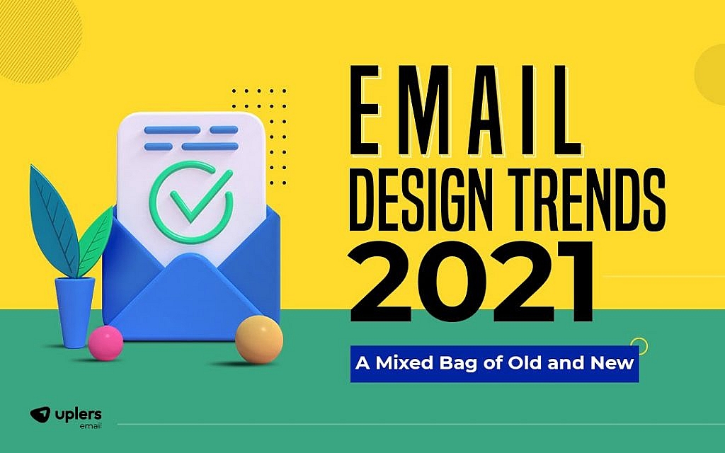
Email Design Trends 2021: A Mixed Bag of Old and New – [Infographic]

March 31st, 2021 No comments

The year 2020 drove us all to the edge, pushed us over in some moments, stretched us too thin in others.

The ripples of this disruptive pandemic have been felt by businesses across multiple industry verticals. A McKinsey report suggests that the worst-hit sectors may take up to 5 years to bounce back in a muted recovery scenario. Besides, consumer behavior and the way they interact with digital content has also changed drastically.

Your emails have to be in line with the realities of the time for them to retain their effectiveness. The choice of design plays a crucial role in making that happen. Let’s take a look at some of the top design trends that will govern the look and feel of your emails for the next year.

5 Top Email Design Trends 2021

Will the email design in 2021 be reflective of the disruption and disharmony of the present times? Or will they seek to counter the chaos with a calming, restful appeal? Could we possibly see a mix of both these design approaches depending on the context? These 5 top email design trends for 2021 have the answer:

1. Minimalism

Emails in 2021 will remain true to the ‘less is more’ adage with muted colors and monochrome layouts being tapped into generously to make the messaging more impactful. The shift from bright and bold colors to softer hues as well as monochromatic designs created by using different shades from a single color palette is emerging as a popular choice.

Acknowledging the ability of colors to influence a person psychologically, these color patterns are likely to be used to create a sense of harmony and serve as a unifying element. Besides, these are perceived to have a calming effect on the reader, promoting ease of reading and a higher likelihood of engaging with the content.

2. Illustrations

Illustrations, which emerged as the top design trend for 2019, will continue to be a preferred visual element even in 2021, albeit with a twist. The next year we could see illustrations being elevated through other elements such as animations and texture effects. Combining illustrations with GIFs or moving animation goes a long way in making your email design more engaging, driving up the likelihood of conversions.

Similarly, using textured illustrations for 2D images is being looked at as a smart way to revamp stock images and heighten their visual impact on the reader’s mind. The mix of contrasts, shades, gradients can add more depth to email design and enhance its appeal.

3. Dark Mode On

Dark mode has been a hotly discussed subject ever since the first dark mode interface was rolled out in 2015. With online education and work-from-home culture considerably driving up screen time, dark mode is something that email marketers will have to rely on heavily to get their message across to their target audience.

With this light-on-dark already popular used in different forms of gadget use, this design element gives email marketers the advantage of tapping into something familiar. Since the reader’s eye is already accustomed to it, they can navigate through the content of the email quickly and more seamlessly.

4. Bold Fonts

The use of big, bold typography comes with the territory when you’re working with a light-on-dark design approach. As one trends, the other can’t be far behind. The use of bold fonts is a smart approach to making your content the centerpiece of your emails. With a bold headline staring the reader as soon as they click on an email, the key takeaway becomes clear in a matter of seconds. Once you have captured the reader’s attention within the first few seconds, the likelihood of them engaging with your message naturally becomes higher.

5. Visual Chaos

The email design trends for 2021 are going to be more than just about clean, minimalistic designs. On the other end of the spectrum, emails with a sense of visual chaos or a hectic vibe created with stills are also predicted to gain traction. This out there yet tangible imagery can be created impactfully through 3D images and phantasmagoric collages – created by using bits of different images to create one.

To Wrap Up

Email marketing has been the most potent digital channel for promotions for a long time. In the current scenario, its importance in helping businesses bounce back by making target users engage with them is more than ever. A crisp copy alone cannot achieve that. Using the right design elements is equally important.Want to know what other trends and design elements you can leverage to make your email more effective in the coming year? Check out this in-depth infographic by Email Uplers – 11 Email Design Trends That Will Reign Supreme in 2021.

Source: 11 Email Design Trends that will reign supreme in 2021

Categories: Others Tags:

11 Pre and Post Mobile App Launch Pitfalls to Avoid

March 31st, 2021 No comments

The market for mobile apps is on an upward trajectory that shows no signs of plateauing out any time soon, making it a very exciting space to dabble in.

There is huge scope for mobile app development and retail. The market was already valued at US$ 106.27 billion in 2018, according to data released by Allied Market Research, and the future is even brighter. The market – fairly pandemic-proof – is expected to grow at a compounded annual growth rate of 18.4% to reach US$ 407.31 billion in the next five years, by 2026

As a result, to be successful, app marketers must create and adopt effective strategies that can help their apps stand out in the crowd. It is not as easy as developing an app and putting it on the market – just like any product, apps, too, face tough competition in the market. Thus, mobile app developers need to focus on the USP of their apps to make them stand out in the crowd and carve out a niche for themselves among app users.

How can you ensure that your mobile app takes the crowning glory? 

It is not uncommon to be so excited about the usefulness of your app that you forget about paving the way for your mobile app’s launch. But you need to keep your wits about you – if you want your mobile app launch to be a successful one, make sure to avoid the following pitfalls! 

Pre-launch pitfalls:

1. Neglecting market research

If your app is the first of its kind, research your target audience and any lacuna that they are facing, that might get them to use your app. Similarly, perhaps research other apps that your target group might utilize and observe their comments on such apps – what do they appreciate and what do they complain about? 

If your app joins several others of a similar nature, be sure to jot down a list of features offered up by the competing apps. Use these apps to get a feel for their advantages and disadvantages. Again observe user comments and take stock of what to replicate and what to avoid – this is a great advantage of not being an early mover. Learn from the mistakes of others. 

2. Skipping the beta test phase

All the biggest tech brands out there conduct beta testing and it should be no different for mobile apps. You can get your beta testing underway as soon as your app is nearly ready for launch. Make sure that you keep time on hand for any changes that might need to be affected as a result of beta test feedback. A simple google search will give you a whole lot of beta testing websites to choose from. 

3. Not involving the marketing team in the initial stages

Your marketing team needs to know all the intricacies of your app to effectively make it the preferred choice for your target audience. Bring them in early on and allow them to be part of the process so that they have a handle on everything that your app stands for. This helps them figure out keywords that will get your app picked up. 

4. Not having an app release date

The date might go for a toss as delays often take place but it is important to have one in mind and work backward also so that you can create excitement through influencers, tech bloggers, and the press. 

Post-launch pitfalls:

5. Letting users forget you

You can use paid marketing channels to obtain users but must engage your users and keep ensuring that the app stays relevant to retain these users in the long run. 

6. Neglecting measurement and monitoring of traffic

As long as your app is making money, things are great, right? Right, but what about tomorrow? You need to keep track of how many active users you have on a daily weekly and monthly basis; you need to know when and where you lose users and you need to know how often your app is used by them. 

7. Not utilizing the app’s update description space

Just like a blank Instagram profile or Tinder profile looks shifty, an app with no description confuses and scares away potential subscribers. And also, why would you forgo a free marketing opportunity?

8. Insufficient focus on customer support

The angriest reviews are usually seen from app users who have been unable to get customer support. Avoid landing yourself in this soup by optimizing your customer support services before your mobile app’s launch. 

9. Stressing too much on push notifications

Most people will not mind a push notification now and then but making it an everyday affair is a big no-no. Here are some clear mistakes to steer clear of when it comes to push notifications:

  • Allow them to be turned off. EASILY! 
  • Do not make push notifications a daily occurrence.
  • Tailor push notifications according to time zone.

10. Failing to customize app review blitz emails 

App reviewers get tonnes of emails from app developers daily. Personalize your emails, do not spam reviewers, include a link to the app at the app store, including a video of your app, and also include your press kit. This lowers your chance of being sent to the reviewer’s junk folder immediately. 

11. Not being clear on software-related agreements 

Remember to ensure that your Service Level Agreement and Maintenance Agreement points are met during software maintenance. Non-adherence is a pitfall to be avoided at all costs. One way to ensure app quality levels and optimum service are to ensure that your SLA covers all the core components:

  • Goals and objectives.
  • Customer service type (for example, will it be telephonic assistance?).
  • Response time for customer queries, complaints, and issues.
  • SOPs related to customer requirements including any payment at predetermined intervals, and timelines, and specifications regarding the expiry of the app developer’s service or app updates.
  • Guidelines with regards to how any requirements with regards to changes in the service will be communicated and handled.

Be sure to keep a check that all of the above are being adhered to when the app is live. 

Meanwhile, your maintenance agreement should cover all points related to how the quality of service will be upheld. Mention clear deliverables on how the app will be maintained to keep pace with evolving trends.

Conclusion

To conclude, it is important to keep an eye on how your app is performing – in terms of traffic and usage – on a regular basis. Maintain historic data and be sure to analyze trends. Any decline in numbers should be taken very seriously and addressed – have your support team work round the clock to fix any errors. Also, appearances are everything. Keep an eye out for trends in terms of making your app look up to date. 

The key to avoiding these 11 pitfalls is the same as it is with any product – impeccable planning, a thorough understanding of the target audience, and of course, attention to detail.


Photo by Kelly Sikkema on Unsplash

Categories: Others Tags:

How to Build an Engaged Online Community: 7 Tips

March 31st, 2021 No comments

A community is one of the most valuable features you can offer in today’s digital environment. 

Whether you’re offering online courses or webinars, or have a SaaS product, your clients are more likely to build stronger connections with your brand if they feel like part of an exclusive group.

Online communities amplify the engagement of your students and customers while encouraging them to feel more invested in your online experience. 

These environments allow people to come together and discuss your content, ask questions, and even deal with issues they’re having too.

With an online community, you can build brand ambassadors, earn valuable feedback from your audience, increase your revenue, and expand your reach.

The question is, how do you build the right community environment?

1. Create an Awesome Onboarding Experience

The right onboarding experience makes a huge difference to your community experience. Good onboarding shows your customers how to use the features of your community platform, and what kind of benefits they can unlock with participation. 

In the initial weeks of someone signing up for your community, make sure you offer all the information they need.

You can start by welcoming members with an email message that explains all the features they now have access to.

Videos are great for providing guided tours of the community and introducing customers to various activities. You can also use this time to get members up to speed with the rules and guidelines of your community space.

Encourage members to introduce themselves with an “ice breaker” question that asks them to post on your forum and start making connections. 

It’s also worth having a follow-up campaign in place so you can check in on each member and keep reminding them of the valuable features you have to offer.

2. Share Valuable Content

Content is the heart of a successful online community.

When someone signs up for your online community, they’re doing so because they want to get access to exclusive content and benefits that are only available to your inner tribe. It’s up to you to ensure your customers don’t end up with buyer’s remorse by providing them with the content they expect.

Consider what kind of content is going to be most useful to your members in this community environment. 

Could you provide extra guides and PDF downloads or even online courses to your members, so that they can more easily understand complex topics?

If you’re a SaaS brand, you can offer video tutorials that help them to get the most out of some more appealing features. Other options for valuable content can include everything from live events, Q&A sessions with you and your team, and more. 

The key is finding ways to engage your audience through the kind of content they crave. Simply speaking, create content that educates, inspires, and entertains.

3. Choose the Right Community Platform

Finding the right platform to support your business is a crucial consideration for any business owner. Just as you need a reliable tool for email marketing, course creation, and social media relationships, you need the right platform for your community.

There are plenty of online community platforms out there. The best thing you can do is do your research and compare options to find the solution that offers the tech and features you need.

For instance, if you’re keen to engage your community through regular live videos with real-time question and answer sessions, you’ll need a platform with live streaming.

If you can’t find the right service with live streaming built-in, make sure your system integrates with something like Zoom.

There are various essential features that should be present on all community platforms too. 

For instance, you should have the option to set up private community spaces, track your clients through a member directory, and get in touch via direct messaging. Consider the kind of community you’re building and find a platform that supports your vision.

4. Reward and Recognize Community Members

The best online communities are the ones that make their members constantly feel special and appreciated. Rewarding and recognizing your members is your way of confirming they made the right choice by subscribing with you.

How you choose to celebrate your members is up to you. Some business owners choose a “member of the month” based on the engagement and response levels of each of their subscribers. 

Alternatively, you could consider giving weekly shout-outs to members who are making a difference. You might even decide to showcase your “top member” on social media or ask them to join you in a video from time to time.

A great way to encourage some positive competition among your fans is to gamify the community with a leader board and a points system. This strategy could involve awarding points whenever someone answers a question or helps someone else in the community. 

Eventually, top performers might be able to win badges, discounts on future courses, or even positions like “community admin”.

5. Notify Your Members

No matter how invested your followers are in your online community, sometimes life will get on top of them. We’re living in a fast-paced world right now and there will be times when your members need a little reminder to get them back onto your website and engaging with other people.

The best way to keep your community “top of mind” with your members is to send regular notifications via email. 

You should have an automated system in place that automatically lets members know when a topic they’re following gets an update, or when someone responds to a comment they made.

You should also have regular weekly newsletters to update your people. For instance, you could send out a summary once a week that highlights some of the biggest things that have happened over the last 7 days, who your top-performing members are right now, and what people have accomplished recently.

To ensure that you don’t annoy your customers with your messages, give them a preferences center in their account where they can customize which notifications they get. 

You can even create a mobile app for your community so they can get push notifications sent straight to their phone.

6. Hire a Community Manager

When you’re busy creating and optimizing a great piece of software, designing content for your online course, or hosting webinars, it’s hard to find time for much else. 

Running a business will take up much of your schedule, meaning that you can only dedicate small amounts of focus to your community. Unfortunately, to thrive, a community needs constant attention.

If you’re serious about building an engaging environment for your audience, then you might need to invest in some extra help. A dedicated community manager is someone passionate about your cause, who can help out with things like responding to questions and coming up with activities for your subscribers to get involved with.

Your community manager can oversee moderation and ensure that the people in your group follow the rules for appropriate behavior. 

He/she can also offer creative ideas on how you can shake things up in your community from time to time. For instance, he/she could run competitions, or set up polls to find out more about what your people want from you.

With a community manager on-hand to keep your people happy, you have more time and focus to dedicate to other parts of growing your business.

7. Analyze and Improve

A great community doesn’t just come to life overnight. Like a thriving eCommerce business or an engaging website, your community will need regular time, attention, and nurturing. 

The only way to ensure that you’re consistently offering your followers what they want from you is to pay attention to your reports and analytics.

Most platform software solutions will come with analytics tools that allow you to track important metrics. 

For instance, you can measure the number of people contributing to your community on any given day. You could also look at your ratio of new customers to returning community members and decide whether you need help boosting retention.

Analyzing the statistics available for your community will also help you to identify which of your content and activities are driving the best response. This should ensure that you can invest your budget into the right strategies moving forward.

Finally, you can also boost your chances of ongoing improvement by collecting feedback from community members. Asking your people what they like most about your environment, and what they would like to change could help you to maintain memberships for longer.

Summary

An online community is a valuable investment for any business leader hoping to build a successful brand online. With an engaged community, you can keep your customers returning for more, year after year, developing a strong tribe of dedicated followers. 

Your online community can even pave the way for things like brand advocacy and loyalty schemes so you can attract future clients.

Of course, just like any investment, it’s important to go into your community development with a strategy in mind. Go out there and engage your tribe.


Photo by John Schnobrich on Unsplash

Categories: Others Tags:

ShopTalk Patreon

March 30th, 2021 No comments

Dave and I launched a Patreon for ShopTalk Show. You get two completely priceless things for backing us:

  1. That great feeling you’re supporting the show, which has costs like editing, transcribing, developing, and hosting.
  2. Access to our backer-only Discord.

I think the Discord might be my favorite thing we ever done. Sorry if I’m stoking the FOMO there, but just saying, it’s a good gang. My personal intention is to be helpful in there, but everyone else is so helpful themselves that I’ve actually learned more than I’ve shared.

Direct Link to ArticlePermalink


The post ShopTalk Patreon appeared first on CSS-Tricks.

You can support CSS-Tricks by being an MVP Supporter.

Categories: Designing, Others Tags:

You want margin-inline-start

March 30th, 2021 No comments

David Bushell in ”Changing CSS for Good“:

I’m dropping “left“ and “right“ from my lexicon. The new CSS normal is all about Logical Properties and Values […] It can be as easy as replacing left/right with inline start/end. Top/bottom with block start/end. Normal inline flow, Flexbox, and Grid layouts reverse themselves automatically.

I figured it made sense as a “You want…” style post. Geoff has been documenting these properties nicely in the Almanac.


The post You want margin-inline-start appeared first on CSS-Tricks.

You can support CSS-Tricks by being an MVP Supporter.

Categories: Designing, Others Tags: