The Case for Building More Dynamic Landing Pages
According to Klipfolio research, users spend on average 52 seconds on a webpage. With minimal time to impress, you must consider how to best help your consumers understand what your product or service does and why they should care about it. It’s not enough to describe your value – great landing pages will go the extra step and show this as well.
One powerful method to do this is by providing a real-life, responsive teaser to show what your product looks like, how it works, and what value it can create. This means incorporating specific elements from your functional, responsive product into the landing page. However, this should be a “mini-product experience” that users can experiment with rather than a freemium version of your product. If done well, the dynamics will pay off in captivating users for longer, increasing their consideration time, and driving your conversion rate as a result.
Building more dynamic landing pages through product experience can change the game completely. These are some strategies to consider.
“Ask & Alter” for Greater Personalization
“Ask & alter” is valuable for services with multiple potential value propositions for different audiences. The simple fix here is to have a pop-up box that asks the visitor which profile they are (and alternatively a few more questions). You can then trigger the page to alter according to their input, ensuring a more customized experience and increasing their chance of conversion. By doing this, you’re taking the onus off the consumer to figure out what’s relevant to them, eliminating any potential confusion.
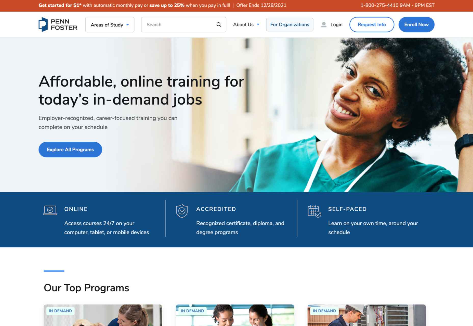
A great example of this is the Penn Foster University website. It has a developed UX optimized for organizations, high school degree seekers, and upskillers alike. Each has an entirely different, carefully designed interface, matching the diverse needs of visitors. For example, while a high schooler might enjoy browsing the career pathways section, an upskiller is likely to search specific career fields. Such distinction is key to consider, as intentional and strategic user experience can raise conversion rates by as much as 400%.
Real-Time Demos to Hook the User
Real-time demos mean that you take a full instance or version of your product that is clickable and responsive and embed it into the flow of your landing page. This way, the user can get a quick “test drive,” and you easily communicate the value that would otherwise be abstract or difficult for the user to imagine or even visualize. Additionally, users always want to know how a product could personally impact them, and live demos offer them a hands-on experience.
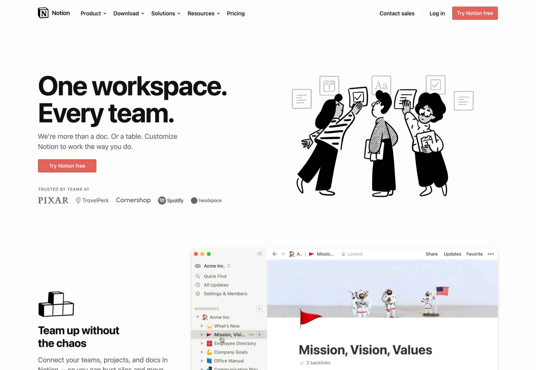
Companies incorporating live demos have proven the power to engage a user’s curiosity and create a strong link with their products or services. Notion, for instance, uses a “templates” section with pre-built pages that can be easily opened and browsed through without needing to register or download anything. This product’s beauty lies in the simplicity and efficiency it offers, rather than overwhelming a user with a self-promotional copy. Even a simple live demo like that can help build considerable trust in the product and encourage users to make a high-value purchase.
Calculators Provide Value
Despite their simplicity, calculators can increase audience engagement by 38%. Their main benefit is undoubtedly providing a personalized solution to users’ actual needs and expectations. ROI and savings calculators can be particularly interesting, especially when they speak of value that isn’t easy to calculate or when the user wouldn’t intuitively know that there are savings to be had by using a particular product.
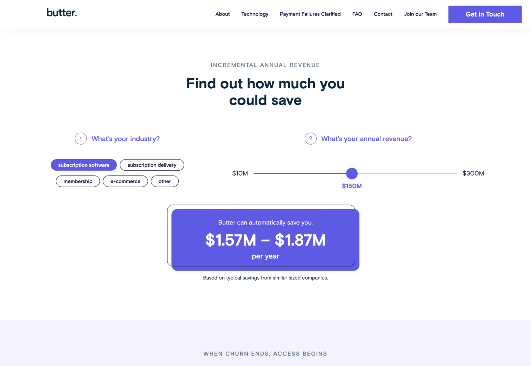
Butter Payment, uses this tool very effectively. As its customers necessarily don’t know they have an involuntary churn problem that is worth solving for, it uses a calculator on its site to demonstrate the problem and enumerate the value-add to potential customers.
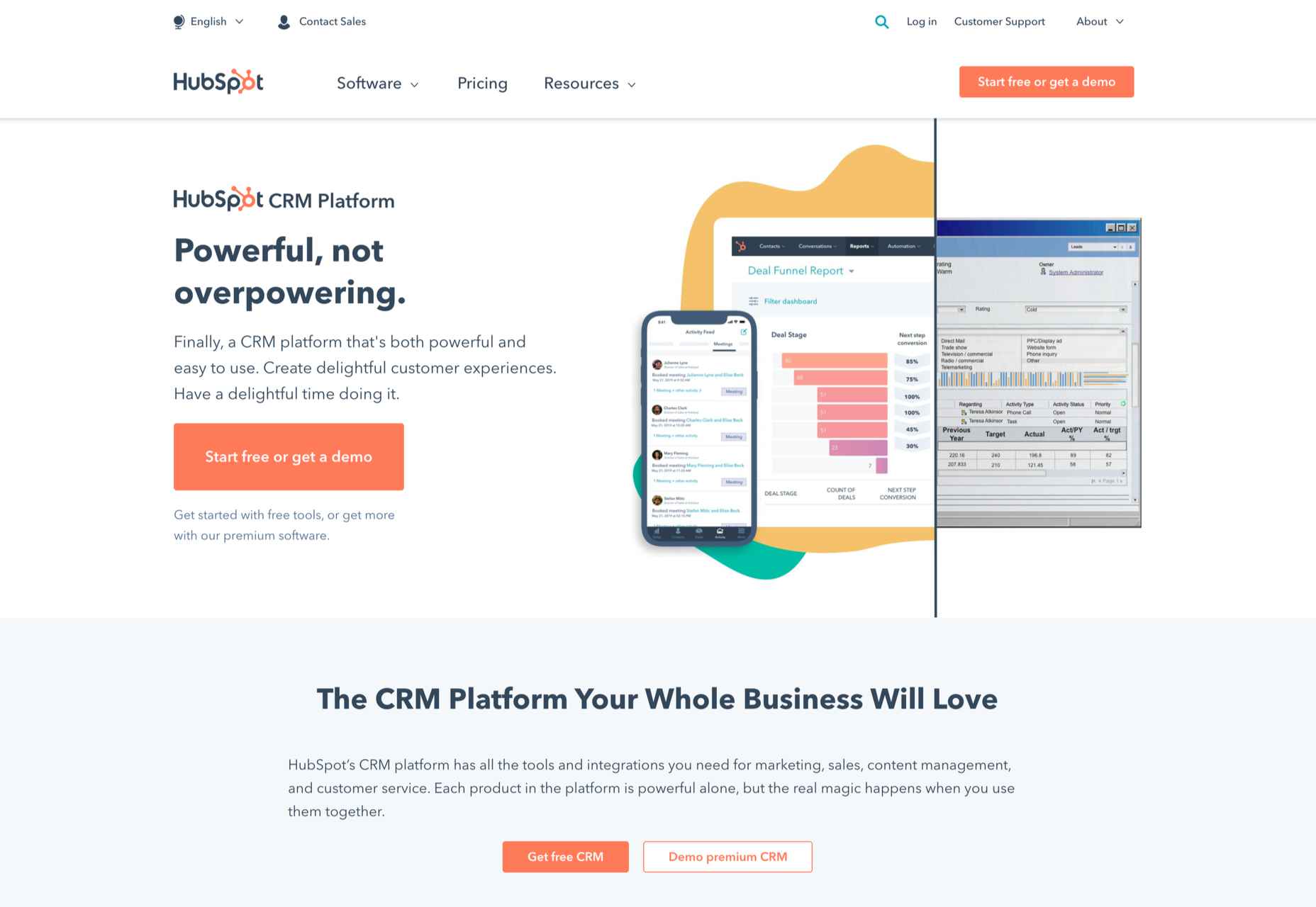
HubSpot, too, has mastered the tool: Its Ad ROI Calculator visually presents the results that its software can bring. Then, HubSpot’s interactive website grader directs the user towards its comprehensive marketing offerings. It is this graphic visualization that companies must adopt to communicate real value.
The Charm of Experiential Interaction
Interactive design is said to drive the responsiveness and real-time interaction of a site through the roof. By incorporating an interactive or experiential page, even if it’s not directly on your landing page, you can craft a unique experience aimed at leaving a lasting, meaningful impression of your product or service.
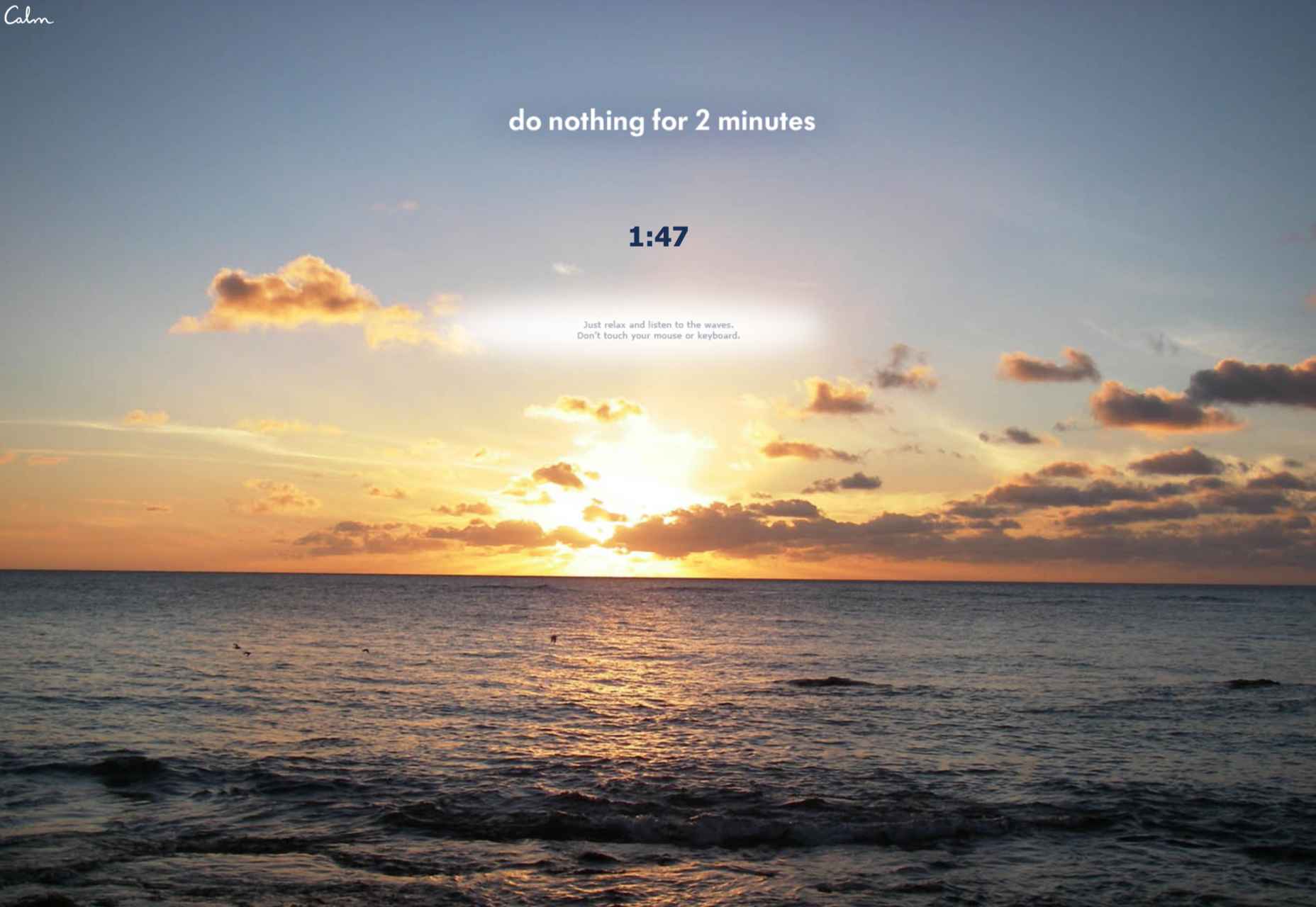
Calm’s “Do Nothing for two minutes” is a simple yet effective way to show users the value of meditation in their daily life and lead them to download the app.
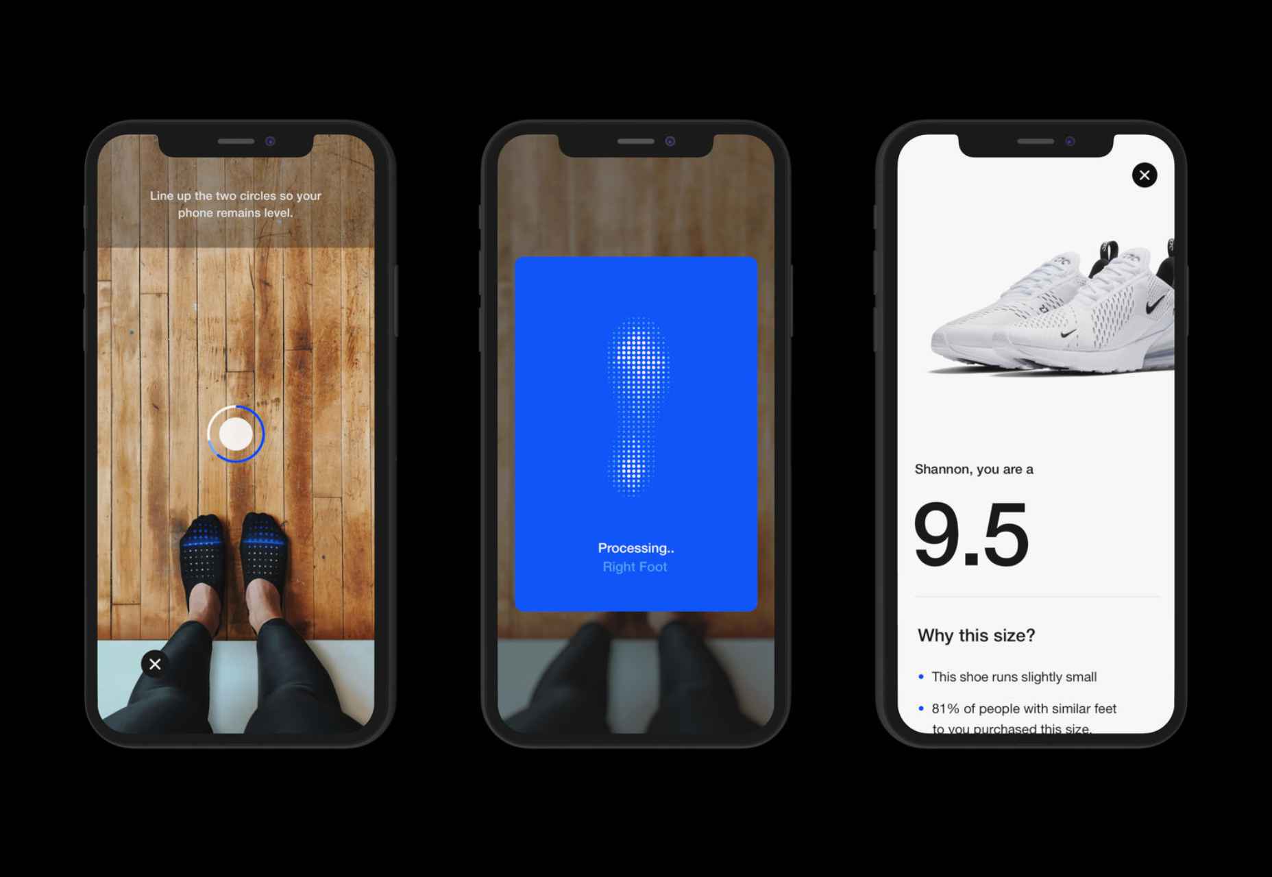
But it works great for consumer products, too: Nike’s Digital Foot Measurement tool is another excellent feature, allowing users to “try shoes on” with their cameras and scan their feet for the right measurement through AR.
Videos are Attention Magnets
Considering that viewers absorb some 95% of the message while watching videos, compared to only 10% when reading text, there’s no reason why you should avoid incorporating videos into your landing pages. Beyond that, videos can be incredibly straightforward: Insert a graphic illustration or real imagery to explain the product, show the step-by-step process, and convey value with raw, unfiltered footage.
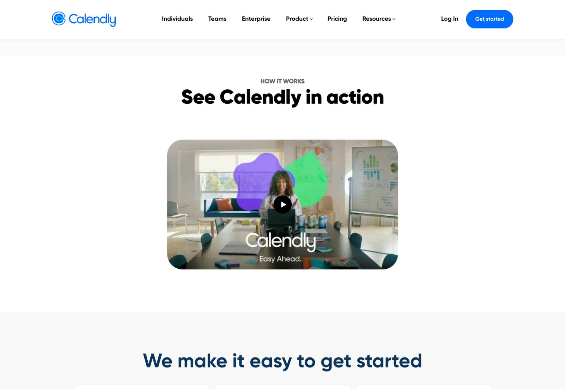
Calendly, for example, has various videos on its landing page, including a 56-second, upbeat, colorful clip showing how simple it is to get started with the product.
Guiding GIFs to Visualize Product Features
As small animations, GIFs represent the perfect middle ground between images and videos. They allow you to show users the value your product adds, providing an engaging glimpse into the actual interface. The small scope of GIFs is both a limitation and a benefit: You can only show a particular feature of your product but can also focus on triggering an exact user emotion.
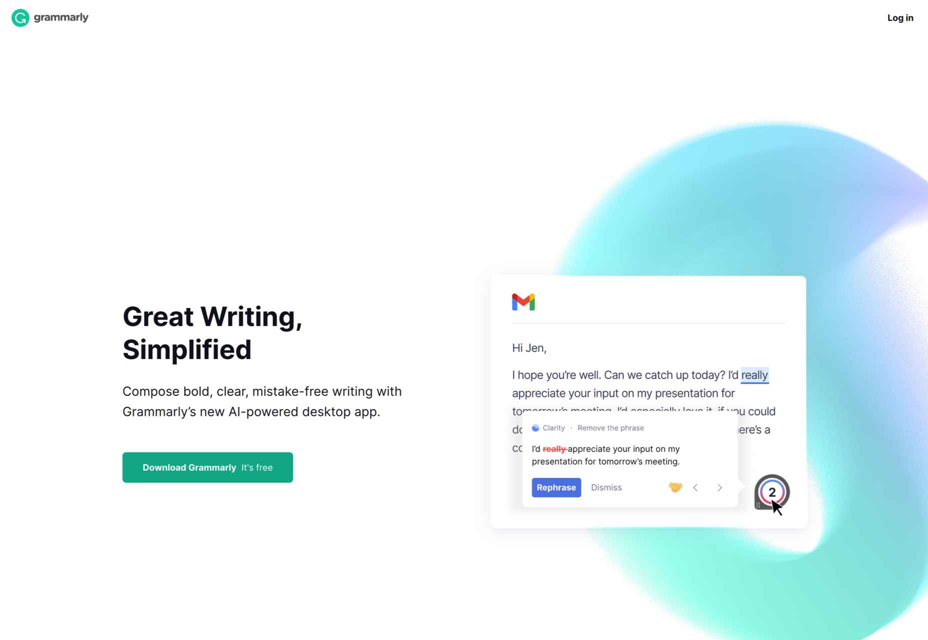
Grammarly, a grammar correction tool, relies on GIFs to give users a taste of their UX. With a quick overview of the product’s functionality across popular platforms, including email and social media, users can see exactly how the product can make their everyday lives easier. And by incorporating GIFs into the right side of the landing page, the scrolling experience of the user isn’t disrupted.
Interactive product experiences can both entertain and tackle pain points, adding dynamics to an otherwise static page. Particularly when customizing based on user attributes, the key benefit of these features is that the users engaging with them are likely the same people interested in the paid product. To ensure that the product experience doesn’t directly compete with the primary offering, clearly differentiate it and guide the user towards a direct call to action.
The post The Case for Building More Dynamic Landing Pages first appeared on Webdesigner Depot.
