Archive

Archive for January, 2023

How B2B Sales Help Us Understand Our Role As UX Designers Better

January 31st, 2023 No comments

This article is a sponsored by Gong.io

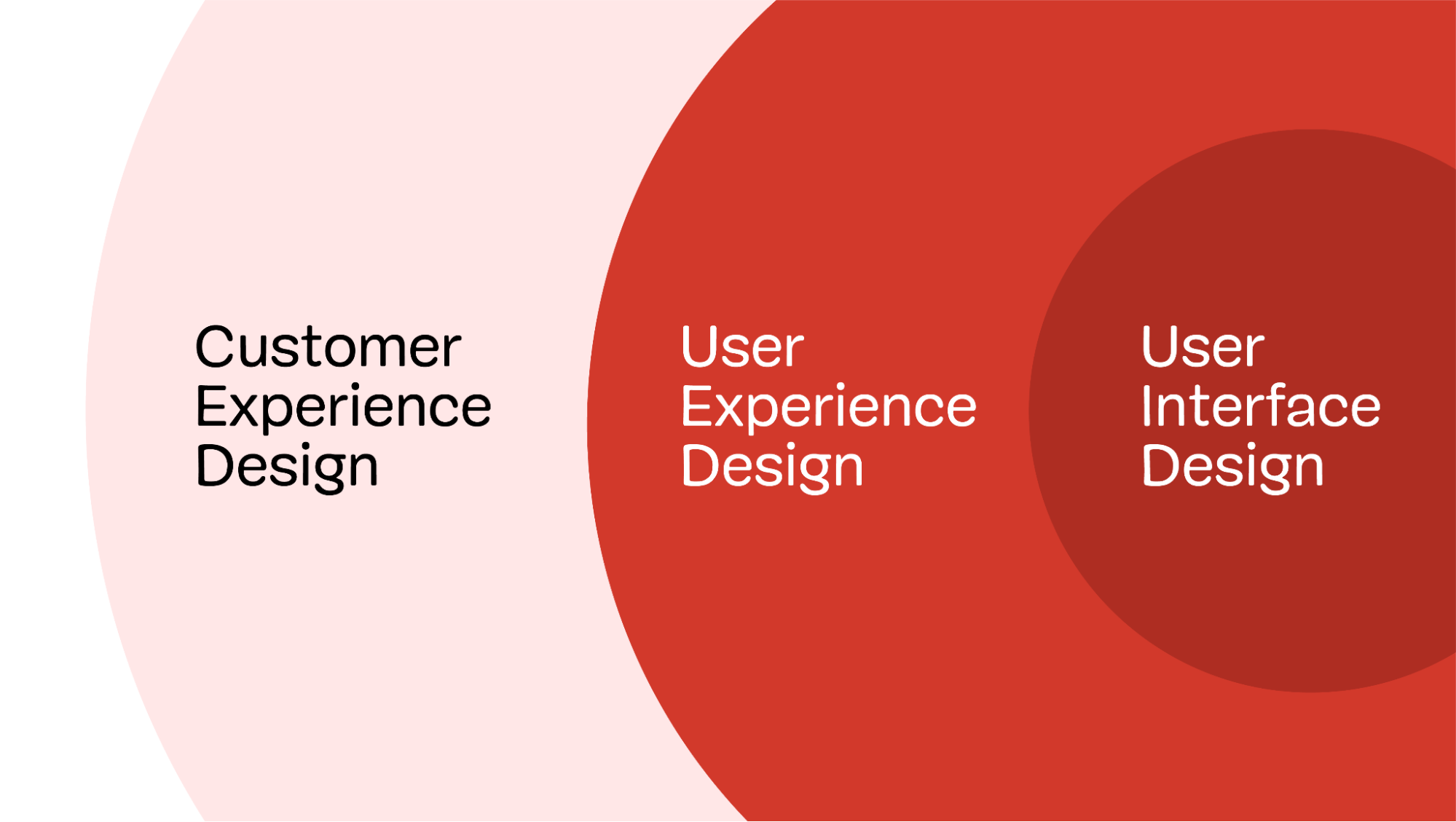
Perhaps this is a controversial statement, but I hate it when UI and UX designers are referred to interchangeably. To my mind, at least, they are different roles, with the clue being in the names.

User Interface designers design the interface, while User Experience designers are concerned with the entirety of the user’s experience.

In most cases, that experience extends beyond a single interface, encompassing many touchpoints, both online and off. Nowhere is this more evident than in a business-to-business experience.

In this article, I want to explore some of the unique characteristics of a B2B sales experience and, hopefully, highlight how a UX designer would consider the entirety of the experience, not just the interface elements.

Let’s begin by exploring what makes B2B sales experiences an interesting challenge for us as UX designers.

Why B2B Is An Interesting UX Challenge

Although we must be wary of generalizing, in many cases, B2B experiences are more complicated than B2C.

This complexity is born out of the nature of B2B. Transactions between businesses tend to be:

  • Higher in value.
  • Involve more stakeholders.
  • Take longer.
  • Involve more interactions between parties.
  • More highly regulated.
  • Often include more complex products and services.

Take, for example, one of my enterprise clients. It is not uncommon for months to pass from them initially getting in touch about a project to me starting work.

Over that time, they may have:

  • read one of my articles or heard me speak,
  • viewed my website,
  • reached out on LinkedIn,
  • exchanged countless emails,
  • spoken over Zoom,
  • read my proposal,
  • signed a contract.

Each of the above works together to shape the client’s experience, not to mention everything I do once work on their project begins.

While a UI designer may work on some of the above touchpoints, a UX designer cares about all of them and how they work collectively together to shape the experience.

With so many potential interactions in a B2B sales journey over an extended period, it is vital to have a clear picture of how they fit together. That is why journey mapping is so popular among UX designers.

Map The Customer Journey

Even if a client commissions me to address a part of a B2B experience, I still favor starting with journey mapping (if they haven’t done so already). Understanding where a particular touchpoint fits into the bigger picture is essential for success.

For example, I work a lot on optimizing the conversion rate of landing pages. Where users have come from is a significant factor in ensuring the success of that landing page. For example, traffic that comes from ads will have different expectations from those that come from organic search.

I care equally about what the user will do next. Any landing page has to prepare the user for that experience. For example, if salespeople contact every lead and users are not expecting that call, this will lower their conversion rate on those calls.

Understanding where in their journey a user also helps me to tailor appropriate messaging and calls to action. Get this wrong, and the experience falls apart. Mapping a journey is an excellent way of designing a sales funnel that gently nudges the user through the process without undermining the experience.

Decide On Calls To Action And Relevant Touchpoints

Have you ever visited a website that immediately displays an overlay when you arrive for the first time? Typically, they offer you a discount in return for signing up for their mailing list. The problem is that you haven’t seen their products yet, so you don’t know if you want the discount. This results in a poor conversion rate and a bad experience that alienates users.

If they displayed the overlay for returning visitors or showed it after they had time to look around the site, it would fit better into the journey. Doing so would increase conversion and leave the user feeling more positive about the experience.

A journey map doesn’t just show where to place a call to action. It also helps you shape the journey itself. For example, a typical B2B sales journey might be:

  1. Discover an organizational need.
  2. Research potential suppliers who could fulfill that need.
  3. Shortlist suppliers.
  4. Pick a preferred supplier.
  5. Sign contracts.
  6. Start work.

Once you understand that journey, you can start shaping the experience so that each stage is optimized, helping the user progress to the next stage. Knowing the stages in the funnel helps you identify the appropriate touchpoints, messaging, and calls to action.

For example, I use posts like this one, speaking slots, and organic search to reach prospective clients who are just discovering they might need help. This is not the moment for a hard sell but rather a chance to help them discover potential solutions to their need.

Often, my call to action at this early stage is to encourage them to subscribe to my mailing list to get more help. That allows me to nurture the relationship until they start looking for potential suppliers.

This is because there can often be a long gap between first discovering a need and securing a budget to find a supplier. It would be easy for them to forget me, and that lead would be lost.

This brings me to another crucial area that a UX designer needs to consider in the user journey: the gaps in the experience.

Mind The Gap

The user experience is not just about the touchpoints (website, email, etc.), but also about the gaps between these interactions. Gaps can be caused by time passing, switching channels, changing devices, or moving between business silos. These are dangerous moments when customers can easily be “dropped,” their experience undermined, and a sale lost. That’s why companies such as Gong.io use sales pipeline software and customer relationship management apps to ensure leads are not lost but instead nurtured over time.

But you still see examples of customers falling between these gaps all the time. Every time you’re put on hold while being transferred to another department, you have fallen into a gap. Or when you switch from a mobile device to your laptop to complete filling in a form, only to discover that all of your data has been lost and you have to start again.

A great UX designer will constantly be looking for these gaps to plug. For example, my banking app recently updated so that I no longer need to go through security to identify myself when I call them from the app. After all, I had already identified myself when I logged into the app, so why do I need to do so again on the call? That was a gap between systems that they had successfully plugged.

But while we strive as UX designers to plug gaps and design effortless digital experiences, there is one area we often overlook: human interactions.

Don’t Forget The Human Factor

At this point, you could argue we are straying into the realm of Customer Experience Design rather than User Experience, but it is still worth mentioning.

Throughout a customer journey (particularly in B2B), there will be interactions that are primarily between two people rather than a human and an interface. These interactions may use digital technology (such as webinars, Zoom meetings, emails, or chat) but are essentially one person speaking to another.

The B2B sales journey beautifully demonstrates these issues, as it has many digital communications between people.

As UX designers, we don’t have the luxury of ignoring these interactions, as they are crucial in shaping the user’s experience and the chance of a lead converting. For example, we have all had a frustrating experience with customer support teams who have emailed or messaged us a stock answer that fails to really address our question. Equally, we have encountered salespeople who have pushed too hard for a sale too early in our buying journey. And, of course, we have all read messages from organizations that have come across as impersonal, rude, or insensitive.

Technology makes these interactions feel worse, as we often cannot see or hear the person we are communicating with. Therefore, it falls to those of us seeking to improve the user experience to do at least something to try and mitigate these problems. That might be as simple as suggesting their sales team downloads a sales coaching plan template or something more ambitious, like running a workshop on how to communicate online better.

At this point, you might think all of this is way outside of your job description. But is it really?

Is This Outside Your Job Description?

We come full circle to where I started this article by saying that the role of UX designer is often mistaken for simply a more senior UI designer. It is not, and in fact, to suggest so is insulting to those who choose to specialize in UI.

If you have been hired as a UX designer and yet spend all of your time creating wireframes for websites, apps, and other interfaces, I would suggest your organization or clients are failing to utilize you to the full.

I would encourage you to break out of the box into which they have put you and start to look at the entire end-to-end user experience. Only then will you be fulfilling the role for which you have been hired.

It won’t happen overnight, and there will be some who would prefer to limit your role, but you cannot improve the user experience without considering the entirety of the journey.

Categories: Others Tags:

Important Social Media Metrics That Matter the Most

January 31st, 2023 No comments

Social media marketing is a popular marketing strategy used by brands to achieve their business goals. But your job doesn’t end after you publish your social media posts or launch your social media campaign. You still need to track it to see if your efforts are reaping the results you expect. This is where social media metrics come in.

Social media metrics allow you to determine what works and what doesn’t in your social media strategy. The result is that you can make the necessary adjustments to ensure that the plan generates better results.

You can track many social media metrics, but, by and large, they are affected by your social media goals. For example, if your goal is to increase engagement or increase your brand’s reach, then the social media followers, likes, and overall engagement will be part of the key metrics to measure.

That said, here are the five social media metrics that matter the most:

1. Followers 

The number of followers shows whether your content is reaching an audience. In a way, it also shows whether your audience finds your brand valuable. The number of your followers on your social media accounts can show your brand’s credibility. This is crucial to have increased engagement and, therefore, to achieving your business goals. 

Source

The growth rate of your followers is also crucial. For example, if the number of your Instagram followers was 5,000 at the beginning of a quarter and still remains the same at the end, it shows that you may need to rework your social media efforts, especially if the goal is to increase your brand’s engagement.

The number of followers also has an amplification effect as your potential audience can see what your immediate audience follows.

Lastly, the number of followers you have affects how well the algorithm pushes your content to the top of the feed, making it important to pay attention to these metrics.

2. Reach

Another metric that matters a lot is your reach. Simply put, reach refers to the number of people who come across your social media content. This metric includes your social media audience and your potential audience base.

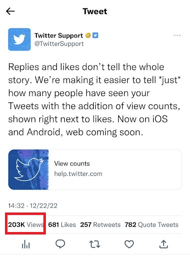
It’s important to calculate how well your social posts reach your followers and non-followers. This metric allows you to easily measure how individual posts perform across your social media accounts. For example, on Twitter, you can easily check the number of people who have viewed an individual post. 

Here’s an example of the views on a Tweet placed at the bottom left of the image below.

Your reach could also involve your video views. Many social media platforms show video views per post, giving an idea of how your content performs. Measuring your reach on social platforms can show how successful your social media campaigns are.

It can also provide information on your number of active followers, potential audience, and how large your audience base is. Rather than showing the viewers who come across your social media content multiple times, social media reach calculates the number of unique visitors or viewers per single post.

Calculating your reach can help you measure your brand awareness growth across social networks over time. On some social media sites, the reach is broken down into different categories such as organic reach, viral reach, and paid reach.

Organic reach refers to the number of viewers on original posts. This type of reach does not involve sponsored posts or ad posts.

Viral reach, meanwhile, includes the number of viewers who come across your content because of other users. For example, the number of people who view your content because of reactions or shares by other users.

Paid reach calculates the reach of paid content such as ads and sponsored posts.

3. Engagement

One of the most important social media metrics is engagement. Engagement is a broad category that includes other subcategories. Each social network has its engagement metrics such as comments, retweets, shares, and likes. They show whether people find your content valuable or interesting and whether, ultimately, your social media strategy suits your audience. 

It’s quite easy to view these metrics on your social channels. It is one of the prominent features of each social media post. The likes on a Facebook post, for instance, can be found right underneath a post:

Source

The total engagement rate is calculated by adding the total number of interactions, shares, comments, and other engagements for a specific period. It is then divided by the total number of followers and multiplied by 100.

However, the formula may vary slightly depending on the social media channel. For example, on Facebook, the engagement rate by followers is measured by adding the number of reactions, shares, and comments. The total is then divided by the number of followers and multiplied by 100.

The engagement rate per post can be calculated by dividing the number of engagements by the reach or the number of impressions. The amplification rate is also part of the engagement metrics.

It refers to the number of shares on average per social media post. Measuring your engagement on social media can give an idea of your brand recognition and popularity. It is critical to your overall social media strategy.

Social media networks keep adding different features for engagement, so it’s important to stay up to date with the possible engagements to measure. You can track your engagement manually or by using a social media analytics tool.

To increase engagement, make sure you create excellent content. Use visuals as much as possible. Also, don’t just write engaging copy. Write it in straightforward and plain language, too, so your audience can easily understand your message and relate to it.

4. Click-Through Rate 

The click-through rate (CTR) refers to the rate at which people click on links included in your social media content. For example, the link could lead to a blog post or other types of content. Click-throughs show the people who are interested in interacting with more of your content.

To calculate the CTR, divide the number of clicks by the total number of impressions. To determine whether your CTR is good or not, you can compare the results to the industry benchmarks. A low click-through rate shows that viewers do not find your content relevant enough to click the links.

5. Conversion Rate

The conversion rate is also one of the important metrics to track on your social accounts. The conversion rate shows how your social content leads to a desired conversion, such as a sale, download, or subscription. The desired action should be written in straightforward language to encourage viewers to do what you want them to do.

To calculate your conversion rate on social media, you can use trackable call-to-action links, such as a free URL shortener. Use this to track the conversions each post has gained. To calculate the conversion rate, divide the total number of conversions by the total number of clicks, multiplied by 100.

Tracking your conversion rate is important as it shows how your social media content is performing, as well as the overall success of your social media campaign.

In Closing

Social media is an important tool for many businesses. But you shouldn’t just run social media campaigns and expect the best results. Track campaigns with the right metrics, too. This way, you can make the necessary tweaks to your next campaign and, ultimately, generate better results.  

You learned the most important metrics to track from this article: your followers, reach, engagement, click-through rate, and conversion rate.

When combined, they can give a wholesome view of your social media campaign performance. Use them to your advantage.

The post Important Social Media Metrics That Matter the Most appeared first on noupe.

Categories: Others Tags:

How to Recruit the Next Generation of Women Sales Leaders

January 31st, 2023 No comments

It’s no secret that women are in the minority when it comes to the sales industry. As the industry continues to evolve and customers become more diverse, having a range of voices in leadership can make the difference between success and failure. With more than 58% of salespeople being male, it’s more important than ever to focus on recruiting and retaining women in sales leadership roles. This article will cover how to attract, recruit and retain more women sales leaders.

Here are some steps you can take to help recruit and retain more women in sales leadership roles.

Identify the qualities of a successful female sales leader

Knowing what you’re looking for and what end goals you have is the start of anything in life and recruiting saleswomen is no different.

That said, a successful female sales leader is, first and foremost, an excellent communicator. She can listen intently to her customers, understand their needs and effectively articulate how her product or service can meet those needs. She can engage with stakeholders at all levels of the organization, including executives, and create a level of trust and mutual understanding.

Second, a successful female sales leader is highly organized and detail-oriented. She understands the importance of tracking progress against targets, as well as staying on top of crucial customer activities to ensure success. Her organizational skills help her prioritize tasks and use resources efficiently while managing multiple projects simultaneously.

Lastly, a successful female sales leader is driven by results. She sets challenging yet achievable goals for herself and works hard to exceed them whenever possible. Her commitment to meeting objectives demonstrates her capability and dedication to achieving success in her role within the organization. In addition, she has an eye for spotting opportunities that could benefit the company’s bottom line and a passion for exceeding customer expectations wherever possible.

Create an attractive job description to attract potential candidates

Helping women understand that sales is a viable career option require an attractive job description that speaks to their needs. Consider highlighting the ability to work remotely or flexibly, as well as the potential for advancement and growth within the organization.

Draw attention to essential qualities and skills required for success in sales. Make sure to emphasize those that apply specifically to female candidates, such as communication, organization, and drive toward results. Emphasize team culture, collaboration opportunities, and other perks that could appeal to women, such as childcare support or mentorship programs. Be sure also to include salary expectations if possible so potential candidates can accurately gauge their suitability for the role before applying.

For example, imagine you are considering a position for a sales representative selling Magento website support. While this is usually a position that men tend to dominate, making the job description more attractive for women can be done by emphasizing that this type of site support is a rapidly growing field with plenty of opportunities for professional growth. 

You could also highlight that the position requires excellent communication and organizational skills and that the employee would directly impact customer satisfaction. Additionally, you could emphasize the potential for career advancement within the organization due to satisfactory performance in the role.

As a woman, such a job description would be much more attractive than a bland listing that doesn’t address the above.

Utilize social media platforms and your company’s blog to promote your open positions

One of the most effective ways to increase the number of candidates for sales leadership positions is to utilize social media platforms. Posting open roles on LinkedIn, Twitter, and Facebook can be a great way to attract potential candidates with the skills, experience, and drive needed for success in sales leadership.

When promoting open positions on these platforms, it’s essential to include more details and facts than you would in a traditional job posting. This will help to create higher semantic richness, making it easier for potential candidates to understand the role better. 

Using photos of successful female team members in similar roles can help further reinforce your commitment to creating greater diversity within your organization.

Another great way to leverage social media platforms is by highlighting relevant industry news and trends which directly relate to the open positions. This helps demonstrate that your organization is keeping up with industry developments and provides prospective candidates with valuable insight into how their role will impact the business beyond just meeting targets or increasing revenue.

If you haven’t yet started a blog for your company, now can be a great time to do so. Creating blog posts about success stories of female sales leaders in your organization is one way to inspire more women to consider this career path.

If you’re unsure what to post on your blog, consider sharing the stories of female sales leaders in your organization or other industry-leading organizations. Highlighting how these women have become successful in their roles and what advice they have for prospective candidates can be extremely helpful to job seekers looking to make a career change into sales.

You can also leverage SEO content writing services to create blog posts that help generate more organic traffic and boost your opportunities for recruiting talented sales candidates.

Develop a recruitment process that is tailored to women’s needs

What do women need in a recruitment process? A tailored recruitment process designed to meet the needs of female candidates can be a great way to attract potential job seekers. This could include ensuring flexible working arrangements, such as part-time or remote working options, which will enable women to balance their careers with other commitments. Additionally, offering greater transparency regarding salary expectations and opportunities for development and promotion within the organization can also increase women’s confidence when considering applying for a sales leadership position.

Taking a lead out of winning strategies from sales situations themselves and using them in recruitment is a great way to move forward. For example, if you know that video email marketing boosts sales for real estate agents,  you can use it to promote your recruitment process in this arena. Offering a personalized video message to each potential candidate that makes it to the interview stage can help to make them feel valued and give them a better idea of the culture within the organization.

Host events and workshops specifically for female sales leaders

These events can provide an opportunity for women to network with other experienced professionals, learn more about the industry, and get insights into what it takes to be successful in a sales leadership role. They can also give you a chance to showcase your organization’s values and why it’s worth applying for this position.

These events are particularly beneficial if you’re looking to recruit diverse talent from outside the usual candidate pool. Offering opportunities such as mentoring, internships, or apprenticeships that have been created with women in mind can help women gain the skills and experience required for success in sales leadership roles. Events should also include panel discussions and Q&A sessions that allow attendees to ask questions or voice their concerns in a safe space.

Connect with local universities and colleges to find potential candidates

Another great way to increase diversity in your sales leadership team is by connecting with local universities and colleges. There is often a range of courses specifically designed for female students, such as Women in Leadership Business Administration, which could be a great source of potential candidates. 

By attending career fairs or joining professional networking events at these schools, you can build relationships with passionate and ambitious young women who may be ready to take their next career step within your organization.

Additionally, researching internship programs that offer permutations from student placements could also be beneficial. Not only will this provide an opportunity for students to gain work experience and develop critical skills, but it could also open up unique recruitment opportunities, allowing you to gain insight into the skills and experiences of potential sales leaders before offering them a position.

Make sure you have an inclusive work environment where everyone can thrive, regardless of gender or background

An environment where everyone feels accepted, valued, and respected for their contributions is essential for any organization. To ensure you have an inclusive work culture that encourages diversity in sales leadership roles, there are several steps you can take. 

Firstly, ensure your recruitment process doesn’t eliminate potential candidates based on gender or other characteristics. Secondly, incorporate diversity into existing team meetings and activities to ensure everyone feels like they belong in the company. Finally, create an open-door policy where anyone can speak up if they feel uncomfortable or discriminated against in the workplace.

Driving sales managers’ productivity starts when you hire and onboard new employees. When recruiting for sales leaders, it is essential to recognize the impact of having a diverse team and take action to create an inclusive environment that encourages everyone to thrive. 

Offer mentorship opportunities for aspiring female sales leaders in your organization

Finally, offering mentorship opportunities to aspiring female sales leaders in your organization is a great way to ensure they are provided with the resources and guidance needed to succeed. This could include setting up formal or informal mentoring programs, providing access to mentors who have succeeded in the industry, or encouraging employees to seek advice when needed. It can also be beneficial for organizations to offer training and development programs specifically designed for women. These initiatives can help build confidence and equip employees with the skills necessary to take on leadership roles.

Suppose you’re a business creating an e-commerce strategy content to improve sales. In that case, mentorship opportunities can help ensure that female sales leaders have access to the same resources and guidance as their male counterparts. 

Such guidance not only helps women create content that resonates with their customers but also provides invaluable feedback and support that can improve their overall sales performance.

Conclusion

With the right combination of leadership, training, and mentorship, you can create an effective sales strategy that incorporates the strengths of both women and men. This will help you maximize revenue opportunities and ensure that everyone has the opportunity to reach their full potential. 

By taking these steps and creating an inclusive environment that encourages female representation at all levels of your organization, you will be well-positioned to foster a diverse sales team of both women and men that can drive success for your business.

The post How to Recruit the Next Generation of Women Sales Leaders appeared first on noupe.

Categories: Others Tags:

15 Best New Fonts, January 2023

January 30th, 2023 No comments

Your choice of typeface significantly impacts the tone of voice your designs adopt. Heritage, ambition, freshness, energy, utility and more can all be communicated with the right font.

And so, every month, we put together this roundup of the 15 best new fonts we’ve found on the web in the previous four weeks. Enjoy!

Bulk

Bulk is an awesome typeface that challenges how letters are constructed. Bulk uses heavy, block-shaped outlines and delicate linear ‘cuts’ to form its letters. It’s an excellent choice for posters, giant typography, and branding.

AW Conqueror Stincilla

We’ve featured AW Conqueror before, and AW Conqueror Stincilla is a delightful stencil variation on the form. It produces some beautiful shapes and is ideal for luxury branding, editorial work, and even as a display face.

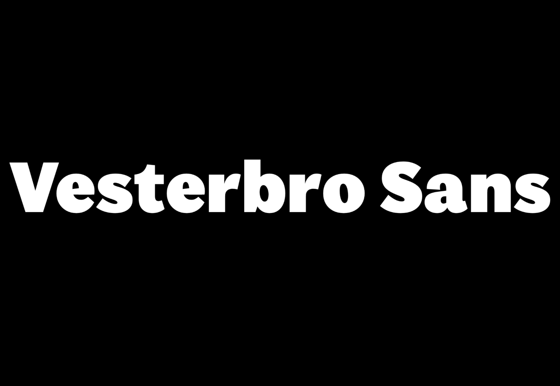
Vesterbro Sans

Rarely do we see a sans-serif that we can honestly describe as refreshing, but Vesterbro Sans falls into that category. It’s expertly executed with simple details adding to the overall feeling of effortlessness. It’s also available as a variable font.

Miau

Miau is an awesomely over-the-top that is barely legible. The ribbon-like letterforms are packed with energy. It works best when used in small doses.

Rikna

Rikna is a workhorse of a slab serif that works well at body font sizes and has enough detail to be interesting at display sizes. It’s a solid all-around choice for a project that’s serious but needs a touch of human warmth.

Austerlitz

Austerlitz is a family of pseudo-didone typefaces. It’s a flexible and highly usable family that works well for serious publications, digital, and print. The refined rhythm means that Austerlitz will work well in some branding projects.

Gramma

Gramma is a modern-looking sans-serif. Gramma has a distinctive style of terminal that creates visual interest at larger sizes and helps the letterforms keep a clean outline on screen at smaller sizes. It would make a great brand font.

Miracle Fairway

Miracle Fairway is a thick-stroked display typeface with tapered serifs that give the overall design a sense of motion. It’s a great option for logo design.

Vitrine

Vitrine is a high-contrast sans-serif that’s great a large sizes. It comes in nine weights, but the semi-bold, bold, and black have the highest contrast and, as a result, the most character. It works well as a display face and for logos.

Kelyon

Kelyon is a graceful display face with medieval and Art Nouveau influences. It has numerous alternates. It works best at display sizes and is a good choice for editorial design.

Fit Devanagari

Fit Devanagari is a highly stylized typeface, designed as a companion for the Latin typeface Fit, that can be used at any size. If you need to fill a particular sized space, then Fit allows you to do so elegantly.

Precise Sans

Precise Sans is a tech-feeling sans-serif with a range of weights and (eventually) two italics. It’s an excellent choice for UI design, where clarity trumps character, but you still want a little personality. It’s still in beta so expect changes.

Mistont

Mistont is a beautiful serif font with elegant curves and graceful ligatures. It’s an ideal choice for branding lifestyle products.

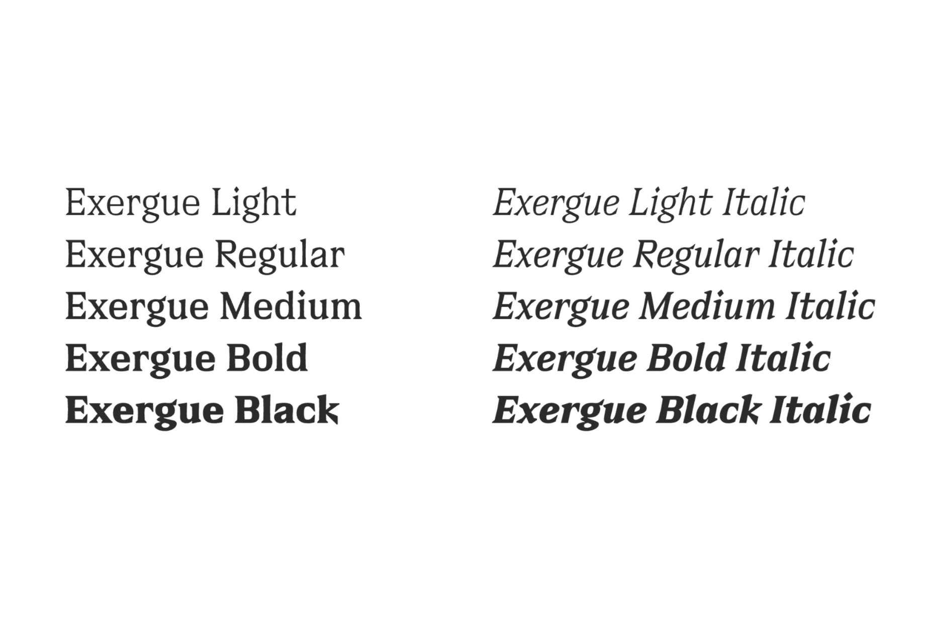
Exergue

Exergue is a stunning serif typeface that uses flared terminals to match its serifs. The result is blocks of text that feel unexpected and familiar at the same time. Exergue is an excellent choice for extended text passages where it adds character while maintaining readability.

Manier

Manier is a very usable typeface with angular wedges and generous, modern proportions. It comes in six weights with matching italics. It’s ideal if you’re looking to infuse your design with some confidence.

Source

The post 15 Best New Fonts, January 2023 first appeared on Webdesigner Depot.

Categories: Designing, Others Tags:

Easy SVG Customization And Animation: A Practical Guide

January 30th, 2023 No comments

Scalable Vector Graphics (SVG) have been a staple in Web Development for quite some time, and for a good reason. They can be scaled up or down without loss of quality due to their vector properties. They can be compressed and optimized due to the XML format. They can also be easily edited, styled, animated, and changed programmatically.

At the end of the day, SVG is a markup language. And just as we can use CSS and JavaScript to enhance our HTML, we can use them the same on SVGs. We could add character and flourishes to our graphic elements, add interactions, and shape truly delightful and memorable user experiences. This optional but crucial detail is often overlooked when building projects, so SVGs end up somewhat underutilized beyond their basic graphical use cases.

How can we even utilize SVGs beyond just using them statically in our projects?

Take the “The State of CSS 2021” landing page, for example. This SVG Logo has been beautifully designed and animated by Christopher Kirk-Nielsen. Although this logo would have looked alright just as a static image, it wouldn’t have had as much of an impact and drawn attention without this intricate animation.

Let’s go even further — SVG, HTML, CSS, and JavaScript can be combined and used to create delightful, interactive, and stunning projects. Check out Sarah Drasner’s incredible work. She has also written a book and has a video course on the topic.

Let’s add it to our HTML and create a simple button component.

<button type="button">
  <svg width="24" height="24" viewBox="0 0 80 80" fill="none" xmlns="http://www.w3.org/2000/svg" aria-hidden="true"><path d="..." fill="#C2CCDE" /></svg>
  Add to favorites
</button>

Our button already has some background and text color styles applied to it so let’s see what happens when we add our SVG star icon to it.

Our SVG icon has a fill property applied to it, more specifically, a fill="#C2CCDE" in SVG’s path element. This icon could have come from the SVG library or even exported from a design file, so it makes sense for a color to be exported alongside other graphical properties.

SVG elements can be targeted by CSS like any HTML element, so developers usually reach for the CSS and override the fill color.

.button svg * {
  fill: var(--color-text);
}

However, this is not an ideal solution as this is a greedy selector, and overriding the fill attribute on all elements can have unintended consequences, depending on the SVG markup. Also, fill is not the only property that affects the element’s color.

Let’s showcase this downside by creating a new button and adding a Google logo icon. SVG markup is a bit more complex than our star icon, as it has multiple path elements. SVG elements don’t have to be all visible, there are cases when we want to use them in different ways (as a clipping region, for example), but we won’t go into that. Just keep in mind that greedy selectors that target SVG elements and override their fill properties can produce unexpected results.

 <svg aria-hidden="true" xmlns="http://www.w3.org/2000/svg" height="24" viewBox="0 0 24 24" width="24">
  <path d="..." fill="#4285F4" />
  <path d="..." fill="#34A853" />
  <path d="..." fill="#FBBC05" />
  <path d="..." fill="#EA4335" />
  <path d="..." fill="none" />
 </svg>

We can look at the issue from a different perspective. Instead of looking for a silver bullet CSS solution, we can simply edit our SVG. We already know that the fill property affects the SVG element’s color so let’s see what we can do to make our icons more customizable.

Let’s use a very underutilized CSS value: currentColor. I’ve talked about this awesome value in one of my previous articles.

Often referred to as “the first CSS variable,” currentColor is a value equal to the element’s color property. It can be used to assign a value equal to the value of the color property to any CSS property which accepts a color value. It forces a CSS property to inherit the value of the color property.

If you are looking for more, CSS-Tricks keeps a comprehensive list of various SVG optimization tools with plenty of information and articles on the topic.

Using SVGs With Popular JavaScript-Based Frameworks

Many popular JavaScript frameworks like React have fully integrated SVG in their toolchains to make the developer experience easier. In React, this could be as simple as importing the SVG as a component, and the toolkit would do all the heavy lifting optimizing it.

import React from 'react';
import {ReactComponent as ReactLogo} from './logo.svg';

const App = () => {
  return (
    <div className="App">
      <ReactLogo />
    </div>
  );
}
export default App;

However, as Jason Miller and many other developers have noted, including the SVG markup in JSX bloats the JavaScript bundle and makes the SVG less performant as a result. Instead of just having the browser parse and render an SVG, with JSX, we have expensive extra steps added to the browser. Remember, JavaScript is the most expensive Web resource, and by injecting SVG markup into JSX, we’ve made SVG as expensive as well.

One solution would be to create SVG symbol objects and include them with SVG use. That way, we’ll be defining the SVG icon library in HTML, and we can instantiate it and customize it in React as much as we need to.

<!-- Definition -->
<svg viewBox="0 0 128 128" xmlns="http://www.w3.org/2000/svg">
  <symbol id="myIcon" width="24" height="24" viewBox="0 0 24 24">
      <!-- ... -->
  </symbol>
  <!-- ... -->
</svg>

<!-- Usage -->
<svg viewBox="0 0 24 24" xmlns="http://www.w3.org/2000/svg">
  <use href="#myIcon" />
</svg>

Breathing Life Into SVGs

Animating SVGs can be easy and fun. It takes just a few minutes to create some simple and effective animations and interactions. If you are unsure which animation would be ideal for a graphic or should you animate it at all, it’s best to consult with the designer. You can even look for some similar examples and use cases on Dribble or other similar websites.

It’s also important to keep in mind that animations should be tasteful, add to the overall user experience, and serve some purpose (draw the user’s attention, for example).

We’ll cover various use cases that you might encounter on your projects. Let’s start with a really sweet example.

Animating A Cookie Banner

Some years ago, I was working on a project where a designer made an adorable cookie graphic for an unobtrusive cookie consent popup to make the element more prominent. This cookie graphic was whimsical and a bit different from the general design of the website.

I’ve created the element and added the graphic, but when looking at the page as a whole, it felt kind of lifeless, and it didn’t stand out as much as we thought it will. The user needed to accept cookies as the majority of website functionality depended on cookies. We wanted to create an unobtrusive banner that doesn’t block user navigation from the outset, so I decided to animate it to make it more prominent and add a bit of flourish and character.

I’ve decided to create three animations that’ll be applied to the cookie SVG:

  • Quick and snappy rolling fade-in entry animation;
  • Repeated wiggle animation with a good amount of delay in between;
  • Repeating and subtle eye sparkle animation.

Here’s the final result of the element that we’ll be creating. We’ll cover each animation step by step.

Let’s store it in a CSS variable so that we can reuse it for the repeatable wiggle movement animation.

--transition-bounce: cubic-bezier(0.2, 0.7, 0.4, 1.65);

Let’s put everything together, set a duration value and fill-mode, and add the animation to our svg element.

/* Our SVG element */
.cookie-notice__graphic {
  opacity: 0; /* Should not be visible at the start */
  animation: enter 0.8s var(--transition-bounce) forwards;
}

Let’s check out what we’ve created. It already looks really nice. Notice how the bouncing easing function made a lot of difference to the overall look and feel of the whole element.

@keyframes wiggle {
  /* Stands still */
  0% {
    transform: translate3d(0, 0, 0) rotateZ(17deg);
  }
  /* Starts moving */
  45% {
    transform: translate3d(0, 0, 0) rotateZ(17deg);
  }

  /* Pulls back */
  50% {
    transform: translate3d(-10%, 0, 0) rotateZ(8deg);
  }

  /* Moves forward */
  55% {
    transform: translate3d(6%, 0, 0) rotateZ(24deg);
  }

  /* Returns to starting position */
  60% {
    transform: translate3d(0, 0, 0) rotateZ(17deg);
  }

  /* Stands still */
  100% {
    transform: translate3d(0, 0, 0) rotateZ(17deg);
  }
}
/* Our SVG element */
.cookie-notice__graphic {
  opacity: 0;
  animation: enter 0.8s var(--transition-bounce) forwards,
    wiggle 6s 3s var(--transition-bounce) infinite;
}

SVG elements can have a CSS class attribute, so we’ll use that to target them. Let’s add the class attribute to the two path elements that we identified.

<!-- ... -->
<path fill="#351f17" d="..." />
<path class="cookie__eye" fill="#fff" d="..." />
<path fill="#351f17" d="..." />
<path class="cookie__eye" fill="#fff" d="..." />
<!-- ... -->

We want to make cookie’s eyes sparkle. I got this idea from a music video for a song by Devin Townsend. You can see the animation play at the 5-minute mark. It just goes to show how you can find ideas pretty much anywhere.

Let’s just change the scale and opacity. Notice how so far, we’ve relied only on those two attributes for all three animations, which are quite different from each other.

@keyframes sparkle {
  from {
    opacity: 0.95;
    transform: scale(0.95);
  }
  to {
    opacity: 1;
    transform: scale(1);
  }
}

We want this animation to repeat without delay. It should be subtle enough to blend in nicely with the graphic and the overall element and not obtrusive for the user. As for the easing function, we’ll do something different. We’ll use staircase functions to achieve that quick and snappy transition between the two animation states (our from and to values).

We need to be careful here. Transform origin is going to be set relative to the parent SVG element’s viewbox and not the element itself. So if we set transform-origin: center center, the transformation will use the center coordinates of the parent SVG and not the path element. We can easily fix that by setting a transform-box property to fill-box.

The nearest SVG viewport is used as the reference box. If a viewBox attribute is specified for the SVG viewport creating element, the reference box is positioned at the origin of the coordinate system established by the viewBox attribute, and the dimension of the reference box is set to the width and height values of the viewBox attribute.

.cookie__eye {
  animation: sparkle 0.15s 1s steps(2, jump-none) infinite alternate;
  transform-box: fill-box;
  transform-origin: center center;
}

Last but not least, let’s respect the user’s accessibility preferences and turn off all animations if they have it set.

@media (prefers-reduced-motion: reduce) {
  *,
  ::before,
  ::after {
    animation-delay: -1ms !important;
    animation-duration: 1ms !important;
    animation-iteration-count: 1 !important;
    background-attachment: initial !important;
    scroll-behavior: auto !important;
    transition-duration: 0s !important;
    transition-delay: 0s !important;
  }
}

Here is the final result. Feel free to play around with the demo and experiment with keyframe values and easing values to change the look and feel of the animation.

Let’s take a closer look at the SVG we’ll be working with. It consists of a few dozen circle elements.

<!-- ... -->
<circle cx="103.5" cy="34.5" r="11.3"></circle>
<circle cx="172.5" cy="34.5" r="15.7"></circle>
<circle cx="310.5" cy="34.5" r="24.6"></circle>
<circle cx="517.5" cy="34.5" r="34.5"></circle>
<circle cx="586.5" cy="34.5" r="34.5"></circle>
<circle cx="655.5" cy="34.5" r="33.4"></circle>
<!-- ... -->

Let’s start by adding a bit of opacity to our background and making it more chaotic. When we apply CSS transforms to elements inside SVG, they are transformed relative to the SVG’s main viewbox. That is why we’re getting a slightly chaotic displacement when applying a scale transform. We’ll use that to our advantage and not change the reference box.

To make things a little bit easier for us, we’ll use SASS. If you are unfamiliar with SASS and SCSS, you can view compiled CSS in CodePen below.

svg circle {
  opacity: 0.85;

  &:nth-child(2n) {
    transform: scale3d(0.75, 0.75, 0.75);
    opacity: 0.3;
}

With that in mind, let’s add some keyframes. We’ll use two sets of keyframes that we’ll apply randomly to our circle elements. Once again, we’ll leverage the scale transform displacement and change the opacity value.

@keyframes a {
  0% {
    opacity: 0.8;
    transform: scale3d(1, 1, 1);
  }
  100% {
    opacity: 0.3;
    transform: scale3d(0.75, 0.75, 0.75);
  }
}

@keyframes b {
  0% {
    transform: scale3d(0.75, 0.75 0.75);
    opacity: 0.3;
  }
  100% {
    opacity: 0.8;
    transform: scale3d(1, 1, 1);
  }
}

Now, let’s use quite a few :nth-child selectors. Every odd child will use the a keyframes, while every even circle will use a b keyframes. We’ll use :nth-child selectors to play around with animation duration and animation delay values.

svg circle {
  opacity: 0.85;
  animation: a 10s cubic-bezier(0.45,0.05,0.55,0.95) alternate infinite;

  &:nth-child(2n) {
    transform: scale3d(0.75, 0.75, 0.75);
    opacity: 0.3;

    animation-name: b;
    animation-duration: 6s;
    animation-delay: 0.5s;
  }

  &:nth-child(3n) {
    animation-duration: 4s;
    animation-delay: 0.25s;
  }

  /* ... */
}

And, once again, just by playing around with opacity values and CSS transforms on our SVG and playing around with child selectors and animation parameters, we’ve managed to create a more interesting background for our hero container.

Here is a markup for our circle SVG.

<svg xmlns="http://www.w3.org/2000/svg" viewBox="0 0 100 100"><circle cx="50" cy="50" r="50" fill-opacity=".03"/></svg>

Be careful not to inline too much data with base64, so stylesheets can be downloaded and parsed quickly. When we convert it to base64, we get this handy CSS background-image snippet:

background-image: url(data:image/svg+xml;base64,PHN2ZyB4bWxucz0iaHR0cDovL3d3dy53My5vcmcvMjAwMC9zdmciIHZpZXdCb3g9IjAgMCAxMDAgMTAwIj48Y2lyY2xlIGN4PSI1MCIgY3k9IjUwIiByPSI1MCIgZmlsbC1vcGFjaXR5PSIuMDMiLz48L3N2Zz4=);

We can simply apply a simple animation where we offset the background-position by the background-size value and get this neat background animation.

.wrapper {
  animation: move-background 3.5s linear;
  background-image: url(data:image/svg+xml;base64,...);
  background-size: 96px;
  background-color: #16a757;
  /* ... */
}

@keyframes move-background {
  from {
    background-position: 0 0;
  }

  to {
    background-position: 96px 0;
  }
}

Our example looks more interesting with this subtle moving animation going on in the background. Remember to respect users’ accessibility preferences and turn off the animations if they have a preference set.

Before diving into the animation, we need to cover two SVG properties that we’ll be using: stroke-dasharray and stroke-dashoffset. They’re integral for pulling off this animation.

Stroke can be converted to dashes with a certain length using a stroke-dasharray property.

And we can offset the positions of those strokes by a certain amount using the stroke-dashoffset property.

So, what’s this have to do with our drawing and erasing animation? Imagine what would happen if we could have a dash that covers the whole stroke length and offset it by the same value. In that case, the starting point of the stroke would be way past the ending point of the stroke, and we wouldn’t see it.

svg path {
  stroke-linecap: round;
  stroke-linejoin: round;
  stroke-dasharray: 800;  /* Dash covering the whole stroke */
  stroke-dashoffset: 800; /* Offset it to make it invisible */
}

If we animate the offset value from that value back to 0, the stroke would slowly become visible, as it was drawing itself.

svg path {
  /* ... */
  animation: draw 6s linear infinite;
}

@keyframes draw{
  to {
    stroke-dashoffset: 0; /* Reduce offset to make it visible */
  }
}

If we continue to animate the offset value from 0 to a negative value, we’d get the erasing effect.

svg path {
  /* ... */
  animation: drawAndErase 6s linear infinite;
}

@keyframes drawAndErase {
  to {
    stroke-dashoffset: -800;
  }
}

You’re probably wondering where the magical 800 pixel value came from. This value depends on the SVG and the length of the dash needed to cover the whole stroke length. It can be easily guessed, but Chris Coyier has a handy function that can do it for you. However, depending on the stroke properties and SVG shape, this function might not always return an ideal value, but it can guide you closer to it.

Check out the complete demo and feel free to play around with values to see how the stroke properties affect the animation. If you are looking for more examples, CodyHouse has covered a fun-looking button animation using the same trick.

Let’s start by adding the mouse-tracking eye animation. We’ll skip manually implementing this feature in JavaScript and use a handy library called watching-you.

Using the browser’s inspect element tool, we’ll find the target elements inside the SVG and add the eye-left and eye-right CSS classes to these elements, respectively.

<ellipse class="cls-5 eye eye-left" cx="245.15133" cy="134.57033" rx="5.31264" ry="8.61816" transform="translate(-33.47349 110.5587) rotate(-23.83807)" />
<ellipse class="cls-4 eye eye-right" cx="284.42686" cy="116.68559" rx="5.31264" ry="8.61816" transform="translate(-22.89477 124.9063) rotate(-23.83807)" />

We’ll configure the library and make it target the classes that we’ve added.

const optionsLeft = { power: 4, rotatable: false };
const watcherLeft = new WatchingYou(".eye-left", optionsLeft);
watcherLeft.start();

const optionsRight = { power: 3, rotatable: false };
const watcherRight = new WatchingYou(".eye-right", optionsRight);
watcherRight.start();

We also need to remember to apply the transform-box property, so our eyes move around the center.

.eye {
  transform-box: fill-box;
  transform-origin: center center;
}

Let’s check out what we’ve got. With just a few lines of code and a tiny JavaScript library to do the heavy lifting, we’ve made the SVG element respond to the mouse position. Now that’s amazing, isn’t it?

Bowtie and hat animation will be created in a very similar way. Let’s start with a hat and find it using the browser’s inspect element tool. The hat graphic consists of two path elements, so let’s group them.

<g class="hat">
  <path class="cls-6" d="..." />
  <path class="cls-9" d="..." />
</g>

We’ll apply the same transform-box property and add a hat--active class that will run the animation when applied.

.hat {
  transform-box: fill-box;
  transform-origin: center bottom;
  cursor: pointer;
}

.hat--active {
  animation: hatJump 1s cubic-bezier(0, 0.7, 0.5, 1.25);
}

@keyframes hatJump {
  0% {
    transform: rotateZ(0) translateY(0);
  }

  50% {
    transform: rotateZ(-10deg) translateY(-50%);
  }

  100% {
    transform: rotateZ(0) translateY(0);
  }
}

Finally, let’s set up a click event listener that applies an active class to the element and then removes it after the animation has finished running.

const hat = document.querySelector(".hat");

hat.addEventListener("click", function () {
  if (hat.classList.contains("hat--active")) {
    return;
  }
  // Add the active class.
  hat.classList.add("hat--active");

  // Remove the active class after 1.2s.
  setTimeout(function () {
    hat.classList.remove("hat--active");
  }, 1200);
});

We use the same trick with the bowtie element, only applying a different animation and class. Feel free to check out the CodePen demo for more details.

Let’s move on to the coffee machine. Notice we don’t have any SVG element acting as a coffee on our SVG, so we’ll need to add it ourselves. You should feel comfortable editing SVG markup and we don’t even have to break a sweat here. Let’s make it easy for ourselves and find and copy the coffee machine’s pipe rectangle, which is similar to the coffee stream shape we want to have. We just have to change the color to brown and slightly adjust the dimensions.

<!-- Pipe -->
<rect class="cls-12" x="137.81171" y="243.99883" width="6.21967" height="12.29272" transform="translate(281.84309 500.29037) rotate(-180)" />

<!-- Copied and adjusted Pipe rect to act as a coffee -->
<rect class="coffee" x="139" y="243.99883" width="4" height="12.29272" transform="translate(281.84309 500.29037) rotate(-180)" fill="brown" />

Like in the previous examples, let’s add active classes and their respective animation keyframes. We’ll compose the two animations and play around with duration and delay.

.lever, .coffee {
  transform-box: fill-box;
  transform-origin: center bottom;
}

.lever {   
  cursor: pointer; 
}

.lever--active {
  animation: leverPush 2.5s linear;
}

@keyframes leverPush {
  0% {
    transform: translateY(0);
  }
  8% {
    transform: translateY(50%);
  }
  90% {
    transform: translateY(50%);
  }
  100% {
    transform: translateY(0);
  }
}

.coffee--active {
  animation: coffeeStream 2.4s 0.1s ease-out forwards;
}

@keyframes coffeeStream {
  0% {
    transform: translateY(0);
  }
  5% {
    transform: translateY(50%);
  }
  95% {
    transform: translateY(50%);
  }
  100% {
    transform: translateY(150%);
  }
}

Let’s apply the active classes on click and remove them after the animation has finished running. And that’s it!

const lever = document.querySelector(".lever");
const coffee = document.querySelector(".coffee");

lever.addEventListener("click", function () {
  if (lever.classList.contains("lever--active")) {
    return;
  }

  lever.classList.add("lever--active");
  coffee.classList.add("coffee--active");

  setTimeout(function () {
    lever.classList.remove("lever--active");
    coffee.classList.remove("coffee--active")
  }, 2500);
});

Check out the complete example below, and, as always, feel free to play around with the animations and experiment with other elements, like the speech bubble or making the coffee machine’s lights blink while coffee is pouring out. Have fun!

See the Pen Smashing cat interaction [forked] by Adrian Bece.

Conclusion

I hope that this article encourages you to play around and make some wonderful SVG animations and interactions and integrate this workflow into your day-to-day projects. We’ve used only a handful of tricks and CSS properties to create a whole variety of nice effects on the fly. With some extra time, knowledge, and effort, you can create some truly amazing and interactive graphics.

Feel free to reach out on Twitter and share your work. Happy to hear your thoughts and see what you come up with!

References

Categories: Others Tags:

Best Business Ideas to Try Out

January 30th, 2023 No comments

Innovation is the key to success in today’s business world. If you want your company to stand out from the crowd, you must develop innovative ideas that will set you apart from your competitors. 

The following are some of the most innovative business ideas currently being implemented by entrepreneurs around the globe:

Drone delivery services

Drones are legal in many countries. We can use drone delivery services for a variety of purposes, including the following:

Drone delivery businesses are an emerging business idea that offers entrepreneurs a high degree of flexibility and control over their businesses. In addition to being cost-effective, they can also utilize drone delivery services for emergencies, such as when roads are blocked off due to natural disasters or accidents.

Artificial intelligence-powered digital assistants

Artificial Intelligence (AI) is a technology that mimics human intelligence. AI is making it possible to automate tasks once thought too complex for machines, such as driving cars and diagnosing diseases.

Benefits of AI:

  • It’s more cost-effective – AI systems can perform tasks at a fraction of the cost of human workers.
  • It improves efficiency – Machines allow businesses to work more efficiently and effectively by automating repetitive tasks or processes so that employees free up time for other things. 

It also allows employees to focus on value-adding activities, which bring about greater productivity levels at lower costs in a business organization compared to traditional ways in which human beings used manual labor and artificial tools during production processes etc.

Augmented reality technology

Augmented reality technology is one of the most exciting things happening in the world right now. It’s used to create a computer-generated environment overlaid in the real world, using information from your smartphone camera.

As well as being useful for gaming and entertainment, augmented reality can also be used for educational purposes – like when you hold up your phone to a plant to get information about what kind it is.

Computer education to the masses

Computer education for the masses is an idea that has been gaining momentum in recent years. As the world increasingly relies on technology, there will be a growing demand for qualified computer users. 

This can be a good business idea if you understand computers and enjoy teaching others about them.

As with any other business idea, it’s essential to consider your options before deciding on this one. You’ll need to assume whether there is enough demand for your services and how much time you’re willing/able to spend on developing your skills as an educator (as well as other possible areas of expertise).

Self-driving cars

Self-driving cars are the future of transportation. They will eliminate human error and make road travel safer, which is why most countries around the world have begun exploring how to integrate autonomous vehicles into their infrastructure. As a result, there has never been a better time to invest in self-driving car technology. 

You could be an early adopter and help shape the industry by working with car manufacturers or tech companies developing software platforms for autonomous driving. Or you could start your own business by offering ride-sharing services via self-driving vehicles. Either way, this is one of the best future business ideas out there right now—and it’s only going to get better!

Facial recognition technology

Facial recognition technology is a great business idea to try out. It can use to identify criminals and keep them from committing more crimes. What can also use technology to identify people in security cameras, photos, and videos? Additionally, it can help identify people on social media platforms like LinkedIn or Facebook.

Facial recognition technology involves taking photos or videos of your subject’s face with your phone’s camera app and uploading it into an app that uses this type of software (such as Find Face). The app will then run algorithms on the photo, which return the other person’s name, age and gender based on facial features such as jawline length or nose width.

Fitness business ideas

Fitness business ideas are great if you want to follow your passion. There are so many ways of making money with fitness; this is one area where information is abundant. Being physically fit gives you more energy, increases your productivity and makes you more attractive.

It’s not just about looking good but also feeling good! 

A healthy lifestyle will help improve your overall well-being and reduce health problems. With so much online information, getting started in the fitness industry is easy. A few simple steps can set up a successful gym or personal training business that could earn you handsome monthly profits for years to come!

Mobile app design and development services

Mobile application development is a big business, with app downloads increasing by over 90% in the past five years. If you’re considering developing a mobile app, it’s essential to understand the costs involved and how you can use it in your business model.

Mobile applications are built around software platforms like Android and iOS, which allow you to use your phone as an interface for apps. They’re often designed as standalone programs that can run on the user’s device without any Internet connection or server support. The variety of mobile apps available today is staggering—there are apps for everything from entertainment to travel booking—and some companies have even created entire businesses based on them (such as Uber).

Creating a successful app requires careful planning and consideration of both technical feasibility and marketing strategy:

Blogging and publishing business ideas

You can get started with a blog quickly. You only need a domain name, some hosting, and a WordPress theme. You don’t even need to know how to code—plenty of great free articles out there will give your site a professional look without hiring anyone.

A self-hosted website might be for you if you want something more than just a website—the ability to publish articles regularly or even sell products or services through it.

Vintage goods sales business ideas

Vintage goods refer to pre-loved items that you can sell at a higher price than the original retail price. Most of these items have an interesting story behind them, and most people like to buy them because of their uniqueness, hence the high demand for vintage goods. 

The best example is when you get an old and rare watch from your grandfather or grandmother, which they used in their early days, this will give a sense of history while giving additional value to the item.

Conclusion

The world is changing, and so is how we do business. Technology is bringing about a new era, and it’s up to us to adapt and innovate. This list contains some of the most innovative business ideas you can try today. We hope our readers will find these ideas interesting enough to pursue them further!

The post Best Business Ideas to Try Out appeared first on noupe.

Categories: Others Tags:

The Pros and Cons of Responsive Web Design in 2023

January 27th, 2023 No comments

Responsive web design has been such a success for many web designers that it is generally seen as the default approach to creating a website, but it’s not as cut and dried as all that.

There are many different factors to consider when deciding whether or not to use a responsive approach to designing your websites, such as budget, timescale, and audience.

In this blog post, we’ll weigh the pros and cons of responsive web design to help you make an informed decision.

What Is Responsive Web Design?

In short, responsive web design (RWD) is a modern approach to designing websites that allows the website to respond intelligently to the device on which it is being viewed.

RWD uses techniques like media queries and relative units to create a flexible design that can grow or shrink depending on the size of the screen. Rather than having multiple versions for mobile and desktop, as used to be the case, this type of web design offers an all-in-one solution with a flexible layout that can adapt to various scenarios.

RWD is often confused with mobile-first web design, firstly because mobile-first is a crucial technique of responsive workflows, and secondly because RWD grew in popularity as the number of mobile devices users viewed the web on grew. However, you can have a mobile-first site that isn’t responsive.

Responsive web design essentially eliminates the need to have separate versions of sites for mobile and desktop-style devices.

The Pros of Responsive Web Design

There are seemingly endless pros to responsive web design.

  • UX-friendly: RWD is excellent for responding to the needs of users. It allows users to access your website on any device, so they don’t have to switch devices. It also allows you to reach customers who don’t have a computer and only use a mobile device like a cell phone.
  • SEO-friendly: RWD is good for SEO (Search Engine Optimization) because it helps people find your website on different devices, like phones and computers. Also, because you don’t have to maintain separate versions of your website for mobile and desktop, Google is less likely to penalize your site for duplicate content.
  • Cost-effective: RWD can save a lot of time and money in creating multiple versions of the same website. Additionally, responsive web design allows you to maintain one website instead of several, which reduces maintenance and hosting costs.
  • Future-proof: As technology continues to evolve, websites that are built responsively will be able to adapt quickly and keep up with the changes. This means that with responsive web design, your website won’t become obsolete as quickly.

The Cons of Responsive Web Design

Although there are considerable benefits to a responsive approach to building your websites, there are a few drawbacks that it’s important to consider.

  • Front-end only: The biggest flaw with RWD is that it is a front-end approach only. This means that while you can change the layout of your website, you can’t change the actual content using responsive techniques.
  • Design restrictions: As clever as RWD can be, some design elements don’t translate to different screen sizes; menus can be particularly difficult. You may find that you must compromise on your vision to make a site responsive.
  • Increased development time: Creating a responsive website can take significantly longer than creating two versions (one for mobile and one for desktop), so it’s important to factor in additional development time when considering RWD.
  • Performance issues: RWD uses code to adapt the design to different viewports. That code adds to the website payload and, if not carefully managed, can impact the performance of the website.

Is Responsive Web Design Worth the Effort?

For the vast majority of sites, RWD is a practical approach to creating a website. It increases the number of users you’re able to attract and ensures that when they arrive, your users have a better experience. RWD also improves your search engine ranking.

However, there are some cases when RWD is not the right choice. For example, if you need to deliver different content for mobile devices than desktop devices, then you will need separate sites for each type of device.

Tips for Responsive Web Design

If you choose an RWD approach, you can do a few things to mitigate the downsides and ensure that your website performs as well as you hope.

  • Design for multiple viewports early: Create different designs for every significant viewport size. Make sure you know how the design should change at different sizes, so you’re not forced to adapt the design as you build it.
  • Choose mobile-first: Take a mobile-first approach by designing the mobile version of your site before the desktop version; it is easier to scale a design up than scale it down.
  • Limit media queries: Media queries are great for adapting a design but quickly lead to code bloat. Instead, rely on relative units as much as possible and reserve media queries for essential changes.
  • Test extensively: Testing is essential for responsive web design. You must preview your finished site on as many devices as possible so that you know how your users will see it.

Conclusion

Responsive web design can be an excellent choice for most websites, as it allows you to create an experience that is optimized for different devices without the need for separate versions of your website.

However, there are some drawbacks to RWD that should also be taken into account before making a decision. It’s important to consider how much time and effort will go into creating a responsive site, whether or not you have content that must vary between mobile and desktop users, and if there may be any performance issues.

By following best practices, such as adopting a mobile-first approach and spending extra time on the design phase to ensure you have layouts prepared for multiple viewports, you can ensure that your website looks great across all devices while avoiding potential pitfalls associated with RWD.


Featured Image by vectorjuice on Freepik

Source

The post The Pros and Cons of Responsive Web Design in 2023 first appeared on Webdesigner Depot.

Categories: Designing, Others Tags:

7 Best QR Code Generators In 2023 For Small Businesses

January 27th, 2023 No comments

The prominence of QR Code usage for small businesses has changed 360 degrees in this post-COVID era. From marketing purposes and product placement to event promotion, they are everywhere. These Codes have become a great way to increase brand awareness and share information quickly. 

Considering the versatility of QR Codes, it makes sense to explore options. They have become an increasingly popular tool for businesses of all sizes to share information and promote their products or services. With the right QR Code generator, small businesses can easily create and track their marketing campaigns with maximum efficiency.

In this blog post, we will compare the features and pricing of different QR Code generators to help you choose the one that best fits your needs and budget. Whether you’re looking to create QR Codes for product links, contact information, or any other type of data, there is a QR Code generator out there that can help you get the job done. 

So without further ado, let’s dive into the best QR Code generators for small businesses in 2023.

Reviews of the 7 Best QR Code Generators for Small Businesses 

Here are the best QR Code Generators for Small Businesses in 2023:

1. Beaconstac (Best Overall)

Source: beaconstac.com

Beaconstac’s QR Code generator solution is curated to meet any size of business – whether an individual, a small business, or a large corporation. Being the only QR Code generator with enterprise-level SSO, GDPR compliance, and SOC2 Type 1 & Type 2 certification, the solution is guaranteed to protect its users’ data from any authorized access. 

You can also create static and dynamic QR Codes for a variety of applications, including digital business cards, PDF QR Codes, Google Form QR Codes, QR Codes for postcards, QR Codes for menu cards and many more. You can even take it a step ahead and create a multilingual QR Code to reach a global audience. 

The solution offers seamless connections with Zapier, Google Analytics, Workato, and several other programs to automate workflows and reduce data silos to make this possible.

Key features 

  • Options to easily change the logo, color, frames, and CTA text. 
  • Bulk QR Codes can be generated by adding up to 2000 URLs. This tool will be handy if you are operating multiple businesses.
  • Corporations can add multiple users, configuring them into teams where separate QR Codes can be generated for each of them. This will help in the better analysis of their performance. 
  • Best customization options for QR Codes to stand out from other generic QR Codes.

Pros 

  • Download high quality QR Codes for print in formats that suit your marketing strategies.
  • Data can be measured and retargeted on Google Ads and Facebook Pixel.
  • Integration with third-party apps such as Zapier, HubSpot, Salesforce, Canva etc.
  • Exceptional customer service.

Cons

  • No free version is available. 

Create a QR Code with Beaconstac’s QR Code Generator

2. QR Code Tiger

Source: qrcode-tiger.com

QR Code Tiger is yet another one-stop solution for all your business QR Code needs. With ideal pricing policies and completely customer-directed services, there is no denial for it being the most preferred application. 

Other pre-eminent features include lifetime valid QR Codes, a dynamic QR Code generator, a bulk QR Code generator, data tracking options, a static QR Code generator, and a QR Code generator with a logo. 

Key features

  • Advanced tools such as 2FA ensure the safety of your data. Round-the-clock human and artificial intelligence survival keeps your data from any cyber-attacks. 
  • Option to create a free QR Code generator with a logo.
  • Already existing content or URL can be updated quickly without making changes to the QR Code.
  • QR tracking options to learn the number of scans, location, and device type.

Pros

  • Offers a free trial.
  • Real-time data tracking.
  • Editable URL with dynamic QR Codes.
  • No advertisements.
  • Good customer service.

Cons

  • Interfaces are not up to date.

Create a QR Code with QR Code Tiger’s Generator

3. Wix QR Generator

Source: wix.com

High-quality QR Codes that are entirely customizable can be created through Wix‘s QR Code generator. These QR Codes comply with almost all modes of sharing. 

This solution can generate QR Codes for SMS, phone, image, wifi, URL, Vcard, email, geolocation, and PDF. Plus, this custom QR Code generator is free and open even for non-Wix users.

Key features 

  • All QR Codes can be managed from a single dashboard. 
  • 33 color combination options to match your branding. 
  • Once a QR Code is created, it is valid for a lifetime. 
  • Testing your QR Code before sharing is possible to see any alterations in the landing page. 

Pros 

  • Highly quality QR Codes.
  • Real-time performance analysis.
  • QR Code’s background can be customized to match your business. 
  • Allows you to save your QR Code in SVG, PNG, or JPEG formats. 

Cons 

  • Once you choose a template, there are no options for switching. 

Create a QR Code with Wix’s QR Code Generator

4. QR Code Chimp 

Source: qrcodechimp.com

QR Code Chimp is another top-rated platform for creating QR Codes for business and marketing. Being one of the best free QR Code generators, you can create QR Codes for social media, Google Forms, Google Maps, payments, restaurant menus, pet ID tags, etc. 

Real-time analytics assists in understanding the performance rate of your scans. It also allows you to read the statistics and help reformulate or enhance your strategy. 

Key features 

  • White-label option gives full control over your branding. 
  • Converting any image to a QR Code will provide a unique appearance and attract more scans. 
  • Add a logo and change the background formats to match your branding. 
  • Bulk upload and folder features allow you to easily scale your campaign.

Pros 

  • Integrates with Google Analytics.
  • Pro analytics tool to track scans.
  • QR Codes in various shapes and designs. 
  • Easy customization. 

Cons 

  • Switching from a yearly plan to monthly billing is not possible.
  • Lacks advanced features.

Create a QR Code with QR Code Chimp’s Generator

5. QR Creator 

Source: qr-creator.com

QR Creator is an ideal QR Code generator for small businesses. Through this solution, you can generate QR Codes for single and multiple URLs. Moreover, previewing and downloading a QR Code is straightforward without any hardships. 

You can design QR Codes for email addresses, email with preset, SMS, plain text, contact information, and for events. In addition, you can download QR Codes in PNG, SVG, or JPG formats. 

Key features 

  • Track the performance of your QR Code via Bitly. 
  • QR Codes, once generated, can be used for a lifetime.
  • Modify the URL of the landing page without making any changes to the QR within minutes.
  • Detects the OS of the mobile phones used and lands in the respective browser.

Pros 

  • Artistic QR Code where a picture or photo can be added. 
  • Plain, round, and dotted QR can be generated.
  • Colors and margin specifications can be assigned.
  • Plural links for languages can be put in a single QR Code.

Cons 

  • Scan statistics data is limited. 

Create a QR Code with QR Creator’s Generator

6. goQR.me 

Source: gorq.me

goQR.me is another excellent free QR Code generator in the market. You have the option for multiple downloads of already created QR Codes. 

You can create QR Codes for URLs, text, Vcard, SMS, call, geolocation, events, calendar, and wifi. Plus, QR Codes can be printed on merchandise such as bags or T-shirts. 

Key features 

  • Changes can be made to the landing URL without changing the QR Code.
  • Analyzing the performance, such as the number of scans by date, location, and time is possible. 
  • The absence of advertisements in the platform provides an uninterrupted experience. 
  • Option to add logo or image to the QR Code.

Pros 

  • High-resolution QR Codes can be generated along with print quality. 
  • Apt for printing QR Codes on shirts, mugs, business cards, caps, and stickers.

Cons 

  • QR Codes with logos cannot be self-made. Details regarding the same have to be sent to the developers who will design and send them back to you. It may cost up to $80.

Create a QR Code with goQR.me’s QR Code Generator

7. Shopify

Source: shopify.com

Shopify’s free online QR Code generator allows you to create QR Codes for product links, contact information, and other types of data. It offers the ability to customize the design and color of the QR Code, add a logo or image to the center of the QR Code, and track the number of scans of the QR Code.

 Key features 

  • Simple and easy to use, with a user-friendly interface that allows you to quickly generate QR Codes for a variety of data types, including product links, contact information, and more.
  • Supports a wide range of data types, including text, URLs, email addresses.

Pros 

  • It’s free to use.
  • Easy to create and share.

Cons 

  • No much room for customization.
  • No dynamic QR Codes.

Create a QR Code with Shopify’s QR Code Generator

How To Choose The Right QR Code Generator Solution For Your Small Business? 

After going through the QR Code generator solutions in the market, we feel these are the features you must look for. 

  1. Easy to create – QR Codes should be easy to create and customize. Numerous choices for layout, colors, and templates should be offered by the developer. This will help you explore the options available and help you create a stunning design.
  1. Easy to share – QR Codes should be easy to share. It should also support sharing it on different platforms. Few applications allow you to share it in the form of text and images only. Most applications allow you to share via email, Vcard, events, and SMS. 
  1. Customization – This option allows you to create QR Codes with custom shapes, colors, artistic codes, image codes, pdf to codes, etc. Ensure to choose a solution that provides many customization options.
  1. Security – Your business’s landing page usually contains all the critical information used to convert users into customers and, furthermore, takes in sensitive data from users through the QR Code. You should choose a QR Code generator that is safe and reliable. Considering applications that come with top-notch security certification and compliance is advisable rather than trusting an unreliable choice.
  1. Integration – No matter your industry, digital business cards are great for lead generation. So to quantify your data, the solutions support integration with leading CRM tools like HubSpot and Salesforce. 

Comparison of the Top QR Code Generators OF 2023

Based on the 4 crucial criteria for choosing the best QR Code generator out there – usability, sharing, distribution, and affordability- we have further compared the above-discussed solutions and created the following comparison table for easy decision-making.

Solution Usability Sharing Distribution Affordability
Beaconstac Easy Easy  Advanced yet easy-to-use 14-day free trial. Paid plans are affordable 
QR Code Tiger Easy Easy  Easy  Includes a free plan. Paid plans are expensive 
Wix QR Generator Easy Easy  Moderate  Free
QR Code Chimp Easy Moderate  Challenging  Includes a free plan. Paid plans are moderately priced 
QR Creator Moderate Easy  Moderate  Free
goQR.me Moderate  Moderate  Easy  Free
Shopify Easy Moderate Moderate Free 

Conclusion

As a small business, QR Codes are the best investments you can make to scale up. But choosing the correct QR Code generator can be tricky with the market flooded with options. 

We hope our article has furnished you with all the essential information. By experimenting and exploring the features, you can choose the best application that suits your requirement. If you have any queries or want to share your experience using any of these tools, feel free to leave a comment below! 

The post 7 Best QR Code Generators In 2023 For Small Businesses appeared first on noupe.

Categories: Others Tags:

How To Build Strong Customer Relationships For User Research

January 27th, 2023 No comments

Nurturing connections with your customers is one of the most effective ways to gain valuable insight into their experiences with your product and make informed decisions that fuel growth and success.

A really great way to build customer relationships is by regularly involving them in user research. However, getting customers involved in user research in the first place can be challenging because they might not understand what you want to do with them, and they’re busy.

Building customer relationships is not always straightforward. It takes work and investment.

In this article, we will go through various ways that product teams can utilize to build relationships with customers.

The Importance Of Customer Relationships

If the growth in the customer relationship management (CRM) software market is any indication, businesses see the value in relationship-building with their customers. Gartner estimates that the CRM market will grow over 14% through 2025. In 2021, Gartner reported that the CRM market share had grown to $69 billion worldwide.

A CRM tool enables businesses to communicate with their customers in a scalable way. However, true customer relationship management goes beyond a software solution. It involves person-to-person interaction and building trust. Business experts recommend viewing customer relationships as long-term relationships. While it’s important to gain new customers, it’s vital to nurture relationships with your current customers. CRM tools have robust functions to engage customers, from sales and marketing to customer service.

As Forbes describes, customer loyalty and retention affect a company’s revenue. A 5% increase in customer retention can produce more than a 25% increase in profit.

While it is important to engage with customers in the sales and service stages (e.g., when they need help), engaging with them while they’re using the product is also essential.

More specifically, after a customer has bought your product or service, do you only want to talk to them when they’re having problems?

One way to show that you’re invested in your customers is to bring them into the product development process through user research, which enables them to provide their input and shape the future of the products that they’re using.

By taking advantage of user research techniques such as user interviews, surveys, usability testing, and focus groups, you can uncover valuable data that will help you refine and improve your product while still keeping it aligned with customer expectations. You can ask your customers for feedback on specific aspects of the product and learn how to make it better.

However, in my experience as a user researcher in business-to-business (B2B) companies, I’ve seen that it can be challenging to involve customers in user research if you haven’t done the work upfront to build a relationship with them. Email invitations from CRM tools to participate in user research often go unopened if additional work hasn’t been done to nurture that relationship.

A user research session typically involves a participant having a 1:1 meeting with the researcher. It’s challenging enough to get people to respond to a quick survey, much less take the time to meet with a person face-to-face. Studies have been done on why responses to surveys have declined over the years. One reason cited is trust: participants distrust the organization or feel that there’s a lack of empathy.

I’d like to share some tips and tricks from my experience that have helped me nurture customer relationships and build better products that go beyond using the software.

How To Start Building Customer Relationships

While CRM software does an excellent job of managing customer relationships, it lacks personality because it takes away that personal approach we’ve relied on for decades before the advent of the software.

However, there are many benefits of using CRM software that help make sure the customers have a better experience with your company. For instance, CRM software can streamline conversations so the marketing and product teams don’t ask the same person the same questions.

I think there’s a middle ground that we can find somewhere. The personal touch still matters because it puts a face to your business, creates emotional bonds, gives you an edge, encourages loyalty, and fosters trust.

To enable a personal touch and be able to elicit product feedback from customers, there are a few different techniques you can try out. Let’s discuss them below.

Technique #1: Find Champions Within Your Company

One way to start building a customer relationship is to find other people at your company who already work with the type of customer you are interested in learning from. Their role will likely be different than yours. They might work in sales or customer success. They might not have heard about user research or understand why it’s actually an important way to deepen a customer relationship. Thus, it might seem daunting to find people who are supportive of user research, especially if your job is remote, where there are no casual water cooler conversations.

I recommend starting with your colleagues who work closely with you and helping them understand what you’re trying to accomplish. They might have people and resources they can identify for you that would be a good person to connect with. Don’t be afraid to ask for a personal introduction.

When I first started in my first researcher role, I found it difficult to advocate for the value of the work I did. I was the first researcher my team had ever had before. We had an old-school product manager who thought that the client conversations he had meant that we didn’t need to do additional research. I sought advice from my teammates and read various case studies to look for ways to communicate the value of my work.

Tomer Sharon, the author of It’s Our Research: Getting Stakeholder Buy-in for User Experience Research Projects, writes that “when you work with stakeholders, not on them, everyone stands to gain.” In user research, stakeholders are those that have a stake in the outcomes of your research. They’re the ones who can act upon your research findings.

A common issue, Sharon writes in his book, is the following:

“Researchers plan a study with their stakeholders, then desert them and run the study by themselves, only to come back to stakeholders a month later expecting them to fix usability problems, change the product roadmaps, or stop a release of a major redesign.”

As much as we want it to, the world does not get put on hold while we conduct our research. The other people on our teams have their own work they’re more worried about than yours. That’s why it’s important to regularly engage your stakeholders throughout the user research process.

I started trying out some of the tips from Sharon’s book along with advice from senior researchers at my company and found a huge change in attitude with my teammates.

When planning a research project, involve the right people in the planning of it. A good best practice is to have people from product management, software development, design, and sales there.

  • Product management knows the business goals and priorities. They can help identify the right audience for the product. Product managers also lead development timelines.
  • Software developers are the ones most influenced by the research results because they have to make code changes based on the findings.
  • Design is a user researcher’s natural partner in getting things right, and they tend to be great at capturing critical observations.
  • Sales are in close relationships with customers and might be critical to recruitment.

Finding out what your stakeholders want to know AND what they plan to do with the results are crucial aspects of creating an effective research strategy because then your research is more likely to provide value and be implemented. At the time, one of my senior research colleagues told me to “get three questions from your stakeholders that they want to be answered.” I’ve found that to be a good rule of thumb when trying to gather effective research questions.

In general, don’t expect that your stakeholders will initiate research planning meetings. As the researcher, that’s something you should own. It’s all about working together as a team. Sharon suggests having high-level research planning meetings with a senior product and/or engineering manager once a month or quarter. He suggests you should have more tactical research planning and updates with a product manager or engineering team lead every week or two. In short, high-level meetings with senior leadership, tactical with the people doing the day-to-day work.

Just as you initiate meetings with them, you should attend the meetings they hold, such as weekly product management and engineering leadership meetings, so that you have a better idea of where your work can fit in.

I learned that continuous involvement in research = continuous buy-in. Bring in your teammates at the beginning of your research planning. Involve them in all aspects of it. As Sharon wrote, don’t just involve them in planning. I like to bring my stakeholders into my actual research sessions. I put them to work, too. I have them take notes, and then we discuss what we observed afterward. That way, nothing is a surprise to them.

Another effective tactic I first read in Sharon’s book is to keep research studies small. The larger and more ambitious the study, the longer it’s going to take. By the time you’ve completed the research project, the team might have moved on to something else. Thus, it’s a good idea to conduct research in a smaller, more agile way.

When you present your research findings to your stakeholders, don’t give them a data dump. As tempting as it might be to show everything you did, they don’t care. They want to know what you found, and if you answered the questions they wanted to know. Your presentation is just the tip of the iceberg. My advisor in college told me that as I was preparing my senior thesis, it crushed my soul at the time. But she was right. To be an effective storyteller, you have to know what to leave out.

By bringing your colleagues into the research process, you’re giving them firsthand experience of what you’re doing, and you’re giving them ownership of the research itself.

When they’re invested in the outcomes of the research, they understand the need to involve customers in the research. They’ll start to see the value of research. A product manager I worked with started thinking that doing user research would help sell the product to new and existing customers because of how we were able to showcase our redesigned product.

All in all, building customer relationships also involves building internal company relationships. One way to do that is to bring your colleagues directly into the research process.

Once you identify the people who can help you build customer relationships, you’ll want to get specific about your request from them.

Technique #2: Get Specific On What You Want To Request

A general request of, “I want to talk to this customer about this,” without the details of what you’re planning to do, will confuse the person you’re asking to assist you and thus might appear reluctant to introduce their contact to you especially if you haven’t involved them in your research because you’re still new or they’re not on your immediate team.

Sometimes you have to go outside of your immediate network to find colleagues who can connect you with the right participants.

I don’t advise trying to reach out to someone at your company without first developing your research plan. A research plan should include the title of the research project, who’s involved with the project, the date last updated, the background of how the study came about, what goals the study should address, the research questions the project should answer, details about the research method, the target user and the number of participants needed, the schedule, and the script.
Once you have a research plan, you should have a clear understanding of what kind of participants you need for your research project. If you need to talk to someone outside of your immediate team that you don’t know very well, you probably don’t want to show them your whole research plan since that’s going to be a lot for someone who isn’t familiar with research to take in. I suggest pulling out the following details from your plan:

  • Target user: Who we’re looking to connect with;
  • Goal: What’s the goal of the research study;
  • Research questions: We plan to ask them these sorts of questions;
  • Time commitment: How much time you are asking for.

Getting clear on who you want to talk to and why will help your colleague know whether they can help you. Knowing details about what you’re doing with the customer and how long the time commitment is will help them understand how to introduce you to the customer.

Once you’ve gotten clear on those details, you can also try to share them on internal messaging boards such as Slack. For instance, I’ve made a “one-pager,” or a one-page flier that includes these details and posted them on Slack channels where I can find people with the customer connections I need. For example, our customer success managers have a special Slack channel, so I’ve posted it there.

When making a one-pager, think about making it as actionable and consumable as possible. I made the following sample one-pager in Google Slides. I used the basic “title and body” layout to write the title and three bullet points. Then I used the “Explore” feature to make the layout look more engaging.

One-pagers like this can be used in other avenues besides Slack. If you’re meeting directly with someone, you can show them the one-pager so they can read it and have a visual to go along with what you’re asking. If a product manager is presenting to customers, you could ask them to include the one-pager at the end of their presentation as a call to action.

Getting specific on what you’re requesting from your colleagues also has the benefit of helping you hone in on your search for customers because it forces you to articulate what you’re looking for.

These first two techniques have looked at how to find internal advocates and assistance to connect with customers. The other tactics involve ways to look externally and find customers directly.

Technique #3: Discover Where Users Spend Their Time

You want to try to understand where your customers spend their time. If you don’t know that, how can you expect to reach them? This might mean taking a look at your web analytics to see where people are coming from before they land on your website or product. It might also mean conducting some user research to ask people where they get their information or what kinds of websites and apps they use on a daily basis. This might be hard to do if you have no one to talk to, but once you do, it’s a strategy you can implement to build out your contact list even more.

One of the most reliable places to connect to your product users is to find a user group or online community specific to your industry or product. For example, if you make accounting software, there’s a good chance that there’s an online community for people who use QuickBooks. You can go to the forums dedicated to QuickBooks and see what conversations people are having. You might try to directly message people who’ve made helpful comments or try posting on the forum itself. You can also get insights into what these users are thinking and feeling about your product or industry and keep a pulse on what product users are talking about. In addition, use the community forums as a method to do some light research.

The benefit of user groups and online communities is that you can get very specific with who you’re talking.

I took advantage of the IBM Community forum to engage with our customers in the hopes of getting them to sign up for user research sessions. In the example post below, I included a screenshot of the homepage for one of our products and asked what the forum members thought about it. You can view the post here and see other questions we asked here.
I got a relatively high response rate on this post because it had a visual for them to respond to and was related to a commonly used feature. In certain posts, I included a link to a sign-up page or a survey that participants could take to get extra raffle tickets.

The raffle tickets were part of how we created an entire event experience on the forum itself to encourage engagement. If you’d like to read more about how to run an entire event on a forum, check out my blog post about it.

You could try doing something similar by posting an image from your product, asking for feedback, and giving a link to sign up to participate in research. If applicable, you could mention the monetary incentive they might receive by participating.

Engaging with customers on a forum is also a nice way to do some continuous user research and get feedback outside of individual research projects.

It’s hard to write content in forums that doesn’t sound spammy, so it might take some trial and error to figure out what kind of messaging will work for your particular target user group.

To strengthen the personal touch, there are other strategies you can use. We will discuss them below.

Technique #4: Attend Trade Shows And Conferences

Trade shows and conferences are great places to meet potential customers. They give you that face-to-face interaction you miss with online communications. A list of upcoming trade shows and conferences can be found by searching online, on social media, or by finding out what events your marketing team plans to go to.

Once you’re at the trade show or conference, be sure to stop by the booths of companies that might be potential customers. Introduce yourself and let them know that you do user research. It’s also a good idea to wear a name tag that has your name and the company you work for. These name tags make it easy for people to find you and start a conversation.

Attending talks and sessions that are relevant to your product or industry is also extremely helpful. I’ve had amazing luck just walking up to a conference speaker after they give a presentation and asking them if they’d like to join our research program. After watching someone give a talk, you know if they might be an articulate participant.

For instance, I was at a user group conference and saw someone give a really helpful presentation on the product I worked on. I knew I’d love to work with him to improve our product, so I introduced myself and asked if he’d be interested in giving product feedback. We exchanged contact information, and he became very engaged in future research activities.

The next time I attended the conference, he told his colleagues about how much he enjoyed participating in research activities and how much that meant to him. It encouraged more interest in our research program.

As you start attracting people to do research with you, you’ll want to find a way to organize and manage your relationship with them.

Technique #5: Build Your Own Participant Panel

It might sound daunting, but let’s start small. When you think of participant panels, you might think you need at least a thousand people. While that is a great goal to shoot for, having that many is not necessary to start running research studies.

Believe it or not, you have a participant panel when you have connected with just one customer. That customer can connect you with other people at their company or in your network.

Be sure to check your company’s policies around storing personal information and what tools you can use to do that. You don’t want to be in violation of any internal policies.

You might consider using your company’s CRM tool to manage your participant panel, or you might use panel management software, that’s more specific for user research use cases. Panel management software differs from CRM software in that there are dedicated functions to help you screen participants and schedule research sessions. Evaluate what tools you have available and see what your needs are.

For example, your company might use Salesforce as its CRM to manage customer relationships. Salesforce works really well as a marketing, sales, and support tool. It aggregates data from various sources, allowing businesses to have a central source of truth about their customers, giving a complete picture of what’s happening with a customer.

That said, Salesforce does not fully meet the needs of user researchers. While it’s very helpful to see information such as customer browsing behavior, demographic information, and support ticket history, it doesn’t necessarily help a user researcher connect with that participant for a focused research session.

In order to properly run a research study, you have to find the right participants, schedule sessions with them, and, if applicable, have them sign non-disclosure agreements (NDAs) and compensate them for their time. Technically, something like this could be done in a CRM tool, but it would involve more steps than a tool designed to run research. It might be challenging to get your research team to adopt such a complex workflow.

A dedicated panel management tool like User Interviews or Great Question works with CRM software by pulling the relevant data (such as name, job title, demographic information, employment type, and so on) into its platform and allows you to focus on running your research. These tools are designed to have a database of participants you can invite to participate in a study. If you need to send them a screener survey, that capability is built into the tool. You’re able to set a calendar with your availability, and the participant can book a time with you. Document signing and consent forms are built into the process, so you don’t have to worry about data compliance. After a session has been completed, you can distribute monetary incentives to the participants to thank them for their time.

While using a panel management tool might be simpler than a CRM tool for conducting research, it does add another tool to the mix, so that’s where it’s important to evaluate your team’s needs. When there’s another tool with customer data, you’ll have to update two datasets. Does the easier user experience outweigh the possible difficulties of having another dataset? If you’re able to integrate the CRM software with the panel management tool, then you don’t have to worry about keeping data up to date in multiple places.

Once you’ve got a panel, you’ll start having access to potential participants without having to go through gatekeepers or spend time recruiting people.

However, the access to participants only lasts if you maintain those relationships. You’re not done after you recruit them the first time.

Technique #6: Take The Time To Build Relationships

Getting to the point where you have easy access to customers can take a lot of work. But just as it is with any relationship, you still need to put in work to maintain customer relationships.

When you get busy with your job, it can be easy to forget the personal touches. You might start reaching out to your customers only when you want to get their feedback on the product. That can start to feel very one-sided. It’s about taking the time to connect and learn about them as people.

Be sure to ask them how they’re doing, what they’re working on, and what their weekend was like. Share something about yourself. People love to connect with others around common interests and values. Also, send thank you notes, too! It’s just as crucial in user research as in any other field.

In my practice, I like to send out newsletters to the customers I work with to update them on how we used their feedback to improve the product. Since the value to the customer is seeing the product improve, I tell them about the takeaways from research projects and how we plan to address them.

Remember that you’re playing the long game here. Relationships take time to build, so it requires perseverance and patience.

Technique #7: Be Patient And Track Your Impact

Building relationships with customers is key to success in user research. However, it takes time. You might not get immediate results, but if you’re patient and keep at it, you’ll eventually find the people you need to talk to.

You might be surprised that the work you’ve put in now will pay off in huge ways you might not have anticipated six months down the line or even a year or more.

It can take time to get buy-in. The important thing is to keep going!

Be sure to recognize your wins: big or small. Keep track of them and remind yourself of them when you get discouraged.

  • Did someone invite you to talk about your customer feedback program at one of their meetings? Yay! That’s huge!
  • Has one of your stakeholders who’s been difficult to work with in the past asked you for your opinion on something? Congrats!
  • Did someone sign up for a research study from a community forum post? Amazing work!

It may not seem like much at this moment, but over time it truly adds up to a meaningful impact.

Final Thoughts

Building customer relationships is vital to user research. These steps will help you get started, but you’ll have to adapt the method to your specific needs.

The most important thing is to be patient and to take the time to connect with people. User research is all about relationships!

Categories: Others Tags:

Creating A High-Contrast Design System With CSS Custom Properties

January 26th, 2023 No comments

Design should never be a trade-off when it comes to creating an accessible web. There are many features coming to the web that will make creating contrast a lot easier. But even though CSS functions such as color-contrast() are only available in Safari behind a flag, we can already do a lot to create contrast in an easy way by using custom properties.

Good Design For Accessibility Shouldn’t Be Hard

When we design, we think about creating something beautiful that enables emotion and can project the philosophy of a brand. We want to reach as many people as we can, but there are times we start struggling to find a way to design something accessible while still respecting the look & feel of a brand. While there might not be an easy way to overcome this when it comes to printed design, we can create better experiences for people on the web by creating small tweaks to our contrast using CSS. I’m not going to lie to you, this does evolve some careful planning and creating a solid design system, but we can do this! Let’s create a design for everybody’s eyes.

Before we really start to take a deep dive into how we can create such a high-contrast system, let’s debunk some of the myths that are still floating around in the world.

Myth 1: We Have To Create Two Designs

With a careful, thought-out design system, it shouldn’t be necessary to create multiple designs in order to create a high-contrast version. All it takes is careful planning of colors and components. While it’s not always possible, you could create high-contrast colors for the brand from the outset. When it comes to the actual design of your components, creating two color definitions in your design system is a good starting point: your primary design colors and high-contrast variants.

When creating those different color sets, we should think about our components. Instead of looking at each component individually, we could think about how to replace all of their colors at the same time. Of course, that is the ideal situation, and we might need to specify some components in detail if necessary.

Myth 2: It Takes Too Much Time

Ah, the good old myth about accessibility and time management. But let’s keep it real. Creating extra options for high contrast will take a small amount of extra time when it comes to design planning. It’s a bit more work than adding some extra aria attributes (which you should avoid, if possible) or using (r)ems for font sizes. But to be fair, the returns you get for that little extra time could be substantial, especially if you decide to create a design with lighter colors or subtle color palettes.

Myth 3: Contrast Is Subjective

While it is true that multiple types of disabilities affect the way a user perceives your website, contrast is a measurable profusion for accessibility. Getting a triple-A score can be a bit more challenging than going for double-A. If achieving a triple-A score across your whole website is really too big of a challenge, you could create a plan where you make choices based on the importance of the content, creating the highest contrast for the main content and navigation and maybe settle for double-A for less important information. The fact that you are already thinking in those terms shows that you have the right mindset and care about your users. A double score shouldn’t be too hard to achieve, but at least try to go for more.

Taking care of a better contrast is caring for your users. We should always try to achieve the highest contrast possible from the start. Even though there are a few software solutions, such as overlays and even manual solutions (screen adjustment), to help with low contrast, we want to make a statement to our users by showing we care. Do we really want our users to visit our website with an external tool? I think we want to give our users the best experience possible. And provide the users with something designed for them.

Myth 4: It Wouldn’t Be True To The Branding, Because The Branding Is Low-contrast.

This is probably the myth that we hear most. But what if we stay true to the branding while also optimizing? If your brand has a low-contrast logo, it’s still better to create an alternative version with high-contrast colors. The reason for this is quite simple: if you want to force people to the low-contrast banding, then you’re just excluding people, and if you are running a webshop, you might potentially lose some sales. We don’t have to just use the colors from the logo, either. You could also add supplementary (high contrast) colors to your palette.

It’s much easier (and cheaper) to create a high-contrast version of your website than to do a complete rebranding. You could even create a high-contrast version of your logo and control the SVG with CSS, which is why in my demo, the logo was slightly altered for low contrast. But I’m getting ahead of myself. Let’s start at the beginning.

If you want to read more about some of the myths about contrast and colors, I suggest you read this smashing article by Andrew Somers.

You Can Plan Ahead Or Optimize While Developing

In the first part of this article, we chose to plan ahead and already create a design system that handles the low-contrast colors. But we all have deadlines and might not find the time to create something like this. So what can we do to adjust our colors for low contrast when we don’t have the plan to start with? Before we set off, let’s start with our basic design; I made a “cupcake factory” with light colors to illustrate contrast issues:

As the title of this article stated, we used custom properties to set our basic colors inside the root of our website.

:root {
    --color-champagne: #EFD9CE;
    --color-tiffany: #07BEB8;
    --color-blizzard: #98DFEA;
    --color-plum: #8F3985;
    --color-space: #25283D;
    --color-lightest: #FAFAFA;
    --color-logo-basket: #F8E6C4;
    --color-logo-topping: #FF89C0;
}

Our Initial Styling Using Custom Properties

We’re going to use these custom properties to color our website. In reality, we would use custom properties for a lot more than the colors, but to keep this demo to the point, let’s keep this to a minimum.

For example, our coloring would be something like this (stripping all other properties):

body {
    background: var(--color-champagne);
    color: var(--color-space);
}

h2 {
    color: var(--color-plum);
}

header {
    background: var(--color-plum);
}


.branding {
    color: var(--color-champagne);
}

We will be overwriting these colors later on by using the media query that detects if the user prefers more contrast:

@media (prefers-contrast: more) {
    /* overwrites here */
}

This media query is available in all of the evergreen browsers.

A Small Note On The prefers-contrast Media Query

It’s always a better practice not to rely on this media query. There are many users out there who struggle with low contrast that haven’t had any education about high contrast system settings. We are now assuming that we don’t have any choice but to use low-contrast color combinations and therefore want to implement some improvements for the people who actually know these settings. However, do not completely underestimate the impact of this improvement, as people are finding their way to these settings a lot more often. There are contrast settings on both Windows and Mac.

Detecting Our Contrast Issues

You can follow along by viewing the full demo of this on CodePen while you read through the article.

It actually shows how far away your contrast ratio is to provide a double or triple-A ratio. Another neat feature of this is the little white line you can see in this screenshot, which actually shows the range you should go to for the right amount of contrast. This might come in handy when we start changing our colors. Also, notice the suggested color next to the “AA” ratio score.

But there is another handy feature for our initial detection when it comes to contrast issues, which is the “CSS Overview” panel. If you don’t have this, it’s probably still hidden; you can access this by pressing the three dots on DevTools and selecting more tools > CSS Overview.

Select the colors tab inside of this overview, and you will get all your contrast issues right away.

As expected, we are having some contrast issues. We’re not getting to the minimum of an “AA” in most cases. We can optimize quite a bit, so let’s get to it and create some more happy customers to try our delicious cupcakes.

Optimizing Our Contrast Issues

The first thing we want to do is actually view our page while enabling this media query. No need to use a special plugin or change settings for that — DevTools has got it covered.

We will need to open our rendering drawer in order to do so. If you don’t have this drawer, you can press cmd+Shift+p in DevTools and type in rendering and select it; this should open that drawer.

There are a lot of options here to test our website for accessibility, also including reduced motion (which is always a great practice take care of). But we will be focussing on the “Emulate CSS media feature prefers-contrast.” Select this option and set it to “more.”

So far, nothing has changed on our website, but we will be able to change our colors now, and since this emulation keeps active while refreshing, it can really speed up our optimization.

Inside our root declaration, let’s add that media query we talked about. I am using Scss for this demo, but it’s certainly not a requirement.

:root {
    --color-champagne: #EFD9CE;
    --color-tiffany: #07BEB8;
    --color-blizzard: #98DFEA;
    --color-plum: #8F3985;
    --color-space: #25283D;
    --color-lightest: #FAFAFA;
    --color-logo-basket: #F8E6C4;
    --color-logo-topping: #FF89C0;

    @media (prefers-contrast: more) {
    /* let's overwrite our colors here */
    }
}

One of the bigger problems we detected was our navigation. Our “plum” color is already pretty dark, so maybe we can make this a bit darker already.

:root {
    /* original colors here */
    @media (prefers-contrast: more) {
        --color-plum: #591D52;
    }
}

The result is staggering, and we can already measure a lot more contrast:

But when taking a closer look at our navigation, we notice that we achieved our “AA” ratio. As this is the navigation, I especially want to achieve a “AAA” ratio here. Since our logo is in SVG, we will change the topping of our cupcake logo as well. This might not be needed, but it will create some harmony in our high-contrast design. So let’s turn to our DevTools again to change the links and cupcake color.

We are so close to getting our ratio of 7. What’s handy about this view in DevTools, is that it actually suggests a color to get better contrast and shows two different lines between the different ratios. Let’s click on the color that was proposed. And add the new hex code to our custom properties.

Note: We could use rgb() or hsl() as well. We can even toggle between color modes inside the DevTools panel.

:root {
    /*our original colors */
    @media (prefers-contrast: more) {
        --color-plum: #591D52;
        --color-logo-topping: #FFAED3;
    }
}

After doing this for a few more of our colors, the final result looks like this:

We’re really close but our quote actually got a bit worse in the process. This is why we sometimes have to take control of our specific components.

We selected the color based on the container of our CTA, so let’s overwrite this:

.container {
          /*other styles*/
        color: var(--color-logo-topping);
        @media (prefers-contrast: more) {
            color: var(--color-plum);
        }
    }

When it comes to our contrast, we pretty much nailed it. But there are a few things missing. At the moment, the navigation’s active state is only differentiated by color. The same goes for our clickable cards, where the only indication is a hover state.

Always make sure active states and possible actions are clearly visible. Make sure you rely on more than just color to indicate that something is active and/or clickable.

Let’s indicate the links and active state more clearly by adding a text decoration on the link itself.

@media (prefers-contrast: more) {
        text-decoration: underline;
}

If you find a text-decoration to be a bit boring for the active state, you can always take another approach such as adding an arrow indicator before the active element. The choice is yours, as long as you don’t rely on colors alone.

The final design looks like this:

Going A Bit Deeper With Visual Deficiencies

We can do a lot more checks for our contrast. How about checking some visual deficiencies? In our rendering tab, we can select some of those to have a look at our page. I suggest we toggle through them.

Achromatopsia, for example, is about having a very poor ability to see colors. While my cupcake factory wasn’t optimized for this at all, when combining this deficiency with the high contrast media query and adding a text-decoration to my cupcake list, it looks very good. You can emulate a lot of other deficiencies with this tool. There are many types of color blindness that you can check with them. Make sure you give them a try.

A Final Conclusion On Contrast

Managing our colors will truly help people to access our content. I also love the idea that we can add meaningful design value to those users. Will a user with achromatopsia browse our website in high contrast? Has the user actually enabled a high-contrast setting? These are questions that we can never know the answer to. Not relying on media queries for this is and will always be the best approach, but it’s nice to have this possibility in CSS for tackling those edge cases. So, by all means, don’t ever rely on them for a complete website; this is just a demo to show the possibility.

Thinking about our users, spreading awareness, and exploring possibilities are certainly big steps in the right direction.

The best practice is always to create a website that has a good contrast to start with. I actually liked the high-contrast version of this little demo more and struggled to create the low-contrast version. But even though I’m (certainly) not the best designer out there, I’ve seen some examples where low-contrast design fits the branding (unfortunately).

CSS is growing at a rapid pace, and more tools are becoming available to us. But no matter which method you use now or in the future, if you have already added some value for users that struggle with contrast issues, you certainly are making the world (wide web) a better place.

You can view a full demo of this on CodePen.

And a special thanks to Deva Williamson on Unsplash for the beautiful cupcake photos.

Categories: Others Tags: