Introverted Design: Building Better UX Experiences
Living in a highly extroverted world, everyone is expected to outshine the rest to succeed and grow. Meeting people, talking, and generally being an outspoken person will be noticeable. However, we all tend to reflect on our inner worlds when we need to disconnect and be with ourselves. It helps us refocus or be safe from external factors affecting our tranquility. Introverts linger more than often in that internal world. Famous personalities such as Bill Gates, Warren Buffet, and Steven Spielberg, to mention a few, are successful introverts. They are excellent at what they do because of a few things:
-
They are keen observers.
For introverts, the spotlight is not important. Anyone but them can run the show. -
Introverts think carefully before speaking.
In a discussion, they would participate but would not speak up unless it was necessary. -
Potential leaders.
Introverts let others run with their ideas and contribute only when needed. It is a great trait since it allows others to be more creative than directive.
Two relevant sources discuss introversion. First, the book titled Quiet by Susan Cain, American author and lecturer, where she discusses what the extrovert ideal is: “the omnipresent belief that the ideal self is gregarious, alpha, and comfortable in the spotlight.” In contrast, she discusses introversion as an undervalued asset in today’s society, being often confused with shyness. However, confidence and competence happen with experience and expertise, and introverts possess them.
The second source comes from a study called the “Lemon Juice Experiment” conducted by H.J. Eysenck, Professor of Psychology at King’s College in London, along with Sybil B.G. Eysenck. The researchers observed that introverts salivate more compared to extroverts when a drop of lemon juice is placed on their tongues. They theorized that introverts get triggered by their surroundings since they have naturally higher arousal levels. Because of this, they prefer less socially intensive activities such as reading, writing, or biking, usually by themselves. Their inward-orientedness makes them unique.
The quiet traits of an introverted personality inspired me with the idea of Introverted Design. This design style would create an excellent balance to the existing experiences that scream for attention. A known example of these experiences is Instagram. Instagram used to be a simple photo and video-sharing app that everyone easily got hooked on. However, now it has grown with a multitude of features such as a marketplace, reels, a highly sophisticated editor, filters, and so on. If we look back to the start of Instagram and where it is now, it is a much busier and more complicated experience than it used to be.
Similar to how Instagram has positioned itself, most designs tend to be bold. However, there are also plenty of very subtle products where the experience itself does all the heavy lifting impeccably. Spotify is a good example. Spotify offers a plethora of music based on the choices the user has already made in their playlists. Basically, there is less scope creep while directly centered around listening. They have kept their focus on music sharing over creation, for example. Due to this, its recommendation engine is hyper-focused on music, unlike Instagram, which is trying to do many things at once.
But you may ask, what is Introverted Design?
It is a design process inspired by introverted traits that will aid designers in building highly functional and minimalistic products. Imagine if the behavior of introversion is married to the existing design process.
- What will happen if the research is equipped with insightful information on top of the conventional way of “ask and answered”?
- Will learning how introverts think help in ideating or brainstorming?
- Introverts evaluate situations before speaking. Can this be translated to identify various risks and edge cases before designing?
- We will look into additional traits that can be translated to incentivize the existing design process.
I am sure we all have experienced “a mental block” at some point in time when it becomes challenging to develop new ideas. Usually, it happens because we are short on research. Inculcating a new way of thinking and a new way of solving problems would aid us at various points of the design thinking and execution process. It will hopefully create a habit of grasping more information and better evaluation that would otherwise go unnoticed or overlooked and directly help to remove that mental block.
Now that we know a bit more about quiet traits, let’s look into some ways to incorporate these traits to create an introverted design.
Identify The Nuances Of User Behavior: Subtle Discomforts
A study done by Kirby M. Jaeger, Austin H. Cox, David Philip Arthur Craig, and James W. Grice, called “An auditory startle response predicts introversion”, at the University of Tennessee at Chattanooga showed that introverts tend to be more sensitive to incoming stimuli on a physiological level. The human brain has an innate ability to block unnecessary information to prevent cognitive overload is called sensory gating or sensory-motor gating. It makes introverts good observers, and they tend to notice details that would otherwise go unnoticed. Also, it occurs naturally to them.
Though the study remarks observation as quality introverts possess, it is not unique to them. Everyone can achieve it by training their mind to observe intently. This trait can be applied in user research to identify information that is not necessarily shared verbally, like body language, nuances in pitch, dialog delivery, eye contact, and so on.
For example, a few years back, I conducted a user study while working at Teltech Systems. The study was to gain insights from the users to develop an app’s spam call-blocking feature. One participant, in particular, articulated their thoughts very well. They mentioned the spam call-blocking feature was helpful and had been very beneficial in blocking most spam calls. Although the participant answered, I could sense discomfort in their voice, and they had no eye contact with me. These nuances would have gone unnoticed had I not been paying attention. My unease with the participant’s responses urged me to probe them further. As a result, I realized that the spam-blocking feature was incomplete. The probing revealed that the user would have to open the app to report any number as spam.
At the end of the interviews, one of the significant findings was that the end-users would appreciate it if the spam blocking feature would allow them to report and block spam calls on the call screen itself instead of reporting it through the app. After I shared this finding with the team, there was an immediate agreement, and a feature enhancement was soon released.
According to the author of Human Communication: The Basic Course, Joseph DeVito, listening has five stages: receiving, understanding, remembering, evaluating, and responding. Listening carefully helps us identify those hidden messages that are commonly overlooked since listening is restricted to just what falls on the ears. Training ourselves to observe body language, the pitch of sound, metaphors, and so on could help identify the nuances in human behavior that might point to the real truth in the conversation. As designers, we could create a habit of detecting these subtle changes and ask follow-up questions to validate our observations.
Once the validation is complete, the next step is to strategize ideas and actions based on the research.
Overthinking An Action
Overthinking is often considered to be a negative trait because it means thinking too much and for too long, for example, second-guessing and constantly analyzing the decision that is already made. Is overthinking always a negative behavior? Probably not.
In a positive state of mind, overthinking can be taking a step back to reconsider something and looking at it as a tool to devise better strategies. For instance, doing more research before writing an article or planning the specifics of a trip can result in much better experiences. It gives us time to evaluate situations better by looking into the details. Another advantage is being able to generate multiple solutions to consider different angles, which provides a wider perspective and it helps to validate or negate assumptions as well as devise backup plans.
According to Jenn Granneman, an educator and journalist, as well as the author of The Secret Lives of Introverts, “overthinking doesn’t necessarily need to be wrong.” She mentions a research study carried out by Dr. Laurie Helgoe, an American psychologist. In it, Dr. Helgoe mapped the electrical activity in participants’ brains and found that introverts have higher levels of electrical activity, thus, greater cortical arousal. It does not matter what emotional state they are in, as they tend to think more. In other words, introverts process more information making them prone to overthinking.
I, myself, being prone to overthinking, created a thought process that mirrors critical thinking. Identify the problem, analyze it by being open-minded, and solve the problems by creative and critical thinking — using various tools such as mind mapping, checklist, lateral thinking, and so on. By breaking overthinking into a much more digestible thinking process, I can evaluate the problems and situations better.
I can translate those same three steps for research as well. Usually, after conducting my first interview for any research, I listen to it to identify if I need to re-evaluate my strategy, identify any mistakes I made and tidy up the script. These are some of the questions I ask myself:
- If there is hesitation, what made them hesitate while answering?
- Did I make them uncomfortable?
- If I made them a bit uncomfortable, would they share more?
- How can I probe them further to get better answers or more in-depth answers?
- Can I ask this question in a different way? How would they react?
This overthinking process provides me with insights to evaluate a better strategy for the remaining interviews.
Overthinking also allows you to foresee particular possibilities. A friend was working on promotional content for their upcoming mobile app update. The business requirement was to push this quickly since the holiday season was around the corner. After an extensive session and design thinking, he came up with plenty of ideas and presented those to the stakeholders. In that working session, he identified the various cases to name a few:
- The changes required for implementation.
- Will these changes affect any future work?
- Will this change bring in more updates after the promotion ends?
- Does it support all the other feature changes?
- Are there any possibilities for reverting to the older version?
- What are the pros and cons of the ideas?
- Identify any outstanding questions or follow-up questions.
- Can a design define the promotion and also pave the path for future enhancements?
However, the business stakeholders had already agreed upon a direction. After presenting possible options to the stakeholders, my friend was able to convince and steer the focus toward one of the options because he had thought it through and had all the answers the stakeholders would ask and even more with what the direction would bring for the future of the app. Overthinking is prone to take a quick negative turn. So it is important to keep two things in mind.
- Identify where to stop.
- Identify if you have developed any patterns and prevent them from happening.
Overthinking, if done positively, allows us to ideate more than expected and gives a clear direction with multiple points to discuss or defend a direction.
Overthinking could help achieve or see more possibilities sooner. It can be a strategy applied to look for additional insights while clustering ideas together in a brainstorming session.
Identify Risks
A risk is choosing a path, knowing that it is uncertain. In contrast, introverts take calculated risks because their overthinking has already led them through multiple outcomes, the pros and cons, allowing them to choose the one with the slightest possibility of failure.
A risky decision should also entail meticulous thinking about the risk itself. Since introverts tend not to need instant gratification, they take their time to evaluate. They prefer to have control over the decisions. It means they pick an option they are comfortable and confident pursuing. It does not mean they choose a safe and easy option. On the contrary, their thinking has led them to choose a path with a higher probability of success.
For example, a brainstorming session about implementing a product and a risk evaluation session would help identify some of the difficulties the user flow might run into. Once identified, it would be easier to find a way to fix it. A well-thought user flow, with all the use cases considered, would help us share with the rest of the team. Identifying risk and overthinking go well together. Overthinking allows us to look for possibilities, and risk analysis helps us evaluate and find the best path forward. In addition, all the edge cases, error states, and deadends can be identified in advance.
Make It Objective By Practicing Active Listening
Ironically, making objective decisions is a very subjective process. Crazy, right? But think about it, we all have unconscious biases. Unconscious biases are the judgments and assessments we carry outside our conscious awareness. For example, imagine we are just looking at a person; our brain builds a persona about their personality. But, in actuality, it could be very different. Introverts are no exception to the bias; they succumb to it as well. However, they have an edge, a trait that can be used to reduce this bias: active listening.
Multiple research papers have been published about introverts being active listeners. One such thesis paper, written by Amari-Mall and Nakhaie, both lecturers of English at Islamic Azad University, compared the performance of participants of English as a foreign language and noticed that introverts are better listeners. In a nutshell, introverts tend to be less reactive in a conversation; they listen intently and speak only when they are confident or know enough to share.
Active listening was coined by Carl Rogers and Richard Farson. According to them, active listening has six stages, such as paying attention, withholding judgment, reflecting, clarity, summarizing, and sharing. Unconscious bias usually occurs just after receiving the information and making a snap judgment without reflection. We start to connect the dots based on experiences, social acceptance, inherited knowledge, and so on to develop a belief or an assertion that could be construed as biased. So, being objective becomes difficult.
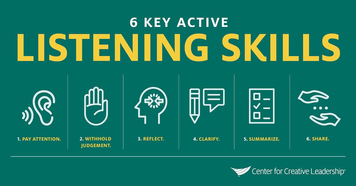
I was working with my product owner on enabling a paperless experience for one of our products. It took a lot of work to execute this experience due to the complexity involved in the types of documents available for paperless; the rest were mailed. It was a time-sensitive update that had to go out in the larger scheme. However, I dug deeper to understand the expectation for the design. I spent quite some time designing the solution. Eventually, my product owner was unhappy and frustrated when I presented the options to the team. I failed as a designer to pay attention, the first step in active listening, causing a chain reaction in loss of time, that too in a time-sensitive design fix. If I had paid attention and listened to the expectation without bias, the result would have been different.
According to the Hubspot Customer Service Survey 2019, almost 42% of companies do not listen to their customers. The balance is tipped toward business requirements, and customer expectations are funneled out. As a result, the final designs are heavily influenced by the bias of what the team feels the customer wants, but none of it gets validated. Unconscious bias has a higher probability of being introduced, not just by the designer but by the team as well. As a result, it becomes even more pressing for the designer to be vigilant about what is being designed.
It is critical to make decisions towards any design implementation unbiased or, at the very least, make an honest attempt. A business that is partially fulfilling customer expectations will fail. Another responsibility that designers have is to make sure the design is validated by customers. An informed design would serve not just the business requirements, but it would also help the users.
Make It Invisible
So far, we have seen a few introverted traits focused on research and design thinking. The next step is more practical; making it invisible means making the experience so attuned to users’ expectations that it is perceived easily. By not introducing a shed of cognitive load, it will make the experience of the product simple. Even if the product is complicated, the experience should be easily maneuverable so that users can go from point A to B without any hassle.
Introverts prefer social engagements but tend to limit them to a certain extent. They need some alone time to recharge. Even after being selectively social, they get mentally drained. To help themselves recover, they enjoy their own company. Likewise, humans are always highly stimulated, for instance, reading a book, watching TV, cooking, thinking about what to do next, and so much more. In all this chaos, we, as designers, have a moral obligation to make the experiences of all the products highly intuitive by not introducing additional cognitive load. Make it invisible.
Many Indie game development companies do not have the budget to market or advertise their games; they hardly get an opportunity to show them to the world. Yet some of the most popular games on the market are made by small studios or even individuals.
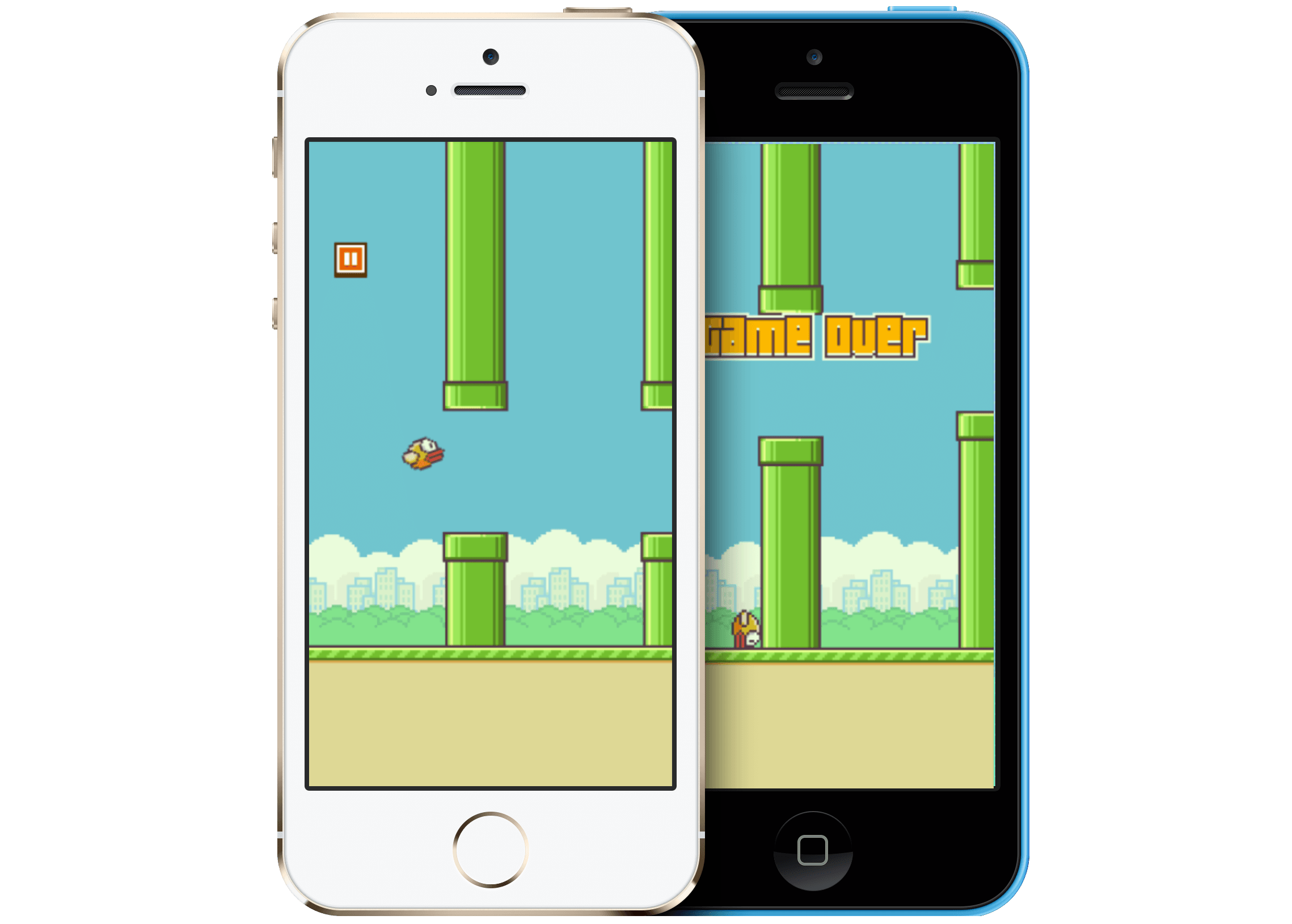
One such example is Flappy Birds. Flappy Birds is a game where the player has to simply tap to make the bird fly. The objective is to avoid obstacles in this infinite scroll game (technically, it is not, however, it is very difficult to beat it by reaching 9,999 points). It became an overnight sensation. The artist and programmer Dong Nguyen, who created this game, took it down because he never imagined it would become this popular and addictive. The game had very simple graphics and deceptively simple interaction, yet it became one of the most downloaded games on Appstore and Google Play. Similarly, a design for any app could also be as simple as Flappy Bird to fulfill user expectations.

“Good design, when it’s done well, becomes invisible. It’s only when it’s done poorly that we notice it.”
— Jared Spool, an expert in the field of design and research
In other words, “making it invisible” means creating an experience that does not make the user think. It is so intuitive that it feels natural. Imagine someone reading your mind and giving you precisely what you want at the exact time.
Another great example is the app Citi Bike, which is mostly used by New Yorkers and tourists alike to commute or explore. It allows the user to easily book a bike for the next 30 mins by undocking it from their generously placed docks throughout the city. If you look at the app, nothing seems to be missing, and everything is easy and intuitive, but it can be invisible.
The moment the app opens, the user sees their location and a button to scan the QR code. Once they scan the code on the bike, it is unlocked. They can then enjoy their ride for the next 30 mins. This is all great, but can the experience be made invisible? Can it be made even better? Of course, it can. Imagine the app would detect the proximity of the user and show the scan code screen directly when they are near a dock. The experience is far more attuned to users’ needs. Just making this small adjustment to the flow would reduce the additional action and make the product, well, invisible.
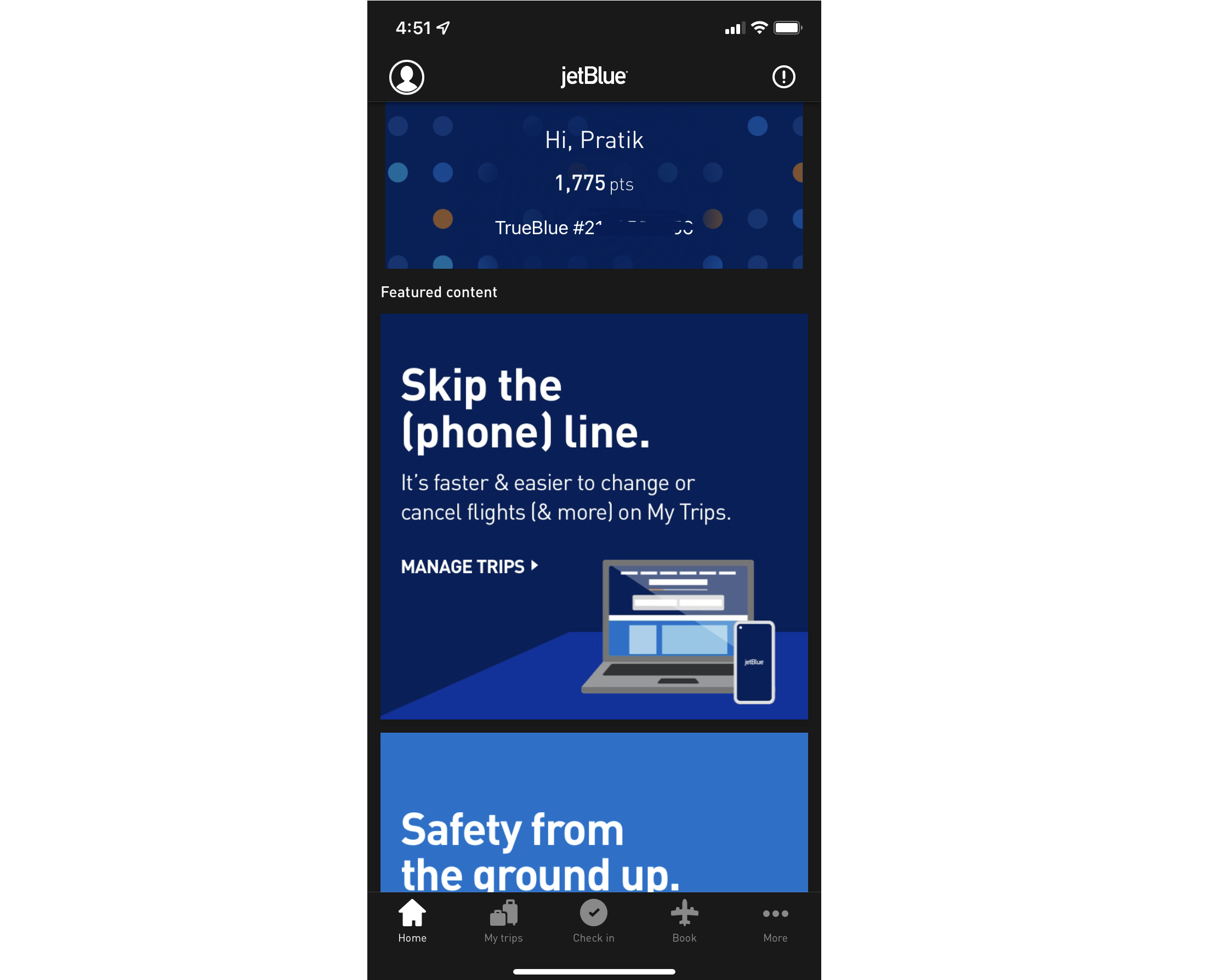
Currently, Jetblue’s mobile app shows points and additional featured content to make up the homepage. However, the main goal is to either view their booking or make a reservation. The user then has to navigate to the book section to make any reservation. This process could be enhanced by simply introducing a search bar that is less intrusive on the homepage.
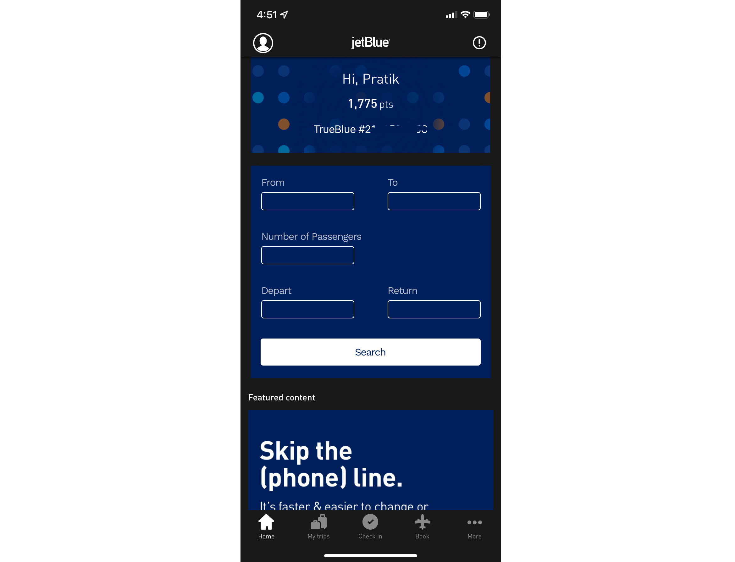
A design does not need to use bright colors, flash call to action (CTA), or jargon words to make it sound smart. It could be very simple but effective with colors, transitions, easy-to-track CTAs, and simple sentences so that anyone can understand it.
Any design decisions we make as designers should help the user quickly complete the task they had in mind when they opened the app. Empathy articulation is a way of understanding the user’s expectations, foreseeing user interaction issues, and translating them into an effortless, actionable, invisible, and affordable design by being mindful. The more we practice invisible design, the better user experiences we can create.
Help The User When Needed
Introverts have a hard time asking for help even if they need it. When others ask them to reach out if they need help, chances are introverts will not reach out. The inherent need to ask for help gets buried because reaching out is difficult for them. Some form of proactivity is needed from others to get them to speak. Of course, this does not mean they are shy. That also does not mean they will never reach out, shifting all the effort onto others. Introverts would find ways to solve the problem by themselves, but they would reach out if nothing worked. However, they would certainly appreciate a nudge.
Help can be needed at any given time, and it should be available. If the idea of “checking with someone” is used in digital media, it will help users to get the needed help when they need it the most. It will give them comfort and improve the experience in general. Imagine a user is trying to find something, and the product identifies their struggle. It would be helpful to push a chatbot or a popover to ask if they need any help. Use the space to assist them. What if there could be an easy way to identify a problem and provide a few options to resolve the issue? What if the control system could help them in their moment of need by recommending a choice?
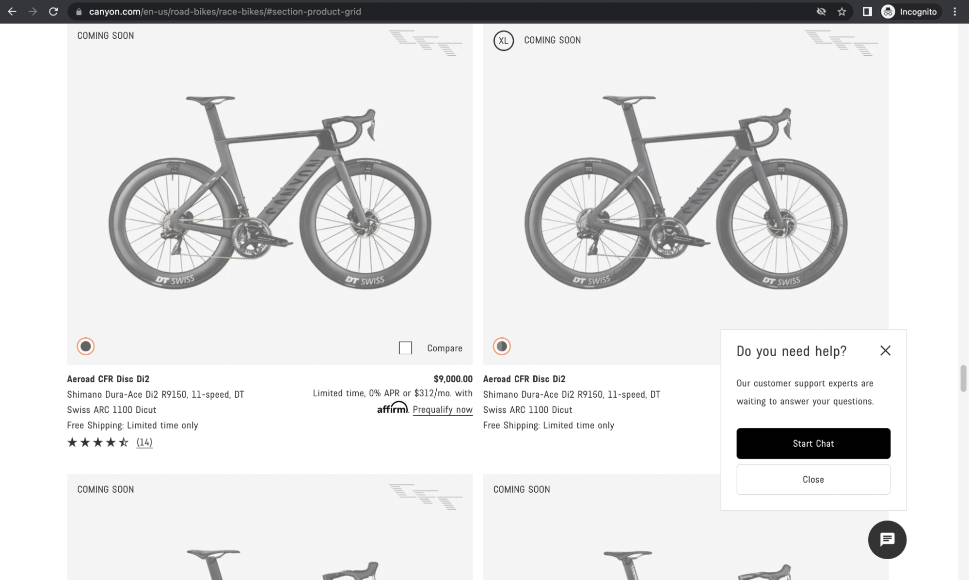
Here is a good example: you visit the Canyon bikes website looking for a brand-new bike for your next adventure, but you have a hard time differentiating between them. All the scrambling and looking for the right model puts you in a paradox of choice. Which bike to pick? However, the website has solved it quite elegantly. After a while, the chat bubble automatically opens up, asking if you want to chat. This feature puts you in line to talk to a representative who can help you locate the exact bike that will satisfy your needs. Here if you notice, the website realized you could not find the bike and surged up to help. It was at the right time and was not invasive, keeping you, as the customer, rooted in the experience.
The help should also be accurate and precise, with actionable items or connecting you to a live agent like in the above example. Otherwise, as much as help is needed, it might pile on more confusion than reduce it. That brings us to the next and final trait.
Subtlety
Introverts enjoy speaking directly yet deftly. They think talking elaborately would stretch the conversation further and make it exponentially longer than they would prefer and also stir up confusion. Introverts believe that a minimal set of words can make a high impact. Similarly, being subtle can bolster a user experience even further. The user experience can be precise to what the user wants instead of creating a visually complicated path. Craigslist, for instance, has no visual design elements compared to many products out there, but it still fulfills customer expectations because the website has a good UX. The arrangement and categorization are well thought out, making the entire experience far smoother.
The implementation of the language is also a part of the user experience, and it should be simple and easy to comprehend. Complex and complicated language tends to alienate users and cause them to overlook important information.
Likewise, keeping a design minimalistic will make the entire experience better, including the language. Subtlety is about keeping the experience to the bare minimum; it should not be overdramatic. Burdening users with too much information or too many interactions puts them in a paradox of choice.
User experience is about building pleasure around expectation.
Shazam is a compelling app that identifies the tune to help you learn more about the song you liked but do not know the name of. They have made using the tool even simpler by integrating it with Siri. “Hey, Siri, which song is this?” will bring up Shazam to help identify the song. Now that is subtlety.
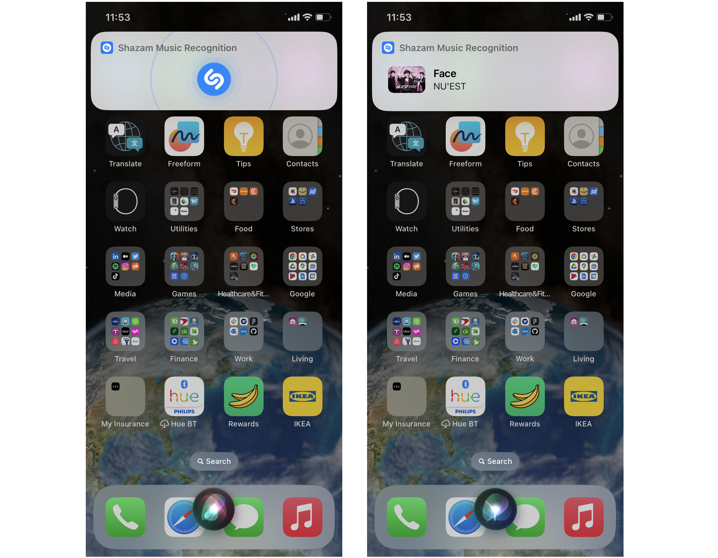
Introverted design is pulled from introverted traits that elegantly influence designs. I firmly believe that using these traits and converting them into appropriate skills could help designers with a different outlook. To practice introverted design, we need to perform the same process with additional intentions that are driven like an introvert:
-
Identify nuances of human behavior: Introverts are expert observers.
- Skill: Exceed the obvious.
-
Overthinking an action: Introverts are prone to overthink.
- Skill: Ponder and analyze data beyond the convention.
-
Identify Risks: Introverts take calculated risks.
- Skill: Carefully consider decisions to pave the path with the slightest possibility of failure.
-
Make it objective by practicing active listening: Introverts are great listeners.
- Skill: Active listening will help designers comprehend and build better products.
-
Make it invisible:Introverts prefer alone time to recharge.
- Skill: Create highly intuitive products by focusing on the need.
-
Help the user when needed: Due to their inwardness, introverts have a hard time asking for help.
- Skill: Intervene and provide necessary information when needed.
-
Subtlety: Introverts prefer using precise words to convey thoughts.
- Skills: Drive high impact by being eloquent.
The design does not need to be bold, but it needs to be elegant. To use an introverted design, we first need to understand the introverted personality. I am a proud introvert, so I highly recommend a great resource — Jenn Granneman’s ‘Introvert, Dear,’ an award-winning community of introverts. Commonly mistaken for shyness, introverts are highly effective people.
The way introverts deal with and interact with the world is nimble. Observe your surroundings, and you will notice so much information that you usually do not perceive. Be articulate using appropriate words and real examples. Listen first, talk later; it helps formulate thoughts better. Speak only when you have something to contribute; otherwise, you are not adding any value to the conversation. Be a critical thinker. All this will help you learn more about how introverts look at the world.
Sometimes a different perspective is all we need to make a difference.
