Archive

Archive for the ‘Programming’ Category

Electric Geek Transportation Systems

August 20th, 2019 No comments
a-team-van

I’ve never thought of myself as a “car person”. The last new car I bought (and in fact, now that I think about it, the first new car I ever bought) was the quirky 1998 Ford Contour SVT. Since then we bought a VW station wagon in 2011 and a Honda minivan in 2012 for family transportation duties. That’s it. Not exactly the stuff The Stig’s dreams are made of.

The station wagon made sense for a family of three, but became something of a disappointment because it was purchased before — surprise! — we had twins. As Mark Twain once said:

Sufficient unto the day is one baby. As long as you are in your right mind don’t you ever pray for twins. Twins amount to a permanent riot. And there ain’t any real difference between triplets and an insurrection.

I’m here to tell you that a station wagon doesn’t quite cut it as a permanent riot abatement tool. For that you need a full sized minivan.

I’m with Philip Greenspun. Like black socks and sandals, minivans are actually … kind of awesome? Don’t believe all the SUV propaganda. Minivans are flat out superior vehicle command centers. Swagger wagons, really.

The A-Team drove a van, not a freakin’ SUV. I rest my case.

After 7 years, the station wagon had to go. We initially looked at hybrids because, well, isn’t that required in California at this point? But if you know me at all, you know I’m a boil the sea kinda guy at heart. I figure if you’re going to flirt with partially electric cars, why not put aside these half measures and go all the way?

Do you remember that rapturous 2014 Oatmeal comic about the Tesla Model S? Even for a person who has basically zero interest in automobiles, it did sound really cool.

It’s been 5 years, but from time to time I’d see some electric vehicle on the road and I’d think about that Intergalactic SpaceBoat of Light and Wonder. Maybe it’s time for our family to jump on the electric car trend, too, and just late enough that we can avoid the bleeding edge and end up merely on the … leading edge?

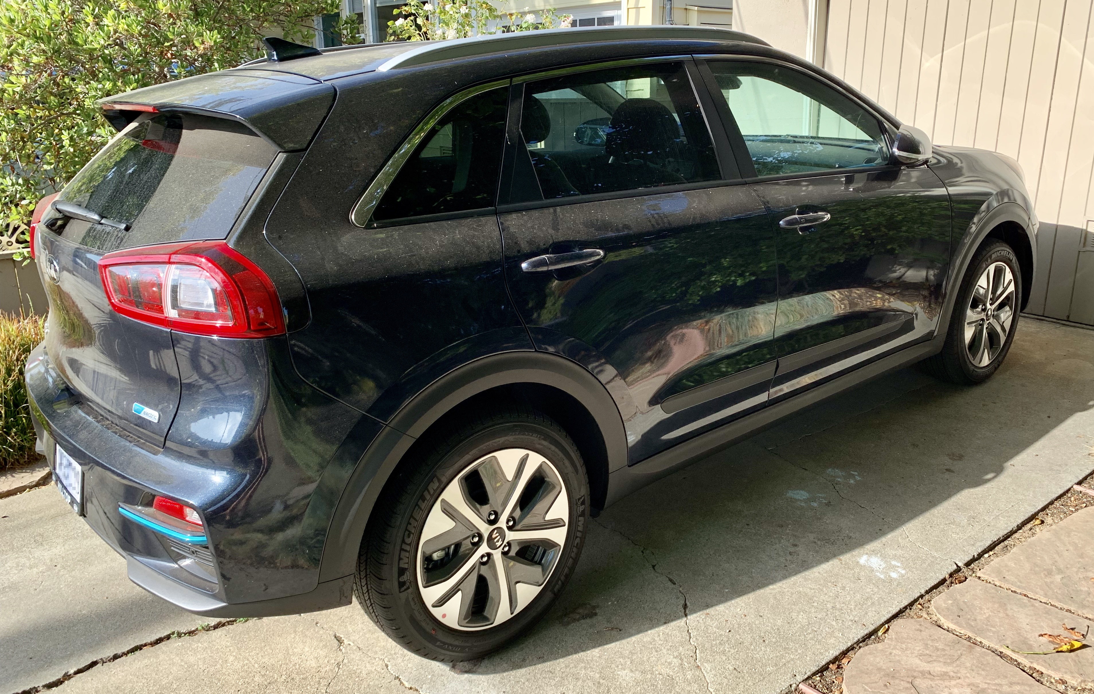
That’s why we’re now the proud owners of a fully electric 2019 Kia Niro.

kia-niro-2019

I’ve somehow gone from being a person who basically doesn’t care about cars at all … to being one of those insufferable electric car people who won’t shut up about them. I apologize in advance. If you suddenly feel an overwhelming urge to close this browser tab, I don’t blame you.

I was expecting another car, like the three we bought before. What I got, instead, was a transformation:

  • Yes, yes, electric cars are clean, but it’s a revelation how clean everything is in an electric. You take for granted how dirty and noisy gas based cars are in daily operation – the engine noise, the exhaust fumes, the scent of oil, the black dust that descends on everything, washing your hands after using the gas station pumps. You don’t fully appreciate how oppressive those little dirty details were until they’re gone.

  • Electric cars are (almost) completely silent. I guess technically in 2019 electric cars require artificial soundmakers at low speed for safety, and this car has one. But The Oatmeal was right. Electric cars feel like a spacecraft because they move so effortlessly. There’s virtually no delay from action to reaction, near immediate acceleration and deceleration … with almost no sound at all, like you’re in freakin’ space! It’s so immensely satisfying!

  • Electric cars aren’t just electric, they’re utterly digital to their very core. Gas cars always felt like the classic 1950s Pixar Cars world of grease monkeys and machine shop guys, maybe with a few digital bobbins added here and there as an afterthought. This electric car, on the other hand, is squarely in the post-iPhone world of everyday digital gadgets. It feels more like a giant smartphone than a car. I am a programmer, I’m a digital guy, I love digital stuff. And electric cars are part of my world, rather than the other way around. It feels good.

  • Electric cars are mechanically much simpler than gasoline cars, which means they are inherently more reliable and cheaper to maintain. An internal combustion engine has hundreds of moving parts, many of which require regular maintenance, fluids, filters, and tune ups. It also has a complex transmission to translate the narrow power band of a gas powered engine. None of this is necessary on an electric vehicle, whose electric motor is basically one moving part with simple 100% direct drive from the motor to the wheels. Simplicity is deeply appealing.

  • Being able to charge at home overnight is perhaps the most radical transformation of all. Your house is now a “gas station”. Our Kia Niro has a range of about 250 miles on a full battery. With any modern electric car, provided you drive less than 200 miles a day round trip (who even drives this much?), it’s very unlikely you’ll ever need to “fill the tank” anywhere but at home. Ever. It’s so strange to think that in 50 years, gas stations may eventually be as odd to see in public as telephone booths now are. Our charger is, conveniently enough, right next to the driveway since that’s where the power breaker box was. With the level 2 charger installed, it literally looks like a gas pump on the side of the house, except this one “pumps” … electrons.

level-2-ev-charger

This electric car is such a great experience. It’s so much better than our gas powered station wagon that I swear, if there was a fully electric minivan (there isn’t) I would literally sell our Honda minivan tomorrow and switch over. Without question. And believe me, I had no plans to sell that vehicle two months ago. The electric car is that much better.

I was expecting “yet another car”, but what I got instead was a new, radical worldview. Driving a car powered by barely controlled liquid fuel detonations used to be normal. But in an world of more and more viable electric vehicles this status quo increasingly starts to feel … deeply unnatural. Electric is so much better of an overall experience, in so many ways, that you begin to wonder, why did we ever do it that way?

Gas cars seem, for lack of a better word, obsolete.

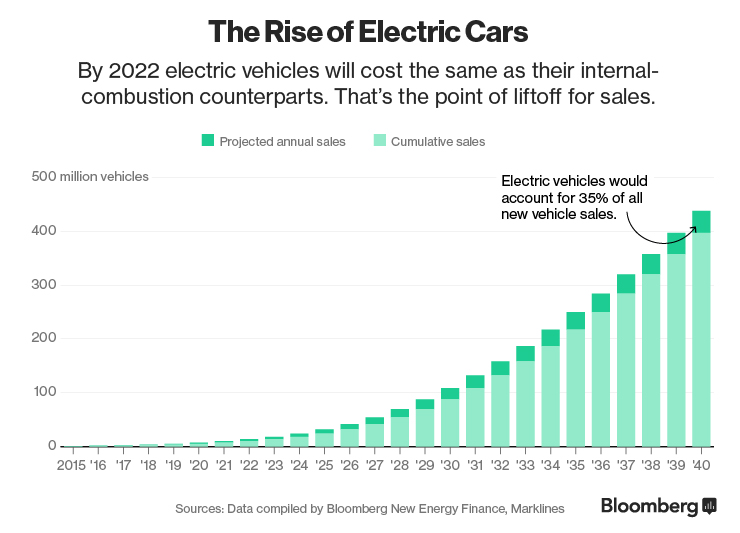
ev-sales

How did this transformation happen, from my perspective, so suddenly? When exactly did electric cars go from “expensive, experimental thing for crazy people” to “By God, I’ll never buy another old fashioned gasoline based car if I can help it”?

I was vaguely aware of the early electric cars. I even remember one coworker circa 2001 who owned a bright neon green Honda Insight. I ignored it all because, like I said, I’m not a car guy. I needed to do the research to understand the history, and I started with the often recommended documentary Who Killed the Electric Car?

This is mostly about the original highly experimental General Motors EV1 from 1996 to 1999. It’s so early the first models had lead-acid batteries! ? There’s a number of conspiracy theories floated in the video, but I think the simple answer to the implied question in the title is straight up price. The battery tech was nowhere near ready, and per the Wikipedia article the estimated actual cost of the car was somewhere between $100,000 and $250,000 though I suspect it was much closer to the latter. It is interesting to note how much the owners (well, leasers) loved their EV1s. Having gone through that same conversion myself, I empathize!

I then watched the sequel, Revenge of the Electric Car. This one is essential, because it covers the dawn of the modern electric car we have today.

This chronicles the creation of three very influential early electric cars — the Nissan Leaf, the Chevy Volt, and of course the Tesla Roadster from 2005 – 2008. The precise moment that Lithium-Ion batteries were in play – that’s when electric cars started to become viable. Every one of these three electric cars was well conceived and made it to market in volume, though not without significant challenges, both internal and external. None of them were perfect electric vehicles by any means: the Roadster was $100k, the Leaf had limited range, and the Volt was still technically a hybrid, albeit only using the gasoline engine to charge the battery.

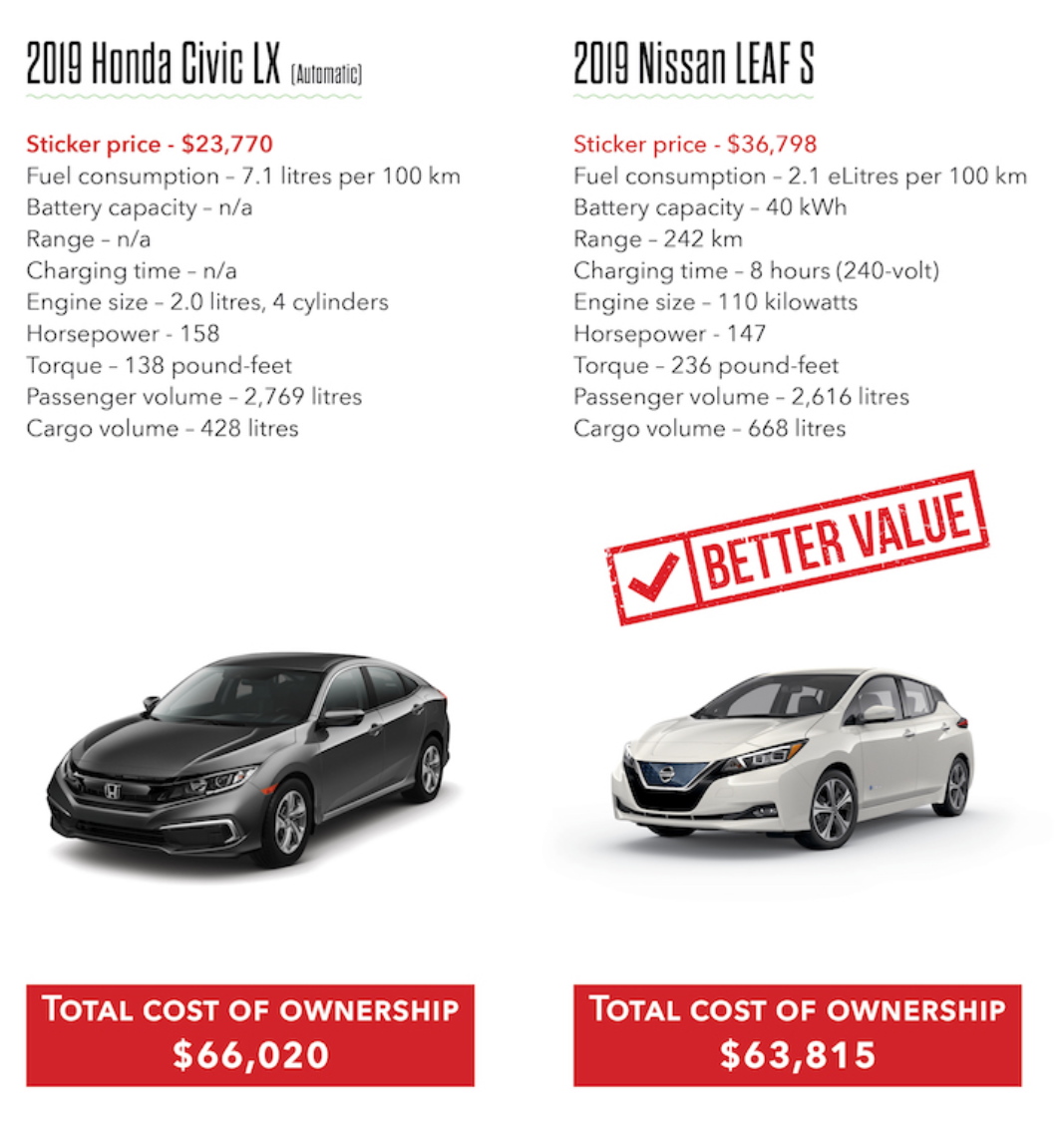
Ten years later, Tesla has the model 3 at $38,000 and we bought our Kia Niro for about the same price. After national and state tax incentives and rebates, that puts the price at around $30,000. It’s not as cheap as it needs to be … yet. But it’s getting there. And it’s already competitive with gasoline vehicles in 2019.

2019-civic-vs-leaf-1

The trends are clear, even now. And I’m here to tell you that right now, today, I’d buy any modern electric car over a gasoline powered car.

If you too are intrigued by the idea of owning an electric car, you should be. It’s freaking awesome! Bring your skepticism, as always; I highly recommend the above Matt Ferrell explainer video on electric vehicle myths.

As for me, I have seen the future, and it is absolutely, inexorably, and unavoidably … electric. ?

Categories: Others, Programming Tags:

No Longer a Microsoft MVP–Hello MVP Reconnect

July 1st, 2019 No comments

Today marks the first time in nearly a decade that I am no longer an MVP. I will be joining the MVP alum in the MVP Reconnect program.

Getting the MVP award every year has become a great side benefit and validation, but the real achievements have been in working with the community and all the things that we’ve accomplished over the last decade!

When I first received the Microsoft MVP award in 2010, it was an achievement I had been working towards and it was something that really validated the work I was doing in the community. It was a goal I had set – to become a Microsoft MVP. When I got it, I was so excited and felt like Microsoft folks were really paying attention to what I was doing. Keep in mind back then that open source wasn’t even a contribution category, but I was doing a lot of talks in the community and working on the Chuck Norris Framework.

After achieving the award for the first time, my focus shifted to primarily doing great things in the community. A lot of that for the last few years has been hands on and I’ve been at the forefront of those efforts. And accordingly, Microsoft continued to validate that what I was doing was important and helpful for developers using Microsoft technologies.

Over the last few years, my role has shifted a bit to building a long term viable business to support the Chocolatey community. This means managing a business and building an amazing team that can help move my vision forward. This last year especially I’ve been focused in that effort of building a great team and that has meant that I’ve had less visible contributions. I’ve been focused enabling my team to do great things, and two of them are MVPs, which is fantastic!

I’m certainly very appreciative of my time as an MVP and have met a lot of amazing folks in the MVP community! I would have loved to have that 10 year blue disk, but Microsoft has rightly saw that my contributions over the last year have not been up to the standard of other folks out there and has made a proper decision on that front.

One thing I will miss is filling out the renewal paperwork every year as it forced me to take some time to reflect on all the great work we were doing in the community, and it put numbers to that work. I think I will look for my own time to do that reflection at some interval, hopefully a bit more often than annually. I always think of this Ferris Bueller quote when I take a moment to reflect. It’s certainly a great quote to apply to your life:

“Life moves pretty fast. If you don’t stop and look around once in awhile, you could miss it.” – Ferris Bueller’s Day Off

Thank you Microsoft for the opportunity and validation over the years – I’m going to continue doing great things in the community and maybe that will bring me back to the MVP award, but maybe it won’t. And that is totally fine.

Categories: Others, Programming Tags:

An Exercise Program for the Fat Web

May 30th, 2019 No comments
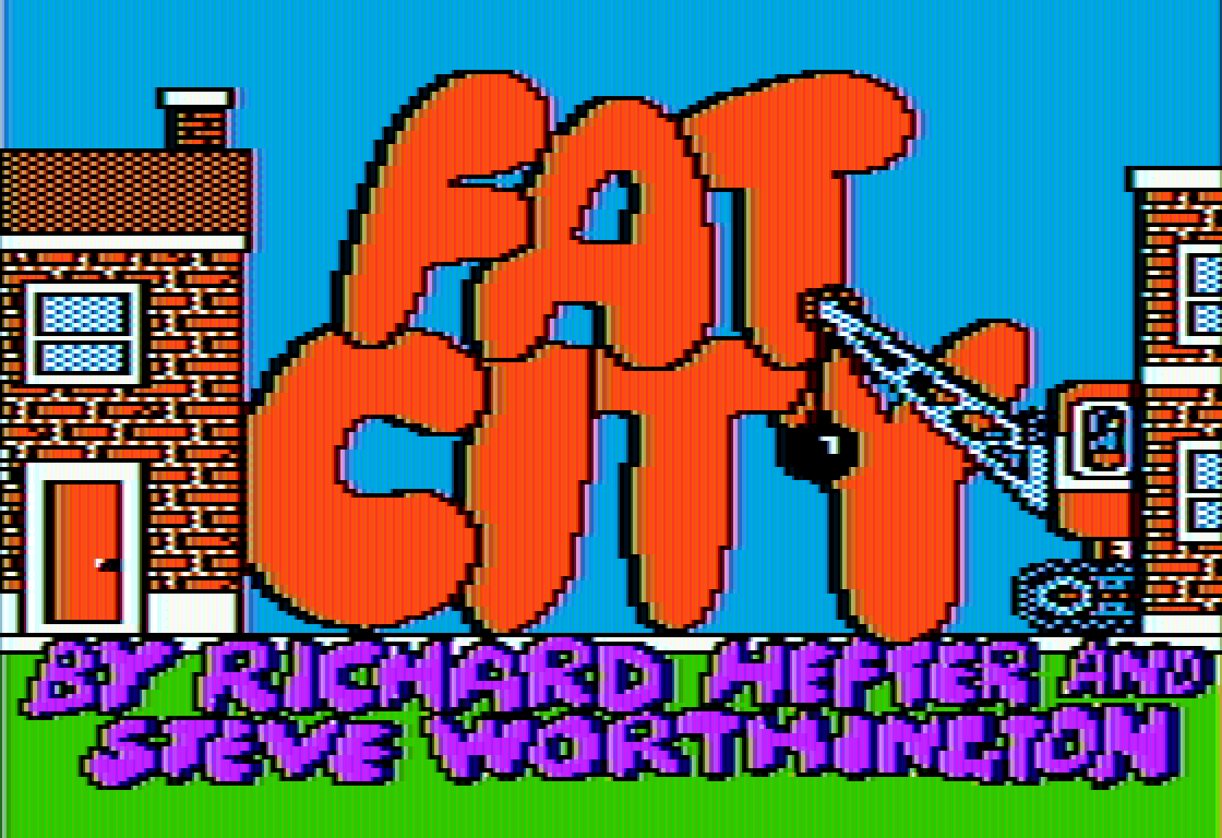
fat city

When I wrote about App-pocalypse Now in 2014, I implied the future still belonged to the web. And it does. But it’s also true that the web has changed a lot in the last 10 years, much less the last 20 or 30.

Websites have gotten a lot … fatter.

While I think it’s irrational to pine for the bad old days of HTML 1.0 websites, there are some legitimate concerns here. The best summary is Maciej Ceg?owski’s The Website Obesity Crisis.

To channel a famous motivational speaker, I could go out there tonight, with the materials you’ve got, and rewrite the sites I showed you at the start of this talk to make them load in under a second. In two hours.

Can you? Can you?

Of course you can! It’s not hard! We knew how to make small websites in 2002. It’s not like the secret has been lost to history, like Greek fire or Damascus steel.

But we face pressure to make these sites bloated.

I bet if you went to a client and presented a 200 kilobyte site template, you’d be fired. Even if it looked great and somehow included all the tracking and ads and social media crap they insisted on putting in. It’s just so far out of the realm of the imaginable at this point.

The whole article is essential; you should stop what you’re doing and read it now if you haven’t already. But if you don’t have time, here’s the key point:

This is a screenshot from an NPR article discussing the rising use of ad blockers. The page is 12 megabytes in size in a stock web browser. The same article with basic ad blocking turned on is 1 megabyte.

That’s right, through the simple act of running an ad blocker, you’ve reduced that website’s payload by twelve times. Twelve! That’s like the most effective exercise program ever!

Even the traditional advice to keep websites lean and mean for mobile no longer applies because new mobile devices, at least on the Apple side, are faster than most existing desktops and laptops.

The iPhone XS is faster than an iMac Pro on the Speedometer 2.0 JavaScript benchmark. It’s the fastest device I’ve ever tested. Insane 45% jump over the iPhone 8/X chip. How does Apple do it?! ? pic.twitter.com/5nCKZUCAYK

— DHH (@dhh) September 21, 2018

Despite claims to the contrary, the bad guy isn’t web bloat, per se. The bad guy is advertising. Unlimited, unfettered ad “tech” has creeped into everything and subsumed the web.

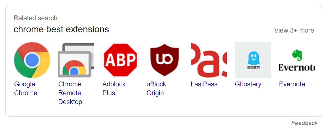
Personally I don’t even want to run ad blockers, and I didn’t for a long time – but it’s increasingly difficult to avoid running an ad blocker unless you want a clunky, substandard web experience. There’s a reason the most popular browser plugins are inevitably ad blockers, isn’t there? Just ask Google:

chrome-best-extensions-google-search

So it’s all the more surprising to learn that Google is suddenly clamping down hard on adblockers in Chrome. Here’s what the author of uBlock Origin, an ad blocking plugin for Chrome, has to say about today’s announcement:

In order for Google Chrome to reach its current user base, it had to support content blockers — these are the top most popular extensions for any browser. Google strategy has been to find the optimal point between the two goals of growing the user base of Google Chrome and preventing content blockers from harming its business.

The blocking ability of the webRequest API caused Google to yield control of content blocking to content blockers. Now that Google Chrome is the dominant browser, it is in a better position to shift the optimal point between the two goals which benefits Google’s primary business.

The deprecation of the blocking ability of the webRequest API is to gain back this control, and to further instrument and report how web pages are filtered, since the exact filters which are applied to web pages are useful information which will be collectable by Google Chrome.

The ad blockers are arguably just as complicit. Eye/o GmbH owns AdBlock and uBlock, employs 150 people, and in 2016 they had 50 million euros in revenue, of which about 50% was profit. Google’s paid “Acceptable Ads” program is a way to funnel money into adblockers to, uh, encourage them to display certain ads. With money. Lots … and lots … of money. ?

We simultaneously have a very real web obesity crisis, and a looming crackdown on ad blockers, seemingly the only viable weight loss program for websites. What’s a poor web citizen of the web to do? Well, there is one thing you can do to escape the need for browser-based adblockers, at least on your home network. Install and configure Pi-Hole.

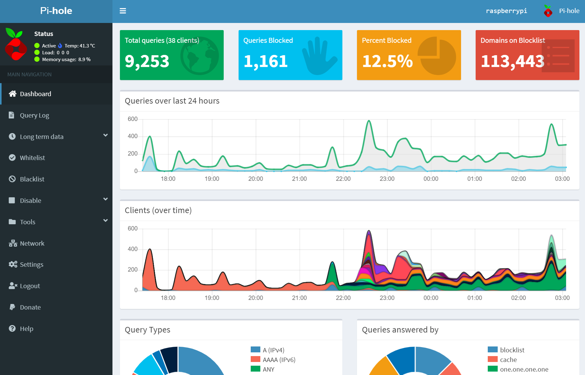
pi-hole-screenshot

I’ve talked about the amazing Raspberry Pi before in the context of classic game emulation, but this is another brilliant use for a Pi.

Here’s why it’s so cool. If you disable the DHCP server on your router, and let the Pi-Hole become your primary DHCP server, you get automatic DNS based blocking of ads for every single device on your network. It’s kind of scary how powerful DNS can be, isn’t it?

pi-hole-action-shot

My Pi-Hole took me about 1 hour to set up, start to finish. All you need is

I do recommend the 3b+ because it has native gigabit ethernet and a bit more muscle. But literally any Raspberry Pi you can find laying around will work, though I’d strongly recommend you pick one with a wired ethernet port since it’ll be your DNS server.

I’m not going to write a whole Pi-Hole installation guide, because there are lots of great ones out there already. It’s not difficult, and there’s a great, mature web GUI waiting for you once you complete initial setup. For your initial testing, pick any IP address you like on your network that won’t conflict with anything active. Once you’re happy with the basic setup and web interface:

  • Turn OFF your router’s DHCP server – existing leases will continue to work, so nothing will be immediately broken.
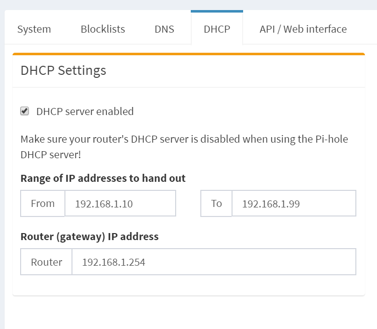
  • Turn ON the pi-hole DHCP server, in the web GUI.

pi-hole-dhcp-server

Once you do this, all your network devices will start to grab their DHCP leases from your Pi-Hole, which will also tell them to route all their DNS requests through the Pi-Hole, and that’s when the ? magic ? happens!

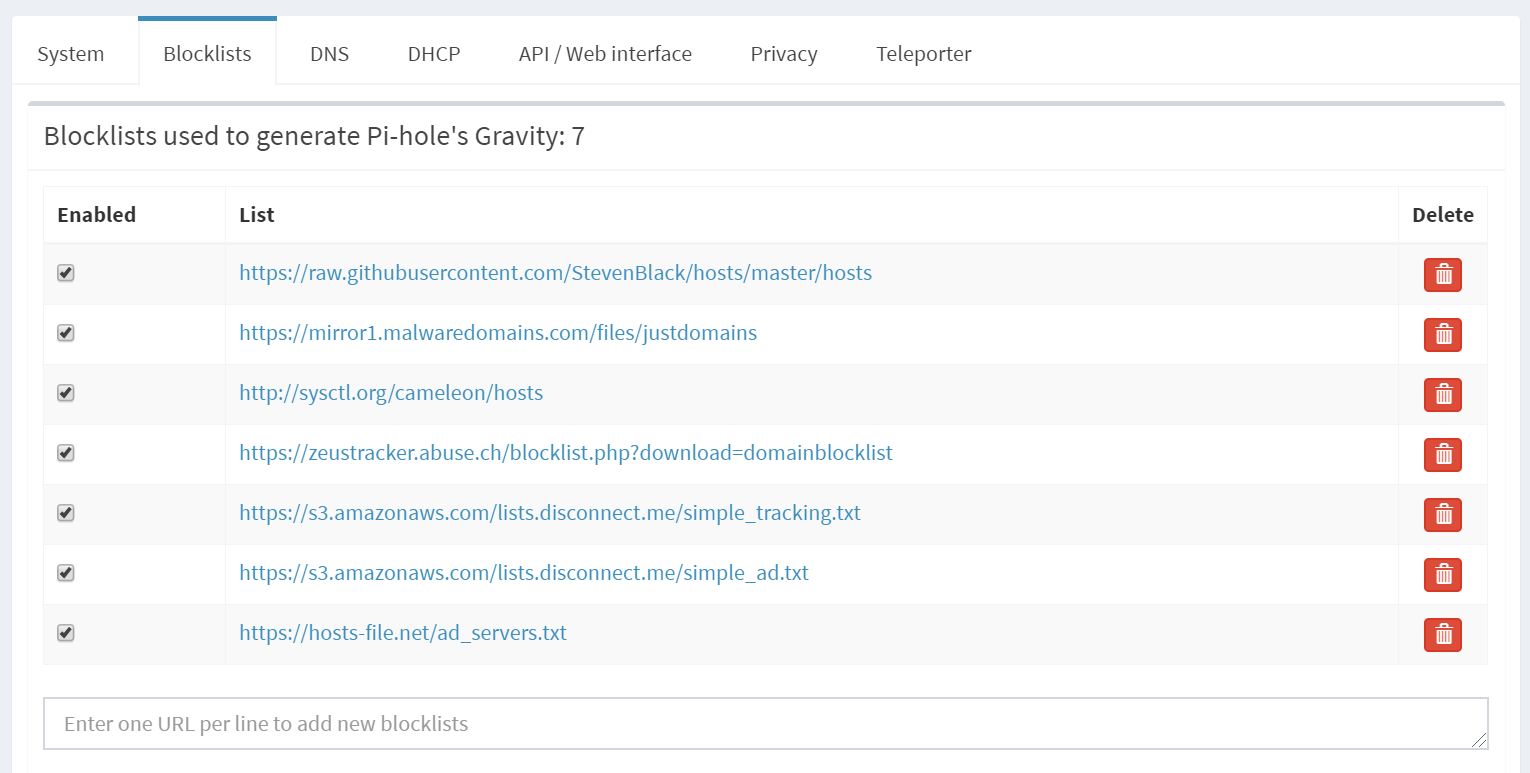
pi-hole-blacklists

All those DNS requests from all the devices on your network will be checked against the ad blacklists, and anything matching is quickly and silently discarded.

pi-hole-dashboard-stats

(The Pi-Hole also acts as a caching DNS server, so repeated DNS requests will be serviced rapidly from your local network, too.)

If you’re worried about stability or reliability, you can easily add a cheap battery backed USB plug, or even a second backup Pi-Hole as your secondary DNS provider if you prefer belt and suspenders protection. Switching back to plain boring old vanilla DNS is as easy as unplugging the Pi and flicking the DHCP server setting in your router back on.

At this point if you’re interested (and you should be), just give it a try. If you’re looking for more information, the project has an excellent forum full of FAQs and roadmaps.

You can even vote for your favorite upcoming features!

I avoided the Pi-Hole project for a while because I didn’t need it, and I’d honestly rather jump in later when things are more mature.

pi-hole-pin

Well, now is the time, and I’m impressed with how simple and easy Pi-Hole is to run. Just find a quiet place to plug it in, spend an hour configuring it, and promptly proceed to forget about it forever as you enjoy a lifetime subscription to a glorious web ad instant weight loss program across every single device on your network with zero effort!

Finally, an exercise program I can believe in.

Categories: Others, Programming Tags:

The Cloud is Just Someone Else’s Computer

February 17th, 2019 No comments
there-is-no-cloud

When we started Discourse in 2013, our server requirements were high:

  • 1GB RAM
  • modern, fast dual core CPU
  • speedy solid state drive with 20G+

I’m not talking about a cheapo shared cpanel server, either, I mean a dedicated virtual private server with those specifications.

We were OK with that, because we were building in Ruby for the next decade of the Internet. I predicted early on that the cost of renting a VPS with those specs would drop to $5 per month, and courtesy of Digital Ocean that indeed happened in January 2018.

The cloud got cheaper, and faster. Not really a surprise, since the price of hardware trends to zero over time. But it’s still the cloud, and that means it isn’t exactly cheap, because it is, after all, someone else’s computer that you pay for the privilege of renting.

But wait … what if you could put your own computer “in the cloud”?

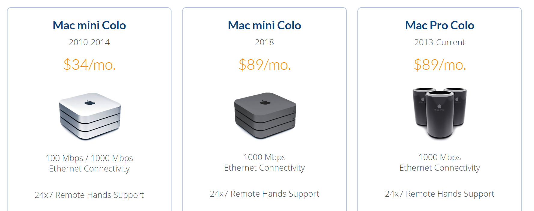
Wouldn’t that be the best of both worlds? Reliable connectivity, plus a nice low monthly price for extremely fast hardware? If this sounds crazy, it shouldn’t – Mac users have been doing this for years now.

mac-colocation-2019-1

I suppose it’s understandable that Mac users would be on the cutting edge here since Apple barely makes server hardware, whereas the PC world has always been the literal de-facto standard for server hardware.

mac-stadium-colocation

Given the prevalence and maturity of cloud providers these days, it’s even a little controversial these days to colocate servers, but we’ve also experimented with colocating mini-pcs in various hosting roles. I’m still a little curious why there isn’t more of a cottage industry for colocating mini PCs. Because … I think there should be.

I originally wrote about the scooter computers we added to our Discourse infrastructure in 2016, plus my own colocation experiment that ran concurrently. Over the last three years of both experiments, I’ve concluded that these little boxes are plenty reliable, with one role specific caveat that I’ll explain in the comments. I remain an unabashed fan of mini-PC colocation. I like it so much I put together a new 2019 iteration:

2017 — $670 2019 — $820
i7-7500u
2.7-3.5 Ghz, 2c / 4t
i7-8750h
2.2-4.1 Ghz, 6c / 12t
16GB DDR3 RAM 32GB DDR4 RAM
500GB SATA SSD 500GB NVMe SSD

This year’s iteration of the scooter computer offers 3× the cores, 2× the memory, and 3× faster drive. It is, as the kids say … an absolute unit. ?

2019-scooter-computer-top-interior-1

2019-scooter-computer-bottom-interior

2019-scooter-computer-front-and-back

It also has a rather elegant dual-sided internal layout. There is a slot for an old-school 2.5″ drive, plus built in wi-fi, but you won’t see it in these pictures because I physically removed both.

I vetted each box via my recommended burn in and stability testing and they all passed with flying colors, though I did have to RMA one set of bodgy RAM sticks in the process. The benchmarks tell the story, as compared to the average Digital Ocean droplet:

Per-core performance
sysbench cpu --cpu-max-prime=20000 run

DO Droplet 2,988
2017 Mini-PC 4,800
2019 Mini-PC 5,671

Multi-core performance
sysbench cpu --cpu-max-prime=40000 --num-threads=8 run

DO Droplet 2,200
2017 Mini-PC 5,588
2019 Mini-PC 14,604

Disk performance
dd bs=1M count=512 if=/dev/zero of=test conv=fdatasync hdparm -Tt /dev/sda

DO Droplet 701 / 8818 / 471 MB/sec
2017 Mini-PC 444 / 12564 / 505 MB/sec
2019 Mini-PC 1200 / 17919 / 3115 MB/sec

Discourse rebuild
time ./launcher rebuild app

DO Droplet 6:59
2017 Mini-PC 3:41
2019 Mini-PC 3:24

Power consumption could be a concern, as the 2017 version had a much lower 15 watt TDP, compared to the 45 watts of this version. That 3× increase in core count ain’t free! So I tested that, too, with a combination of i7z, stress, and my handy dandy watt meter.

2019-mini-pc-i7z-testing

(idle login) 800 Mhz 10w
stress --cpu 1 4.1 GHz 30w
stress --cpu 2 4.1 GHz 42w
stress --cpu 3 4.0 GHz 53w
stress --cpu 4 3.9 GHz 65w
stress --cpu 5 3.7 GHz 65w
stress --cpu 6 3.5 GHz 65w
stress --cpu 12 3.3 Ghz 65w

I’d expect around 10-15 watts doing typical low-load stuff that isn’t super CPU intensive. Note that running current-ish versions of mprime jacks power consumption up to 75w ? and the overall clock scales down to 3.1 Ghz … let me tell you, I’ve learned to be very, very afraid of AVX2 extensions.

(If you’re worried about noise, don’t be. This active cooling solution is clearly overkill for a 65w load, because it barely spun up at all even under full core load. It was extremely quiet.)

So we’re happy that this machine is a slammin’ deal for $820, it’s super fast, and plenty reliable. But how about colocation costs? My colocation provider is EndOffice out of Boston, and they offer very competitive rates, at $29/month for colocating a Mini-PC.

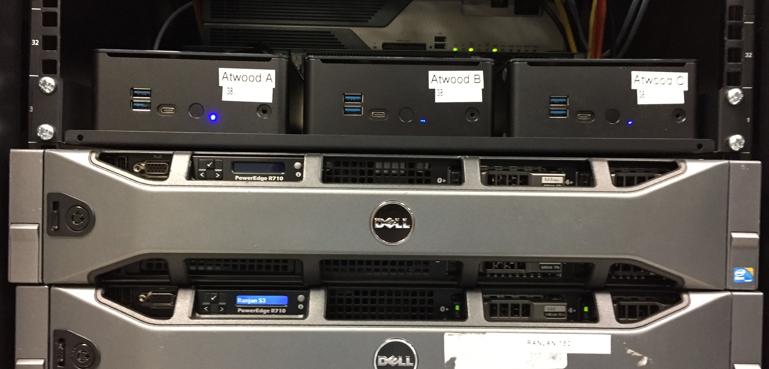
I personally colocate three Mini-PCs for redundancy and just-in-case; there are discounts for colocating more than one. Here they are racked up and in action. Of course I labelled the front and rear before shipping because that’s how I roll.

endoffice-colocated-2019-mini-pcs

Let’s break this down and see what the actual costs of colocating a Mini-PC are versus the cloud. Let’s assume a useful life of say, three years? Given the plateauing of CPU speeds, I think five years is more realistic, but let’s use the more conservative number to be safe.

  • $880 mini-pc 32GB RAM, 6 CPUs, 500GB SSD
  • $120 taxes / shipping / misc
  • $29 × 12 × 3 = $1,044

That’s $2,044 for three years of hosting. How can we do on Digital Ocean? Per their current pricing page:

  • 32GB RAM, 8 vCPUs, 640GB SSD
  • $160/month
  • $160 × 12 × 3 = $5,760

This isn’t quite apples to apples, as we are getting an extra 140GB of disk and 2 bonus CPUs, but let’s assume the CPUs can be partially consumed by multi-tenancy compared to our dedicated, isolated CPUs. Still, you pay almost three times as much for a cloud server. ?

I’m not saying this is for everyone. If you just need to spin up a quick server or two for testing and experimentation, there’s absolutely no way you need to go to the trouble and up-front cost of building and then racking colocated mini-pcs. There’s no denying that spinning servers up in the cloud offers unparalleled flexibility and redundancy. But if you do have need for dedicated computing resources over a period of years, then building your own small personal cloud, with machines you actually own, is not only one third the cost but also … kinda cool?

your-own-personal-cloud

If you’d also like to embark upon this project, you can get the same Partaker B19 box I did for $490 from Amazon, or $460 direct from China via AliExpress. Add memory and drive to taste, build it up, then check out endoffice.com who I can enthusiastically recommend for colocation, or the colocation provider of your choice.

Let’s do our part to keep the internet fun and weird!

Categories: Others, Programming Tags:

What does Stack Overflow want to be when it grows up?

October 22nd, 2018 No comments
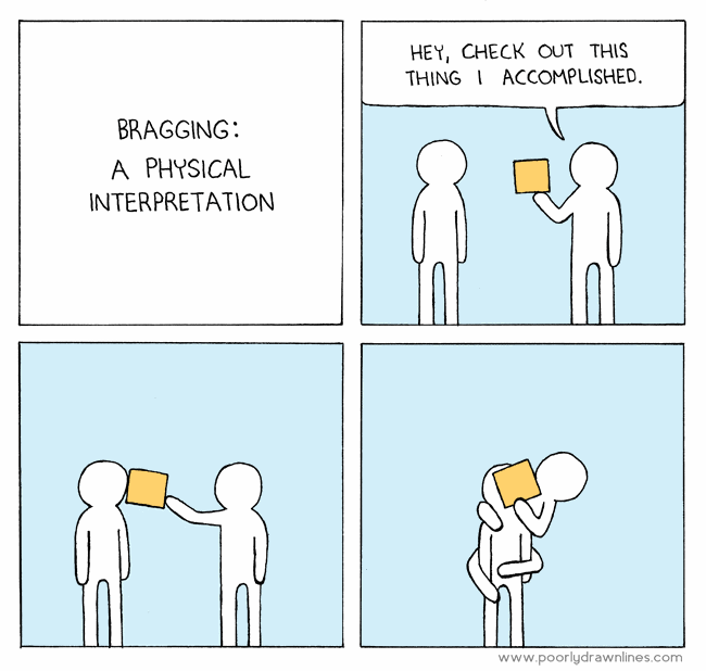
bragging

I sometimes get asked by regular people in the actual real world what it is that I do for a living, and here’s my 15 second answer:

We built a sort of Wikipedia website for programmers to post questions and answers. It’s called Stack Overflow.

As of last month, it’s been 10 years since Joel Spolsky and I started Stack Overflow. I currently do other stuff now, and I have since 2012, but if I will be known for anything when I’m dead, clearly it is going to be good old Stack Overflow.

Here’s where I’d normally segue into a bunch of rah-rah stuff about how great Stack Overflow is, and thus how implicitly great I am by association for being a founder, and all.

I do not care about any of that.

What I do care about, though, is whether Stack Overflow is useful to working programmers. Let’s check in with one of my idols, John Carmack. How useful is Stack Overflow, from the perspective of what I consider to be one of the greatest living programmers?

@StackExchange @codinghorror SO has probably added billions of dollars of value to the world in increased programmer productivity.

— John Carmack (@ID_AA_Carmack) September 17, 2013

I won’t lie, September 17th, 2013 was a pretty good day. I literally got chills when I read that, and not just because I always read the word “billions” in Carl Sagan’s voice. It was also pleasantly the opposite of pretty much every other day I’m on Twitter, scrolling through an oppressive, endless litany of shared human suffering and people screaming at each other. Which reminds me, I should check my Twitter and see who else is wrong on the Internet today.

I am honored and humbled by the public utility that Stack Overflow has unlocked for a whole generation of programmers. But I didn’t do that.

  • You did, when you contributed a well researched question to Stack Overflow.
  • You did, when you contributed a succinct and clear answer to Stack Overflow.
  • You did, when you edited a question or answer on Stack Overflow to make it clearer.

All those “fun size” units of Q&A collectively contributed by working programmers from all around the world ended up building a Creative Commons resource that truly rivals Wikipedia within our field. That’s … incredible, actually.

But success stories are boring. The world is filled with people that basically got lucky, and subsequently can’t stop telling people how it was all of their hard work and moxie that made it happen. I find failure much more instructive, and when building a business and planning for the future, I take on the role of Abyss Domain Expert™ and begin a staring contest. It’s just a little something I like to do, you know … for me.

abyss-oc

Thus, what I’d like to do right now is peer into that glorious abyss for a bit and introspect about the challenges I see facing Stack Overflow for the next 10 years. Before I begin, I do want to be absolutely crystal clear about a few things:

  1. I have not worked at Stack Overflow in any capacity whatsoever since February 2012 and I’ve had zero day to day operational input since that date, more or less by choice. Do I have opinions about how things should be done? Uh, have you met me? Do I email people every now and then about said opinions? I might, but I honestly do try to keep it to an absolute minimum, and I think my email archive track record here is reasonable.

  2. The people working at Stack are amazing and most of them (including much of the Stack Overflow community, while I’m at it) could articulate the mission better — and perhaps a tad less crankily — than I could by the time I left. Would I trust them with my life? No. But I’d trust them with Joel’s life!

  3. The whole point of the Stack Overflow exercise is that it’s not beholden to me, or Joel, or any other Great Person. Stack Overflow works because it empowers regular everyday programmers all over the world, just like you, just like me. I guess in my mind it’s akin to being a parent. The goal is for your children to eventually grow up to be sane, practicing adults who don’t need (or, really, want) you to hang around any more.

  4. Understand that you’re reading the weak opinions strongly held the strong opinions weakly held of a co-founder who spent prodigious amounts of time working with the community in the first four years of Stack Overflow’s life to shape the rules and norms of the site to fit their needs. These are merely my opinions. I like to think they are informed opinions, but that doesn’t necessarily mean I can predict the future, or that I am even qualified to try. But it ain’t gonna stop me, either!

Stack Overflow is a wiki first

Stack Overflow ultimately has much more in common with Wikipedia than a discussion forum. By this I mean questions and answers on Stack Overflow are not primarily judged by their usefulness to a specific individual, but by how many other programmers that question or answer can potentially help over time. I tried as hard as I could to emphasize this relationship from launch day in 2008. Note who has top billing in this venn diagram.
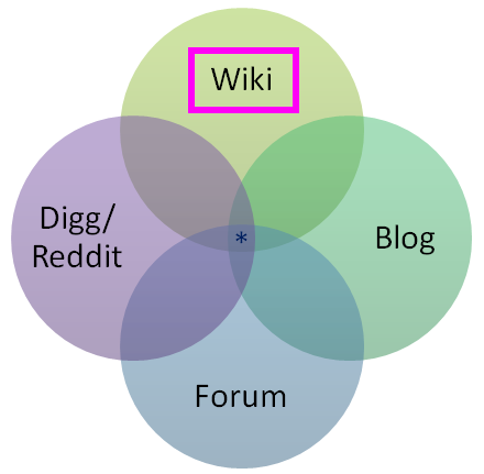
stack-overflow-venn-diagram

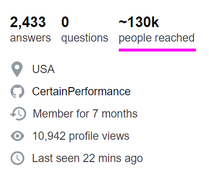
Stack Overflow later added a super neat feature to highlight this core value in user profiles, where it shows how many other people you have potentially helped with your contributed questions and answers so far.
stackoverflow-people-reached-profile-stat-1

The most common complaints I see about Stack Overflow are usually the result of this fundamental misunderstanding about who the questions and answers on the site are ultimately for, and why there’s so much strictness involved in the whole process.

I wish more people understood that the goal of Stack Overflow is not “answer my question” but “let’s collaboratively build an artifact that will benefit future coders”. Perhaps SO could be doing more to educate people about this.

— Jeff Atwood (@codinghorror) April 30, 2018

The responsibility for this misunderstanding is all on Stack Overflow (and by that also mean myself, at least up until 2012). I guess the logic is that “every programmer has surely seen, used, and understands Stack Overflow by now, 10 years in” but … I think that’s a highly risky assumption to make. New programmers are minted every second of every day. Complicating matters further, there are three tiers of usage at Stack Overflow, from biggest to smallest, in inverted pyramid style:

  1. I passively search for programming answers.

    Passively searching and reading highly ranked Stack Overflow answers as they appear in web search results is arguably the primary goal of Stack Overflow. If Stack Overflow is working like it’s supposed to, 98% of programmers should get all the answers they need from reading search result pages and wouldn’t need to ask or answer a single question in their entire careers. This is a good thing! Great, even!

  2. I participate on Stack Overflow when I get stuck on a really hairy problem and searching isn’t helping.

    Participating only at those times when you are extra stuck is completely valid. However, I feel this level is where most people tend to run into difficulty on Stack Overflow, because it involves someone who may not be new to Stack Overflow per se, but is new to asking questions, and also at the precise time of stress and tension for them where they must get an answer due to a problem they’re facing … and they don’t have the time or inclination to deal with Stack Overflow’s strict wiki type requirements for research effort, formatting, showing previous work, and referencing what they found in prior searches.

  3. I participate on Stack Overflow for professional development.

    At this level you’re talking about experienced Stack Overflow users who have contributed many answers and thus have a pretty good idea of what makes a great question, the kind they’d want to answer themselves. As a result, they don’t tend to ask many questions because they self-medicate through exhaustive searching and research, but when they do their questions are exemplary.

(There’s technically a fourth tier here, for people who want to selflessly contribute creative commons questions and answers to move the entire field of software development forward for the next generation of software developers. But who has time for saints ?, y’all make the rest of us look bad, so knock it off already Skeet.)

It wouldn’t shock me at all if people spent years happily at tier 1 and then got a big unpleasant surprise when reaching tier 2. The primary place to deal with this, in my opinion, is a massively revamped and improved ask page. It’s also fair to note that maybe people don’t understand that they’re signing up for a sizable chunk of work by implicitly committing to the wiki standard of “try to make sure it’s useful to more people than just yourself” when asking a question on Stack Overflow, and are then put off by the negative reaction to what others view as an insufficiently researched question.

Stack Overflow absorbs so much tension from its adoption of wiki standards for content. Even if you know about that requirement up front, it is not always clear what “useful” means, in the same way it’s not always clear what topics, people, and places are deserving of a Wikipedia page. Henrietta Lacks, absolutely, but what about your cousin Dave in Omaha with his weirdo PHP 5.6 issue?

Over time, duplicates become vast fields of landmines

Here’s one thing I really, really saw coming and to be honest with you I was kinda glad I left in 2012 before I had to deal with it because of the incredible technical difficulty involved: duplicates. Of all the complaints I hear about Stack Overflow, this is the one I am most sympathetic to by far.

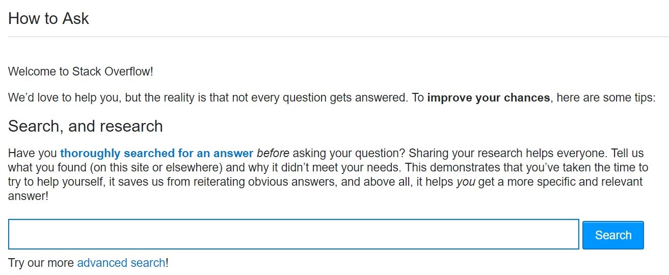
If you accept that Stack Overflow is a wiki type system, then for the same reasons that you obviously can’t have five different articles about Italy on Wikipedia, Stack Overflow can’t accept duplicate questions on the exact same programming problem. While there is a fair amount of code to do pre-emptive searches as people type in questions, plus many exhortations to search before you ask, with an inviting search field and button right there on the mandatory page you see before asking your first question …
stack-overflow-how-to-ask

… locating and identifying duplicate content is an insanely difficult problem even for a company like Google that’s done nothing but specialize in this exact problem for, what, 20 years now, with a veritable army of the world’s most talented engineers.

When you’re asking a question on a site that doesn’t allow duplicate questions, the problem space of a site with 1 million existing questions is rather different from a site with 10 million existing questions … or even 100 million. Your mission to ask a single unique question goes from mildly difficult to mission almost impossible, because that question needs to thread a narrow path through this vast, enormous field of prior art questions without stepping on any of the vaguely similar looking landmines in the process.
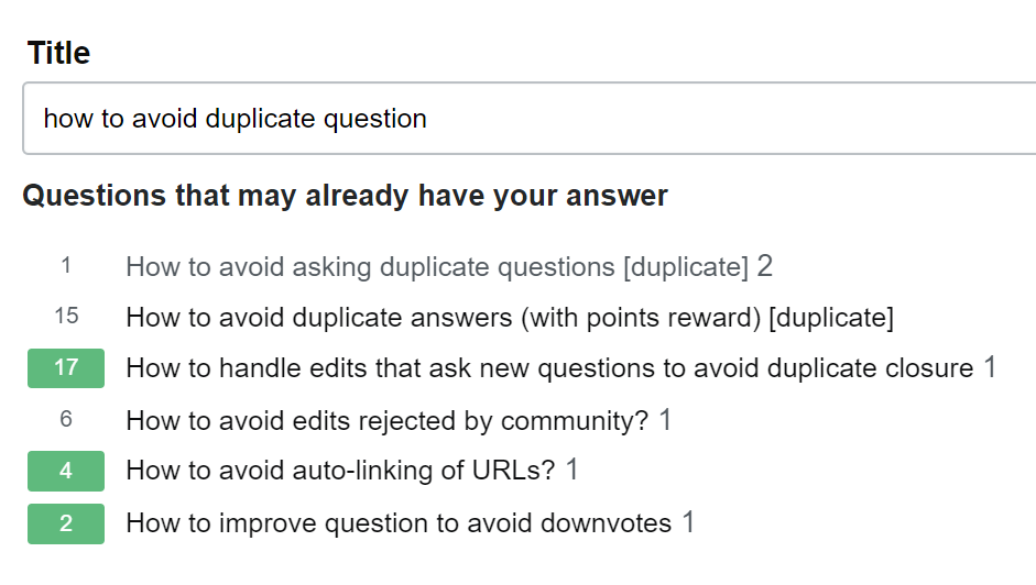
stackoverflow-asking-duplicate-question

But wait! It gets harder!

  • Some variance in similar-ish questions is OK, because 10 different people will ask a nearly identical question using 10 different sets of completely unrelated words with no overlap. I know, it sounds crazy, but trust me: humans are amazing at this. We want all those duplicates to exist so they can point to the primary question they are a duplicate of, while still being valid search targets for people who ask questions with unusual or rare word choices.

  • It can be legitimately difficult to determine if your question is a true duplicate. How much overlap is enough before one programming question is a duplicate of another? And by whose definition? Opinions vary. This is subject to human interpretation, and humans are.. unreliable. Nobody will ever be completely happy with this system, pretty much by design. That tension is baked in permanently and forever.

I don’t have any real answers on the duplicate problem, which only gets worse over time. But I will point out that there is plenty of precedent on the Stack Exchange network for splitting sites into “expert” and “beginner” areas with slightly different rulesets. We’ve seen this for Math vs. MathOverflow, English vs. English Learners, Unix vs. Ubuntu… perhaps it’s time for a more beginner focused Stack Overflow where duplicates are less frowned upon, and conversational rules are a bit more lenient?

Stack Overflow is a competitive system of peer review

Stack Overflow was indeed built to be a fairly explicitly competitive system, with the caveat that “there’s always more than one way to do it.” This design choice was based on my perennial observation that the best way to motivate any programmer .. is to subtly insinuate that another programmer could have maybe done it better.

geek-hero-motivating-programmers

This is manifested in the public reputation system on Stack Overflow, the incredible power of a number printed next to someone’s name, writ large. All reputation in Stack Overflow comes from the recognition of your peers, never the “system”.
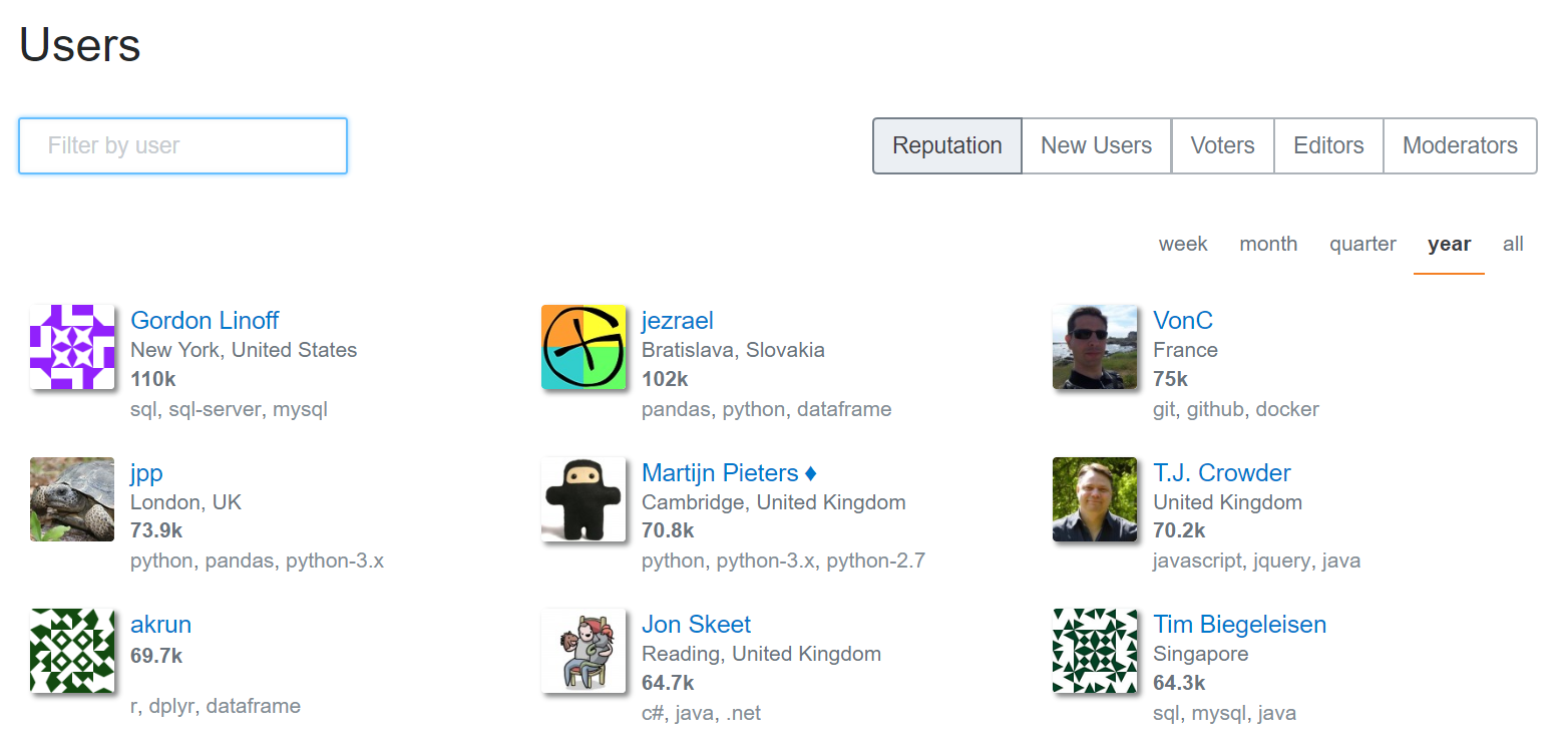
stack-overflow-top-rep-by-year

Once your question is asked, or your answer is posted, it can then be poked, prodded, edited, flagged, closed, opened, upvoted, downvoted, folded and spindled by your peers. The intent is for Stack Overflow to be a system of peer review and friendly competition, like a code review from a coworker you’ve never met at a different division of the company. It’s also completely fair for a fellow programmer to question the premise of your question, as long as it’s done in a nice way. For example, do you really want to use that regular expression to match HTML?

I fully acknowledge that competitive peer review systems aren’t for everyone, and thus the overall process of having peers review your question may not always feel great, depending on your circumstances and background in the field — particularly when combined with the additional tensions Stack Overflow already absorbed from its wiki elements. Kind of a double whammy there.

I’ve heard people describe the process of asking a question on Stack Overflow as anxiety inducing. To me, posting on Stack Overflow is supposed to involve a healthy kind of minor “let me be sure to show off my best work” anxiety:

  • the anxiety of giving a presentation to your fellow peers
  • the anxiety of doing your best work on a test
  • the anxiety of showing up to a new job with talented coworkers on your first day
  • the anxiety of showing up on your first day at school with other students at your level

I imagine systems where there is zero anxiety involved and I can only think of jobs where I had long since stopped caring about the work and thus had no anxiety about whether I even showed for work on any given day. How can that work? Let’s just say I’m not a fan of zero-anxiety systems.

Could there be a less competitive Q&A system, a system without downvotes, a system without close votes, where there was never any anxiety about posting anything? Absolutely! I think many alternative sites should exist on the internet so people can choose an experience that matches their personal preferences and goals. Should Stack build that alternative? Has it already been built? It’s an open question; feel free to point out examples in the comments.

Stack Overflow is designed for practicing programmers

Another point of confusion that comes up a fair bit is who the intended audience for Stack Overflow actually is. That one is straightforward, and it’s been the same from day one:
stackoverflow-for-business-description

Q&A for professional and enthusiast programmers. By that we mean

People who either already have a job as a programmer, or could potentially be hired as a programmer today if they wanted to be.

Yes, in case you’re wondering, part of this was an overt business decision. To make money you must have an audience of people already on a programmer’s salary, or in the job hunt to be a programmer. The entire Stack Overflow network may be Creative Commons licensed, but it was never a non-profit play. It was always imagined as a viable business from the outset, and that’s why we launched Stack Overflow Careers only one year after Stack Overflow launched. To be honest far sooner than we should have, in retrospect. Careers has since been smartly subsumed into Stack Overflow proper at stackoverflow.com/jobs for a more integrated and most assuredly way-better-than-2009 experience.

The choice of audience wasn’t meant to be an exclusionary decision in any way, but Stack Overflow was definitely designed as a fairly strict system of peer review, which is great (IMNSHO, obviously) for already practicing professionals, but pretty much everything you would not want as a student or beginner. This is why I cringe so hard I practically turn myself inside out when people on Twitter mention that they have pointed their students at Stack Overflow. What you’d want for a beginner or a student in the field of programming is almost the exact opposite of what Stack Overflow does at every turn:

  • one on one mentoring
  • real time collaborative screen sharing
  • live chat
  • theory and background courses
  • starter tasks and exercises

These are all very fine and good things, but Stack Overflow does NONE of them, by design.

Can you use Stack Overflow to learn how to program from first principles? Well, technically you can do anything with any software. You could try to have actual conversations on Reddit, if you’re a masochist. But the answer is yes. You could learn how to program on Stack Overflow, in theory, if you are a prodigy who is comfortable with the light competitive aspects (reputation, closing, downvoting) and also perfectly willing to define all your contributions to the site in terms of utility to others, not just yourself as a student attempting to learn things. But I suuuuuuper would not recommend it. There are far better websites and systems out there for learning to be a programmer.

Could Stack Overflow build beginner and student friendly systems like this? I don’t know, and it’s certainly not my call to make. Insert thinking emoji face here!

And that’s it. We can now resume our normal non-abyss gazing. Or whatever it is that passes for normal in these times.

I hope all of this doesn’t come across as negative. Overall I’d say the state of the Stack is strong. But does it even matter what I think? As it was in 2008, so it is in 2018.

Stack Overflow is you.

This is the scary part, the great leap of faith that Stack Overflow is predicated on: trusting your fellow programmers. The programmers who choose to participate in Stack Overflow are the “secret sauce” that makes it work. You are the reason I continue to believe in developer community as the greatest source of learning and growth. You are the reason I continue to get so many positive emails and testimonials about Stack Overflow. I can’t take credit for that. But you can.

I learned the collective power of my fellow programmers long ago writing on Coding Horror. The community is far, far smarter than I will ever be. All I can ask — all any of us can ask — is to help each other along the path.

And if your fellow programmers decide to recognize you for that, then I say you’ve well and truly earned it.

The strength of Stack Overflow begins, and ends, with the community of programmers that power the site. What should Stack Overflow be when it grows up? Whatever we make it, together.
stackoverflow-none-of-us-is-as-dumb-as-all-of-us

p.s. Happy 10th anniversary Stack Overflow!


Also see Joel’s take on 10 years of Stack Overflow with The Stack Overflow Age, A Dusting of Gamification, and Strange and Maddening Rules.

Categories: Others, Programming Tags:

UX Explained in Fewer than 140 Characters

October 2nd, 2018 No comments

As a UX designer or digital agency, you have your regular sources of information that keep you up-to-date on industry happenings and best practices. However, you’ve likely found that different outlets can put out similar content. When you’re feeling like there’s a lull in inspirational content, take to Twitter for a diverse source of unique opinions, perspectives, statistics and UX news.

Whether you feel isolated as the sole UX employee in your agency or you manage UX specialists and want to see how other UX designers conduct their work, Twitter gives you access to other professionals and companies to connect with, share ideas and gain vital information to improve your workflow and understanding of UX.

"The design team consists of every individual who influences the rendering of our intent." @jmspool #DesignLeadership @WeAreDesignX pic.twitter.com/HyP13smaWG

— Farwa K (@itsfarwa) September 29, 2018

When to it comes to a user’s experience on a website, mobile app or any other form of media, there are no small details. The entire display (visual, audio) of content is what creates the atmosphere surrounding a user’s focus, intent and attitude. From the copy and interactivity to the background image and the button for the CTA, every element of what is displayed on the screen currently and leading up to a particular moment is what makes up a user’s experience.

This can come as an aid or a detriment to a UX designer. You can create stunning visuals that capture the essence of the moment/brand perfectly and one typo or a slow page speed can completely throw off a user. You may struggle on a particular project with telling a story and lean on a great copywriter to assist your attractive designs to create a successful project. Understand who will play a role in a given project and work with them to generate an intuitive and engaging experience.

"It doesn’t matter how great your product…if people are not able to perform their desired tasks efficiently." UX Research Is Essential to Product Success https://t.co/SEwKCRWJ6C (@Apurvo_Ghosh via @uxmatters) #ux #techcomm #cx

— Rick Sapir (@ricksapir) September 27, 2018

This works to expel the myth that UX is all about visuals. You may find yourself caught up on the visual aspect of a certain web page or mobile app and overlook the end user experience from the functional standpoint. Just remember that in the end, the time you spend creating the perfect atmosphere that is immersive, engaging, informative and natural, will likely not matter if a user cannot get through the entire process efficiently. Be confident in your work so as not too overcomplicate the project. Simplistic and functional will always beat complex and frustrating.

We often talk about effective design ‘delighting’ users – but how often do we sit back and consider what that ‘delight’ actually really entails?@BMoreWalkative explains how her team define delight (it’s not all about fun!) for @uxmatters https://t.co/ait0GCtNcc pic.twitter.com/TOwVMm2vG5

— Lighthouse London (@wearelighthouse) September 5, 2018

The goal of UX is to delight users, but what defines UX more than establishing an emphasis on delighting users, is the notion that the goal of UX is constantly being redefined. Year after year, even from project to project, the way that you delight an end user is going to vary drastically. If you’re creating a website for an expert end user, your visuals need to be sharp and your content needs to be robust and dynamic. If you’re creating a website for an end user seeking answers on an unfamiliar topic, delighting that user is quickly and efficiently providing a user with useful information.

Be fluid in your approach towards each project from the research phase to putting the finishing touches on your product. This allows the user experience to be what it needs to be rather than what you perceive it should be.

#UX research is essential for #innovating and creating a product your customers care about. Encourage dialog with customers and create a fertile ground for designing features based on the real needs of your customer community. #avtweeps #tech https://t.co/ih03ccs7TU by @uxmatters pic.twitter.com/xMrTKLo0ar

— Mersive (@Mersive) September 27, 2018

Sometimes the most obvious solution is the best solution. Often times, especially when we’re trying to create something unique and innovative, we get caught up in being experts. This thought that, “we know better” is simply contradictory to our entire goal as “User Experience” designers. Now this doesn’t mean that every user has a complete understanding of the big picture and UX best practices, but it does mean that customer research should guide certain key decisions. Even if you’re doing something that’s never been done before, take the steps to analyze how users will react to your product.

"Often, #UserResearch participants don’t know why they do things, what they really need, what they might do in the future, or how a #design could be improved. To really understand what people do, (…) you have to observe them." https://t.co/g8pUFcvqFg @uxmatters pic.twitter.com/ut550m0TFc

— User Viewing (@UserViewing) September 18, 2018

When conducting UX research, you can’t just ask questions or place participants in awkward, unnatural scenarios. In order to get authentic and truly useful information from users, you need to observe them from afar. Attempt to normalize your studies as much as possible. Take away as many external factors, such as other peers. Placing pressure on participants may lead to inauthentic actions that can impact the validity of the data you collect.

Utilize these insights from various industry experts to enhance your understanding of what UX truly is from an individual and company wide standpoint. Twitter and other social resources can be used to gain unique perspectives.

Whether you’re in need of UX work, are looking to better manage your UX team or are a UX designer yourself, gaining different perspectives gives you the necessary knowledge to make good decisions as UX pertains to you.

"The hardest part of my job, as a UX leader, is keeping the work interesting for designers and retaining the talent"@uxmatters @madgeodear #UserExperience #usercentric #Usability #UI #DesignThinking #design #uxdesign #ux #webdesign https://t.co/afcMzJrdBH pic.twitter.com/x0XGfUKc2e

— Denis Z. (@deniszdesign) August 20, 2018

As a UX specialists, you’re constantly having to balance function, client relations and creativity. Whether you’re a natural creative, you always want to push your designs to new innovative levels to excite clients/users and keep your job fresh and interesting. The struggle is that it’s not always practical to go the extra mile or you may not have complete free reign over a project, if a client wants to have input in the final product.

Satiating your creativity can be challenging when so much of the work of UX designers is strict task completion. Understand that UX design may not be artistic work, but if a project is completed successfully, the client and end user will be delighted, making UX design a fulfilling career.

3-steps to predictable innovation:

1. Target a market
2. Uncover unmet needs
3. Address the unmet needs

Sounds simple, but the devil is in the details. Here’s a process that reveals the details:https://t.co/ok3IQ2QObQ#JTBD #JobsToBeDone #Innovation #Disruption

— THE JTBD INSTITUTE (@JTBDi) July 24, 2018

When it is time to get creative, innovative and disruptive, it takes all gears grinding at once to push through amazing and ground breaking design work. From the research and planning phase to the execution phase, every detail matters. In order to create something truly unique and, most of all, helpful, it’s going to take a massive effort for everyone involved in the project. Be certain to make your opinion heard so that client input is limited to preference and doesn’t impact the overall function and performance of your product.

Utilize these and other Tweets to motivate the performance of your UX team. Follow respected industry leaders and companies for a regular source of inspiration, support and guidance. Consider other social platforms and unique sources of UX information to generate more original and insightful thoughts and projects.

The post UX Explained in Fewer than 140 Characters appeared first on Web Design Blog | Magazine for Designers.

Categories: Others, Programming Tags:

UX Explained in Fewer than 140 Characters

October 2nd, 2018 No comments

As a UX designer or digital agency, you have your regular sources of information that keep you up-to-date on industry happenings and best practices. However, you’ve likely found that different outlets can put out similar content. When you’re feeling like there’s a lull in inspirational content, take to Twitter for a diverse source of unique opinions, perspectives, statistics and UX news.

Whether you feel isolated as the sole UX employee in your agency or you manage UX specialists and want to see how other UX designers conduct their work, Twitter gives you access to other professionals and companies to connect with, share ideas and gain vital information to improve your workflow and understanding of UX.

“The design team consists of every individual who influences the rendering of our intent.” @jmspool #DesignLeadership @WeAreDesignX pic.twitter.com/HyP13smaWG

— Farwa K (@itsfarwa) September 29, 2018

When to it comes to a user’s experience on a website, mobile app or any other form of media, there are no small details. The entire display (visual, audio) of content is what creates the atmosphere surrounding a user’s focus, intent and attitude. From the copy and interactivity to the background image and the button for the CTA, every element of what is displayed on the screen currently and leading up to a particular moment is what makes up a user’s experience.

This can come as an aid or a detriment to a UX designer. You can create stunning visuals that capture the essence of the moment/brand perfectly and one typo or a slow page speed can completely throw off a user. You may struggle on a particular project with telling a story and lean on a great copywriter to assist your attractive designs to create a successful project. Understand who will play a role in a given project and work with them to generate an intuitive and engaging experience.

“It doesn’t matter how great your product…if people are not able to perform their desired tasks efficiently.” UX Research Is Essential to Product Success https://t.co/SEwKCRWJ6C (@Apurvo_Ghosh via @uxmatters) #ux #techcomm #cx

— Rick Sapir (@ricksapir) September 27, 2018

This works to expel the myth that UX is all about visuals. You may find yourself caught up on the visual aspect of a certain web page or mobile app and overlook the end user experience from the functional standpoint. Just remember that in the end, the time you spend creating the perfect atmosphere that is immersive, engaging, informative and natural, will likely not matter if a user cannot get through the entire process efficiently. Be confident in your work so as not to over-complicate the project. Simplistic and functional will always beat complex and frustrating.

We often talk about effective design ‘delighting’ users – but how often do we sit back and consider what that ‘delight’ actually really entails?@BMoreWalkative explains how her team define delight (it’s not all about fun!) for @uxmatters https://t.co/ait0GCtNcc pic.twitter.com/TOwVMm2vG5

— Lighthouse London (@wearelighthouse) September 5, 2018

The goal of UX is to delight users, but what defines UX more than establishing an emphasis on delighting users, is the notion that the goal of UX is constantly being redefined. Year after year, even from project to project, the way that you delight an end user is going to vary drastically. If you’re creating a website for an expert end user, your visuals need to be sharp and your content needs to be robust and dynamic. If you’re creating a website for an end user seeking answers on an unfamiliar topic, delighting that user is quickly and efficiently providing a user with useful information.

Be fluid in your approach towards each project from the research phase to putting the finishing touches on your product. This allows the user experience to be what it needs to be rather than what you perceive it should be.

#UX research is essential for #innovating and creating a product your customers care about. Encourage dialog with customers and create a fertile ground for designing features based on the real needs of your customer community. #avtweeps #tech https://t.co/ih03ccs7TU by @uxmatters pic.twitter.com/xMrTKLo0ar

— Mersive (@Mersive) September 27, 2018

Sometimes the most obvious solution is the best solution. Often times, especially when we’re trying to create something unique and innovative, we get caught up in being experts. This thought that, “we know better” is simply contradictory to our entire goal as “User Experience” designers. Now this doesn’t mean that every user has a complete understanding of the big picture and UX best practices, but it does mean that customer research should guide certain key decisions. Even if you’re doing something that’s never been done before, take the steps to analyze how users will react to your product.

“Often, #UserResearch participants don’t know why they do things, what they really need, what they might do in the future, or how a #design could be improved. To really understand what people do, (…) you have to observe them.” https://t.co/g8pUFcvqFg @uxmatters pic.twitter.com/ut550m0TFc

— User Viewing (@UserViewing) September 18, 2018

When conducting UX research, you can’t just ask questions or place participants in awkward, unnatural scenarios. In order to get authentic and truly useful information from users, you need to observe them from afar. Attempt to normalize your studies as much as possible. Take away as many external factors, such as other peers. Placing pressure on participants may lead to inauthentic actions that can impact the validity of the data you collect.

Utilize these insights from various industry experts to enhance your understanding of what UX truly is from an individual and company wide standpoint. Twitter and other social resources can be used to gain unique perspectives.

Whether you’re in need of UX work, are looking to better manage your UX team or are a UX designer yourself, gaining different perspectives gives you the necessary knowledge to make good decisions as UX pertains to you.

“The hardest part of my job, as a UX leader, is keeping the work interesting for designers and retaining the talent”@uxmatters @madgeodear #UserExperience #usercentric #Usability #UI #DesignThinking #design #uxdesign #ux #webdesign https://t.co/afcMzJrdBH pic.twitter.com/x0XGfUKc2e

— Denis Z. (@deniszdesign) August 20, 2018

As a UX specialists, you’re constantly having to balance function, client relations and creativity. Whether you’re a natural creative, you always want to push your designs to new innovative levels to excite clients/users and keep your job fresh and interesting. The struggle is that it’s not always practical to go the extra mile or you may not have complete free reign over a project, if a client wants to have input in the final product.

Satiating your creativity can be challenging when so much of the work of UX designers is strict task completion. Understand that UX design may not be artistic work, but if a project is completed successfully, the client and end user will be delighted, making UX design a fulfilling career.

3-steps to predictable innovation:

1. Target a market
2. Uncover unmet needs
3. Address the unmet needs

Sounds simple, but the devil is in the details. Here’s a process that reveals the details:https://t.co/ok3IQ2QObQ#JTBD #JobsToBeDone #Innovation #Disruption

— THE JTBD INSTITUTE (@JTBDi) July 24, 2018

When it is time to get creative, innovative and disruptive, it takes all gears grinding at once to push through amazing and ground breaking design work. From the research and planning phase to the execution phase, every detail matters. In order to create something truly unique and, most of all, helpful, it’s going to take a massive effort for everyone involved in the project. Be certain to make your opinion heard so that client input is limited to preference and doesn’t impact the overall function and performance of your product.

Utilize these and other Tweets to motivate the performance of your UX team. Follow respected industry leaders and companies for a regular source of inspiration, support and guidance. Consider other social platforms and unique sources of UX information to generate more original and insightful thoughts and projects.

The post UX Explained in Fewer than 140 Characters appeared first on Web Design Blog | Magazine for Designers.

Categories: Others, Programming Tags:

UX Explained in Fewer than 140 Characters

October 2nd, 2018 No comments

As a UX designer or digital agency, you have your regular sources of information that keep you up-to-date on industry happenings and best practices. However, you’ve likely found that different outlets can put out similar content. When you’re feeling like there’s a lull in inspirational content, take to Twitter for a diverse source of unique opinions, perspectives, statistics and UX news.

Whether you feel isolated as the sole UX employee in your agency or you manage UX specialists and want to see how other UX designers conduct their work, Twitter gives you access to other professionals and companies to connect with, share ideas and gain vital information to improve your workflow and understanding of UX.

When to it comes to a user’s experience on a website, mobile app or any other form of media, there are no small details. The entire display (visual, audio) of content is what creates the atmosphere surrounding a user’s focus, intent and attitude. From the copy and interactivity to the background image and the button for the CTA, every element of what is displayed on the screen currently and leading up to a particular moment is what makes up a user’s experience.

This can come as an aid or a detriment to a UX designer. You can create stunning visuals that capture the essence of the moment/brand perfectly and one typo or a slow page speed can completely throw off a user. You may struggle on a particular project with telling a story and lean on a great copywriter to assist your attractive designs to create a successful project. Understand who will play a role in a given project and work with them to generate an intuitive and engaging experience.

This works to expel the myth that UX is all about visuals. You may find yourself caught up on the visual aspect of a certain web page or mobile app and overlook the end user experience from the functional standpoint. Just remember that in the end, the time you spend creating the perfect atmosphere that is immersive, engaging, informative and natural, will likely not matter if a user cannot get through the entire process efficiently. Be confident in your work so as not to over-complicate the project. Simplistic and functional will always beat complex and frustrating.

The goal of UX is to delight users, but what defines UX more than establishing an emphasis on delighting users, is the notion that the goal of UX is constantly being redefined. Year after year, even from project to project, the way that you delight an end user is going to vary drastically. If you’re creating a website for an expert end user, your visuals need to be sharp and your content needs to be robust and dynamic. If you’re creating a website for an end user seeking answers on an unfamiliar topic, delighting that user is quickly and efficiently providing a user with useful information.

Be fluid in your approach towards each project from the research phase to putting the finishing touches on your product. This allows the user experience to be what it needs to be rather than what you perceive it should be.

Sometimes the most obvious solution is the best solution. Often times, especially when we’re trying to create something unique and innovative, we get caught up in being experts. This thought that, “we know better” is simply contradictory to our entire goal as “User Experience” designers. Now this doesn’t mean that every user has a complete understanding of the big picture and UX best practices, but it does mean that customer research should guide certain key decisions. Even if you’re doing something that’s never been done before, take the steps to analyze how users will react to your product.

When conducting UX research, you can’t just ask questions or place participants in awkward, unnatural scenarios. In order to get authentic and truly useful information from users, you need to observe them from afar. Attempt to normalize your studies as much as possible. Take away as many external factors, such as other peers. Placing pressure on participants may lead to inauthentic actions that can impact the validity of the data you collect.

Utilize these insights from various industry experts to enhance your understanding of what UX truly is from an individual and company wide standpoint. Twitter and other social resources can be used to gain unique perspectives.

Whether you’re in need of UX work, are looking to better manage your UX team or are a UX designer yourself, gaining different perspectives gives you the necessary knowledge to make good decisions as UX pertains to you.

As a UX specialists, you’re constantly having to balance function, client relations and creativity. Whether you’re a natural creative, you always want to push your designs to new innovative levels to excite clients/users and keep your job fresh and interesting. The struggle is that it’s not always practical to go the extra mile or you may not have complete free reign over a project, if a client wants to have input in the final product.

Satiating your creativity can be challenging when so much of the work of UX designers is strict task completion. Understand that UX design may not be artistic work, but if a project is completed successfully, the client and end user will be delighted, making UX design a fulfilling career.

When it is time to get creative, innovative and disruptive, it takes all gears grinding at once to push through amazing and ground breaking design work. From the research and planning phase to the execution phase, every detail matters. In order to create something truly unique and, most of all, helpful, it’s going to take a massive effort for everyone involved in the project. Be certain to make your opinion heard so that client input is limited to preference and doesn’t impact the overall function and performance of your product.

Utilize these and other Tweets to motivate the performance of your UX team. Follow respected industry leaders and companies for a regular source of inspiration, support and guidance. Consider other social platforms and unique sources of UX information to generate more original and insightful thoughts and projects.

The post UX Explained in Fewer than 140 Characters appeared first on Web Design Dev.

Categories: Others, Programming Tags:

UX Explained in Fewer than 140 Characters

October 2nd, 2018 No comments

As a UX designer or digital agency, you have your regular sources of information that keep you up-to-date on industry happenings and best practices. However, you’ve likely found that different outlets can put out similar content. When you’re feeling like there’s a lull in inspirational content, take to Twitter for a diverse source of unique opinions, perspectives, statistics and UX news.

Whether you feel isolated as the sole UX employee in your agency or you manage UX specialists and want to see how other UX designers conduct their work, Twitter gives you access to other professionals and companies to connect with, share ideas and gain vital information to improve your workflow and understanding of UX.

When to it comes to a user’s experience on a website, mobile app or any other form of media, there are no small details. The entire display (visual, audio) of content is what creates the atmosphere surrounding a user’s focus, intent and attitude. From the copy and interactivity to the background image and the button for the CTA, every element of what is displayed on the screen currently and leading up to a particular moment is what makes up a user’s experience.

This can come as an aid or a detriment to a UX designer. You can create stunning visuals that capture the essence of the moment/brand perfectly and one typo or a slow page speed can completely throw off a user. You may struggle on a particular project with telling a story and lean on a great copywriter to assist your attractive designs to create a successful project. Understand who will play a role in a given project and work with them to generate an intuitive and engaging experience.

This works to expel the myth that UX is all about visuals. You may find yourself caught up on the visual aspect of a certain web page or mobile app and overlook the end user experience from the functional standpoint. Just remember that in the end, the time you spend creating the perfect atmosphere that is immersive, engaging, informative and natural, will likely not matter if a user cannot get through the entire process efficiently. Be confident in your work so as not to over-complicate the project. Simplistic and functional will always beat complex and frustrating.

The goal of UX is to delight users, but what defines UX more than establishing an emphasis on delighting users, is the notion that the goal of UX is constantly being redefined. Year after year, even from project to project, the way that you delight an end user is going to vary drastically. If you’re creating a website for an expert end user, your visuals need to be sharp and your content needs to be robust and dynamic. If you’re creating a website for an end user seeking answers on an unfamiliar topic, delighting that user is quickly and efficiently providing a user with useful information.

Be fluid in your approach towards each project from the research phase to putting the finishing touches on your product. This allows the user experience to be what it needs to be rather than what you perceive it should be.

Sometimes the most obvious solution is the best solution. Often times, especially when we’re trying to create something unique and innovative, we get caught up in being experts. This thought that, “we know better” is simply contradictory to our entire goal as “User Experience” designers. Now this doesn’t mean that every user has a complete understanding of the big picture and UX best practices, but it does mean that customer research should guide certain key decisions. Even if you’re doing something that’s never been done before, take the steps to analyze how users will react to your product.

When conducting UX research, you can’t just ask questions or place participants in awkward, unnatural scenarios. In order to get authentic and truly useful information from users, you need to observe them from afar. Attempt to normalize your studies as much as possible. Take away as many external factors, such as other peers. Placing pressure on participants may lead to inauthentic actions that can impact the validity of the data you collect.

Utilize these insights from various industry experts to enhance your understanding of what UX truly is from an individual and company wide standpoint. Twitter and other social resources can be used to gain unique perspectives.

Whether you’re in need of UX work, are looking to better manage your UX team or are a UX designer yourself, gaining different perspectives gives you the necessary knowledge to make good decisions as UX pertains to you.

As a UX specialists, you’re constantly having to balance function, client relations and creativity. Whether you’re a natural creative, you always want to push your designs to new innovative levels to excite clients/users and keep your job fresh and interesting. The struggle is that it’s not always practical to go the extra mile or you may not have complete free reign over a project, if a client wants to have input in the final product.

Satiating your creativity can be challenging when so much of the work of UX designers is strict task completion. Understand that UX design may not be artistic work, but if a project is completed successfully, the client and end user will be delighted, making UX design a fulfilling career.

When it is time to get creative, innovative and disruptive, it takes all gears grinding at once to push through amazing and ground breaking design work. From the research and planning phase to the execution phase, every detail matters. In order to create something truly unique and, most of all, helpful, it’s going to take a massive effort for everyone involved in the project. Be certain to make your opinion heard so that client input is limited to preference and doesn’t impact the overall function and performance of your product.

Utilize these and other Tweets to motivate the performance of your UX team. Follow respected industry leaders and companies for a regular source of inspiration, support and guidance. Consider other social platforms and unique sources of UX information to generate more original and insightful thoughts and projects.

The post UX Explained in Fewer than 140 Characters first appeared on WebDesignDev.

The post UX Explained in Fewer than 140 Characters appeared first on WebDesignDev.


UX Explained in Fewer than 140 Characters was first posted on October 2, 2018 at 1:34 am.
©2022 “WebDesignDev“. Use of this feed is for personal non-commercial use only. If you are not reading this article in your feed reader, then the site is guilty of copyright infringement. Please contact me at jc@ventureupwards.com

Categories: Others, Programming Tags: